3d graphs in Excel
Overview
The 3D graph in Excel is a feature that offers a visually stunning way to showcase complex data. With the ability to represent three different variables on the same chart, 3D graphs allow for a more comprehensive view of data. In addition, customizable colors, fonts, and styles make creating and presenting these graphs easy and engaging. Perfect for data analysts and business professionals, a 3D graph in Excel is a powerful tool to bring data to life and make it more accessible to colleagues, clients, and stakeholders.
Introduction to Excel 3D Plot Chart
3D Plot Chart:
- A 3D plot chart is a type of chart that displays data points in a three-dimensional space. This type of chart is perfect for representing data sets with three variables, making it easier to understand the relationships between the variables.
- In a 3D plot chart, the x-axis, y-axis, and z-axis represent the three variables, and each data point is plotted according to its values in the three variables.
Excel's 3D Plot Chart:
- Excel's 3D plot chart is a powerful tool that allows users to create visually stunning and informative charts.
- Excel's 3D plot chart offers numerous benefits to data analysts, researchers, and decision-makers. The chart allows users to visualize complex data sets and identify patterns that might not be apparent in traditional charts.
3D Plot in Excel Examples
3D graphs in Excel are used to visualize three-dimensional data in a way that makes it easy to understand. In Excel, 3D plots are created using charting tools, allowing you to create various charts and graphs. This article guides you through the steps to create 3D plots in Excel.
Example 1
Step 1: Prepare Your Data
- The first step in creating a 3D plot in Excel is to prepare your data.
- The data should be in a format that is easy to work with and analyze.
In this example, we will use a set of data that contains the student's climbing distance in meters for consecutive 5 hours.
Step 2: Select Your Data
Once you have your data prepared,
- The next step is to select the data you want for your 3D plot.
- To do this, highlight the cells that contain your data.
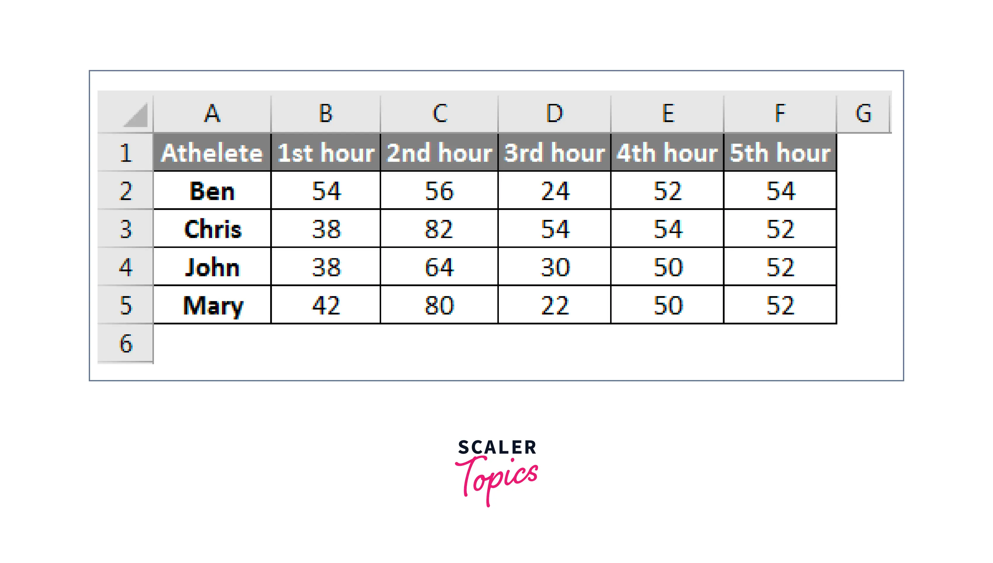
Make sure that the cells are contiguous and that there are no empty cells within the range.
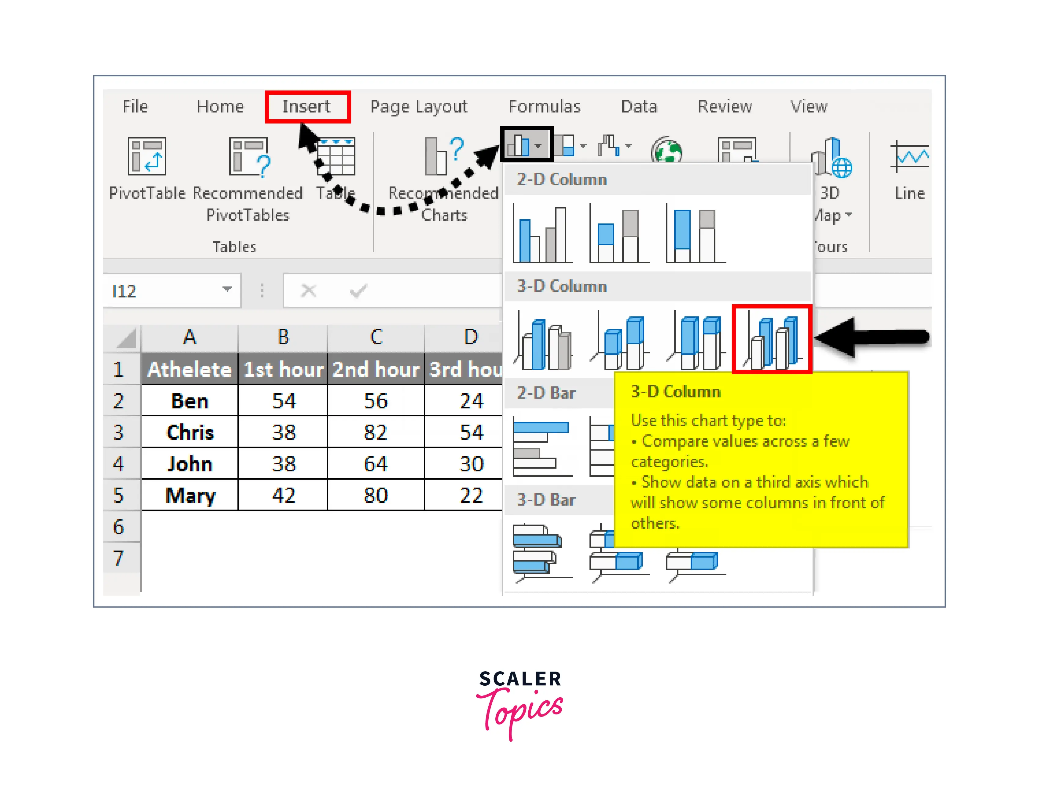
Step 3: Insert a 3D Plot
After selecting your data, the next step is to insert a 3D plot.
- First, go to the "Insert" tab in the Excel ribbon and click on the "3D Scatter" chart icon. This will bring up a list of available chart types.
- Select the type of 3D plot you want to create and click "OK".
Step 4: Customize Your Chart
Once you have inserted your 3D plot,
- You can customize it to make it more meaningful and visually appealing.
- You can add titles and labels to your chart, change the colors and formatting, and adjust the size and scale of the chart.
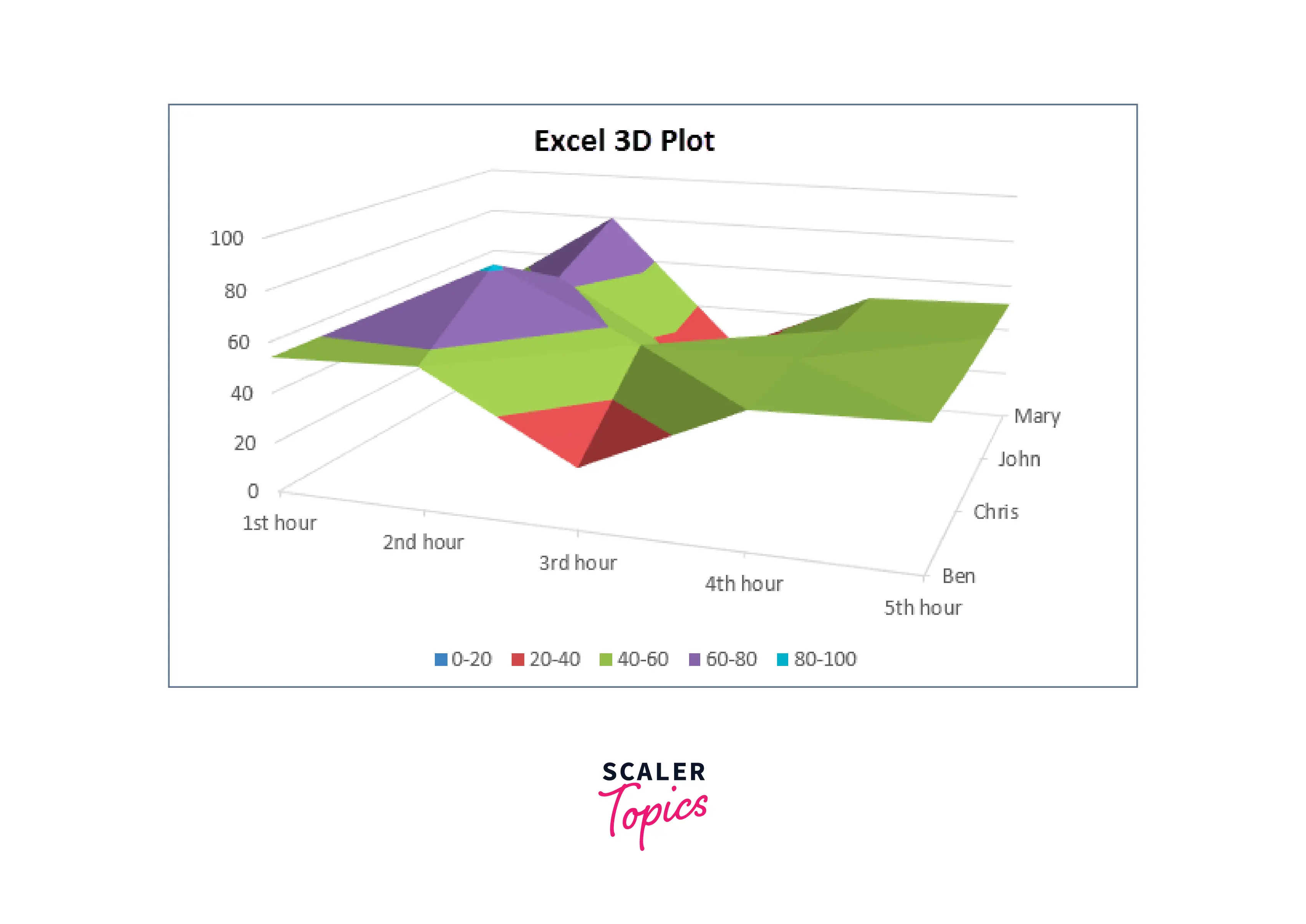
After selecting the 3D Column option, we will get a 3D plot with Columns as shown below. Here we can add Data labels, Axis Titles, and Headings and even change the design of 3D columns.
Step 5: Analyze Your Data
- The final step in creating a 3D plot in Excel is to analyze your data.
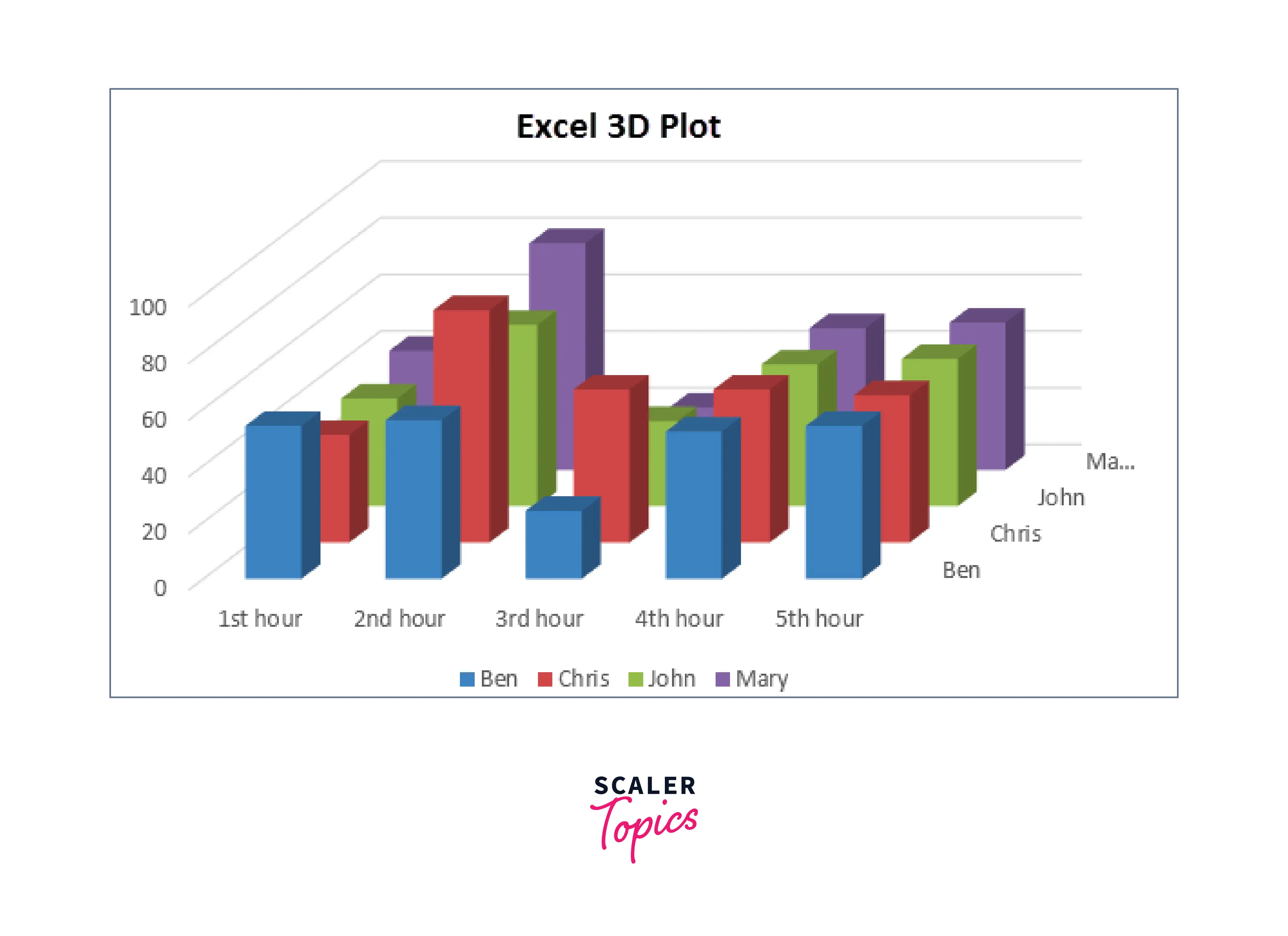
You can use the chart to identify trends and patterns in the data and to gain insights into how the variables are related.
Different plotting approach:
- Select the data you want for the 3D graph; go to the Insert menu tab in Excel.
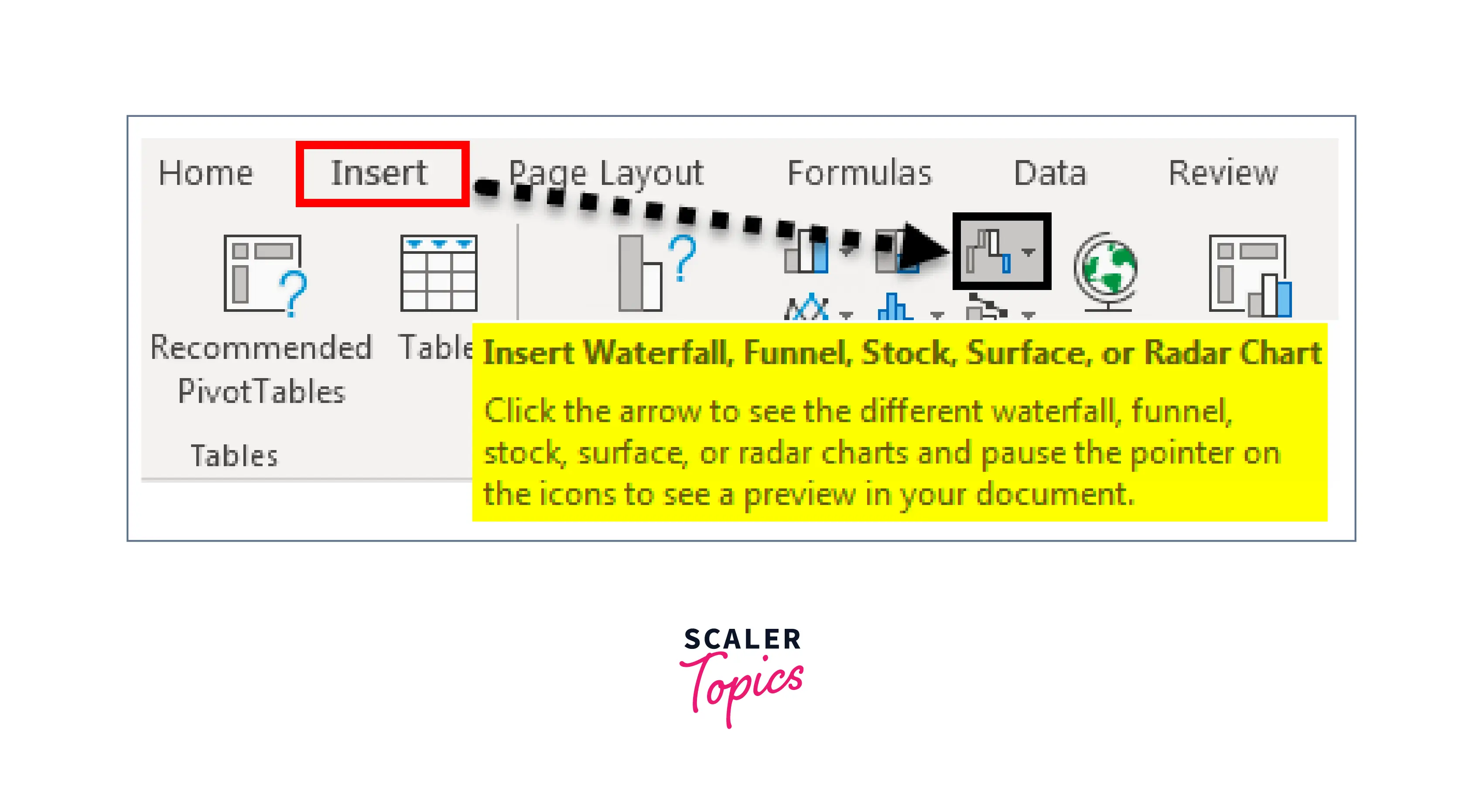
- select the Waterfall, Stock, Surface, or Radar chart option under the Charts section.
- Once you click on the desired chart type, you will receive a drop-down menu of chart subtypes.
- Choose the 3D Surface option.
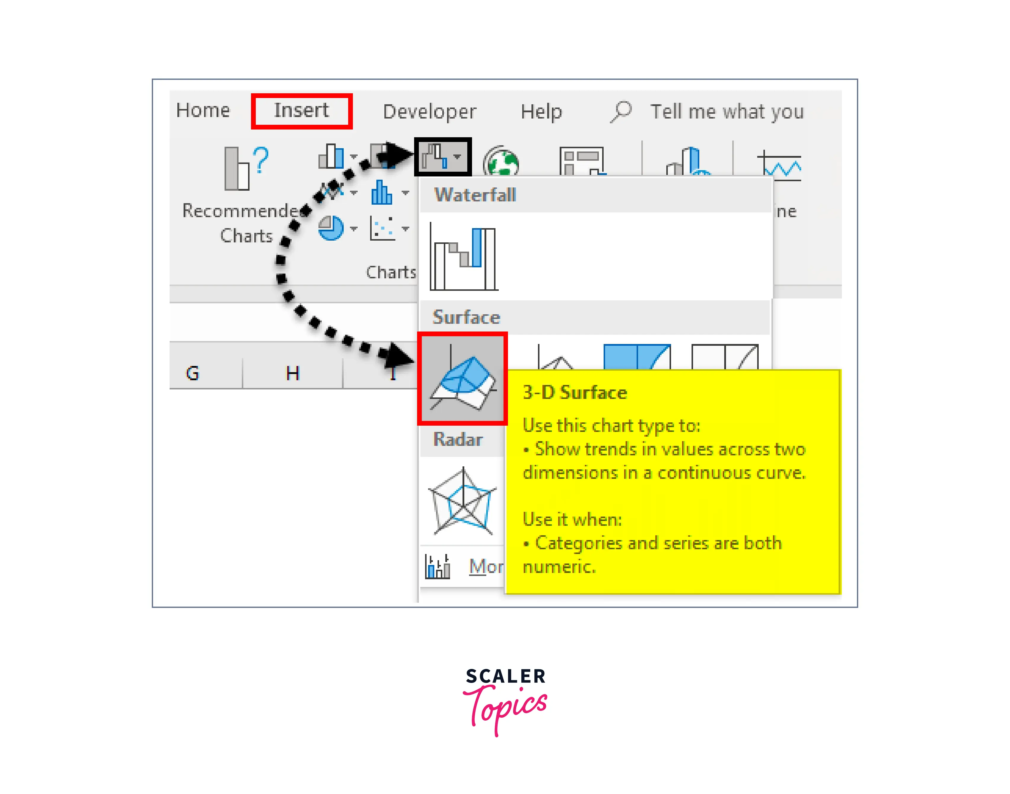
- Excel will generate a 3D Surface chart based on your selected data.
- You can customize the chart by adding titles and labels and adjusting the appearance of the 3D surface.
- Analyze the chart to gain insights into your data, such as identifying patterns or trends.
Things to Remember
Here are some important things to remember when creating a 3D graph in Excel plot:
- Prepare your data in a format that is easy to work with and analyze.
- Select the data that you want to use for your 3D plot.
- Go to the "Insert" tab in the Excel ribbon and select the desired chart type under the "Charts" section.
- Choose the 3D plot option that best fits your needs.
- Customize your chart by adding titles and labels and adjusting the appearance of the plot.
- Analyze your chart to identify trends and patterns in your data.
- Excel provides various 3D plot options, including 3D Scatter, Surface, Waterfall, and Radar charts.
Remember that the quality of your 3D plot depends on the quality of your data, so be sure to take the time to ensure that your data is accurate and well-organized.
Conclusion
- 3D graphs in Excel can help analyze complex data sets and visualize data intuitively and interactively.
- Excel offers several 3D graph options such as 3D Surface, Scatter, Waterfall, and Radar charts to represent data in three dimensions.
- Proper prepare data preparation and organization for creating a 3D graph is crucial for accurate results.
- Customizing the graph, adding titles and labels, and analyzing the results can help users gain insights into their data that may be difficult to discern from traditional 2D graphs.
- 3D graphs in Excel can enhance decision-making capabilities by providing a more detailed and accurate representation of data relationships.