abline() Function in R
Overview
Adding lines into graphical representations of data is an essential aspect of data visualization. They help us to identify the underlying patterns and relationships between variables. Also, we can easily compare different parts of the data to understand what the plot is showing. We can use R's built-in abline() function to do all this. With the function abline in R, we can easily add lines to our plots, enhancing our ability to see and interpret the data. In this article, we will explore the abline() function in R, where we will see different examples of how it can be used in data visualization.
What is abline() Function in R?
The abline() function in R adds straight lines to a plot, typically a scatter plot or a line plot. It is commonly used to overlay a regression line on a scatter plot to visually represent the relationship between two variables.
Syntax
To use the abline() function in R, we can use the following syntax:
In this syntax of the abline() function, the different parameters are:
- 'a' represents the intercept of the line.
- 'b' represents the slope of the line.
- 'h' represents the numeric value for the horizontal line (y-value)
- 'v' represents the numeric value for the vertical line (x-value)
Using the abline() function, we can mix and match these parameters according to our plotting needs to enhance our visualization. Moreover, the ellipsis (...) in the above syntax signifies the possibility of using extra optional arguments for further customizing and refining our plot.
Examples
Before exploring different examples of how the abline() function in R can be used, let's create a simple dataset named "students". This dataset contains student information and their performance in two exams. We will then proceed to explore various scenarios where the abline() function can be used to add straight lines to plots.
Example - 1:
Output:
Here we used the data.frame() function to create the student's dataset. The dataset contains 3 columns: 'student_id', 'exam1', and 'exam2', with 10 rows of data.
Example - 2:
Next, we will create a scatter plot of Exam 1 vs. Exam 2 marks for the students using the following code:
Output:
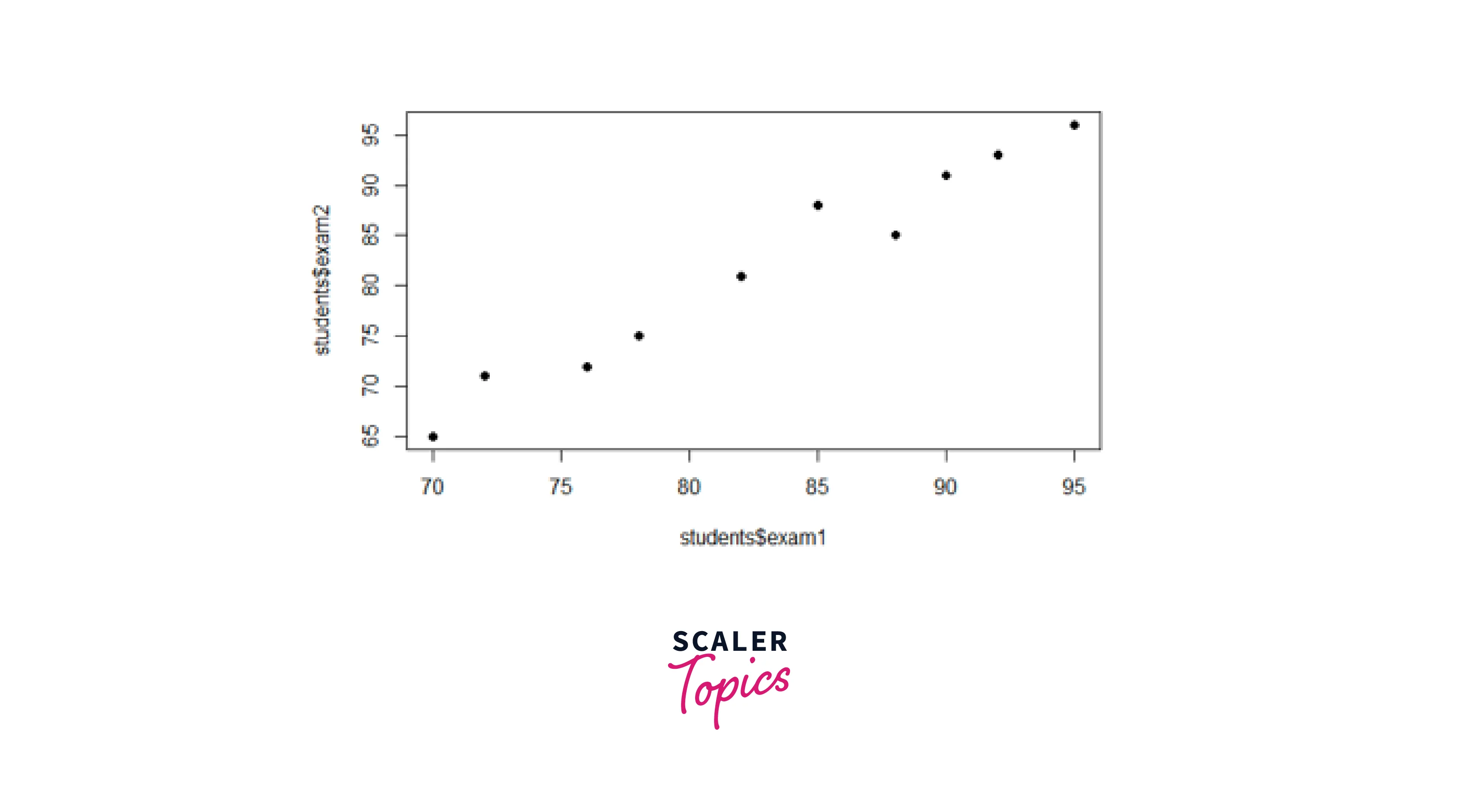
Here we used the plot() function to create a scatter plot, with the exam1 scores on the x-axis and the exam2 scores on the y-axis. The pch argument is used to specify the shape of the points on the plot.
-
Add a Horizontal Line:
Output:

Here we have specified the h argument inside the abline() function to add a horizontal line to the plot at y-coordinate 80.
In other words, adding a horizontal line with the abline() function helps to mark specific reference values (in this case - 80), which can be useful to depict how many students scored above and below it.
-
Add a Vertical Line:
Output:

First, we created a histogram of the exam1 scores using the hist() function. Then, we specified the v argument inside the abline() function to add a vertical dashed line at the mean value of the exam1 scores. Also, we used the lwd argument inside the abline() function to set the line width and lty to set the line style of the plot.
Using abline() to a vertical line at the x-coordinate equal to the mean of exam 1 scores helps in visualizing central tendencies or dividing data points.
Let us change the colors of the line and histogram using the following code:
Output:
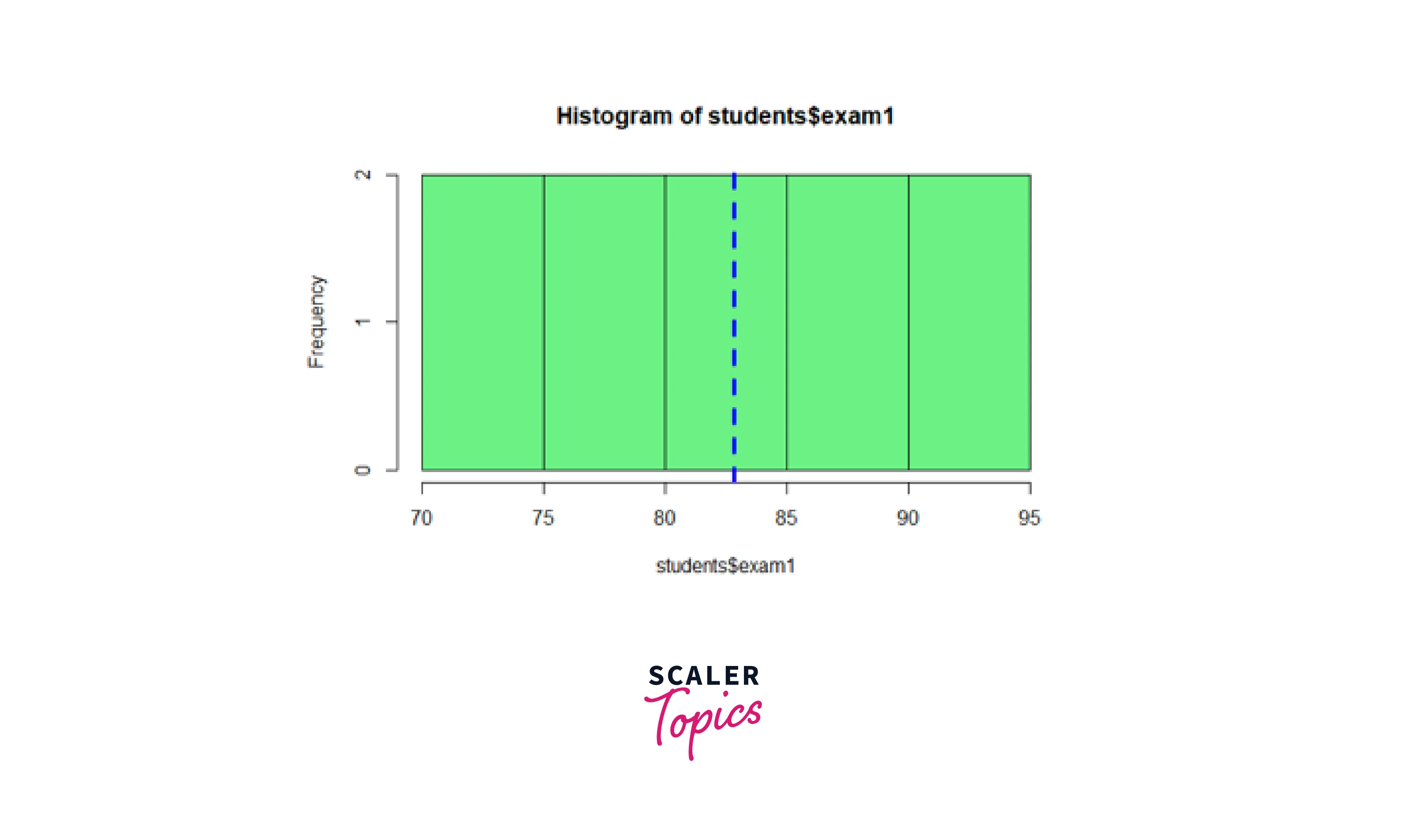
Here we changed the color of the histogram to light green using the argument 'col' inside the hist() function. Further, we used the 'col' argument inside the abline() argument to change the color of the vertical line to blue.
-
Add Regression Line:
Output:

Here we have fitted a linear regression model to predict exam2 scores based on exam1 scores using the lm() function. The fitted regression line is then added to the scatter plot using the abline() function with the argument 'reg_model'. Adding a regression line can provide a visual representation of the linear relationship between these two variables.
Conclusion
In conclusion:
- The abline() function in R is a powerful function for enhancing data visualizations by adding different types of lines to plots.
- Adding vertical and horizontal lines can help us highlight specific data points, reference values, or thresholds on a plot.
- The abline() function allows us to personalize our charts by adjusting attributes such as line color, width, and style.
- We can easily visualize linear relationships between variables by incorporating regression lines with the abline() function.
- The combination of the abline() function with other plotting functions, like plot() and hist(), allows us to create more insightful and detailed visualizations, thereby enhancing our data analysis process.