Static User Interface in Android
Overview
Static User Interface in Android refers to a UI that is defined entirely in XML layout files and does not change during the runtime of the applications. This means that all of the views in the user interface, such as buttons, text views, and images, are defined in the XML layout files and will not change over time with respect to the input given by the user.
Creating a Basic Layout
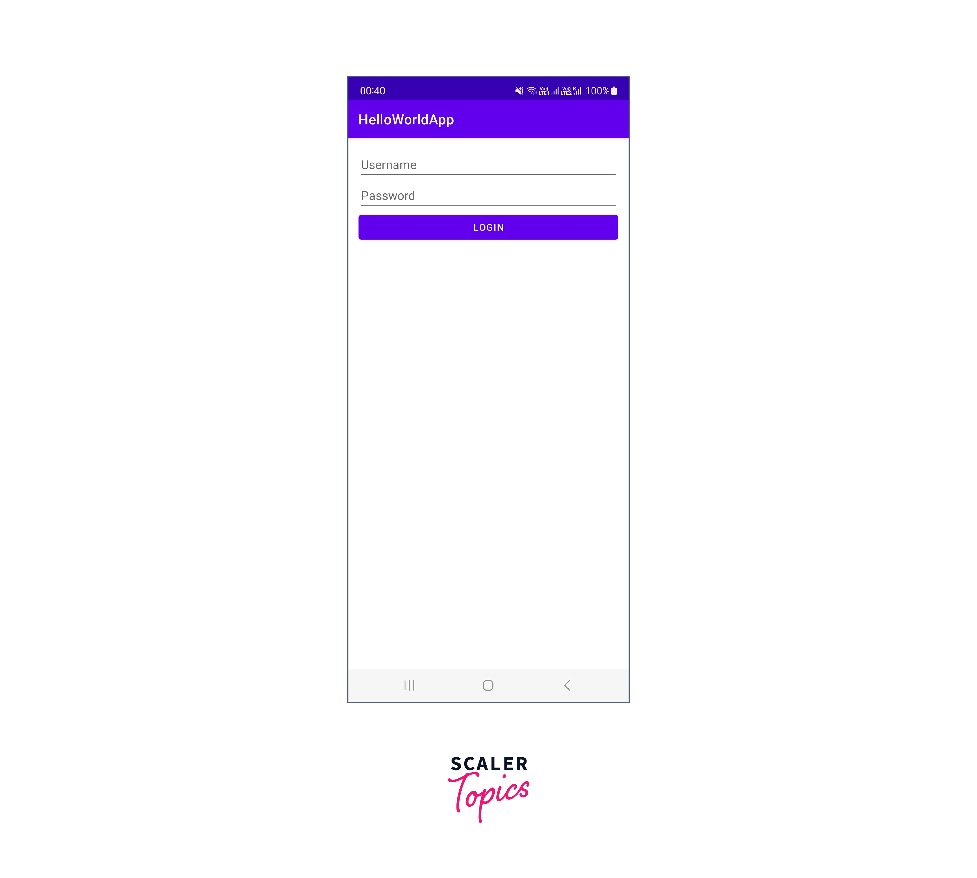
Ever wondered how we can create a simple Login page in an Android app? On a higher level, we can determine that we would an EditText for the username and another for the password. There also needs to be a button to login into the application.
Since in a login page, the View objects are arranged one below the other, we can simply make use of LinearLayout where we can horizontally. Layouts as well as Views have been explained further in this article. But for now, we can simply use it to know what it is all about.
We aren't concerned about the logic code in Java for this login page as the focus is clearly on building the user interface in Android applications.
Output:
Types of layouts in Android
There are numerous ways to style your Android app with the help of different layouts available. As a reference, here's a brief explanation of all the layouts that can be used to build a Static User Interface in Android.
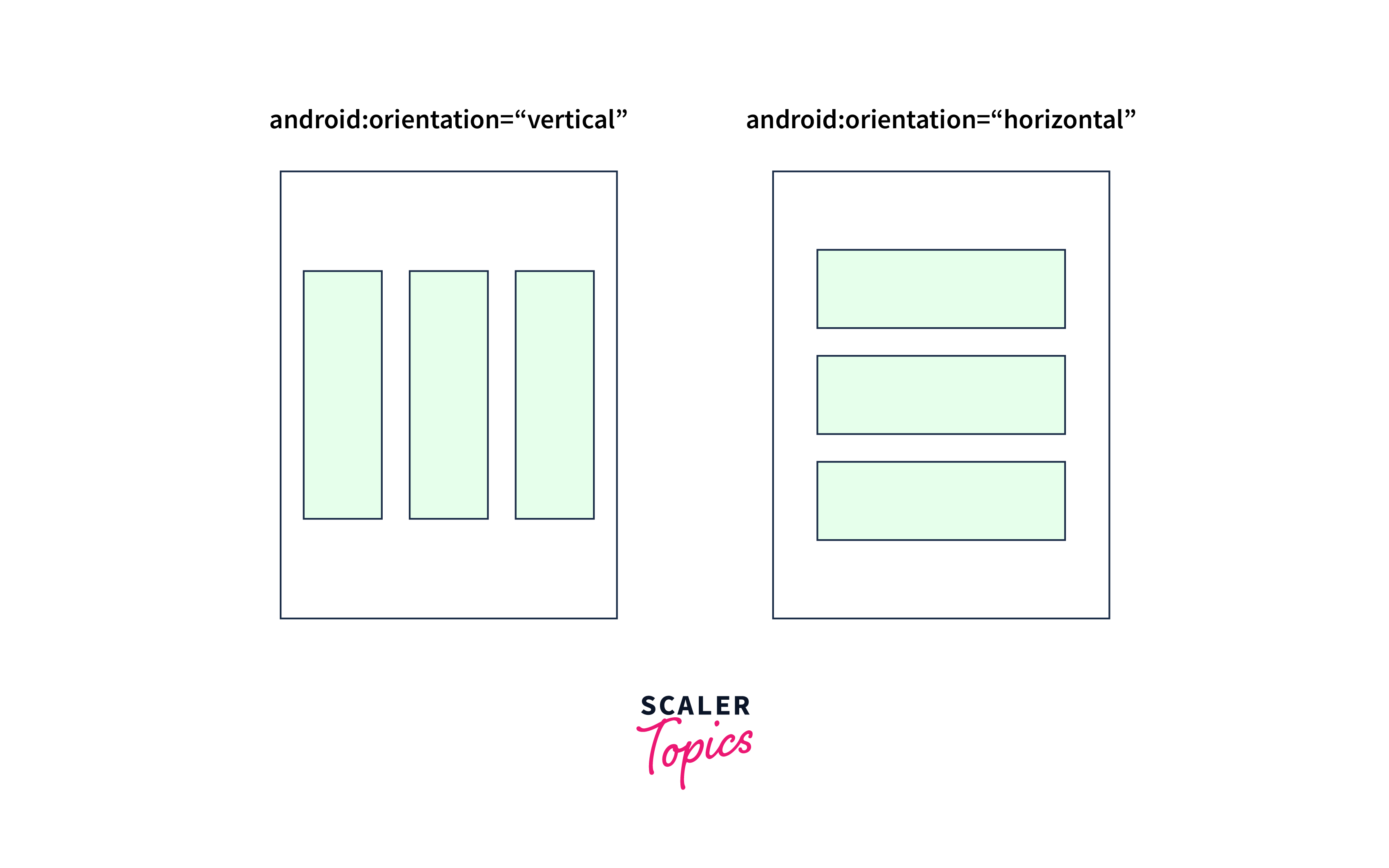
LinearLayout
Linear Layouts are used when we need to arrange the widgets linearly, though we also have two choices for orientation, i.e. horizontal and vertical. The orientation can be specified explicitly.
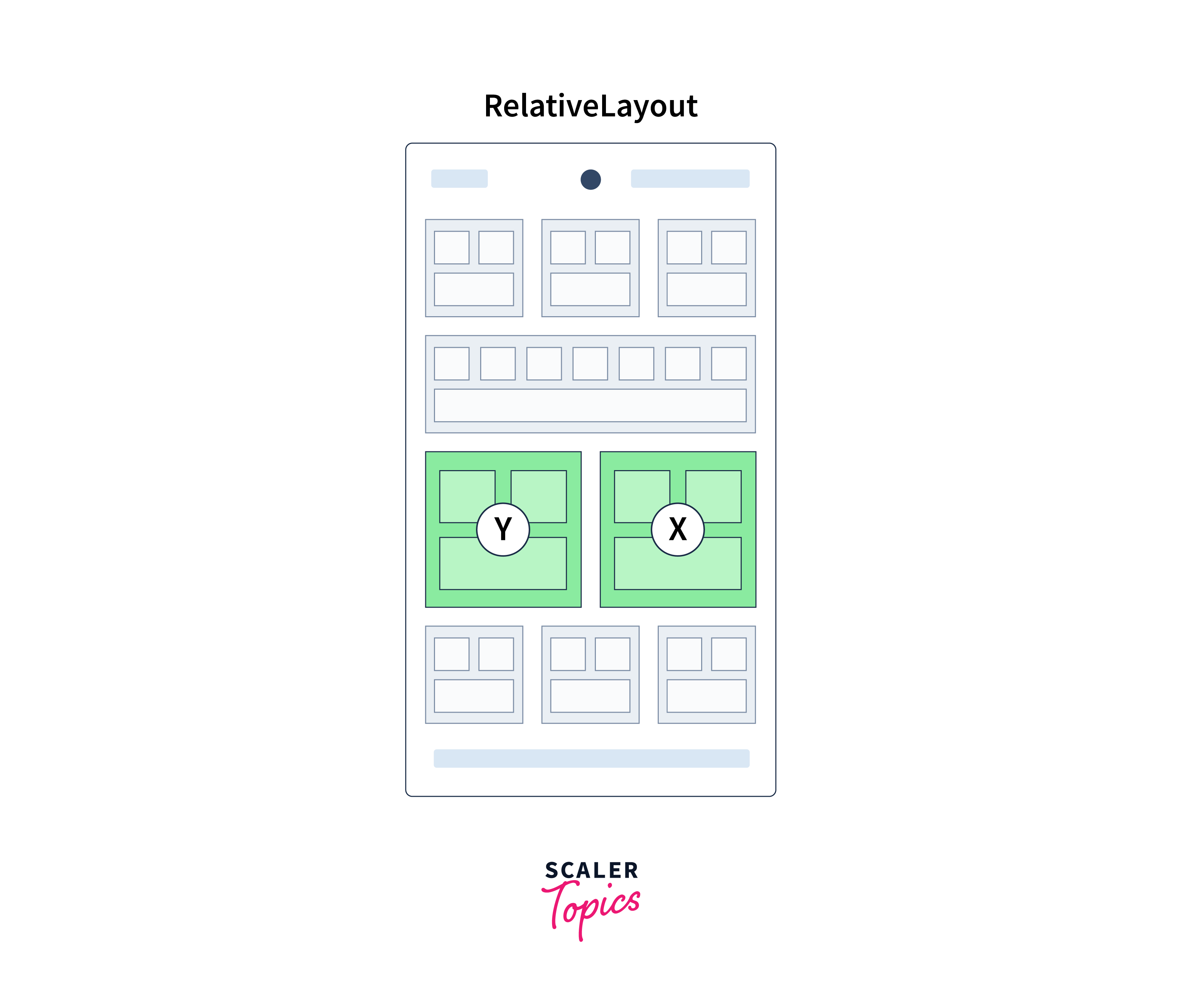
RelativeLayout
RelativeLayout is used when we need to arrange the widgets (or child views) in relation to one another or relative to the parent view. To position such views, attributes like android:layout_alignParentTop and android:layout_below can be used.
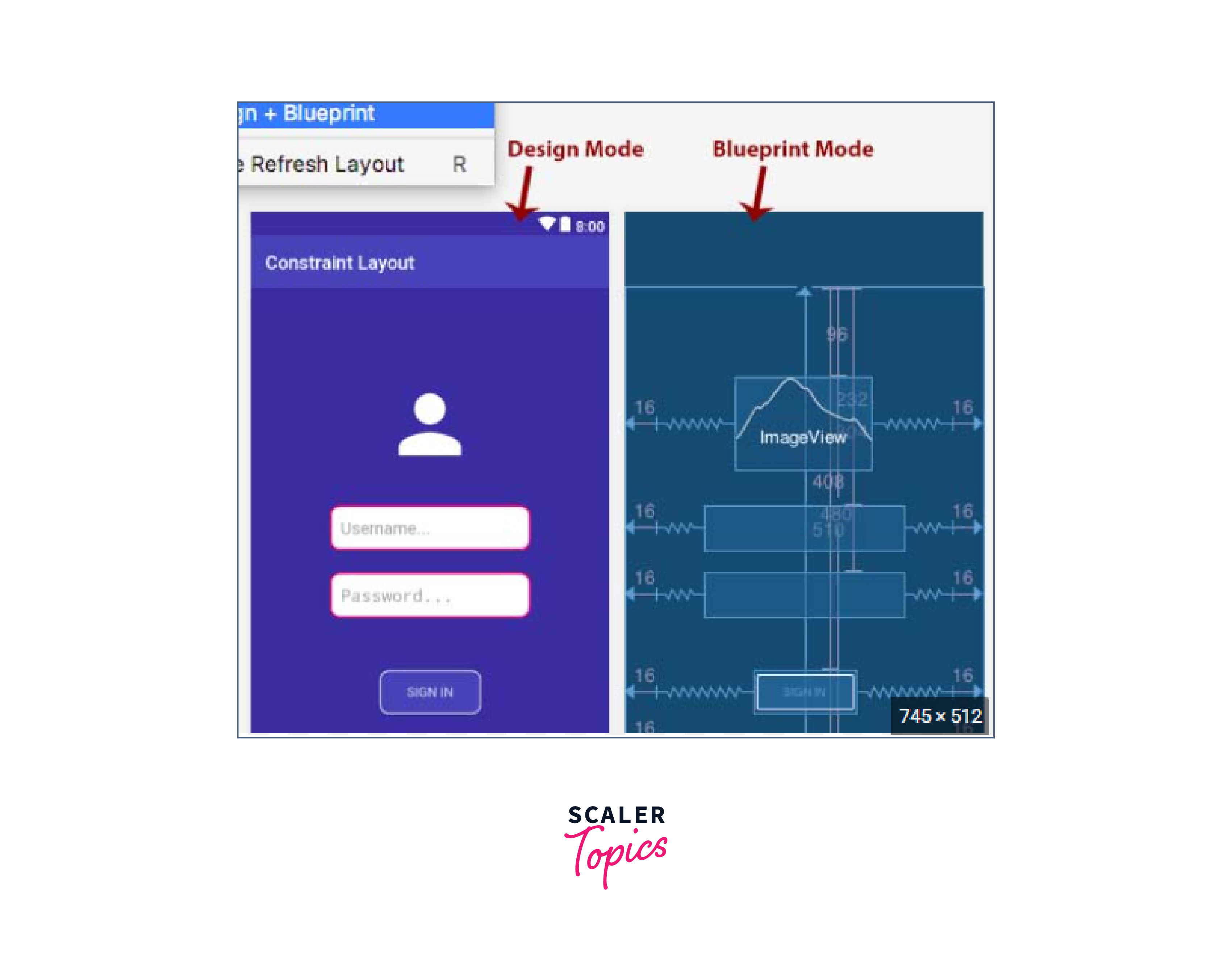
ConstraintLayout
ConstraintLayout can be referred to as an enhanced version of RelativeLayout as it provides a lot more capability than RelativeLayout. You can use constraints to position views relative to each other or to the parent view.
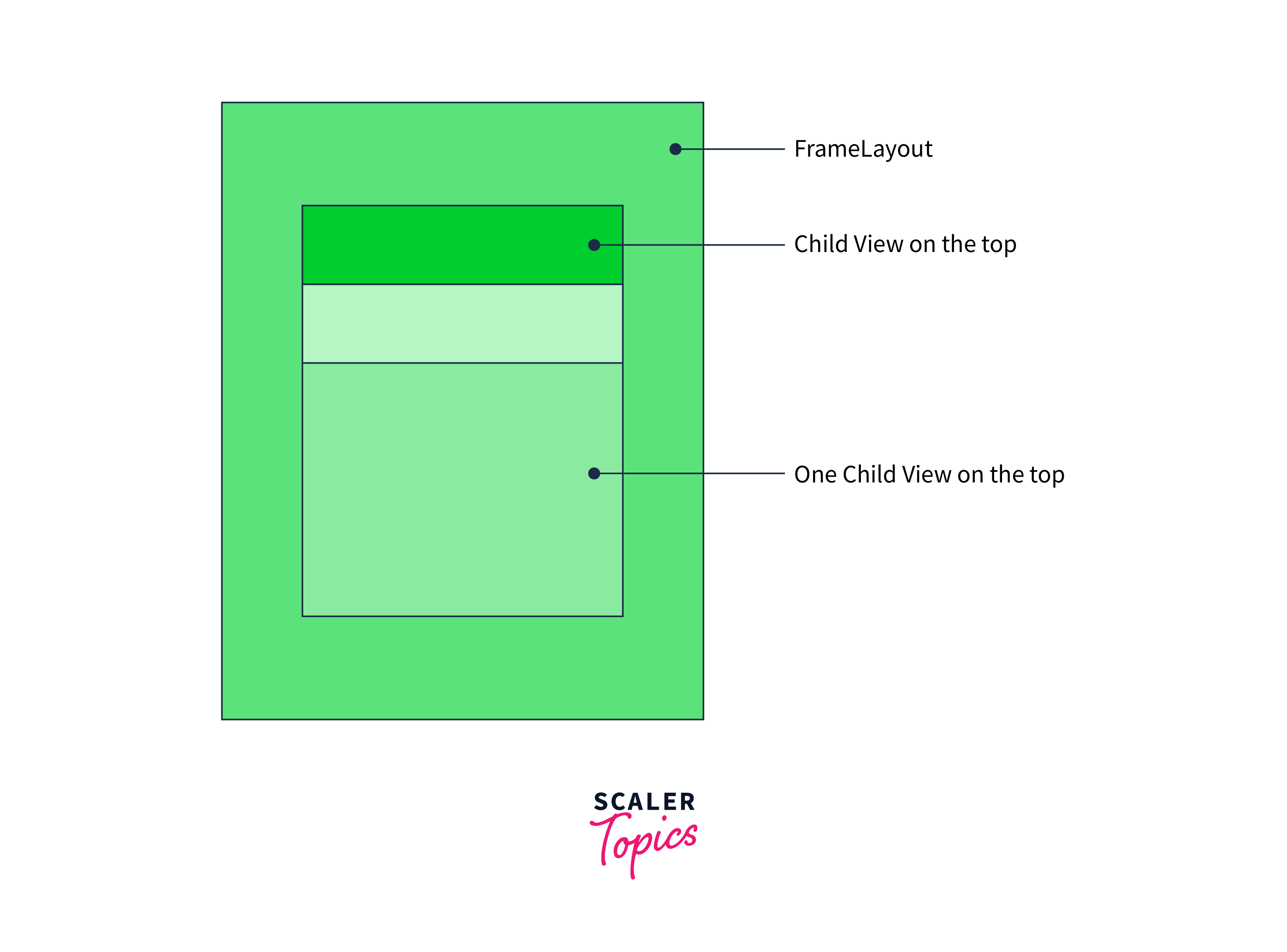
FrameLayout
FrameLayout contains only one child view at a time. FrameLayouts are more often used to create splash screen in an Android app.
FrameLayout is a simple layout that allows you to display one or more views on top of each other, with each view occupying the full size of the layout. However, it is true that only one child view can be fully visible at any given time because they are stacked on top of each other.
The stacking order of the views is determined by the order in which they are added to the FrameLayout.
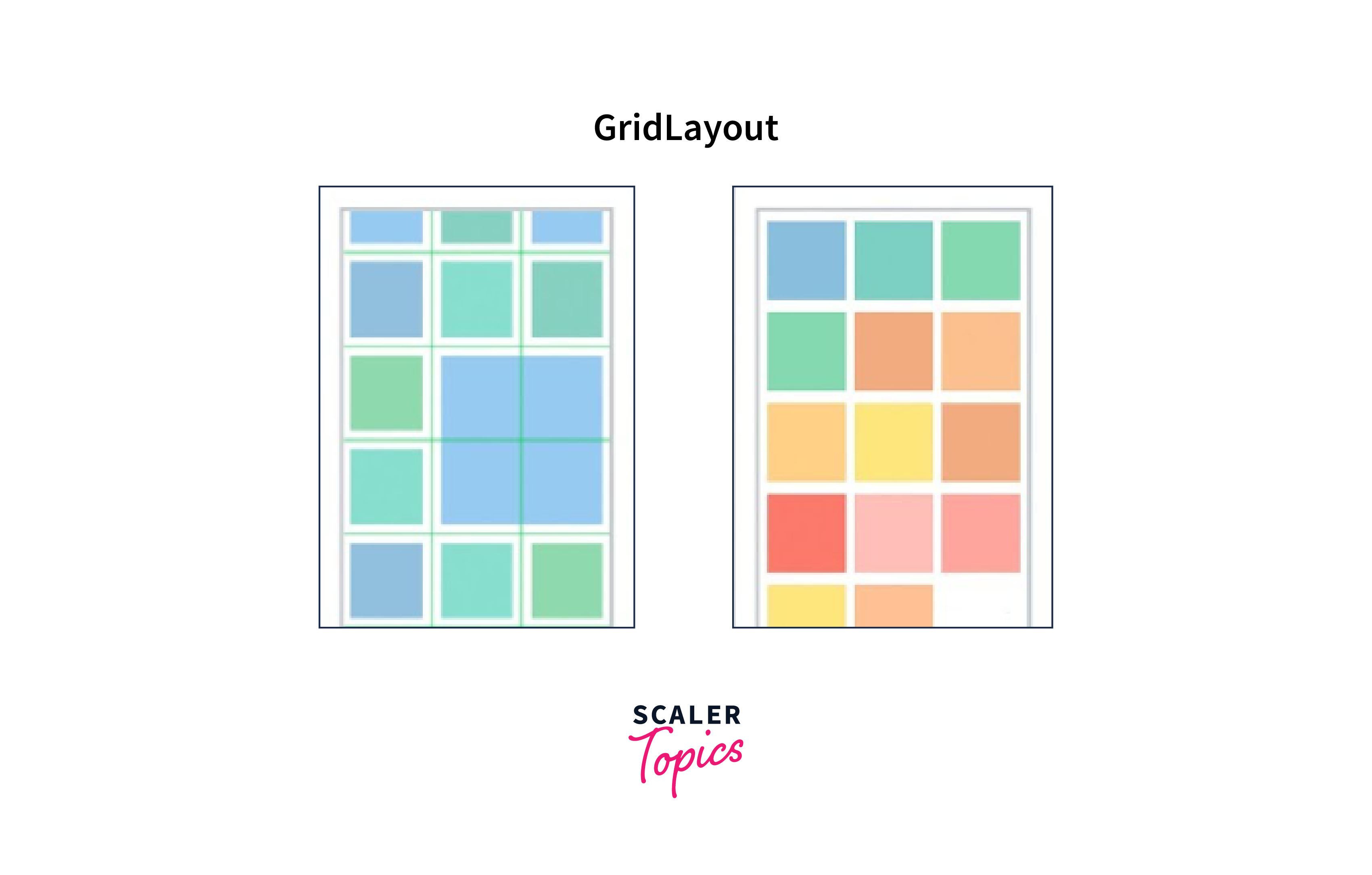
GridLayout
GridLayout is used to arrange the child views in a grid-like format. You just need to specify the number of rows and columns to be displayed and the layout will adjust them automatically as per their size.
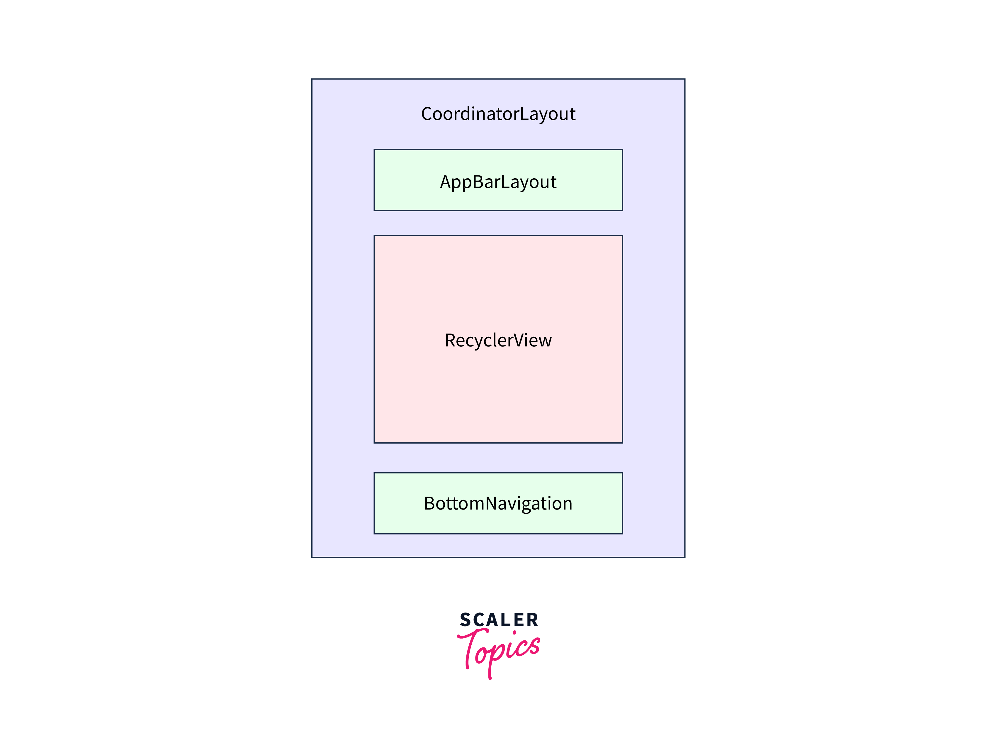
CoordinatorLayout
CoordinatorLayout is a layout that provides advanced behaviours and animations for its child views. You can use this layout to create complex and responsive layouts with scrolling and animations.
The main purpose of CoordinatorLayout is to handle the positioning and interactions between its child views.
Adding UI Elements
Before adding any UI element, you must have an idea of View and ViewGroups. A View is something that is drawn on the screen and with which a user can interact. It is an element on the screen that is visible to the user. ImageView, TextView, Button, EditText, etc. are all some of the Views in Android.
A ViewGroup is always invisible to the user but comprises Views and other ViewGroup objects as well. Layouts in Android are all ViewGroups.
Note: A View cannot hold any ViewGroup.
There are many UI elements that can be used in an Android app to create an intuitive and visually appealing user interface. Here are some common UI elements used in Android development:
- TextView: It is used to display text on the screen.
- EditText: It is a predefined subclass of TextView that accepts input from the user via a soft keyboard.
- ImageView: It is used to display an image on the screen.
- Button: A button triggers an action or event when a user clicks on it.
- CheckBox: CheckBox provides multiple options for a user to choose from.
- RadioButton: RadioButton is used when only one option can be selected out of all.
- ListView: A widget used to display a list of items that can be scrolled vertically.
- RecyclerView: A more advanced widget than ListView, used to display a list of items with more advanced features such as animations and layout customization.
- NavigationDrawer: NavigationDrawer provides a navigation menu that can slide in and out from the side of the screen. It is commonly used to create a menu that can be opened and closed with the hamburger icon.
- ProgressBar: It is used to show the progress of any task on the screen.
Styling the UI
We had previously worked on creating a basic login page in the above section. For some reason, we didn't focus on enhancing its design, let's do it now. Focus on the attributes that are being used here.
We'll use androidx.appcompat.widget.LinearLayoutCompat which is provided in the AndroidX library and has additional features compared to LinearLayout.
We want the elements to be at the centre of the screen, so we'll use android:gravity="center".
Here's what the code for LinearLayout looks like:
Now, let's add our components. Before that in order to make our EditText box and the button attractive, we'll define a shape with rounded corners and also a different. So, in your Project Explorer, open app > res > drawable and right-click to create a new Drawable Resource File.
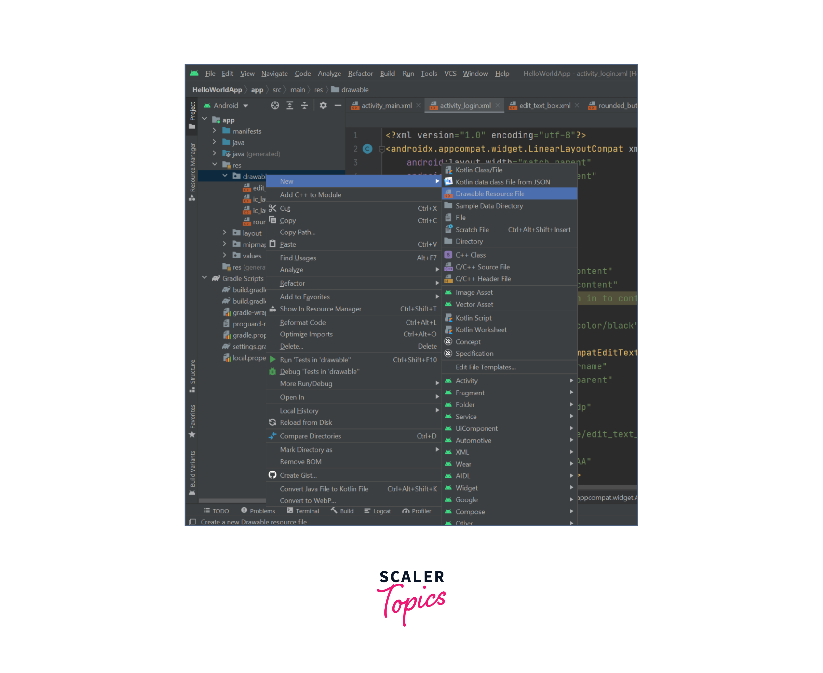
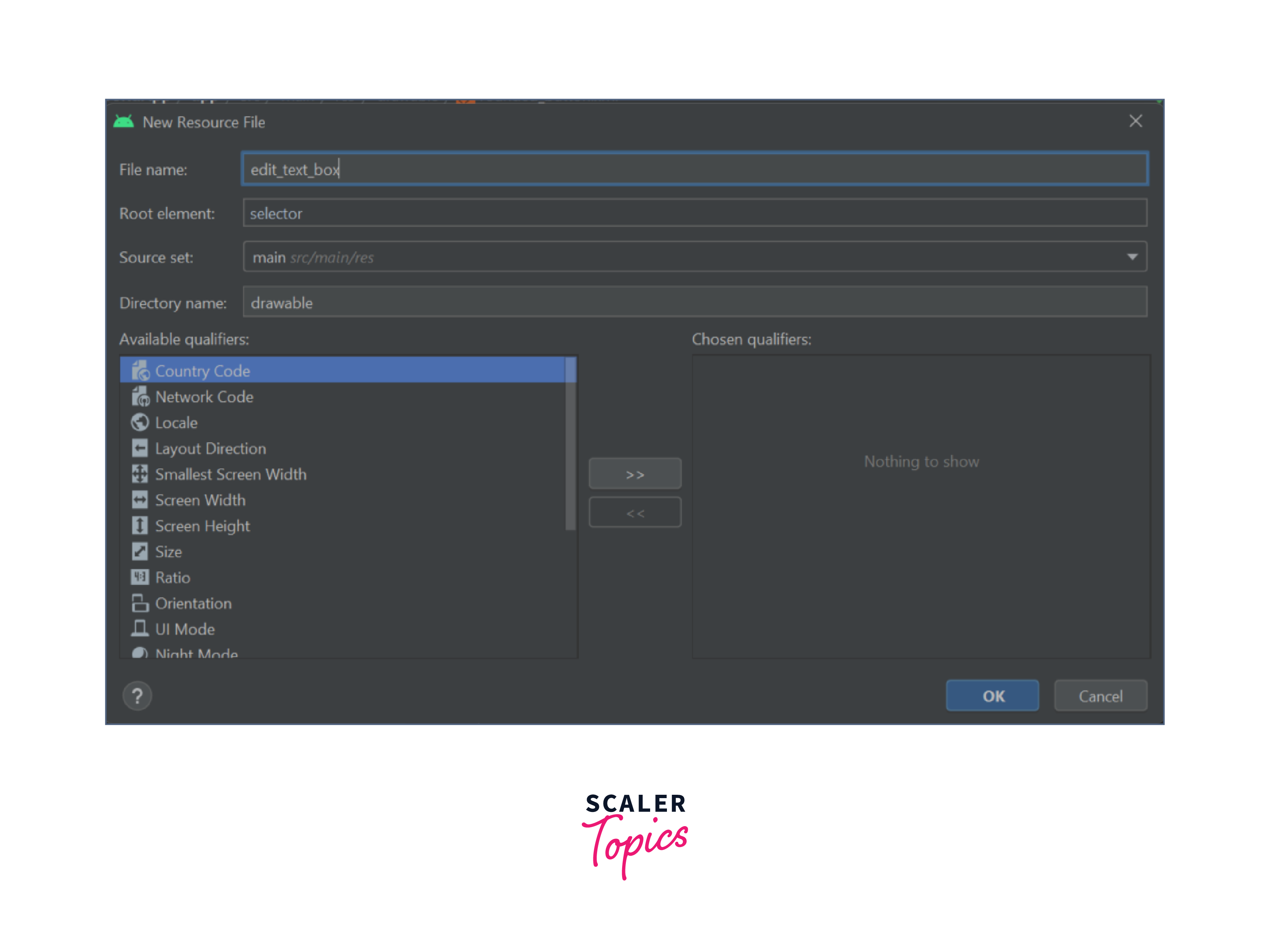
We'll create two files, edit_text_box.xml and rounded_button.xml and here's the code for both these drawable resource files.
edit_text_box.xml
rounded_button.xml
Now, we can use these shapes in our XML layout file with the help of android:background="@drawable/{xml_filename}" attribute.
For EditText and Button, we can use androidx.appcompat.widget.AppCompatEditText and androidx.appcompat.widget.AppCompatButton.
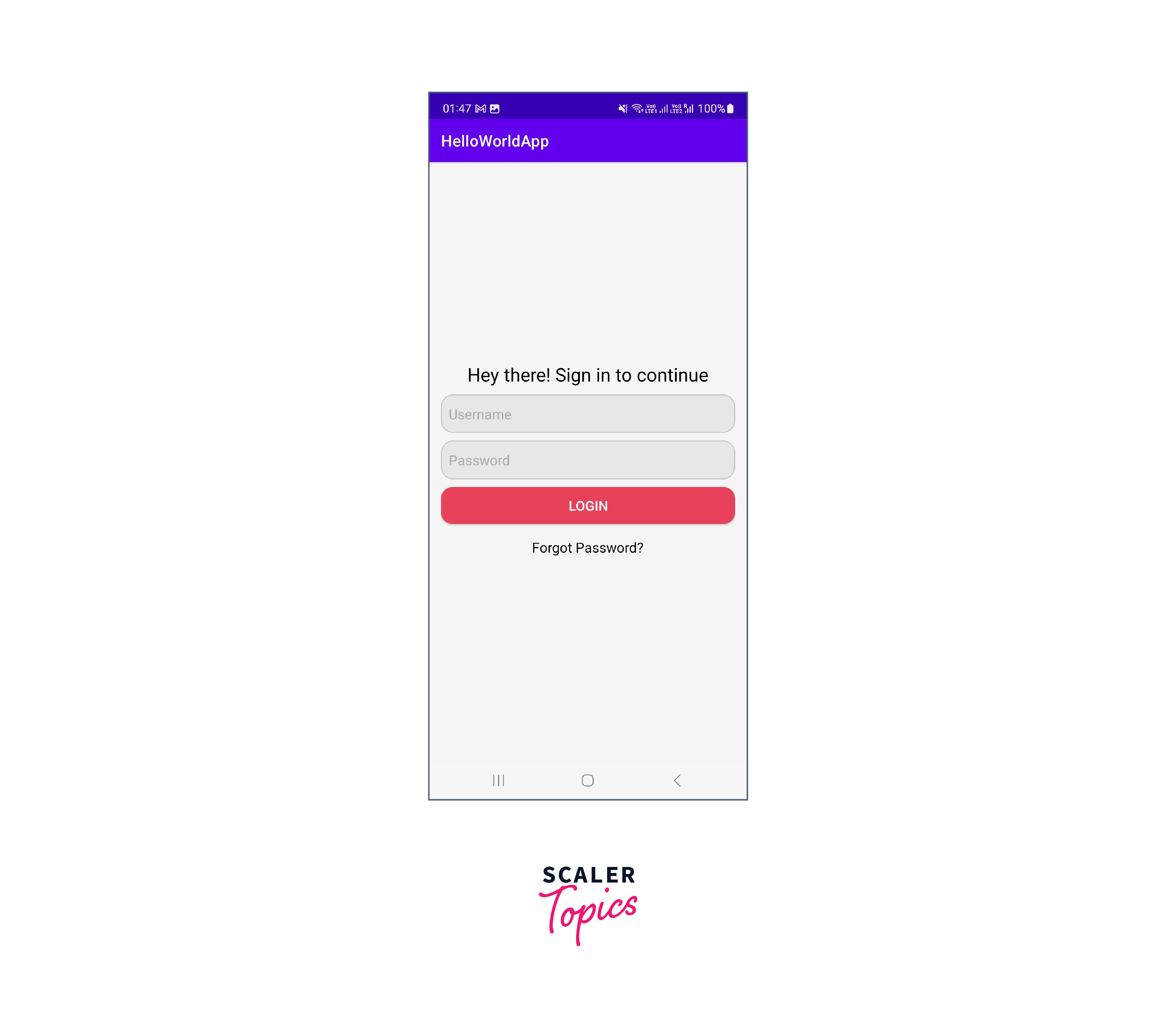
And here's our final code with the output:
Output:
Working with Constraints
In ConstraintLayout, you can create constraints between views, which specify how the views should be positioned relative to each other. Constraints can be set on the horizontal and vertical axis, and they can be set to a specific distance or to match a certain view size. You can also set constraints to be chained, which means that multiple views will be linked together and distributed evenly.
Here are the basic steps to work with constraints in ConstraintLayout:
- Add a ConstraintLayout to your XML layout file.
- Add the views you want to include in your layout as children of the ConstraintLayout.
- Set the constraints between the views by selecting a view, then drag the anchor points to the desired position. Alternatively, you can use the Attributes panel to set the constraints manually.
- Preview the layout to see how it looks. You can adjust the constraints as needed to achieve the desired layout.
Here are some commonly used attributes for ConstraintLayout in Android:
- android:layout_width / android:layout_height: Specifies the width/height of the ConstraintLayout.
- app:layout_constraintStart_toStartOf: Specifies the start edge of a view to be anchored to the start edge of another view or the parent layout.
- app:layout_constraintEnd_toEndOf: Specifies the end edge of a view to be anchored to the end edge of another view or the parent layout.
- app:layout_constraintTop_toTopOf: Specifies the top edge of a view to be anchored to the top edge of another view or the parent layout.
- app:layout_constraintBottom_toBottomOf: Specifies the bottom edge of a view to be anchored to the bottom edge of another view or the parent layout.
- app:layout_constraintLeft_toLeftOf: Specifies the left edge of a view to be anchored to the left edge of another view or the parent layout.
Conclusion
- Static User Interface in Android refers to a UI that is defined entirely in XML layout files and does not change during the runtime of the applications.
- Layouts in Android are LinearLayout, RelativeLayout, ConstraintLayout, FrameLayout, GridLayout, and CoordinatorLayout.
- A View is something that is drawn on the screen and with which a user can interact.
- A ViewGroup is always invisible to the user but comprises Views and other ViewGroup objects as well.
- In ConstraintLayout, you can create constraints between views, which specify how the views should be positioned relative to each other. Constraints can be set on the horizontal and vertical axis, and they can be set to a specific distance or to match a certain view size.