Themes for Android
Overview
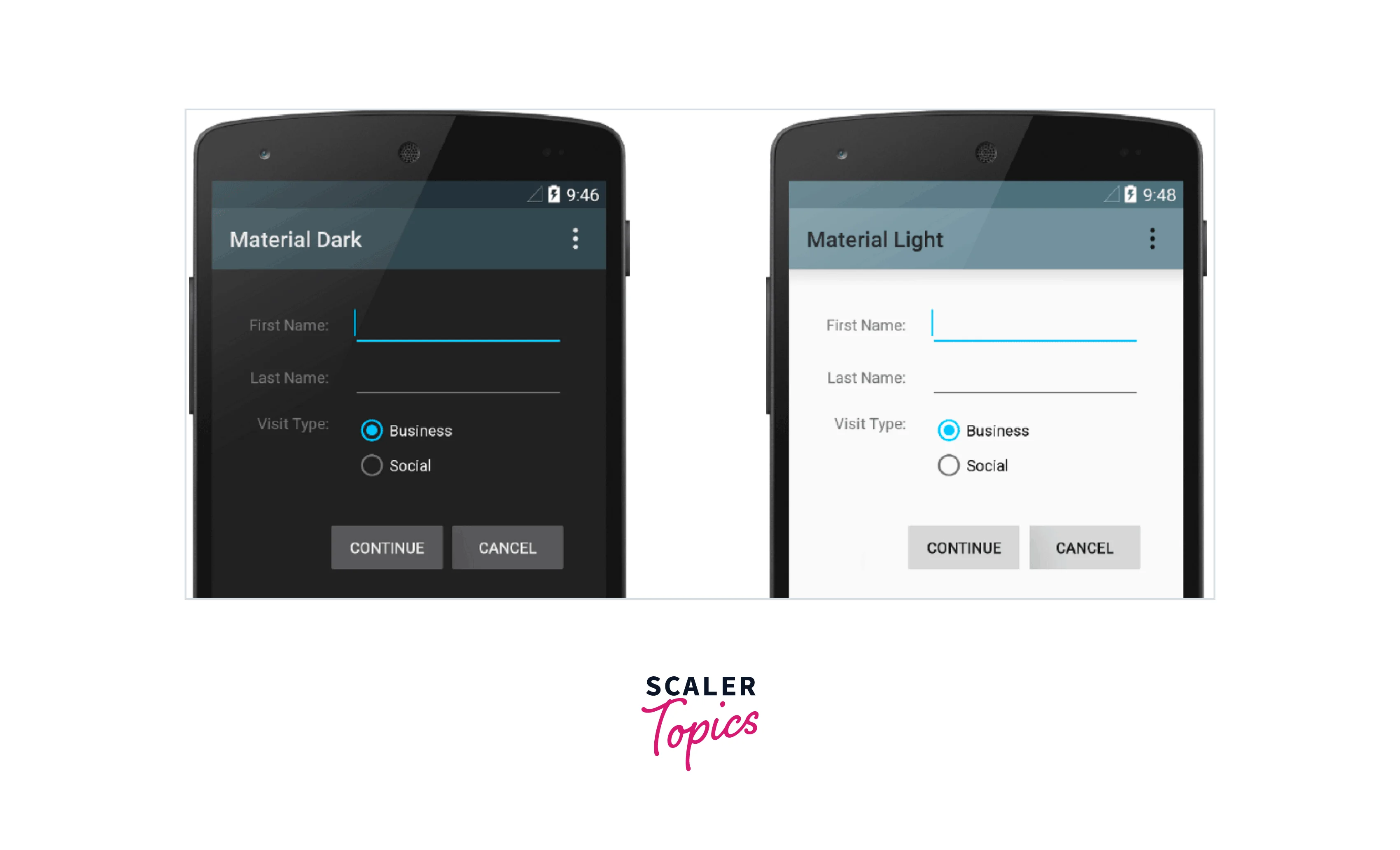
Similar to stylesheets in web design, styles and themes on Android allow you to separate the specifics of your app's design from the UI structure and behavior. The aesthetic and occasionally functional styles that can be applied to an Android app to alter its appearance and behavior are referred to as themes in Android. The usage of themes for android enables developers to design user interfaces that are consistent and aesthetically pleasant, making them a crucial component of Android app development.
Themes versus styles
| Aspect | Themes | Styles |
|---|---|---|
| Definition | The whole appearance and feel of an Android app, including color schemes, typography, and layout, are defined by themes for android. | A style is a set of characteristics that can be applied to certain UI elements in an app, like buttons or text views. |
| Scope | Themes are frequently applied globally to the entire app, changing how it looks. | Specific UI elements can have styles assigned to them, enabling per-element customization. |
| Inheritance | The ability of themes to inherit from one another enables the development of new themes for android that expand upon preexisting ones. | Style hierarchies can be made since styles can inherit from one another. |
| XML Definition | Themes are defined in res/values/styles.xml | Styles are also defined in res/values/styles.xml |
| Attribute Modifiers | In order to establish values that can be referred to in layouts and styles, themes for android employ theme attributes like android | Assigning particular values to attributes like android |
| Elements Affected | Themes impact various design elements, including fonts, colors, backgrounds, layouts, and more. | Styles affect specific attributes, such as font size, font color, line spacing, alignment, borders, and other individual formatting properties. |
| Examples | Material Design theme, Dark theme, Light theme | Button style, Text view style, Custom dialog style |
| Consistency | Themes help maintain visual consistency across the entire document or website, ensuring a cohesive and professional appearance. | Styles allow for customization and variation within the document, which can be useful for emphasizing certain content or creating visual contrast |
| Customization | Custom theme definitions that inherit from pre-existing themes and override particular attributes allow for the customization of themes. | By creating unique style definitions and applying them to UI elements in XML layout files, styles can be altered. |
| Examples | Material Design theme, Dark theme, Light theme | Button style, Text view style, Custom dialog style |
Create and apply a style
You must define a style in your app's XML resource file before applying it to a UI element in a layout XML file in order to generate and use it in an Android app.
Here is a detailed explanation of how to develop and use a style:
- Define a Style (res/values/styles.xml): Open or create the res/values/styles.xml file in your Android project. This file is where you define styles for your app. Here's an example of defining a style for a TextView:
In this example, we've defined a style called MyTextStyle with attributes for text size and text color.
- Apply the Style to a UI Element (layout XML file): Open the layout XML file where you want to apply the style to a TextView or any other UI element. Apply the style using the style attribute.
In this example, we've applied the MyTextStyle to a TextView by setting the style attribute to @style/MyTextStyle.
-
Reference the Style Attribute: When you apply the style to a UI element, the attributes defined in the style will be applied to that element. You can reference styles in multiple UI elements, ensuring a consistent appearance across your app.
-
Build and Run: After creating and applying the style, build and run your Android app. The TextView in the layout XML file will now have the attributes defined in the "MyTextStyle" style.
Extend and customize a Style
In Android, you can develop variations of an existing style while inheriting its characteristics by extending and tweaking it. This might help you keep your design themes for android constant while making small changes to certain UI elements.
Here's how to customize and extend a style:
- Define the Base Style (res/values/styles.xml): First, define the base style that you want to extend. This style serves as the starting point for your custom styles. For example, let's say you have a base text style:
- Extend the Base Style (res/values/styles.xml): Create a new style that extends the base style. You can add or override attributes in this style to customize it. Here's an example of extending the BaseTextStyle:
In this example, we've created a new style called CustomTextStyle that extends BaseTextStyle. We've added attributes for text style (making it bold) and a custom font.
- Apply the Custom Style (layout XML file): Apply the custom style to a UI element in your layout XML file using the style attribute:
- Build and Run: After defining and applying the custom style, build and run your Android app. The TextView in the layout XML file will now use the attributes defined in the CustomTextStyle, which extends the BaseTextStyle.
Apply a style as a theme
To alter the general appearance and feel of your entire app on Android, apply a style as a theme. Applying a style as a theme is helpful for keeping your app's look consistent.
How to use a theme as a style is as follows:
- Define a Theme (res/values/styles.xml):
Open your res/values/styles.xml file and define a new theme that inherits from the base theme you want to customize. For example, you can create a custom theme based on the Material Design theme:
In this example, AppTheme is defined as a custom theme that inherits from Theme.MaterialComponents.Light and overrides certain color attributes.
- Apply the Custom Theme to Your App (AndroidManifest.xml):
Open your AndroidManifest.xml file and specify the custom theme as the default theme for your entire app. Add the android
In this example, we've set the android
- Build and Run:
After defining and applying the custom theme, build and run your Android app. The theme attributes you specified in AppTheme will be applied to various UI elements throughout your app, providing a consistent visual style.
Style hierarchy
Styles in Android can be arranged in a hierarchy, allowing you to customize certain aspects for child styles while inheriting parent styles' traits and properties. This style hierarchy enables customization where necessary while preserving consistency in your app's design.
The Android style hierarchy is summarized as follows:
Base Styles
- You can specify base styles at the top of the style hierarchy to act as the starting point for further styles.
- Base styles frequently provide generic properties that are applicable to numerous UI elements.
- These parent styles are used for more specific styles and may not be directly applied to UI elements.
Parent Styles
- A level of abstraction is provided for certain UI components or groups of components via parent styles, which are styles that inherit from base styles.
- The attributes of parent styles may be used to define particular app sections or a group of UI elements (such as buttons or text views).
Child Styles (Custom Styles):
- Child styles are used to alter the appearance of specific UI elements or app parts. Child styles can derive from either base styles or parent styles.
- To offer distinctive design options, these styles can alter properties that were passed down from their parent styles.
Here's an example of how the style hierarchy might be organized:
In this example:
- BaseTextStyle and BaseButtonStyle are base styles.
- ParentTextStyle and ParentButtonStyle are parent styles that inherit from base styles.
- CustomButtonStyle is a child style that inherits from ParentButtonStyle and customizes the text color.
a. TextAppearance
- TextViews, EditTexts, and Buttons are just a few UI elements that can have their text styled using the TextAppearance style resource in Android. For uniform typography across all of your app's text elements, it enables you to declare text-related attributes like text color, text size, text style, and more in a single style resource.
- TextAppearance allows you to provide text-specific styling while leaving a View's style open for other applications. But keep in mind that the values you define for any text attributes directly on the View or in a style will take precedence over the settings for TextAppearance.
- A portion of the stylistic options available in TextView are supported by TextAppearance.
- LineHeight[Multiplier|Extra], lines, breakStrategy, and hyphenationFrequency are a few typical TextView characteristics that are not included. The properties that influence the overall layout are not allowed since TextAppearance operates at the character level rather than the paragraph level
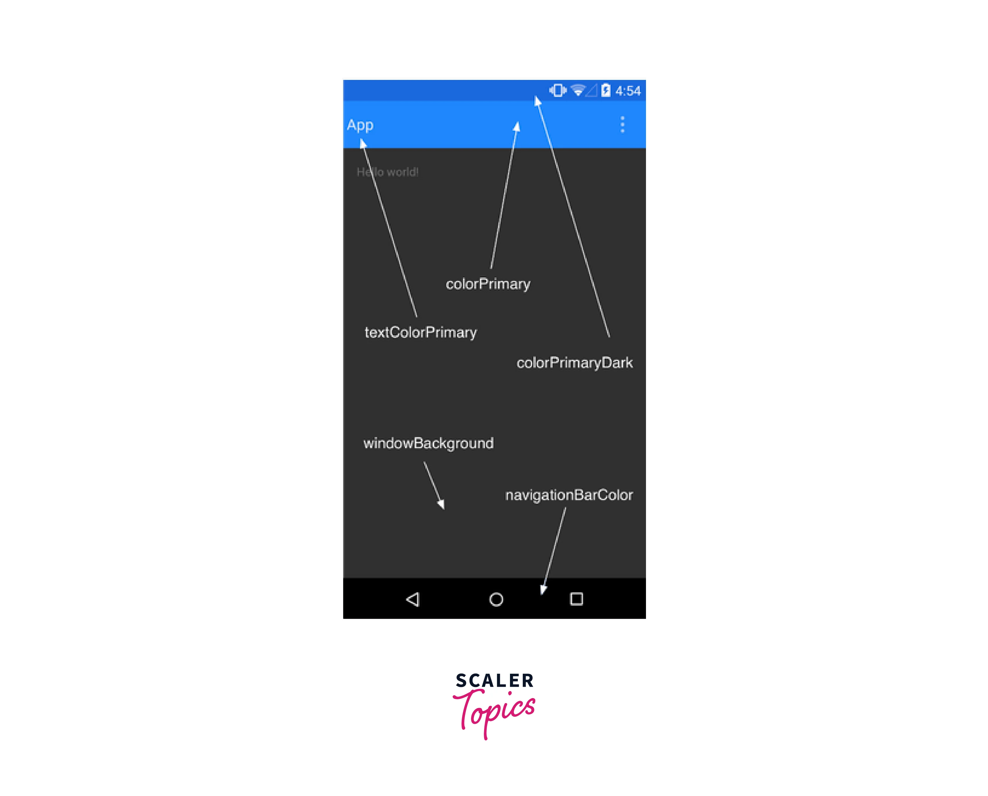
Customize the default theme
You can alter the general appearance and feel of your Android app, as well as the colors, fonts, and other design aspects, by changing the default theme. You can make a new theme that derives from one of the pre-built themes, such Material Design themes, to alter the default theme.
The following instructions explain how to change the default theme:
- Define a Custom Theme (res/values/styles.xml):
Open your res/values/styles.xml file and define a custom theme. You can base it on one of the built-in themes like Theme.MaterialComponents.Light or Theme.AppCompat.Light. For example, let's create a custom theme based on Material.
In this example, we've defined a custom theme named "AppTheme" that inherits from Theme.MaterialComponents.Light. We've customized attributes like primary color, primary dark color, accent color, and the window background.
- Apply the Custom Theme to Your App (AndroidManifest.xml):
Open your AndroidManifest.xml file and set the custom theme as the default theme for your entire app by adding the android:theme attribute to the <application> element:
Set the android
- Customize Resources (colors, drawables, fonts, etc.):
To fully customize the theme, you'll likely need to define custom color resources, drawables, fonts, and other resources in your res/values and res/drawable folders. For example, create XML files for custom colors in res/values/colors.xml:
You can define custom resources for colors, drawables, dimensions, and more to match your desired theme.
- Build and Run:
After defining and applying the custom theme and customizing resources, build and run your Android app. Your app will now use the customized theme throughout, giving it a unique and personalized appearance.
Add version-specific styles
Use resource qualifiers in your project if you need to provide styles for several Android releases or API levels. You may supply various sets of resources, including styles, for various device configurations, such as different screen sizes, orientations, and API levels, thanks to resource qualifiers.
Here's how you can add version-specific styles:
-
Create Resource Folders: In your Android project's res directory, you can create resource folders that are specific to different API levels. These folders should be named using the values-vXX format, where XX represents the API level you want to target. For example, if you want to create version-specific styles for devices running Android 5.0 (API level 21) and higher, you would create a values-v21 directory.
-
Define Version-Specific Styles (res/values-vXX/styles.xml): Within the version-specific resource folder, create or modify a styles.xml file to define styles that are specific to that API level. You can override existing styles or define entirely new ones. Here's an example:
- Define Common Styles (res/values/styles.xml):
In the default res/values/styles.xml file, define the common styles that apply to all versions of Android. These styles serve as a baseline and are used as fallbacks if a version-specific style is not defined. For example:
- Customize Resources (if needed):
In addition to styles, you can customize other resources, such as colors, dimensions, or drawables, in version-specific resource folders as needed.
- Build and Run:
After defining version-specific styles and resources, build and run your Android app. Android will automatically select the appropriate styles and resources based on the device's API level.
Customize widget styles
You may alter the look and behavior of common UI widgets like buttons, text views, checkboxes, and more in Android by customizing widget styles. Within your app's styles.xml file, you can specify unique styles for these widgets.
How to modify widget styles is as follows:
- Open or Create styles.xml: Open the res/values/styles.xml file in your Android project. If it doesn't exist, you can create it.
- Define a Custom Widget Style:
To customize a specific widget, create a new style entry with a name that reflects the widget you want to style. For example, if you want to style a button, create a style like this:
In this example, we've defined a style called CustomButtonStyle and customized attributes like text size, text color, and background for buttons.
- Apply the Custom Style to a Widget:
To apply your custom widget style to a widget in your layout XML file, use the style attribute:
Here, we've applied the CustomButtonStyle to a Button widget.
- Customize Resources (if needed):
If your widget style requires custom colors, drawables, or other resources, make sure to define those resources in your res/values or res/drawable folders and reference them in your widget style.
- Build and Run:
Build and run your Android app to see the customized widget style in action. The widget will now use the attributes defined in your custom style.
Conclusion
- Themes vs. Styles: Themes define the overall app appearance, while styles customize specific UI elements. Both are defined in res/values/styles.xml. To create and apply style define styles in styles.xml and apply them to UI elements in layout XML files using the style attribute.
- Extending and Customizing Styles: Customize UI elements by extending and modifying base or parent styles. You can also customize UI widget appearance and behavior by defining custom widget styles.
- Applying a Style as a Theme: Customize the overall app appearance by creating a custom theme based on a base theme and applying it in the AndroidManifest.xml file.
- Style Hierarchy: Styles can be organized in a hierarchy, from base styles to parent and child styles, for consistent and customized design. Using hierarchy you can customize the default app theme by defining a custom theme that inherits from a base theme and customizing colors, fonts, and design aspects.
- TextAppearance: Use TextAppearance to ensure consistent typography across text elements.
- Version-Specific Styles: Provide styles for different Android versions using resource qualifiers and version-specific styles.