ReactJS UI Ant Design Button Component
Overview
User interface (UI) components play a crucial role in shaping the visual and interactive aspects of web applications. React, a JavaScript library for building user interfaces, is commonly used in conjunction with UI frameworks like Ant Design to streamline the development of visually appealing and functional web applications. The Ant Design Button component is a versatile and highly customizable UI element that serves as a fundamental part of Ant Design’s UI library. It provides developers with a wide array of options and props to control its appearance, behavior, and interaction within their web applications.
Button Props
The Antd Button component offers a diverse set of props, granting comprehensive control over its appearance and functionality. This versatility makes it a valuable tool for crafting various buttons in your React applications.
- type: Determines the visual style of the button. Options include default, primary, dashed, text, link, and ghost.
- shape: Defines the shape of the button. Options include default, round, and circle.
- size: Sets the size of the button. Available sizes are large, default, and small.
- htmlType: Specifies the HTML behavior of the button, with options like button, submit, and reset. Use it to control the button's form-related actions.
- icon: Allows you to add an icon to the button for additional context or decoration.
- loading: When set to true, displays a loading indicator within the button to indicate an ongoing action.
- disabled: This prop disables the button, preventing user interaction. Employ this when you want to temporarily prevent users from clicking a button, like during form submission to avoid double submissions.
- block: The block prop makes the button expand to fill its parent container horizontally, making it ideal for full-width buttons within forms. Employ this for "Submit" or "Save" buttons in forms to ensure they span the entire width of the form container.
- danger: The danger prop indicates that the button represents a potentially harmful or destructive action. Apply this to a "Delete" button to visually alert users to the irreversible nature of the action.
- ghost: The ghost prop creates a ghost button, which is a transparent button with a colored border. Use this for secondary actions or buttons with lower visual prominence, like "Cancel" buttons alongside primary actions.
- href: When provided, turns the button into an anchor link, redirecting users to the specified URL when clicked.
- target: Used with the href prop to determine where the linked resource opens, such as _blank for a new tab or window, and _self for the current frame.
- onClick: Allows you to define a custom function to execute when the button is clicked. Useful for handling user interactions.
Creating React Application And Installing Module
Creating a React application and installing the necessary modules, including Ant Design, is the first step in using the Antd Button component in your project. Below, we will walk through the process step by step:
Step 1: Create a New React Application
- You can create a new React application by running the following command in your terminal: npx create-react-app ant-design-button-demo
- This command creates a new directory named ant-design-button-demo with the basic structure of a React application.
Step 2: Navigate to the Project Directory
Change your working directory to the newly created project folder:
cd ant-design-button-demo
Step 3: Install the Ant Design Library
To use Ant Design components in your React application, you need to install the Ant Design library. You can do this using npm:
npm install antd
Step 4: Use Custom Styling
Developers can customize the appearance of Antd buttons using various methods:
- CSS: Create a separate CSS file for global styles or use CSS Modules for scoped styles. Import these styles and apply them to Ant Design buttons by adding custom class names.
- styled-components: Use the styled-components library to define custom button components with specific styles using tagged template literals.
- Other CSS-in-JS Libraries: Alternative CSS-in-JS libraries like Emotion, styled-jsx, or JSS offer similar capabilities for styling Ant Design buttons.
Step 5: Testing
Testing React components, including Ant Design components, is crucial for ensuring reliability and preventing regressions. Tools like Jest and React Testing Library facilitate the testing process.
It's essential to set up testing environments, write tests for components, including those using Ant Design components, and simulate user interactions.
Example
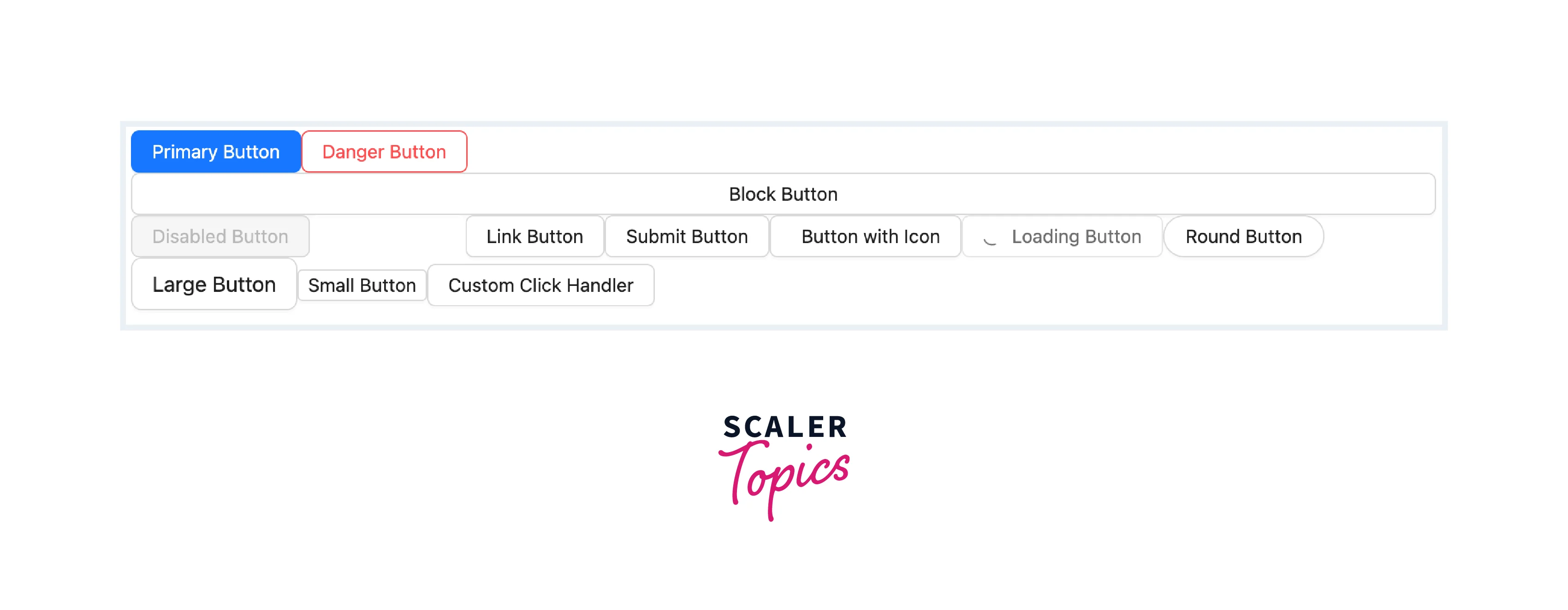
Now that we have our React application set up, let’s look at an example of how to use the Ant Design Button component with various props:

In this example, we’ve demonstrated various Button props to showcase the flexibility and versatility of the Ant Design Button component.
Steps to Run the Application
To run the React application you’ve created with the Antd Button component, follow these steps:
- Open a terminal or command prompt.
- Ensure that you are in the root directory of your React project, where the package.json file is located. You can use the cd command to navigate to your project folder if you are not already there. cd ant-design-button-demo
- Start the development server by running the following command: npm start
This command will initiate the development server, compile your React application, and open it in your default web browser.
After a few moments, your React application should open automatically in your web browser. If it doesn’t, you can manually open your web browser and navigate to the following address: http://localhost:3000
Conclusion
- The Ant Design Button component is a versatile UI element that plays a crucial role in creating interactive web applications.
- It offers a wide range of props and customization options to control its appearance and behavior.
- Running your React application is as simple as executing npm start and accessing it in your web browser at http://localhost:3000.
- The Ant Design Button component empowers developers to create visually appealing and interactive user interfaces in React applications.
- By mastering the Antd Button and its props, you can enhance user experiences and streamline UI development in your projects.
