ReactJS UI Ant Design Dropdown Component
Overview
Dropdowns are a fundamental part of user interfaces in web applications. They provide a convenient way to present users with a list of options to choose from. ReactJS, a popular JavaScript library for building user interfaces, offers a wide range of components to create interactive and user-friendly UI elements. One such component is the Ant Design Dropdown, which is part of the Ant Design(Antd) library. In this article, we will explore the Ant Design Dropdown component in ReactJS, including its props, how to use it, and how to create a React application with it.
Dropdown Props
Before delving into creating a React application with the Ant Design Dropdown component, let's take a closer look at some essential properties (props) that can be used with this component:
- Overlay: The overlay prop is used to specify the content that appears when the dropdown is activated. It can be a list of options or any other HTML element you want to display when the user interacts with the dropdown.
- Placement: You can control the position of the dropdown in relation to its trigger element using the placement prop. Common placement options include 'bottomLeft,' 'bottomCenter,' 'bottomRight,' 'topLeft,' 'topCenter,' and 'topRight.'
- Visible: The visible prop allows you to determine whether the dropdown is displayed or hidden. You can set it to true to show the dropdown or false to conceal it.
- Trigger: The Antd Dropdown component offers different triggers:
- click: The dropdown opens when clicked and closes when an option is selected or when clicking outside. Use for standard dropdown behavior.
- hover: The dropdown appears when hovering over the trigger element and disappears when the mouse moves away. Useful for quick access to options.
- contextMenu: The dropdown opens on right-click, similar to a context menu. Ideal for displaying context-specific actions.
- Disabled: You can disable the dropdown by using the disabled prop, which prevents users from interacting with it.
- OverlayStyle: The overlayStyle prop lets you apply custom inline styles to the dropdown content, allowing for fine-grained control over its appearance.
- Arrow: You can customize the arrow that indicates the dropdown direction using the arrow prop. By default, Ant Design handles the arrow, but you can set it to false to hide it or provide a custom React element.
- DefaultVisible: The defaultVisible prop allows you to set the initial visibility state of the dropdown when it is first rendered.
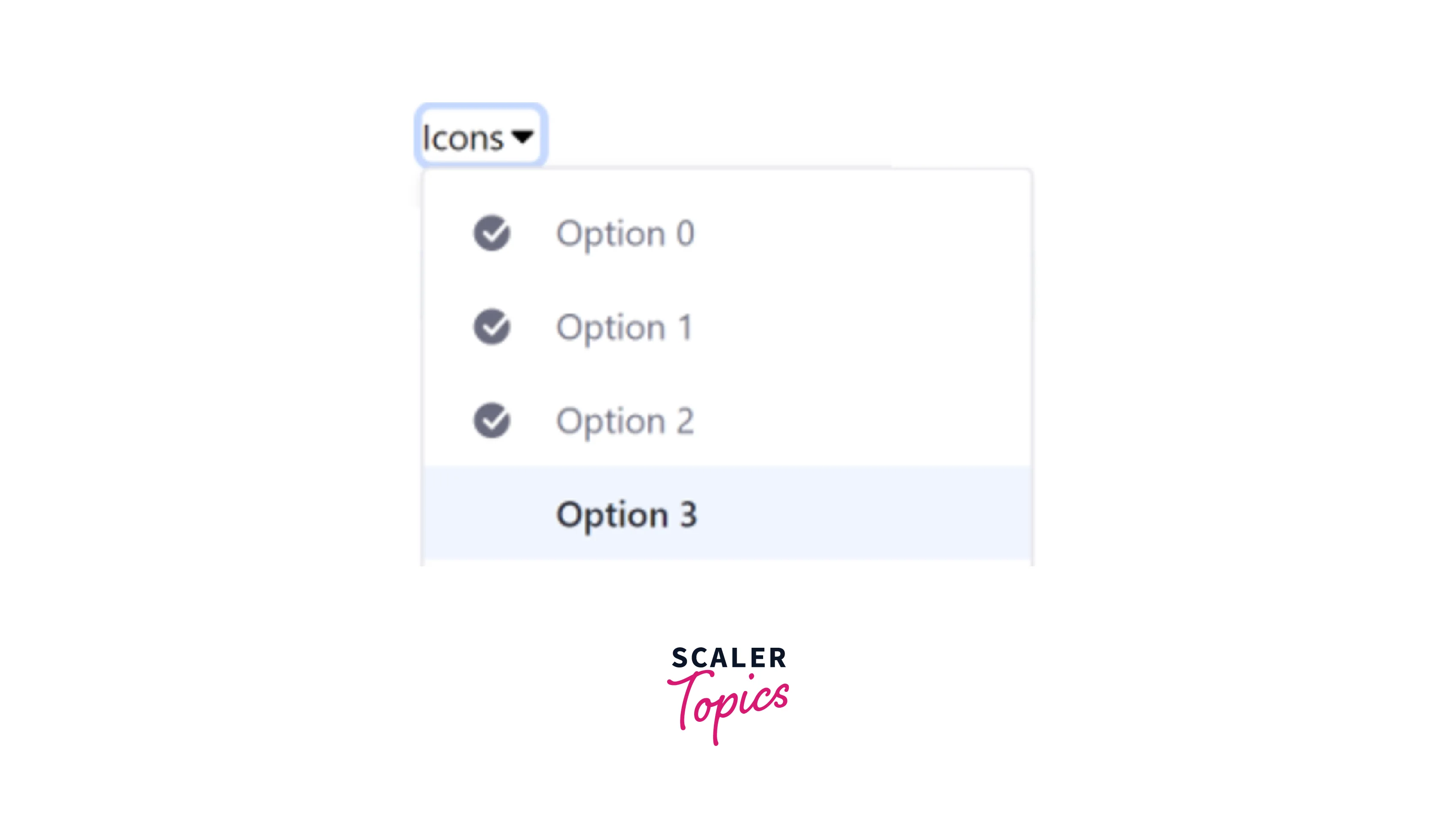
- Nested: Nested dropdowns allow one dropdown to contain another, creating a hierarchical menu structure. This is useful for organized, context-specific actions, multi-level navigation, and displaying hierarchical data or categories in a structured manner within your user interface. Here's a small example of how to implement this concept in Ant Design and scenarios where it can be useful:
Dropdown.Button Props
In Ant Design, the Dropdown.Button component simplifies this process by combining a button and a dropdown seamlessly. Let's delve into these Dropdown.Button props below:
- Type: The type prop allows you to define the style of the button portion within the Dropdown.Button. You can choose from different types such as primary, default, danger, and more to match your design preferences.
- Icon: Use the icon prop to include an icon alongside the button text. This icon provides a visual cue to users about the purpose of the button. You can specify the icon using Ant Design's icon component or other icon libraries.
- Size: The size prop enables you to control the size of the button within the Dropdown.Button component. This helps you ensure that the button's dimensions align with your application's design.
- Loading: When you want to indicate that an action is in progress or loading, set the loading prop to true. This will display a loading indicator within the button portion, notifying users that something is happening.
Creating React Application And Installing Module
Let's dive into the step-by-step process of creating your React application and installing the required modules.
Step 1: Create a New React Application
To begin, ensure that you have Node.js and npm (Node Package Manager) installed on your computer. If not, you can download and install them from the official Node.js website https://nodejs.org/.
Open your terminal or command prompt.
Use the following command to create a new React application. Replace 'ant-design-dropdown-example' with your preferred project name:
npx create-react-app ant-design-dropdown-example
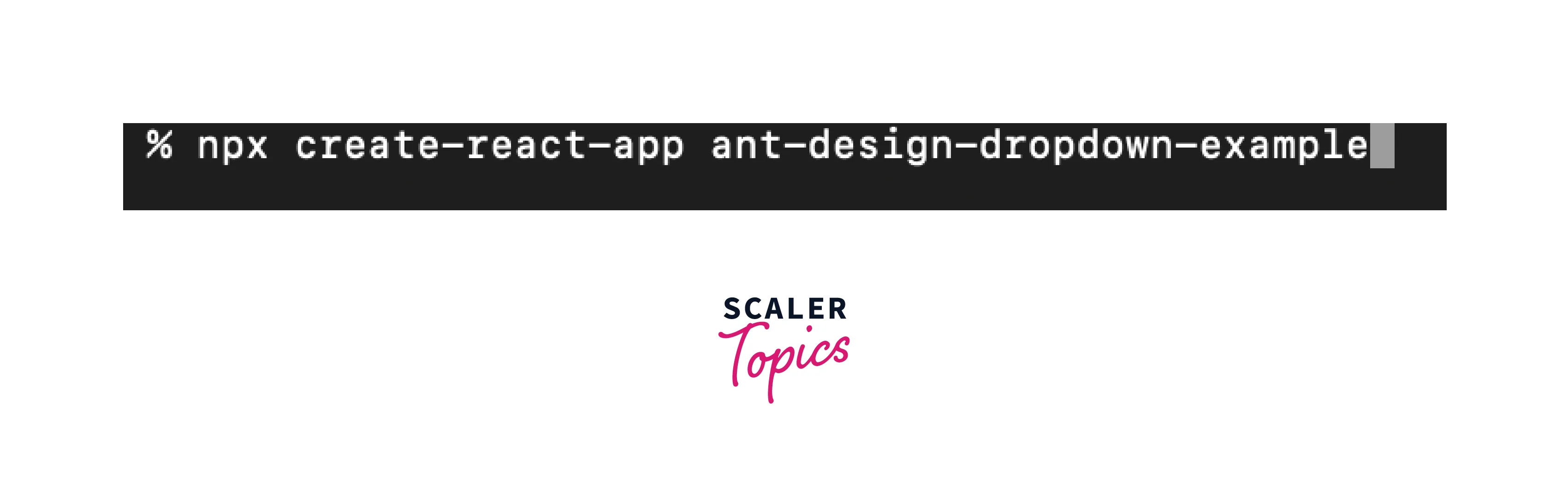
This command will initialize a new React project named 'ant-design-dropdown-example' in a directory with the same name.
Step 2: Install Ant Design
With your React application set up, you'll need to install the Ant Design library to use the Dropdown component.
Navigate to the root directory of your React project in the terminal:
cd ant-design-dropdown-example
Install Ant Design by running the following npm command:
npm install antd
This command installs the Ant Design library and its required dependencies into your project.
Step 3: Import and Use Ant Design Components
Now that you have Ant Design installed, you can start using its components within your React application.
In your React application code, open the component file where you want to use the Ant Design Dropdown component.
Import the necessary Ant Design components and styles at the beginning of your file:
Step 4: Create a Dropdown
You can now create a simple Antd Dropdown component and customize it according to your needs. Here's an example:
Step 5: Use the Dropdown Component
With your Dropdown component created, you can now use it within your React application by importing it where needed and rendering it within your application's JSX.
Conclusion
- The Ant Design Dropdown component simplifies the creation of interactive dropdown menus in React applications.
- It offers a wide range of customizable props, allowing you to control various aspects of the dropdown's appearance and behavior.
- The Dropdown.Button component combines a button and dropdown, providing a convenient way to present actions and options to users.
- Create a new React app with create-react-app, install Ant Design via npm install antd, import the required components and styles, and customize your Dropdown or Dropdown.Button component for a more interactive user experience.
- Remember to refer to the official Ant Design documentation https://ant.design/docs/react/introduce for more detailed information and advanced customization options.