ReactJS UI Ant Design Tabs Component
Overview
User Interface (UI) plays a pivotal role in creating engaging and interactive web applications. ReactJS, a popular JavaScript library for building user interfaces, offers a wide range of components to simplify the development process. One such component is the Tabs component, and when combined with Ant Design, it becomes a powerful tool for creating dynamic tabbed interfaces. In this article, we will explore the Ant Design(Antd) Tabs component for ReactJS, covering its features, props, and how to integrate it into a React application.
Tabs Props
In ReactJS, the Ant Design Tabs component comes with various props that allow you to customize the behaviour and appearance of the tabs in your user interface.
Here's an overview of some of the most commonly used props for the Antd Tabs component:
- defaultActiveKey: This prop allows you to specify the key of the initially active tab when the Tabs component is first rendered. If not provided, the first tab is set as the default active tab.
- activeKey: The activeKey prop is used to control which tab is currently active. You can use this prop to programmatically change the active tab.
- Animated: This prop enables or disables tab content animation when switching between tabs. It accepts a boolean value, and when set to true, it provides a smooth transition effect. By default, it's set to true.
- Type: The type prop determines the style of the tab bar. It accepts values like "line" (default), "card," or other custom styles provided by Ant Design.
- onChange: The onChange prop is a callback function that gets triggered when the active tab changes. It receives the active tab's key as an argument, allowing you to perform actions when tabs are switched.
When working with the Antd Tabs component for React to create tabbed interfaces in your web applications, it's essential to be prepared for potential errors and issues that can arise during development.
To handle potential errors or issues when using the Ant Design Tabs component for React:
- Missing Key Props: Always provide a unique key prop for each TabPane to avoid unexpected behaviour.
- Tab Content Rendering Issues: Debug issues with tab content rendering by inspecting HTML, and CSS, and resolving conflicts.
- Async Data Loading: Handle data loading asynchronously, display loading indicators or error messages, and manage data with state.
Tabs.TabPane Props
The Tabs.TabPane component in Ant Design for ReactJS allows you to customize the individual tab panes within the Tabs component.
Here are some of the commonly used props for the Tabs.TabPane component:
- Key: The key prop is a required prop and serves as a unique identifier for each tab-pane. It is used to identify and differentiate between the various tabs.
- Tab: The tab prop defines the label or title that is displayed in the tab header. It's the text that users click on to switch between tabs.
- Disabled: You can use the disabled prop to make a specific tab unclickable or inactive. This is useful when you want to prevent users from interacting with certain tabs.
- forceRender: By default, tab content is rendered lazily, meaning that the content of inactive tabs is not rendered until they are activated. If you want to render the content of a tab even when it's not active, you can set the forceRender prop to true.
Creating React Application And Installing Module
Creating a React application and installing the necessary modules is the first step to getting started with Ant Design Tabs or any other React component.
Here's a step-by-step guide on how to create a React application and install the required modules:
Step 1: Create a New React Application
Open your terminal or command prompt. Use the create-react-app command to create a new React application. Replace ant-design-tabs-demo with your preferred project name:
npx create-react-app ant-design-tabs-demo
This command will create a new React application with the specified name in a directory named ant-design-tabs-demo.
Once the project is created, navigate to the project directory:
cd ant-design-tabs-demo
Step 2: Install Ant Design Modules
To use Ant Design components, you need to install the Ant Design library and its CSS styles. Here's how to do it:
Install the antd package, which includes the Ant Design components:
npm install antd
Install the antd CSS styles by importing them into your project. Open your src/index.js file and add the following import statement at the top:
This ensures that the Ant Design styles are applied to your components.
Step 3: Start the Development Server
You can now start the development server to see your React application in action:
npm start
This command will start the development server, and your React application will be accessible in your web browser at http://localhost:3000.
Step 4: Begin Building Your React Application
With your React application set up and the Ant Design modules installed, you can start building your application and integrate the Antd Tabs component as described in the previous sections of the article.
Project Structure
Let's discuss the typical project structure for a React application using the Ant Design Tabs component. This structure will help you organize your code and assets efficiently.
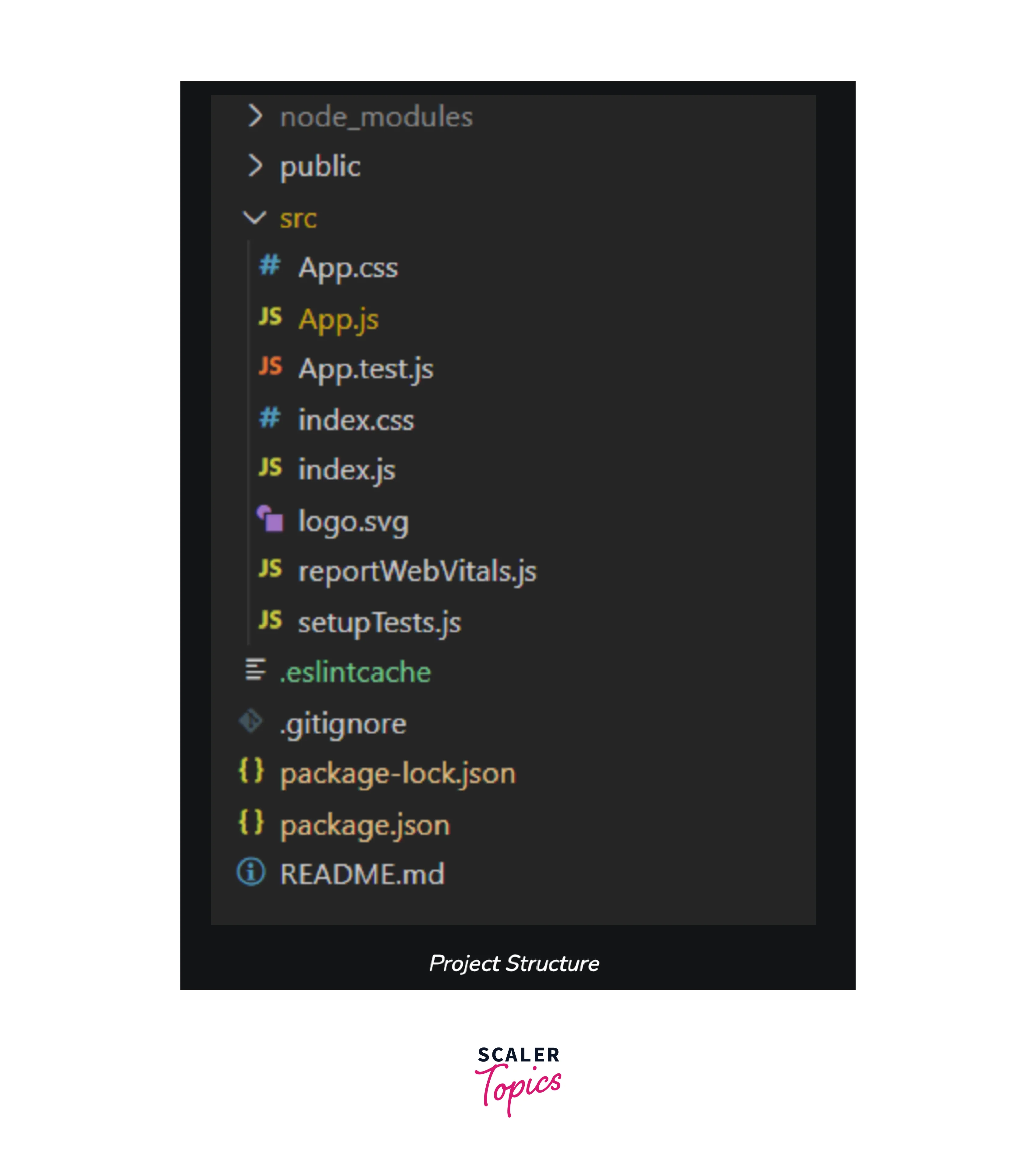
This project structure provides a clear separation of concerns, making it easier to develop, maintain, and scale your React application. You can expand the components/ directory to include more components and organize them as your project grows.
Conclusion
- The Ant Design Tabs component for React offers a convenient way to implement tabbed interfaces in web applications and provides a wide range of customizable props, allowing developers to control the appearance and behaviour of tabs and tab panes.
- By integrating Ant Design Tabs into your React application, you can create user-friendly and visually appealing tab-based navigation systems.
- The project structure for a typical React application with Antd Tabs involves directories for components, public assets, and source code, providing a well-organized development environment.
- Following best practices in structuring your React project helps in maintaining code clarity, scalability, and ease of collaboration with other developers.
- Remember to import the necessary components and handle tab changes using event handlers like onChange for a seamless user experience.