CSS Background-Size Property
 FREE
FREE
Overview
- The background-size CSS property specifies the size of the background image. The background image can be stretched or restricted to fit into the available space. Basically, it gives us the ability to change the scaling of the background image.
- The background-size CSS property is one of the most useful properties of CSS. This attribute has numerous variations and syntaxes, each with its own set of use cases. This property supports four syntaxes: the keyword syntax, the one-value syntax, the two-value syntax, and the multiple background syntax.
Syntax of Background Size CSS
The background-size CSS property can be defined in one of the following ways:
- Using the keyword values as 'auto', 'cover' or 'contain'.
- One value - If you simply provide one value (for example, background-size: 500px), it counts for the width and sets the height to auto. You can use any CSS size unit you like, such as pixels, percentages, ems, viewport units, etc.
- Two values - Using both a width and a height value, where the first determines the width and the second determines the height. Each value can be of the <length>, <percentage>, or auto type.
- Multiple backgrounds - You may also combine any of the above ways and apply them to multiple images by separating each syntax with commas.
Note: To specify the size of multiple background images, use a comma to separate the values.
Background in CSS
- The size of the background image for an element can be specified using the background-size CSS property. Background-size property can be used to compress or stretch the image to fit it in the limited space. In general, it allows us to adjust the size of the background image.
- This attribute can have length, percentage, or keyword values. It can have two keyword values: contain and cover. Its single-value syntax determines the image's width (in this case, the height is set to auto), but the double values define the value of both height and width, with the first value setting the width and the second setting the height.
- If an element contains many background pictures, we can use comma-separated values to specify the sizes of each.
- The background-size CSS property cover value is used to cover the whole background area of the element. On the other hand, the contain value of this property scales the image as much as possible without clipping the image.
a. Default Value of background size CSS
| Attribute | Description |
|---|---|
| auto | Its default value is auto. |
b. Property Values of background size CSS
| Attribute | Description |
|---|---|
| Contain | This property is used to scale the image to the largest possible size within its container without cropping or stretching it and resizes the backdrop image to ensure the image is fully visible. Image tiling will occur if the container is larger than the image unless the background-repeat attribute is set to no-repeat. |
| Cover | This property is used to scale the image (while preserving its ratio) to the smallest possible size in order to fill the container (that is, both its height and width cover the container entirely), leaving no empty space. If the proportions of the background and the element differ, the image is cropped vertically or horizontally. |
| Auto | This is the default value, which presents the background image in its original size. |
| <length> | It is used to specify the background image's width and height. This value stretches the image in the supplied length's equivalent dimension. Its single value indicates the image's width, while the height is set to auto. If two values are specified, the first determines the width, and the second determines the height. Negative values are not permitted. |
| <percentage> | This property stretches the image to the specified % of the backdrop positioning area in the relevant dimension. The value of background origin determines the background positioning area (by default, the padding box). If the background-attachment value is fixed, the positioning area is instead the entire viewport. Negative values are not permitted. |
| initial | It restores the property to its default value. |
| inherit | It inherits the property from its parent element. |
Intrinsic Dimensions and Proportions of Background Size CSS
The computation of values is dependent on the intrinsic dimensions (width and height) and intrinsic proportions of the image (width-to-height ratio). These properties are as follows:
- A bitmap image (like JPG) always has intrinsic proportions and intrinsic size.
- It is not necessary that a vector image (like SVG) may always have intrinsic dimensions. It contains intrinsic proportions if it has both vertical and horizontal intrinsic dimensions. It may or may not have proportions if it has no dimensions or simply one dimension.
- CSS <gradient>'s' have no intrinsic proportions or intrinsic dimensions.
- The intrinsic proportions and dimensions of the producing element are used to create background images with the element() function.
The rendered size of the background picture is determined using the intrinsic proportions and dimensions as follows:
- The background picture's specified size is rendered if both background-size components are specified and are not auto.
- If the background-size CSS property is contained or covered: The image is rendered at the maximum size contained within, or covering, the background positioning area while preserving its intrinsic proportions. If the image lacks intrinsic dimensions, it is rendered at the size of the background positioning area.
- If background size is set to auto or auto auto:
| Cases | Description |
|---|---|
| 1. | The image is rendered at the size specified if it has both horizontal and vertical intrinsic dimensions. |
| 2. | The image is rendered at the size of the background positioning area if it does not have intrinsic dimensions or proportions. |
| 3. | If the image has intrinsic proportions but no intrinsic dimensions, it is presented as if contain had been specified instead. |
| 4. | If an image has intrinsic proportions and only one intrinsic dimension, it is rendered at the corresponding size to that one dimension. Then the specified dimension and the intrinsic proportions are used to calculate the other dimension. |
| 5. | If an image has no intrinsic proportions but only one intrinsic dimension, it is rendered with that specified dimension plus the other dimension of the background positioning area. |
- If the background size has one auto component and one non-auto component:
| Cases | Description |
|---|---|
| 1. | The image is stretched to the specified dimension if it has inherent proportions. The specified dimension and the intrinsic proportions are used to compute the unspecified dimension. |
| 2. | If the image lacks intrinsic dimensions, it is stretched to the desired size. If the picture has an intrinsic dimension, it is used to compute the undefined dimension. If such an intrinsic dimension does not exist, it becomes the corresponding dimension of the background positioning area. |
Note: Background sizing is not yet fully implemented in all browsers for vector images that lack intrinsic dimensions or proportions. Be careful when relying on the behavior described above, and test in various browsers to ensure satisfactory results.
Working with Gradients
- If you're using a <gradient> as the background and creating a background size to go with it, avoid choosing a size that uses a single auto component or is supplied using only a width value (for example, background-size: 50% ). In such cases, the rendering of <gradient>'s changes with Firefox 8 and is now often inconsistent between browsers, as not all implement rendering in full accordance with the CSS3 background-size specification and CSS3 Image Values gradient specifications.
- It's especially not advised to use a pixel dimension and an auto dimension with a <gradient> because it's not possible to replicate rendering in versions of Firefox prior to 8 and in browsers that don't support Firefox 8's rendering without knowing the exact size of the element whose background is being specified.
Examples of Background Size CSS
Tiling a large image
Consider a small image of the Google logo (193x197). This image will be tiled four times into a 300x300-pixel element. We may accomplish this by using a fixed background-size value of 150 pixels.
Output of the above code:
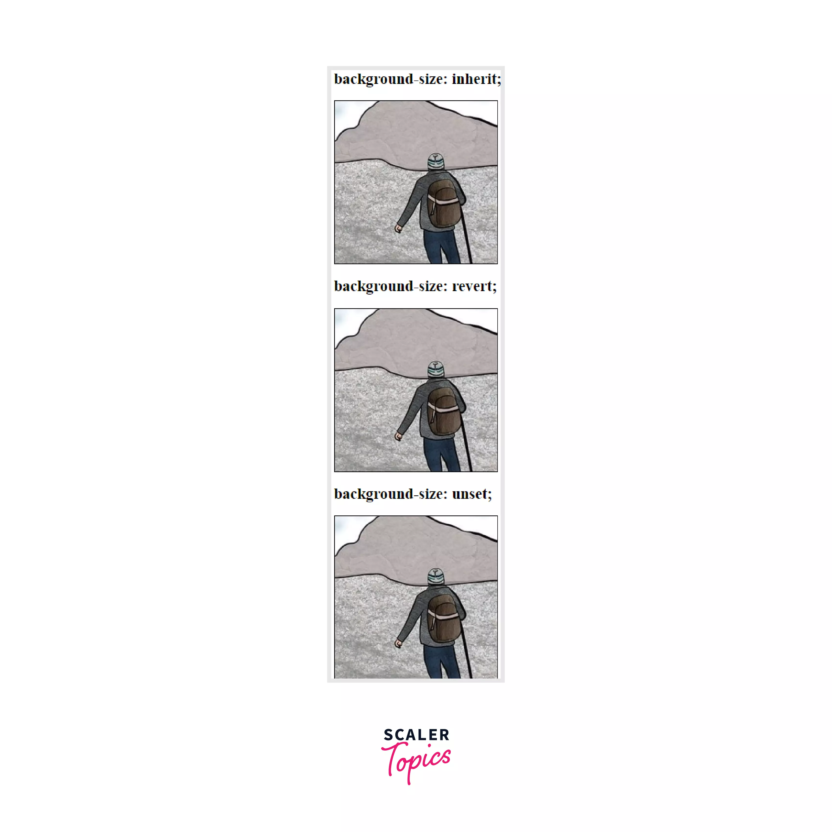
Using Global Values
Output of the above code:
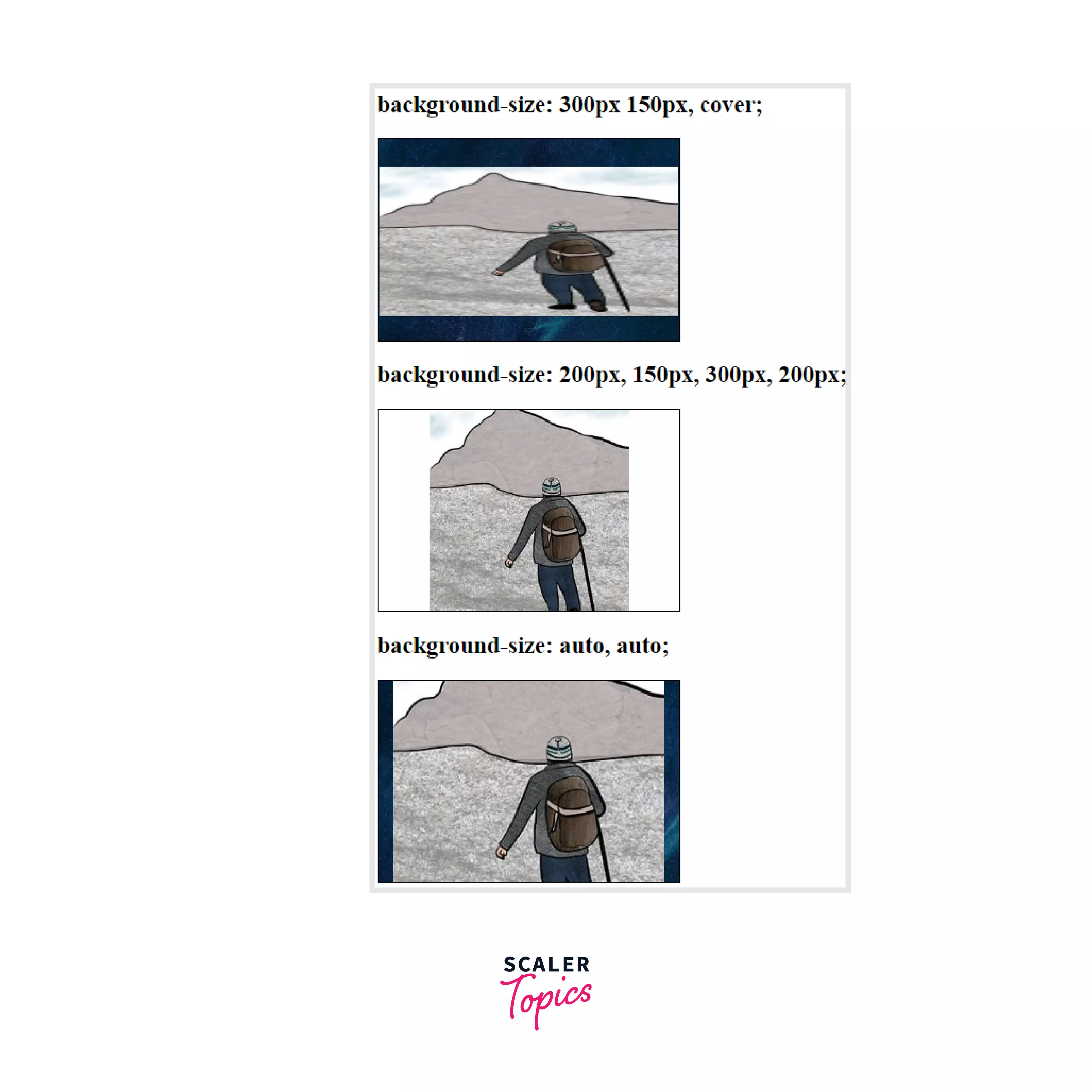
Using multiple backgrounds
Output of the above code:
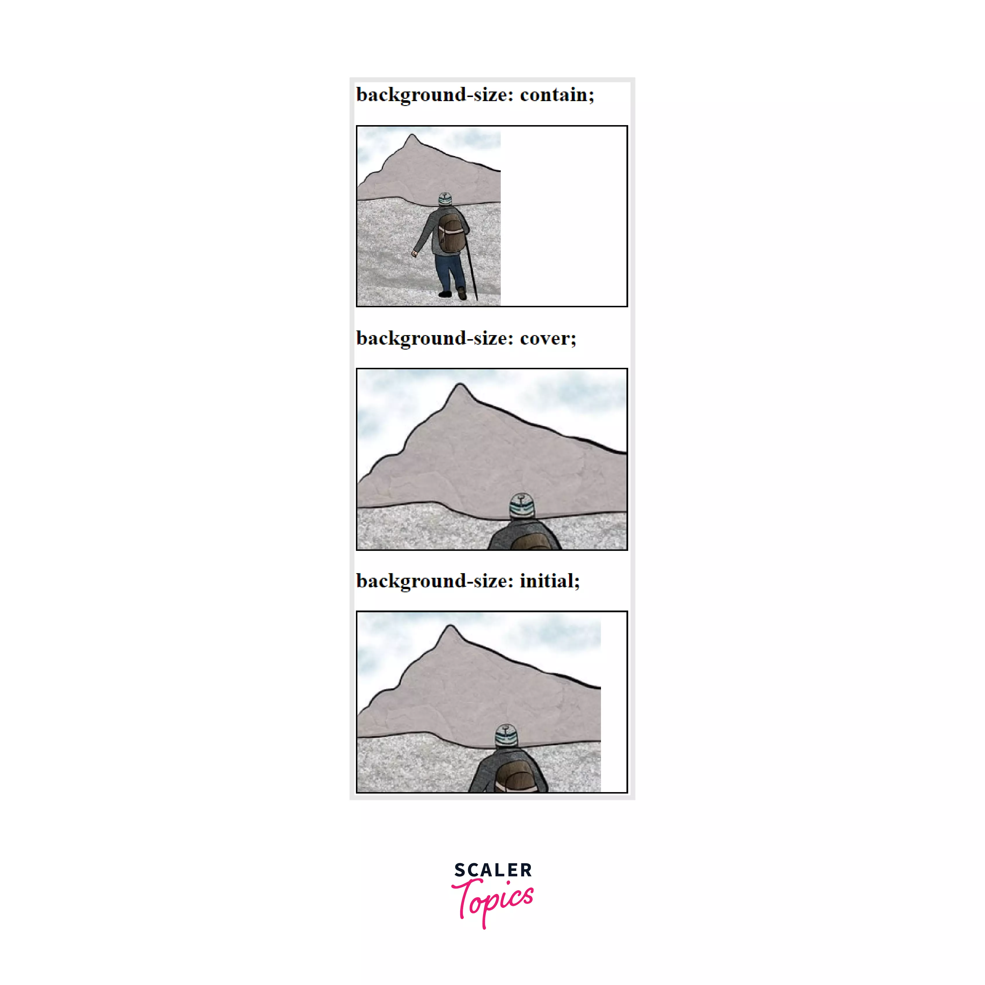
Using Keyword values
Output of the above code:
Using numerical and percentage values
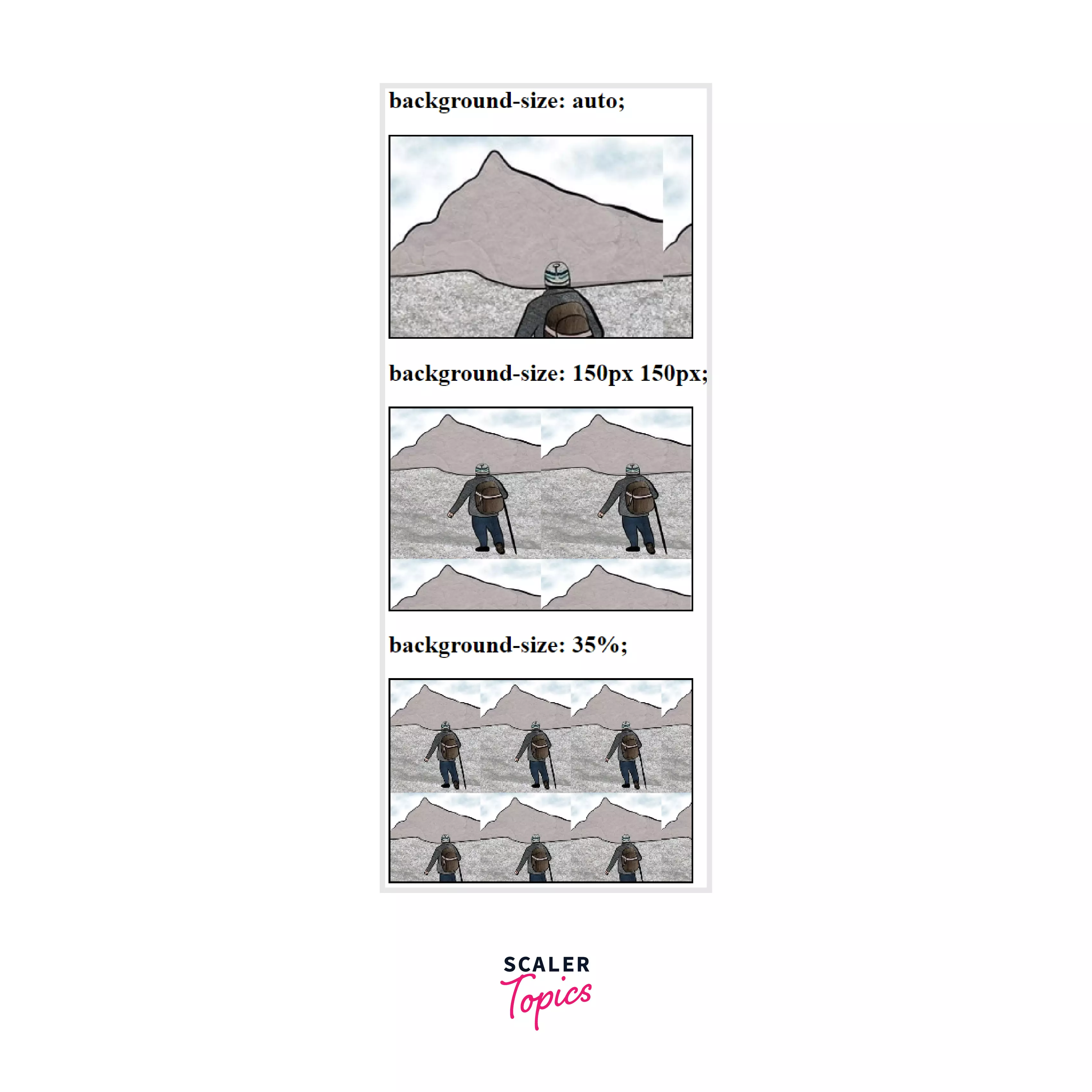
Output of the above code:
Browser Support
The background-size CSS property is supported by the following browsers:
| Browser | Google Chrome | Internet Explorer | Microsoft Edge | Firefox | Opera | Safari |
|---|---|---|---|---|---|---|
| Version Support | Yes | Yes | Yes | Yes | Yes | Yes |
| Download | 4.0+ | 9.0+ | 12.0+ | 4.0+ | 10.5+ | 4.1+ |
Conclusion
- Images used as backgrounds on elements are displayed at their full pixel dimensions. For example, if the picture file used for the backdrop has a pixel dimension of 800x600, but the element to which it is applied has a pixel dimension of 400x300, then only 25% of the background image will be displayed to address this issue of a background-size CSS property is used.
- You can use the background-size CSS property to scale the background picture to be entirely visible within the element with the contained value.
- The CSS background property specifies the initial position of an element's background image. It is a shorthand for the CSS attributes such as background-color, background-image, background-repeat, background-attachment, background-position, etc.
- The background-size CSS property is used to specify the size of the background picture. The image may be positioned to the left of its native size, stretched, or constrained to fit in the available space.
Related Properties
- background-position
- background-origin
- background-clip
- background-attachment
- object-fit