R - Bar Charts
Overview
Bar charts are a commonly used for data visualization tool in R, enabling the representation of categorical data with rectangular bars. They provide a clear and concise summary of information, making it easy to compare different categories or groups. In R, bar charts can be created using functions like ‘barplot()’ or with packages like ‘ggplot2’ for more advanced customization. Bar charts allow researchers and analysts to effectively communicate with data patterns, trends, and comparisons in a visually appealing manner. With the flexibility and simplicity of R, creating informative and visually appealing bar charts is accessible to users of all levels of expertise.
Bar Chart in R Programming Language
Syntax
A bar chart in R can be created using the barplot() function. The basic syntax for creating a bar chart is as follows:
Parameters
- height: A numeric vector representing the heights of the bars.
- names.arg: A vector of names or labels for each bar.
- main: The title or main heading of the chart.
- xlab: The label for the x-axis.
- ylab: The label for the y-axis.
- col: The colour or colours to be used for the bars.
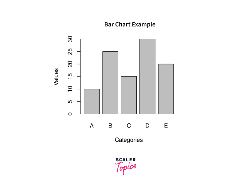
Example
This code snippet will generate a bar chart with five bars, labelled A, B, C, D, and E. Each bar will have a corresponding height given by the data vector. The chart will have a title, x-axis label, y-axis label, and the bars will be coloured blue.
Create a Bar Chart in R
Certainly! Here's an example of creating a bar chart in R using the built-in barplot() function:
In this example, we have a vector category representing the categories or labels for each bar, and a vector of values representing the corresponding values or heights of each bar. The barplot() function is used to create the bar chart. We provide the values vector as the first argument, names.arg as the categories vector, and specify the main title, x-axis label and y-axis label using the main, xlab, ylab, and col parameters respectively.
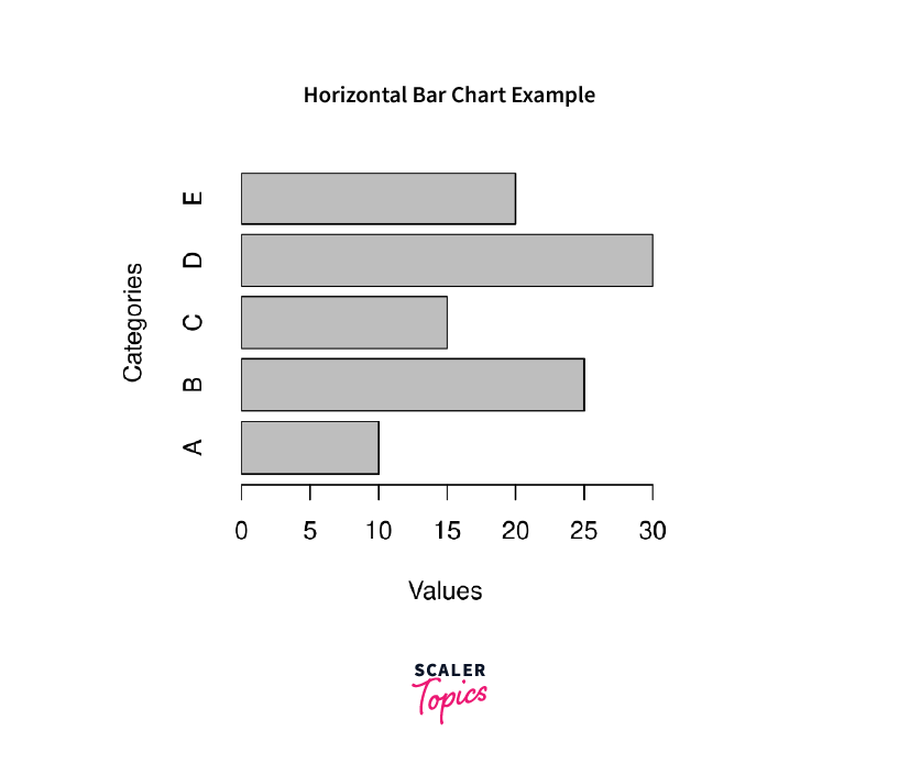
Create Horizontal Bar Chart in R
To create a horizontal bar chart in R, you can use the barplot() function with the horiz parameter set to TRUE. Here's an example:
In this code snippet, we use the same data as before, but set the horiz parameter to TRUE within the barplot() function. This tells R to create a horizontal bar chart instead of a vertical one.
When you run this code, it will generate a horizontal bar chart with five bars labeled A, B, C, D, and E. The lengths of the bars will be determined by the values vector. The chart will have a title, x-axis label, y-axis label,
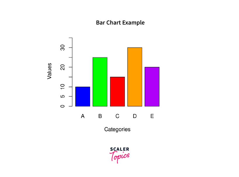
Add Label, Title, and Color in the Bar Chart
To add labels, a title, and colour to a bar chart in R, you can modify the corresponding parameters of the barplot() function. Here's an example that demonstrates how to add labels, a title, and colour to a bar chart:
In this example, we first create the bar chart using the barplot() function. We specify the values vector as the first argument, names.arg as the categories vector, and set the main parameter for the chart title, xlab for the x-axis label, and ylab for the y-axis label. The col parameter is used to assign different colours to each bar. You can provide a vector of colours corresponding to the categories.
After creating the bar chart, we use the text() function to add labels to the bars. The text() function takes the x and y coordinates to position the labels, the labels parameter for the actual values to be displayed, and pos = 4 to position the labels on the right side of the bars.
Finally, we use the title() function to add the chart title and axis labels.
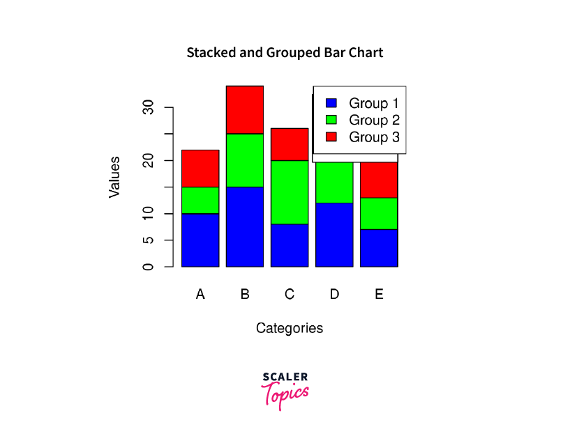
Create Stacked and Grouped Bar Chart
To create a stacked and grouped bar chart in R, you can utilise the barplot() function with some additional data manipulation. Here's an example that demonstrates how to create a stacked and grouped bar chart:
In this example, we have three groups of data (group1, group2, and group3) representing the values for each category (A, B, C, D, E). We combine the data into a matrix called stacked_data using the rbind() function to stack the groups.
The barplot() function is then used to create the stacked and grouped bar chart. We provide the stacked_data matrix as the first argument, names.arg as the categories vector, and specify the main title, x-axis label, y-axis label, and bar colours using the main, xlab, ylab, and col parameters, respectively. The legend parameter is used to add a legend to the chart by providing the row names of the stacked data.
Finally, we use the legend() function to add a legend to the chart, specifying the location (topright), the labels for each group, and the corresponding fill colours.
Examples
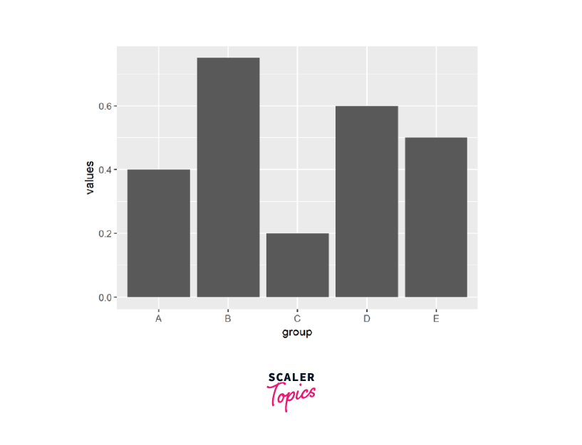
Example : Barplot in ggplot2 Package
In this illustration, you will discover how to generate a basic bar plot using the ggplot2 library. Initially, it is essential to install and activate the ggplot2 package:
Next, we must assemble our group and value variables into a data frame, as the functions within the ggplot2 package necessitate this data structure.
At this point, we can employ the ggplot and geom_bar functions from the ggplot2 package to construct the barplot.
Example : Barplot using Plotly Package
The plotly package is another robust R add-on that facilitates the creation of bar charts. To utilize its features, we'll start by installing and loading the package in R.
Within the plotly package, you'll find the plot_ly function, which serves as a powerful tool for creating bar charts. Utilizing this function, we can generate a bar chart in the following manner:

Conclusion
- Bar charts in R are a powerful data visualization tool for representing categorical data.
- They provide a clear visual summary of information, allowing easy comparison between categories or groups.
- In R, bar charts can be created using the ‘barplot()’ function or with packages like ‘ggplot2’ for more customization.
- Bar charts allow researchers and analysts to effectively communicate data patterns, trends, and comparisons.
- R offers flexibility and simplicity in creating informative and visually appealing bar charts for users of all levels of expertise.