What is Bootstrap Flex?
Bootstrap offers flexbox utilities for effortless webpage layout, alignment, and responsiveness. These utilities simplify design tasks, enabling easy element alignment and mobile-friendly designs without intricate CSS or positioning methods.
Bootstrap Flexbox
Flexbox is a layout model in bootstrap that is used to design responsive mobile-friendly layouts of a webpage. Unlike CSS grids, flexboxes are used to design one-dimensional layouts of a page.
The flexboxes are used to align the elements in a container even if we don't know the sizes of the elements. This is because a flex container is flexible and therefore, it expands or shrinks the elements to fill up the space or avoid the overflow inside the container.
Flex Behaviors and Direction
We need to apply the display utilities to create a flex container and then transform its direct child elements into flex items. After which this flexbox container and the child elements can be modified further with additional flexbox properties such as direction, margins, etc.
The different display utilities such as d-flex, or d-inline-flex are used to create a flexbox container and transform its child elements into flex items.
Let us now see the syntax of the d-flex and the d-inline-flex utility classes.
Therefore, both of the above syntaxes would create a flexbox container and transform all the direct children to the div element into flex items. However, you must be wondering if both the classes do the same thing then what is the difference between them. The difference between them would be clear enough after we discuss an example of these classes.
Example
Let us understand the d-flex and the d-inline-flex utility classes with the help of an example and understand the difference between them.
Output:
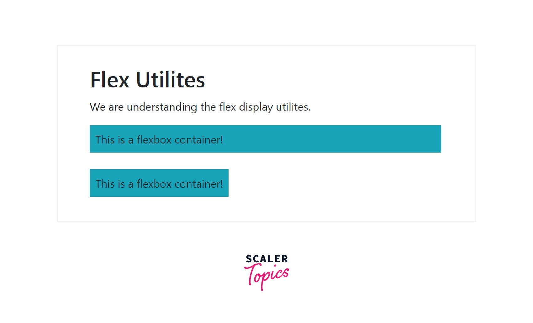
Therefore, as you can see in the output, the .d-flex class extends all to the screen width, leaving some margins from all sides whereas the .d-inline-flex class extends only to the specified text, therefore, making an inline-level flex container.
Horizontal Direction
To display the flex items horizontally one after the other (side by side) on a webpage, we use the .flex-row utility class. This is the default direction for the flex items.
Let us see a code example of how to display the flex items horizontally on a webpage.
Output:
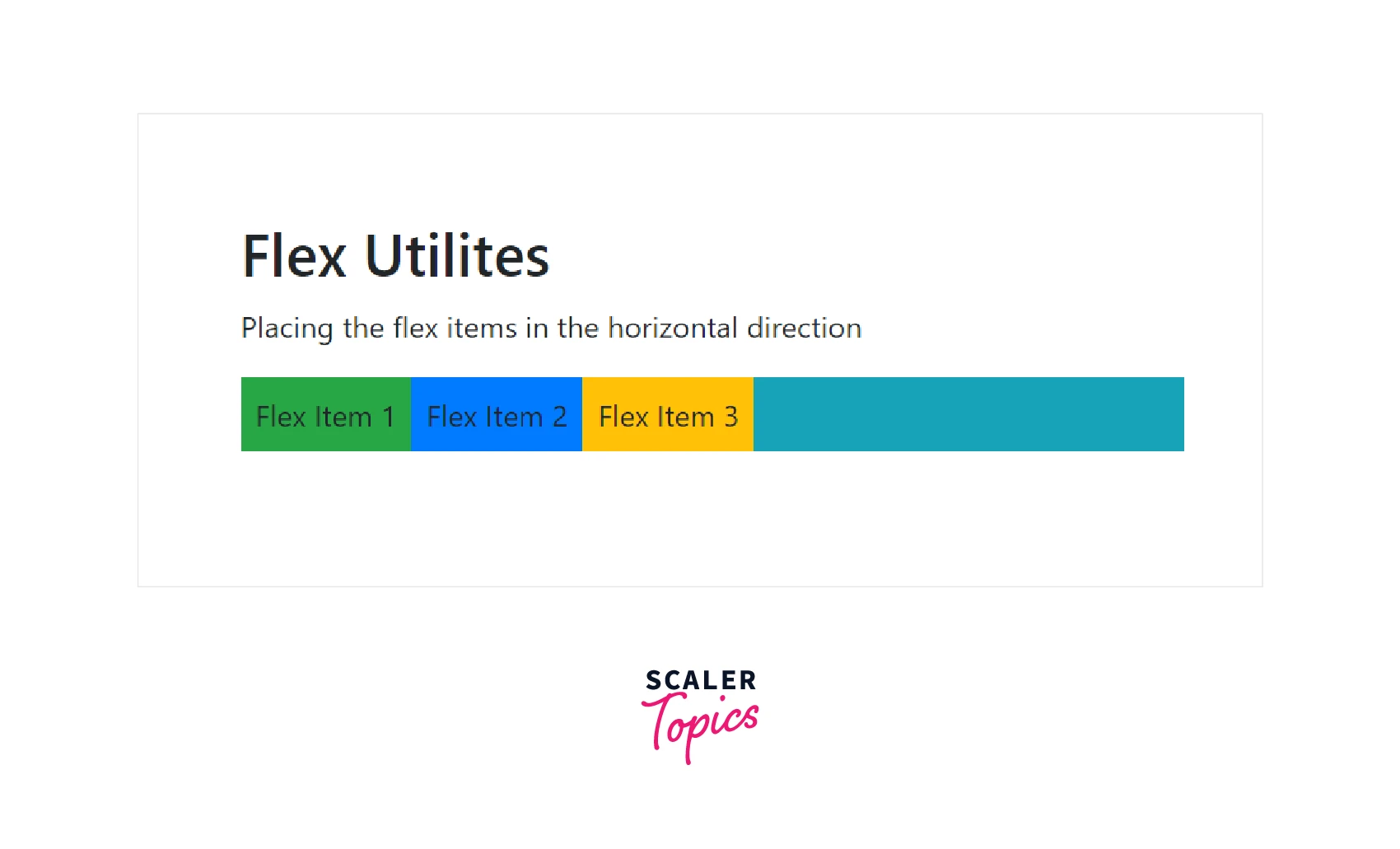
Therefore, as you can see in the output, the flex items have been positioned side by side one after the other using the .flex-row utility class provided by bootstrap.
You can place these flex items in the reverse direction, that is, starting from the right for which we require the .flex-row-reverse utility.
Let us see a code example of the .flex-reverse-row utility class as well.
Output:
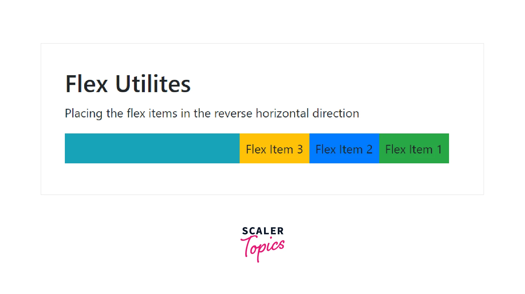
Therefore, now the flex items have been right-aligned in the horizontal direction.
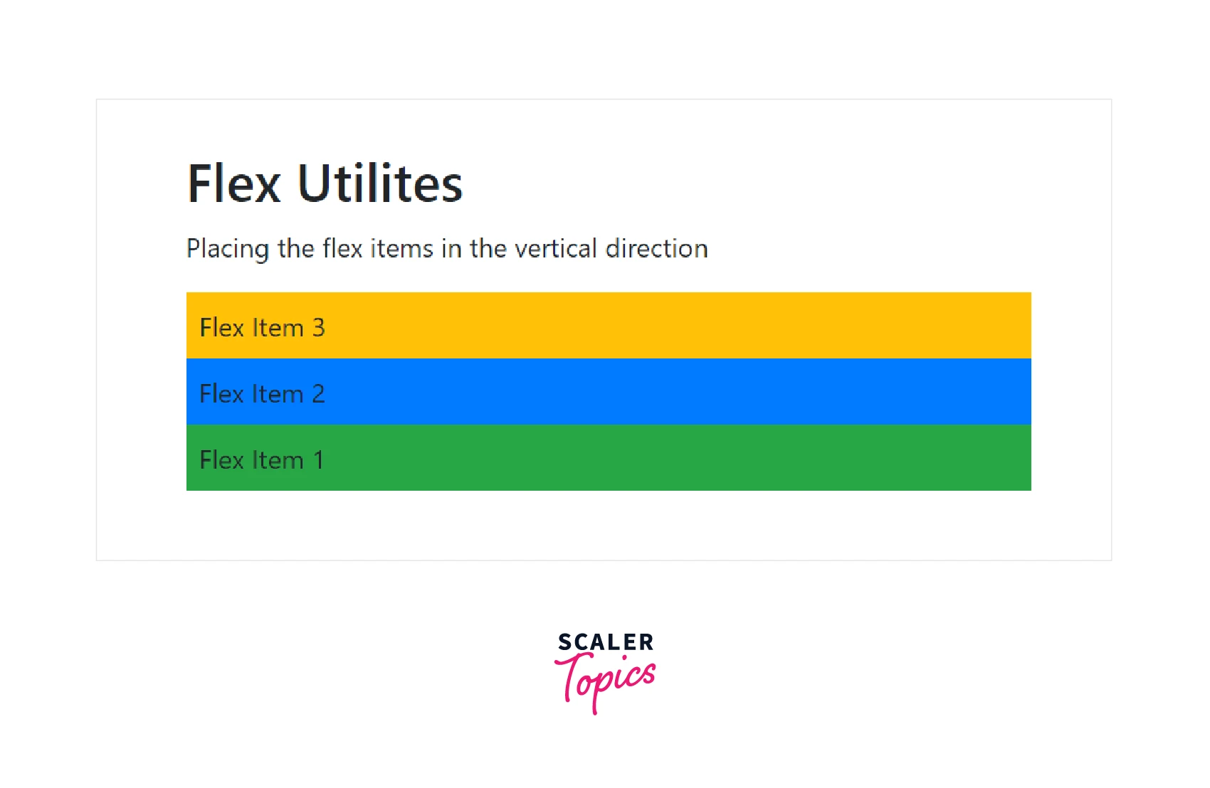
Vertical Direction
If you want to align the flex items vertically then you should use the .flex-column utility. It places all the flex items on top of each other.
Let us see an example of the .flex-column utility class to understand it better.
Output:
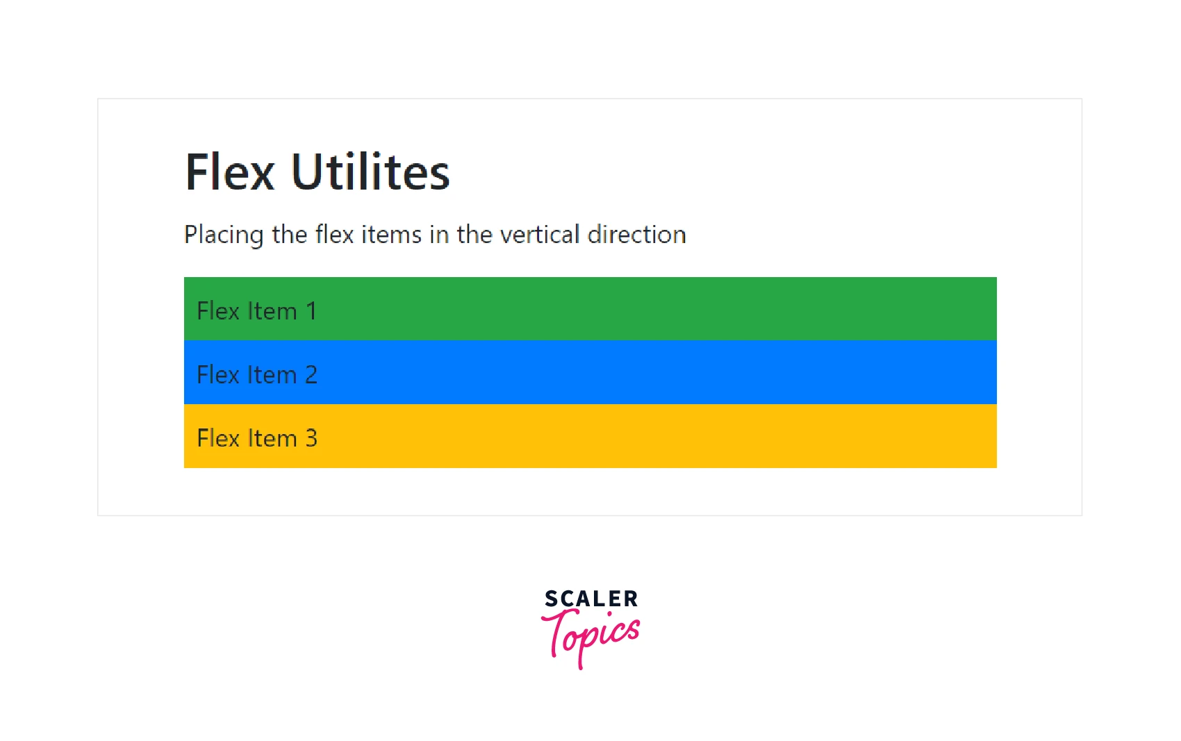
As you can see in the output, the flex items are aligned vertically on top of each other.
Similarly, you also reverse the vertical direction using the .flex-column-reverse utility class. Let us see a code example for that as well.
Output:
Now, the direction of the flex items has been reversed. Flex item 3 is on the top whereas flex item 1 is at the last.
Justify Content
The justify-content utility lets you change the alignment of the flex items. You can align them to the left, right, or even in the center. You can also add spaces between the flex items, and around the flex items.
Now let us discuss these utilities one by one.
- justify-content-start - It aligns the flex items to the left of the container. It is the default alignment of the flex items.
- justify-content-end - It aligns the flex items to the right of the container.
- justify-content-center - It aligns the flex items in the center of the container.
- justify-content-between - It is used to add a space between the flex items.
- justify-content-around - It is used to add a space around the flex items.
Let us understand these utilities with the help of a code example.
Output:
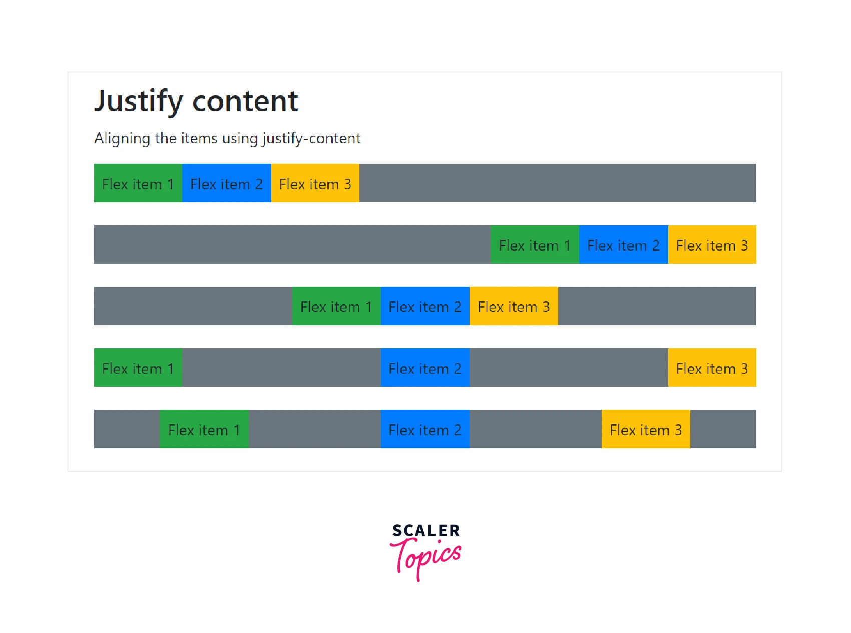
Therefore, the first-row flex items have been aligned to the left, the second to the right, and the third-row items to the center but the fourth-row flex items are aligned such that they have enough space between them. Similarly, the fifth-row flex items are aligned such that they have space around them.
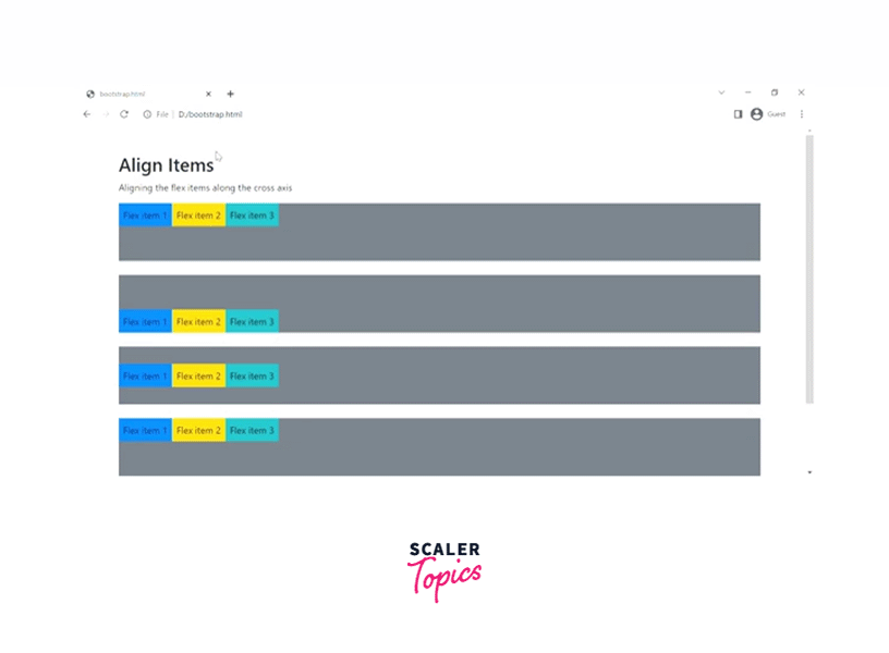
Align Items
The align-items utility class is used to change the vertical alignment of a single row inside the container. The valid align item utilities are as follows -
- align-items-start - It is used to align the flex items at the start of the cross-axis(Y-axis).
- align-items-end - It is used to align the flex items at the end of the cross-axis.
- align-items-center - It is used to align the flex items in the center of the cross-axis.
- align-items-baseline - Using this utility class, the flex items will align themselves to have the baseline of the text along a horizontal line.
- align-items-stretch - It is used to stretch the flex items to the whole cross-axis(Y-axis).
Let us see all these utility classes using a code example.
Output:
Fill, Grow and Shrink
The .flex-fill utility class is used to make all the flex items of equal widths. Let us see it using a code example.
Output:
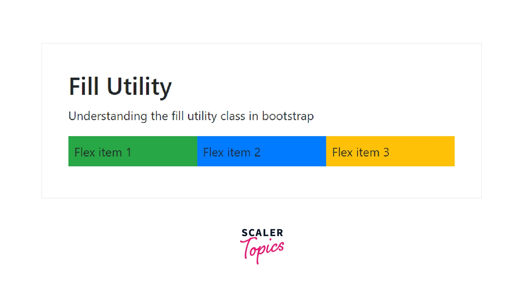
Therefore, all three flex items have taken equal widths on applying the .flex-fill class.
You can also increase the width of the flex items to take up all the remaining space in the container using the .flex-grow-1 utility class. Let us understand the grow utility class with the help of a code example.
Output:
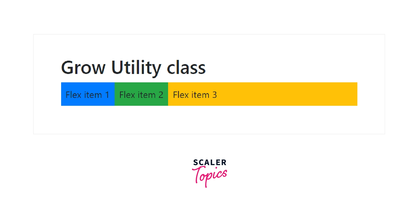
Since we have applied the .flex-grow-1 utility class to the third flex item, therefore it has taken up all the remaining space in the container.
Similarly, to shrink a flex item, we use the flex-shrink-1 utility class, if necessary.
Order
The order utility classes are used to change the visual order of the flex items, which means that you can interchange the positions of the flex items using the order utility classes.
Since there are 12 grid columns in a row, so there are 12 order utility classes as order-1, order-2, and so on till order-12 in which the order-1 utility class has the highest priority and the order-12 has the lowest priority.
Now, let us understand them with the help of a code example.
Output:
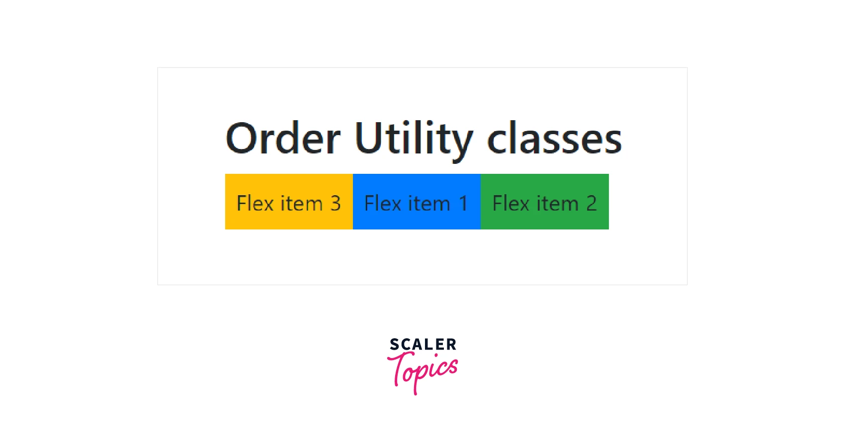
Therefore, as you can see in the output, the positions of the flex items have been changed because of the order classes applied to them.
Auto Margins
You can easily apply the auto margins to the flex items using the classes ml-auto to apply the margin from the left and mr-auto for applying the margin from the right.
Let us see a code example using the auto-margin utility class.
Output:
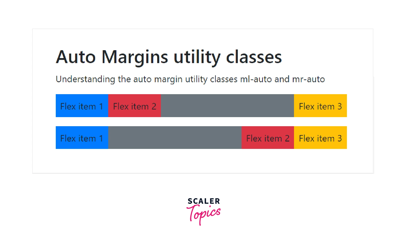
As you can see in the output, in the first row, since we have applied the class mr-auto to the second flex item, therefore, the right margin has been set to auto and so the third flex item is shifted altogether to the right and similar is the case in the second row in which we have used the class ml-auto which applied a left margin to the flex item.
Align Content
You can also change the alignment of the gathered flex items with the align-content-* utility classes. The valid classes that come under this category are align-content-start, align-content-end, align-content-center, align-content-around, and align-content-stretch.
However, these classes do not affect the single rows of flex items.
Let us see how these classes work with the help of a code example.
Output:
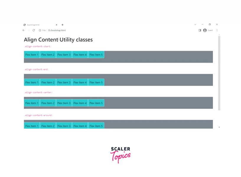
As you can see in the output, all the flex items have aligned according to the specified classes.
Wrap
The wrap class in bootstrap controls how the flex items are wrapped in the flex container. There are three wrap classes namely, flex-wrap which wraps the flex items in the flex container, flex-wrap-reverse which wraps the flex items in the flex container but in a reverse fashion, whereas third is flex-nowrap which does not wrap the flex items in the flex container.
Let us see how to use them with the help of a code example.
Output:
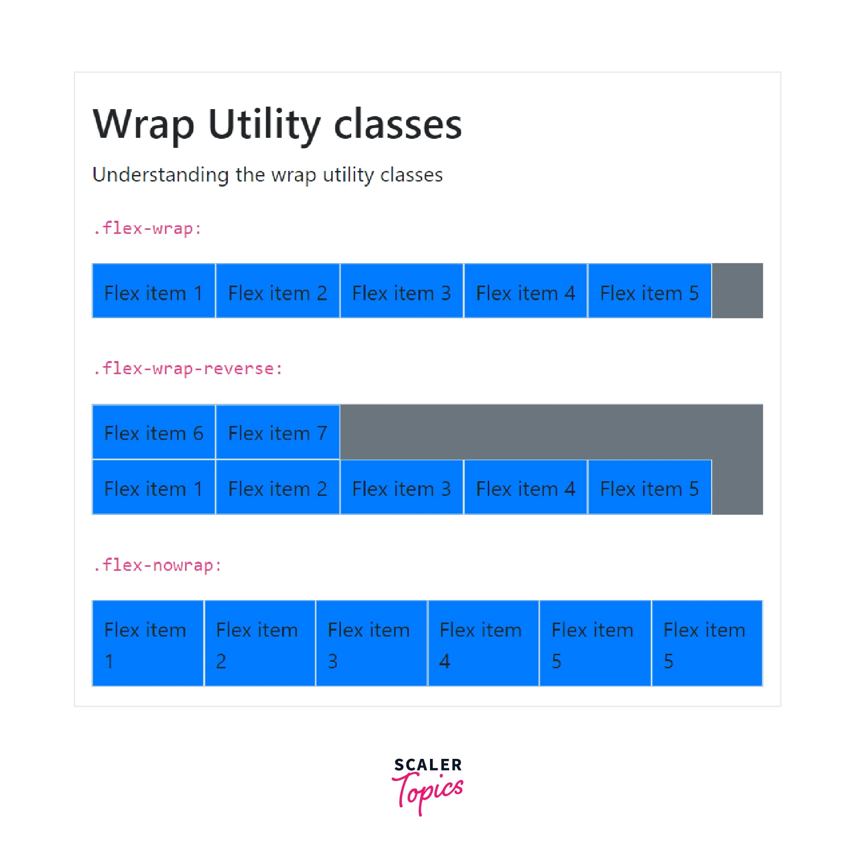
As you can see in the output, the first row is wrapped inside the container, and the second row is also wrapped inside the container but in a reverse fashion whereas the flex items of the third row are laid out in a single line which might have caused the container to overflow.
Align Self
You can also change the vertical alignment of a particular flex item using the align-self utility classes. The classes that come under this category are as follows - align-self-start, align-self-end, align-self-center, align-self-baseline, align-self-stretch which work similarly to the align-items utility classes.
Therefore, let us see how they work directly using a code example.
Output:
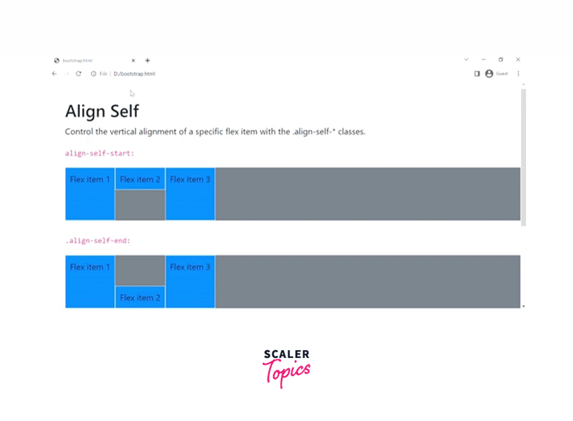
Therefore, in the above output, we have changed the vertical alignment of the second flex item using different align-self utility classes.
Responsive Flex Classes
All the flex classes discussed above come with additional responsive classes, that make it easy to apply for a particular screen size. An example of a responsive flex class can be .d-*-flex where * can be replaced with xs, sm, md, lg, xl, which represents extra small, small, medium large, and extra large screens. Therefore, the example becomes .d-sm-flex for smaller screens, d-lg-flex for larger screens, and d-md-flex for medium screens.
Similarly, all the flex classes can be made responsive and can be used for a particular screen size which makes work even easier.
Conclusion
- Flexboxes are used to design one-dimensional layout models which are used to manage the layout, alignment, navigations, and other components.
- We use different display utilities such as d-flex and d-inline-flex to display the flexbox container and transform its direct children into flex items.
- You can align the flex items horizontally or vertically using the classes .flex-row and .flex-column respectively in bootstrap.
- There are several classes for wrapping the content inside the flex container such as flex-wrap, and flex-wrap-reverse.
- You can add an auto margin from the left and right using the .ml-auto and .mr-auto utilities respectively.
- You can also change the alignment of a particular element using the align-self utilities in bootstrap.
- Bootstrap provides responsive classes for all the flex classes which can be used for different screen sizes.