Bootstrap Accordion, Collapse, and Spinners
Bootstrap Accordion, a user-friendly component, elegantly organizes content. It enhances web interactivity with expandable and collapsible features for effective presentation.
What is Bootstrap Collapse?
- Collapse is a togglable component of the bootstrap framework.
- It is a JavaScript plugin used to show and conceal content. Links or buttons are used as triggers that are assigned to particular toggleable elements. When an element is collapsed, the height will change from its current value to zero.
- Collapse is typically used when there is information that, in the majority of cases, would take up too much space on the page but we still want to give users the option to see it.
- The following classes are applied to the elements to show or hide the content:
- .collapse hides the content
- .collapsing is applied during the start of the transition and removed when the transition ends.
- .collapse.show shows the content
- You can use a button with the data-target attribute, or a link with the href attribute. In both cases, the data-toggle=collapse is necessary.
Example
-
By clicking on a button or link via data attributes, you can show and hide elements in Bootstrap without writing any JavaScript code.
-
Basically, for the Bootstrap collapse plugin to function, two elements are needed: the collapsible element itself and the trigger element, such as a button or hyperlink.
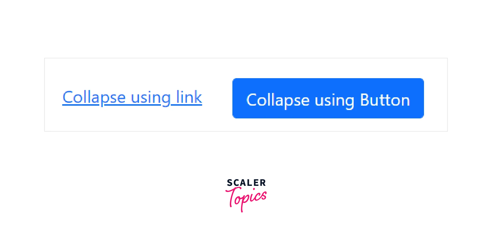
Let's use an illustration to demonstrate how the Bootstrap Collapse functions:
Code:
Output:
Initially:
After toggling over the link or button:
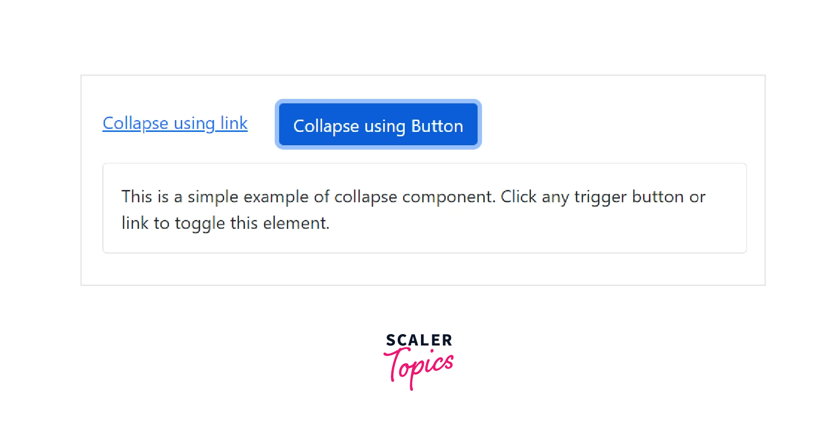
Try out this code on your own to see how to collapse can be used to show or hide content on the webpage.
Multiple Targets
By referencing multiple elements with a selector in their href or data-bs-target attributes, a <button> or <a> can show and conceal many different elements. If more than one <button> or <a> references the same element using the data-bs-target or href attributes, the element can be shown and hidden by both.
Let us see an illustration to demonstrate the working of multiple targets collapse.
Code:
Output:
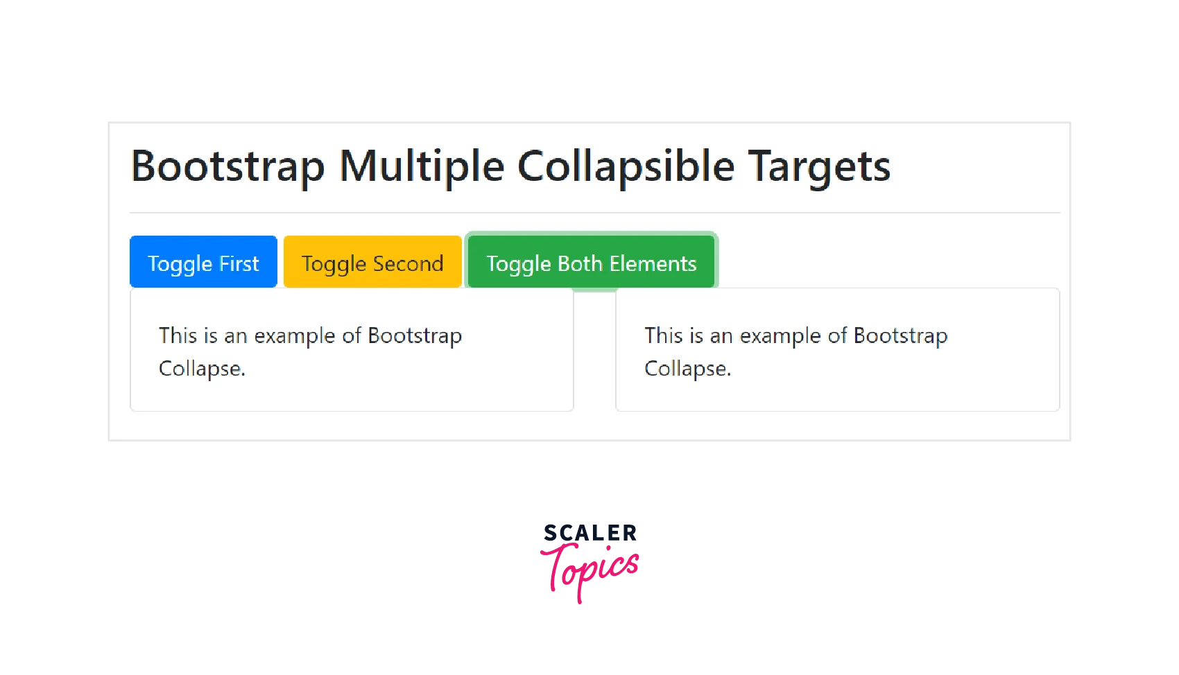
Try this code on your own to have a better understanding of Multiple Collapsible Target elements.
Horizontal Collapse
Horizontal collapsing is also supported by the collapse plugin. Set a width rather than the height on the immediate child element and add the .collapse-horizontal modifier class to transition the width. To get a better understanding of horizontal collapse, visit this official documentation and take a look at the given example.
Bootstrap Accordion
- The accordion can be created by extending the default collapse behavior. To achieve the proper accordion style, we must wrap all card items within a <div> element with the .accordion class.
- It is made up of many .card elements that are stacked vertically. Depending on the configuration, each .card can be expanded or collapsed.
- The accordion is collapsible because it employs collapse internally. To render an expanded accordion, add the .open class to the .accordion element. Let us understand with the help of an example.
Code:
Output:
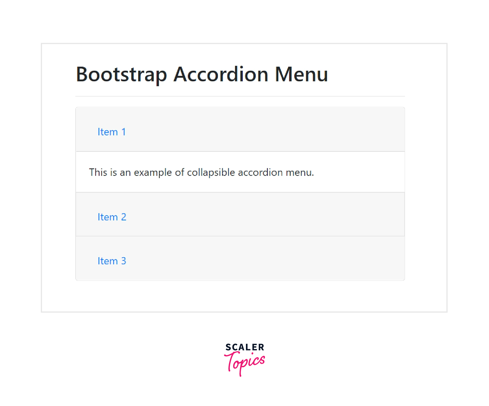
If you look at the code above, you'll notice that we added the data-parent attribute to the collapsible elements to ensure that only one item is opened at a time and all elements are closed.
Accessibility
- Make sure to add aria-expanded to the control element. For screen readers and other similar assistive technologies, this attribute clearly defines the collapsible element's current state.
- If the collapsible element is closed by default, its aria-expanded attribute should be set to false. Set aria-expanded=true on the control if you've used the show class to make the collapsible element default to being open.
- Depending on whether the collapsible element has been opened or closed, the plugin will automatically toggle this attribute.
- Additionally, you may add the aria-controls attribute to the control element that contains the id of the collapsible element if your control element is targeting a single collapsible element and the data-target attribute is pointing to an id selector. To give users more shortcuts to get to the collapsible element itself, modern screen readers and similar assistive technologies make use of this attribute.
Usage
The collapse plugin uses a few classes to carry out the heavy lifting tasks:
- .collapse class conceals the content
- .collapse.show class displays the content
- .collapsing class is added when the transition starts and removed when it ends(during hiding or showing the content). These classes are contained in the file _transitions.scss.
Via Data Attributes
- To assign control of a collapsible element automatically, simply add data-bs-toggle=collapse and a data-bs-target to the element. To apply the collapse to a CSS selector, use the data-bs-target attribute.
- Make sure to add the class .collapse to the collapsible element. Add the additional class show if you want it to open by default.
- Add the data attribute data-bs-parent=#selector to a collapsible control to add accordion-like group management.
Via Javascript
If you need to use the collapse of JavaScript, you could control it using a jQuery plugin that always provides methods and events.
Instead of using data attributes, we can initialize it manually in the following way:
Methods
-
The methods of the collapse component are always called asynchronously. Also, the other method calls are disregarded while the animation is running. After the animation begins but before it ends, the control flow is passed.
The standard methods for bootstrap collapse are as follows:
1. toggle - Toggles a collapsible element to be shown or hidden. Returns to the caller before the collapsible element has actually been shown or hidden (i.e. before the shown.bs.collapse or hidden.bs.collapse event occurs).
You can use this method like this:
2. show - Shows a collapsible element. Returns to the caller before the collapsible element has actually been shown (e.g., before the shown.bs.collapse event occurs).
You can use this method like this:
3. hide - Hides a collapsible element. Returns to the caller before the collapsible element has actually been hidden (e.g., before the hidden.bs.collapse event occurs).
You can use this method like this :
4. dispose - This method destroys the collapse element.
You can use this method like this :
5. getInstance - This is a static method which allows you to get the collapse instance associated with a DOM element.
You can use this method like this:
6. getOrCreateInstance - This is a static method which returns a collapse instance associated with a DOM element or creates a new one in case it wasn't initialized.
You can use this method like this:
Events
We can handle the following JavaScript events of the Bootstrap Collapse component:
- show.bs.collapse - This event is called immediately when the show instance method is called.
-
shown.bs.collapse - This event is called when a collapse element has been made visible to the user (will wait for CSS transitions to complete).
-
hide.bs.collapse - This event is called immediately when the hide method has been called.
-
hidden.bs.collapse -This event is called when a collapse element has been hidden from the user (will wait for CSS transitions to complete).
The following code demonstrates how we can handle events:
What are Bootstrap Spinners?
- The Bootstrap framework provides the spinner component that you can use to show the loading state in your projects. Spinners are typically loading icons and they're built purely with HTML and CSS. However, some custom JavaScript is needed to show or hide the spinners on a web page.
- You can customize the bootstrap spinner's appearance, size, and alignment using various utility classes.
- You can create a spinner or loading indicator in bootstrap by using the .spinner-border class as illustrated below:
Code:
Output:
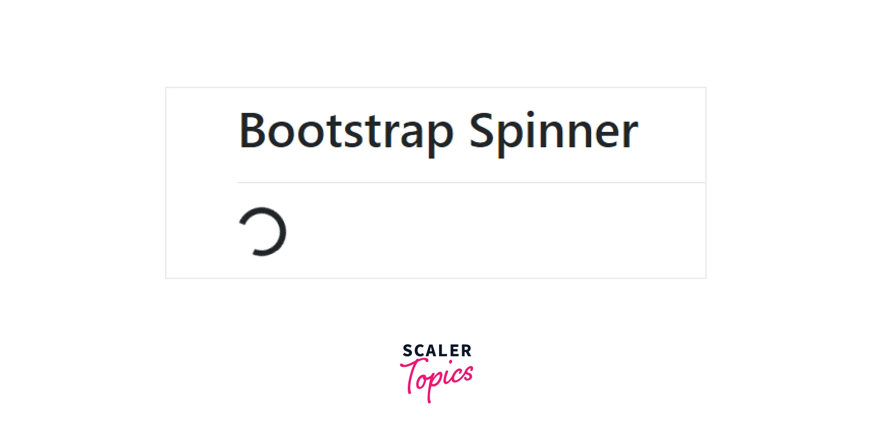
Try this code on your own to see how the growing spinners work.
Examples of Spinners
1. Colored Spinners
In bootstrap, use the text color utility classes such as .text-info, .text-success, .text-warning, etc. to change the color of the spinner.
For example: Code:
Output:
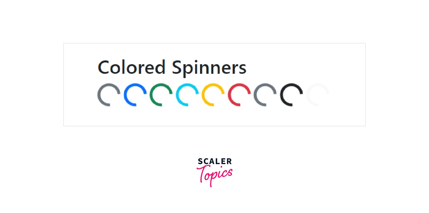
Try this code on your own to see how the growing spinners work.
2. Growing Spinners
The growing spinner will repeatedly grow and fade out instead of spinning. In order to use a growing spinner in your project, you need to add the .spinner-grow class to the <div> element as shown in the example below:
Code:
Output:
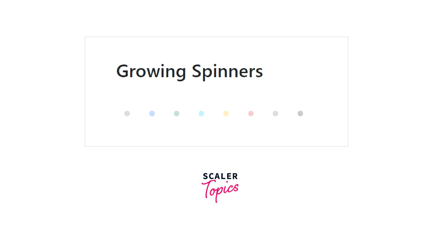
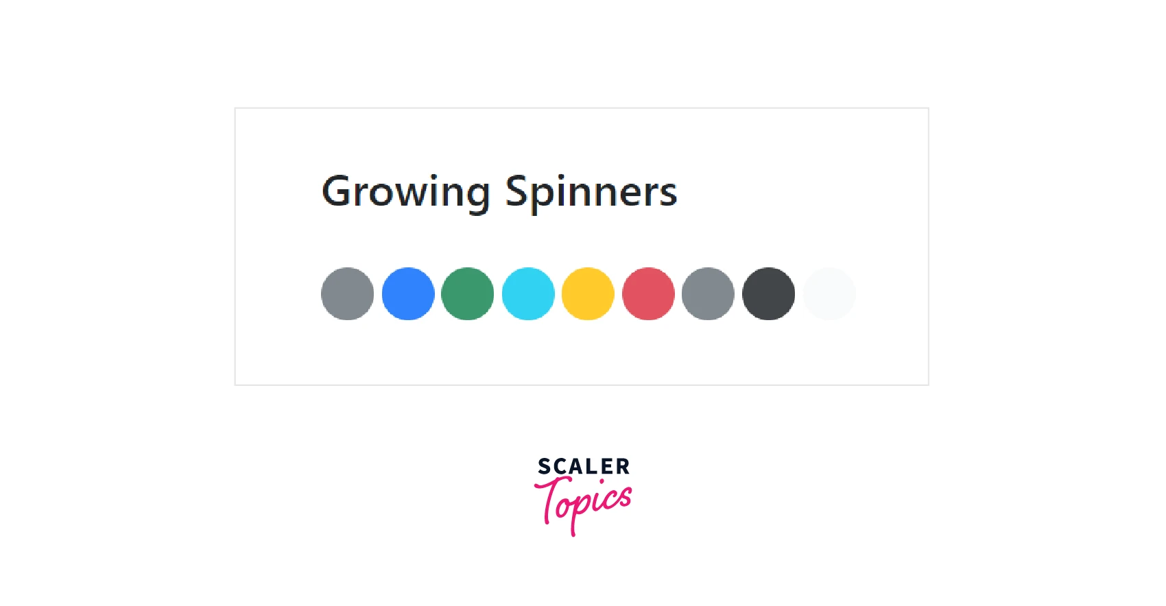
Try this code on your own to see how the growing spinners work.
3. Spinner size
The .spinner-border-sm class and .spinner-grow-sm class can be used to make a smaller spinner that can be used within other bootstrap components like buttons. For example:
Code:
Output:
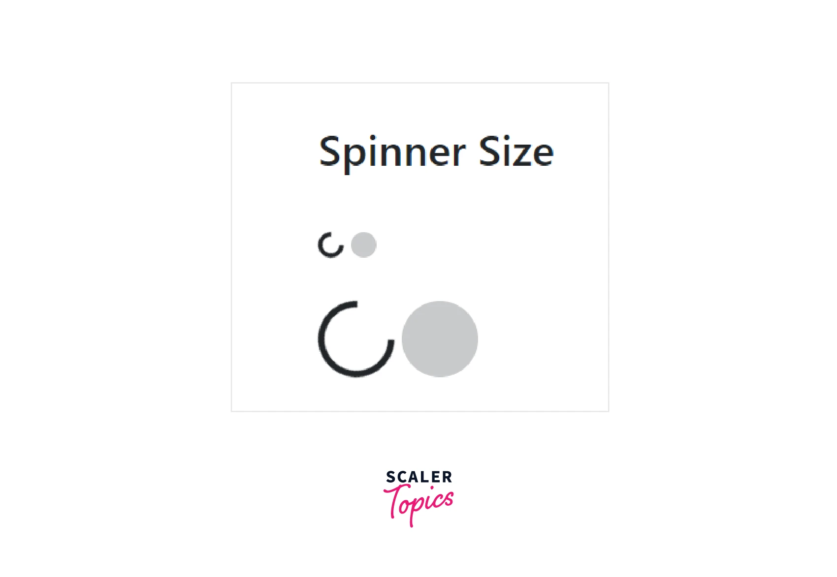
Try this code on your own to have a better understanding of the spinner sizes.
4. Spinner Buttons
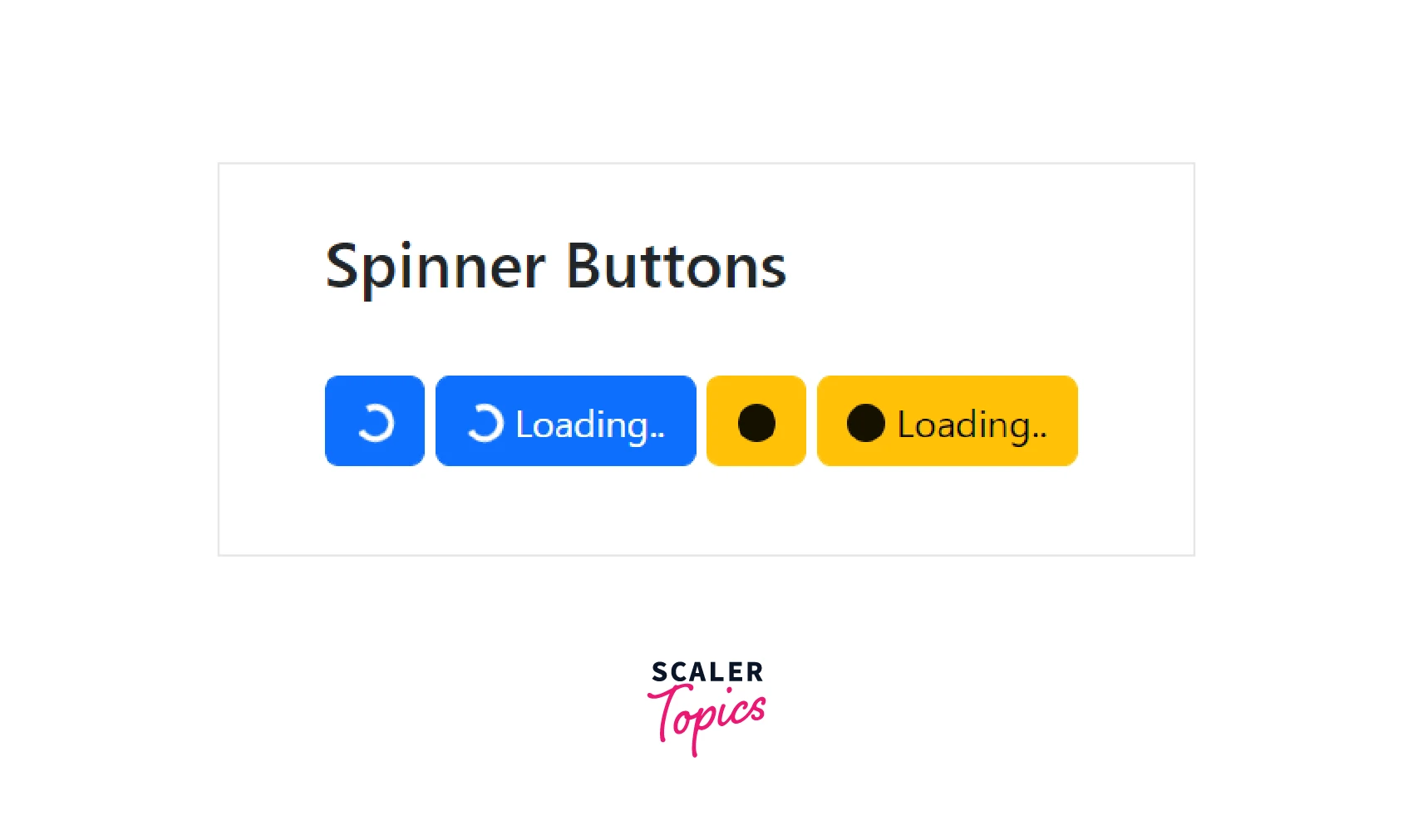
In bootstrap, you can add spinners to the button to indicate that the action is currently processing by using the bootstrap .spinner-border class and .spinner-grow class.
For example:
Code:
Output:
Conclusion
- The Bootstrap collapse is a JavaScript plugin that is used to show and hide content.
- Buttons or anchors are used as triggers that are associated with specific elements you need to toggle.
- The Bootstrap Accordions are a modification of Bootstrap collapse that use the collapse plugin internally to make the accordion collapsible.
- Accordions are used to manage a large amount of content on a small area of the webpage.
- Bootstrap Spinners are used to indicate the loading state of the website.
- Spinners are of different types as mentioned in the article above. You can adjust the appearance and size of the spinners according to the requirement.
- The detailed explanation along with code implementations of these components are mentioned in the article above.
