Bootstrap Alerts
Bootstrap alerts enhance user communication by providing contextual feedback for actions. These alerts, easily created with predefined classes, highlight important messages on websites. The .alert class, combined with contextual classes like .alert-success and .alert-danger, offers a range of styles for effective user engagement.
Alerts in Bootstrap
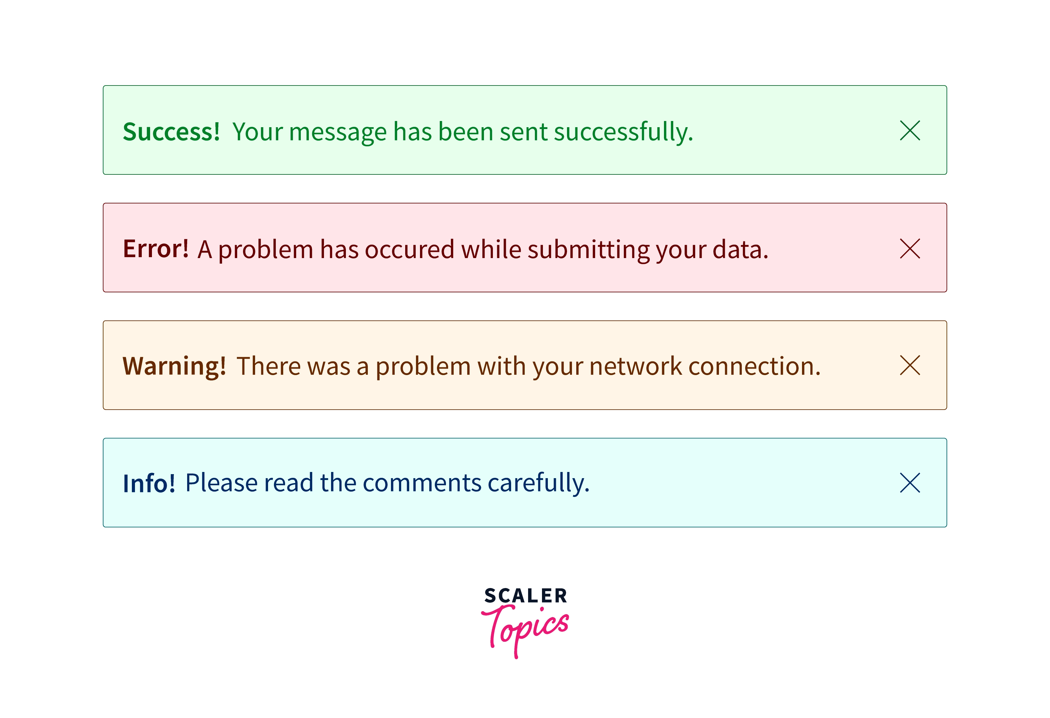
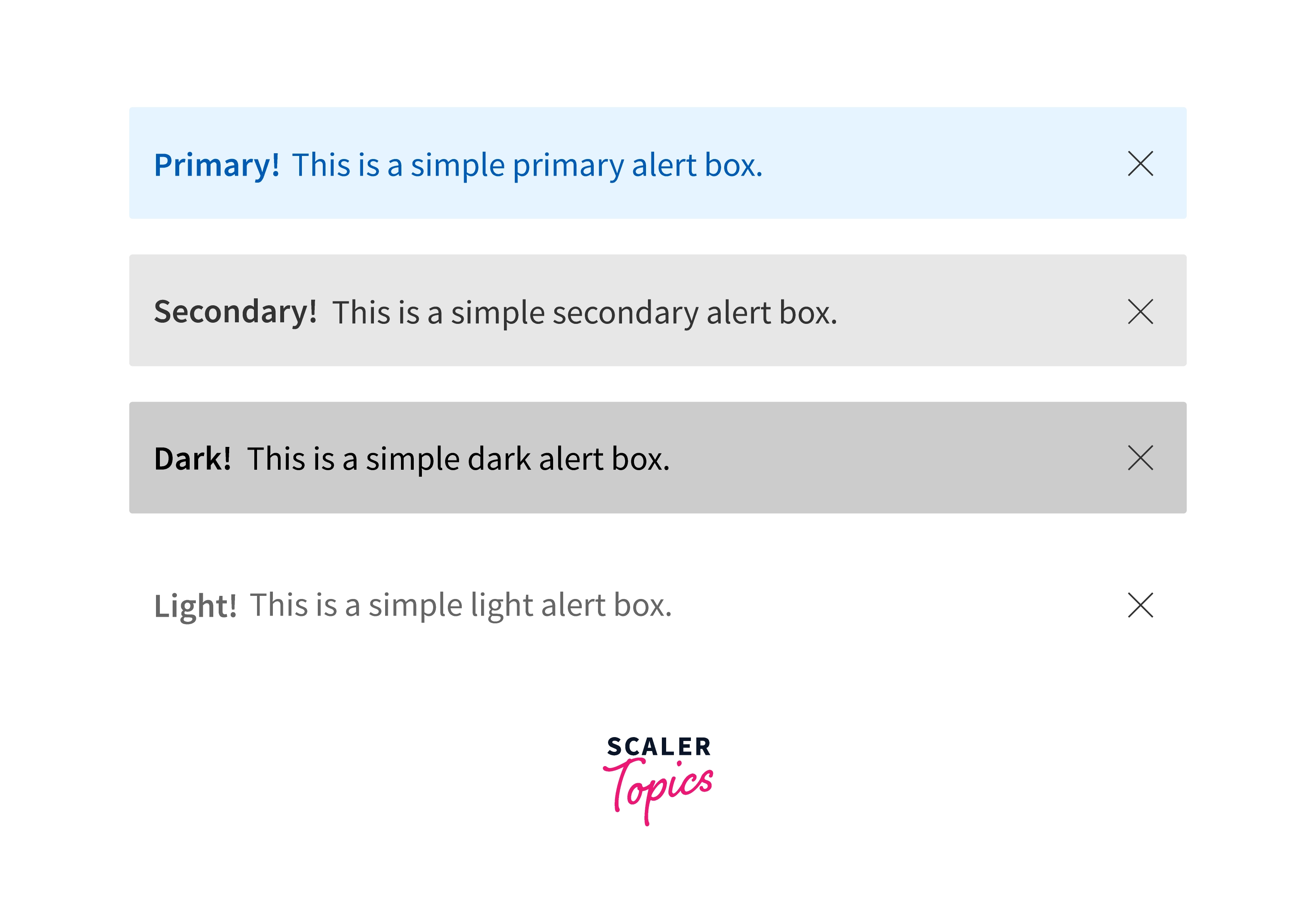
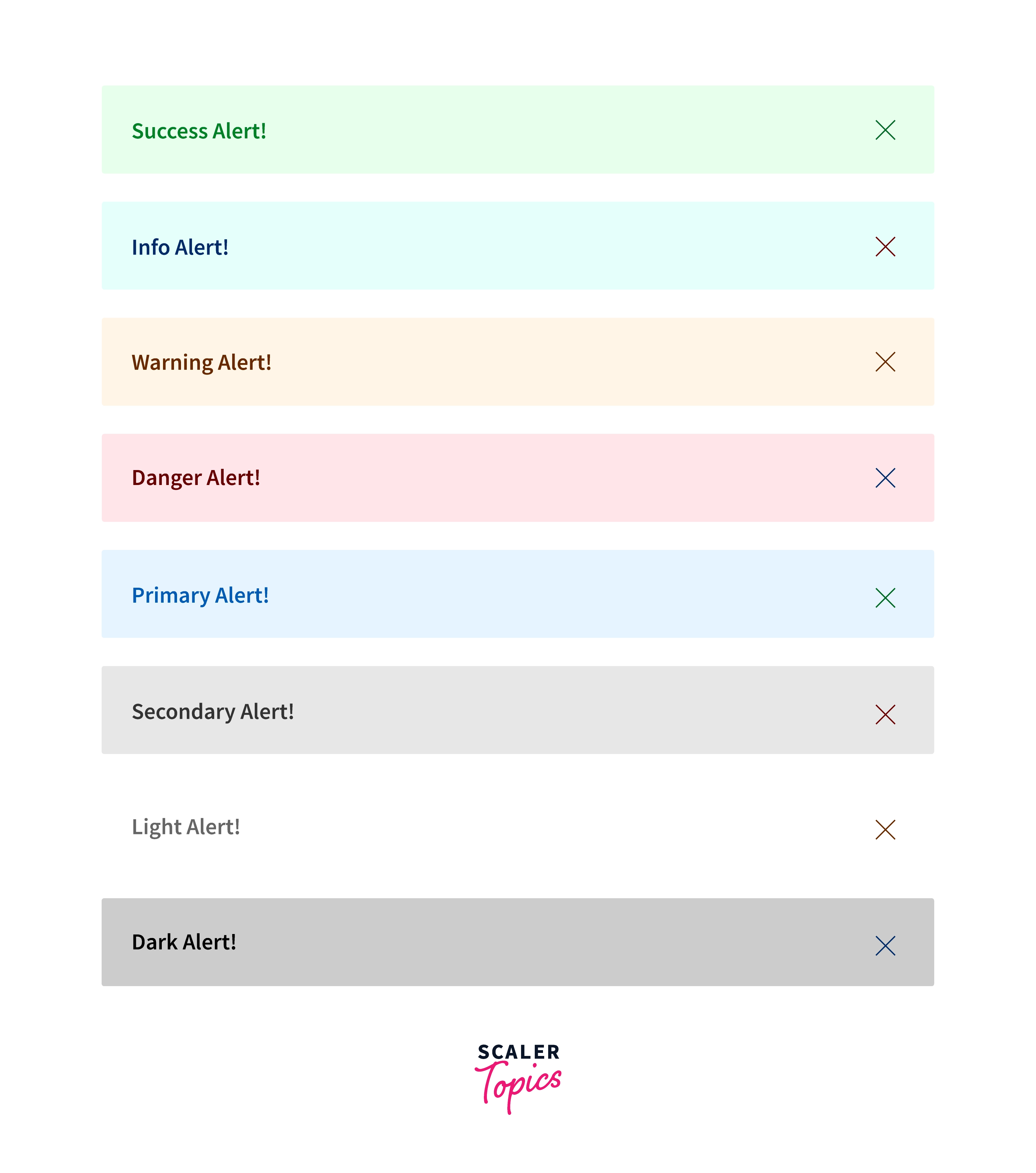
There are 8 different types of bootstrap alert. The following example will show you the most commonly used alerts, which are: success, error or danger, warning, and info alerts: The different types of alerts in Bootstrap are:
- Primary alert
- Secondary alert
- Success alert
- Danger alert
- Warning alert
- Info alert
- Light alert
- Dark alert
Example:
Adding Icons to Bootstrap Alerts
![]()
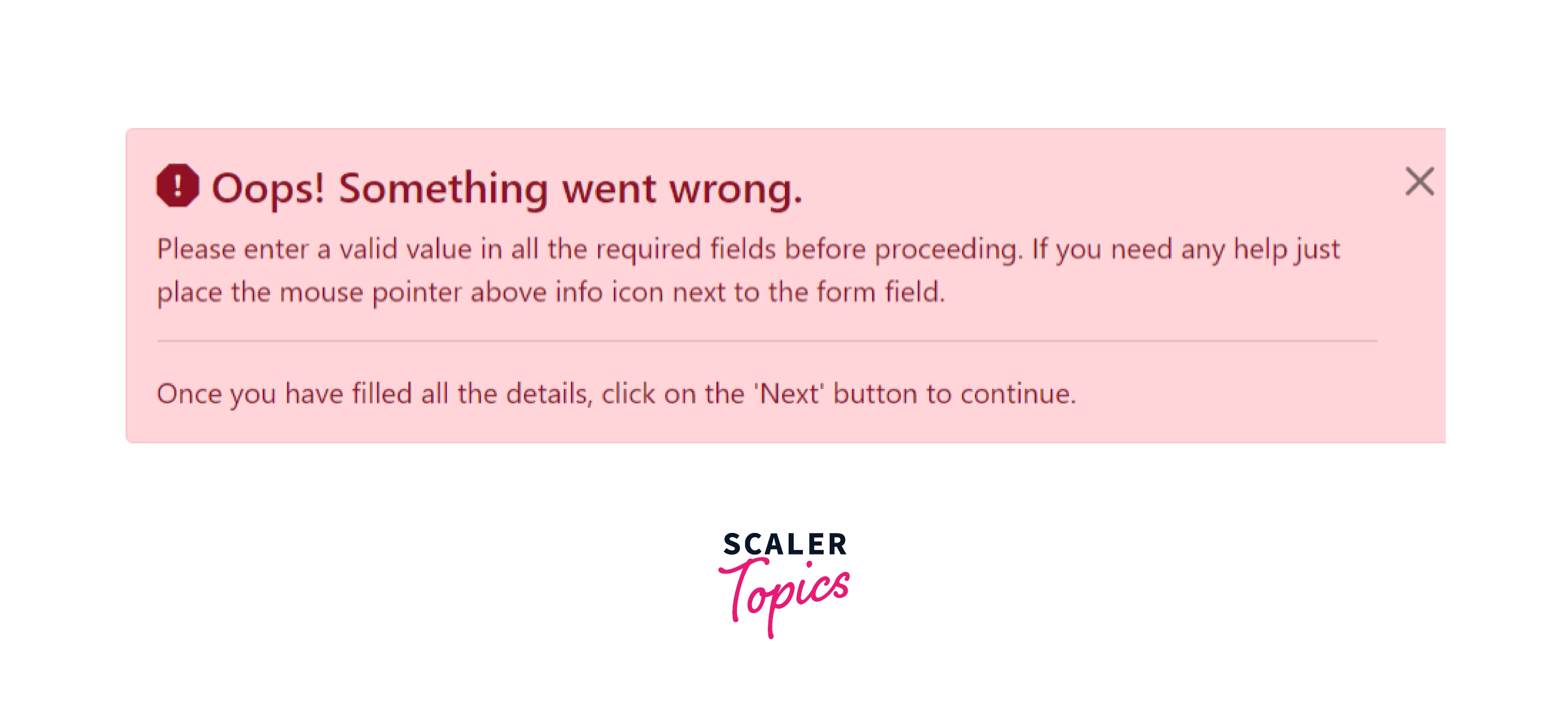
Additional Content Inside Alerts
You can also place additional HTML elements like headings, paragraphs and dividers inside an alert. To manage spacing between the elements you can use margin utility classes, as here
Matching Links Color inside Alerts
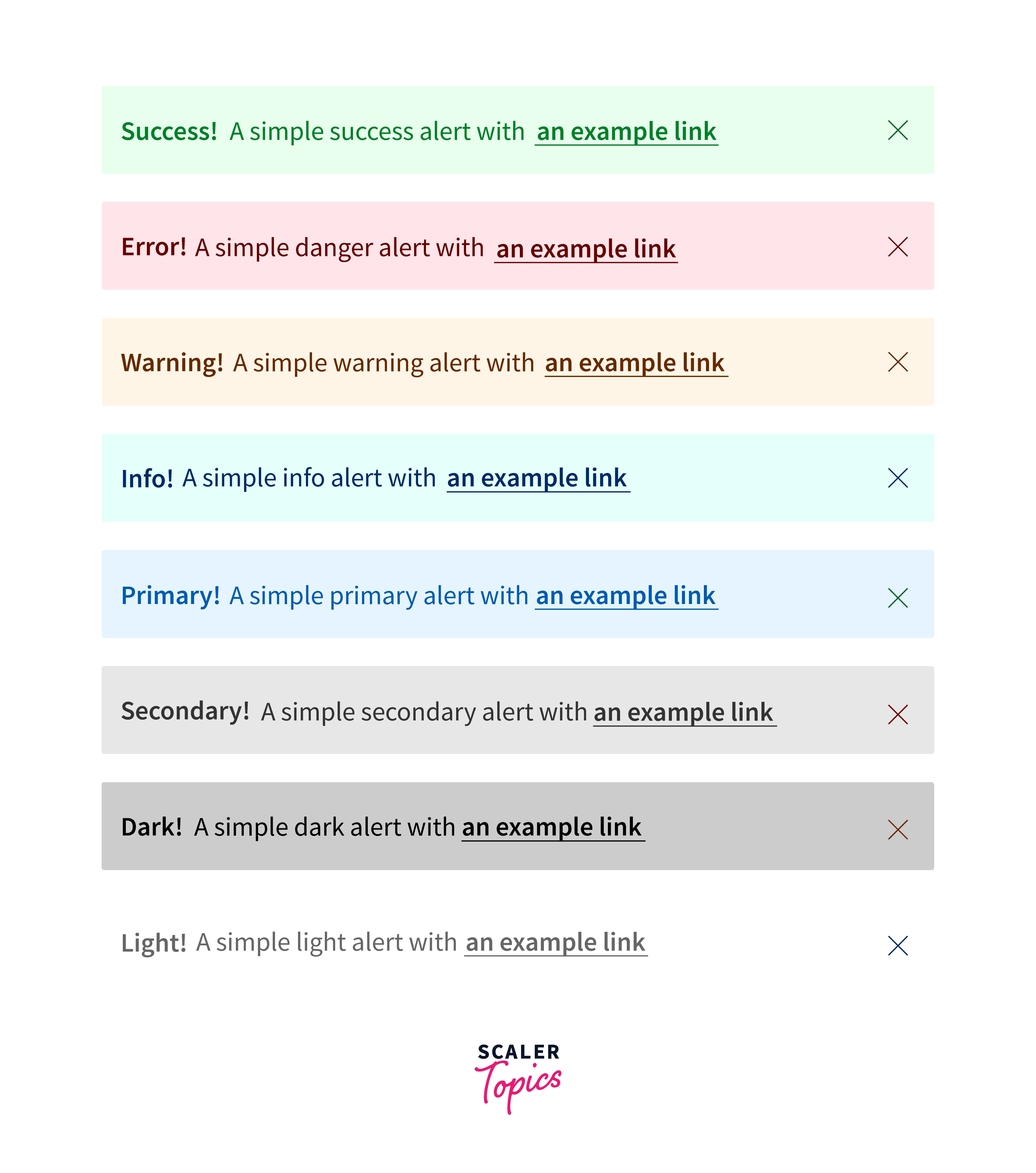
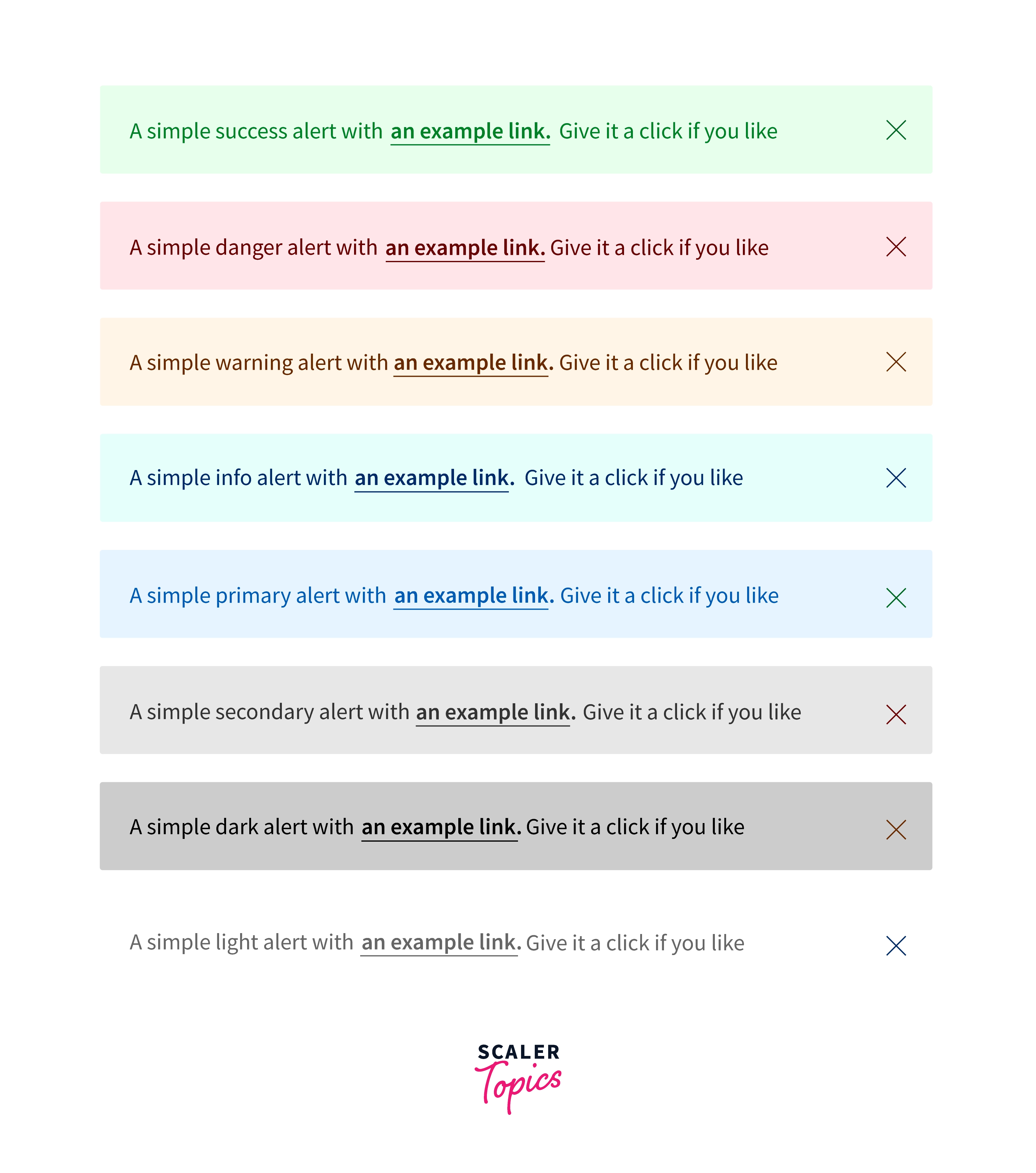
You can apply the utility class .alert-link to the links inside any alert boxes to quickly create matching colored links, as shown in the example below:
Links in Alerts
Use the .alert-link utility class to quickly provide matching colored links within any alert.
Closing Alerts
Using the alert JavaScript plugin, it’s possible to dismiss any alert inline. Here’s how:
- Be sure you’ve loaded the alert plugin or the compiled Bootstrap JavaScript.
- If you’re building our JavaScript from the source, it requires util.js. The compiled version includes this.
- Add a dismiss button and the .alert-dismissible class, which adds extra padding to the right of the alert and positions the .close button.
- On the dismiss button, add the data-dismiss="alert" attribute, which triggers the JavaScript functionality. Be sure to use the <button> element with it for proper behavior across all devices.
- To animate alerts when dismissing them, be sure to add the .fade and .show classes.
Animated Alerts
To make the alerts more attractive for the user we can add animation to our bootstrap alerts. Bootstrap provides various mainly two classes to accomplish this task. The .fade and .show classes are used to add the fading effect of animation when closing the alert message.
Example:
JavaScript Activities of the Bootstrap Alert Popup
Triggers
Enable termination of an alert using JavaScript
$(".alert").alert() Enable dismissal of an alert through JavaScript
Alternatively with data features on a button located in the alert, as shown mentioned earlier
Take note that shutting an alert will take it out from the DOM.
Solutions
$().alert() -Makes an alert listen for click events on descendant elements which in turn have the data-dismiss=" alert" attribute. (Not important while working with the data-api's auto-initialization.).
$().alert('close') - Shuts off an alert simply by removing it from the DOM. If the.fade and.show classes are present on the element, the alert will fade out just before it is taken out.
Events
Bootstrap's alert plugin introduces a couple of events for fastening into alert features.
close.bs.alert- When the close instance method is called, this event fires immediately.
closed.bs.alert- This event is fired anytime the alert has been closed will wait for CSS transitions to.
Conclusion
- A lot of different alert features can be created using bootstrap classes.
- You can modify the font-color, background-color, animation, link color.
- You get to know different types of bootstrap alert classes.
- We created Bootstrap alerts with icon and text with the complete explanation.
- We can add animations to our alerts using .show and .fade classes.
- We can add different links in our alert boxes using .alert-link class.
- Now we can create different alert layouts as per our requirements with the help of bootstrap alert class.
