Bootstrap Badge
Bootstrap badges effectively highlight additional information like labels, counters, or icons on web pages. They are integral for areas like notification bars, indicating unread messages with dynamically updating counters. Bootstrap badges, primarily using the .badge utility class, are easily integrated with HTML and Bootstrap utilities, including contextual classes. With rounded corners and relative font sizing, they seamlessly adapt to their parent element's size. As of Bootstrap v5, badges have evolved, no longer featuring focus or hover styles for links, emphasizing simplicity and functionality. They enhance web page aesthetics and user awareness, particularly for new or unread items.
Pre-requisite
The prerequisites for using the bootstrap badges are
- HTML
- Bootstrap
- Bootstrap utilities
- Bootstrap contextual classes.
Basic Example
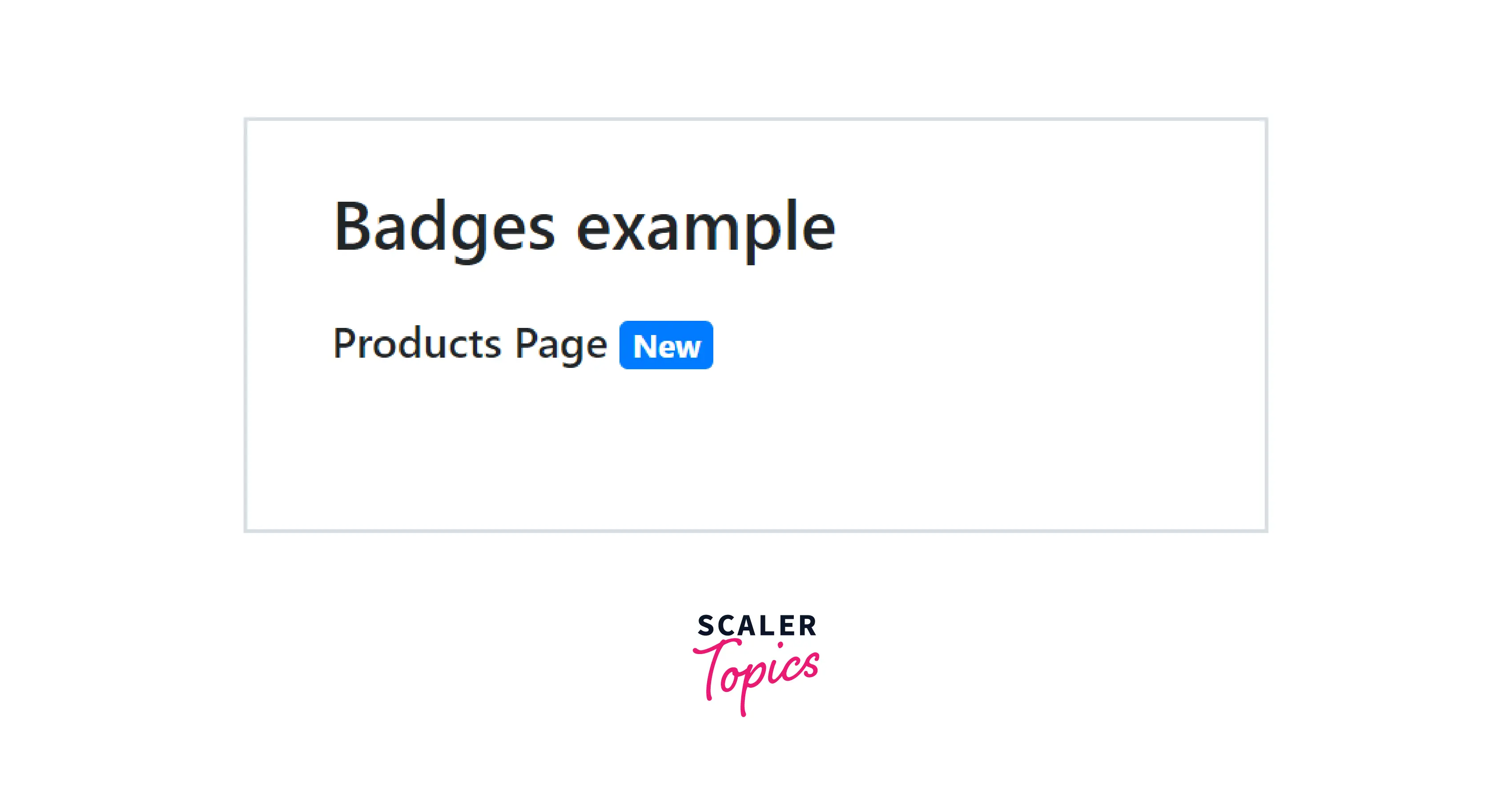
You can create a bootstrap badge just by adding a .badge utility class to a span element inside the element besides which we need to append the badge. Let us see how to create a bootstrap badge with the help of a code example.
Output:
As you can see in the above output, the New badge has been added beside the product's page. However, you also have to give a badge color utility class in which you can choose from the contextual classes available with bootstrap and use these contextual classes along with the .badge-* class.
Sizes
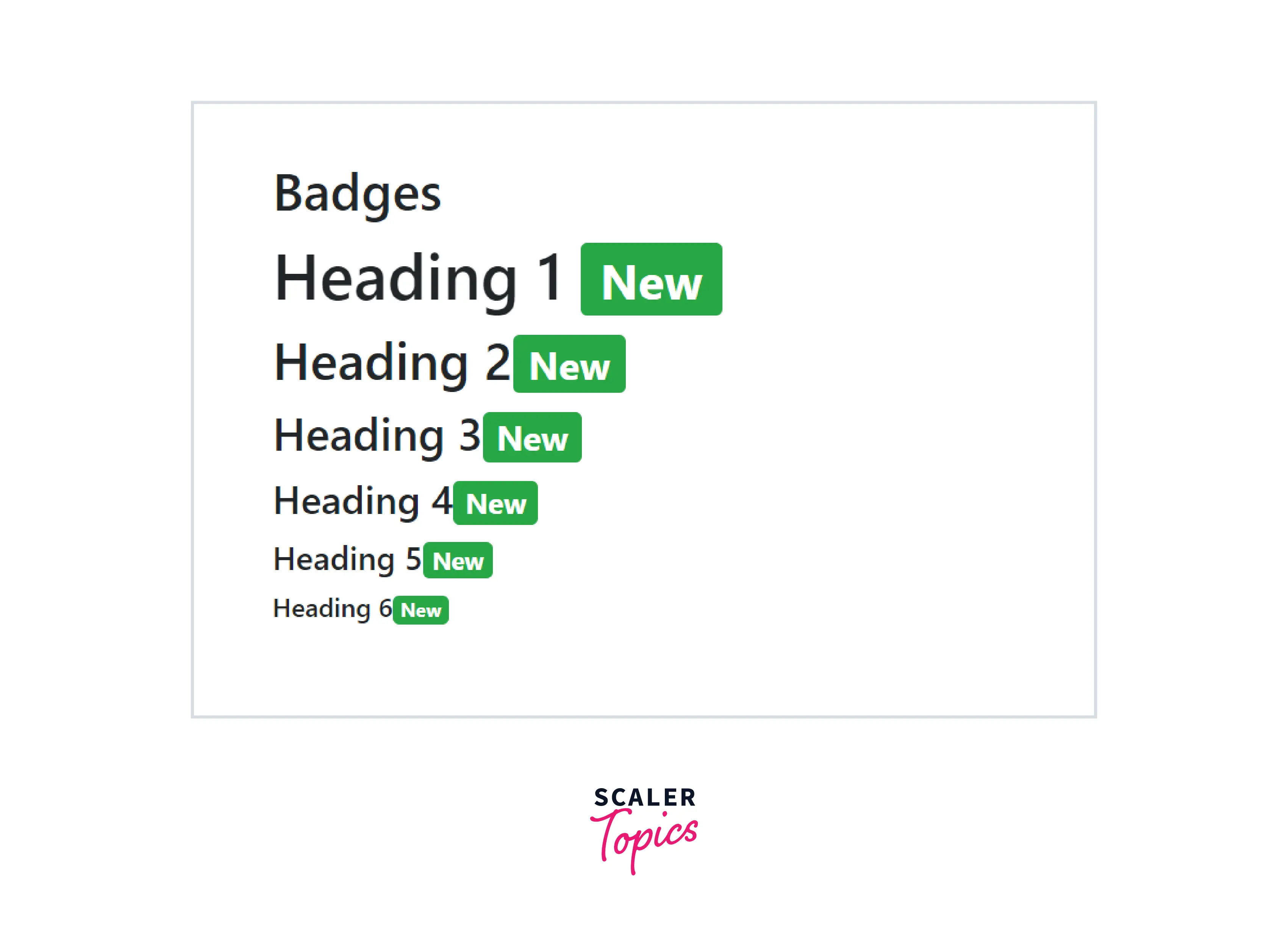
The bootstrap badges used with any HTML element tend to scale themselves to match the size of the immediate parent by using the relative font sizing and the em units. For example, badges when used with the h1 element tend to scale themselves with the size of the h1 element.
Let us see the bootstrap badges of different sizes with the help of a code example.
Output:
As you can see in the above output, the different badges have scaled themselves to match the sizes of the different heading elements in HTML.
Badges Used as Part of Links or Buttons
The bootstrap badges can also be used as a part of the links and the buttons. We add a span element inside the button or the link element and add the .badge class along with the corresponding color utility.
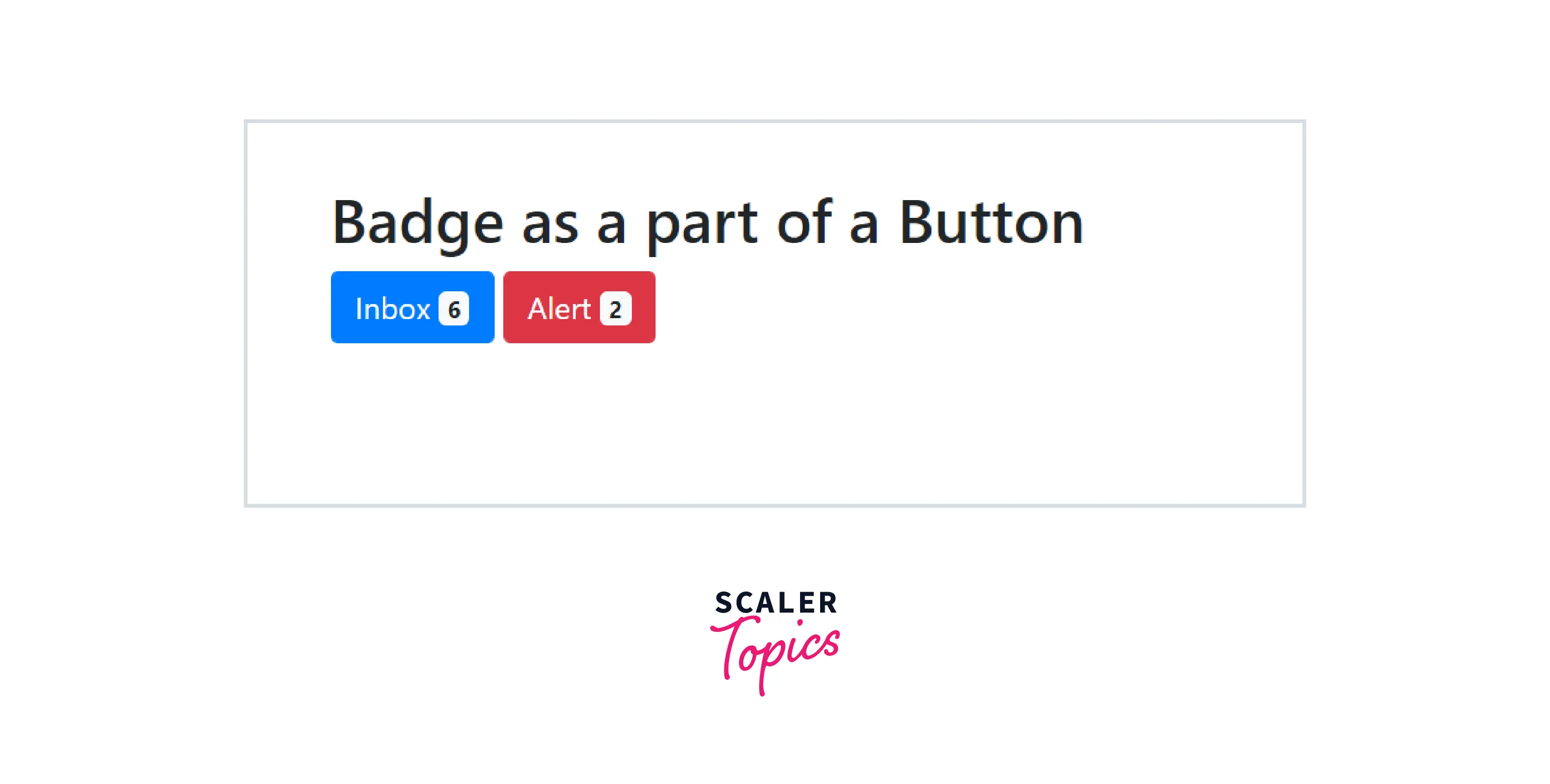
Let us see how to create a bootstrap badge inside a button or link element with the help of a code example.
Output:
Therefore, as you can see in the above output, we have made two buttons that have counter badges beside them.
Positioned
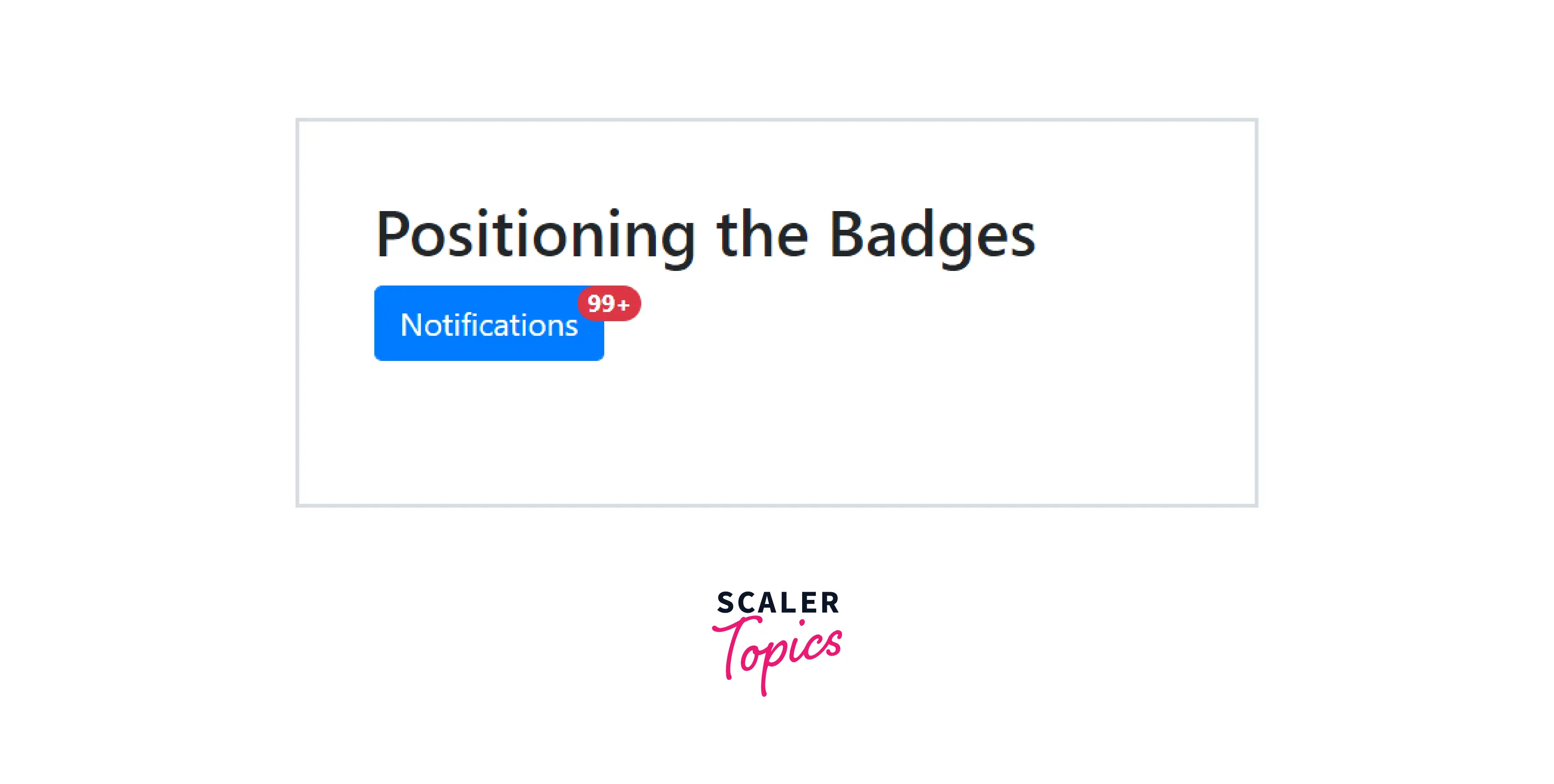
You can change the position of these bootstrap badges with different utility classes available with bootstrap. Firstly, you need to give a class .position-relative to the parent element of the badge and then give a class .parent-absolute to the span element of the badge. After which, you need to also give some other classes such as .top, .start, .end, etc as per the position of the bootstrap badge on the screen.
Let us see how to position a bootstrap badge on the top right corner of a button with the help of a code example.
Output:
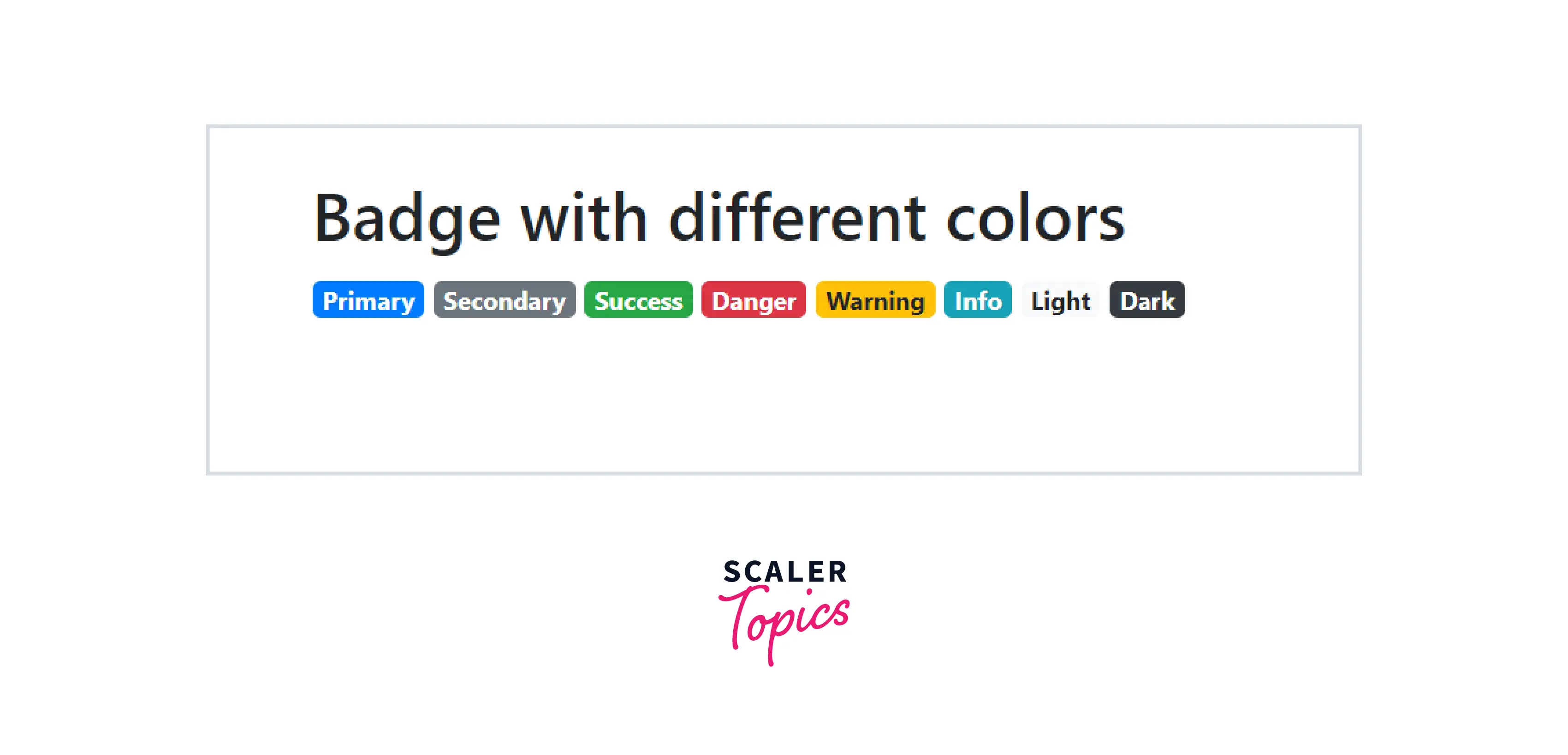
Contextual Badges
You can use any of the contextual classes of bootstrap to color the badge with the appropriate color. To add any contextual color to a bootstrap badge, we need to use the .badge-* utility class where * can be primary for the blue color, secondary for grey, success for green, warning for yellow, a danger for red, and so on.
Let us see the bootstrap badges with different colors with the help of a code example.
Output:
As you can see in the above output, we have added different color badges by using the different contextual classes in bootstrap.
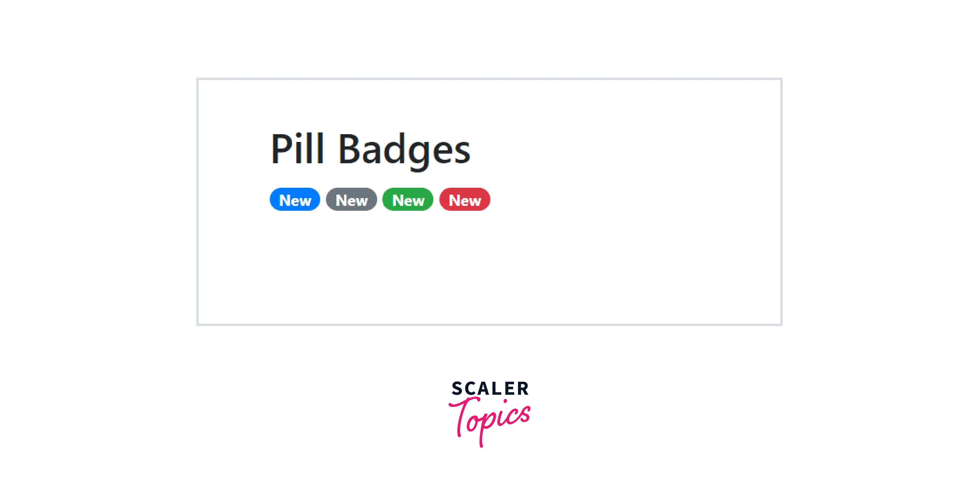
Pill Badges
You can also make the bootstrap badges more round from the corners using the .badge-pill utility class. These badges with this utility that are more round from the corners are known as pill badges.
Let us see these pill badges with the help of a code example.
Output:
As you can see in the above output, the bootstrap badges are more rounded than usual by using the .badge-pill utility along with the .badge and .badge-primary classes.
Conclusion
- Bootstrap Badges are used to add additional information to the content of a webpage such as labels, counters, and icons.
- These badges scale themselves according to the size of their immediate parents.
- To make a bootstrap badge, we need to use the .badge utility class along with the appropriate contextual class such as .badge-primary to give the badge a particular color.
- You can change the color of a bootstrap badge using the different contextual classes present in bootstrap.
- You can also use these bootstrap badges inside a button or a link.
- You can change the position of a badge using the various utility classes in bootstrap such as position-relative, .position-absolute, top, start, etc.
- You can also make these badges more round by using the .badge-pill utility in bootstrap.