Bootstrap Buttons
Bootstrap 5 introduces responsive buttons with diverse styles. Utilize MDB custom button classes for actions in forms, dialogs, and more, supporting multiple sizes and states. Simplify styling using the .btn class for basic attributes like padding and content alignment.
Buttons in Bootstrap
Bootstrap provides several predefined buttons each with its own properties such as sizes, states, colors, etc. You can create buttons in your website using bootstrap with basic prior knowledge of HTML and CSS. To add a button you just have to copy the code of the predefined template of bootstrap and paste that code in the body section of your HTML file.
These are some examples of code for some different default buttons.

As you can see, In the code given above the only variable which is changing is the class of the button and with that single change, the styling of the button is changing. So, let's find out what these classes are and what their significance is.
Button Classes in Bootstrap
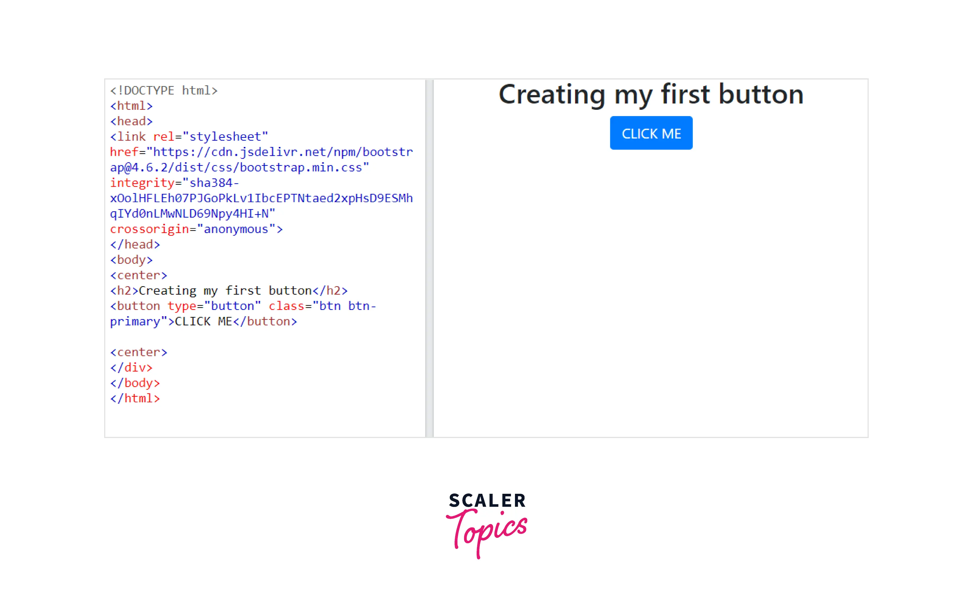
Classes in bootstrap provide the specific styling to the component in which the class is used. In the case of buttons .btn is the class used to create the standard/default button. This standard button inherits the look of a gray button with rounded corners. Here your component is <button> and the class is .btn. Therefore the code of the required button is
Button with Class .btn

However Bootstrap provides a lot more options to style using different modifier classes. These modifier classes help you to change the color of the button and font of the default button created using the .btn class. Let's take a closer look at these modifier classes.
.Btn-primary
It provides a blue color to the button and white to the font. This "primary" class provides an extra visual weight to the button which helps in getting more clicks from the users. It indicates a primary action to the user.
For example:- This "VIEW ALL" button from an E-commerce website is a button with a primary class.

.Btn-secondary
It provides grey color to the button and white to the font. This "secondary" class also provides an extra visual weight to the button. It indicates a secondary action to the user. while a primary button(VIEW ALL) might invite users to get a product on an E-commerce website homepage, the secondary button might invite them to demo it.

.Btn-success
It provides green color to the button and white to the font. This "success" class indicates a positive or on-track action to the user. for example:- This "PLACE ORDER" button is fit for the button with a successful class.

.Btn-warning
It provides yellow color to the button and black to the font. This "warning" class is used to represent a warning or to indicate that caution must be taken with a particular action. Example of this class can be, while placing an order from an E-commerce website you forget to select the payment option and to click on place order, the website can give you the option to go back to that checkbox and fill it.

.Btn-danger
It provides red color to the button and white to the font. This "danger" class signifies an unrealized mistake or wrong track action to the user. Both warning and danger class indicates that the user must take a look back and check for mistakes.

.Btn-info
Info class is used to indicate an information alert. This class is used to create button which are used to get information from the user. For example: A button to edit a profile.

.Btn-light
It provides white color to the button and black to the font. It is mostly used for the dark version of the website so that visibility and design enhance. Also in the case of the warning class, the font color is black which will not be properly visible in dark mode, so there is a need of the light class.
.Btn-dark
"dark" class is just the opposite of the "light" class. The color of the button is white and the text is black. This class is used in light mode mostly.

.Btn-link
This modifier class gives the button a look at a link. The button appears as a link but works as a button. "link" class is used in articles to create a "read more" button.

These are the 9 modifier classes you can use to create different buttons according to your need. Apart from these 9 styles of buttons, you can create an infinite number of different buttons by combining these classes with other CSS classes.
You can even combine 2 or more different modifier classes in a button element.
For Example: If you use the link class and danger class simultaneously you will get a button with properties of both classes.

How to Use Bootstrap Button Classes
The button classes of bootstrap are created to be used with the <button> element but they can also be used on <a> and <input> elements. You can use button classes on href elements so that you can link the current page to new pages or can move to different sections within the current page.
Button classes are used on <a> elements to either subside content or activate in-page functionality. In that case, these links should be given a role="button" to properly convey their reason for convenient technologies.
Below is the code of examples of button classes being used with the <button> and <input> elements.

This code and the resultant output show that we can create a button using <button>, <a>, and <input>.
Bootstrap Button Styles
Till now you have seen that using the inbuilt classes of bootstrap you can change the color and font of the button. Now let's take a look on how we can use inbuilt classes with some CSS code to create and style a button.
Bootstrap Button Colors
Using the modifier classes in the button will change the color of the font and the background color of the buttons. .btn-primary will make the button green and font white, whereas .btn-danger will make the button red and font white, and so on for other classes. But what if you want to create a different font color and background color to your buttons.
Let's look at an example in which CSS is used to style the button.
Here the required button will be

Bootstrap Outline Buttons
The .btn-outline class is used to create buttons that have colored borders instead of colored backgrounds. You can use this outline class with any modifier class to get a button with similar attributes. Like if you use .btn-outline-danger instead of .btn-danger, you will get a button with red border and black font.


You can style these outline buttons using CSS in a similar way as shown above for the bootstrap buttons. The difference is that here the class of the button is btn btn-outline and in CSS code you have to declare the value of the border-color instead of the background color.

Bootstrap Button Size
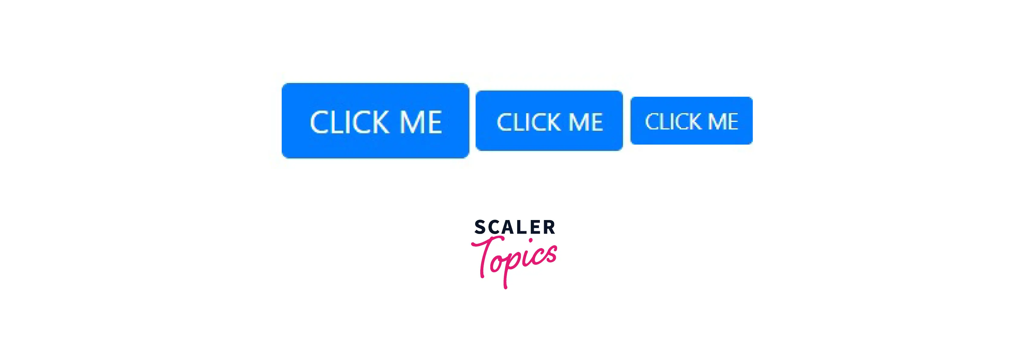
Till now you have seen how to change the background color, border color, and font color of a button. Now let's find out what you can do with the size of a button. Bootstrap also provides you the freedom to play with the size of the button using some different modifier classes.
- you can increase the size of a button using the .btn-lg class.
- you can decrease the size of a button with the help of the .btn-sm class.
- you can create a block-level button with class .btn-block.

Here you can see all three buttons have "CLICK ME" written on them but still the size of all three is different.
Block level button span the complete width of the parent component.

Bootstrap Button States
In Bootstrap you can even change the state of a button by using the class .active. The .active class gives a little animation effect to the button. Like when you click on the button then the appearance of the button will be changed in correspondence with the .active class. You can change any property of your button including background-color, size, etc.
Before Clicking

After Clicking

The "Disable" attribute make buttons look inactive by adding the disabled boolean attribute to any <button> element.
Before Clicking

After Clicking

When you use the "disable" attribute with the button component, it looks like the button is functionless, but it is not. After clicking the button, there is no change in its appearance, but the link attached to the button runs on clicking.
<a> elements do not support the disabled attribute. So to make <a> elements look inactive you’ll have to use the .disabled class. In fact, since the .disabled class disables the link functionality of <a> elements, these modified elements will not only appear unclickable they will be unclickable.
Bootstrap Toggle Buttons
To change the Bootstrap button from its initial state to an active state when the button is clicked, you can add data-toggle="button" after your .btn class. After the button is clicked, these buttons will hold on to their darker background, and darker border.
Bootstrap Radio Buttons
A radio button is used when you have to choose from some given options related to each other (known as a radio group). You can select only one radio button at a moment. So if you have selected one button and after that, you select any other button of the group, the first choice will be deselected automatically.
No option selected

Option 1 selected

Option 3 selected

The syntax of a radio button is <input type="radio"> so to make four options let’s copy and paste that four times. Each button has to share the same name attribute so we’ll add name=”options” to the same line. And since we may want to apply different styles to each <input> element, we’ll give each its own ID name. We’ll call them option 1, option 2, option 3, and option 4.
Create a Bootstrap Button

Use any IDE which supports HTML, CSS, and JS, and start your journey to the front-end using Bootstrap.
Adding Button to Your Bootstrap Site
Buttons are an important part of your website and the bootstrap buttons described above can be used to enhance your website and its working. You can customize these buttons as per your requirement with basic knowledge of CSS and HTML.
Conclusion
- A lot of different buttons can be created using bootstrap button classes.
- You can modify the font color, background color, and border color.
- You can change the size and state of the default button using bootstrap.
- Using bootstrap classes toggle buttons and radio buttons can also be created.
- Using Bootstrap’s framework, you can design customized buttons that you can use in forms, card elements, and navigation bars quite easily.
