Bootstrap Components - Modals, Popovers, Toasts, Tooltips
Bootstrap 4, initially named Twitter Blueprint, was crafted by Mark Otto and Jacob Thornton at Twitter. This free CSS framework facilitates rapid web development with customizable components like alerts, buttons, and cards. Its design philosophy emphasizes a "mobile-first" approach, ensuring responsiveness across devices. The framework employs a base-modifier system; for instance, .btn serves as a base class, while .btn-primary or .btn-success act as modifier classes. To integrate Bootstrap, one must link jQuery and Bootstrap's JavaScript components, in addition to its CSS files. These resources are conveniently available for download or via Content Delivery Networks (CDNs), streamlining the development process and ensuring consistent, elegant web design irrespective of screen size changes.
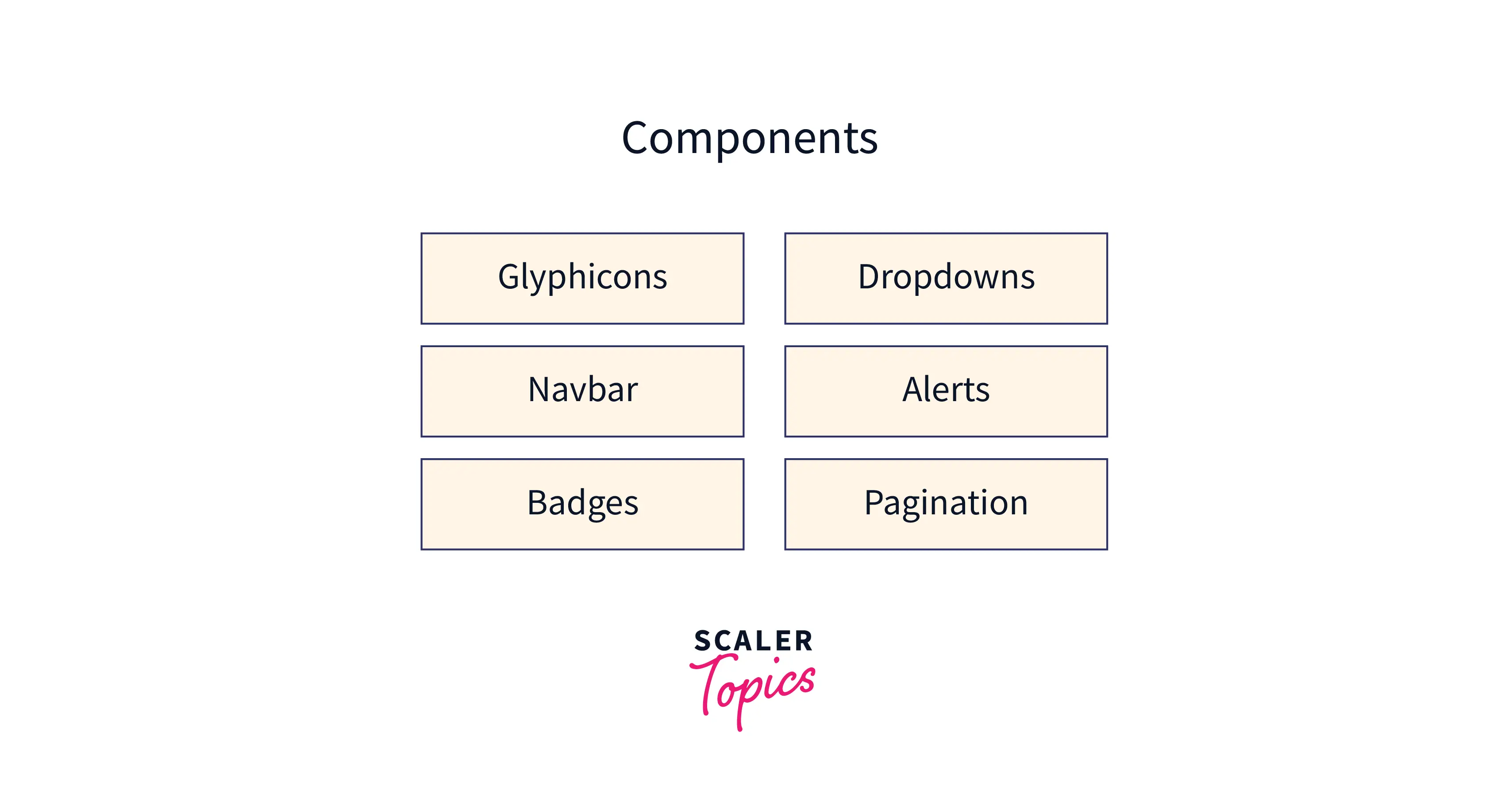
Bootstrap Components
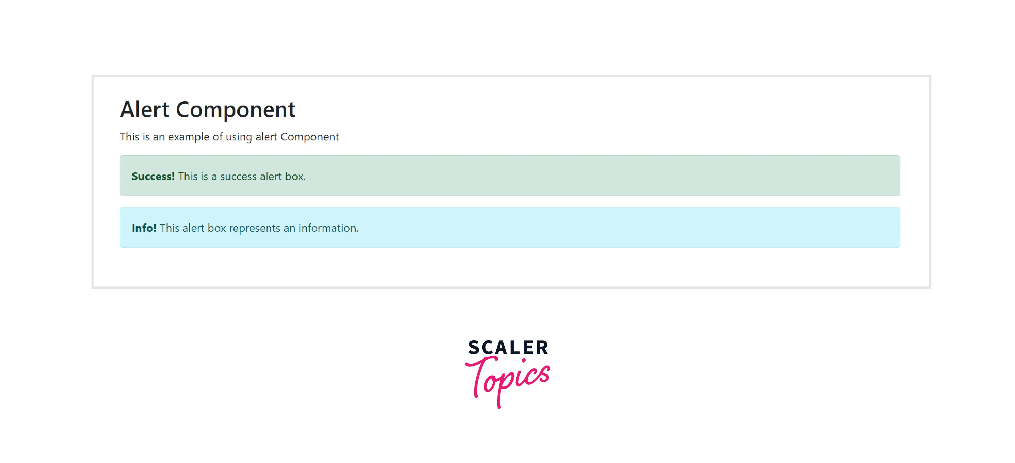
a. Alerts
- It is a pop-up that appears after a specific action and contains a predefined message.
- The base class for using the alert component is .alert. There are various contextual classes for alert components provided by Bootstrap. They are .alert-success, .alert-info, .alert-warning, .alert-danger, .alert-primary, .alert-secondary, .alert-light or .alert-dark.
The following example illustrates the usage of the alert component.
Example Code:
Output:
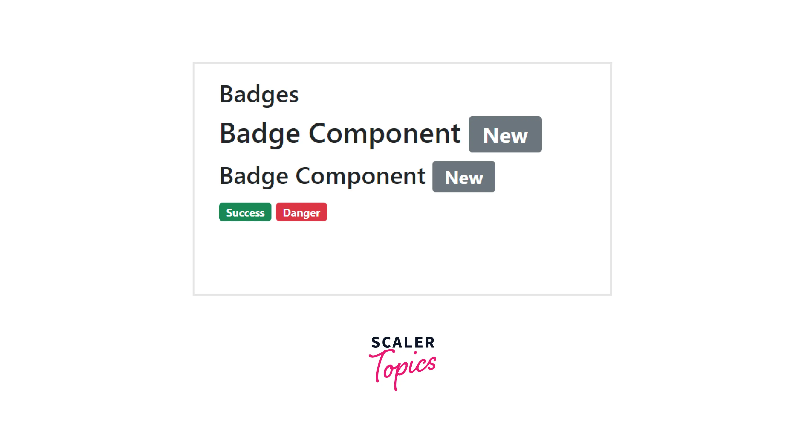
b. Badges
- It is a labeling element that is employed to include extra information.
- To create rectangular badges, combine the .badge class with a contextual class (like.bg-primary) within <span> elements.
- Badges scale to the parent element's size, if one exists.
The following example illustrates the usage of the alert component.
Example Code:
Output:
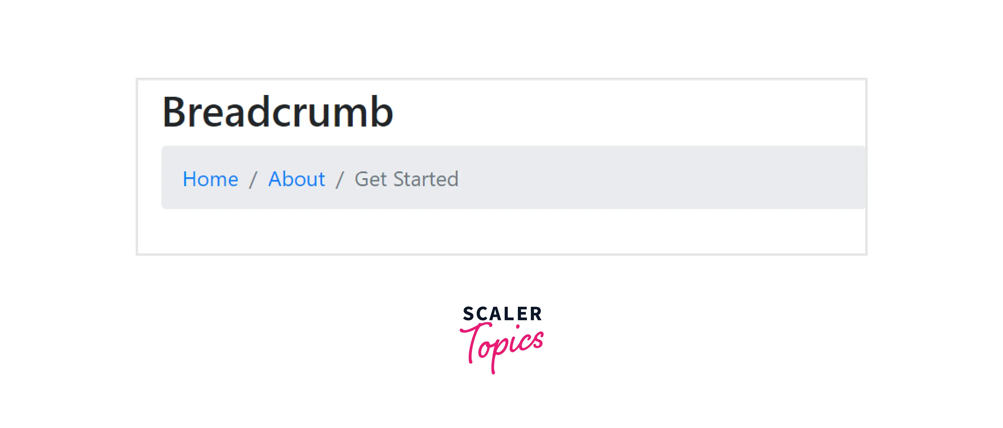
c. Breadcrumb
- It gives the position of the current page in the navigational hierarchy and uses CSS to add separators.
- Bootstrap uses the .breadcrumb class to define breadcrumb the list as a b.
The following example demonstrates the usage of the badge component:
Example Code:
Output:
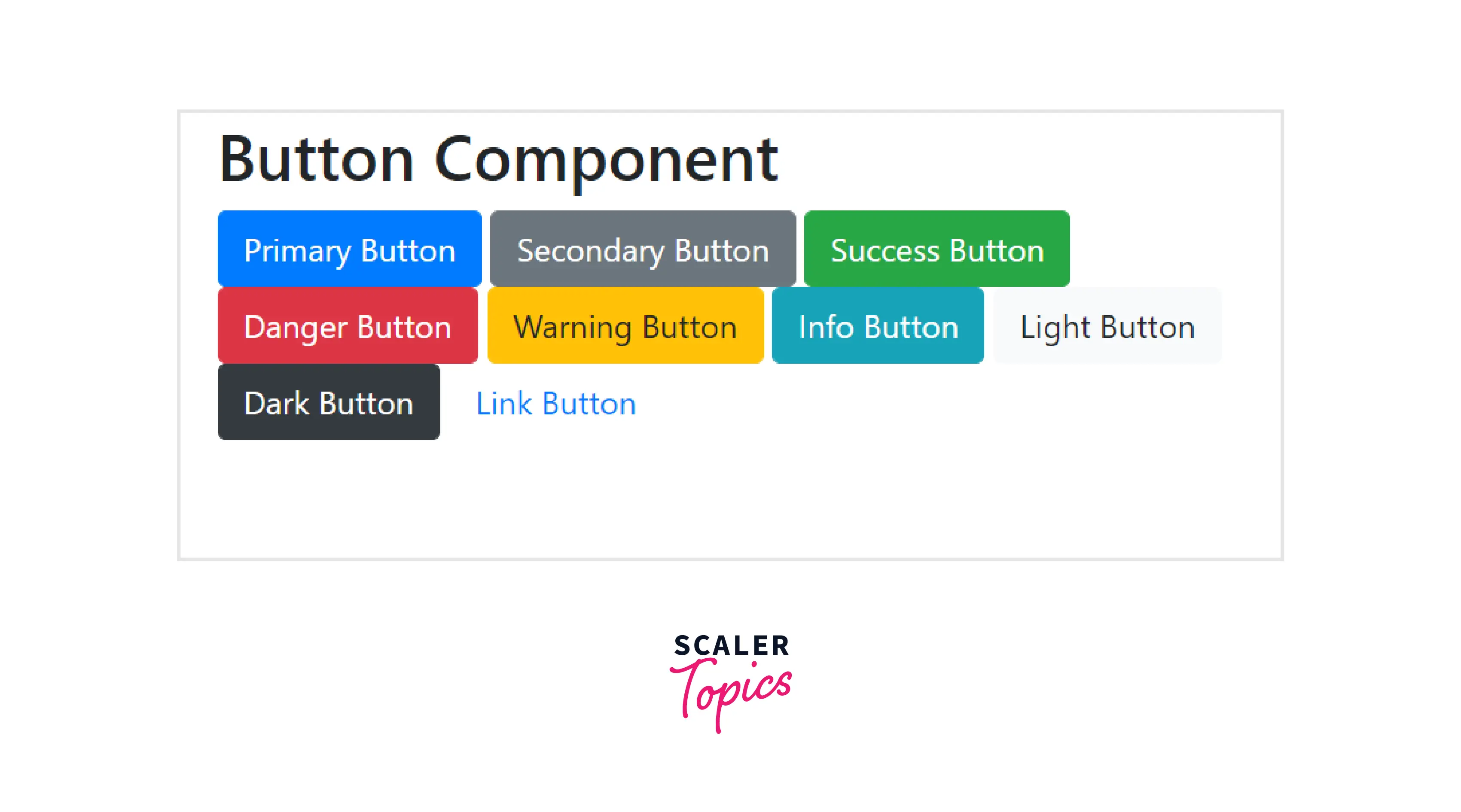
d. Buttons
- The buttons are used to execute an action in the form, dialogue box, etc., and they are pre-styled using CSS.
- They come in a variety of sizes, states, and predetermined styles.
- You can create a button using the .btn class followed by an abstract class (e.g., btn-primary).
The following example demonstrates the usage of the badge component:
Example Code:
Output:
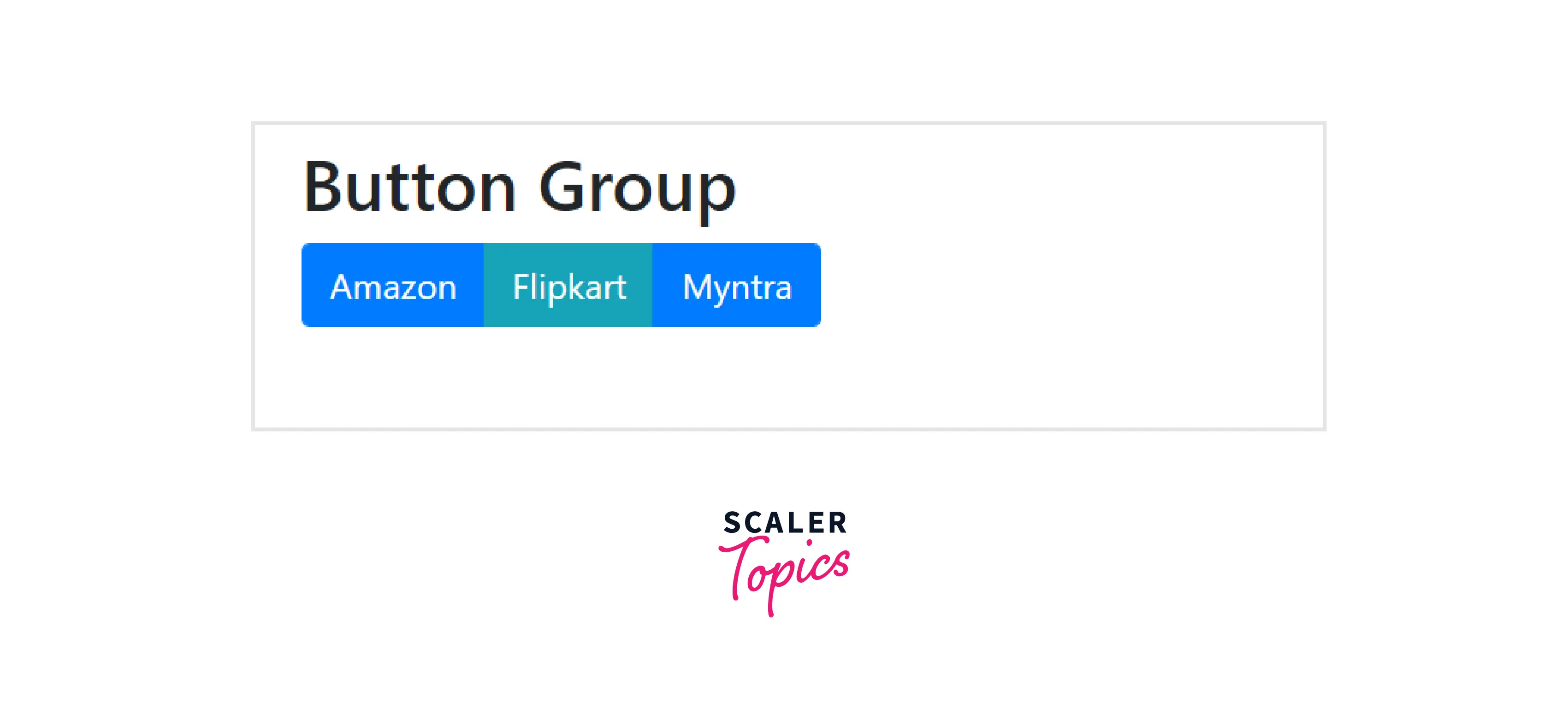
e. Button group
- It is a collection of buttons arranged in a single line and can be positioned vertically and horizontally.
- To create the basic button group, use the .btn-group class inside <div> element.
The following example demonstrates the usage of the basic button group:
Example Code:
Output:
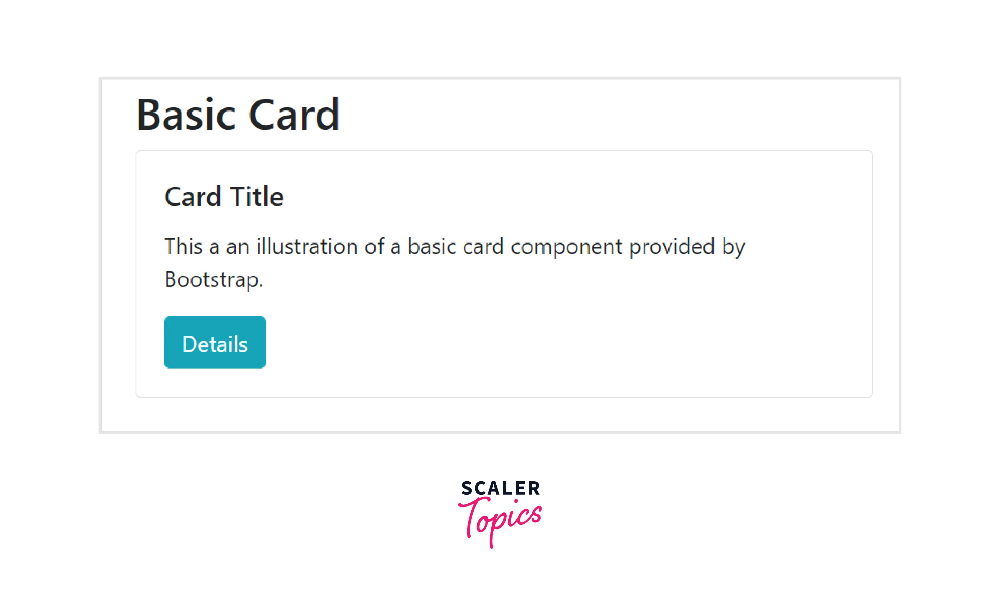
f. Cards
- Bootstrap provides cards which is a potent and helpful content container. It has a little padding around its content and includes various options like headers and footers, display options, and different colours.
- Cards can have different types of content like images, list groups, text, links, and more.
- To use a basic card, add the .card class to the <div> element and place the content inside the .card-body class.
The following example demonstrates the usage of a basic card:
Example Code:
Output:
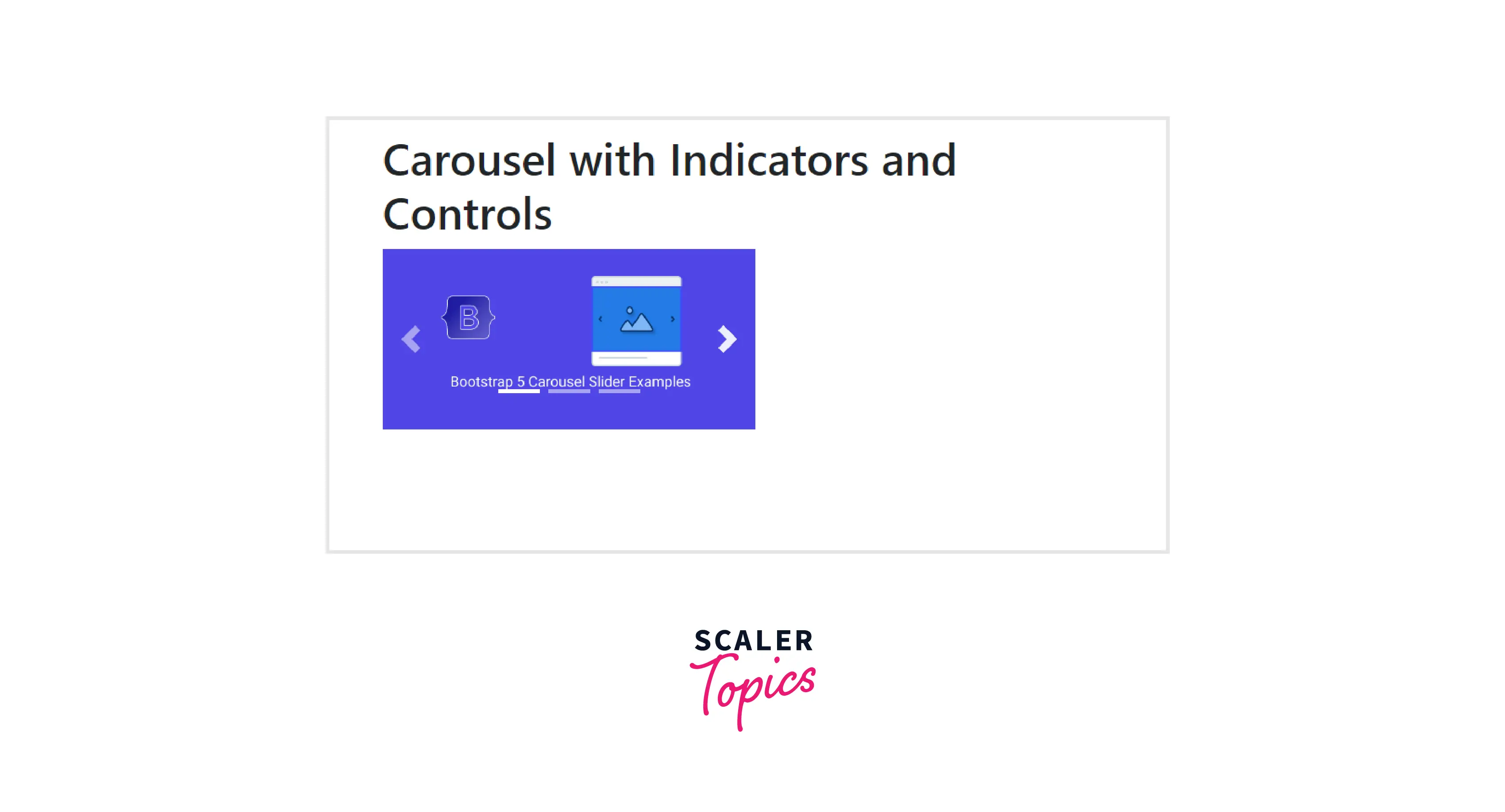
g. Carousel
- Carousels are used to implement an image slideshow on our webpage to make the website look more attractive. Carousels are built with CSS 3D transforms and a bit of Javascript.
- You can customize the carousels according to our needs. For example, to add an indicator or previous/following controls.
- To implement the carousel on the web page:
- First, add the .carousel and .slide classes to the container along with an id.
- Next, define the slides in a div with the class .carousel-inner and .carousel-item for each slide.
- The carousel will not be visible unless the .active class is added to one of the slides. Hence, add the .active class
The following example demonstrates the usage of a Carousel:
Example Code:
Output:
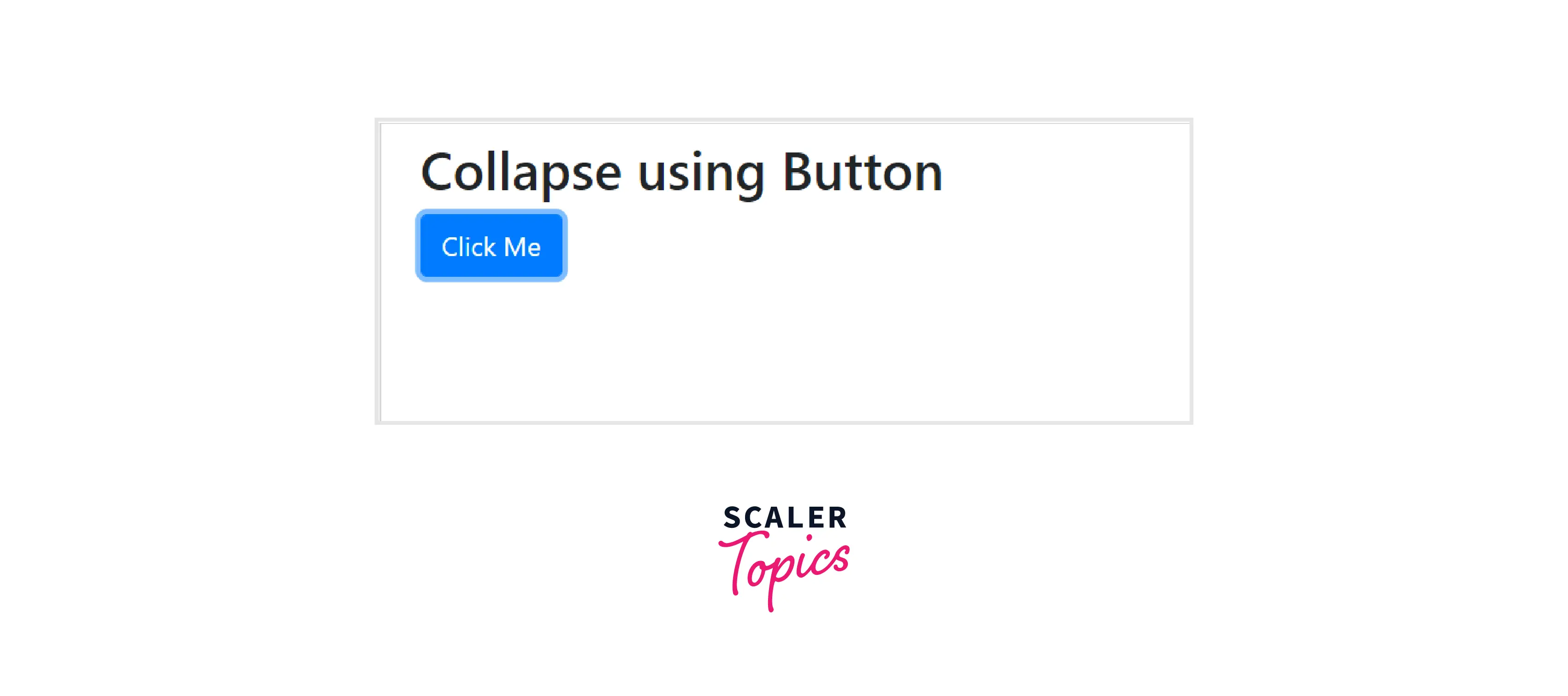
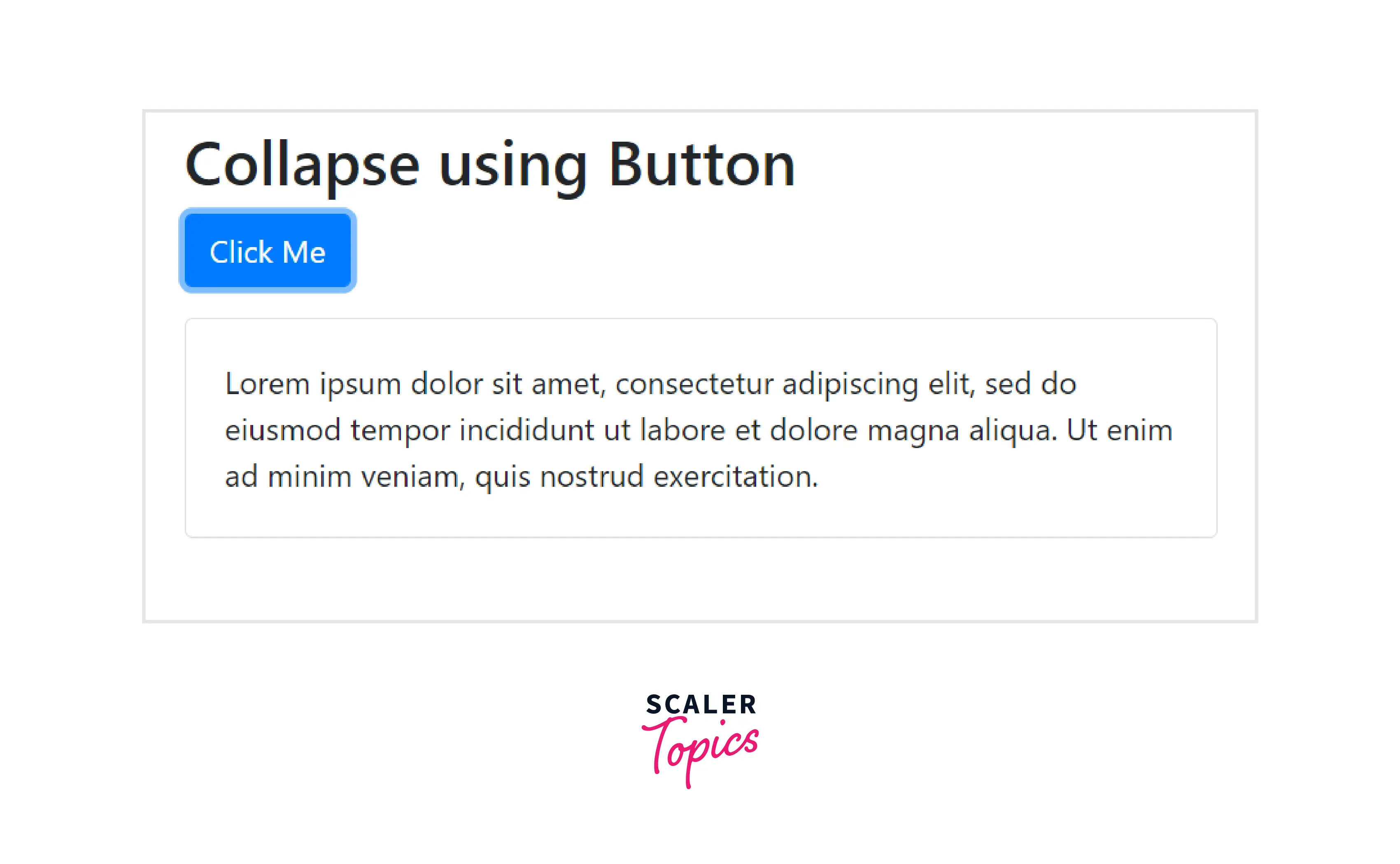
h. Collapse
- The collapse component is a Javascript plugin that shows or hides the content using the .collapse class.
- The content can be collapsed by including the data-toggle="collapse" attribute on an anchor or button element.
- These elements' id should match the content's id to be collapsed The following example demonstrates the usage of a Collapse using Button:
Example Code:
Output:
Initially
After clicking on the button
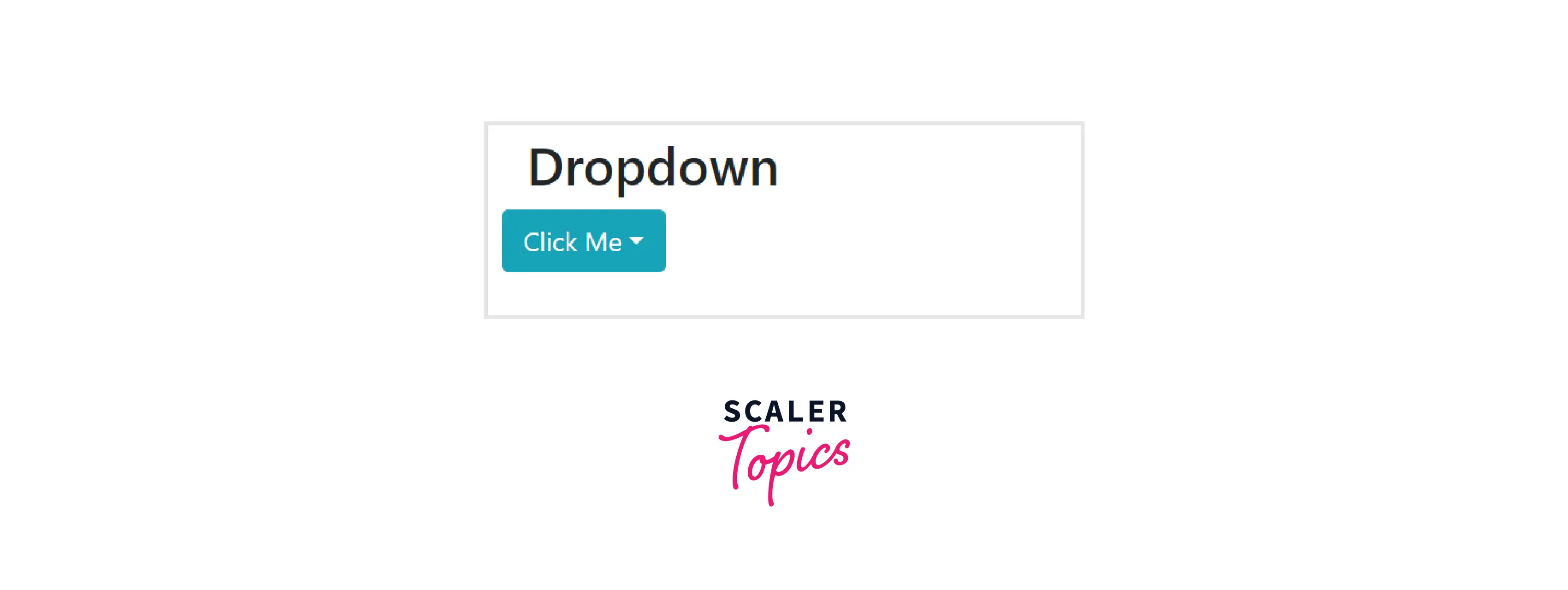
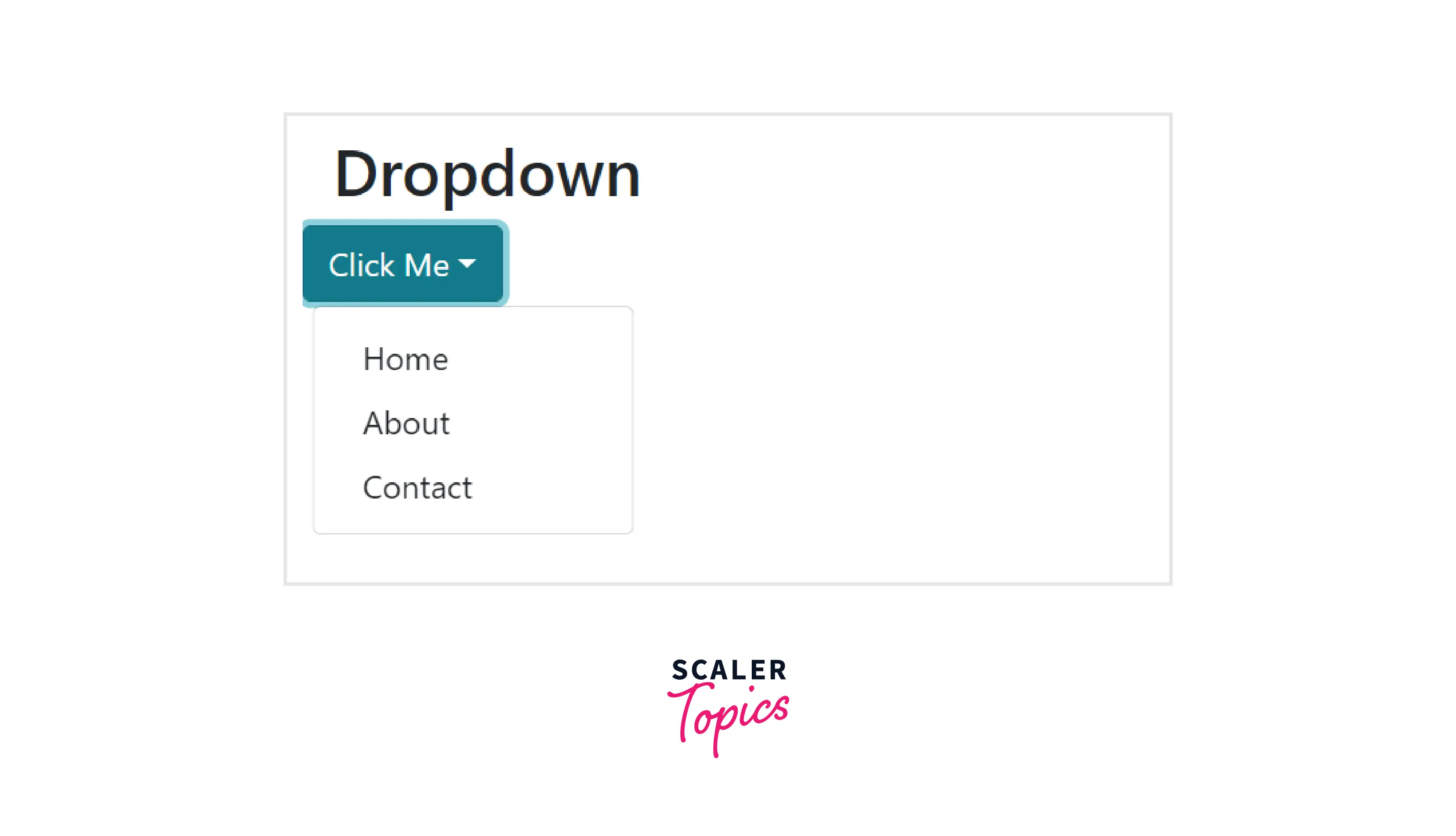
i. Dropdowns
- Toggleable contextual menus that display links as lists are called dropdown menus.
- To use the dropdown component, wrap the dropdown menu within the .dropdown class.
The following example illustrates a basic dropdown menu:
Example Code:
Output:
Initially
After clicking on the button
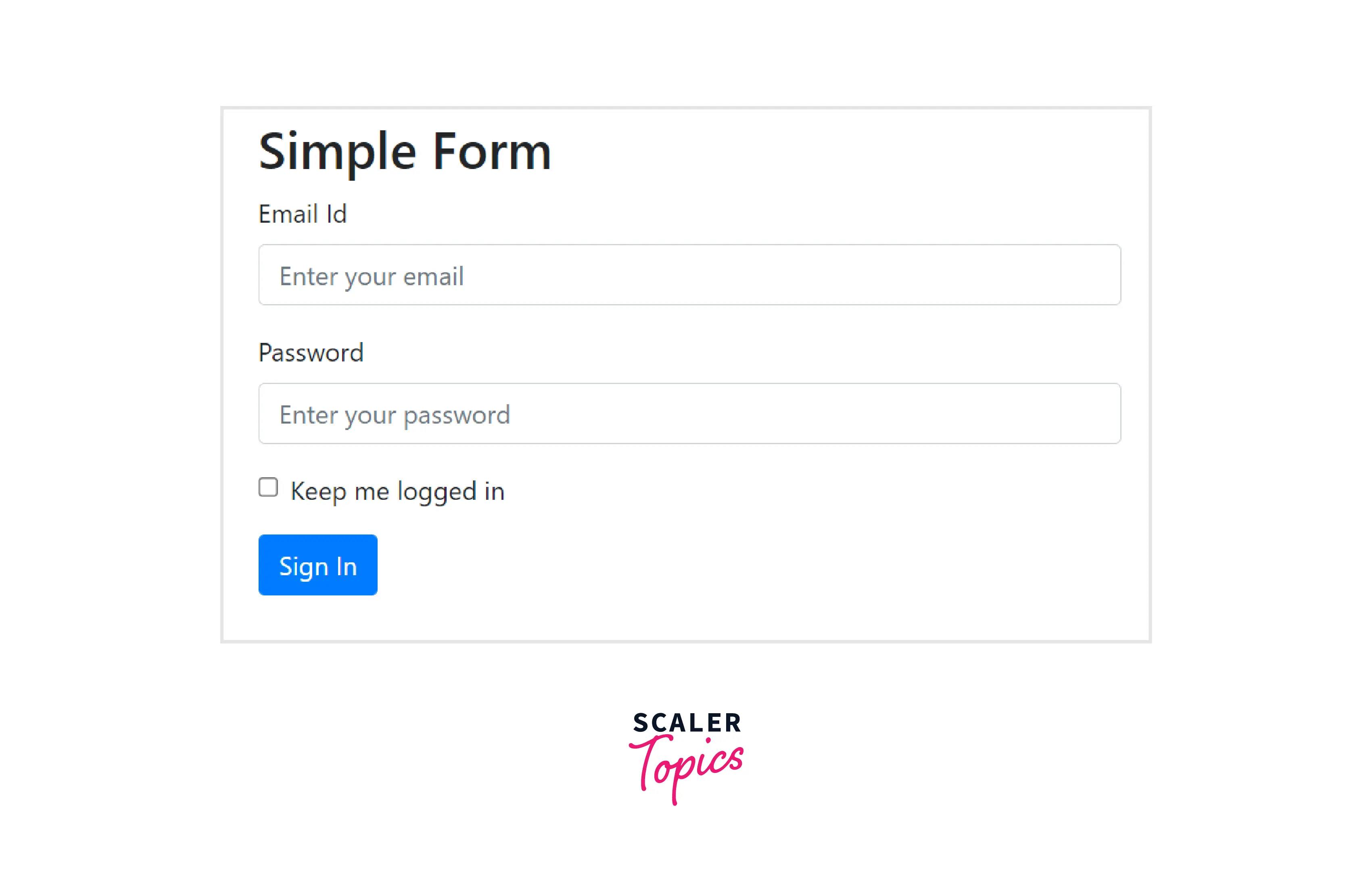
j. Forms
- The form element is used to collect multiple user inputs by using fields such as checkboxes, labels or text fields, etc.
- To use the form component, wrap labels and controls in a <div> element with the .form-group class and all the textual <input>, <textfield>, and <select> elements with the .form-control class.
- Bootstrap provides two layouts. They are stacked and inline.
The following example illustrates a simple form:
Example Code:
Output:
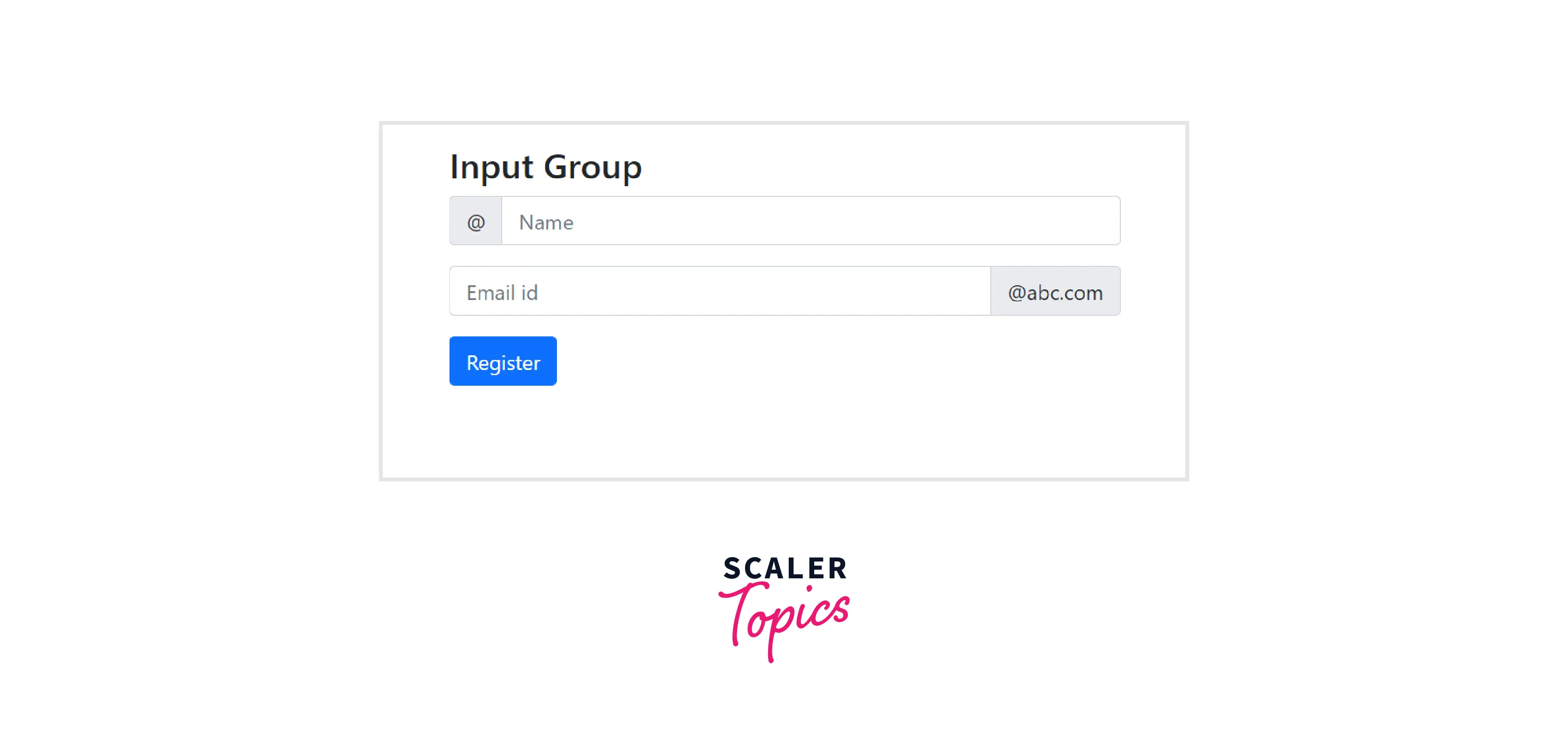
k. Input group
- Input Groups enhance form controls by adding a button, an icon, or text on either side of the input field as a reference text.
- To create an input group, add the .input-group class within <div> element.
The following example illustrates a basic input group:
Example Code:
Output:
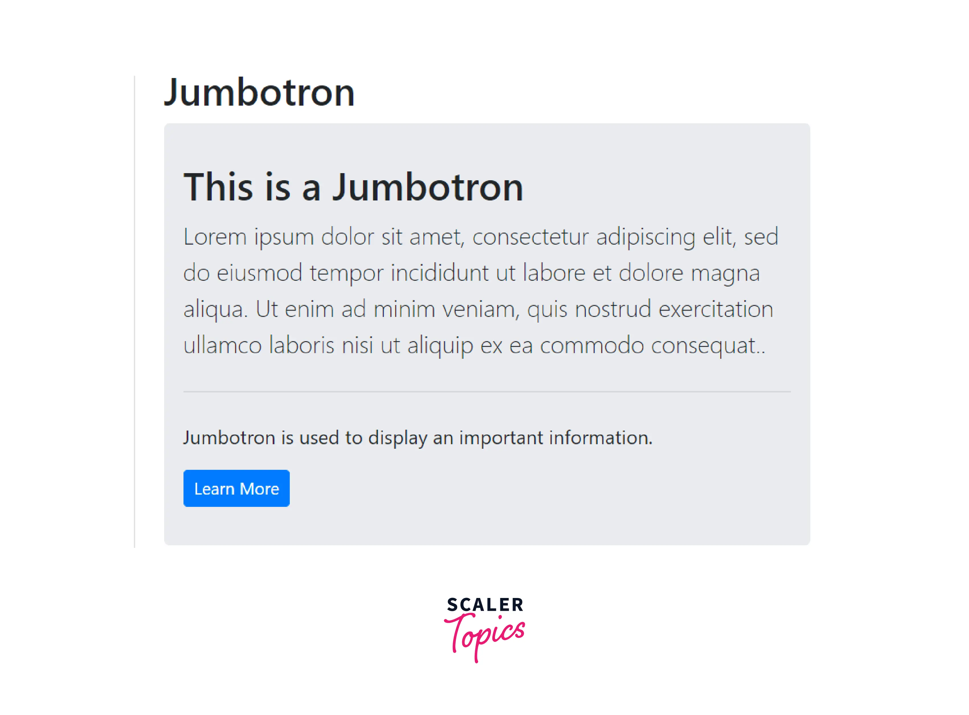
l. Jumbotron
- It draws extra attention to any unique content or information by adding a lot of margins and increasing the size of headings, making them more prominent and eye-catching.
- You can create a jumbotron by adding the.jumbotron class to <div> element.
- Jumbotron was introduced in Bootstrap version 3. It is no longer supported in Bootstrap version 5.
The following example illustrates a Jumbotron:
Example Code:
Output:
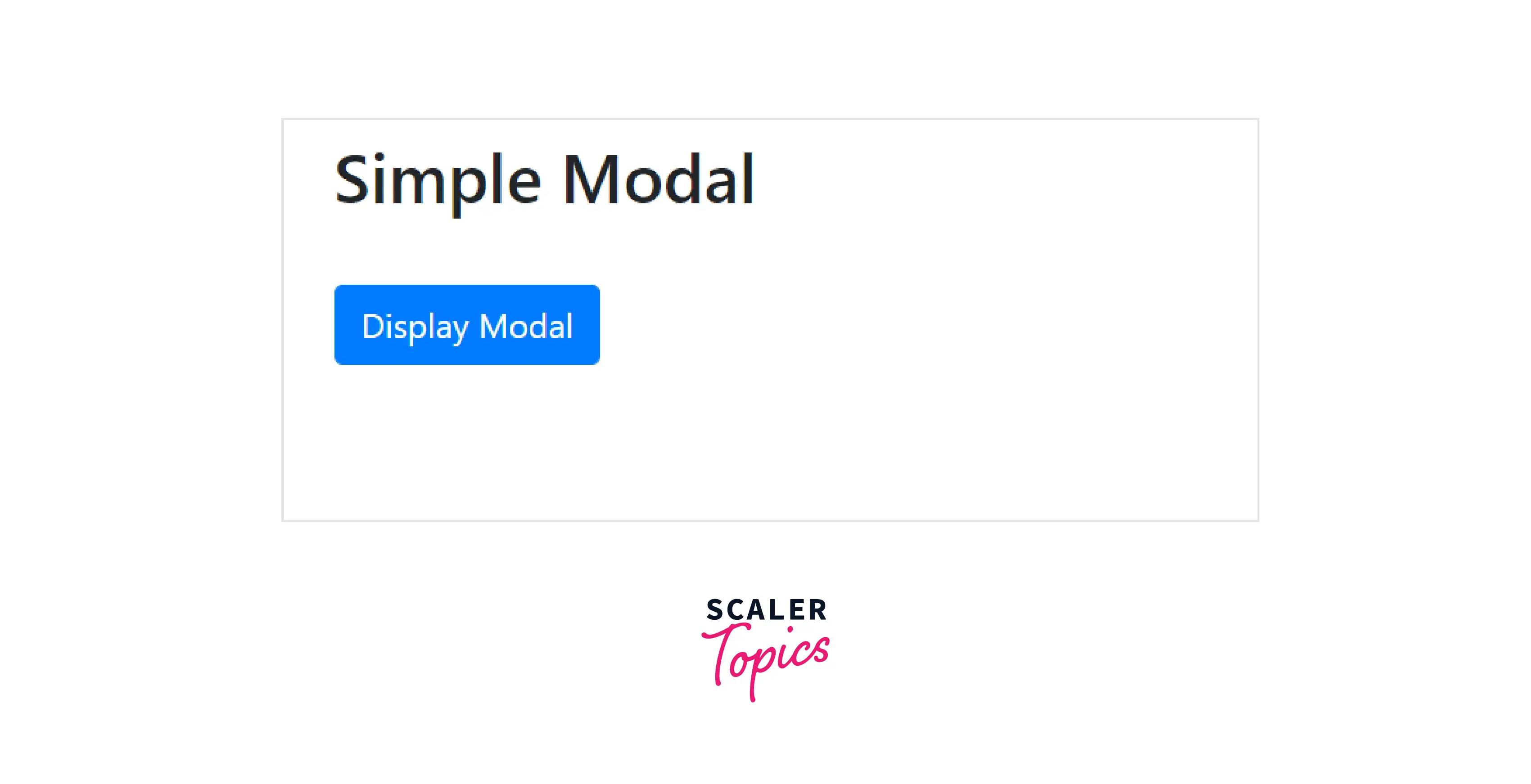
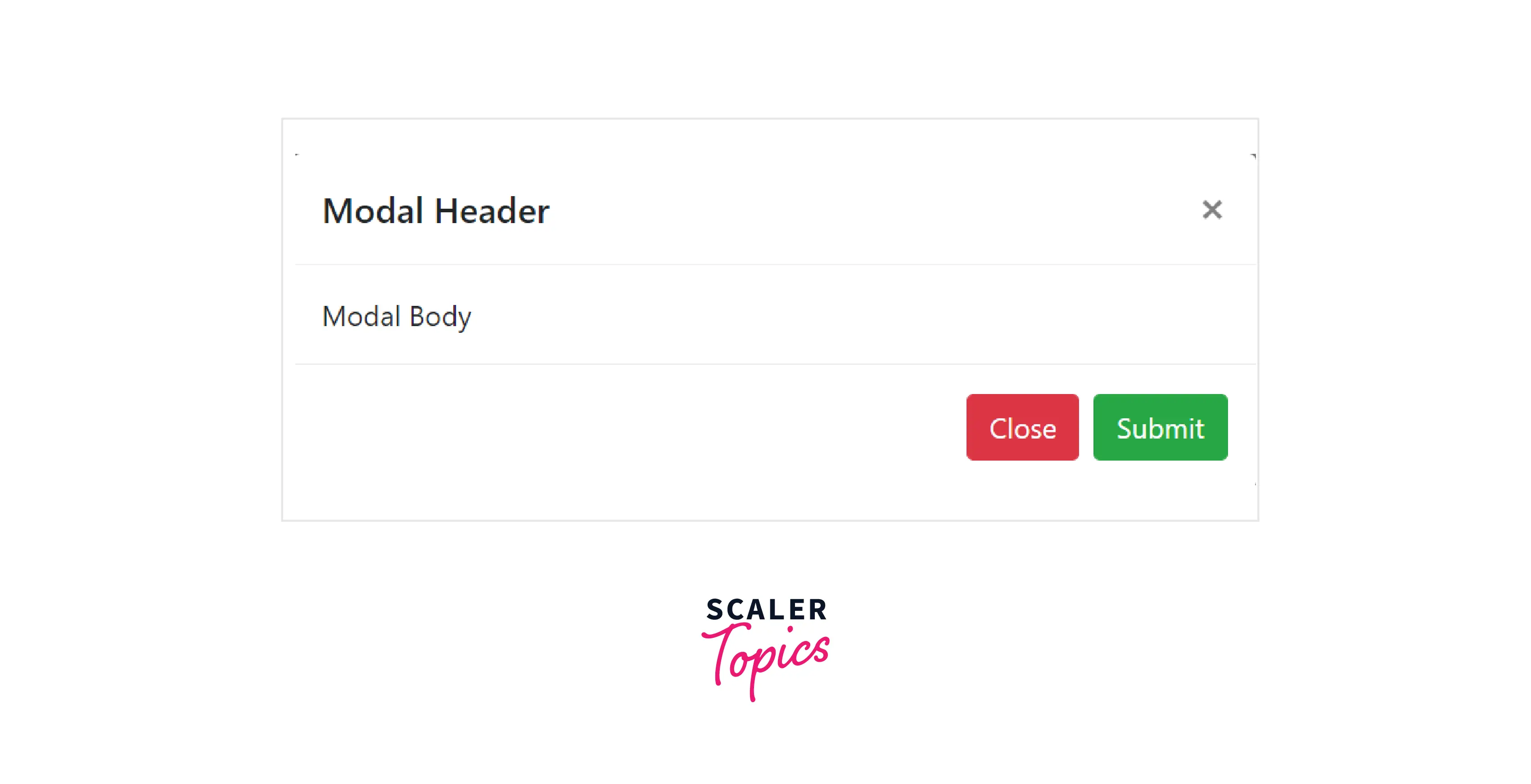
m. Modal
- A small dialogue box/popup window is positioned over the parent window.
- It presents information from an external source that allows for some interaction without leaving the parent window.
- To create a modal, add the .modal class and attribute data-toggle = "modal" on an element, like a link or button, along with a data-target = "#idname" or href = "#idname" to target a particular modal to toggle.
The following example illustrates a simple modal window:
Example Code:
Output:
Initially
After clicking on the button
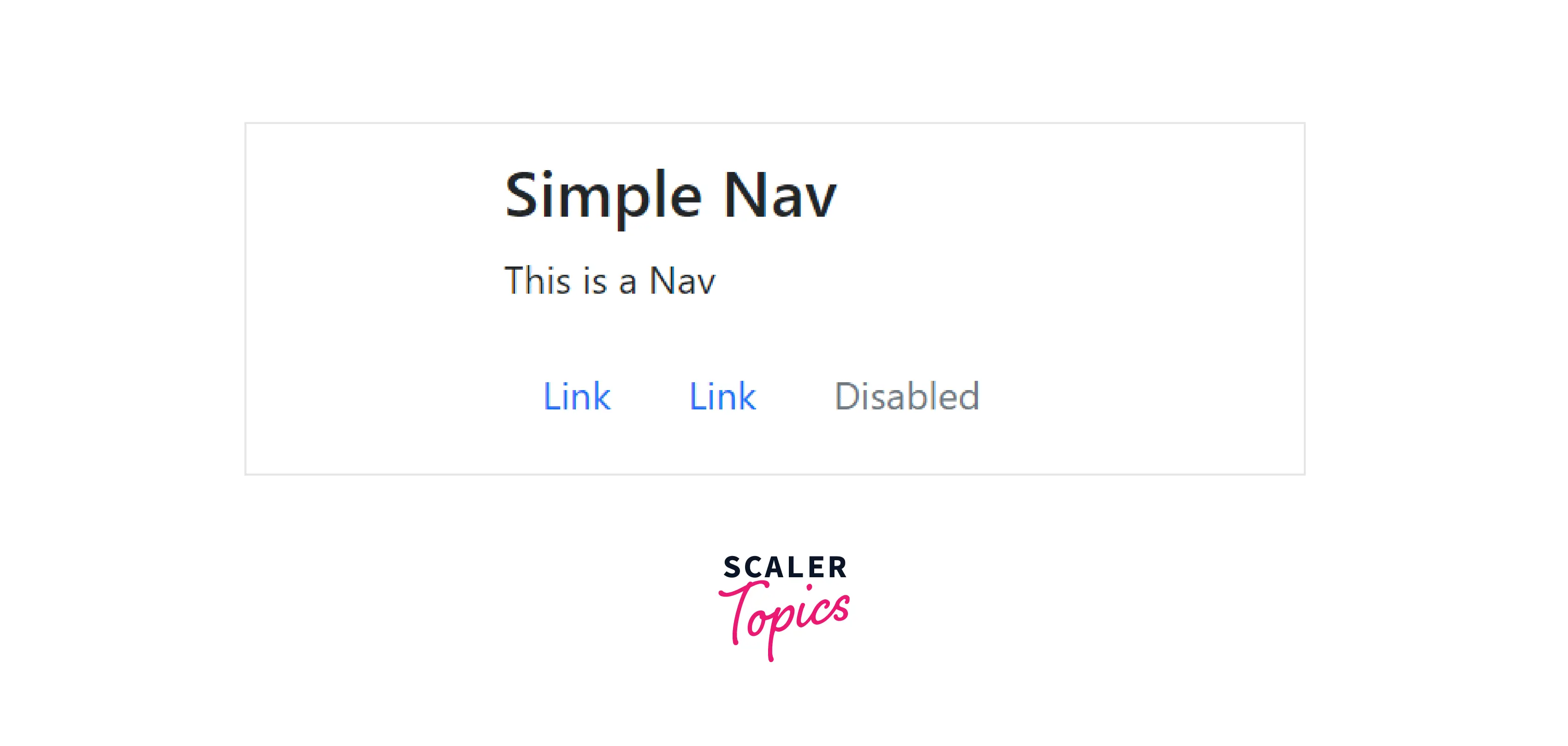
n. Navs
- It creates a basic and simple horizontal navigation menu using the .nav base class.
- To create a nav menu, add the .nav class to the <ul> element followed by nav items and add the nav.link class to generate the link for the nav items.
The following example illustrates this:
Example Code:
Output:
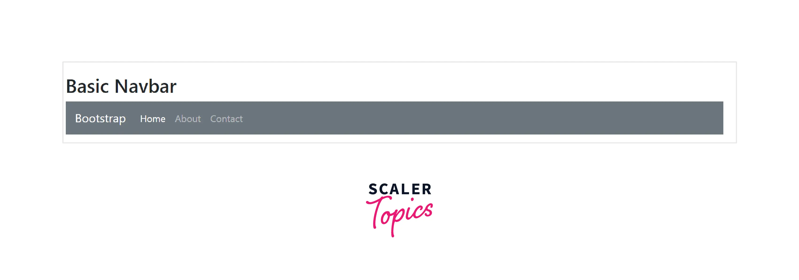
o. Navbar
- Every website uses a navbar or navigation bar to improve usability, making it easier for visitors to navigate the site and conduct direct searches for topics of interest.
- <nav class="navbar navbar-default"> creates a standard navigation bar.
- For our use, Bootstrap offers a variety of navigation bar types:
- Basic navbar
- Inverted Navbar
- Right-Aligned Navbar
- Coloured Navigation Bar
- Fixed navigation bar
- Collapsible Navigation Bar
- Drop-Down menu Navbar
The following example illustrates a basic navbar:
Example code:
Output:
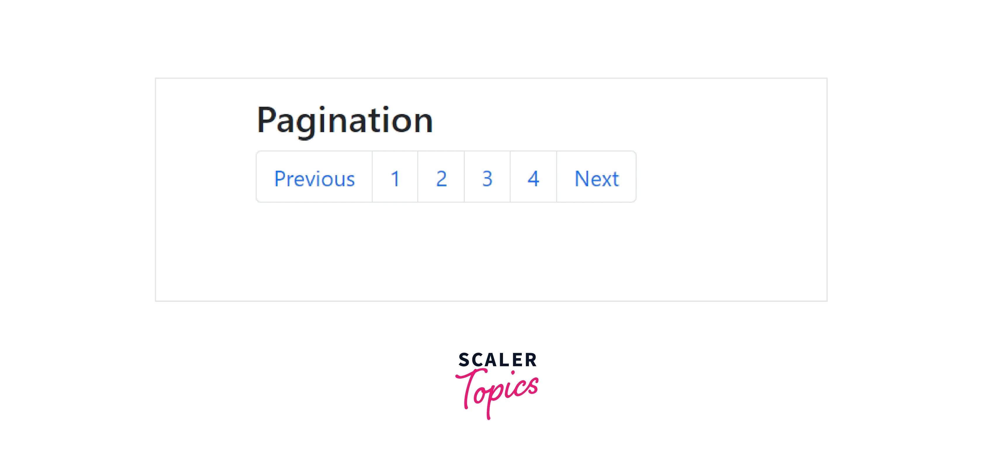
p. Pagination
- If your website has many pages, you might want to add some kind of pagination to each page. Pagination is a method of navigating between pages on a website.
- To create a basic pagination, add the. pagination class to an <ul> element. The following example illustrates the pagination:
Example Code:
Output:
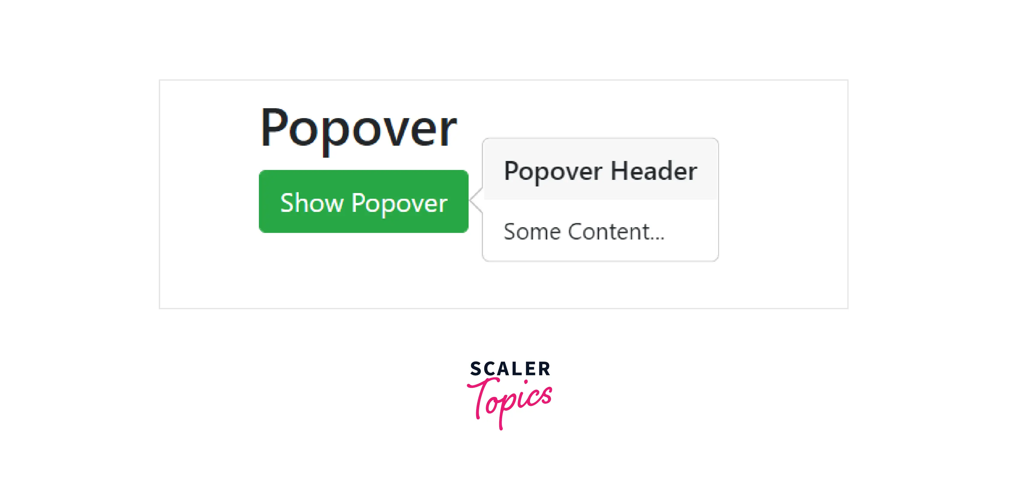
q. Popovers
-
A Bootstrap Popover is a feature that can be used to give any website a more dynamic appearance.
-
Popovers typically show more details about any element and appear when the mouse pointer hovers over that element.
-
If you click on any element that you include in your script in the popover, it will display a specific message as a popover, and you can see your message as defined in the script.
-
To create a popover in Bootstrap, simply add a few attributes, and we're done.
- data-toggle="popover"
- title="Popover Header"
- data-content="Some content inside the box"
The following example illustrates a popover:
Example Code:
Output:
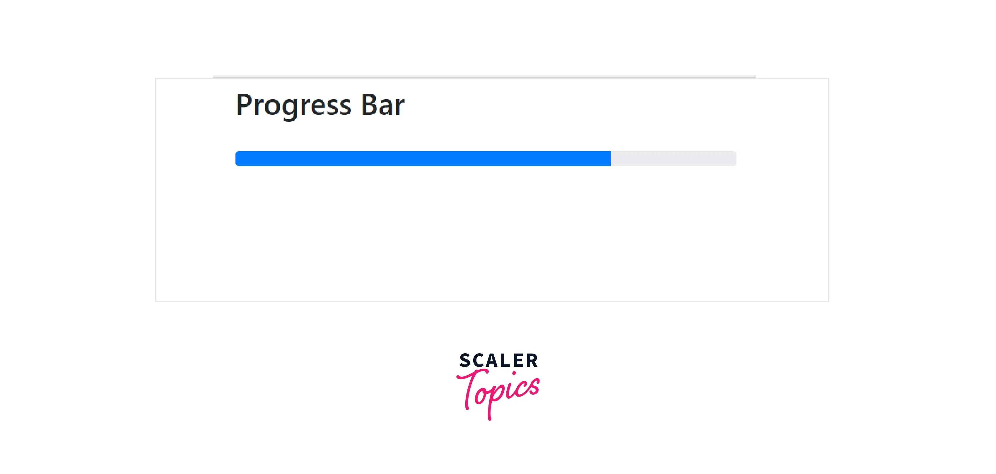
r. Progress
- On a computer, a progress bar is used to show the status of a process. The progress bar shows how much of the process has already been completed and how much is left.
- Add a .progress class to a <div> element and the .progress-bar class inside its child element to create a default progress bar.
The following example illustrates the progress bar:
Example Code:
Output:
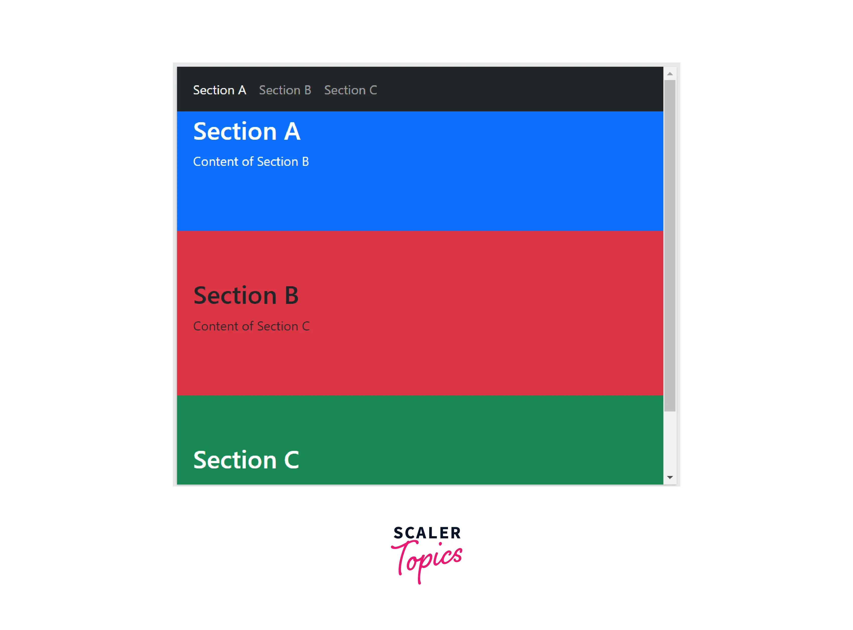
s. Scrollspy
-
A beautiful feature that can be incorporated into your website is scroll spy.
-
To use scrollspy, set data-spy = "scroll" attribute of the content to be scrolledd.
-
By using the scroll position to determine which link is active in the viewport, Scrollspy automatically updates Bootstrap navigation or list group components.
The following example illustrates the Scrollspy:
Example Code:
Output:
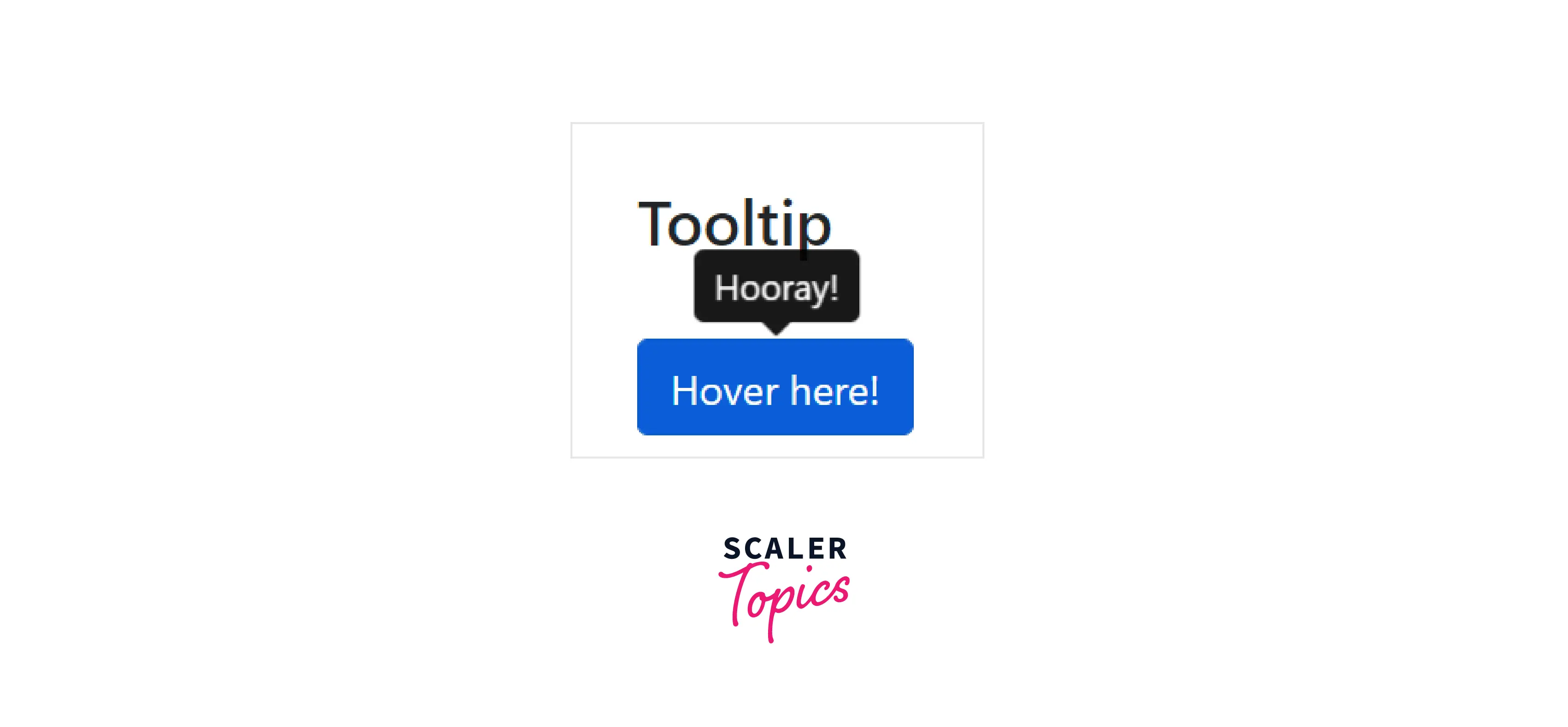
t. Tooltips
-
When the user hovers the mouse pointer over an element, a small pop-up box called a tooltip appears. The tooltip can be very helpful for describing various website elements.
-
Add the data-toggle="tooltip" attribute to an element to produce a tooltip. The text that should be displayed inside the tooltip can be specified using the title attribute.
The following example illustrates the tooltips:
Example Code:
Output:
Conclusion
-
Bootstrap is a widely used CSS framework for implementing responsive, mobile-first websites. The latest version is Bootstrap 5.0, with various utilities to make our styling and work more accessible.
-
Bootstrap provides numerous pre-styled components that you can directly use to make your website beautiful and interactive.
-
These components are based on base-modifier terminology, where the base class(like the .btn class) has shared properties, and the modifier class(like the .btn-info class) provides unique styles to the components.
-
The components are built using HTML, CSS, and Javascript.Some of them include Buttons, Forms, Alerts, Pop-ups, Modals, and many more.