Bootstrap Containers
In Bootstrap, the container sets content margins for responsive layouts. It encompasses row elements, which, in turn, serve as containers for columns, constituting the grid system within the framework.
Container Types
There are three types of containers in the latest version of Bootstrap (Bootstrap 5). They are:
1. Default container 2. Fluid container 3. Responsive container
Let us discuss them in detail.
Default Container
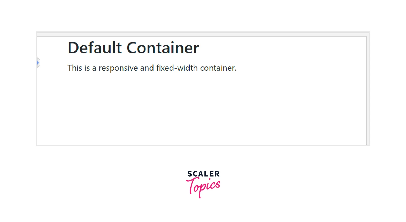
- The .container class creates the default container. This container is responsive and has a fixed width. The max width of the default container changes at each breakpoint.
- The div containing the .container class will have a fixed left and right margin and will not occupy the entire viewport or the parent div.
The following example illustrates a default container. Try this code to see how the container scales on different viewports of different sizes.
Code:
Output:

Fluid Containers
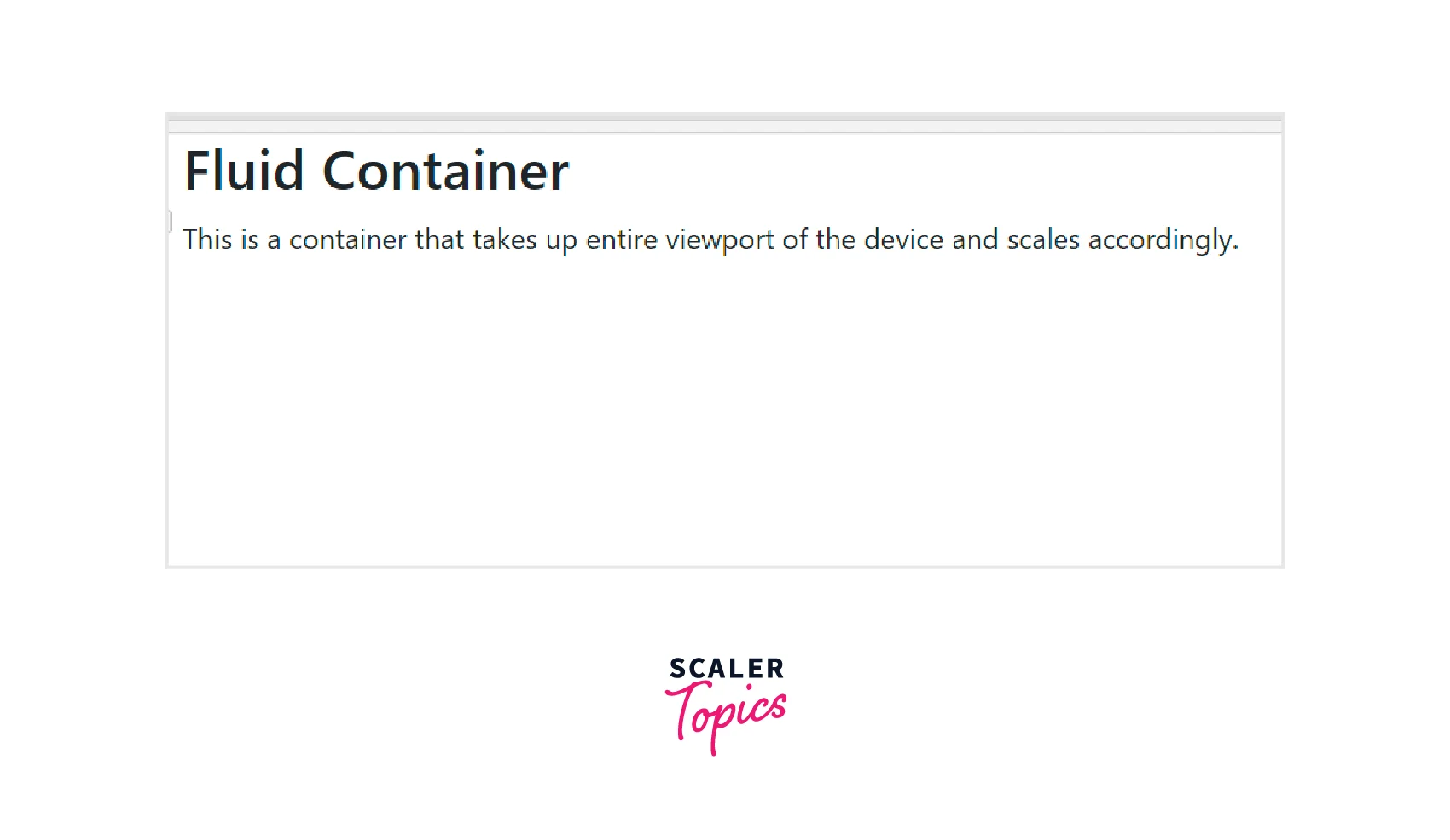
- The .container-fluid class is used to build a full-width container that spans the entire width of the viewport.
- Regardless of the screen size, the container will always have a 100% width.
- The div with class container-fluid will occupy the entire width of the viewport and will scale according to the viewport size.
The following example illustrates a fluid container. Try this code on different viewports of different sizes to see the responsiveness of the container.
Code:
Output:

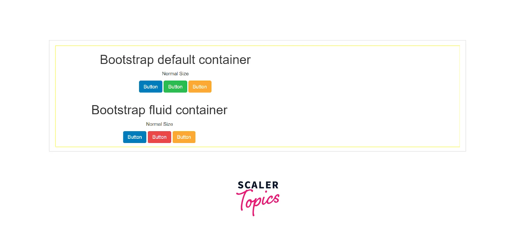
The example below demonstrates the different scaling of default and fluid containers on a viewport. Code:
Output:

Responsive Containers
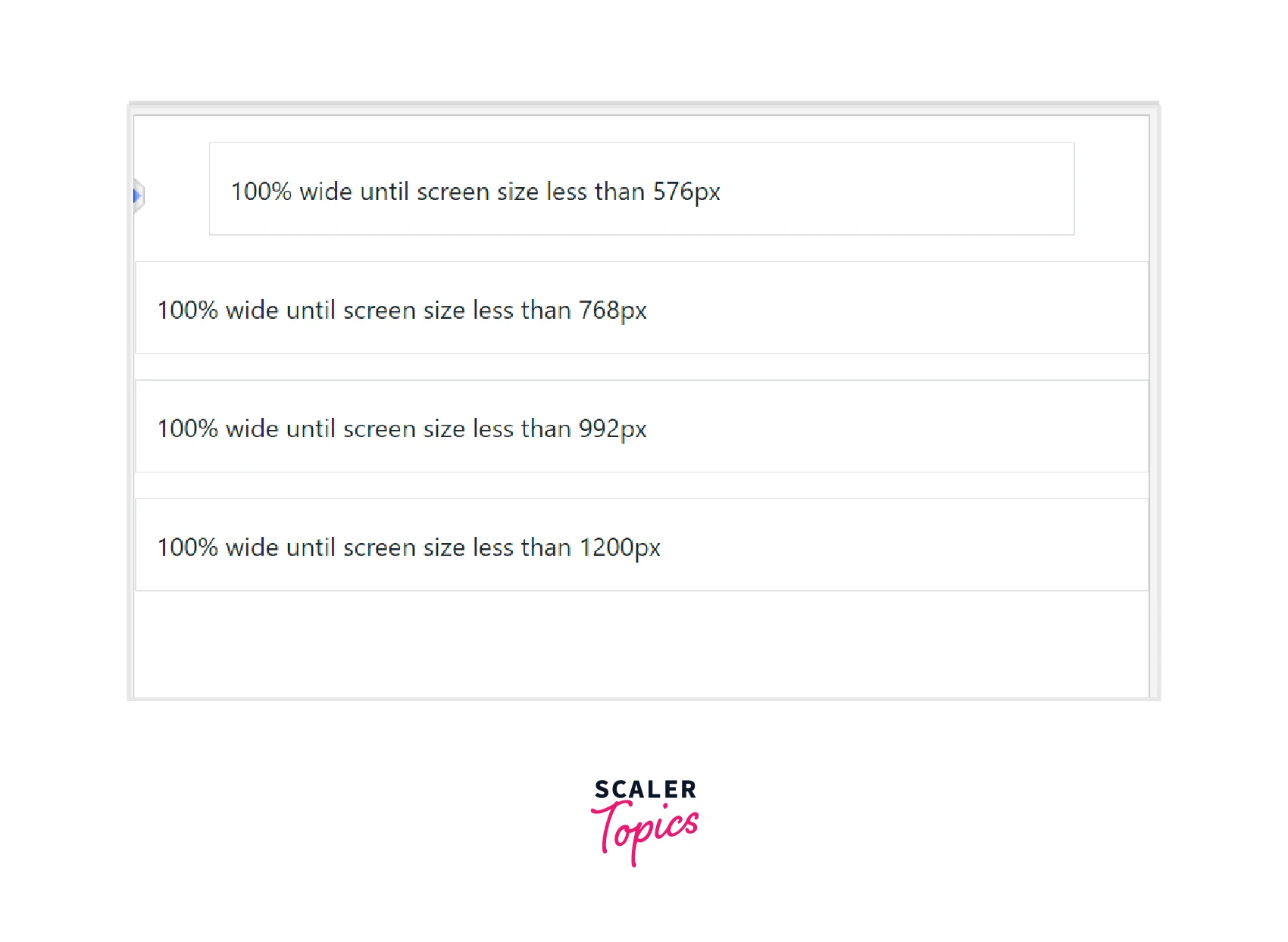
- When using responsive containers, you can specify a class that will be 100% wide up until the stated breakpoint is reached. The class .container-{breakpoint} is used for responsive containers. After that, we apply maximum widths for all subsequent breakpoints.
- For example, .container-md is 100% wide to start until the md breakpoint is reached(viewport width ≥ 992px), where the container will scale up with md, lg, xl, and xxl.
The following code illustrates the various responsive container classes. Try this code on different viewports of different sizes for better understanding. Code
Output:

How Do Containers Work?
Containers are the most fundamental Bootstrap layout component necessary when using the default grid system. The purpose of containers is to contain, pad, and occasionally center the content they hold. Although containers can be nested, the majority of layouts do not require nested containers.
Bootstrap provides three different container classes:
- .container: It sets a max width at each responsive breakpoint.
- .container-fluid: It has a width of 100% at all breakpoints.
- .container-{breakpoint}: It is width: 100% until the specified breakpoint
For example, while using the .container class, which sets a max width at each responsive breakpoint, the width of the container will be:
- 100% if the viewport width is less than 576px.
- 540px if the viewport width is greater than or equal to 576px but less than 768px
- 720px if the viewport width is ≥768px but <992px
- 960px if the viewport width is ≥992px but <1200px
- 1140px if the viewport width is ≥1200px but <1400px
- 1320px if the viewport width is ≥1400px.
Similarly, when you use the .container-lg class, the width will be 100% of the viewport until the specified breakpoint(here -lg). The actual width of the container at different viewport sizes will be:
- 100% until the viewport width is <992px
- 960px if the viewport width is ≥992px but <1200px
- 1140px if the viewport width ≥1200px but <1400px
- 1320px if the viewport width is ≥1400px
The table below demonstrates how each container's max-width varies across each breakpoint.
| Container Classes | Extra Small (<576px) | Small (>=576px) | Medium (>=768px) | Large (>=992px) | X-Large (>=1200px) | XX-Large (>=1400px) |
|---|---|---|---|---|---|---|
| .container | 100% | 540px | 720px | 960px | 1140px | 1320px |
| .container-sm | 100% | 540px | 720px | 960px | 1140px | 1320px |
| .container-md | 100% | 100% | 720px | 960px | 1140px | 1320px |
| .container-lg | 100% | 100% | 100% | 960px | 1140px | 1320px |
| .container-xl | 100% | 100% | 100% | 100% | 1140px | 1320px |
| .container-xxl | 100% | 100% | 100% | 100% | 100% | 1320px |
| .container-fluid | 100% | 100% | 100% | 100% | 100% | 100% |
SASS Predefined Container Class
- Bootstrap generates a series of predefined container classes to help you build beautiful layouts. You may customize these predefined container classes by changing the Sass map (found in _variables. scss) that defines them.
For Example:
- With the Sass mixin, you can make your containers in addition to customizing Sass.
For Example:
SASS stands for Syntactically Awesome Stylesheet. It is an extension of CSS and is entirely free to use. Sass is a CSS pre-processor and is completely compatible with all CSS versions. It reduces the repetition of CSS and therefore saves coding time. For a detailed understanding of SASS, visit this official documentation.
Conclusion
- Containers are considered the most fundamental layout element of Bootstrap 5 that are required to contain, align and wrap elements inside them along with specific padding and margin.
- Containers are essential for building a grid layout.
- Bootstrap provides three types of containers: Default container, fluid container, and Responsive Container.
- You can create a default container by applying the .container class. It is a responsive, fixed-width container. Its max-width changes at each breakpoint.
- For the fluid container, use the .container-fluid class. The fluid container is a full-width container and spans the entire viewport width.
- The responsive container has a 100% width until the specified breakpoint. Use the .container-{breakpoint} class to create a responsive container. For example: .container-sm will be of 100% width until the sm breakpoint is reached.
- All these containers and their implementations are mentioned in the article above.
