Bootstrap Forms
Bootstrap forms are essential for website user data submission and simplify form creation with classes for styling and alignment. This framework offers various layouts and components, making it easier than manual CSS styling for tasks like user registrations, orders, and contact forms.

Bootstrap Form Layouts
Bootstrap offers three different form layout types:
- Vertical form (default layout)
- Horizontal form
- Inline form
Now let us understand these form layouts in detail in the next section.
Creating Forms with Bootstrap
- With a predefined set of classes, bootstrap's forms are a useful way to apply some default styles to form controls like input elements, labels, textareas, select elements, etc.
- Bootstrap includes a basic form structure, and each form control gets some automatic global styling. The forms can be created in different layouts provided by bootstrap. Let us understand how to create forms in different layouts one by one.
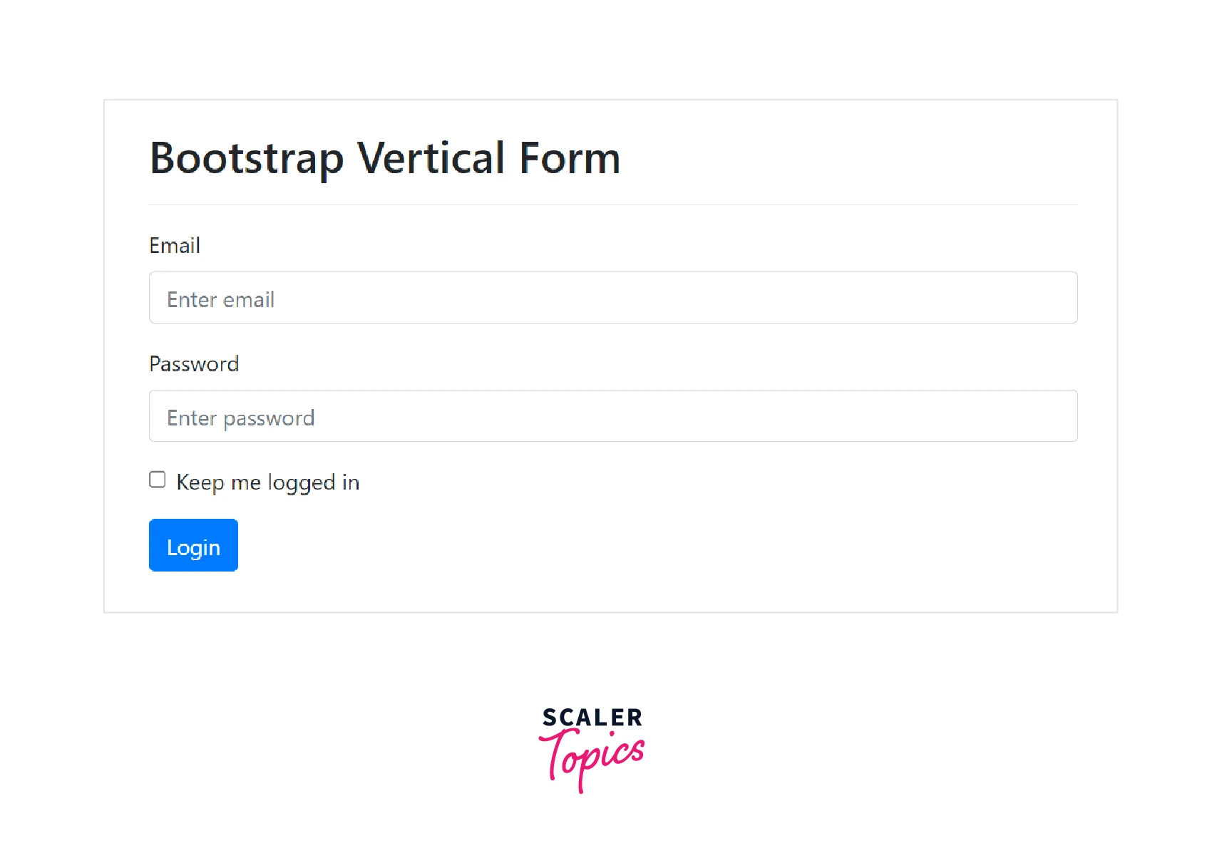
Creating Vertical Form Layout
To create a basic form with a vertical layout, follow these steps:
- Wrap the parent element inside of <form>.
- Wrap all the labels and form controls in a <div> with class .form-group to ensure proper spacing.
- Add the .form-control class to all the textual <input>, <textarea>, and <select> elements.
The following example illustrates how to create a simple vertical layout form with bootstrap.
Code:
Output:
Creating Horizontal Form Layout
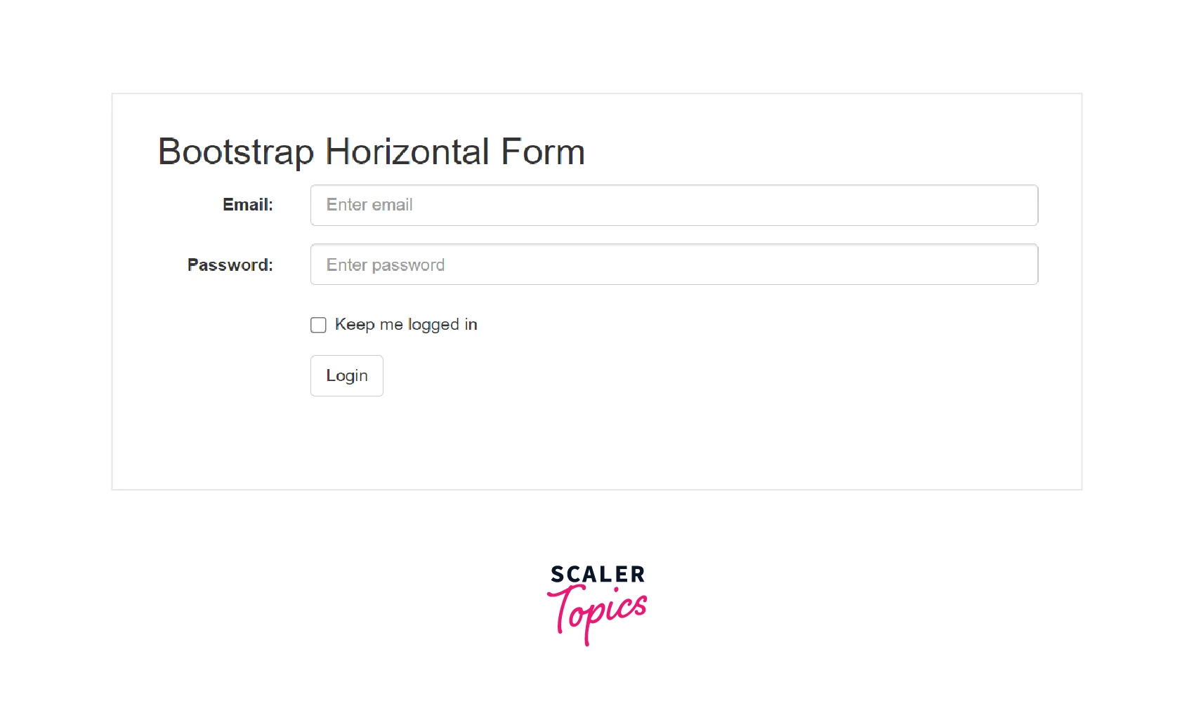
A horizontal form means that the input fields are aligned next to the labels (horizontal) on large and medium screens. Although, on smaller screens (viewport width 767px and below), the form will change to a vertical form (the labels are placed on top of input fields) in order to ensure proper rendering of the form according to the viewport size. Try out the example code given in this section on different screen sizes for better understanding.
To create a horizontal form layout, follow these steps:
- Add the .form-horizontal class to the parent <form> element.
- Wrap all the labels and input controls within a <div> with the .form-group class.
- Add the .control-label class to all the labels.
- To align labels and all the form controls in a horizontal layout, use Bootstrap's predefined grid classes.
The following example illustrates how to create a horizontal form layout using bootstrap:
Code:
Output:
Creating Inline Form Layout
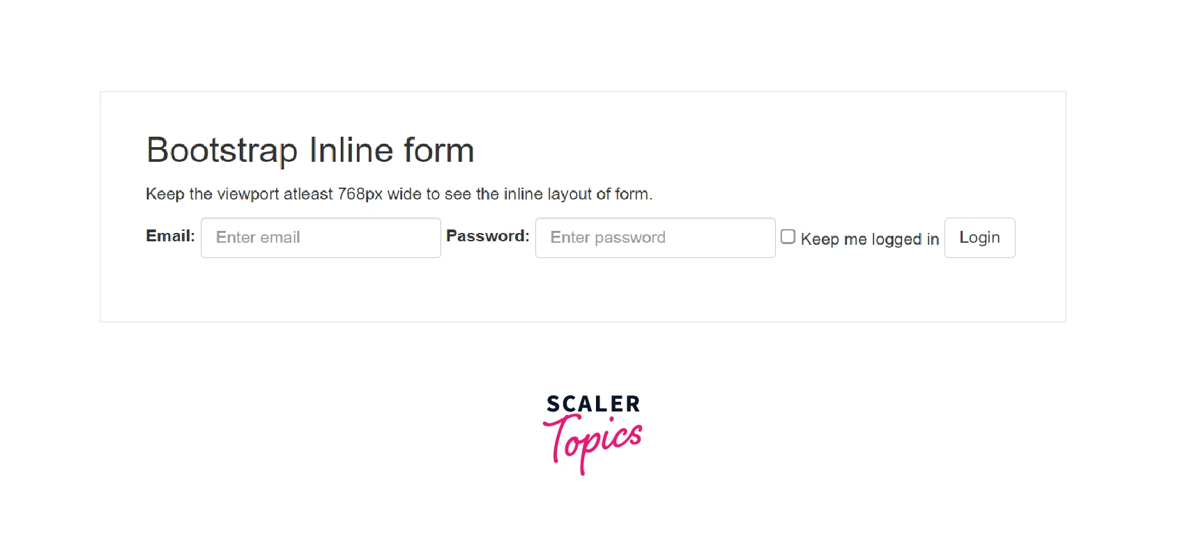
In an inline form, all of the elements are left-aligned and inline, and the labels are next to each other. This layout can only be applied to the forms whose viewports are at least 768px wide. On viewports less than 768px, the inline form will transform into a vertical form.
To create an inline form layout, follow these steps:
- Wrap all the labels and form controls in a <div> with class .form-group to ensure proper spacing.
- Add the .form-inline class to the <form> tag.
The following example illustrates how you can create an inline form:
Code:
Output:
Creating Responsive Form Layout
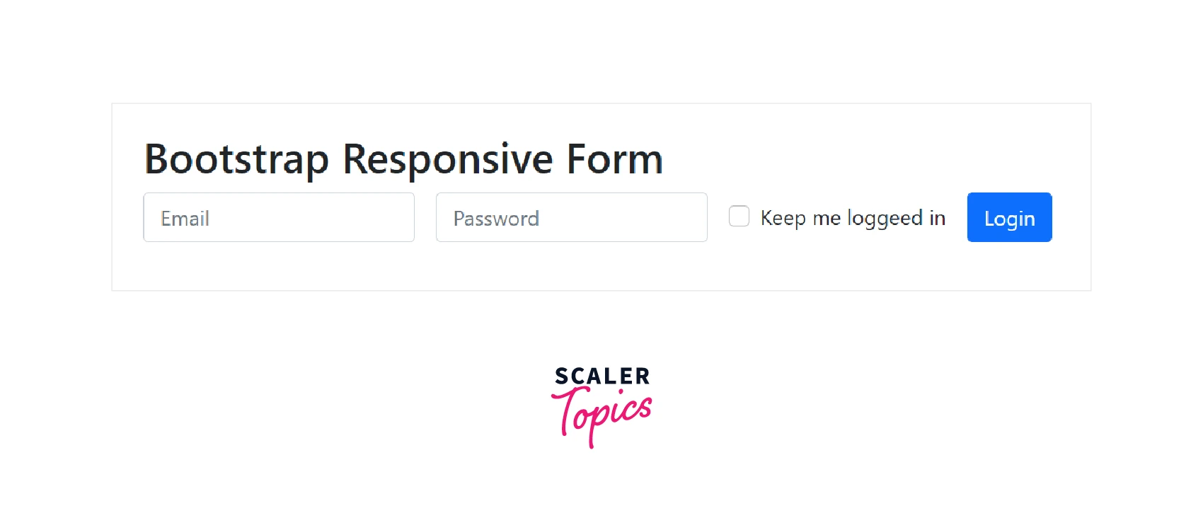
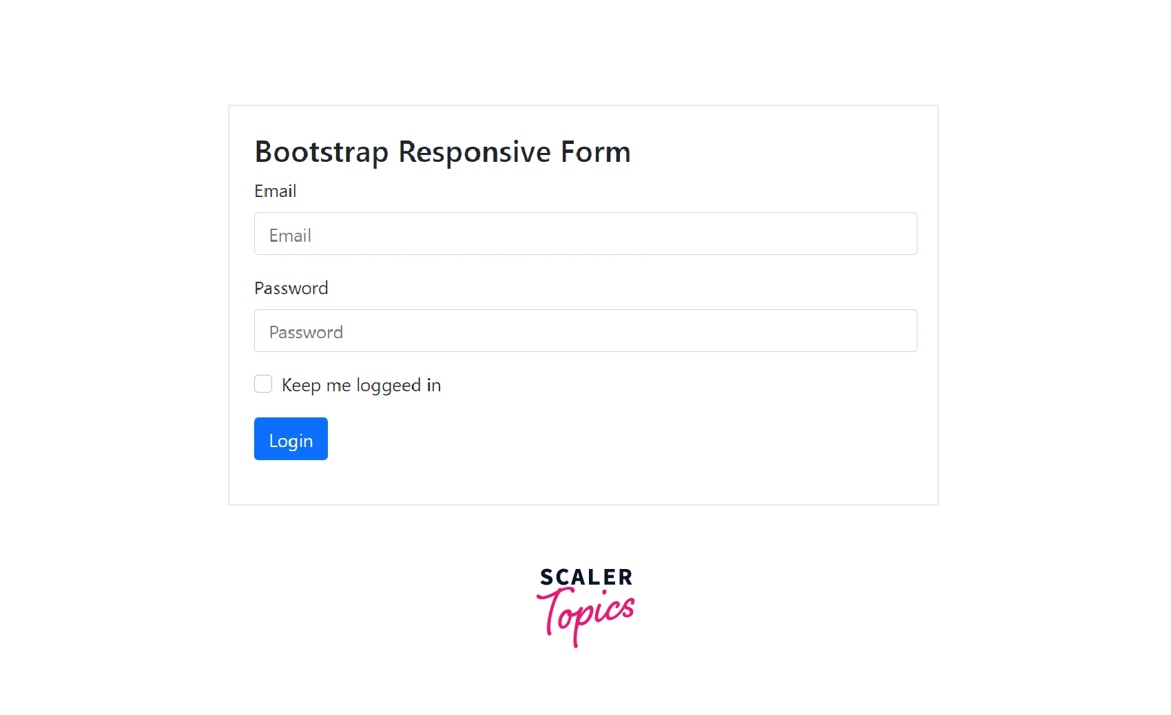
- You can make your forms responsive by utilizing grid classes with particular specified breakpoints.
- For example, if the specified breakpoint is 768px, the inline form will remain inline on the devices with a viewport width greater than or equal to 768px but will transform to a vertical layout form on smaller viewport widths.
The following example illustrates the responsive form layout:
Code:
Output: On viewports greater or equal to 768px (inline layout):
On smaller viewports (vertical layout):
Creating Static Form Control
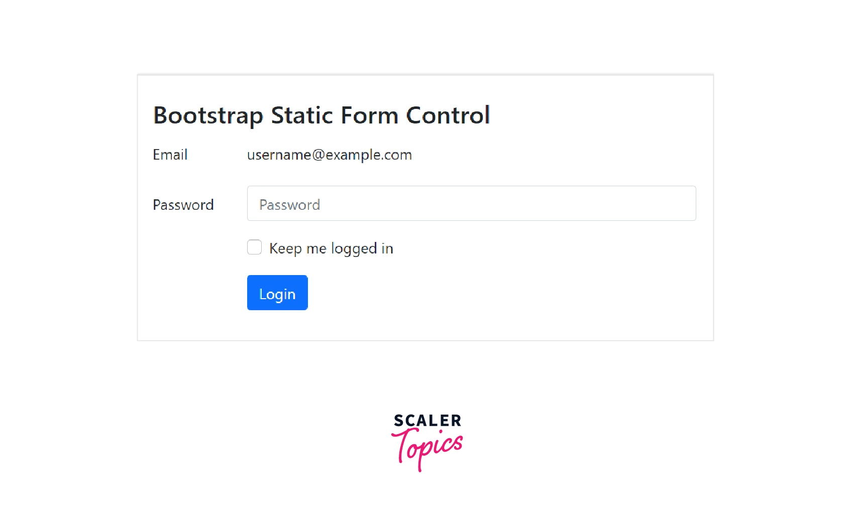
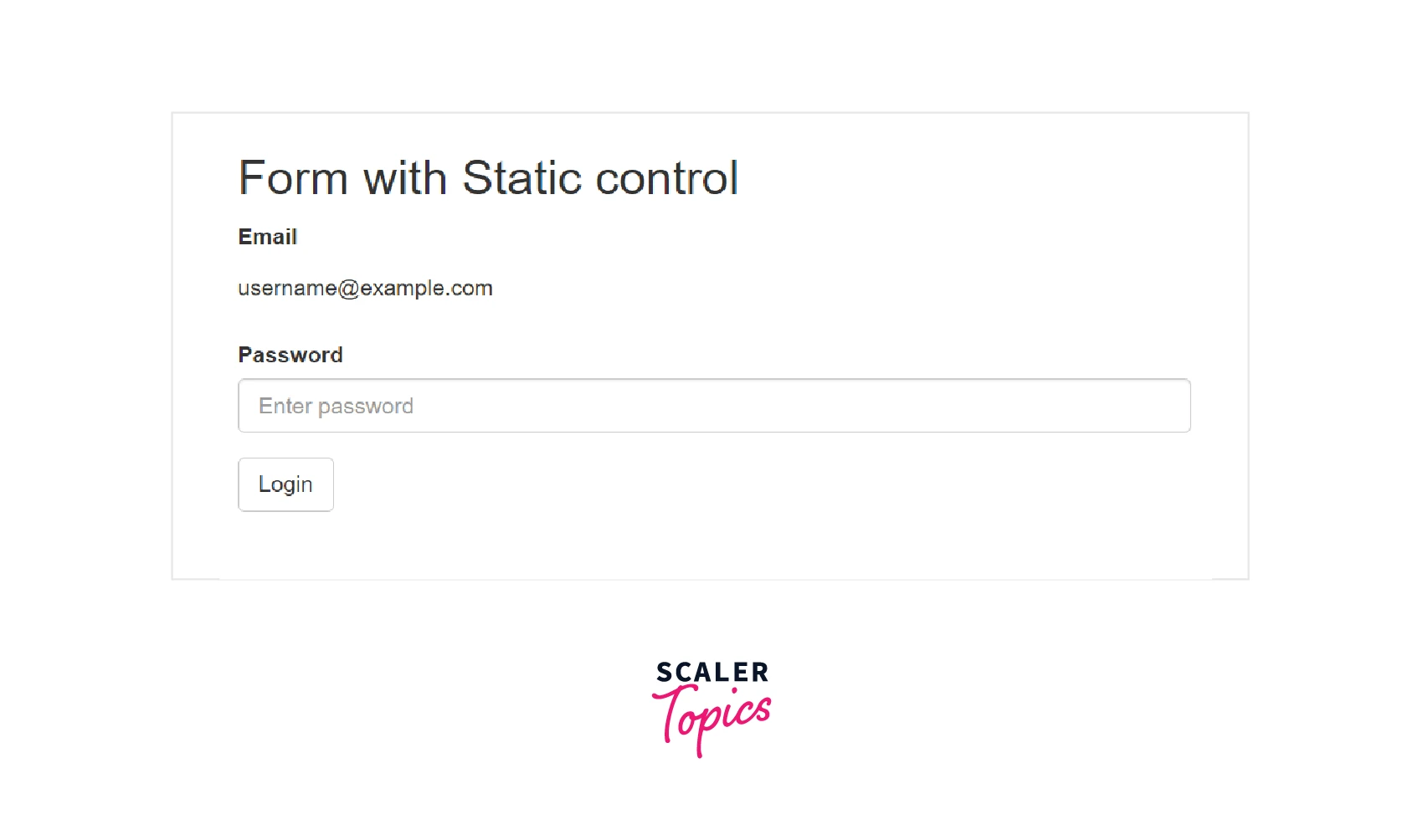
- In some cases, you might prefer to show a value in the plain text next to a form label rather than a functioning form control.
- Simply apply the attribute readonly and swap out the class .form-control with the .form-control-plaintext to accomplish this.
- The form field's default styling is removed but the proper margin and padding are kept when the .form-control-plaintext class is applied.
The following example illustrated the static form control:
Code:
Output:
Supported Form Controls
Following Form Controls are supported by bootstrap:
- Inputs
- Textarea
- CheckBoxes and Radio Buttons
- Selects
- Static Control
Let us discuss them in detail.
Inputs
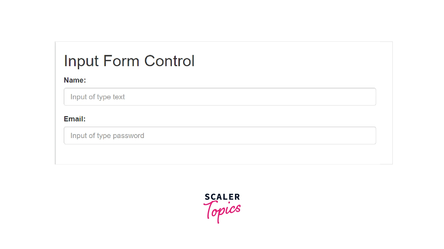
- The input field is the text field that is used the most frequently. The majority of the necessary form data will be filled out by users here.
- The following native HTML5 input types are supported by Bootstrap: Text, password, datetime, datetime-local, time, date, month, week, email, number, color, etc.
- Inputs must have a proper type declaration in order to be fully styled.
The following example illustrates the input form controls:
Code:
Output:
Textarea
-
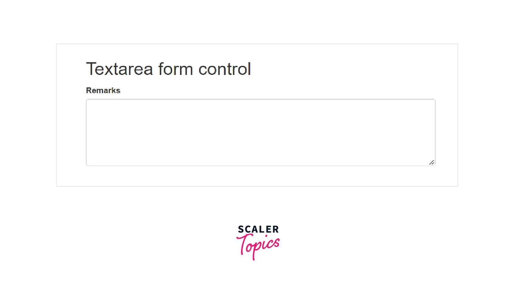
The textarea form control is used when you require multiple lines of input.
-
To create a textarea, change the rows attribute as per requirement (lesser rows = smaller box, more rows = larger box).
The following example illustrates a Textarea.
Code:
Output:
CheckBoxes and Radio Buttons
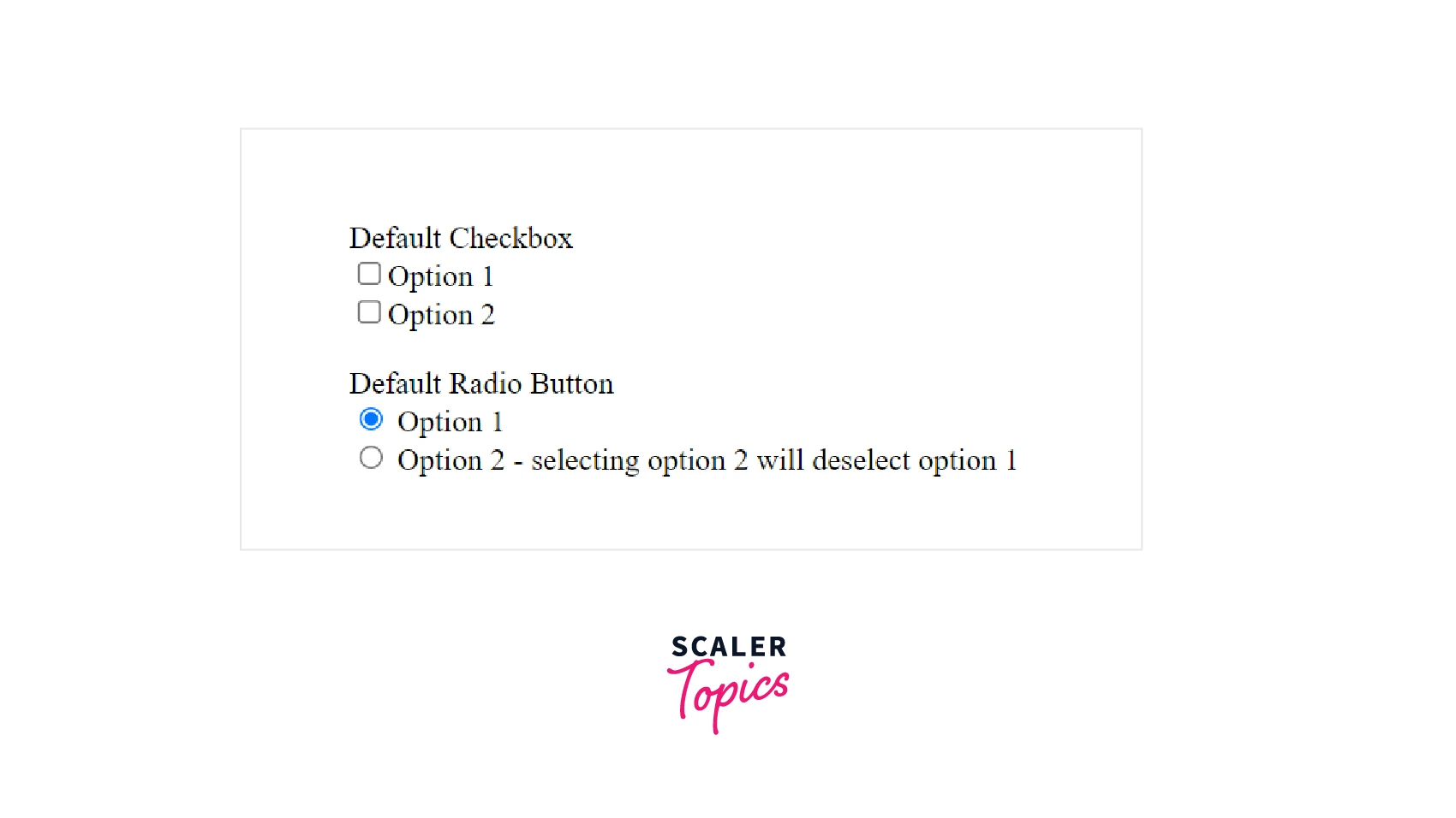
- CheckBoxes are used where the user wants to choose one or more options from a list of pre-selected options.
- Radio Buttons are used when you want the user to choose only one option from a list of pre-selected options.
- Use class checkbox for creating checkboxes and class radio for creating radio buttons.
- If you want multiple checkboxes or radio buttons for controls to appear on the same line, use the .checkbox-inline or .radio-inline class. The following example illustrates checkboxes and radio buttons.
Code:
Output:
Selects
- A select is used when you want the user to be able to choose from a variety of options.
- For list options that the user is familiar with, use <select> tag.
- To give users the option of choosing more than one option, use multiple multiple.
- To select multiple options from a select list, hold ctrl or shift or( drag the mouse). The following example illustrates select lists.
Code:
Output:

Static control
- Use the .form-control-static class on a <p> element to add plain text next to a form label in a horizontal form. The following example illustrates a static control.
Code:
Output:
Form Control States
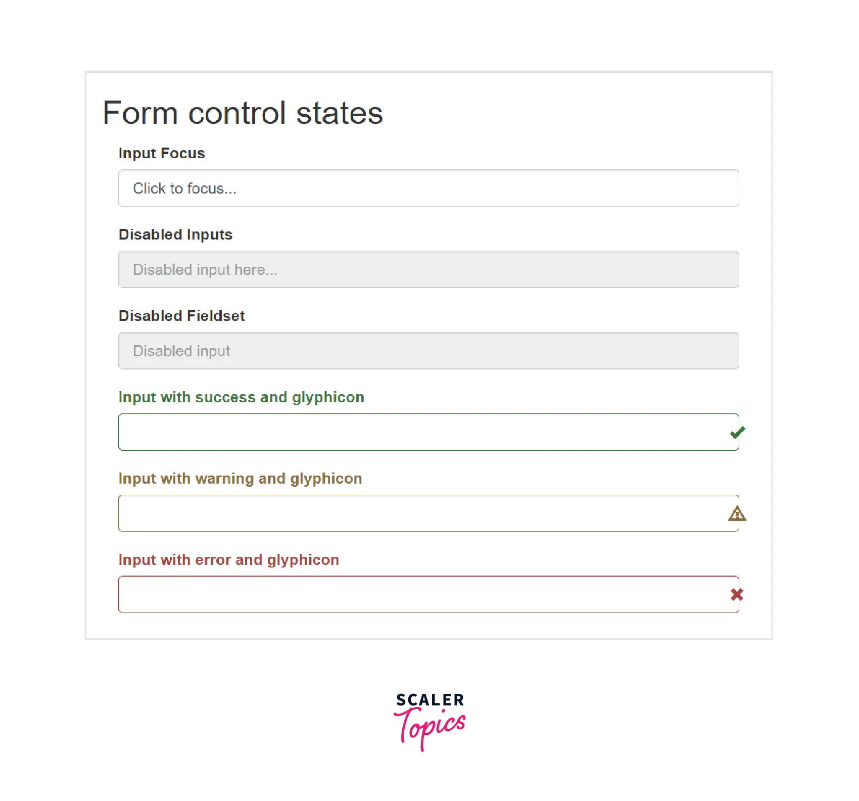
Bootstrap provides various Form control states. They are:
- INPUT FOCUS - The input's outline is erased, and a box-shadow is applied to the focus
- DISABLED INPUTS: Include a disabled attribute to make an input field inactive.
- Disable all controls in a fieldset by adding a disabled attribute to it.
- READONLY INPUTS: To prevent user input, give an input a readonly attribute.
- VALIDATION STATES - Bootstrap comes with validation styles for error, warning, and success messages. In order to use them, add .has-error, .has-warning, or .has-success to the parent element.
- ICONS - You can add feedback icons by using the .has-feedback class and an icon.
- HIDDEN LABELS: Include a .sr-only class for invisible labels.
The following example demonstrates all the form control states.
Code:
Output:
Form Control Sizing
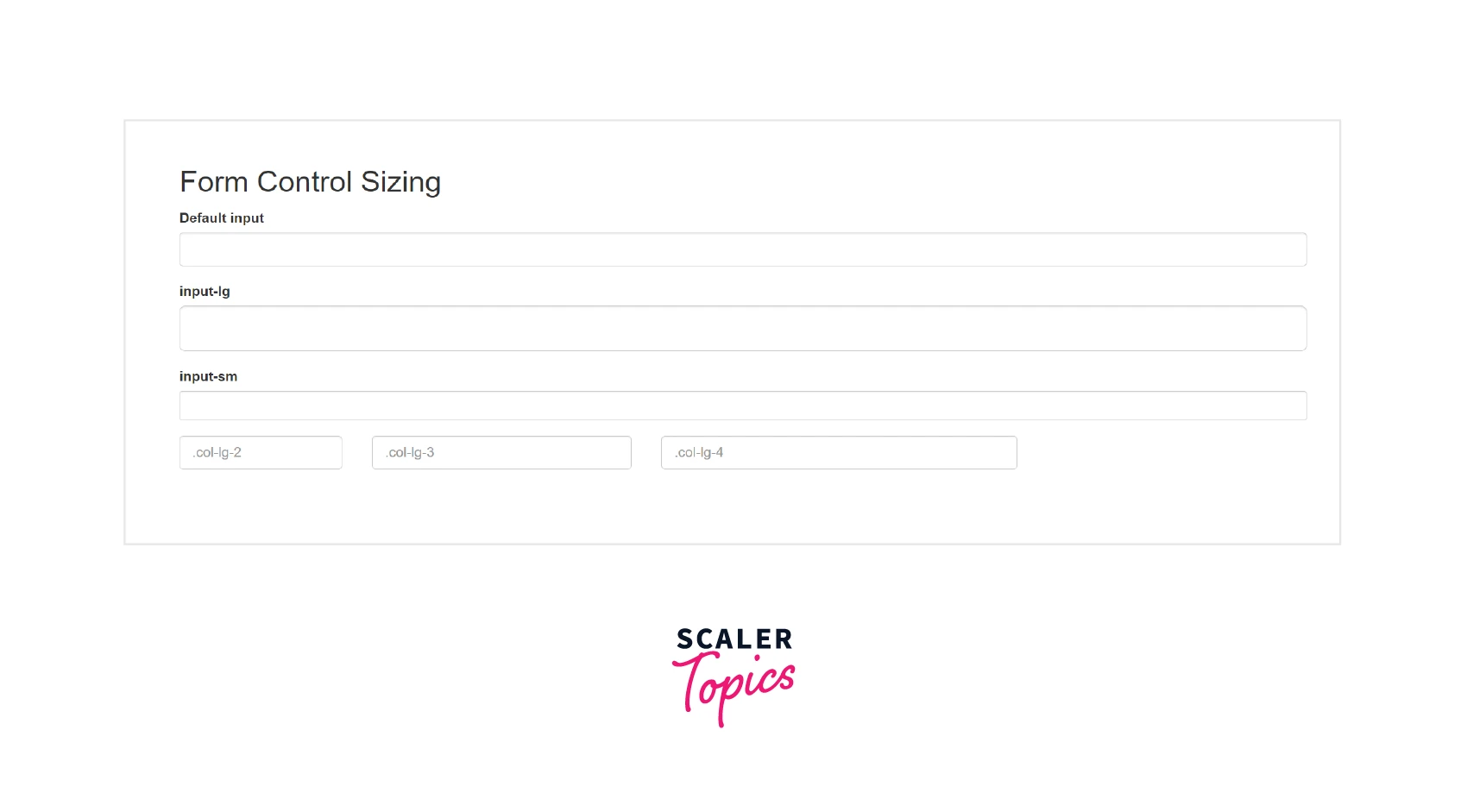
You can adjust the heights of input elements using classes like .input-lg and .input-sm and the widths of elements by using the grid column classes like .col-lg-* and .col-sm-*.
The following example demonstrates the input elements in different sizes.
Code:
Output:
Creating Disabled Form Controls
-
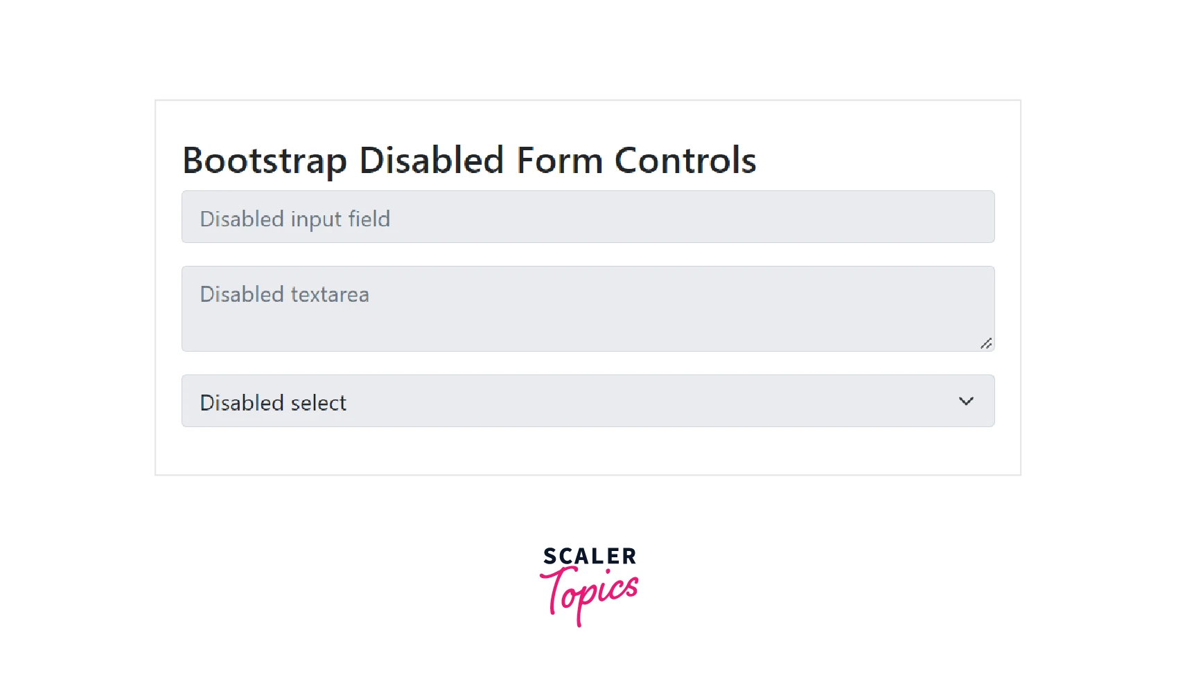
Simply add the attribute disabled to form controls like <input>,<textarea>, and <select> to make them disabled, and Bootstrap will take care of the rest.
The following example demonstrates the disabled form controls.
Code:
Output:
Creating Readonly Inputs
-
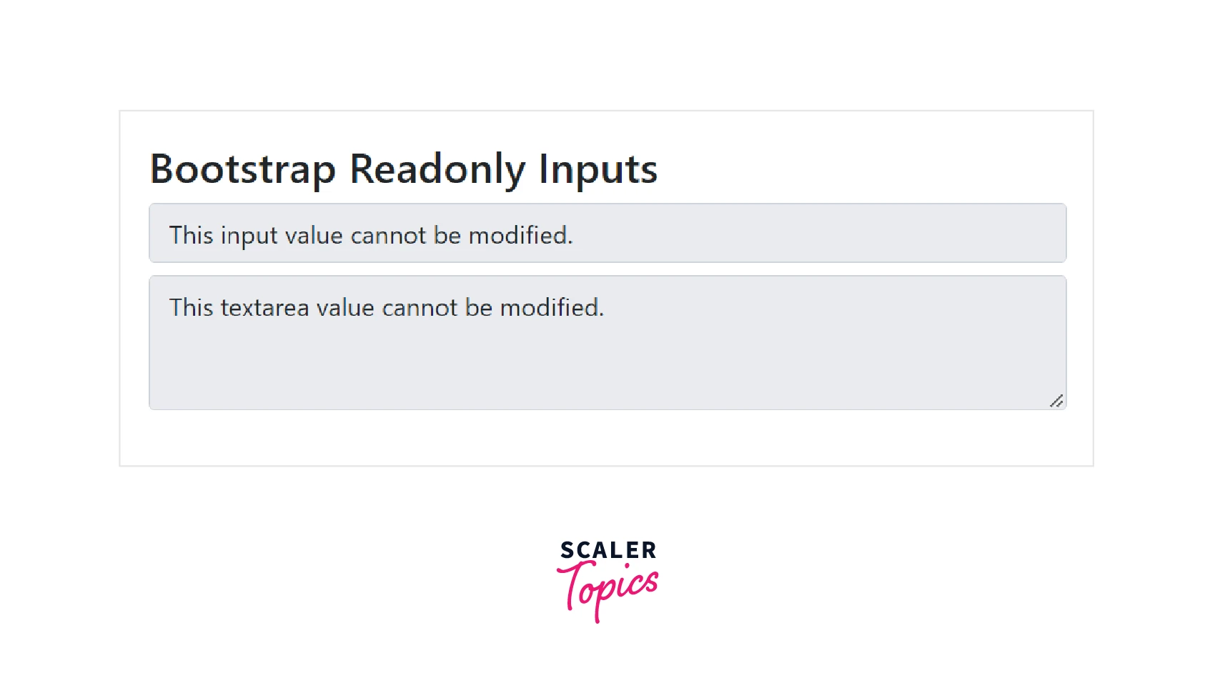
If you do not want the user to modify the input or textarea value, add the boolean attribute readonly to the element.
The following example demonstrates the readonly inputs.
Code:
Output:
Bootstrap Form Validation
-
Bootstrap provides a built-in easy and efficient way to validate web forms for users. To validate the form, Bootstrap uses the native form validation API of the browser.
-
Validation can be applied to the forms in two ways:
- By using the .was-validated class to the <form> element. This method provides validation to the users before submitting the form.
- By using the .needs-validation class to the <form> element.This method provides validation to users after submitting the form.
-
In both the ways, you need to add the required attribute to the form input controls that need to be validated.
-
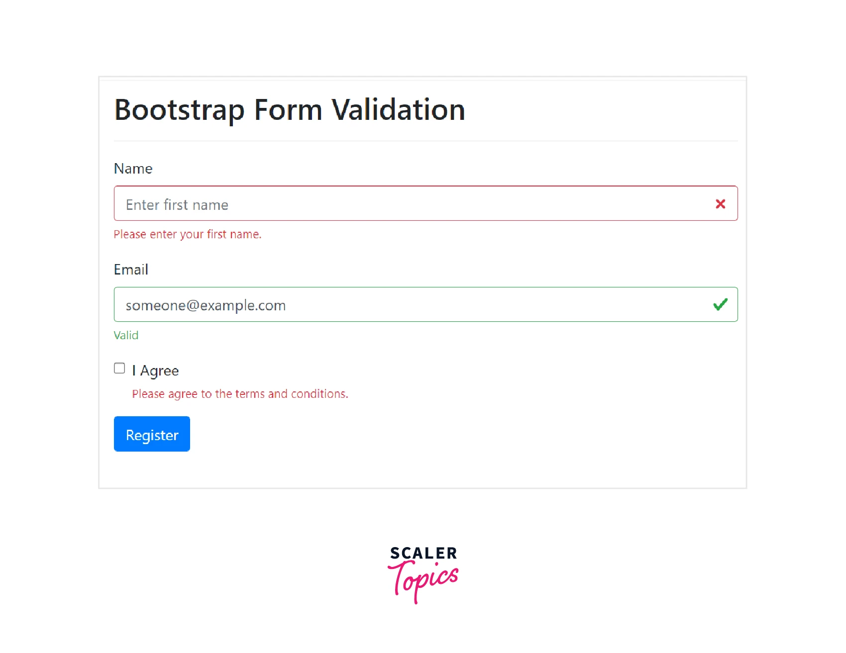
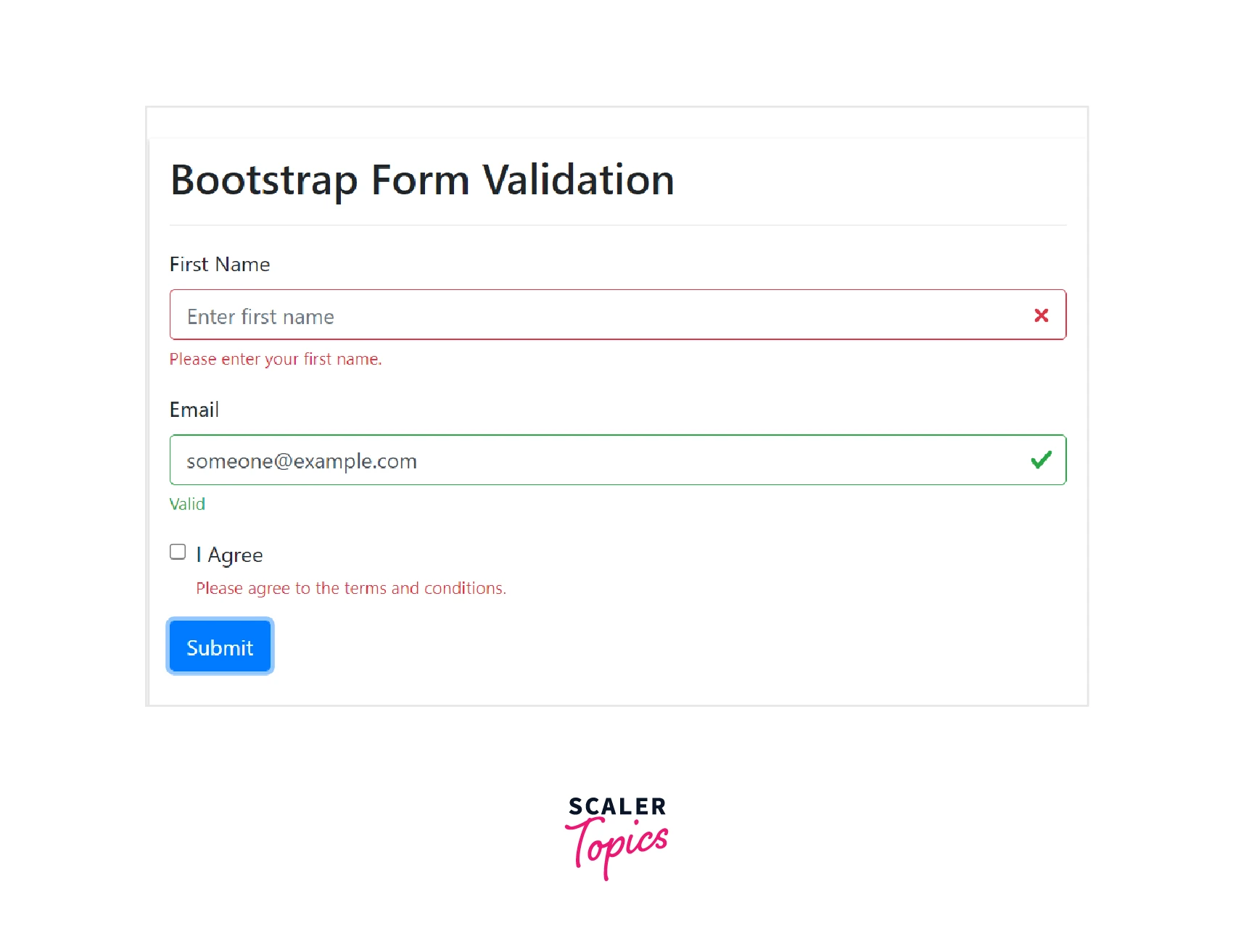
The bootstrap validation will apply green color (valid) to the valid input fields and red color(invalid) to the invalid input fields.
-
You can also include .valid-feedback or .invalid-feedback messages in the form to let the user know what is missing or what needs to be done before submitting the form.
The following example illustrated form validation using the .was-validated class:
Code:
Output:
-
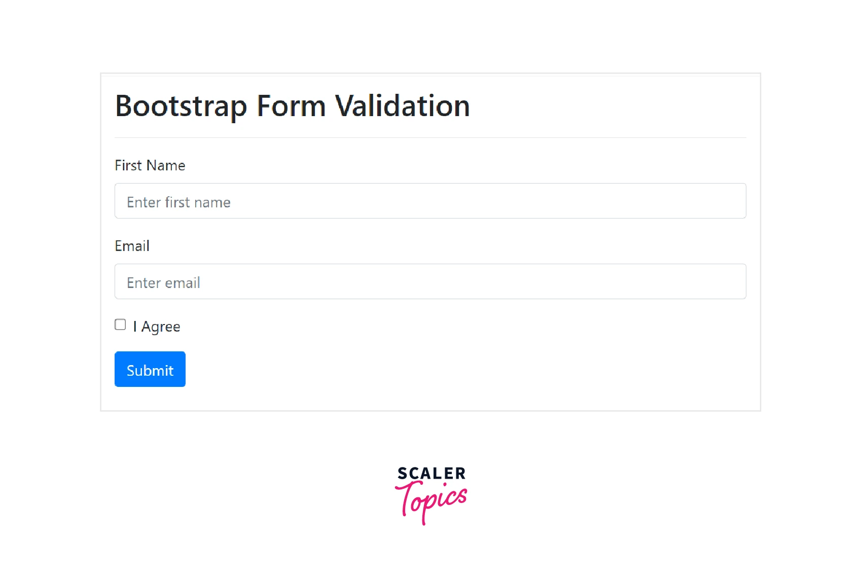
In order to disable the form submission in case of invalid input controls, you can use javascript.
The following example illustrates form validation using the .needs-validation class and also how to disable the form submission using javascript.
Code:
Output:
Before clicking the submit button:
After clicking the submit button:
Help Text
-
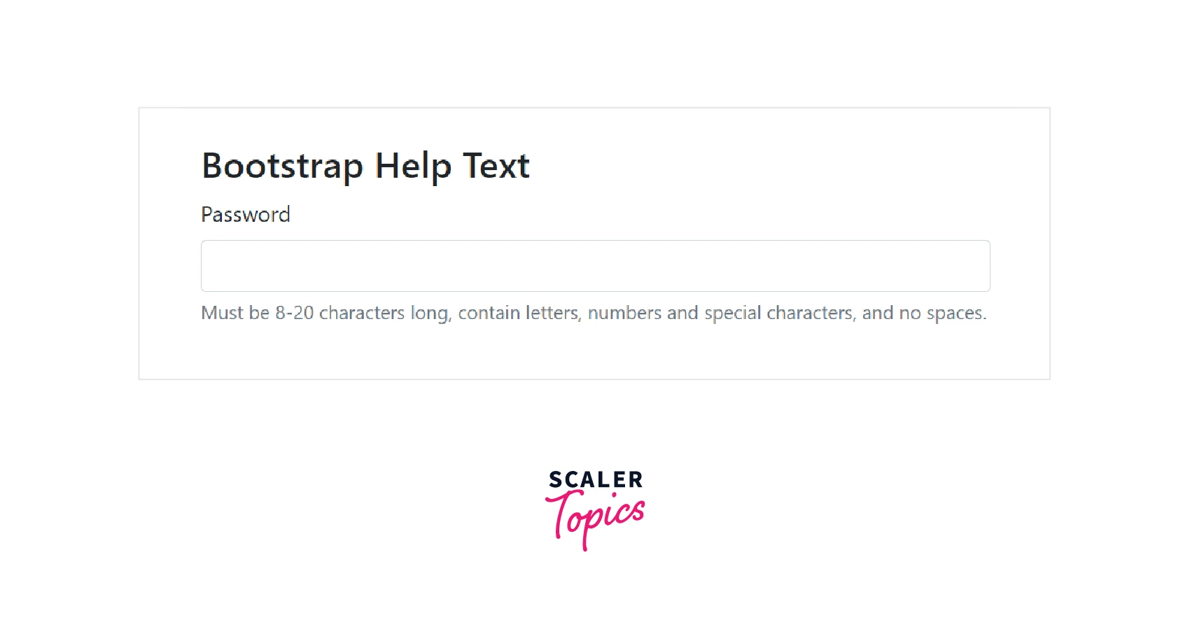
You can also place help text for the form controls in order to guide the users to enter valid data in a form.
-
Use the .form-text class to place block-level help text for a form control.
-
The help text is usually displayed at the bottom of the form control.
The following example illustrates this:
Code:
Output:
Conclusion
- HTML forms are a very important part of web pages and projects, but creating different layouts from scratch and styling them using CSS would be very time-consuming.
- Bootstrap forms highly facilitate the styling and creation of forms.
- There are three different form layouts provided by bootstrap. They are -- vertical (default layout), horizontal and inline. A detail explanation of these layouts along with their implementation is mentioned in the article above.
- The bootstrap form supports numerous form controls like textareas, checkboxes and radio buttons, select lists, etc.
- The bootstrap form also provides various form control states and form control sizings as mentioned in the article.
- You can adjust the size and state of the form controls as per requirement by using some pre-defined classes.
- You can also validate the forms using built-in bootstrap classes. These classes apply green color to the valid form controls and red color to the invalid ones.
- Lastly, you can also add help text in your forms in order to help the users enter the correct information in the input fields.
