Bootstrap Grid System
Bootstrap's grid system is a robust tool for creating mobile-first layouts. With a twelve-column structure, five responsive tiers, Sass variables, and numerous predefined classes, it empowers developers to design versatile layouts using the flexibility of a mobile-first flexbox grid.
Breakdown of Bootstrap Grid System
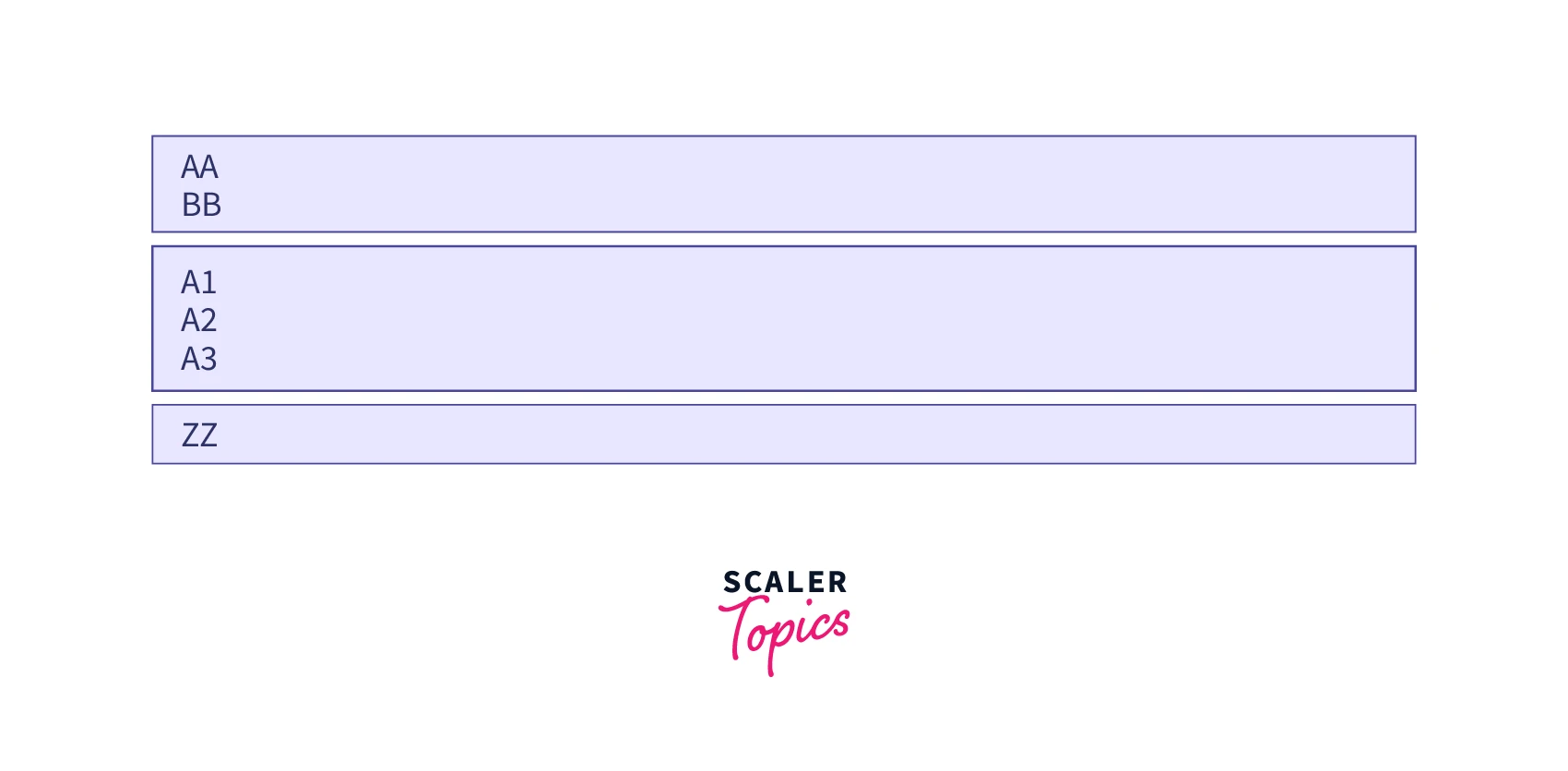
This Grid System is Made of Three Components Namely
Container: A ‘<div>’ element effectively holds rows and columns and plays a vital role in offering the correct width to a particular layout. Rows: It is a class .row component that discharges the padding menu and acts as a wrapper all over the columns. Columns: In Bootstrap, different column class prefixes are used for the diverse sizes of devices. For example .col-xs- prefix is used for device size <768px.
Grid Options
While Bootstrap uses ems or rems for defining most sizes, pxs are used for grid breakpoints and container widths. This is because the viewport width is in pixels and does not change with the font size.
See how aspects of the Bootstrap grid system work across multiple devices with a handy table.
| <576px | ≥576px | ≥768px | ≥992px | ≥1200px | |
|---|---|---|---|---|---|
| Max container width | None (auto) | 540px | 720px | 960px | 1140px |
| Class prefix | .col- | .col-sm- | .col-md- | .col-lg- | .col-xl- |
| # of columns | 12 | 12 | 12 | 12 | 12 |
| Gutter width | 30px | 30px | 30px | 30px | 30px |
| Nestable | Yes | Yes | Yes | Yes | Yes |
| Column ordering | Yes | Yes | Yes | Yes | Yes |
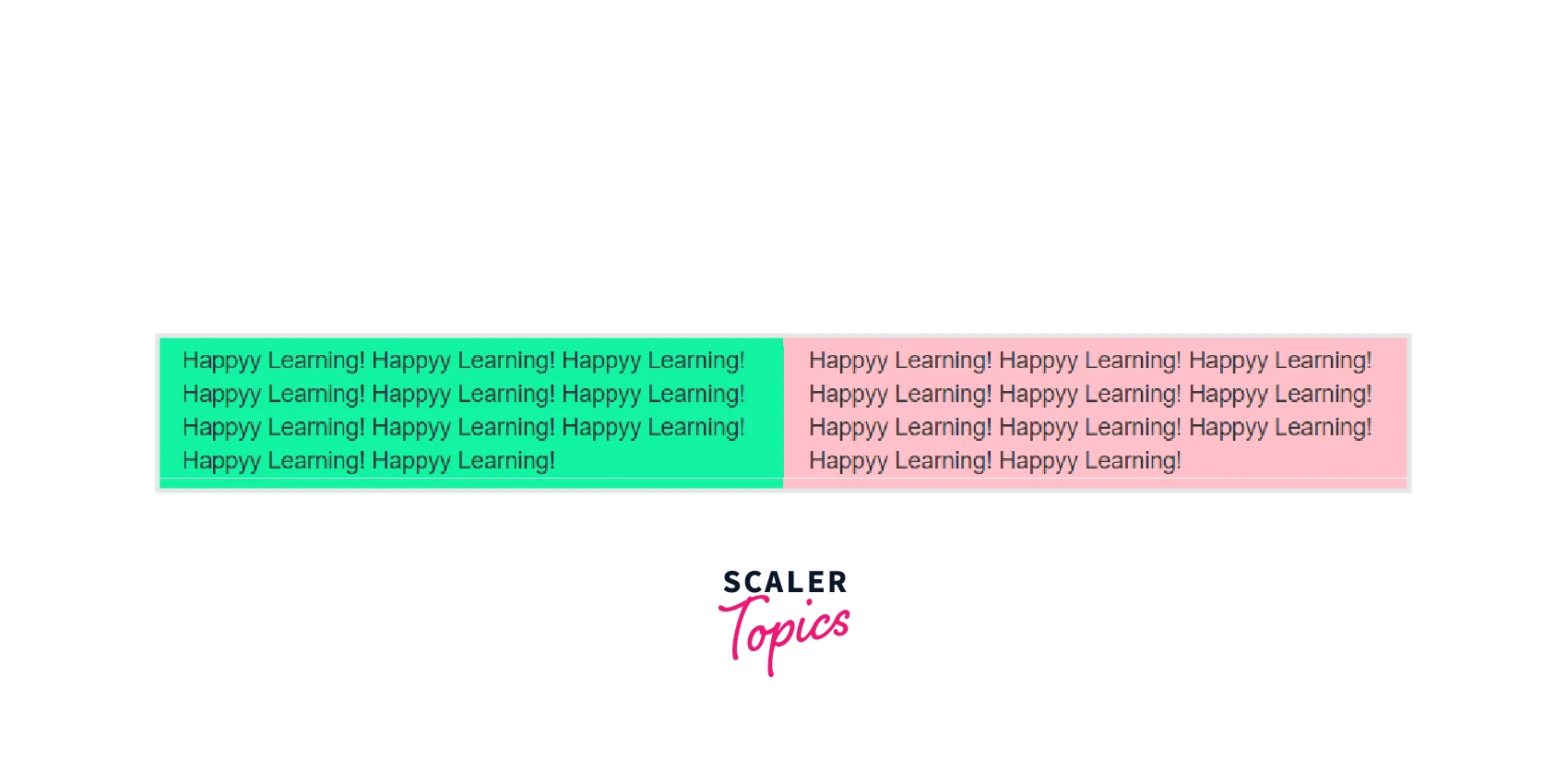
Auto Layout Columns
You can also create equal-width columns for all devices (x-small, small, medium, large, x-large, and xx-large) through simply using the class .col, without specifying any column number.
Let's try out the following example to understand how it exactly works:
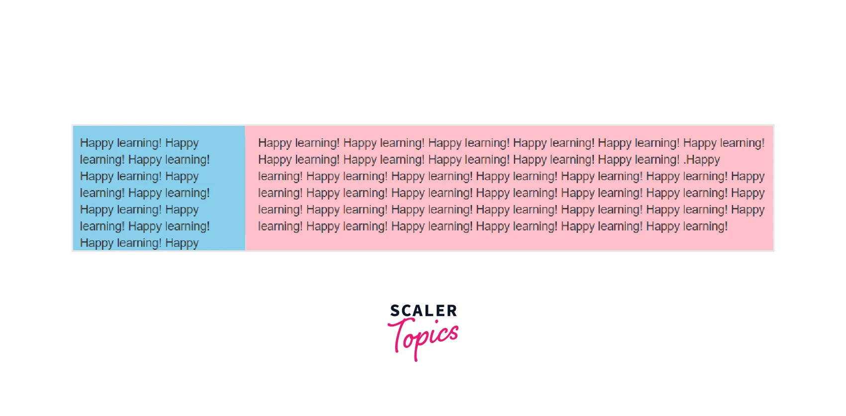
Additionally, you can also set the width of one column and let the sibling columns automatically resize around the column equally. You may use the predefined grid classes or inline widths.
If you try the following example you'll find columns in a row with class .col has equal width
Grid Classes
The Bootstrap grid system has four classes:
- xs (for phones - screens less than 768px wide)
- sm (for tablets - screens equal to or greater than 768px wide)
- md (for small laptops - screens equal to or greater than 992px wide)
- lg (for laptops and desktops - screens equal to or greater than 1200px wide)
The classes above can be combined to create more dynamic and flexible layouts
Grid System Rules
Some Bootstrap grid system rules:
- Rows must be placed within a .container (fixed-width) or .container-fluid (full-width) for proper alignment and padding
- Use rows to create horizontal groups of columns
- Content should be placed within columns, and only columns may be immediate children of rows
- Predefined classes like .row and .col-sm-4 are available for quickly making grid layouts
- Columns create gutters (gaps between column content) via padding. That padding is offset in rows for the first and last column via a negative margin on .rows
- Grid columns are created by specifying the number of 12 available columns you wish to span. For example, three equal columns would use three .col-sm-4
- Column widths are in percentage, so they are always fluid and sized relative to their parent element
Basic Structure of a Bootstrap Grid
The following is a basic structure of a Bootstrap grid:
So, to create the layout you want, create a container <div class="container">. Next, create a row <div class="row">. Then, add the desired number of columns (tags with appropriate .col-*-* classes). Note that numbers in .col-*-* should always add up to 12 for each row.
Examples
Stacked-to-horizontal
We will create a basic grid system that starts out stacked on extra small devices, before becoming horizontal on larger devices.
The following example shows a simple "stacked-to-horizontal" two-column layout, that results in a 50%/50% split on all screens, except for extra small screens, which get stacked automatically. (100%):
Code:
Small Devices
Assume we have a simple layout with two columns. We want the columns to be split 25%/75% for small devices.
Tip: Small devices are defined as having a screen width from 768 pixels to 991 pixels.
For small devices we will use the .col-sm-* classes.
We will add the following classes to our two columns:
Now Bootstrap is going to say "at the small size, look for classes with -sm- in them and use those".
The following example will result in a 25%/75% split on small (and medium and large) devices. On extra small devices, it will automatically stack (100%):
Example
Medium Devices
In the previous chapter, we presented a grid example with classes for small devices. We used two divs (columns) and we gave them a 25%/75% split: But on medium devices the design may be better as a 50%/50% split.For medium devices we will use the .col-md-* classes.
Now we will add the column widths for medium devices:
Now Bootstrap is going to say "at the small size, look at classes with -sm- in them and use those. At the medium size, look at classes with -md- in them and use those".
The following example will result in a 25%/75% split on small devices and a 50%/50% split on medium (and large) devices. On extra small devices, it will automatically stack (100%):
Large Devices
In the previous chapter, we presented a grid example with classes for small and medium devices. But on large devices, the design may be better as a 33%/66% split.For large devices, we will use the .col-lg-* classes. So now we will add the column widths for large devices:
Now Bootstrap is going to say "at the small size, look at classes with -sm- in them and use those. At the medium size, look at classes with -md- in them and use those. At the large size, look at classes with the word -lg- in them and use those".
The following example will result in a25%/75%split on small devices, a 50%/50% split on medium devices, and a 33%/66% split on large devices:
Three Equal Columns
Three Unequal Columns
No gutters
Two Columns With Two Nested Columns
Clear Floats
Mixed: Mobile And Desktop
Offsetting Columns
Conclusion
- Using the Bootstrap grid system you can create Two, Three, Auto, Multi, and Compact column layouts.
- While Using Bootstrap Grid make sure the layout works on all screen sizes, and the structure complies with requirements
- Bootstrap Grid system also helps in Offsetting, Nesting, Aligning, and Reordering of grid columns.
- Bootstrap grid System ensures the utmost consistency in generating profitable outcomes in the long run.
- With the help of Bootstrap, you can develop a mobile-ready, responsive website with ease.