Bootstrap Images
Bootstrap, an open-source CSS framework, streamlines responsive web and mobile-first design. It offers classes for image responsiveness and aesthetics, ensuring images scale with their containers and adapt to different screen sizes, while maintaining aspect ratio and optimal display.
Bootstrap Image Shapes
The different image shapes provided by Bootstrap are:
Rounded Corners:
An image with rounded corners.

Circle-shaped image:
Image in a circular shape.

Thumbnail:
An image shaped into a thumbnail.

Bootstrap Image-Rounded
- The .img-rounded class is used to add rounded corners (by adding a g border with borderadiusus of 6px) to an image.
- All browsers support images with rounded corners except Internet Explorer 9.
- Following is an example illustrating the use of the .img-rounded class to add rounded corners to the image:
Code:
Output:

Bootstrap Image-circle Example
- The .img-circle class is used to make the entire image round by adding a border radius of 500px.
- The following example illustrates the use of a .img-rounded class:
Code:
Output:

Bootstrap Thumbnail Image
- The .img-thumbnail class is used to shape the image to a thumbnail by adding a bit of padding and a gray border.
- The following example illustrates the use of the .img-thumbnail class:
Code:
Output:

Bootstrap Responsive Images
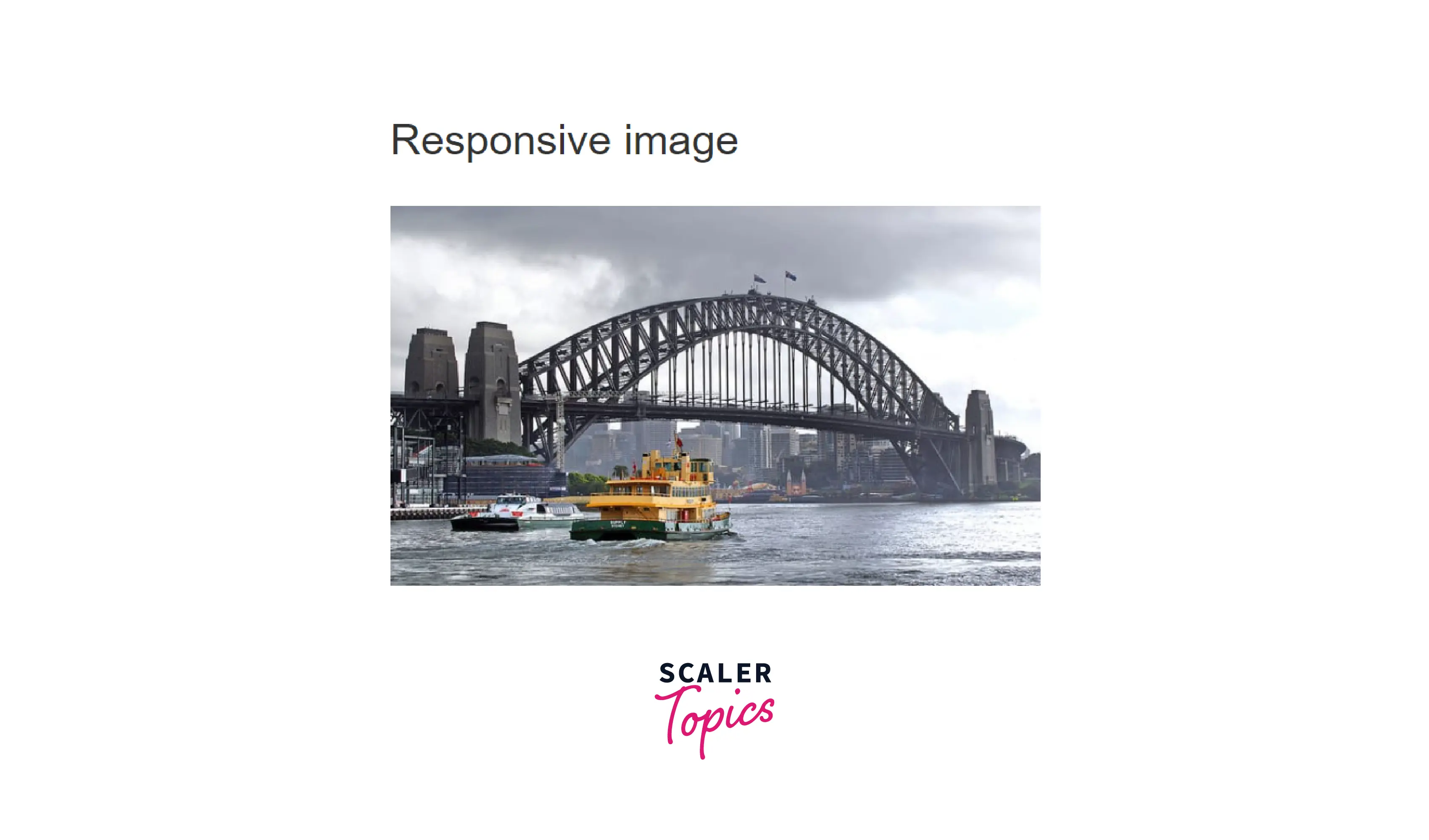
- The responsive images can automatically resize themselves to fit the available screen space. By including the .img-responsive class in the <img> tag, responsive images can be produced. Afterward, the image will adapt to the parent element accurately.
- The image is given the following properties: display: block; max-width: 100%; and height: auto; by the .img-responsive class.
- The following example illustrates the use of the .img-responsive class:
Code:
Output:

Responsive Embeds
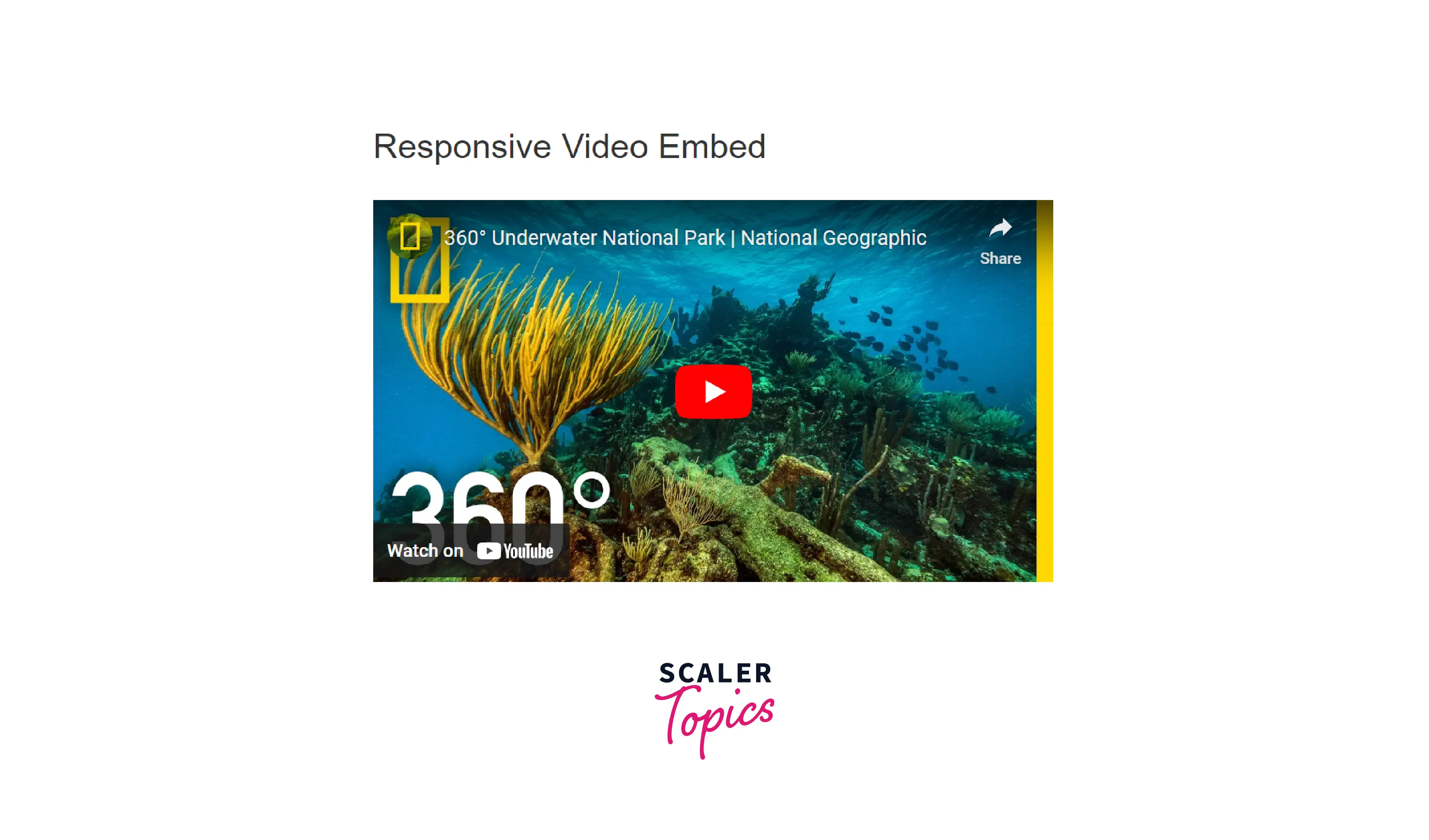
- You can include videos in Bootstrap and scale them correctly across all devices.
- The .embed-responsive-item class is used to create a responsive video. The classes can be directly applied to <iframe>, <embed>, <video>, and <object> elements.
- The .embed-responsive-item class is applied to an <iframe> tag in the example below to turn a video responsive (the video will then scale properly concerning the parent element). The aspect ratio of the video is determined by the div container:
Code:
Output:

Aspect Ratio:
- The proportionality between an image's width and height is described by the aspect ratio of that image. The two most popular video aspect ratios are (the 20th century's standard video format) and (the standard for HD television and European digital television).
- You can use any of the aspect ratios classes in the following ways:
Code:
Conclusion
- Bootstrap provides support for images by using the <img> tag.
- Images are styled and made responsive using the classes provided by bootstrap images, which means they will scale with the image container when a browser window is resized.
- It offers three classes that can be used to give images some basic styling:
- .img-rounded − It is used to a add border r-radius of 6px to give the image rounded corners.
- .img-circle −It is used to make the entire image round by adding a border radius of 500px.
- .img-thumbnail −It adds a little padding and a gray border to the image.
- Bootstrap also provides an option to add videos and scale them properly on any device. The .embed-responsive-item class is used to embed a responsive video.
