Bootstrap JS
Overview
Bootstrap JavaScript provides plugins that bring bootstrap components to life. Plugins are available for modals, buttons, carousels, affixes, alerts, etc. Bootstrap JS plugins provide functionality and design of various complex web elements with minimal code using data attributes and javascript. These available plugin classes are built using JavaScript and CSS in Bootstrap.
Pre-Requisite
- Bootstrap basics
- JavaScript basics
- Bootstrap components such as modals, dropdowns, tabs, etc.
Introduction To Working With Bootstrap In The JavaScript Interface
Plugins: Individual or Compiled
Before moving to use Bootstrap JavaScript functions in our webpage, let us first see how we can include it in our HTML file. As we know the link to the JavaScript file is added in the body section of the HTML file. Either individual plugins can be included by using Bootstrap's individual *.js files or we can include them all at once. For including all the files at once we can either use the bootstrap.js or a minified version bootstrap.min.js. But don't attempt to include both bootstrap.js and bootstrap.min.js.
The following link must be added before the closing <body> tag to include Bootstrap JS plugin.
Note: All the JavaScript plugins require jQuery to be included.
Data Attributes
Bootstrap lets us use the plugins through the markup API without writing a single line of JavaScript. This is Bootstrap's first-class API and must be considered when using a plugin. These are attributes that can be written in the HTML tag itself to add Bootstrap JS functionality.
For example:
Here, data-toggle, aria-pressed, etc are data attributes, that use Bootstrap JS to provide functionality as required without writing a single line of code JavaScript.
Also, when there is a conflicting scenario you may require to turn off this functionality as follows:
To target specific plugins, we can include only the plugin's name as a namespace along with the data.api namespace as follows:
Programmatic API
As we saw there is the possibility of conflict as well as to make the tags look tidier and code simpler we can add functionalities using JavaScript as well with a minimal amount of code.
All Bootstrap plugins are easily used through the JavaScript API. All the public APIs are single and chainable methods that return the collection acted upon.
For example:
The above example takes a button with the btn-danger class and adds functionality to the toggle. It also adds a fat class to the list of classes of the button.
All methods should accept an options object which is optional, a string targeting a particular method or nothing.
Say for instance:
Each plugin's raw constructor can be viewed using the Constructor property as $.fn.popover.Constructor. If we wish to get a particular plugin's instance, we can directly retrieve the instance from an element as $('[rel=popover]').data('popover').
No Conflict
While using other UI frameworks along with Bootstrap JS and plugins namespace conflicts can occur occasionally. To avoid these, we can call .noConflict on the plugin whose value we wish to revert.
Events
Bootstrap also provides custom events for most plugins' unique actions. These generally come in a past participle and infinitive form. The infinitive is triggered when the event is started say for example show is triggered at the start of the event, and its past participle is triggered when the event is completed, taking the same example shown is triggered when the event is completed.
All infinitive events provide a function called preventDefault(). This function provides the ability to stop the execution of the action before it starts.
For example:
Sanitizer
Tooltips and Popovers are represented as a response to the hover over specific elements on the webpage. These elements use bootstrap's built-in sanitizer to sanitize options that accept HTML code.
The default value of the whiteList is as follows:
To add new items to the above whiteList we can perform the following steps:
What happens when JavaScript is Disabled?
When JavaScript is disabled Bootstrap's plugins don't particularly fall back. To improve user experience in such a case, we can use <noscript> to explain the situation to the user.
Transitions
Transition is changing one state of an element to another when the user performs some action. Bootstrap JS file transiton.js can be included to access the simple transition effects. If including bootstrap.js we are not required to add any additional files, it is already included.
The transition.js is a basic helper for transitionEnd events and a CSS transition emulator.
We can also disable these transitions using the following:
Modal
Modals in Bootstrap are user notifications, dialogs, or completely custom content that pops us to then use either when the page loads or when some action is performed. We can use Bootstrap plugins to implement these using Bootstrap and JavaScript.
Note: These Modals don't support multiple models together, it requires custom code. Modals must be placed at the top of the HTML code, to avoid another component affecting the modal.
Usages
The modal toggles the hidden content on demand, via data attributes or JavaScript. The modal plugin adds a class modal-open to the <body> tag to override default scrolling behavior and it also generates a class called modal-backdrop to provide a click area for dismissing shown modals when clicking outside the modal. In simpler words, we can scroll the page down or up even when the modal is being displayed as well as instead of clicking in the modal area or on its buttons if we click on the screen the modal is dismissed or closed.
Modal via Data Attributes
To activate a modal using the data attributes of a button, we use data-toggle and data-target attributes. The data-toggle attribute must be a class (or element) that is being triggered by clicking the button. The data-target attribute must be a unique id that is to be shown as the button is clicked.
Modal via JavaScript
We can also use JavaScript code to trigger modal on a webpage instead of using data attributes.
Options
Options can be passed via JavaScript as well as data attributes. The following options are available for Modal:
| Name | type | default | description |
|---|---|---|---|
| backdrop | boolean or string 'static' | true | It includes a modal backdrop element. |
| keyboard | boolean | true | If true closes the modal when ESC is pressed on the keyboard. |
| show | boolean | true | When set to true it shows the modal on the screen else hides it. |
For example, to trigger a modal when a button is clicked using JavaScript the following code can be used:
The above JavaScript code defines a function that triggers Modal and we are using the option show which is made true when the function is called. The button's onclick attribute calls the function and thus triggers the modal.
Methods
Let us look at some methods of the Modal:
- .modal(options): The above options can be modified to show, hide, close using a keyboard, etc. It activates the modal content and accepts an option. This option is optional.
Syntax:
-
.modal('toggle'): This method manually toggles a modal. It displays the modal as soon as the webpage is refreshed.
-
.modal('show'): This method when called triggers the modal.
-
.modal('hide'): This method hides the triggered modal when called.
-
.modal('handleUpdate'): This method re-adjusts the position of the modal when the page is scrolled. It only appears when the height of the modal changes while it is open.
Events
Bootstrap's modal class exposes a few events to perform actions with modal functionalities.
| Column 2 | Column 3 |
|---|---|
| show.bs.modal | The event is fired as soon as the instance of the show method is called. The code written in the event is performed as soon as the modal is called by the user. |
| shown.bs.modal | This event is fired when the modal is made visible to the user. |
| hide.bs.modal | This event is immediately fired when the instance of hide is called. |
| hidden.bs.modal | This event is called as soon as the modal is hidden from the user. |
| loaded.bs.modal | This event is fired when the modal is done loading content from the remote option. |
Example
Let us now take an example of Modal using Bootstrap JS:
Output:
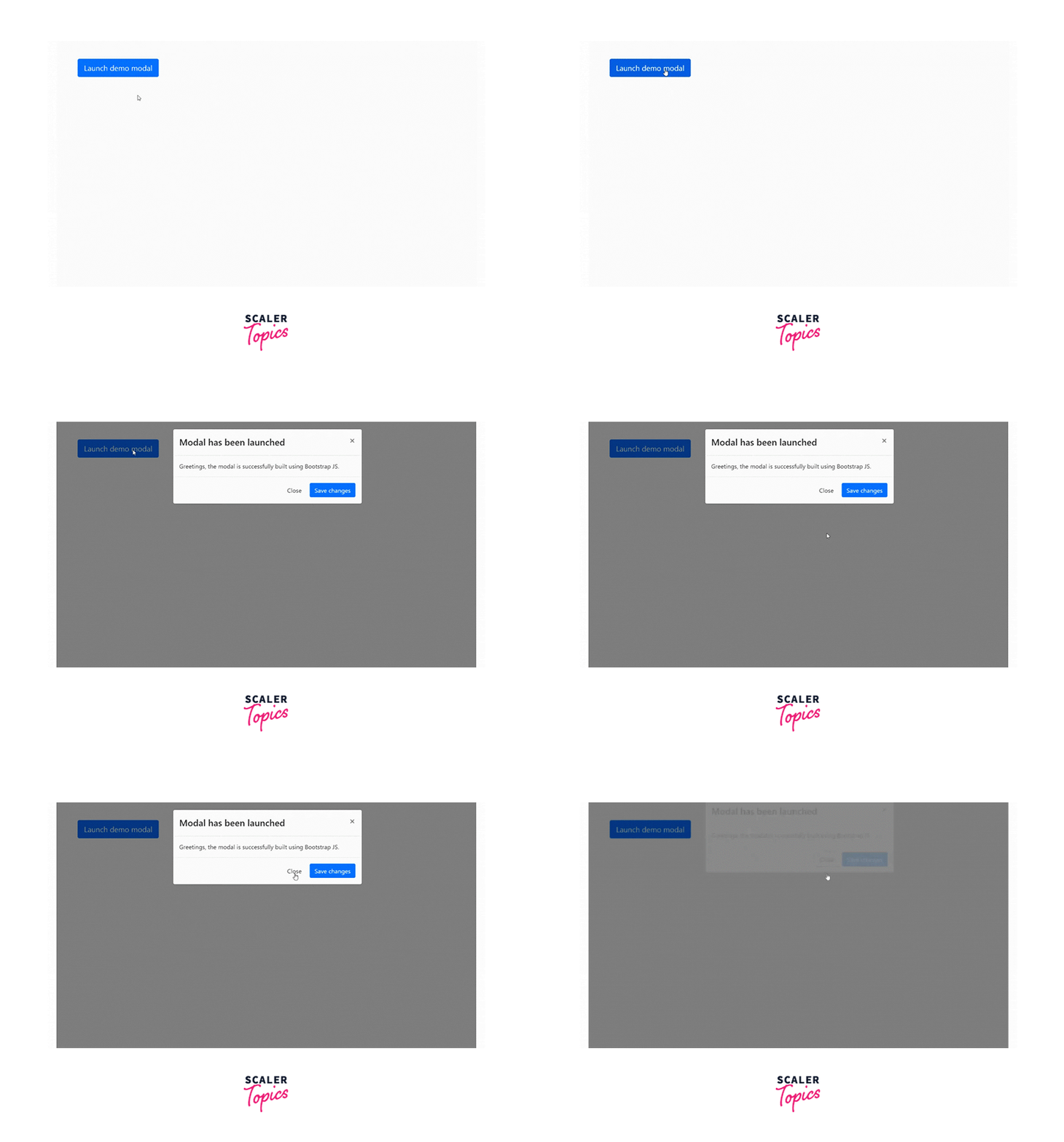
In the above example, we are using data attributes instead of javascript. The modal is the BootStrap class.
Dropdown
Dropdowns are toggleable, contextual overlays to display lists or multiple links when they are toggled by clicking.
Usage
Dropdown plugins can be toggled using data attributes as well as JavaScript. The dropdown plugin toggles hidden content using the .open class on the parent list item. On mobile devices when tapped on the other part of the screen and not on the dropdown menu when it is open must minimize the dropdown menu. This is facilitated by the .dropdown-backdrop class.
Dropdown Via Data Attributes
While using dropdowns, the data-attribute data-toggle will hold the value dropdown as data-toggle=" dropdown". It has two more data attributes aria-haspopup= true and aria-expanded=false.
The aria-haspopup= true attribute indicates the availability of the interactive type popup element that can be triggered by the respective element. The aria-expanded=false indicates if the control or popup is expanded or collapsed i.e. whether its child elements are displayed(True) or hidden(False).
Syntax:
Here href attribute is not used, instead data-target attribute is used with the value #.
Dropdown Via JavaScript
The dropdown can also be triggered using JavaScript when the parent element is clicked.
Note: The data-toggle="dropdown" attribute is still required even if we are using Bootstrap JS.
Syntax:
Methods
- $().dropdown('toggle'): It toggles or displays the dropdown menu of a given nav bar or tabbed nav bar.
Events
| Event Type | Description |
|---|---|
| show.bs.dropdown | This event fires right after the show instance method is called. |
| shown.bs.dropdown | This event fires immediately when the dropdown is made visible on the webpage. |
| hide.bs.dropdown | This event is triggered when the hide instance method has been called. |
| hidden.bs.dropdown | This event is fired immediately when the dropdown has been successfully hidden from the user. |
Example
Let us see an example of a Dropdown using Bootstrap JS
Output:
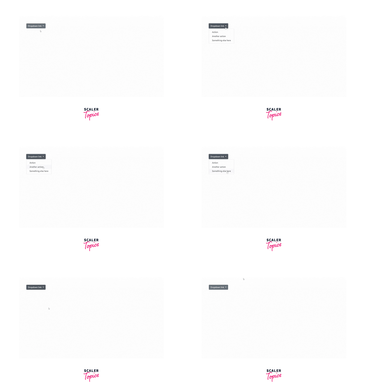
Here, we are using JavaScript for the working of the dropdown menu.
Togglable Tabs
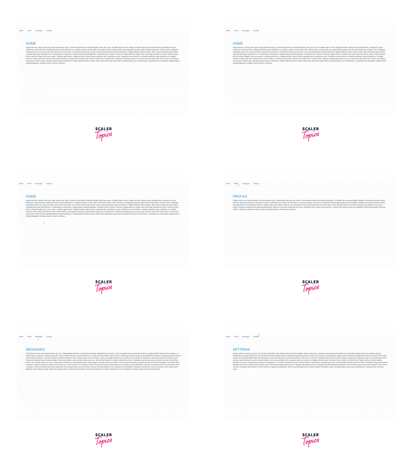
Tabs are used to provide a tabbed interface i.e. display multiple tabs of different topics belonging to the same subject. Tab plugin extends the tabbed navigation component to add a tabbed structure.
Usage
Tab via JavaScript
To enable tabs via JavaScript following syntax can be used:
Individual tabs can also be selected using JavaScript as follows:
Tab via Data Attributes
A tab or pill navigation can be activated using data attributes data-toggle="tab" or data-toggle="pill" in the tag of the parent element. Using nav and nav tabs either using Unordered list or Container class, rows, and cols to the Bootstrap styling tab or pill styling can be achieved.
The fade effect on the tabs when they are switched can also be applied to the tabs using the fade class. The first tab or the initial tab must also contain the in class so that when the page is refreshed, the initial tab is consistent with the other tabs.
Syntax:
Methods
-
$().tab: It activates a tab element. The data attribute data-toggle="tab" is mandatory. Now, the tab must have href to the unique id of the content of the tab or the data-target attribute can also be used.
-
.tab('show'): The show function activates the requested tab by the user and the rest of the tabs must be hidden.
Syntax:
Events
| Event | Description |
|---|---|
| show.bs.tab | The event fires as soon as the tab show has been called but before showing the tab. |
| shown.bs.tab | This event fires as the tab is shown. |
| hide.bs.tab | This event fires when a new tab is to be requested to be shown. |
| hidden.bs.tab | This event fires immediately after a new requested tab is shown. |
Syntax:
Example
https://codepen.io/niyati-thakkar/pen/MWXZagv
Popover
Popovers are small overlays of content that are hidden and are triggered and shown by hovering or clicking. Popovers consist of title and content as the name suggests, the title tells what is popover is about and the content is the description of the title. Popovers having zero-length of both title and content are never displayed.
Usage
Popovers can be in 4 different positional directions i.e. left, right, top, and bottom to the element.
Note: To dismiss popover on the next click or tap on the screen, the focus trigger must be used.
Popover Via Data Attributes
Data Attributes used to add a popover to a link or button are data-toggle="popover", data-trigger="focus", data-title="title here", and data-content=" content here". The data-trigger is used to dismiss or hide popover when the user clicks on the other area of the screen.
Popover Via JavaScript
Popovers can also be enabled using JavaScript as follows:
Options
| Name | Type | Default | Description |
|---|---|---|---|
| animation | boolean | true | Applies CSS fade transition. |
| container | string or false | false | Appends the popover to specific elements like body. |
| content | string or function | Content to be displayed on the popover. | |
| delay | number or object | 0 | Delay in showing and hiding the popover in milliseconds. It doesn't apply to manual trigger triggers. |
| HTML | boolean | false | To insert HTML code inside the popover. |
| Placement | string or function | 'top', 'bottom', 'left', 'right', 'auto' | Where to position the popover is answered by this function or attribute. |
| title | string or function | The value to be contained in the popover | |
| trigger | string | 'hover' 'focus' 'click' 'manual' | How the popover should be triggered i.e. by focus, click, etc. |
Methods
-
$().popover(options): This method attaches a popover handler to an element collection with the help of Bootstrap JS.
-
.popover('show'): It reveals or triggers the popover element manually. Syntax:
-
.popover('hide'): It hides an element's popover.
-
.popover('toggle'): Toggles an element's popover. Again, it is considered to be a "manual" triggering of the popover.
-
.popover('destroy'): It hides and destroys an element's popover.
Events
| Event Type | Description |
|---|---|
| show.bs.popover | The event fires immediately after the instance of the show method is called. |
| shown.bs.popover | This event is fired immediately when the popover is visible to the user. |
| hide.bs.popover | This event is fired right after the instance of the hide method is called. |
| hidden.bs.popover | This event is fired right after the tooltips are hidden from the user. |
| inserted.bs.popover | The event is fired after the show.bs.popover event. |
Syntax:
Example
Look at the below example of the popover being displayed on all four sides of the webpage.
Output:
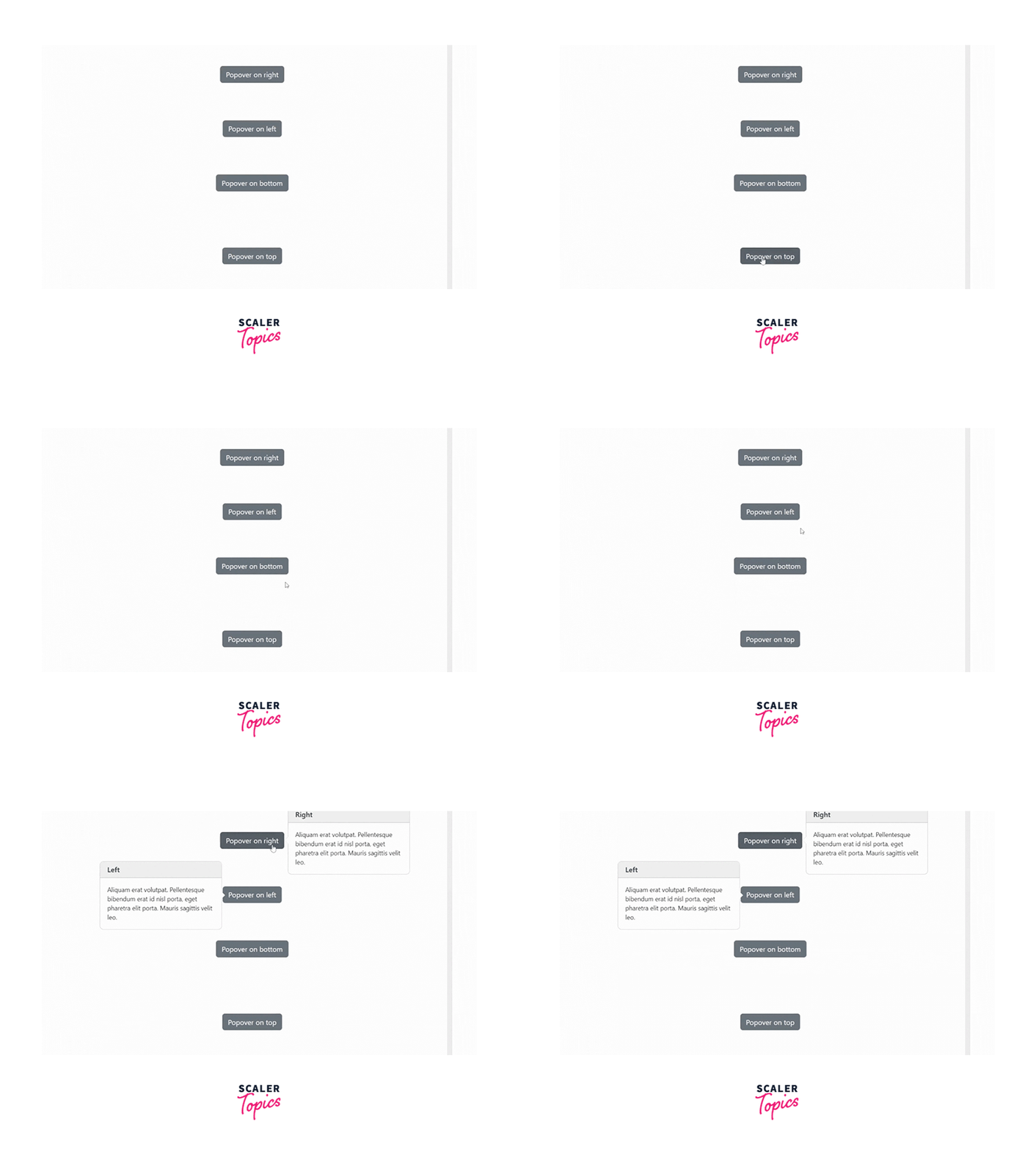
Alert
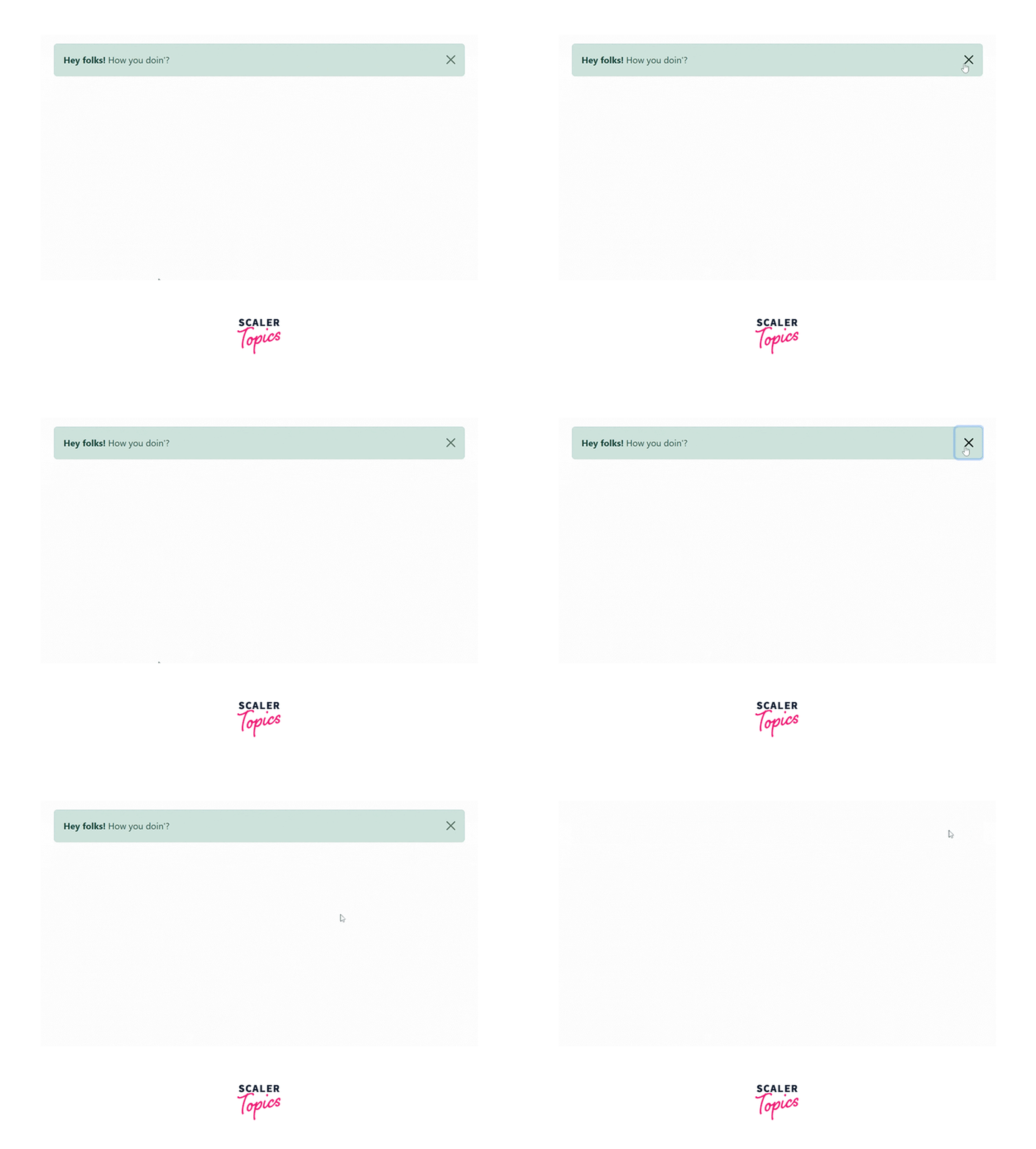
Alerts are used to provide contextual feedback messages to the user action which can be closed by the user. The dismiss functionality is provided to the alerts created using the alert plugin.
Usage
Alert Via Data Attributes To turn a button to an alert button, add the class="close" and data-dismiss="alert"attribute to the button tag of the close button. The alert is enclosed between div tags with many alert classes present in CSS such as alert, alert-success, alert-warning, alert-dismissible, fade, show, etc.
The CSS class alert gives it the functionality of an alert. alert-success or alert-warning gives it different background color indicating the purpose of the alert. alert-dismissible allows us to add a dismiss button to the div thus, an indication the user can dismiss the alert if the user doesn't wish to see the alert anymore.
Methods
-
$().alert(): This method makes an alert listen for click events on selected elements so that it can be activated when the user performs some action that requires an alert.
-
$().alert('close'): It closes an alert by removing it from the DOM(Document Object Model).
Events
| Event | Description |
|---|---|
| close.bs.alert | This event is fired right after the close instance method is called. |
| closed.bs.alert | This event is immediately fired when the alert is closed manually or due to the occurrence of some event. |
Syntax:
Example
Let us see what the alert looks like on the screen:
Output:
Button
Buttons can be combined to create a group of buttons or we can change the state of the buttons using button plugins.
Stateful
Various states such as data-loading-text="Loading" used to change the state of the button to loading, data-toggle="button" to make the button toggle, data-complete-text="finished" used to change the state of the button when some task is completed.
Usage
Button Via Data Attributes
To make a button toggleable data attributes aria-pressed="true" and class .active must be added to make a button in the active state initially when the page is freshly loaded. It is helpful for the nav bar and tabs.
For all toggleable buttons, the data-toggle="button" attribute is used.
Methods
-
$().button('toggle'): When the user clicks on the button the button is activated andclickg on the rest of the screen stills keeps the state of the button active until the user manually clicks again on the button to remove it from the active state. This is known as toggling. The above function provides the toggle functionality when it is called on a particular function.
-
$().button('reset'): This function resets the button state i.e. swaps the modified text to the original text.
-
$().button(string): It changes the text on the button with the given text in the form of a string.
Syntax:
Example
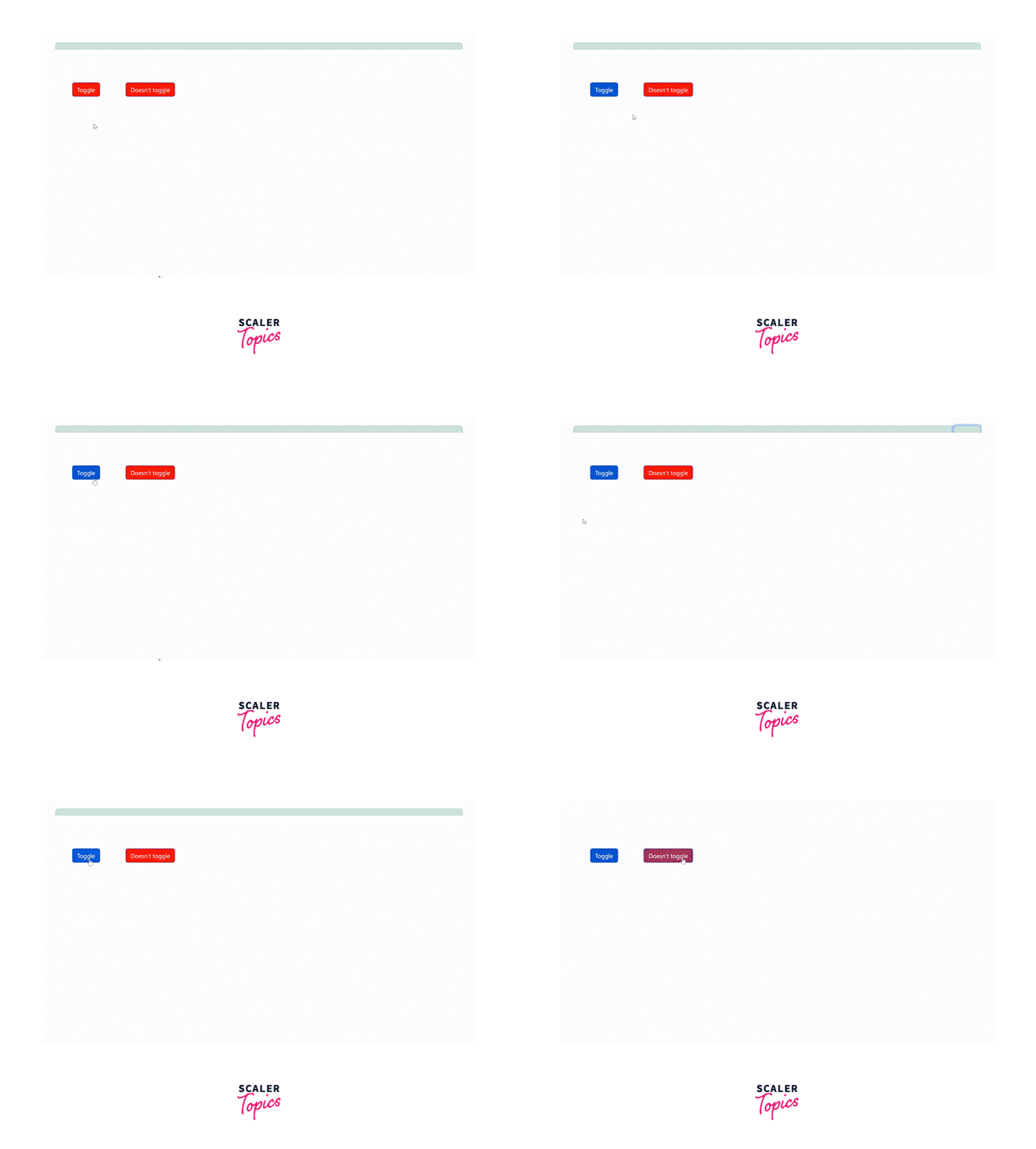
Let us see an example of the toggle button along with the normal button. Also, we will be using a different color for the active button to uniquely identify them.
The above example demonstrates that the toggle button doesn't change its state even when we click on another button or the screen whereas another button changes its state as soon as we move the focus from it.
Output:
Collapse
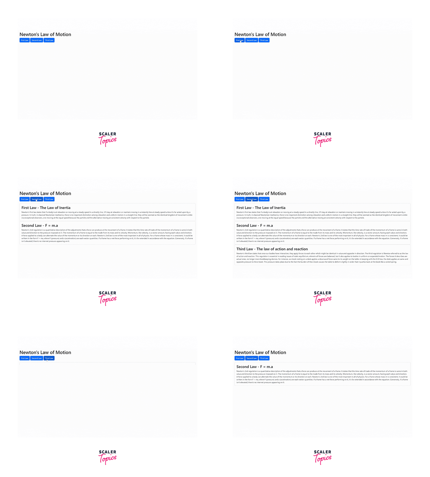
Collapse as the name suggests when clicked on opens a particular option to the user which is otherwise collapsed along with all the other options. The collapse plugin is a flexible plugin that utilizes classes for easy toggle behavior.
Usage
The collapse plugin makes use of a few CSS classes to handle the heavy lifting:
- The .collapse class hides the content
- The collapse.in class shows the content
- The collapsing class is added when the transition starts and is removed when the transition finishes. These classes are present in the component-animations.less.
Button Via Data Attributes
Add data attributes data-toggle="collapse" and a data-target targeting the element containing content and is collapsible i.e. contains the class collapse. To initially keep an element displayed add the class in.
Button Via JavaScript
To manually enable the collapse plugin using JavaScript
Options
| Name | Type | Default | Description |
|---|---|---|---|
| parent | selector | false | If a selector is specified, then all the elements with the collapse class under the specified parent will be closed when this collapsible item is shown. |
| toggle | boolean | true | This option toggles the collapsible element |
Methods
- .collapse(options): It activates the content as a collapsible element. An optional object can also be passed to perform specific tasks.
- .collapse('toggle'): This method toggles a collapsible element, it changes its state i.e. if it is hidden it shows it or vice versa.
- .collapse('show'): It shows the collapsible element.
- .collapse('hide'): It hides the collapsible element.
Events
| Column 1 | Column 2 |
|---|---|
| show.bs.collapse | This event is fired immediately after the show instance method is called. |
| shown.bs.collapse | This event is fired right after a collapse element has been made visible to the user. |
| hide.bs.collapse | This event fires when the hide method has been called. |
| hidden.bs.collapse | This event is fired immediately when a collapse element has been hidden from the webpage. |
Syntax:
Example
Let's see an example to understand and implement the collapse feature using Bootstrap JS plugins.
https://codepen.io/niyati-thakkar/pen/oNyJjNm
Output:
Carousel
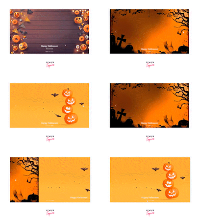
The carousel is a slideshow that cycles through a series of content manually as well as through css animation. It must have active content initially. Bootstrap provides .icon-prev and icon-next classes as plain Unicode for previous and next icons.
Optional Captions can also be added using .carousel-caption class withing any carousel .item. It will automatically place it at the bottom and center it.
Usage
Carousels require a unique ID assigned to the outermost container (i.e. .carousel) for the carousel function and inner elements to work properly.
Carousel Via Data Attributes
Data Attributes can be used to easily control the position of the carousel. data-slide-to accepts an index to the carousel, which shifts the slide position to the next slide or particular index beginning with 0.
Data-Attribute data-ride="carousel" attribute marks a carousel as animating at page load.
Carousel Via JavaScript
The carousel can be manually called as follows:
Syntax:
Note: The carousel must not be used in combination with the explicit JavaScript initialization of the same carousel.
Options: Options can be applied either through JavaScript or Data Attribute.
| Name | Type | default | description |
|---|---|---|---|
| interval | number | 5000 | The time delay between automatically cycling to another item. |
| pause | string or null | "hover" | When the user hovers over the carousel, it stops cycling if it is set to hover. |
| wrap | boolean | true | It defines whether the carousel should cycle continuously or have hard stops. |
| keyboard | boolean or Text | true | Defines whether the carousel should respond to keyboard events. |
Methods
- .carousel(options): The carousel can be initialized with an options object. The option's object is optional.
Syntax:
-
.carousel('cycle'): Cycles left to right through the carousel cycle.
-
.carousel('pause'): Pauses the carousel from cycling.
-
.carousel('number'): Cycles the carousel to a specified frame (frames are indexed starting from 0).
-
.carousel('prev'): Cycles to the prev item of the current slide.
-
.carousel('next'): Cycles to the next item of the current slide.
Events
| Event | Description |
|---|---|
| slide.bs.carousel | This event is fired right after the slide instance method is involved. |
| slid.bs.carousel | This event fires immediately after the carousel has completed its slide transition. |
Example
Look at the example below of the carousel with the optional caption to the carousel and its heading.
Output:
Affix
The affix plugin toggles the CSS property position: fixed on and off, which makes it look like the effect generated by position: sticky;. It is often used with navigation menus to make them fix or stick at a specific area while scrolling up and down the page.
Usage
The affix plugin can be applied using data attributes or manually with JavaScript. In both implementations, CSS positioning is a must.
Affix Via Data Attributes
Data attribute data-spy="affix" must be added to the element we want to spy on. Options such as data-offset, data-target, etc can also be added using data attributes.
Syntax:
Affix Via JavaScript
To call the affix plugin using JavaScript
Options
| Column 1 | Column 2 | Column 3 | |
|---|---|---|---|
| offset | number or function or object | 10 | It defines the number of pixels to offset from the screen calculating the position of the scroll. |
| target | selector or node or jQuery element | the window object | It specifies the target element of the affix. |
Methods
- .affix(options): It activates the affixed content. An optional options object.
- .affix('checkPosition'): It recalculates the state of the affixed element based on the dimensions, position, and scroll position of the relevant elements.
Events
| Column 1 | Column 3 |
|---|---|
| affix.bs.affix | This event is fired right before the element has been affixed. |
| affixed.bs.affix | This event is fired right after the element has been affixed. |
| affix-top.bs.affix | This event is fired immediately before the element has been affixed-top. |
| affixed-top.bs.affix | This event is fired immediately after the element has been affixed-top. |
| affix-bottom.bs.affix | This event is fired right before the element has been affixed-bottom. |
| affixed-bottom.bs.affix | This event is immediately fired after the element has been affixed-bottom. |
Interactive Bootstrap Components Without Custom JavaScript
To custom bootstrap components data attributes are used which don't require JavaScript code. These data attributes are added to the tag itself.
Example
For instance, to make a button display a modal when it is clicked. Data attributes data-toggle and data-target must be added to the button or link as follows:
Bootstrap Components With Custom JavaScript
We can achieve the same functionality using Bootstrap JavaScript as well. We are required to add the link to Bootstrap JS.
Let us see how we can achieve the above toggle functionality of the button using JavaScript.
Button Methods
JavaScript methods are used to control the buttons. These methods include .button('toggle') which makes the appearance of the button as if it is activated.
Modal Methods
Bootstrap JS also provides methods to display models such as .modal(options) which activates the modal using the optional option provided, .modal('toggle') which manually toggles a modal, modal.('show') manually triggers the modal, etc.
Events
Bootstrap JS additionally provides events to be performed along with methods and options of the bootstrap components and plugins. The most common events are performed when the show method's instance is called after the element is shown when the hide method's instance is called and immediately after the element is hidden.
Bootstrap Components to Indicate Progress
Components such as modal, alerts are used to inform users of important details such as progress. Look at the example below that saves the work of the user and also shows the progress bar notifying the user of the completion of the task.
Extend the task1_save Function
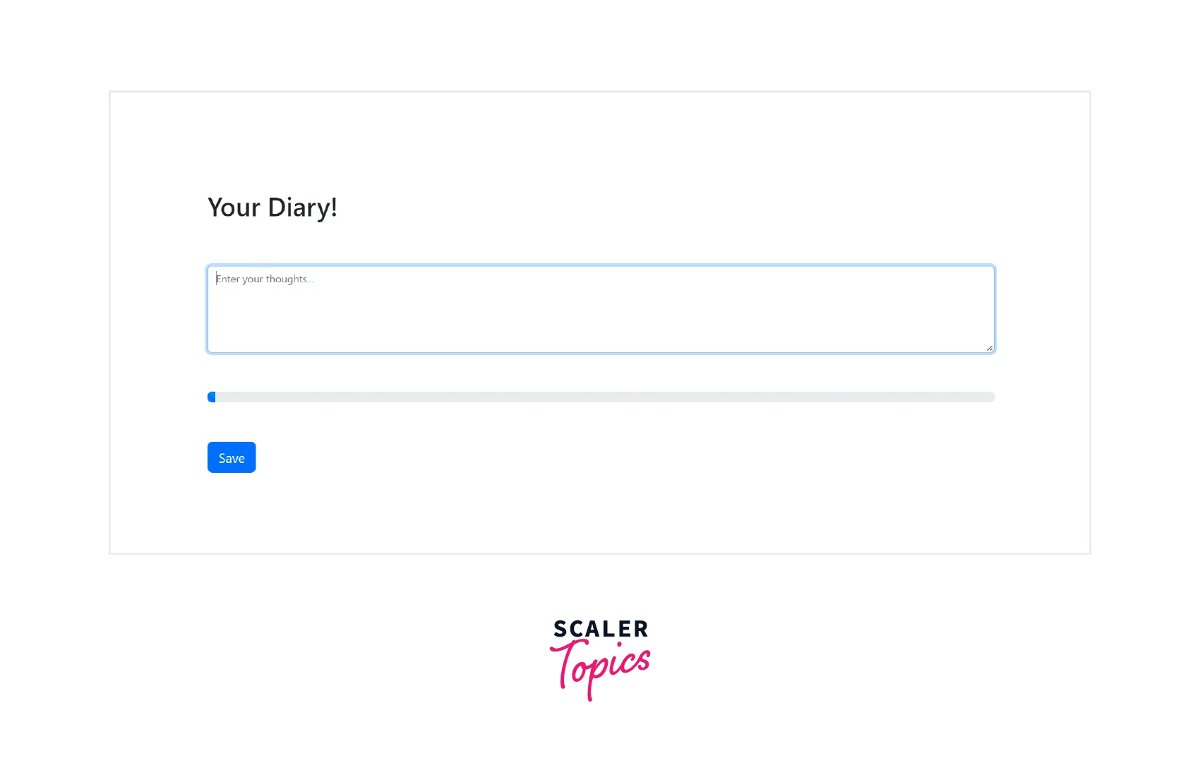
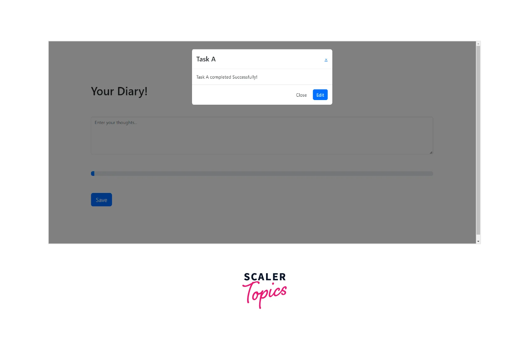
The task1_save function displays a modal to the user saying that their progress is saved. We will be creating a webpage that lets the user write his/her thoughts or diary. This webpage will be consisting of the text area, button, and progress bar. As the user completes writing, the save button can be clicked on to display a modal that tells the user that the task is completed.
HTML code for the layout
Signal Task Completion
As the task is completed we display the modal to the user. This modal will be created using Bootstrap JS. HTML code for the Modal along with Bootstrap:
Add a Progress Bar and Animation
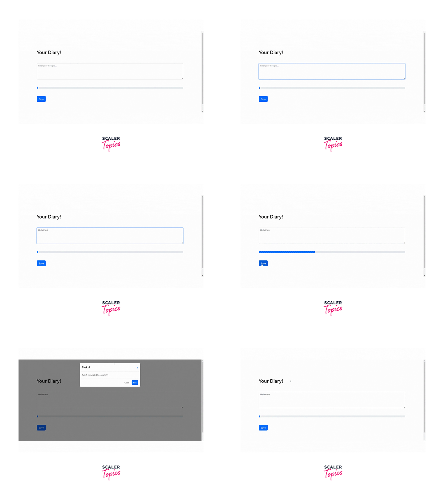
Now we will add the progress bar that shows the animation for task completion and after loading the progress bar, the modal is displayed to the user.
Compiling the above code snippets gives the following output:
Conclusion
- Bootstrap JS provides plugins to bring life to bootstrap components.
- Data Attributes facilitates the use of plugins by inserting attributes to the respective tags with appropriate values.
- Instead of data attributes, JavaScript code can also be used to apply plugins to the components.
- Bootstrap provides custom events for most plugins. These events are unique for each component.
