Bootstrap Labels
Explore Bootstrap labels, a versatile tool for integrating counts or tips, demonstrated through the .label class. The chapter extends to Bootstrap labels and badges, crucial for responsive web and app design. Bootstrap, a popular front-end framework, uses classes for responsiveness. Badges dynamically scale with relative font sizing, while labels provide extra information about links or text, enhancing the overall user experience.
What are Bootstrap Labels
The bootstrap labels are designed and flexible components that supply extra information about the content. The bootstrap labels are layout components that provide tips and additional small information on the main content. The bootstrap labels are highlight or markup the content with minimum space and information. The labels are the adjustable component which is modified as per tag, elements, and content size.
Syntax
- The bootstrap label classes are mostly come up with the <span> tag.
- The class label and contextual label class are always working together in the labels.
- The class label and class label-primary are placed inside of span tag.
- The labels always adjust with the content size or text size.
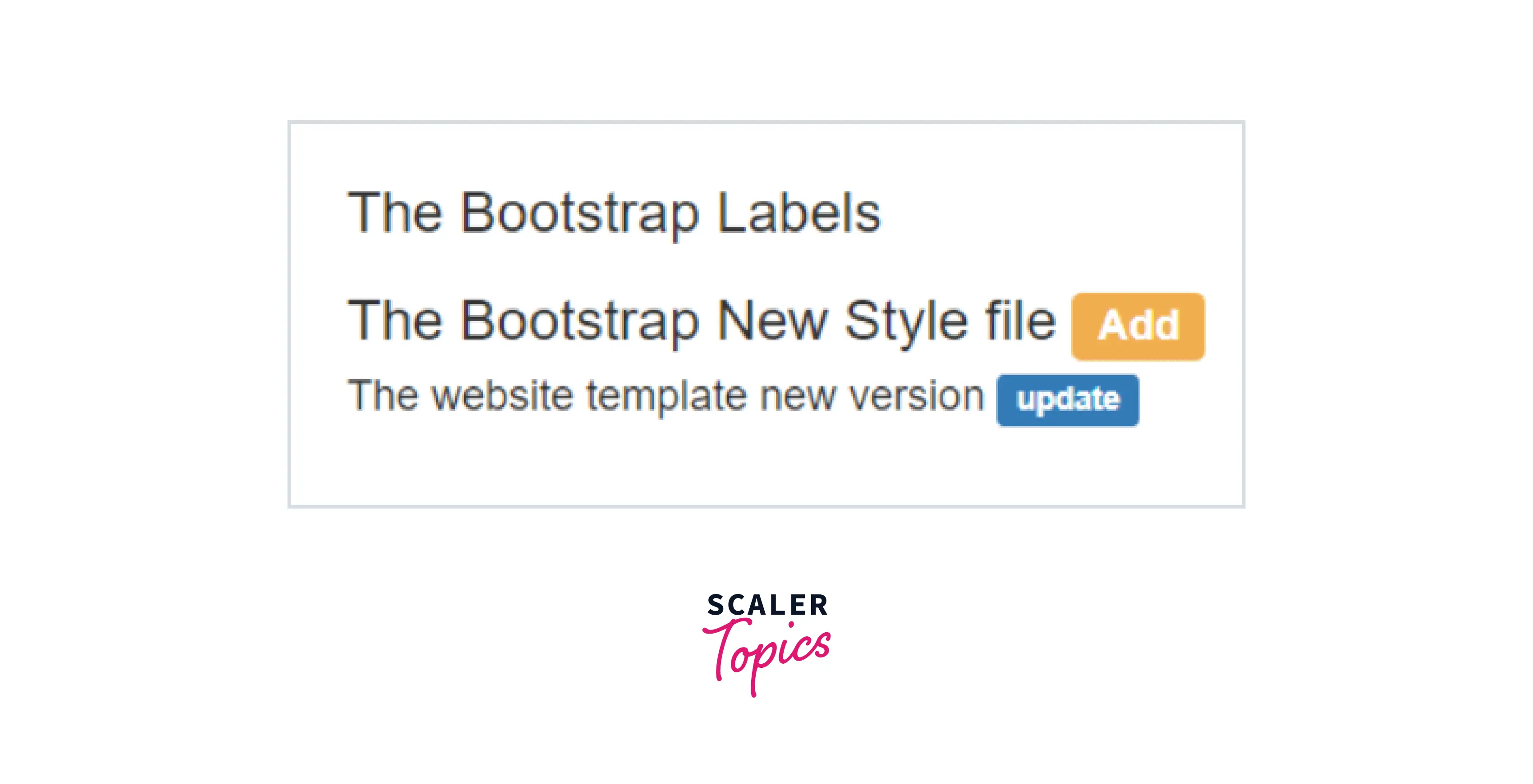
A basic example of bootstrap labels.
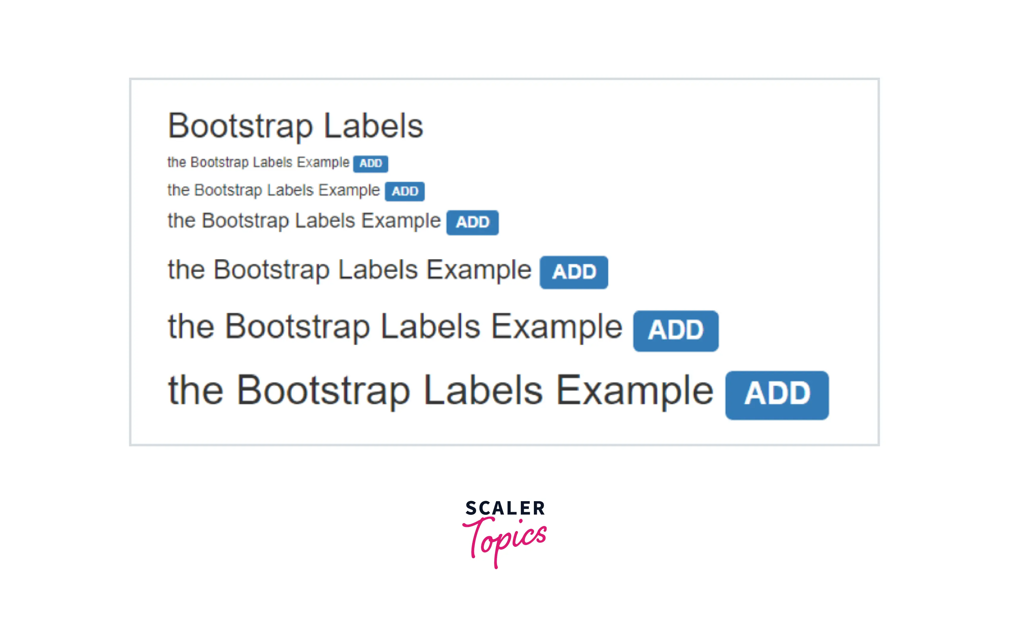
The label with heading size syntax is below.
- The <span> tag is used inside of <h1> tag with the <h1> tag text and label and label-primary classes are placed inside of span tag.
Types of Bootstrap Labels
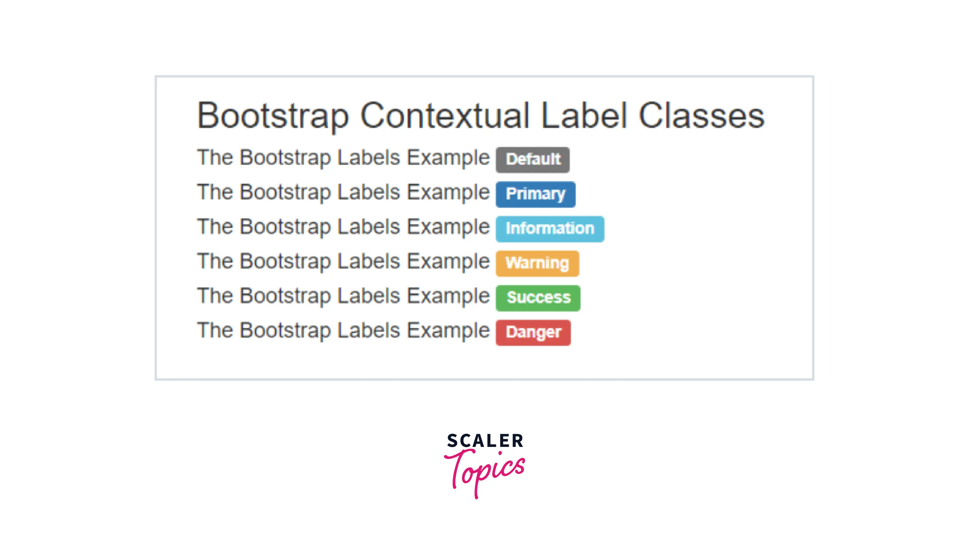
Following are the 6 types of labels available in Bootstrap:
- label-default: As the name suggests, this is the default label used, when no other label is used to an element.
- label-primary: This label is used to represent some important labels by adding the blue color to an element.
- label-success: This label is used to represent success or some positive action labels by adding the green color to an element.
- label-info: This label is used to indicates an informative label by adding the light-blue color to an element.
- label-warning: This label is used to indicates an alert or negative action label by adding the yellow color to an element.
- label-danger: This label is used to indicates danger or negative action label by adding the red color to an element.
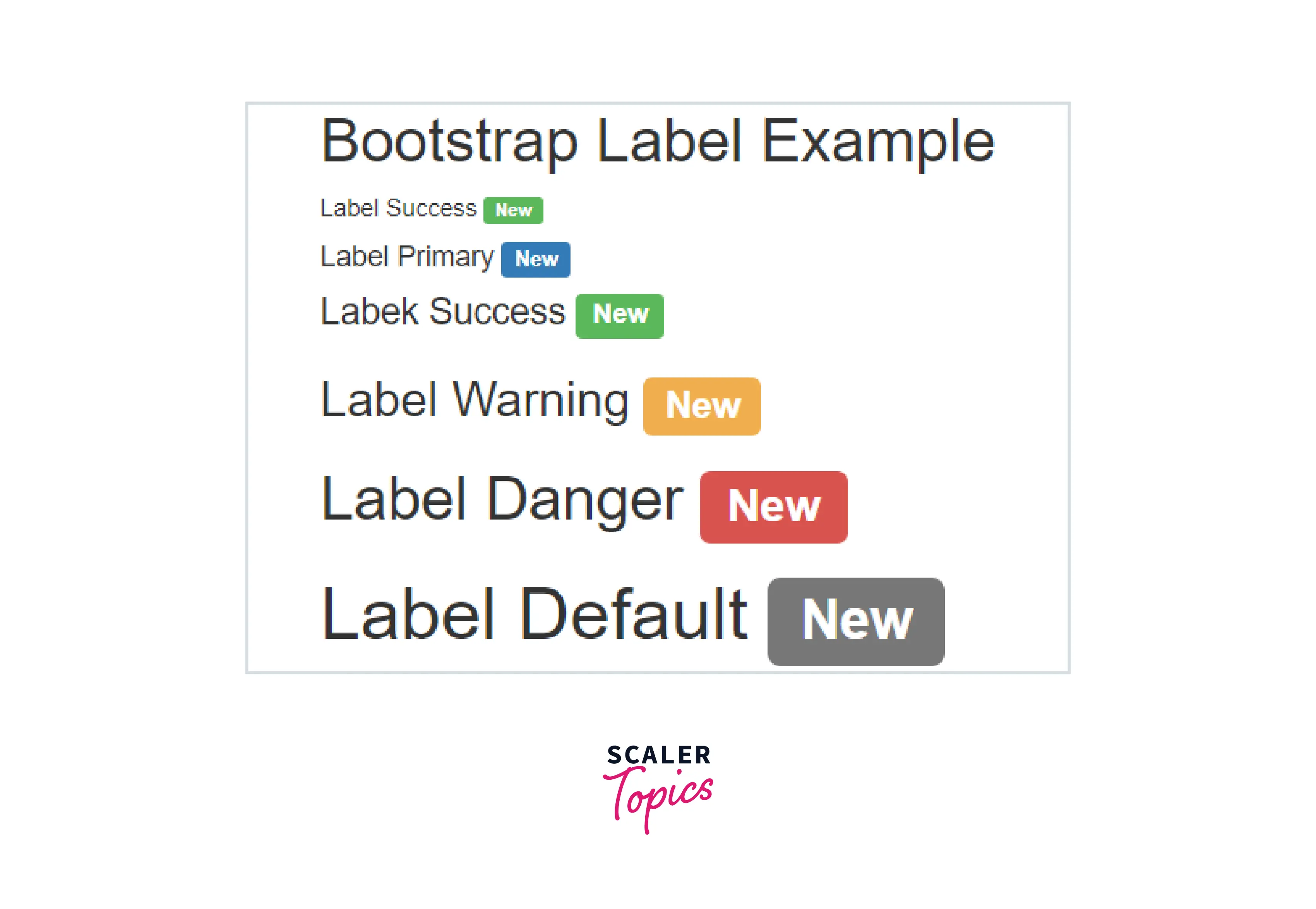
How Bootstrap Labels Works?
- To provide bootstrap components like labels, we need a bootstrap3 or bootstrap4 support file.
- The bootstrap is responsive for mobile, laptop, desktop devices framework.
- We include <meta> tag with their attributes in the head section of the HTML file. The syntax is below.
The bootstrap3 includes three support files in the head section of the HTML file.
The bootstrap4 includes four support files in the head section of the HTML file.
To know how to assemble files and label syntax in the HTML file. The Basic label example is below.
The label-warning and label classes are placed inside of the <h3> heading tag.
The label and label-primary classes are placed inside of the <h4> heading tag.
Examples of Bootstrap Labels
Example 1:
Example 2:
Example 3:
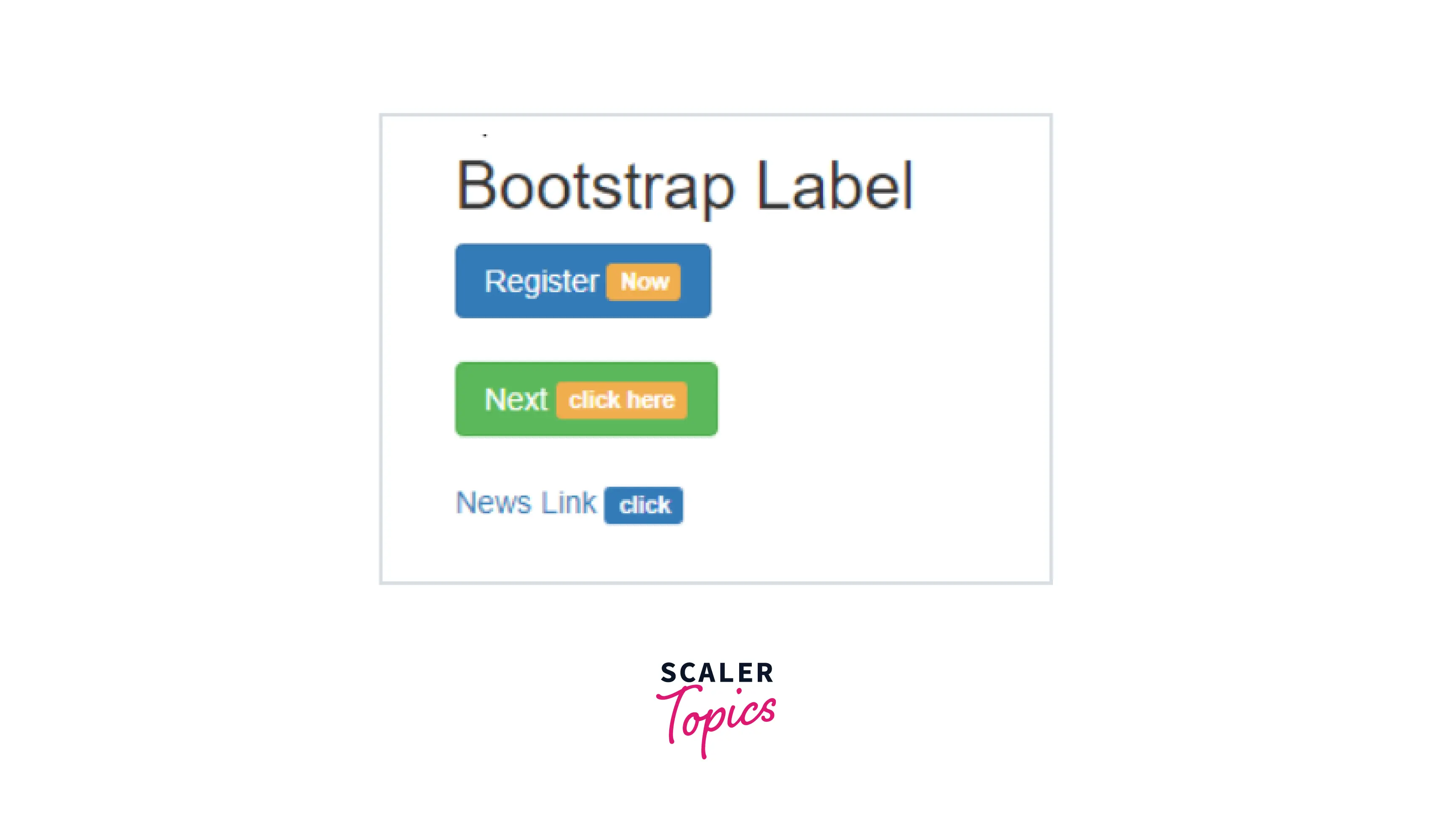
Example 4:
Exactly how To Utilize the Bootstrap Label Group
The things so far has been stated concerns the <label> component that is completely maintained inside of the latest edition of the most popular mobile friendly framework-- Bootstrap 5. The <label> element does not stand out with interesting visual appeal or else several functionalities yet it works the perhaps most critical objective in our forms-- lets the individuals understand precisely what engaging with a particular form control will trigger and adding some clickable area for turning on the control in itself which in cases of little controls like radio or checkboxes and mobile device displays is important.
The system is very practical -- simply just install a <label> element within your markup specifying it the for =" ~ labeled form control ID ~ " attribute and make the proper content you want to be revealed within it. The for="" attribute says to the internet browser what form control to become turned on in case the user clicks the <label> component and is able to be rejected keeping the very same behaviour if you simply just wrap the desired command within the <label> itself.
However wrapping form controls within labels is rather complicating the code and it's more desirable to leave out it-- additionally with the for ="" attribute you achieve some freedom in producing your form's layout and so it is actually the much better approach to go for.
Additionally plain text within the <label> you can easily likewise install some simple HTML tags like a heading or else a small section maybe-- that is definitely not a usual situation yet is feasible and undoubtedly all of it relies on the special objective of the form you're treating.
Bootstrap Badges
Bootstrap has many classes, tags, and attributes to make web application user-friendly. The badge in bootstrap is used to add the extra information of content and highlight the additional information of content. The badge is similar to label but it has some classes and more effective than label.
Syntax
The .badge class is used in <span>tag in the content text tag.
- The .badge-primary class is contextual class. It is used for style and design.
- The following syntaxes are different tags and different contextual.
- The basic syntax with content text size and badge class in bootstrap.
This bootstrap budge sets the size according to the content of the main element.
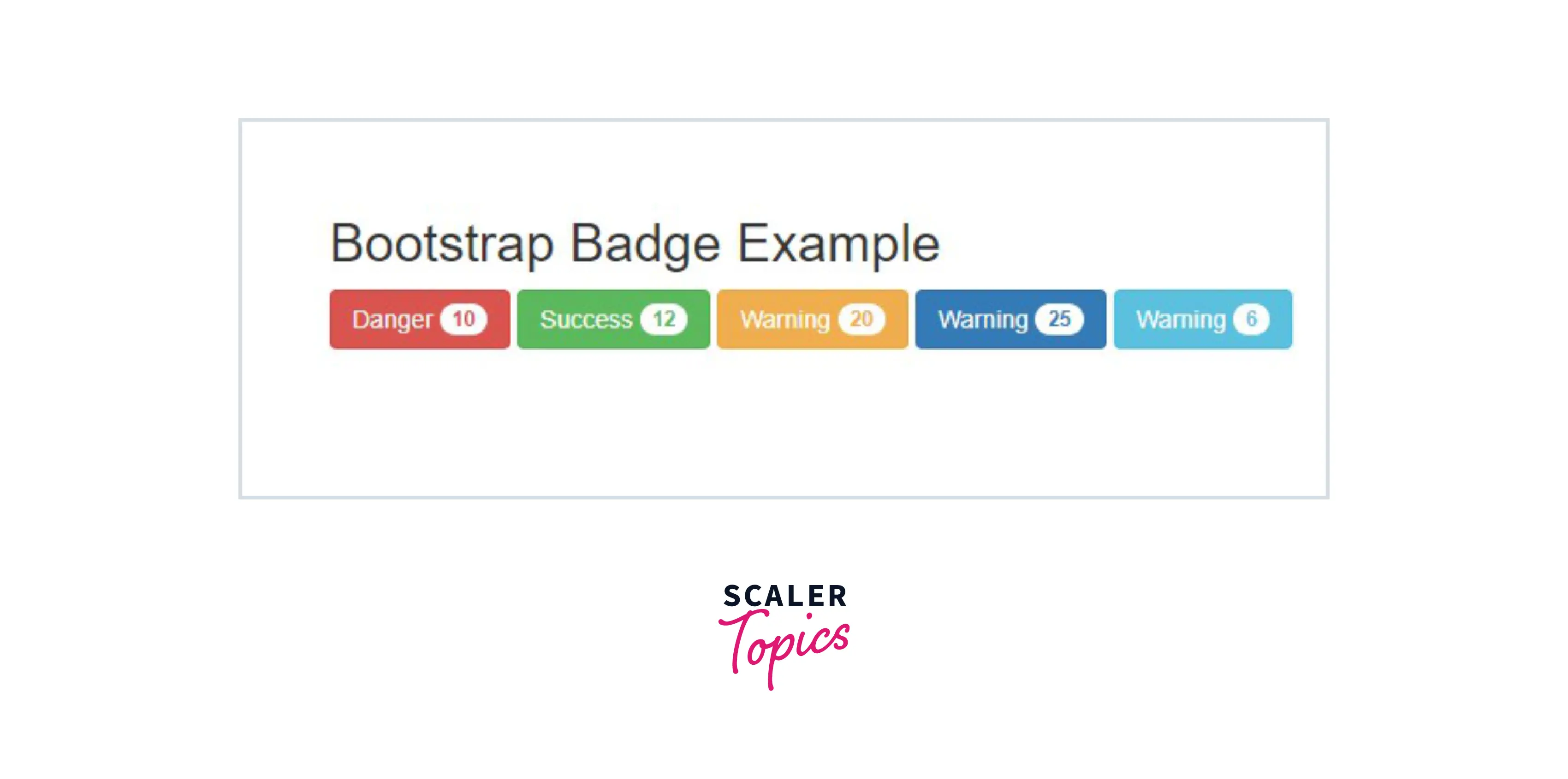
The Bootstrap Badge with The Contextual Badges
- Contextual badges are the different color and rectangular size badges.
- Some contextual badge syntax are given below.
Bootstrap Badge with The Pill Badge
- Pill badges are rectangular with a round shape at the corner.
- The .badge-pill class is used for pill badges in boots
Types of Bootstrap Badges
- bg-primary: It is used to add a blue color background to the element that highlights the importance of the element.
- bg-info: It is used to represent some information by adding a light-blue background color to an element.
- bg-success: It is used to represent success or positive action by using the green background color to an element.
- bg-danger: It is used to indicates the danger or negative action by using the red background color to an element.
- bg-warning: It is used to indicates the alert or the negative action by using the yellow background color to an element.
- bg-secondary: It is used to represent the uninformative or secondary action by using the grey background color to an element.
- bg-light: It is used to represent the transparent background color to an element.
- bg-dark: It is used to represent the dark grey background color to an element.
Examples
Example 1:
Example 2:

Example 3:
Example 4:
Conclusion
- The bootstrap labels are one of the more adjustable, flexible, and user-friendly components.
- This provides a small amount of information that helps the user on the web application.
- In addition, the label is a lightweight component to make meaningful extra content of the web application.
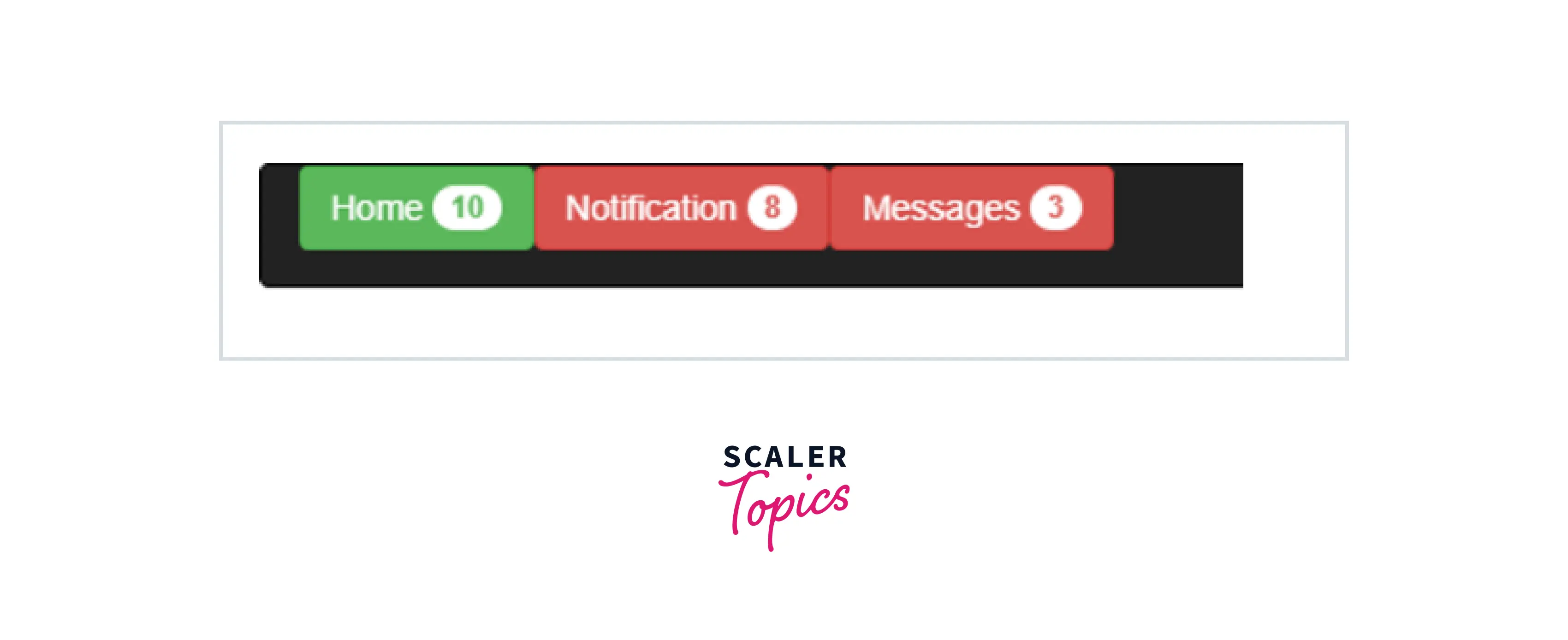
- Badge is used for counting the number of inputs like notifications, messages, updates, and comments.
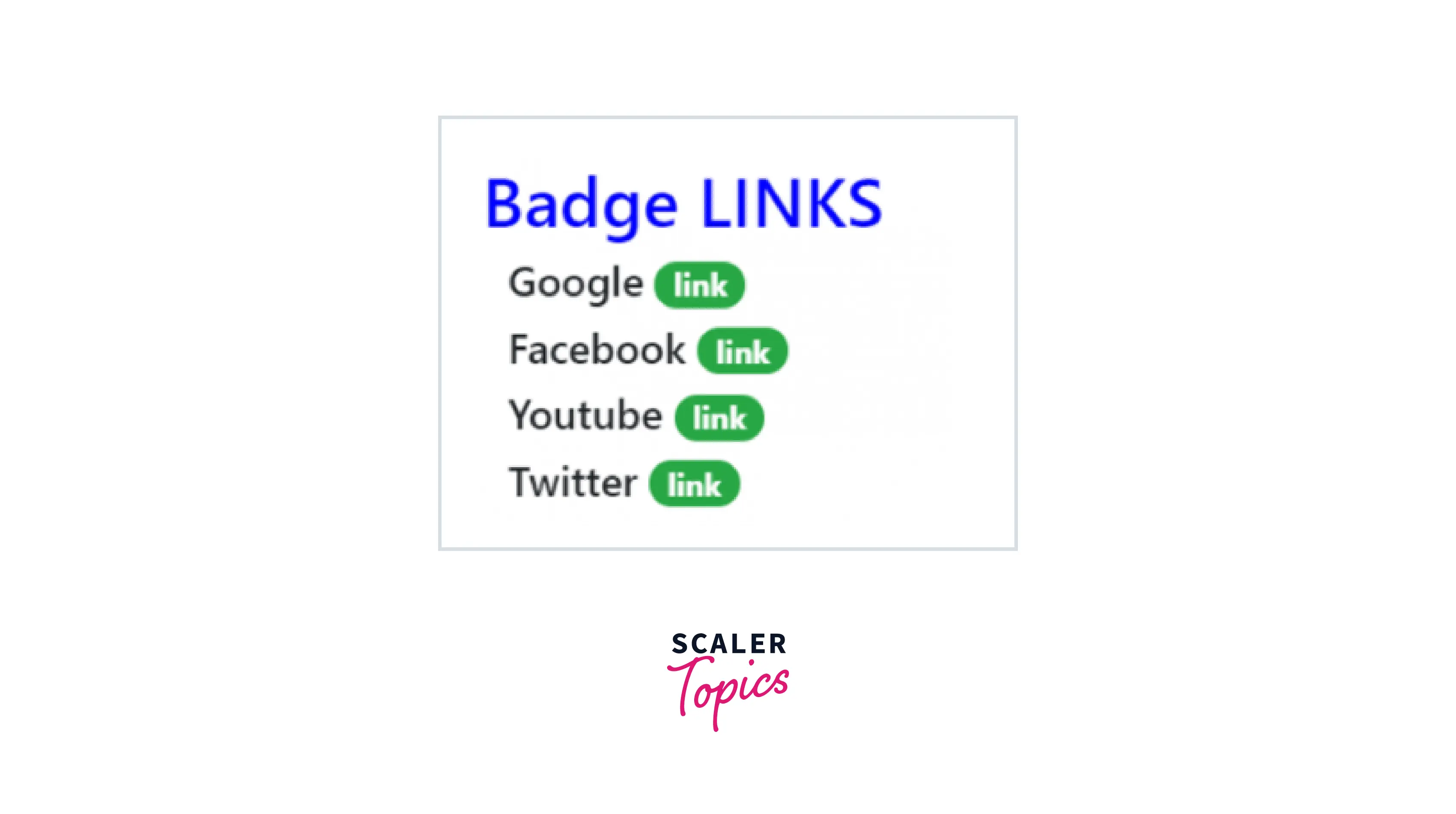
- This is used as a link and button to show extra information about the content.
- This is the same as a label but the shape is more rounded of contextual badges.
- And so now we have figured out exactly what the # elements are for and precisely how they act in Bootstrap the only thing that's left is considering the appropriate form areas to attach them to.
