Bootstrap List Groups
Bootstrap's .list-group class creates versatile responsive list groups for simple or complex content, enhancing UI design without starting from scratch.
Basic Example of Bootstrap List Groups
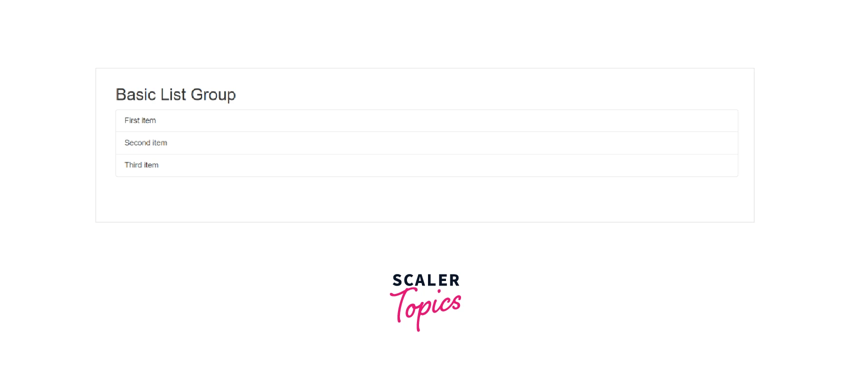
An unordered list with list items and the appropriate classes is the simplest type of list group. Add to it using the options that are provided below or your CSS as necessary.
Following is an illustration of a basic list group.
Code :
Output :
Active Items
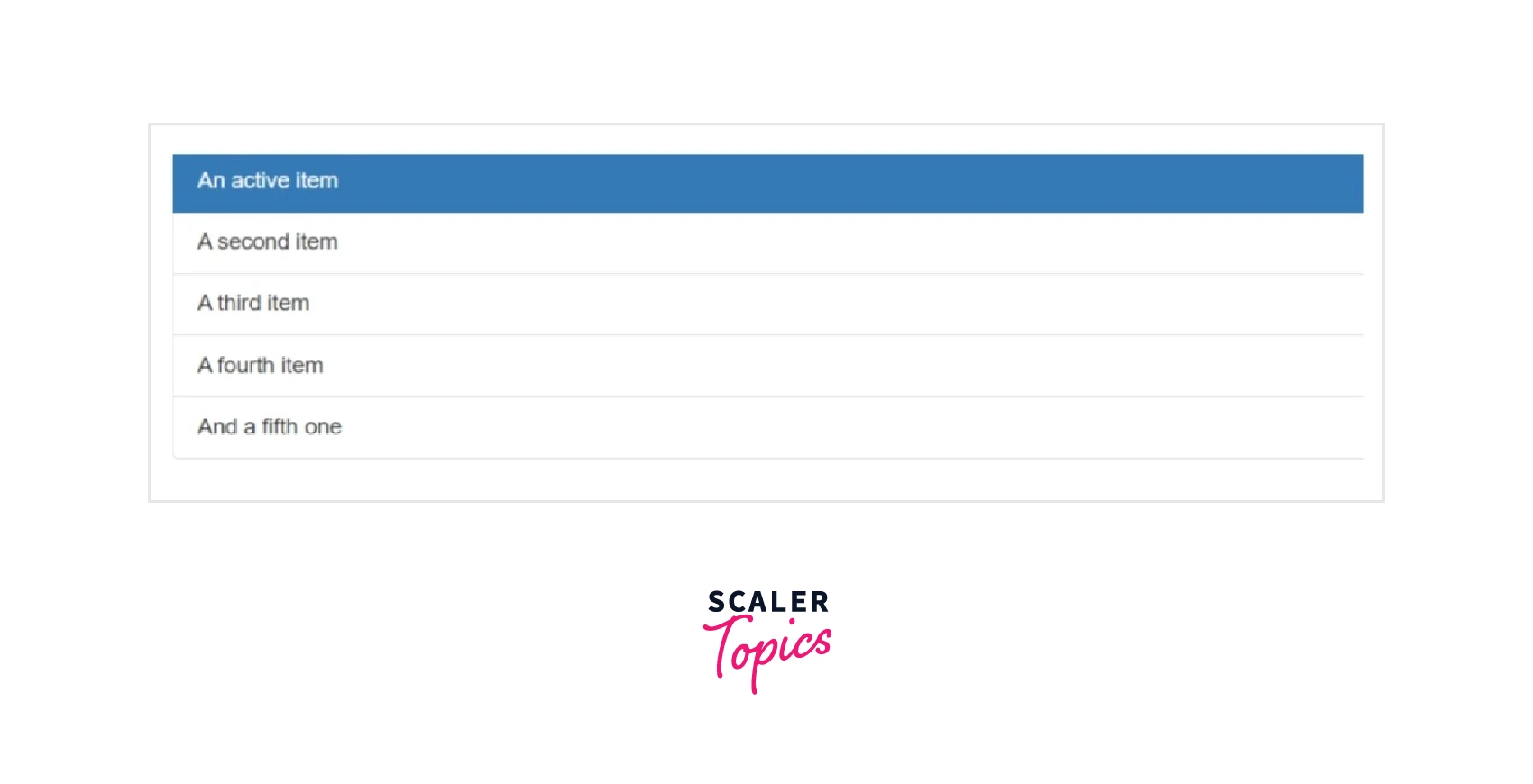
To show the currently active selection, append the class .active to a .list-group-item.To prevent the text from overlapping the edge of the list, you can additionally add extra padding with spacing classes. You should also use .border-0 to eliminate borders between items.
Code :
Output :
Disabled Items
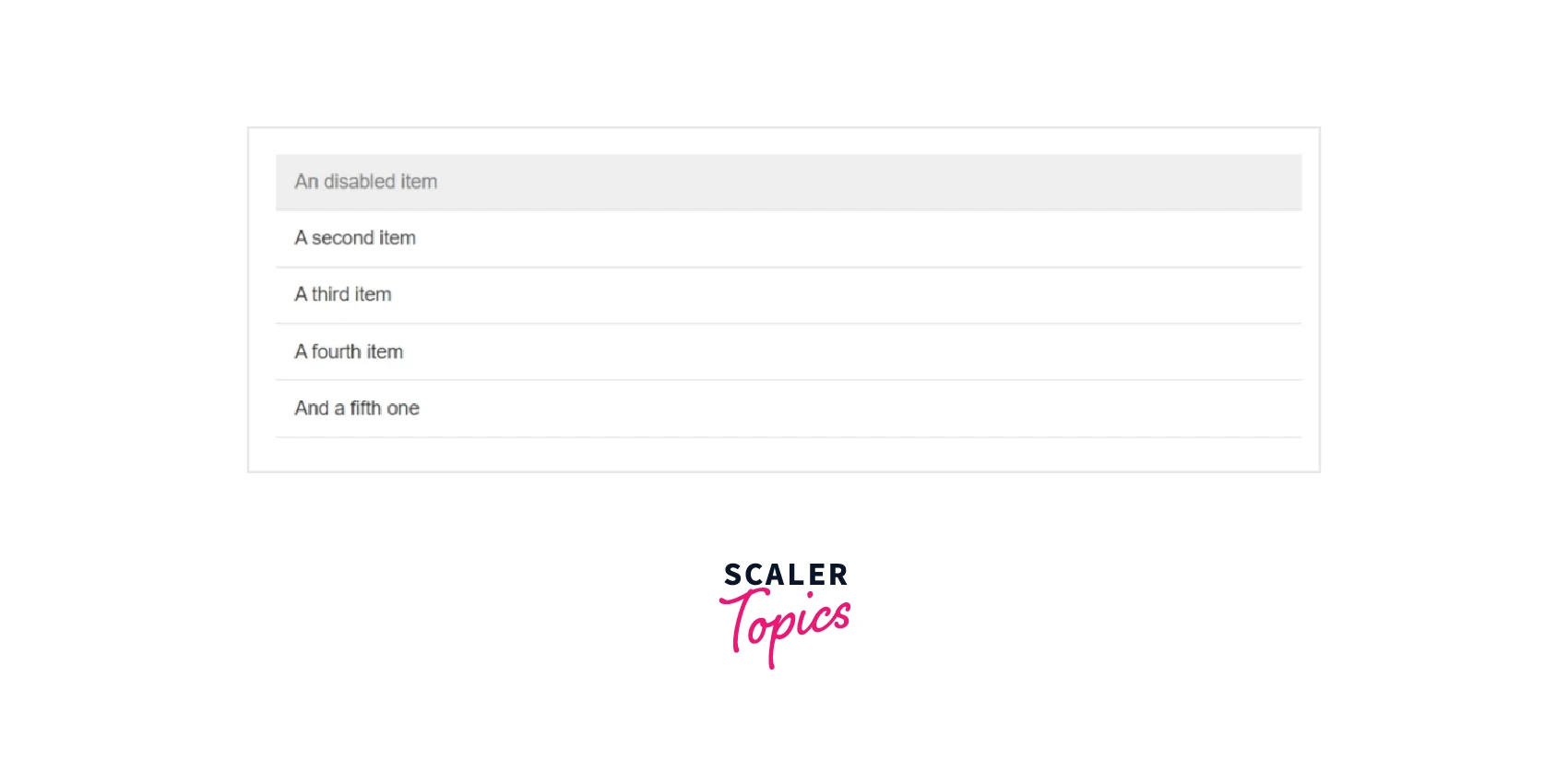
To make a .list-group-item appear disabled, append the class .disabled to it. To completely deactivate the click events of particular items with the .disabled class, special JavaScript is necessary (e.g., links).
Code :
Output :
Links and Buttons
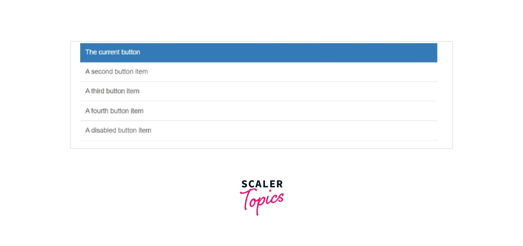
Add .list-group-item-action to using <a> or <button> to build actionable list group items with disabled, hover, and active states. We divide these pseudo-classes between making sure list groups built of non-interactive components (like <div> or <li>) don't offer a click-or-tap affordance.
Be sure to avoid applying the standard .btn classes.
Instead of using the .disabled class with <button>, you can use the disabled attribute. Sadly, the disabled attribute is not supported by <a>.
Code :
Output :
Flush
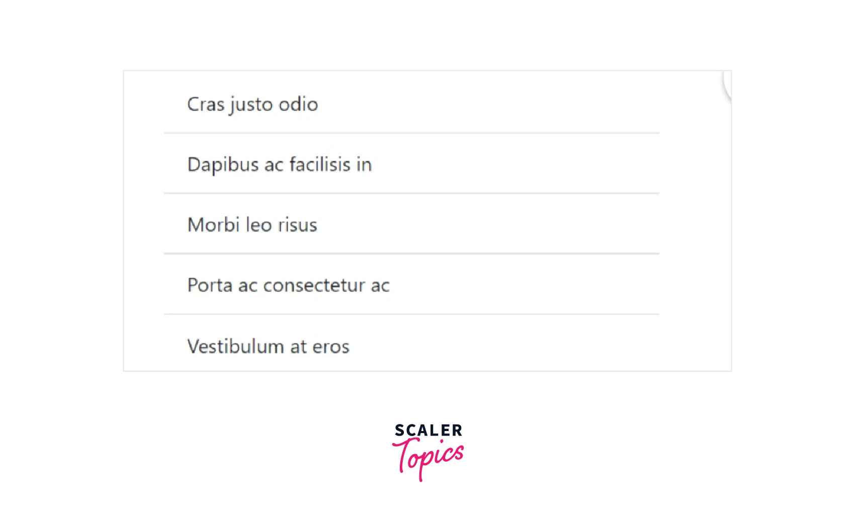
To display list group items edge-to-edge in a parent container, add .list-group-flush to remove some borders and rounded corners (e.g., cards).
Code :
Output :
Numbered
To enable numbered list group elements, add the .list-group-numbered modifier class (and optionally utilize an <ol> element). For better placement inside list group items and to enable better customization, numbers are generated using CSS (as opposed to default browser styling).
a::before pseudo-element on the <li> with counter-increment and content is used to style and position numbers after being generated by counter-reset on the <ol>.
Horizontal
To alter the list group item layout from vertical to horizontal across all breakpoints, add .list-group-horizontal. To create a list group horizontal beginning at that breakpoint's min-width, select a responsive variation .list-group-horizontal-{sm|md|lg|xl|xxl}. At the moment, flush or light list groups cannot be mixed with horizontal list groups.
ProTip :
Do you like equal-width list groups for horizontal lists ? Use .flex-fill with each list group.
Contextual Classes
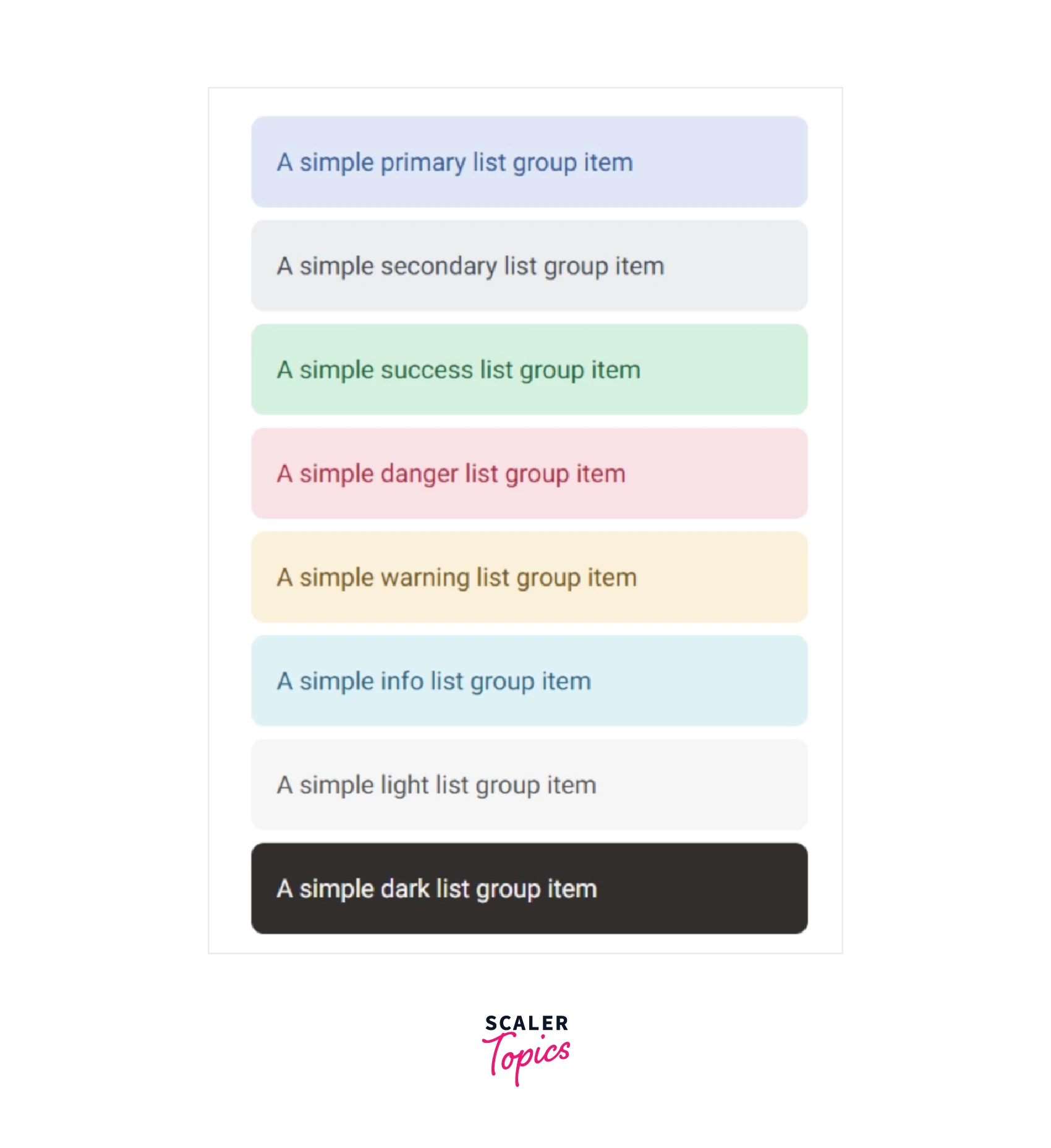
Contextual classes are used by Bootstrap for list group elements. It will give the items a variety of colors.
- .list-group-item-primary :
Add this class to impart blue color to a list item. - .list-group-item-secondary :
Add this class to impart grey color to a list item. - .list-group-item-success :
Add this class to impart green color to a list item. - .list-group-item-danger :
Add this class to impart red color to a list item. - .list-group-item-warning :
Add this class to impart orange color to a list item. - .list-group-item-info :
Add this class to impart a light blue color to a list item. - .list-group-item-light :
Add this class to impart a light grey color to a list item. - .list-group-item-dark :
Add this class to impart a dark grey color to a list item.
Important :
Using color-coding to add meaning just gives a visual cue, which users of assistive technologies like screen readers won't be able to understand. Make sure the information the color designates is either evident from the content itself (such as the visible text) or is included in another way, such as by hiding additional text using the .visually-hidden class.
Badges
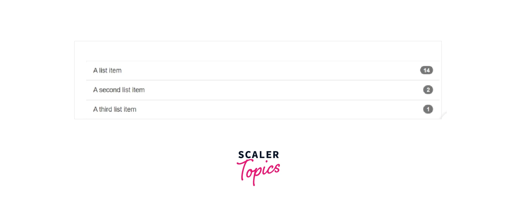
Using simple flexbox utilities, you can add badges to any list group item to display unread counts, activity, and other information.
Code :
Output :
Custom Content
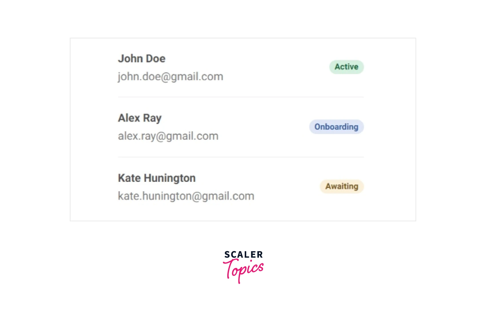
With the use of flexbox utilities, almost any HTML may be included therein, even for linked list groups like the one below.
Code :
Output :
Javascript Behaviour
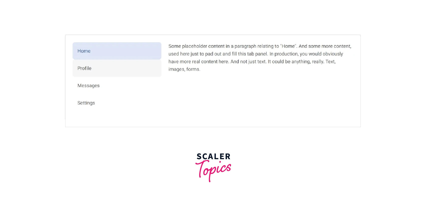
To add tabbable panes of local content to our list group, use the tab JavaScript plugin.
Code :
Output :
Fade Effect
Add .fade to each .tab-pane to have the tabs panel fade in. For the original content to be displayed, the first tab pane also has to have .show.
Methods :
$().tab
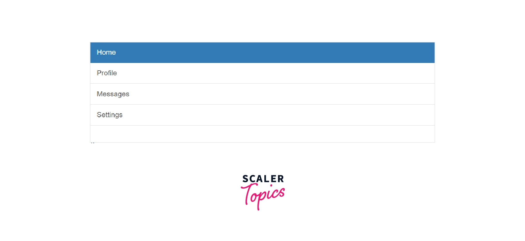
It activates a content container and lists item elements. Either a data-target or a href targeting a container node in the DOM should be present in Tab.
Code :
Output :
.tab(‘show’
Selects the specified list item and display the related pane. Previously selected list items become unselected, and the associated window is hidden. returns to the caller before the tab window appears (for example, before the shown.bs.tab event occurs).
Code :
Events
The following events take place when a new tab is displayed :
- hide.bs.tab :
on the current active tab. - show.bs.tab :
on the to-be-shown tab. - hidden.bs.tab :
on the previous active tab. - shown.bs.tab :
on the newly-active just-shown tab.
The hide.bs.tab and hidden.bs.tab events won't be called if there were no active tabs.
Description of the following events are given below :
-
hide.bs.tab :
This event occurs when a tab is shown, but before the next tab appears. To target the active tab and the preceding active tab (if available), use event.target and event.relatedTarget, respectively. -
show.bs.tab :
After a tab has been presented, this event occurs on the tab shown. To target the active tab and the preceding active tab (if available), use event.target and event.relatedTarget, respectively. -
hidden.bs.tab :
This occurs when a new tab is about to be displayed (and thus the previous active tab is to be hidden). To target the currently active tab and the new tab that will soon become active, use event.target and event.relatedTarget, respectively. -
shown.bs.tab :
This occurs after the appearance of a new tab (and thus the previous active tab is hidden). To target the previous active tab and the new active tab, use event.target and event.relatedTarget, respectively.
Conclusion
- List groups are a flexible and effective component for showing a series of content.
- List groups are styled using a variety of classes in Bootstrap.
- We can make various lists, including ones with actionable list items, horizontal groups, groups with badges, etc.
- Bootstrap classes required to create list groups are .list-group and .list-group-item.
- For styling the list items, various contextual classes are used.
- Using Bootstrap List Groups have a lot of advantages like the overall structure of the page and user-friendly look.
- There is no harm in using them, so it is quite good to use them.
