Bootstrap Loader
Overview
Bootstrap provides useful utilities for different components to make our work easier and faster. Loaders are simple animations that are used to enhance the user experience. These animations are displayed on the screen while a page is still loading and fetching its contents. Therefore, these loaders keep the users of the page entertained while the page loads.
What is Bootstrap Loader?
A Bootstrap loader, also known as a spinner, is used to show the loading state of a project. These spinners are basically animations that keep the user entertained while the page is loading its contents. The bootstrap loaders are built using only HTML and CSS, and you do not need any Javascript to create them. However, you will need some custom javascript to toggle their visibility on the screen.
You can create a simple bootstrap loader using the .spinner-border utility class which creates a rounded animation on the screen while the actual content of the page loads.
However, you can change the alignment, size, color, and appearance of the spinner using the other bootstrap utility classes as per your need.
Use the Border Spinners for a Lightweight Loading Indicator
For making simple lightweight loading spinners, we use border spinners that are extremely easy to make. For making a border spinner, we just need to use the spinner-border utility class of bootstrap.
However, for accessibility purposes, each of the loaders includes role=" status" and a nested span having the class="sr-only".
Let us see the code example for showing a lightweight loading indicator using the spinner-border utility class of bootstrap.
Output:
As you can see in the above output, just by using the spinner-border utility, we have created an animated spinner. However, the role=" status" and the nested span are just used for accessibility purposes, role=" status" shows the status messages whereas the sr-only class hides the span from the screen. However, you can also create the animated spinner just by using the spinner-border utility as well.
Types of Spinner
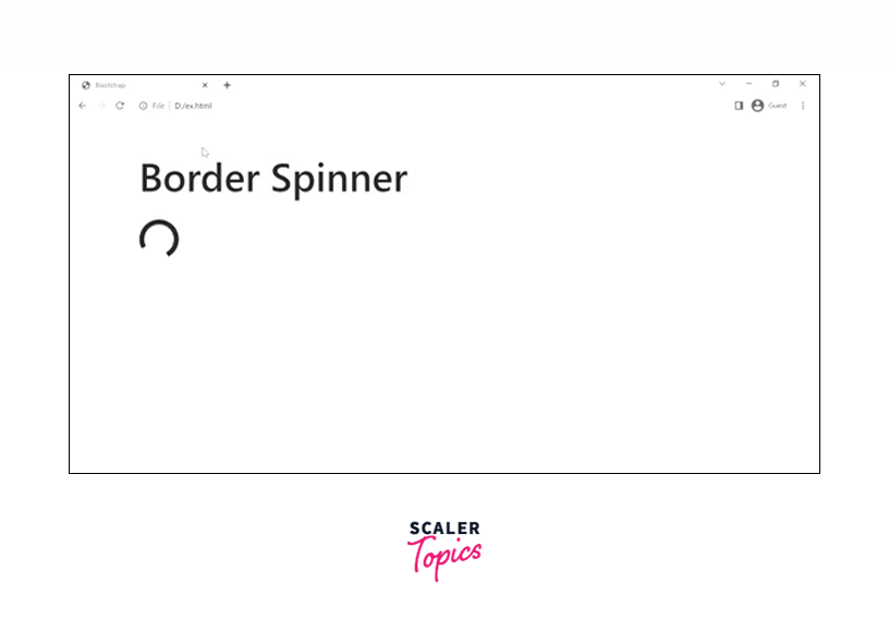
Border Spinner
As discussed earlier, you can create a border-spinner using the spinner-border utility class in bootstrap.
Let us see the border spinners with the help of a code example.
Output:

Colored Spinners
You can also change the color of the spinners to make them look more attractive to the users. Bootstrap provides certain text-color utilities that when used with the .spinner-border utility change the color from black to the specified text color.
Some of the text-color utilities that bootstrap provides are - text-primary, text-secondary, text-warning, text-success, text-info, and much more.
Let us understand the colored spinners with the help of a code example.
Output:
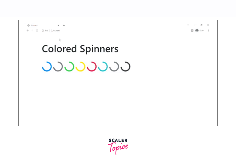
Therefore, as you can see in the output, the different color spinners have been created using the corresponding bootstrap utilities. Moreover, only the corresponding text-color class is used with the .spinner-border utility to give the spinner a particular color.
Growing Spinner
You can also create a spinner that repeatedly grows instead of spinning as it adds variety to the spinners. For creating a growing spinner, we need to use the .spinner-grow utility of Bootstrap.
Let us see how to create a growing spinner with the help of a code example.
Output:
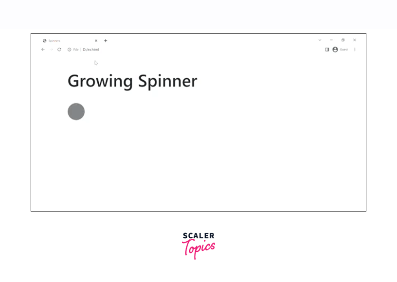
As can see in the output, the spinner is repeatedly growing using the spinner.grow utility of bootstrap.
Colored Growing Spinner
As we colored the spinning loaders, similarly we can also color the growing spinners to make them look colorful and more attractive. You just need to add the text-color utilities provided by bootstrap to the spinner-grow class.
Let us see how to create colored growing spinners with the help of a code example.
Output:
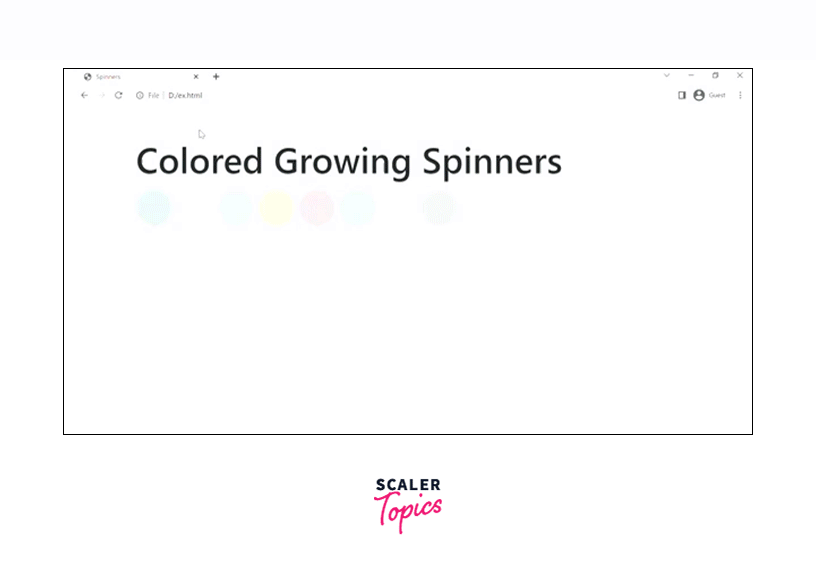
Therefore, as you can see in the output, we have created different colored growing spinners using the different text-color utilities of bootstrap along with the .spinner-grow utility.
Buttons With Border Spinner
You can also use spinners within the buttons to show that an action is currently taking place or is in processing.
For creating a spinner inside a button, we first need to make a button using the bootstrap .btn class, inside which add the span element with a class of .spinner-border to make the spinner inside the button.
Let us how to create a spinner inside a button in bootstrap with the help of a code example.
Output:
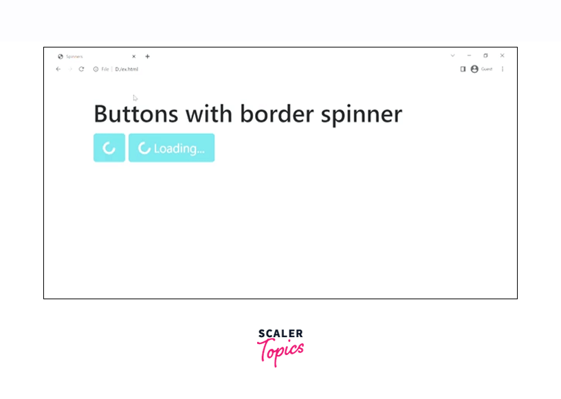
As you can see in the above code example, the first button is created using the .btn btn-info class which gives the button a light blue color. Moreover, the button is given a class disabled so that when it is clicked/loading, nobody should be able to click the button again. Inside the button element, we have a span that has been given a class of .spinner-border to create a spinner inside it.
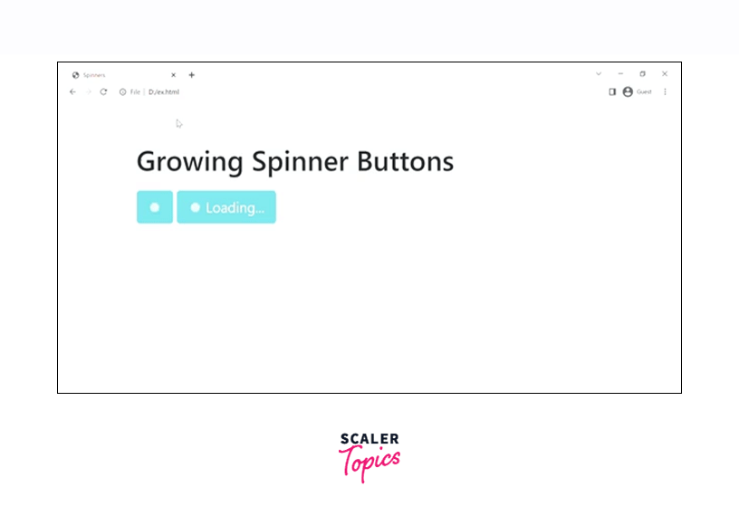
Buttons with Growing Spinner
You can also make the buttons with growing spinners inside them. To make a button with a growing spinner, make a button element and inside the button element make a span with a class of spinner-grow.
Let us see how to use create growing spinners with buttons with the help of a code example.
Output:
Examples
Changing the Alignment
Spinners in bootstrap are built in such a way that we can change the alignment of the spinners as per our needs. However, this can be done using some of the bootstrap utilities which we will be studying now.
Text alignment utilities
We can use the text alignment utilities to change the alignment of the spinner as per your need. Let us see the text alignment utilities to control the alignment of the spinner with the help of a code example.
Output:
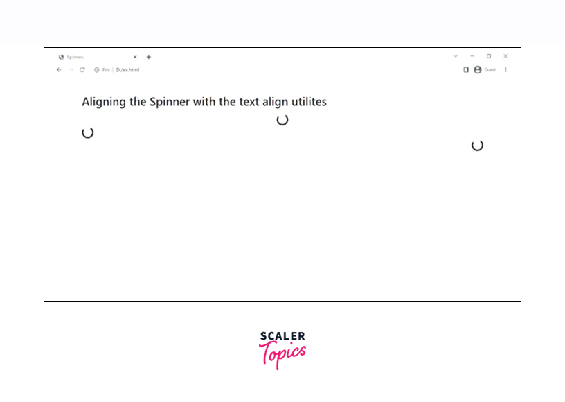
As you can see in the above output, the bootstrap loaders have been aligned to the left and right respectively because of the text-left
Float Utilities
You can also use the float utility classes in bootstrap to change the alignment of the spinner.
Let us see some of the float utility classes to align the spinners with the help of a code example.
Output:
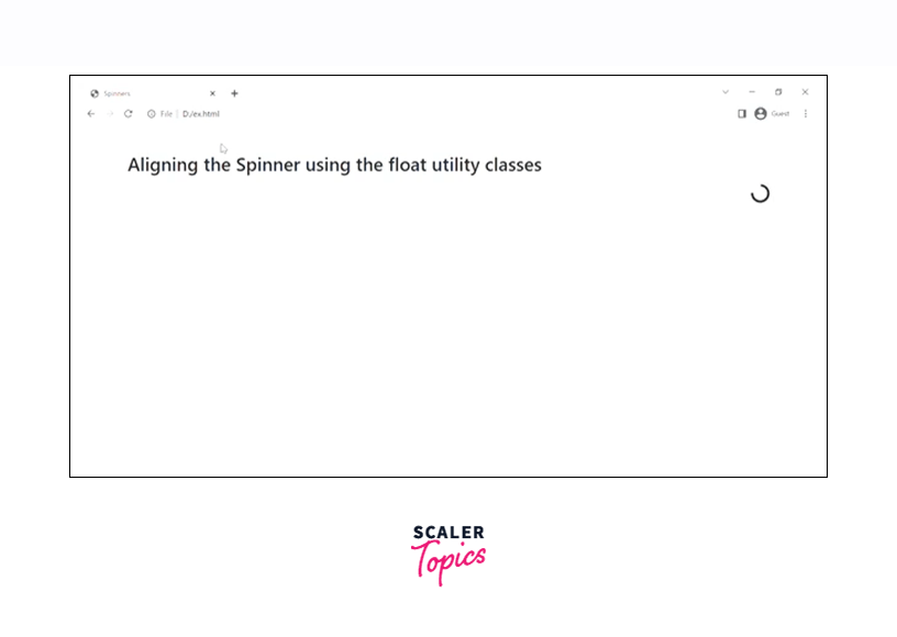
We have used one of the float utility classes, float-right to change the alignment of the spinner to the right. However, you can use any of them to simply align the spinner based on the requirement.
Flexbox utilities
You can also use any of the flexbox utilities to align the spinners in bootstrap.
Let us see some of them with the help of a code example.
Output:

Therefore, as you can see in the above output, the first spinner has been center aligned using the .justify-content-center class whereas the second spinner is aligned using the align-items-center utility.
Changing the Spinner Size
You can also change the size of the spinner using some of the bootstrap classes. However, there are bao ways in which the size of a spinner can be changed.
The first one is by using the classes that bootstrap provides whereas the second one is by using some CSS. Let us discuss both of these methods in detail.
Using Class
We have three classes using which we can change the size of a spinner. Those three classes are - .spinner-border-sm for smaller-size spinners, .spinner-border-md for medium size spinners, and .spinner-border-lg for larger size spinners. However, all these utilities must be used along with the .spinner-border class to alter the size of a spinner.
Similarly, you can use these three classes sm, md, and lg with a growing spinner as well to alter its size. A slight difference for the growing spinner would be changing the border keyword to grow. For example - .spinner-grow-sm.
Let us now see how to use these utilities to alter the size of a spinner.
Output:
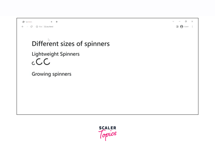
In the above code example, we have created all the different sizes of the border as well as the growing spinners using the respective utility classes.
Using CSS
You can change the size of a spinner using some custom CSS. Let us understand it with the help of a code example.
Output:
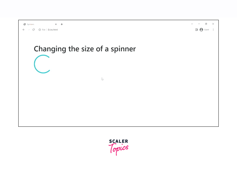
Therefore, as you can see in the above output, we have changed the sizes of the spinners using some inline CSS of height and width.
Keyframes
The keyframes are used for creating CSS animations for the spinners. The animation is created by gradually changing the CSS styles from one to the other. They are implemented using percentages or by using the from and to keywords which are the same as 0% to 100%. 0% represents the start of the animation and 100% represents the end of the animation.
Let us see an example to understand the keyframes in bootstrap.
Output:
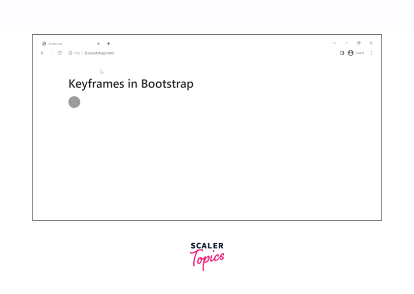
Therefore, we have added a keyframe in the growing spinner which has been added to the toe style element.
Refer to the official documentation for more information Bootstrap Loaders.
Conclusion
- Bootstrap loaders are animations that keep the users entertained while the page is still loading.
- Bootstrap loaders are built using only HTML and CSS and no Javascript. However, you might need some javascript for toggling purposes.
- Bootstrap loaders can be created using simple bootstrap classes such as .spinner-border for a lightweight spinner or .spinner-grow for a growing spinner.
- Both of these loaders can be colored using the text color utilities provided by bootstrap.
- Moreover, you can also change the alignment of these bootstrap loaders using the text-align, float, and flexbox utilities.
- You can also change the size of these spinners either by using the sm, md, or lg utility classes or by using some simple CSS.