How To Create A Login Form In Bootstrap
Overview
Bootstrap is a free and open-source framework for creating responsive and user-friendly websites. While scrolling through the internet, we are often required to register ourselves to access certain website content for which we use the sign-in/ login form. With the use of Bootstrap, we can easily create responsive and user-friendly login forms for our usage.
Introduction to Bootstrap Login Form
A Bootstrap login form is used for entering the authentication credentials for a user and getting them access to the restricted content of a website. While accessing the contents of a website, we are often required to register ourselves and then log in with our credentials to access the content of the website.
This login step is added to fulfil the fundamental task of security in a website and restrict the user to access a certain part or the whole website.
The login form contains fields like Username and Password as the credentials that we have made while registering ourselves on the website. These credentials- username and password are what separate each user from the other.
Syntax
Now, let us see the syntax to create a basic login form in bootstrap.
Output:
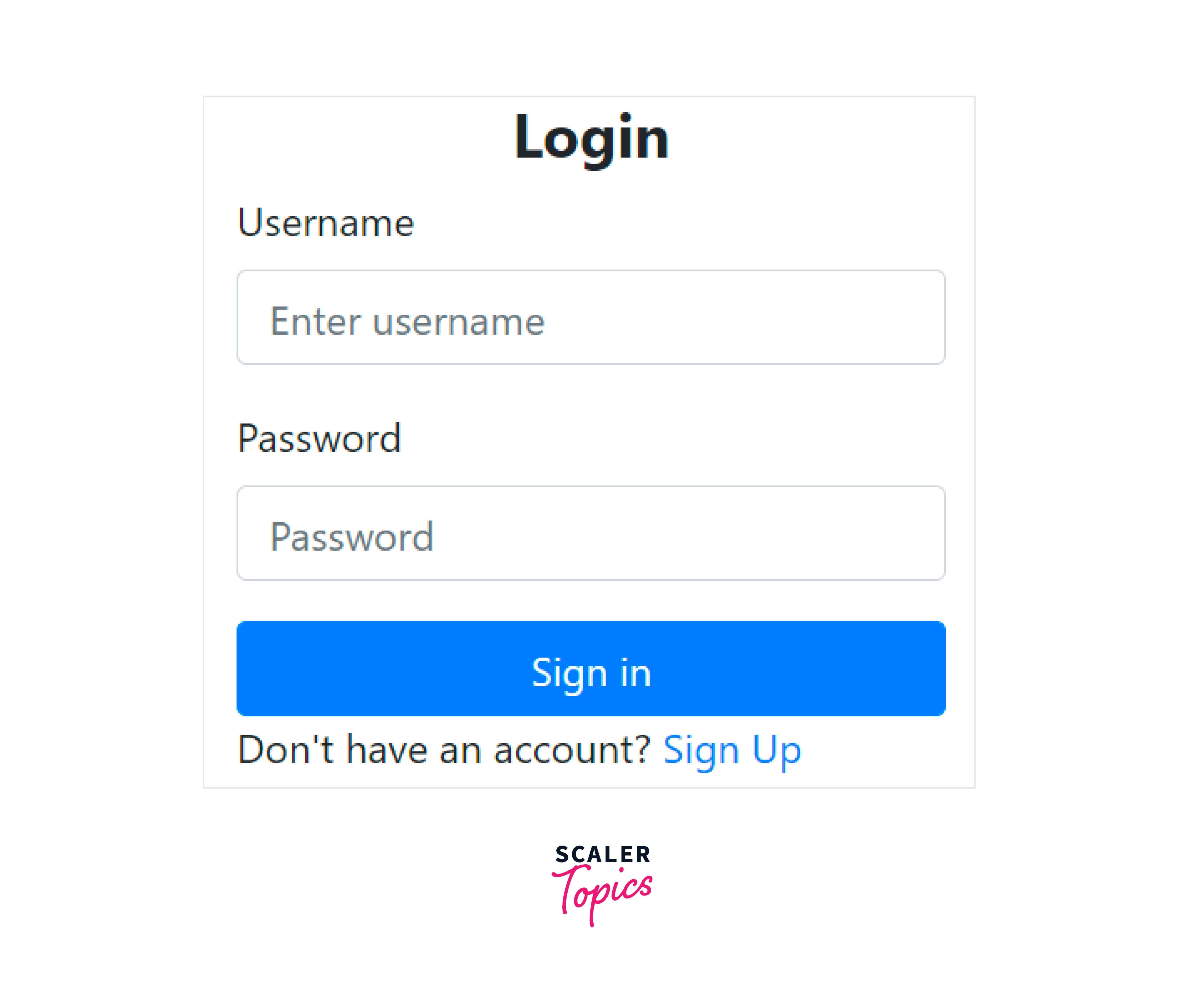
To create a login form in bootstrap, we have used the below-mentioned utility classes.
- container-fluid - It is used to set a full-width container covering the entire width of the viewport and also handles the responsiveness of the form.
- row justify-content-center - These classes are used to place the form in the centre of the page.
- col-12 col-sm-6 col-md-4 - These classes are used to set the number of grids taken by the form in various viewport sizes, such as in medium-sized devices the grid will take 4 columns, in small-sized devices, the grid will take 6 columns and for large devices, the grid will take 12 equal columns.
- form-container - It is used to enable a simple information-based submission form.
- form-group - It is used to bind the input and the label of the input in a group.
- After which we put the heading of a login form and then made a form using the label and input elements.
- form-control - It styles textual inputs and text areas with support for multiple states.
- btn btn-primary - It is used to create a blue colour button in bootstrap.
- form-footer - It is used to create a footer of a form in bootstrap.
In this way, we can make a bootstrap login form using the above-mentioned classes.
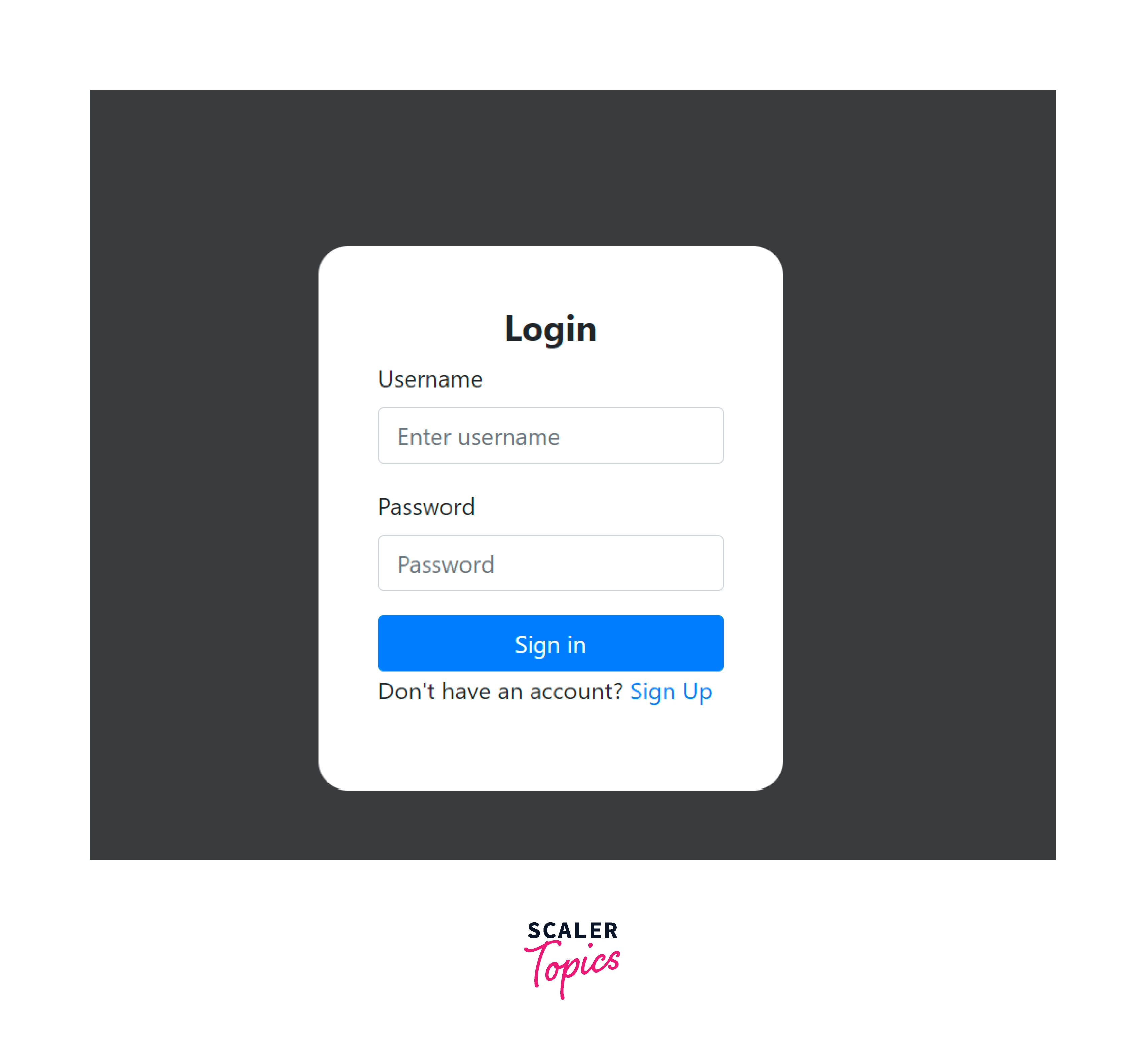
Adding CSS
Now, let us add some basic CSS to style the login form and make the login form a bit more attractive to the users.
We will be adding the CSS in a separate file that has already been imported into the HTML syntax. The CSS file is named login_style.css which contains the below-mentioned styling:
Output:

As you can see in the above output, we have changed the background colour and added some padding from the top. Moreover, we have added some border-radius to change the size of the form and some padding to the form itself.
Login Form in Desktop View
As you have seen in the syntax above that for a desktop screen, the login form would look like the below -
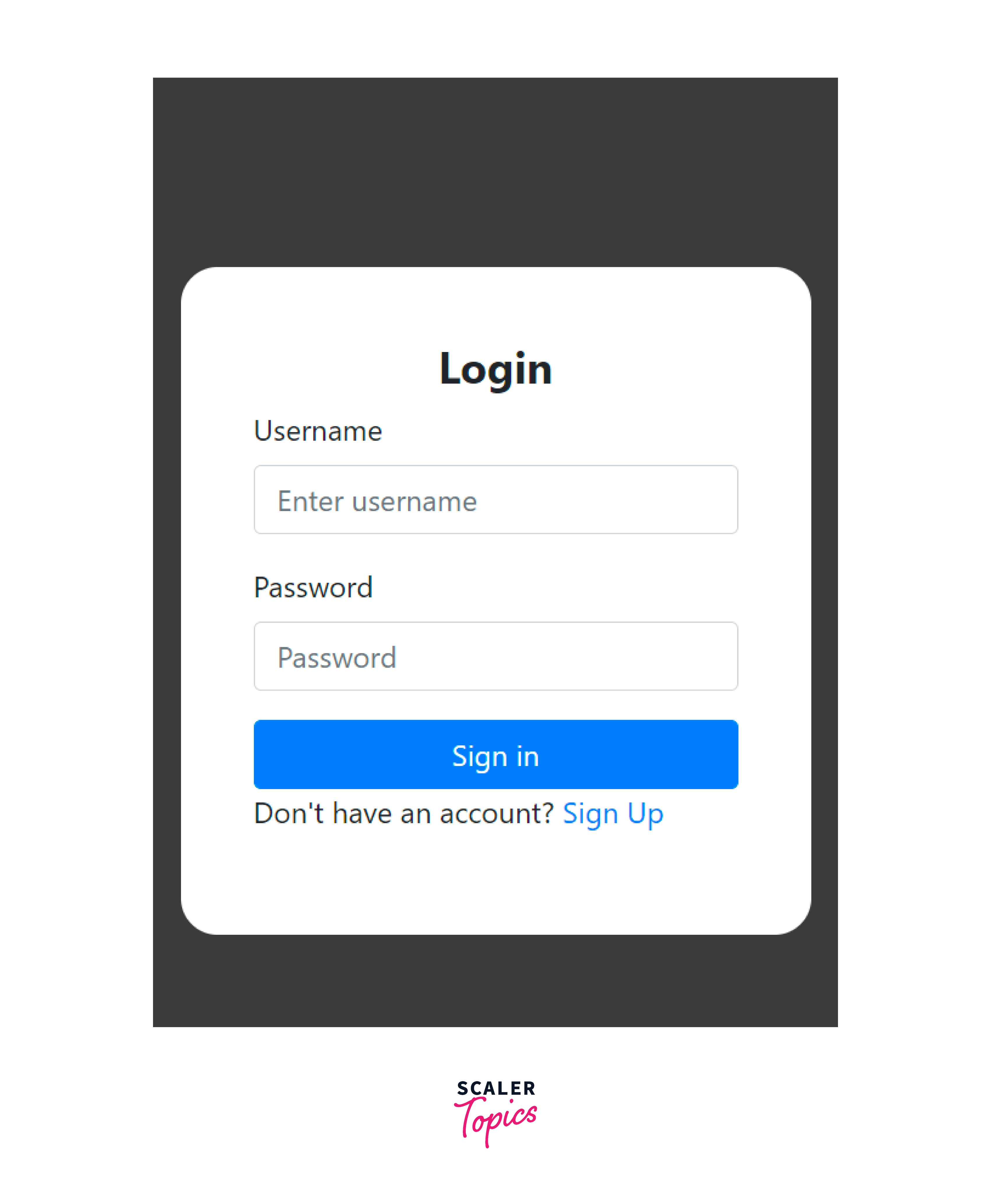
Login Form in Mobile View
Now, let us see how the login form has been made responsive and would appear ON mobile devices.
Examples:
Bootstrap provides three different types of form layouts that are -
- Vertical form.
- Horizontal form.
- Inline form.
Vertical Form
The vertical form is the one in which the labels and the input elements are placed vertically one below the other. For making a vertical form layout, we use certain bootstrap utilities such as container-fluid, form-container, form-group, checkbox, and btn btn-primary.
Now, let us see a vertical login form with the help of a code example.
Output:
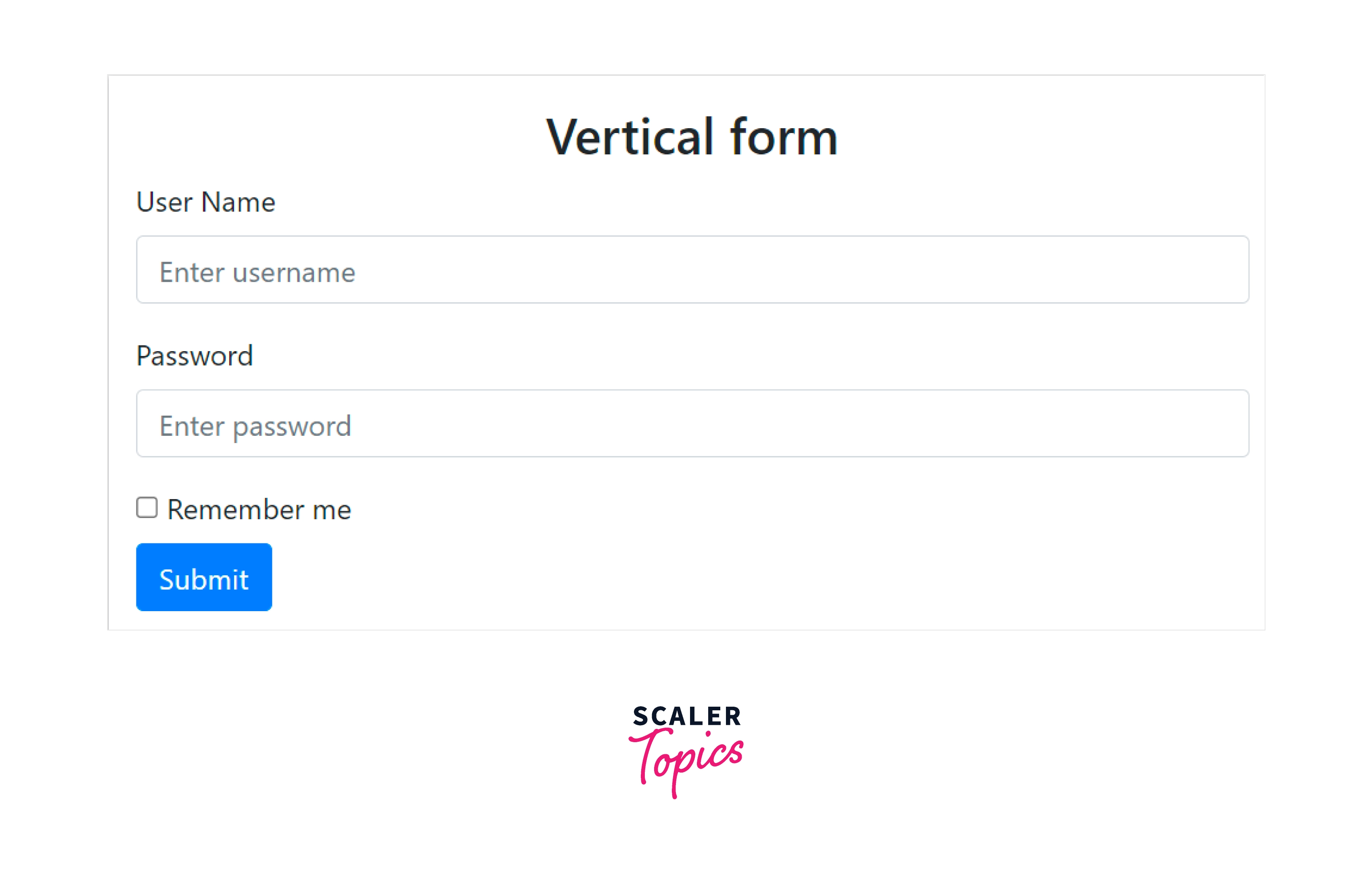
Therefore, as you can see in the above output, we first have a <h2> heading in vertical form, after which we have the labels and their corresponding input elements placed one below the other in the login form. This is the default form layout provided by bootstrap.
Horizontal Form
The horizontal forms are the ones that have both the label and the input element on the same line. We place them in the same line by using the .row and .col-* utility classes of bootstrap.
As discussed previously, to make a login form, we surround the fields like the label and input element with the .form-group class. Therefore, we put the .row class with the .form-group utility and the .col-* utility with the label and the input element.
Now, let us see how to make a horizontal form with the help of a code example.
Output:
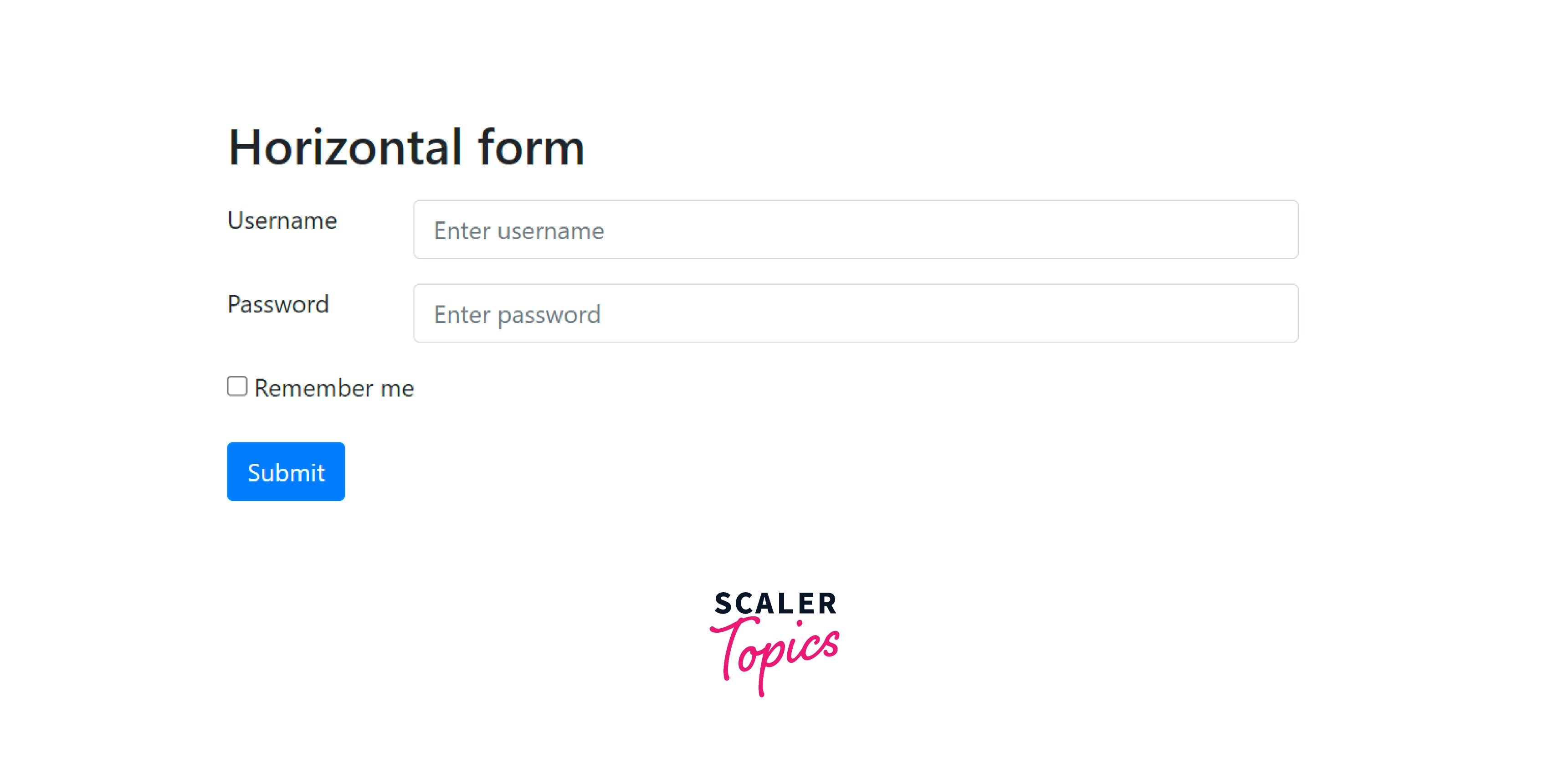
As you can see in the above output, we first have the <h2> heading in horizontal form, after which we have the label and the input elements placed on the same line.
Inline Form
The inline forms are the ones in which all the fields, that is, labels, input elements, buttons, and checkboxes are all in the same line.
Let us see an inline form with the help of a code example.
Output:
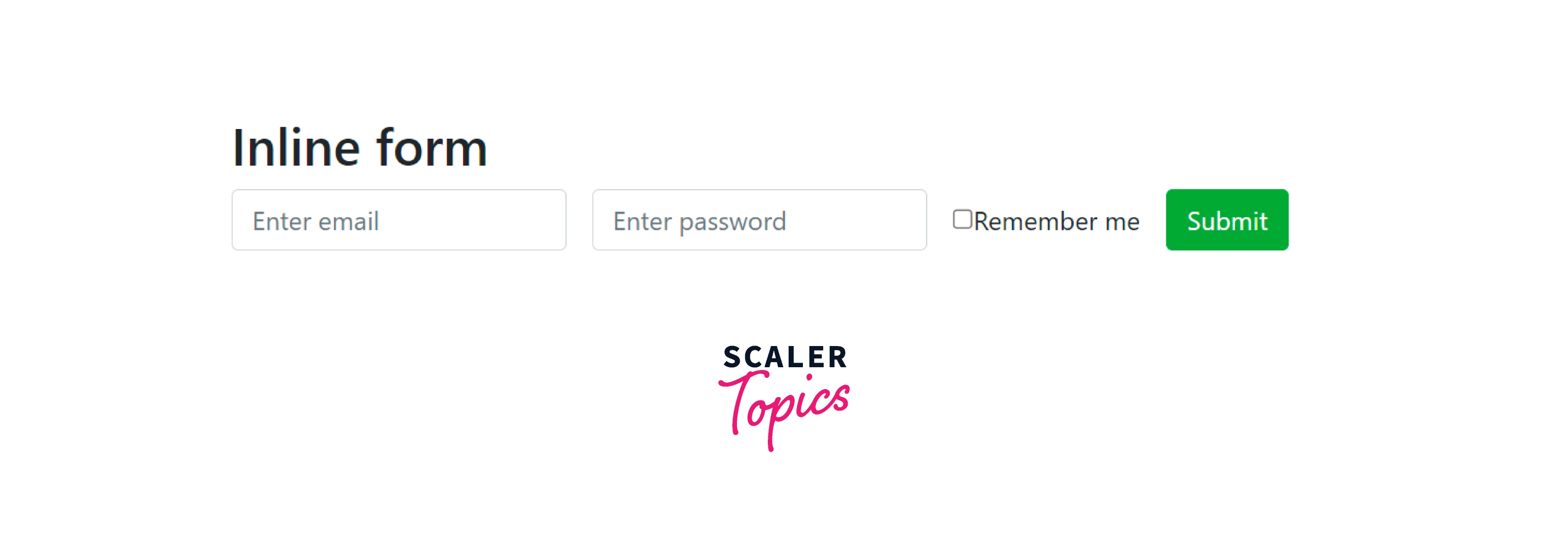
As you can see in the above output, we first have the <h2> heading as inline form, after which the email, password, remember me check box and the submit button are all in the same line.
Conclusion
- Bootstrap Login forms are used to restrict certain portions of a website or the whole website from the users.
- Bootstrap Login forms are made using certain bootstrap utilities such as form-container, form-group, form-control, checkbox, and btn btn-*.
- You can make the forms responsive using bootstrap utilities and use them in both the desktop view and the mobile view.
- The login forms can be made in three different layouts - vertical, horizontal, and inline.
- The vertical forms place the labels and the input elements on different lines which is the default layout for a bootstrap login form.
- The horizontal forms place them both on the same line and are done using the .form-horizontal, .row, and .col-* utilities.
- The inline forms place all the fields in the login form on the same line which is done using the .form-inline class.