Navigation - Navbars, Tabs and Dropdowns
Overview
Bootstrap is a free, open-source front-end framework with HTML, CSS, and JavaScript. This tool offers ready-to-use templates for creating websites that are mobile-first and responsive. It is easy to create interactive and responsive navigation bars using Bootstrap. Navbar is the responsive navigation header in Bootstrap. By default, navbars are responsive and fluid.
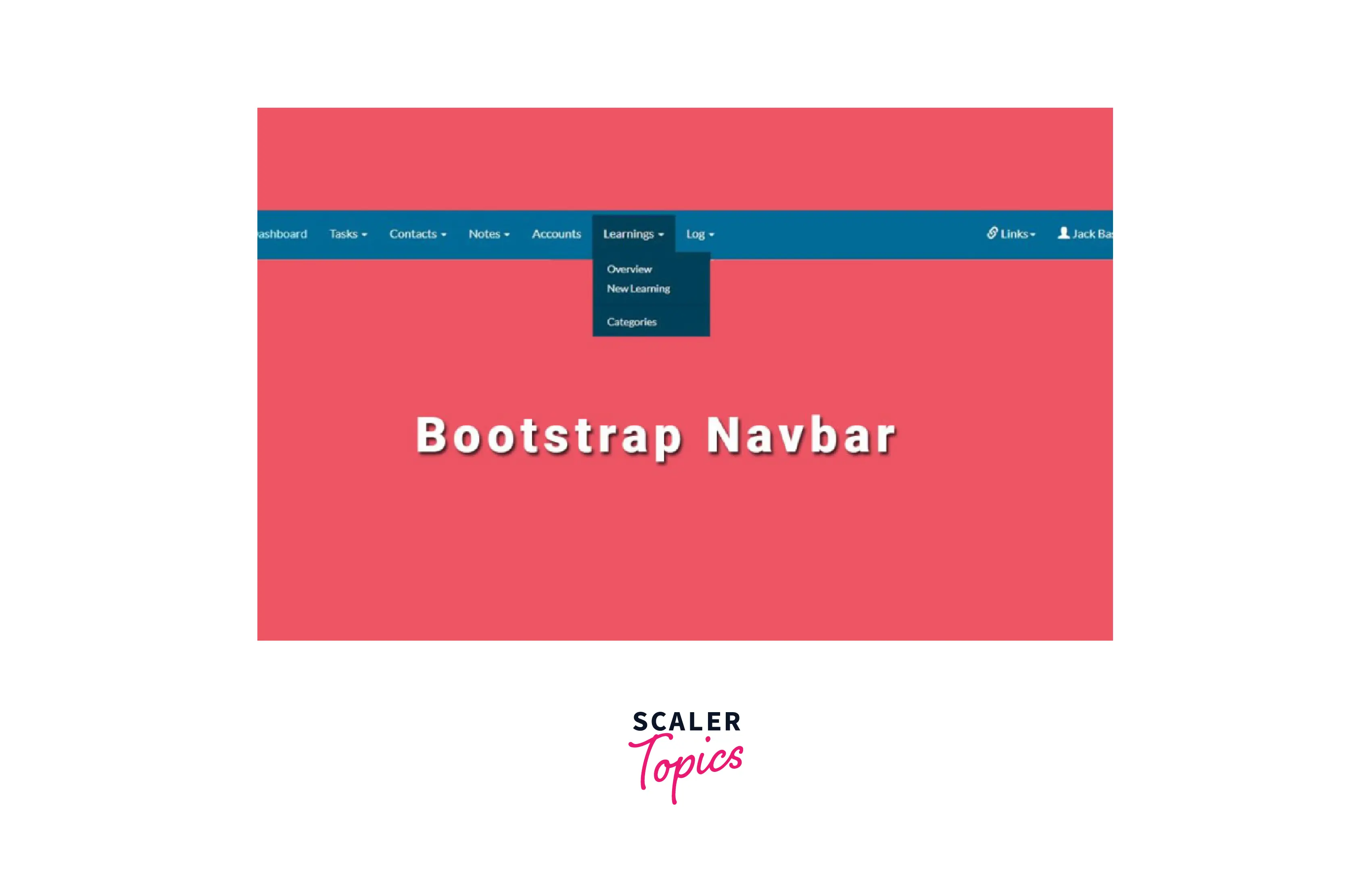
Introduction to Bootstrap Navbar
- Every website uses a navigation bar to make the web page more user-friendly, improving visitors' convenience to navigate the site and conduct direct searches for topics of interest.
- Making a bootstrap navbar with Bootstrap is much more responsive and accessible than doing so with plain HTML, CSS, and Javascript.
- Additionally, you can more easily create various navbar variations, such as navbars with dropdown menus, search boxes, and navbars that are fixed in place.
How to Create a Bootstrap Navbar?
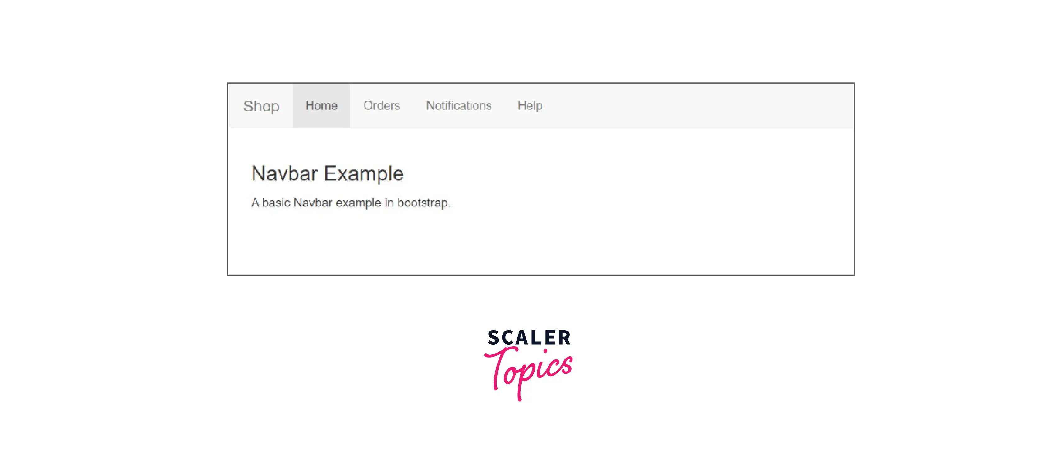
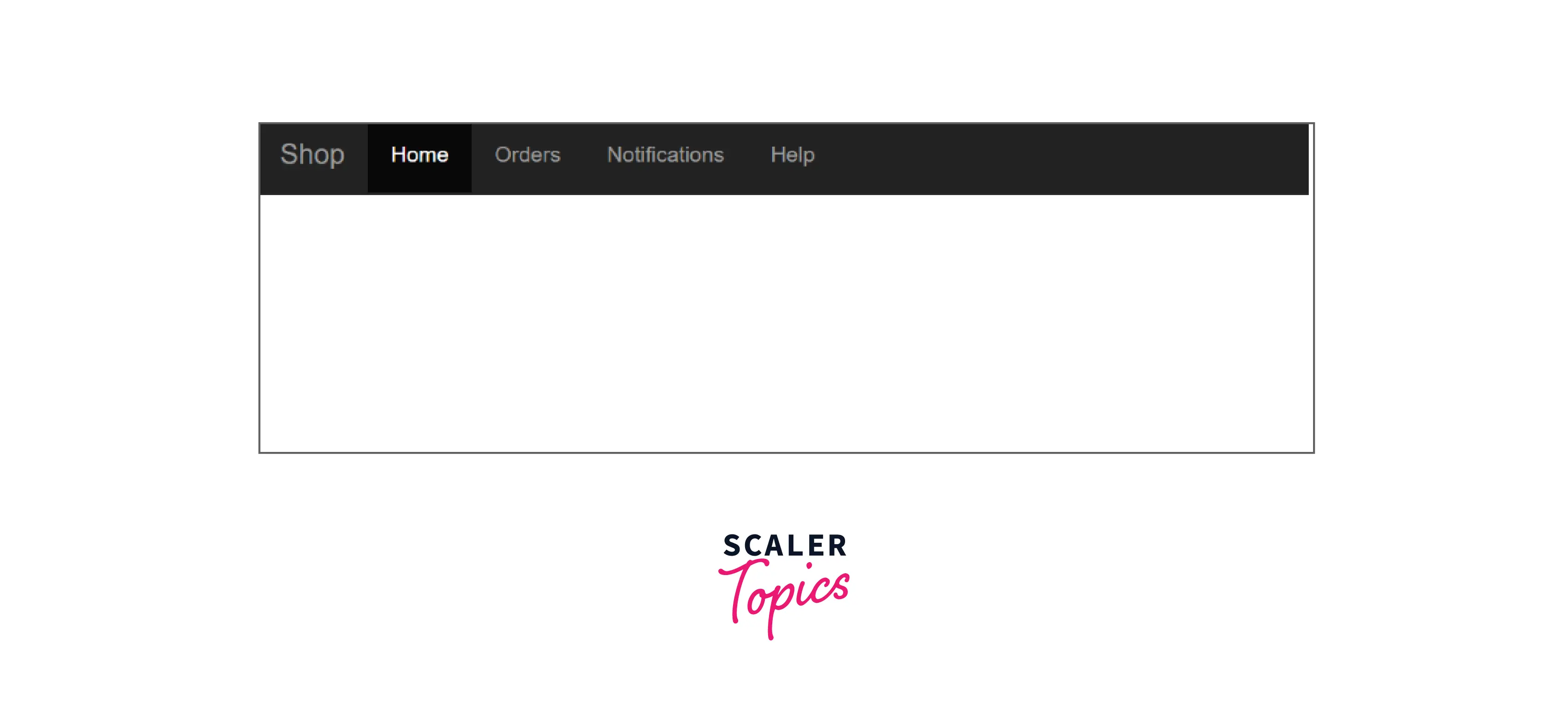
- <nav class="navbar navbar-default"> creates a standard navigation bar.
- The example below demonstrates how to add a navigation bar to the top of the page.
Example Code:
Output:
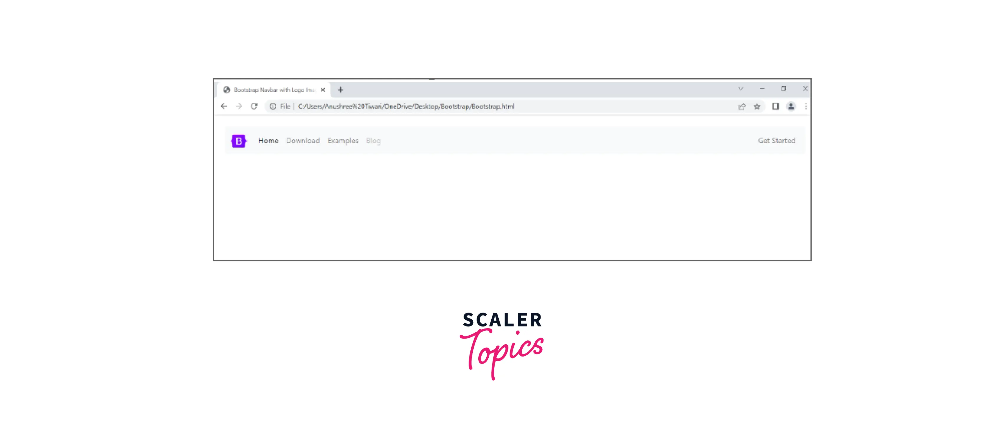
Adding Logo Images to Navbars
-
To add a company's name, brand, or logo, use the .navbar-brand class.
Example Code:
Output:
Bootstrap Navbar Styles
Bootstrap offers several different styles of the navigation bar.
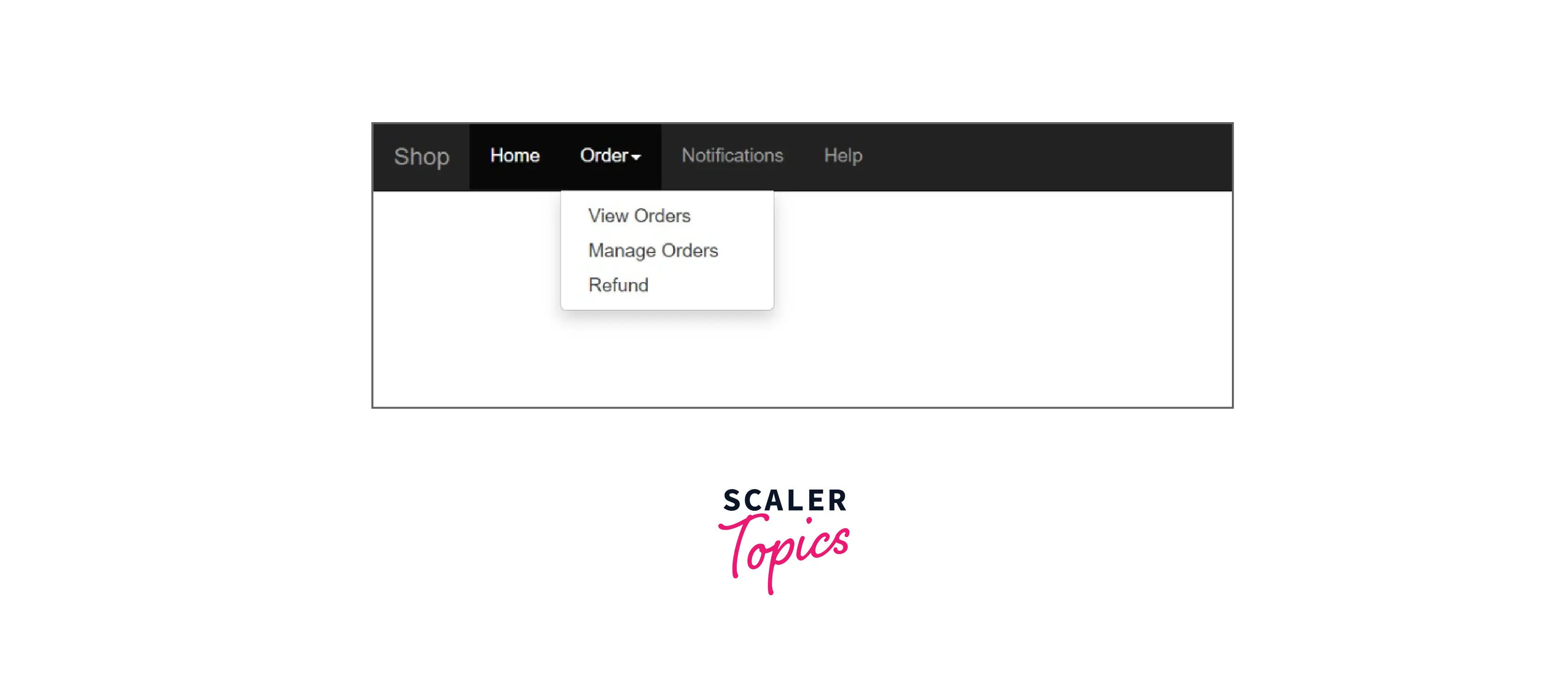
1. Bootstrap Navbar Dropdown
- Navbar Dropdown is an excellent method to design a navigation bar because it works well for websites with a lot of content and is large enough to scroll. If you want to include a lot of links to pages in your navigation bar, listing them side by side is not an option because it would either look cluttered or be impossible to fit them all horizontally. Instead, list the most important or general items in the top-level navigation bar and include the rest in a dropdown menu.
- The advantage is that these links do not take up the entire navigation bar.
Example Code:
Output:
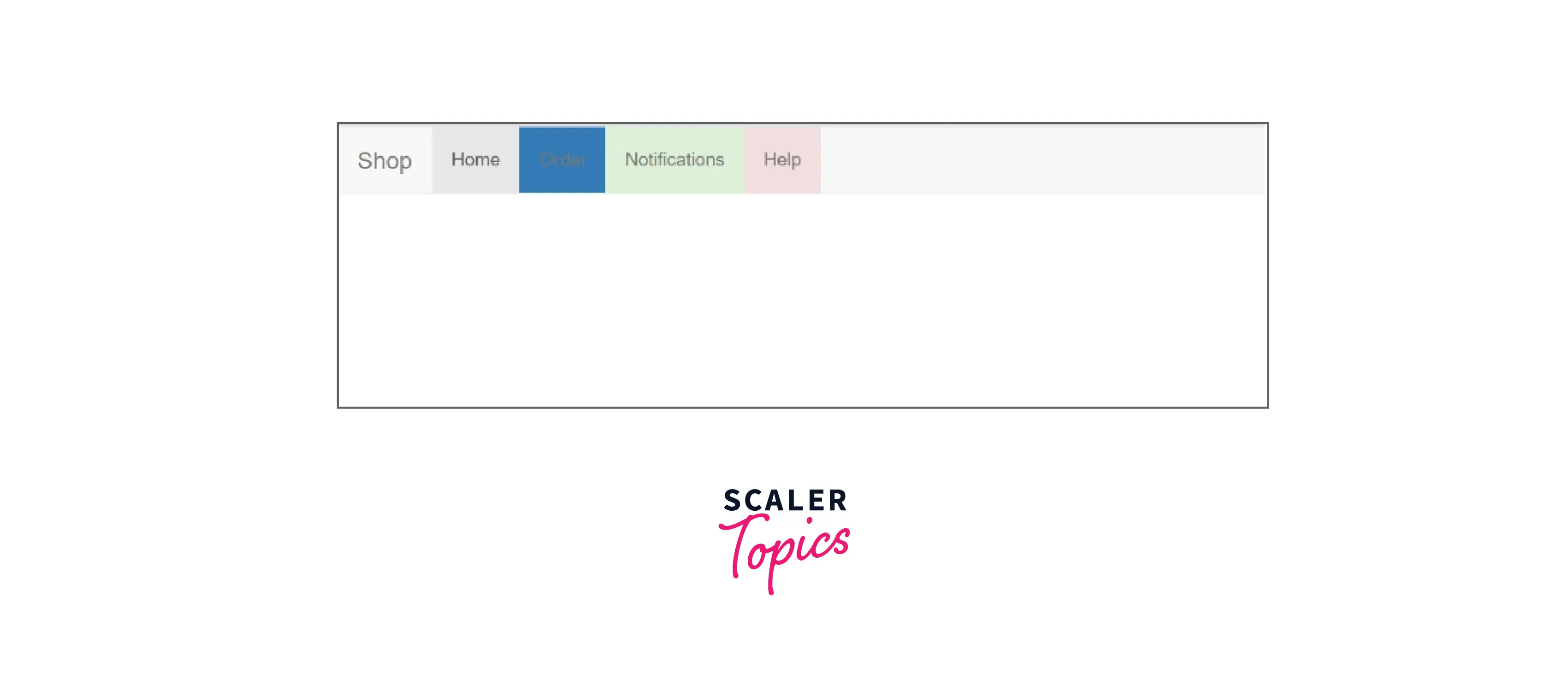
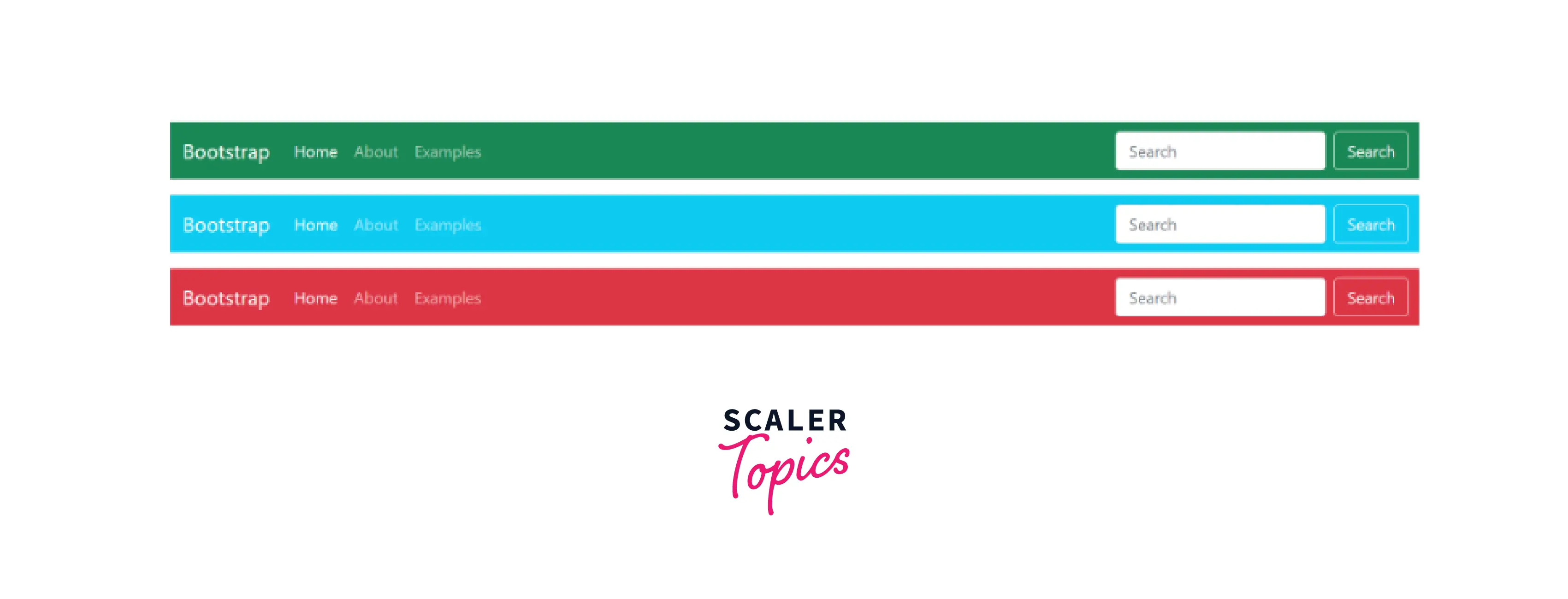
2. Bootstrap Navbar Color
- Using different classes with the nav tag in Bootstrap 4 allows us to change the background colour of the navigation bar.
- .bg-primary – Blue
- .bg-success – Green
- .bg-warning – Yellow
- .bg-danger – Red
- .bg-secondary – Grey
- .bg-dark – Black
- .bg-light – White
- To make the navbar's colour match the ones mentioned above, use the .bg-color class
Example Code:
Output:
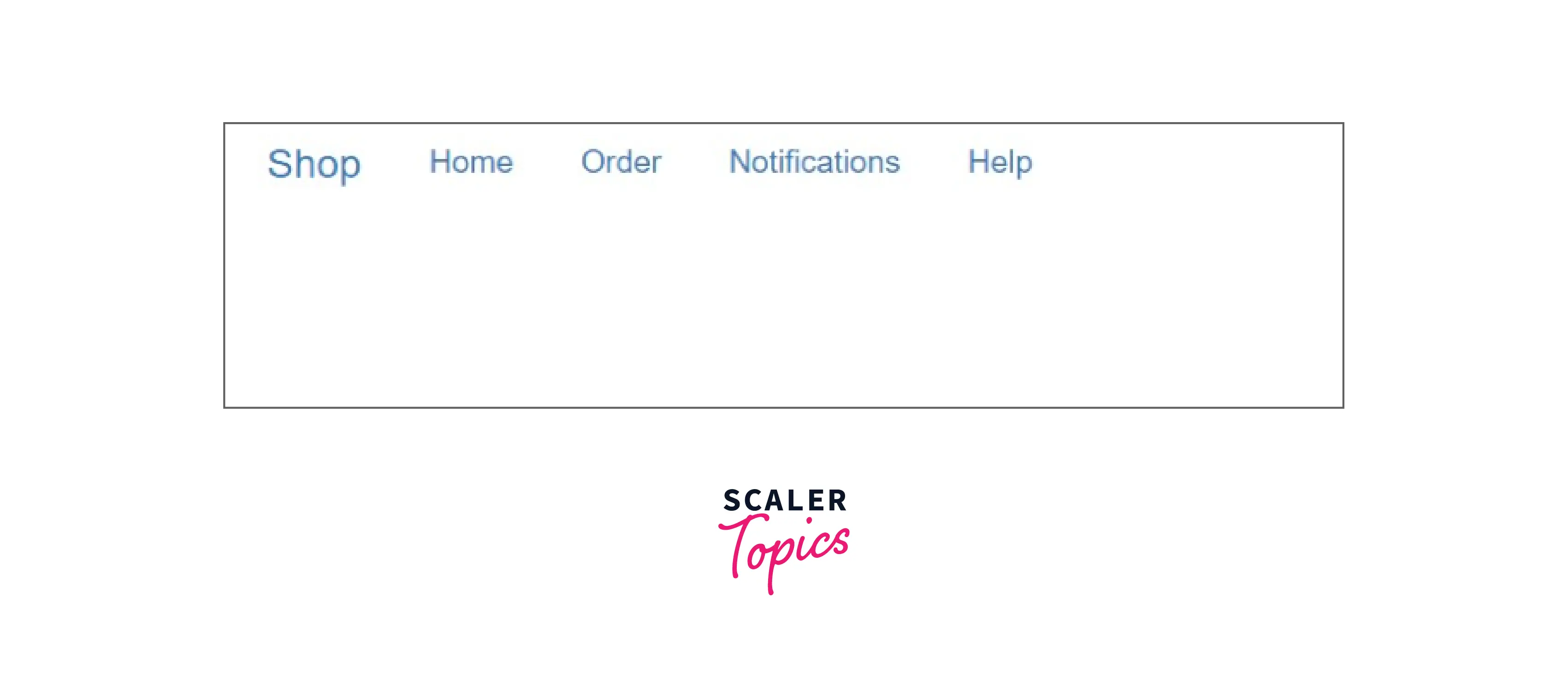
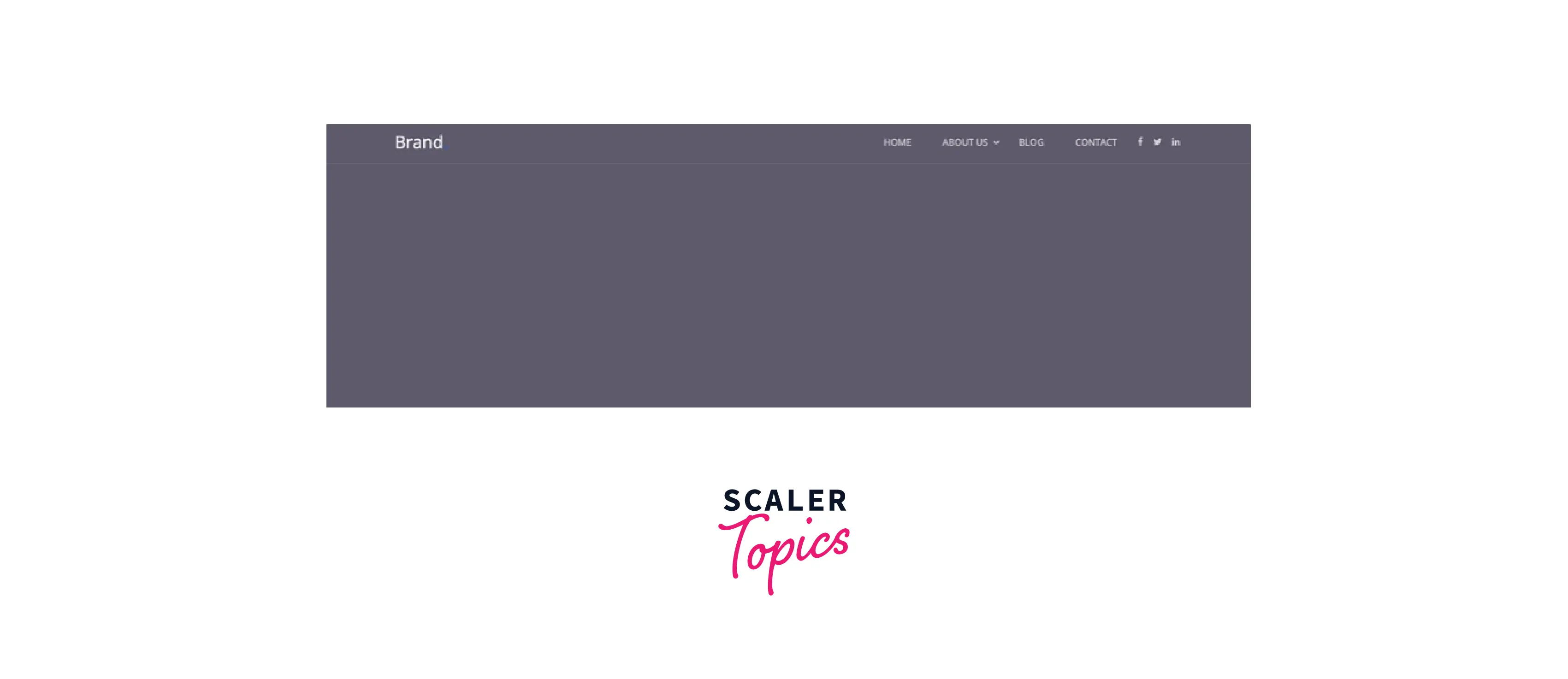
3. Bootstrap Transparent Navbar
- Simply remove the color class .bg-* from the Bootstrap navbar to create a transparent navbar.
- In this scenario, the bootstrap navbar will adopt the parent's background colour.
Example Code:
Output:
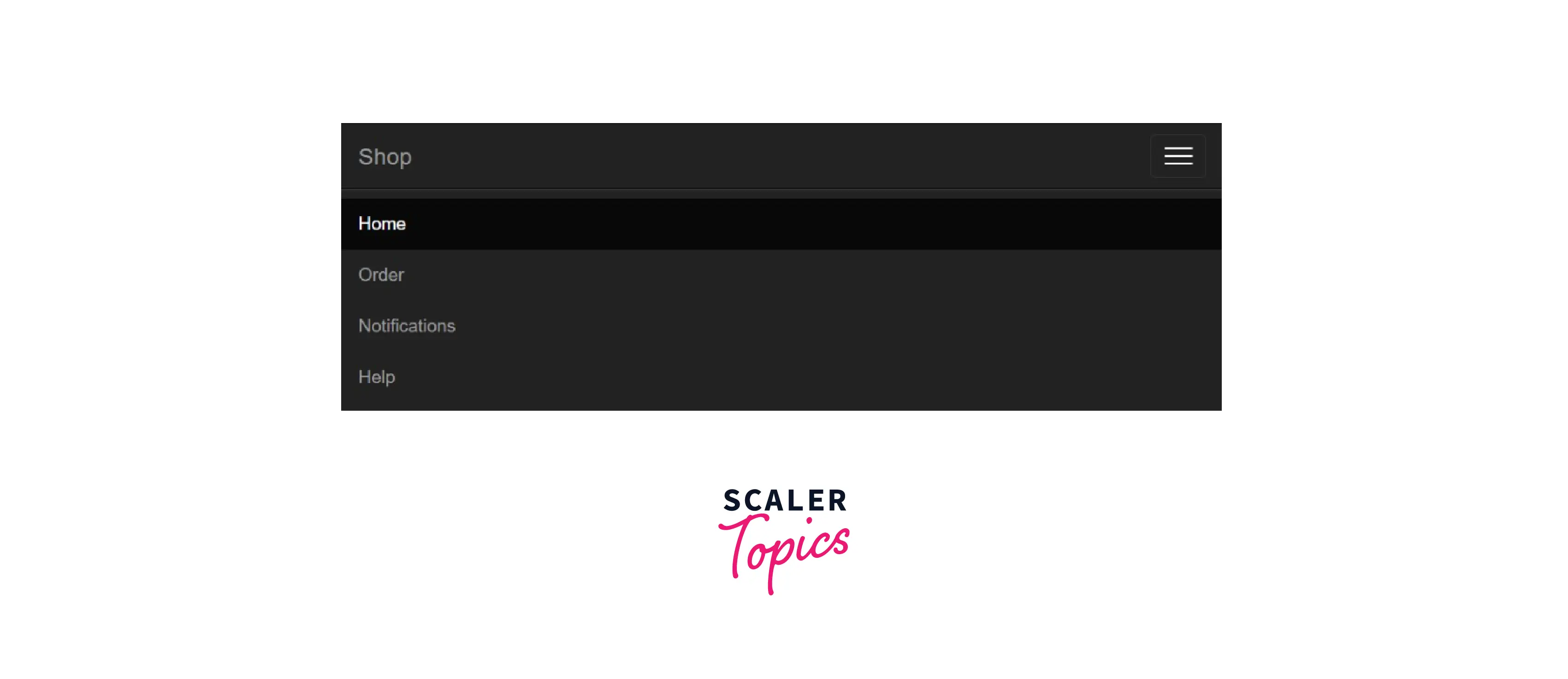
4. Bootstrap Navbar Collapse
- On a small screen, the navigation bar often consumes too much space. The navigation bar should be hidden and only displayed when necessary.
- We include a collapsible navigation bar so that links can be hidden on the navigation bar and made visible after clicking a button.
- A button should have the navbar-toggle class added to it, data-toggle=" collapse" added, an id added to the list of links, and the name of the id added inside data-target="#id".Finally, place all of the navbar's content inside a div element with the class collapse navbar-collapse
Example Code:
Output:
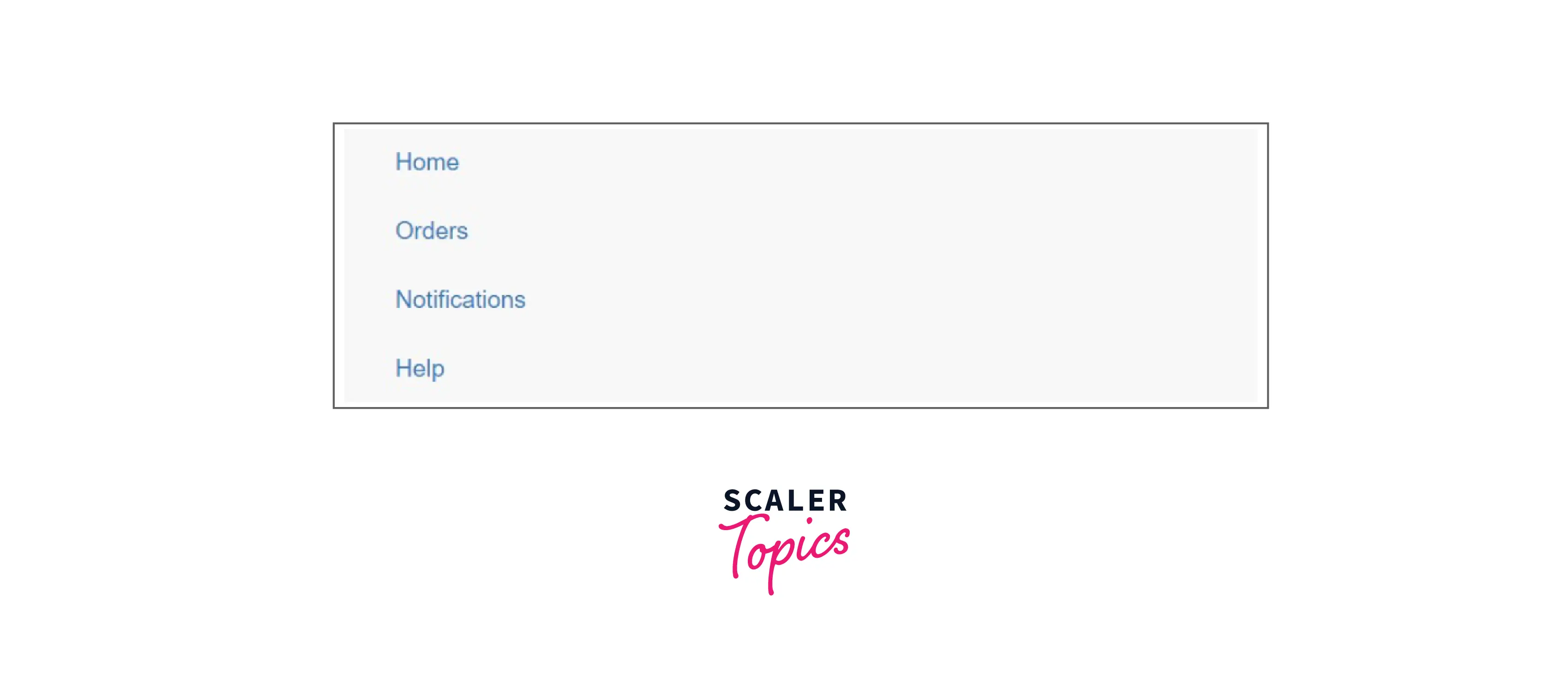
5. Bootstrap Vertical Navbar
- With the .flex-column utility, you can stack your navigation by changing the flex item direction.
Example Code:
Output:
6. Bootstrap Fixed Navbar
- We can fix the navigation bar at the top of the page so that it can be seen from anywhere, even if you scroll down.
- .navbar-fixed-top class is used to implement this functionality.
Example Code:
Output:
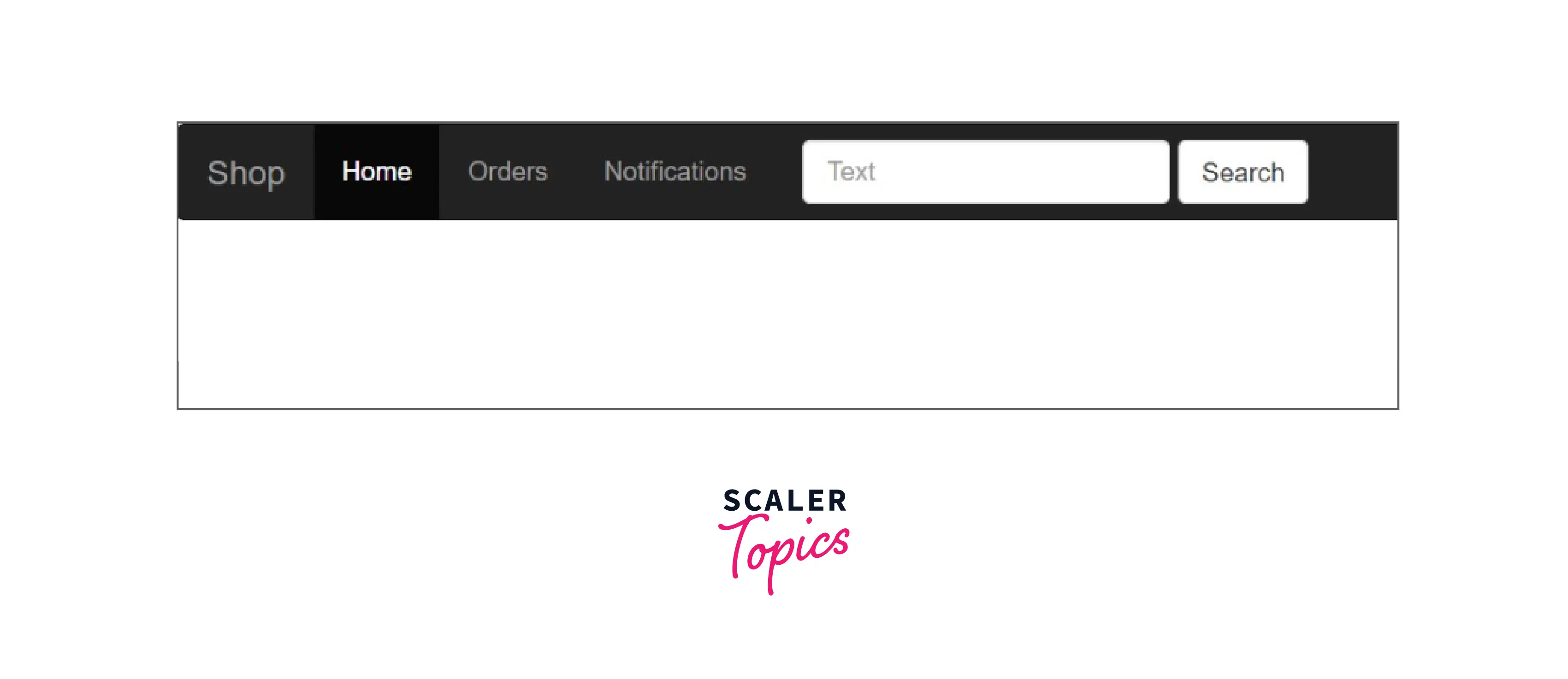
7. Bootstrap Navbar Forms
- To include form elements within the navbar, apply the .navbar-form class to a form element and add an input(s).
Example Code:
Output:
Customize Bootstrap Navbar
- Combining theming classes and background-colour utilities has made it simpler to customize the navbar.
- Choose between .navbar-light and .navbar-dark to use with light or dark backgrounds, respectively. Then use the .bg-* utilities to customize.
Example Code:
Output:
Examples of Customized Bootstrap Navbars
1. Simple Website Menu
- We can make many simple website menus using Bootstrap.
- For example, we could create a transparent Bootstrap navbar that becomes solid white as soon as the user starts scrolling. In addition to social media icons, it has a multi-level dropdown menu.
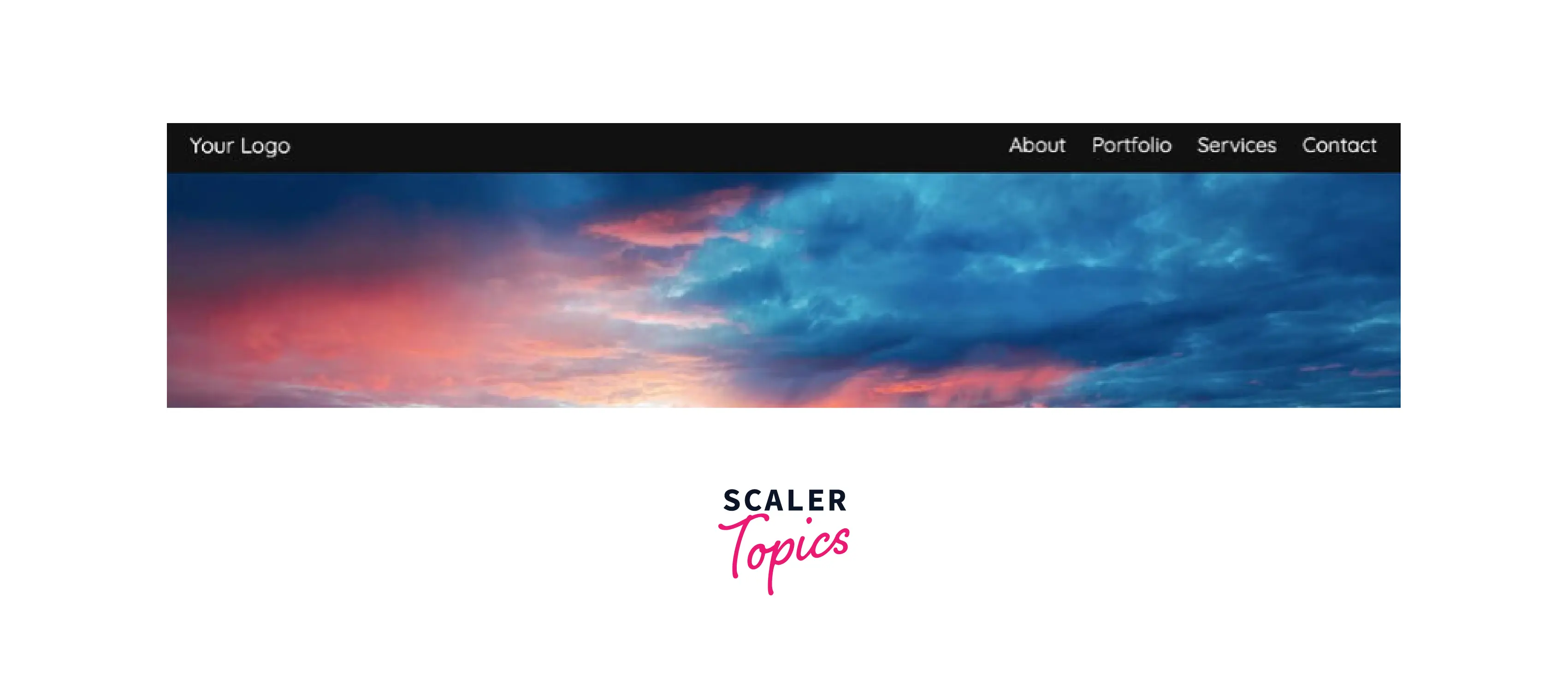
2. Bootstrap Navbar With the Logo Centered Above
- The Bootstrap navbar with the logo in the centre above is a simple and contemporary example.
- Instead of placing the brand lower and to the left, this illustration places it in the centre of the page, above the navbar links. All the navigation links will be hidden behind a toggle button on smaller screen sizes.
3. Simple Horizontal Bootstrap Navbar
- An advanced navbar example is the Simple Horizontal Bootstrap Navbar.
- It has a blue bottom border and a transparent custom background colour. The navigation items are white, but when users hover over them, they turn the same shade of blue.

4. Responsive Fixed Animated Navbar
- A sample animated navbar is the Responsive Fixed Animated Navbar. The navbar's background changes from transparent to solid black as the user scrolls. It also gets smaller in size.
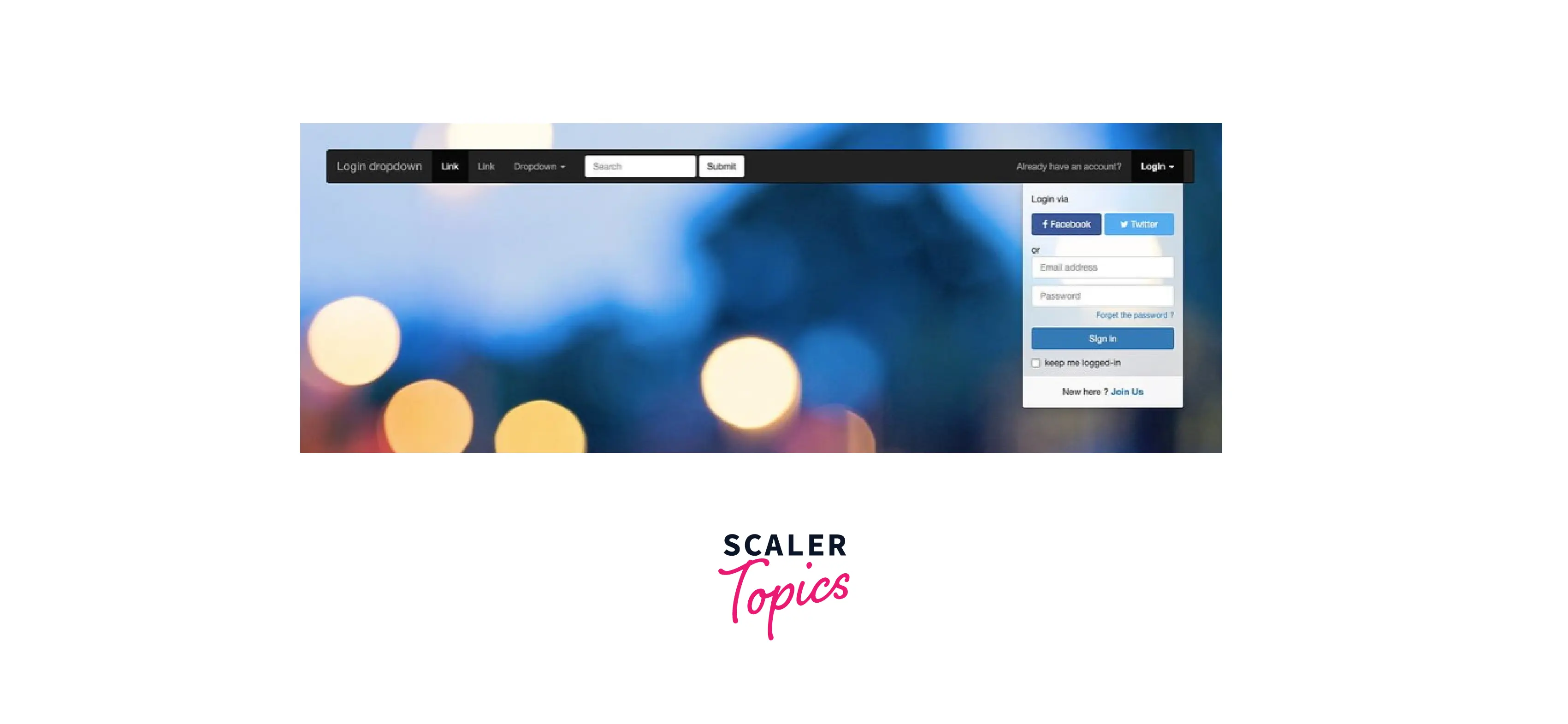
5. Bootstrap Navbar Login Signup
- Bootstrap Navbar Login Signup shows you can include login or sign-up buttons in your Bootstrap navbar. - This example includes a login dropdown menu. Users will be prompted to log in using Facebook, Twitter, email, or to create an account when they click on the dropdown menu.
Conclusion
-
Navbars are essential to any website, and we can create them quickly and easily with Bootstrap.
-
The bootstrap navigation bar is usually placed either above or on the side of the content. It contains the website's navigation interface.
-
We must include the .navbar class to create a standard Bootstrap navbar.
-
There are different styles of the navbar in Bootstrap, namely
- Bootstrap Navbar Dropdown
- Bootstrap Navbar Color
- Bootstrap Transparent Navbar
- Bootstrap Navbar Collapse
- Bootstrap Vertical Navbar
- Bootstrap Fixed Navbar
- Bootstrap Navbar Forms
-
For light and dark-colored navbars, we can customize the navbar with .navbar-light and .navbar-dark, respectively. And style it with .bg-* classes.
-
Navigation bars must be wrapped in .navbar-expand-sm|-md|-lg|-xl|-xxl for responsive collapsing.