Bootstrap Panels
Overview
Bootstrap is the most popular CSS framework, as we all know, for building responsive and mobile-first websites. Bootstrap provides several classes so that you don't have to construct and design the components from scratch in order to build and develop the user interface (UI) based on the needs.
Introduction
A panel in bootstrap is a box with padding around its content and a border. A panel is functional when we need to quote text on a webpage. It is indicated with a .panel class. The Bootstrap panels offer a flexible and adaptable content container with numerous variations. Contextual backdrop colors, a choice of content, headers, and footers, as well as strong display options, are just a few of the options available. Cards and panels are similar, except panels don't include media. Bootstrap panels are made by adding the class .panel to the div element. The panel's content has the .panel-body class.
The markup and styles used to create panels are kept to a minimum while still allowing for a great deal of control and customization. They are easily alignable and blend in with other Bootstrap components thanks to their flexbox construction. Use spacing tools as necessary because they don't come with margins by default.
Basic Examples of Bootstrap Panels
Here are some examples of Bootstrap Panels.
Code:
Output

Content Types
A wide range of content types is supported by panels, including text, list groups, links, and more. Examples of what is supported are shown below.
Body
The .card-body class is the foundation of a panel. Use it whenever you require a padded section within the panel. This section holds the content of the panel.
Titles, Text, and Links
Adding .card-title class to a < h*> element allows for the use of panel titles. Similar to this, adding .card-link to a <a> tag causes links to be added and positioned next to one another.
By including a .card-subtitle to a <h*> element, subtitles can be used. The title and subtitle of the panel are beautifully aligned if the .card-title and .card-subtitle items are inserted into a .card-body item.
List Groups
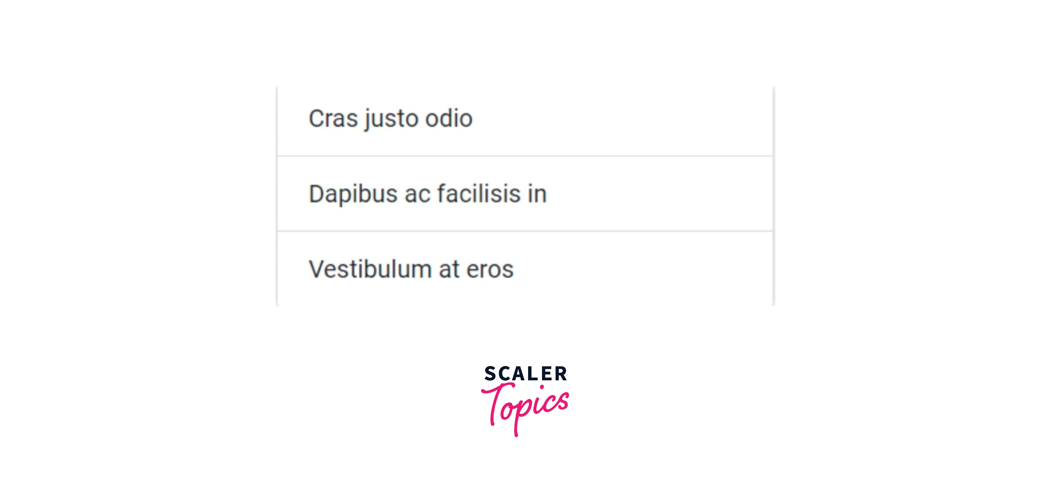
With a flush list group, you can make content lists in a card.
Code:
Output
Kitchen Sink
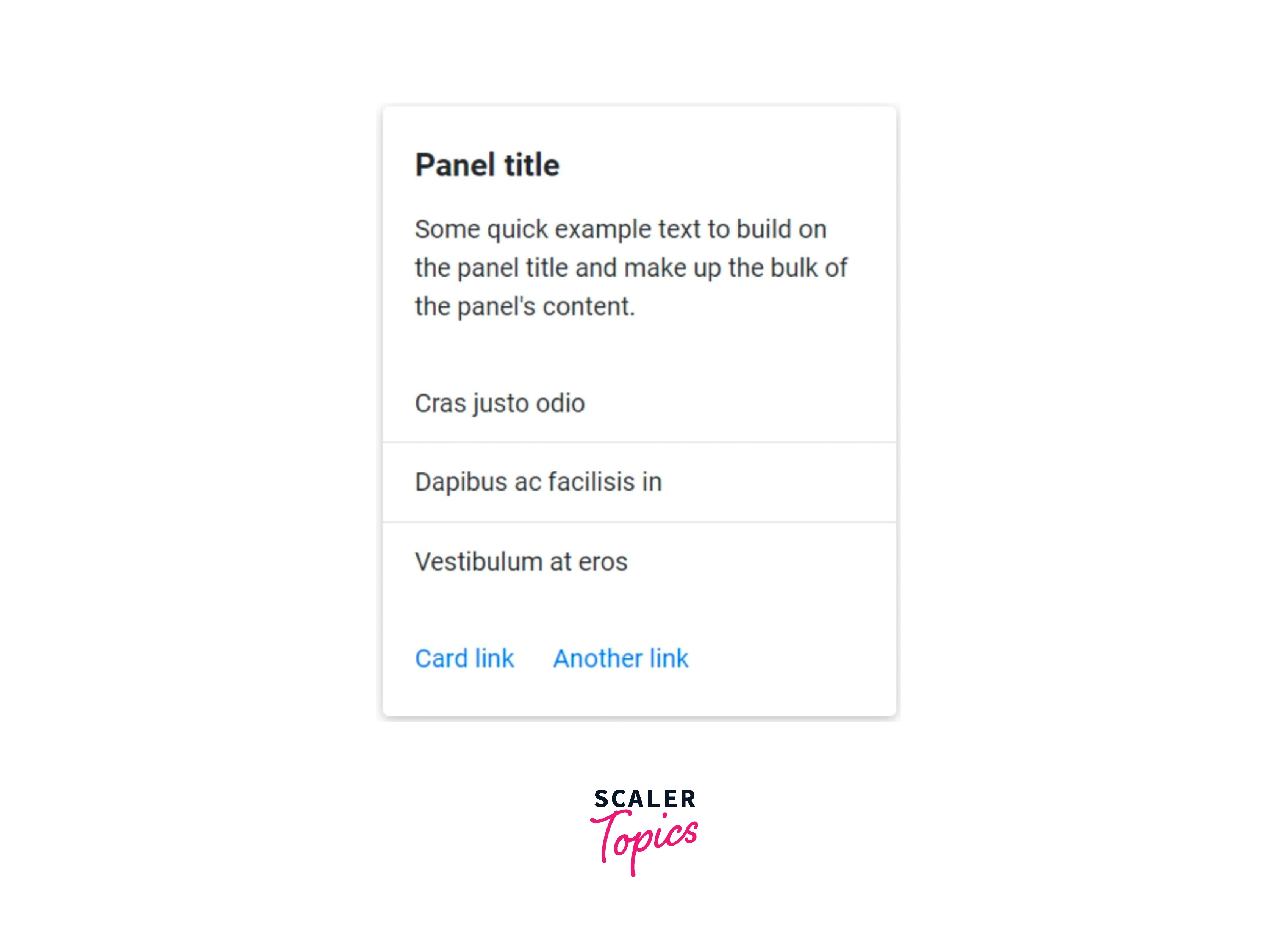
To make the card you require, you can combine different content kinds or just put everything in there. Blocks, text styles, and a list group are all displayed below, all contained within a fixed-width panel.
Code:
Output:
Different Classes of Panel
In a Bootstrap panel, there are parts available, such as Bootstrap Cards. The following provides descriptions of each Bootstrap Panel body part:
- .panel body: It is used to define the body of a panel.
- .panel heading: It is used to give the panel a header.
- .panel footer: It is used to give a footer class to the panel.
- .panel group: It is used to combine together various panels into a single unit.
Contextual Classes in a Panel
The panel's colors are determined by contextual classes.
- .panel-default
- .panel-primary
- .panel-success
- .panel-info
- .panel-warning
- .Panel-danger
Panel with Tables
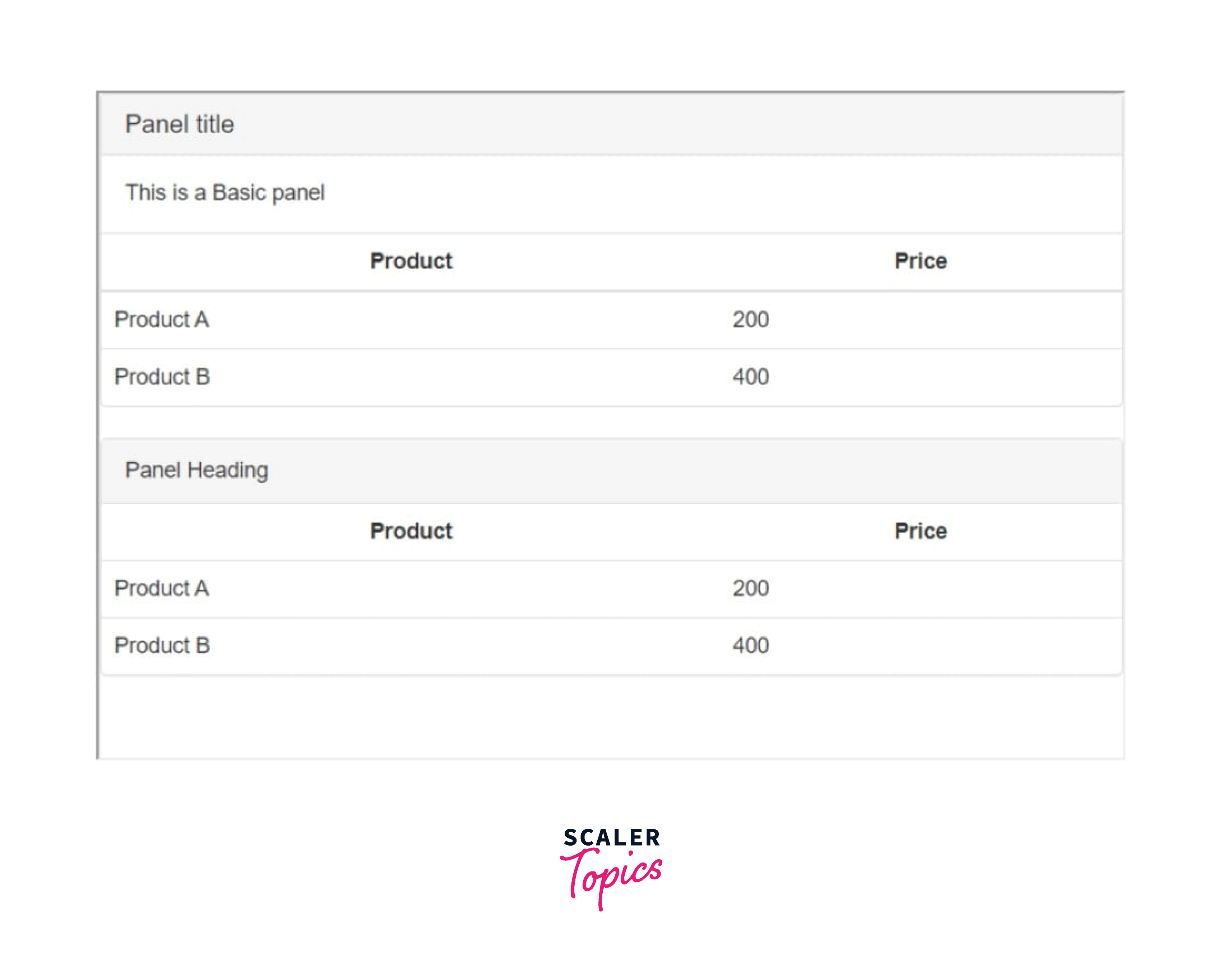
Use the class .table within the panel to obtain a non-bordered table. Assuming there is a <div> containing .panel-body, we extend the top border of the table in order to differentiate it from the rest of the page. In the absence of a <div> containing .panel-body, the component seamlessly transitions from the panel header to the table.
The following example demonstrates this − Code:
Output
Sizing
Assuming no defined width at all, panels will always be 100% broad until otherwise specified. Custom CSS, grid classes, grid Sass mixins, or utilities can all be used to adjust this as necessary.
Using Grid Markup
To wrap panels in columns and rows using the grid as necessary.
Using utilities-Our size tools make it simple to rapidly set a panel's width. Using custom CSS-Your stylesheets or inline styles can utilise custom CSS to set a width.
Text Alignment
With our text-align classes, you can easily alter the text alignment of any card—in its entirety or only certain portions.
Navigation
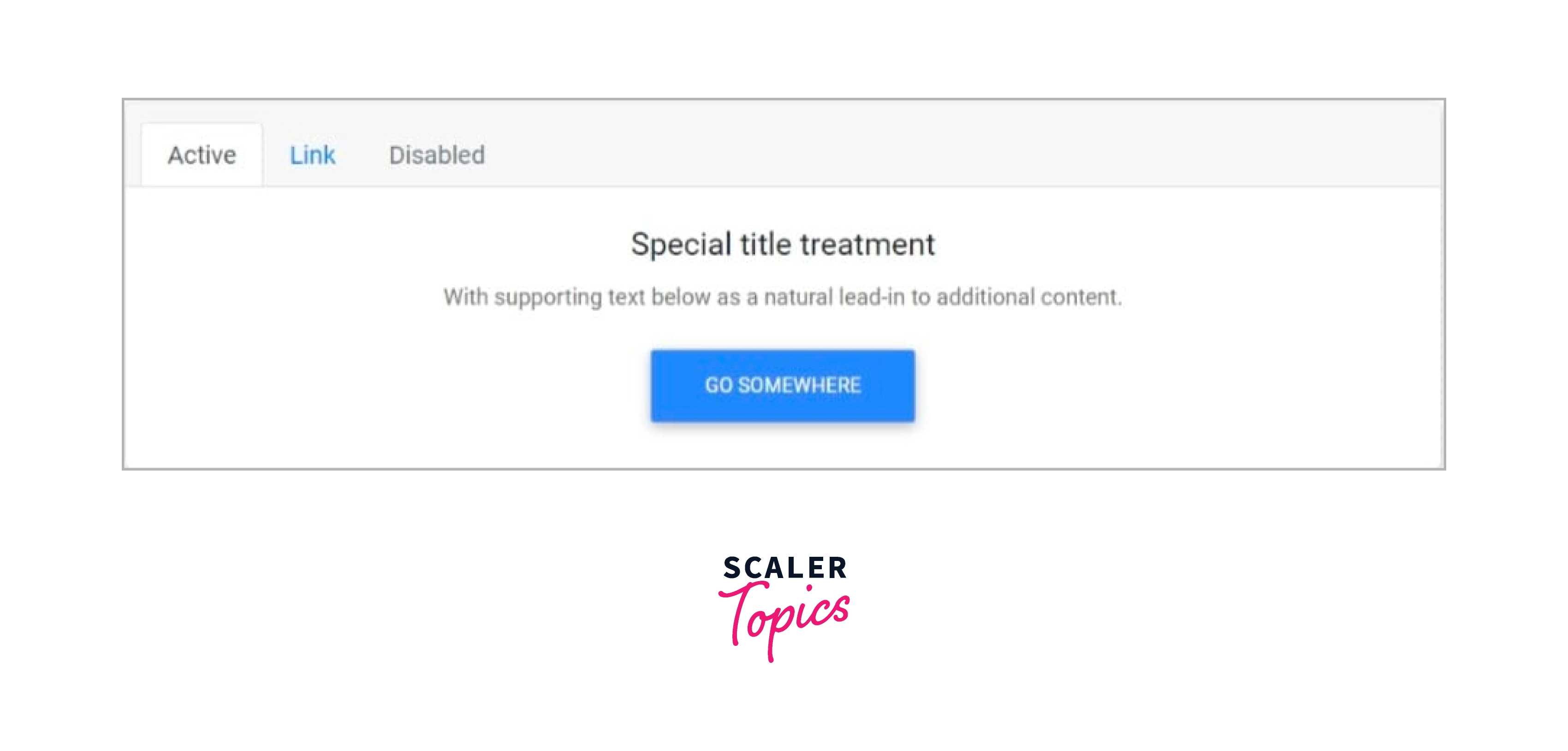
Bootstrap’s nav components add some navigation to a panel's header (or block).
Code:
Output:
Panel Styles
The borders, colors, and backgrounds of panels can all be altered in a variety of ways.
Background and Color
To alter the look of a card, use tools for the text and background.
Code:
Output:
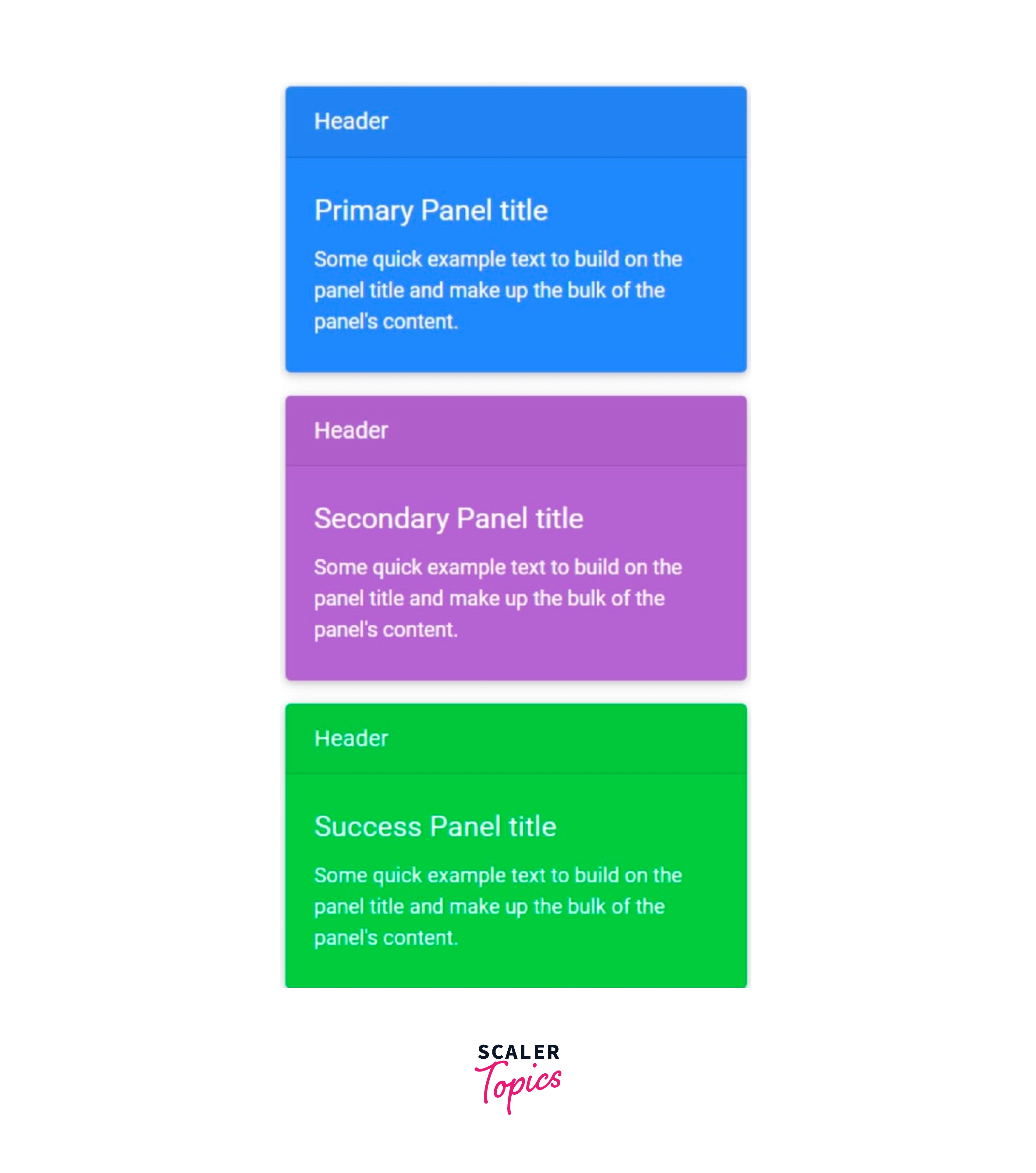
Note:
Only a visual indicator will be provided to users of assistive devices, such as screen readers, when meaning is added through colour. Make sure the information the color denotes is either clear from the content itself (such as the visible text) or is included in another way, such as additional text that is concealed using the .sr-only class.
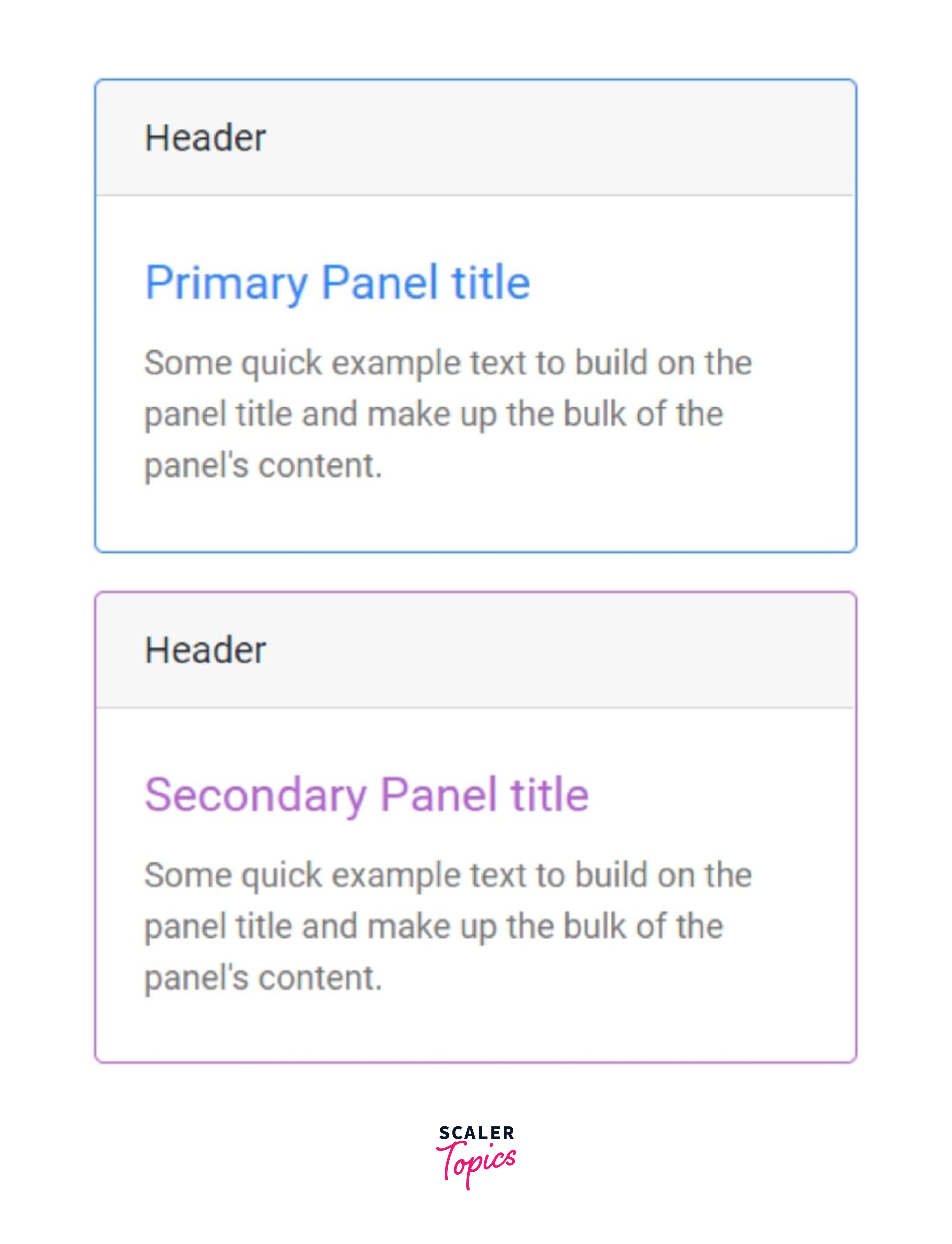
Border
To alter a card's border color only, use border utilities. A subset of the panel's contents, as illustrated below, or the parent card can both have .text-color classes applied to them.
Code:
Output
Mixins Utilities
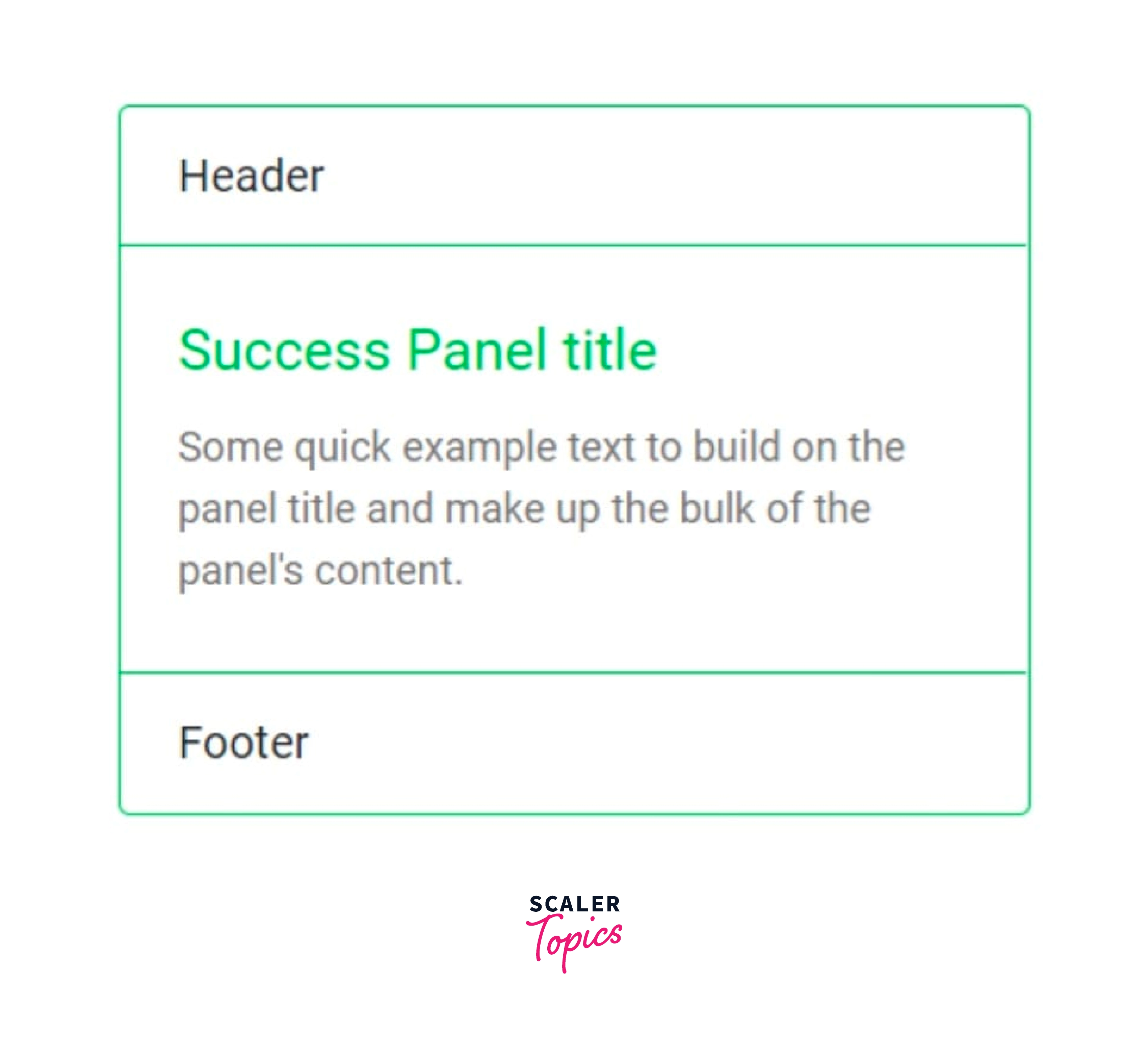
Additionally, you can modify the card's header and footer's borders as desired and, using the .bg-transparent style, even get rid of their background ccolors
Code:
Output
Panel Layout
Bootstrap has a few choices for setting up a row of panels in addition to customising the content within them. These layout choices are not yet responsive at this time.
Groups
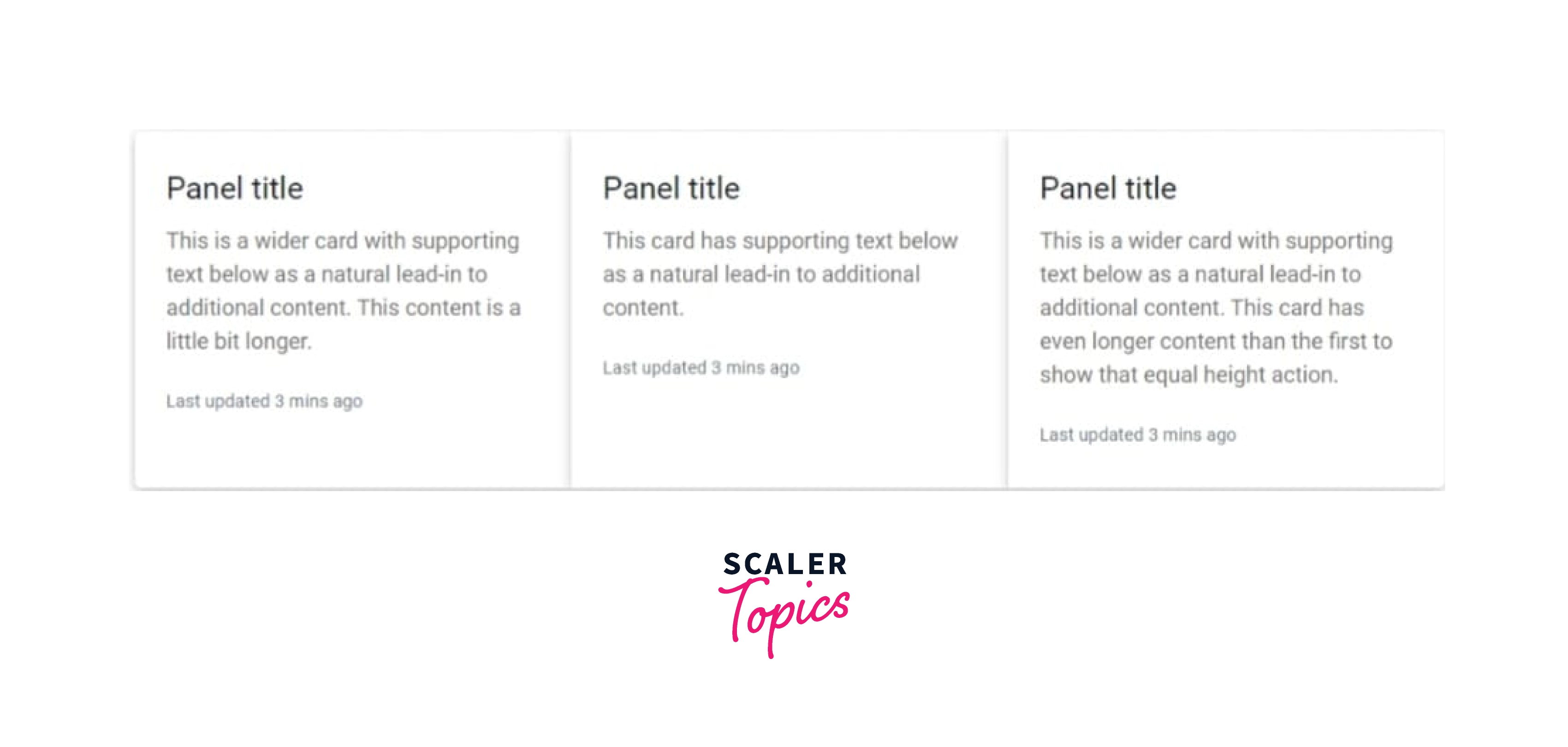
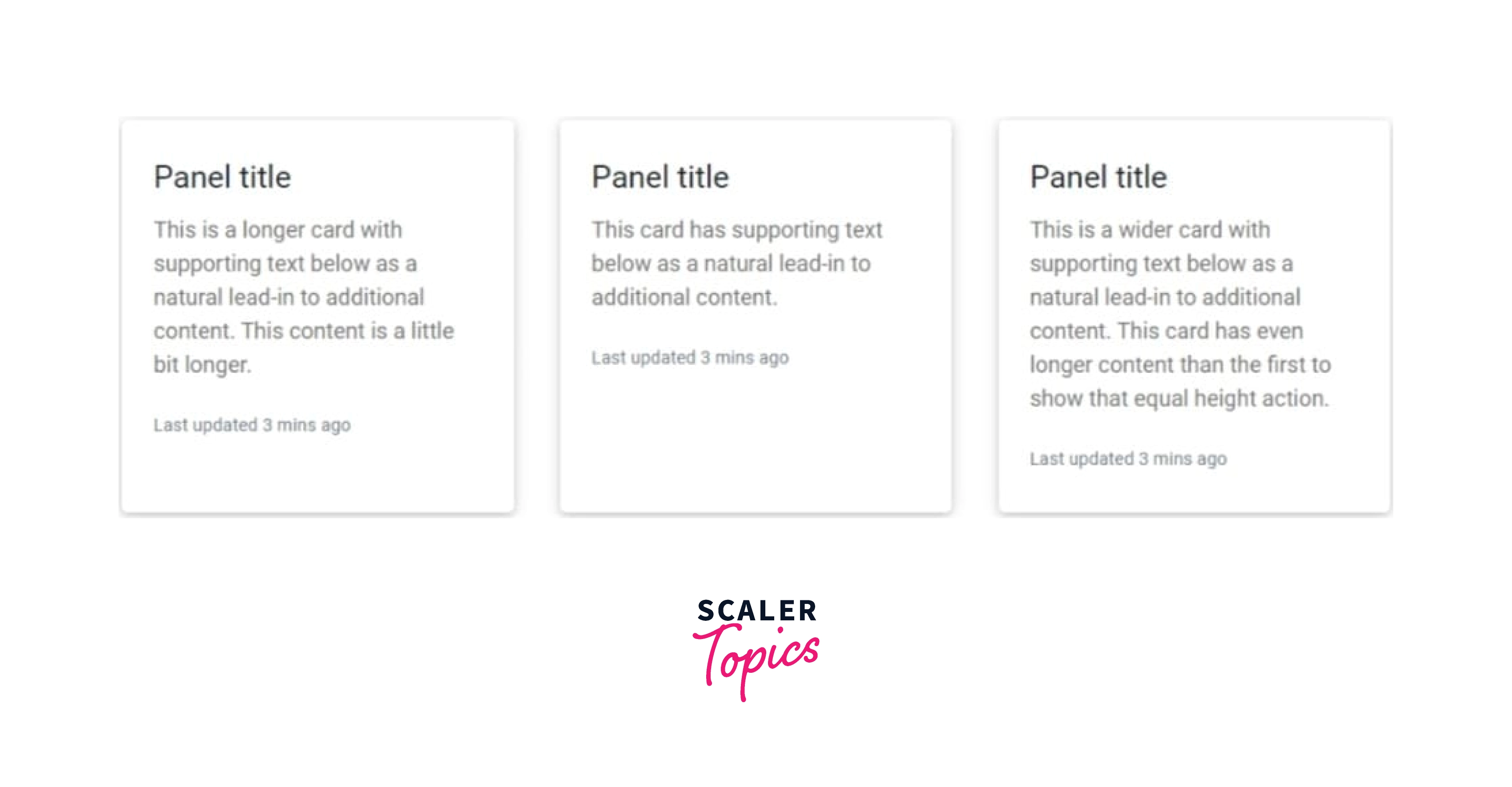
To render cards as a single, associated element with columns of the same width and height, use card groups. Card groups get their uniform sizing by using display:flex.
Card groups' content will automatically align when used with footers.
Code:
Output
Decks
If you require a group of unconnected panels that have the same width and height use decks.
Code:
Output
Columns
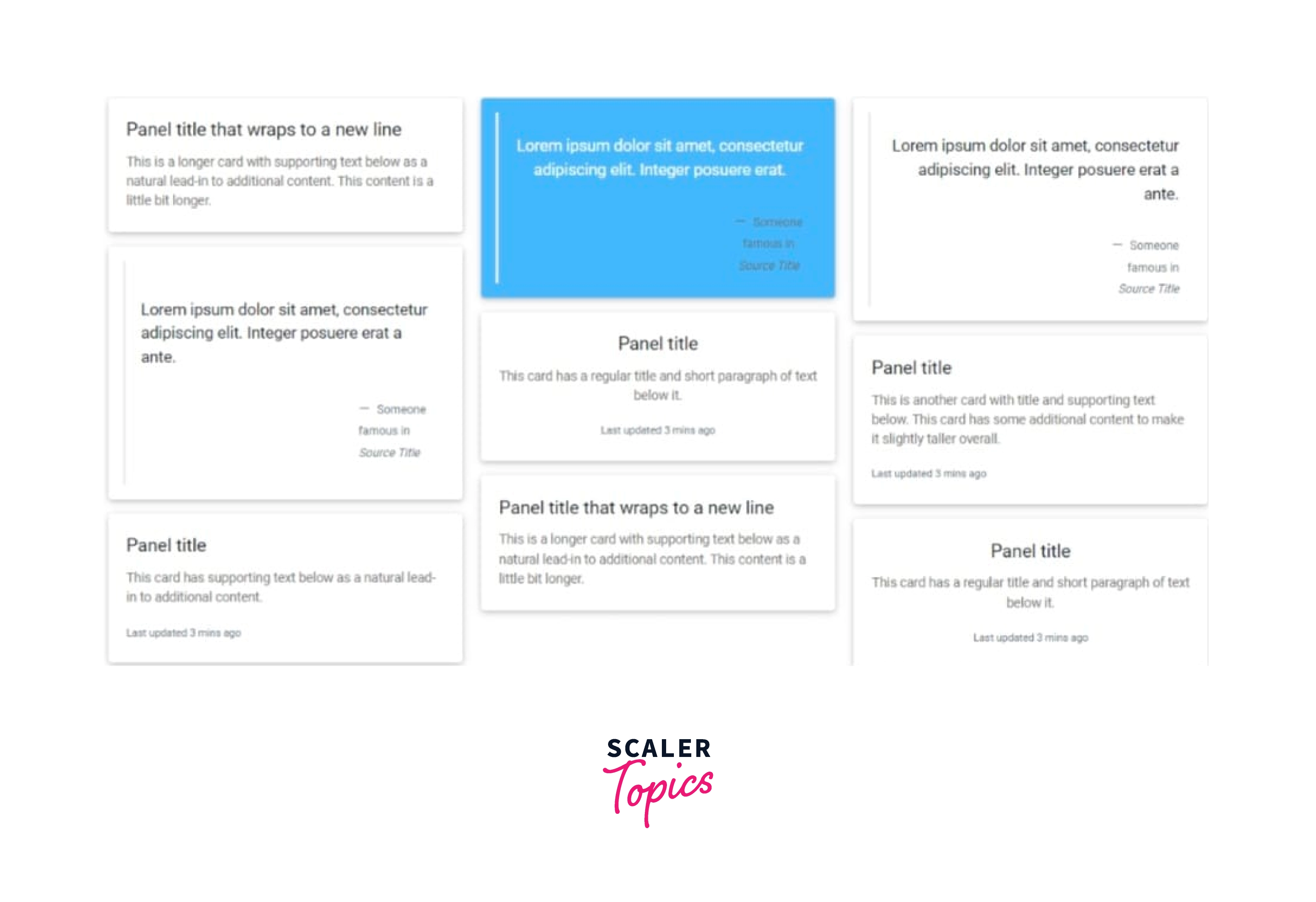
By enclosing panels in .card-columns, panels can be structured into Masonry-like columns using only CSS. For simpler alignment, panels are constructed using CSS column attributes rather than flexbox. From top to bottom and left to right, the panels are arranged.
Be aware! With card columns, results may vary. To prevent panels from breaking across columns, we should set them to display: inline-block as column-break-inside:a void is not yet a foolproof fix.
With little extra code, card columns can also be expanded and altered. The .card-columns class has been extended using the same CSS that we use to create a set of responsive tiers that allow you to change the thenumbert of columns.
Code:
Output
Jumbotron
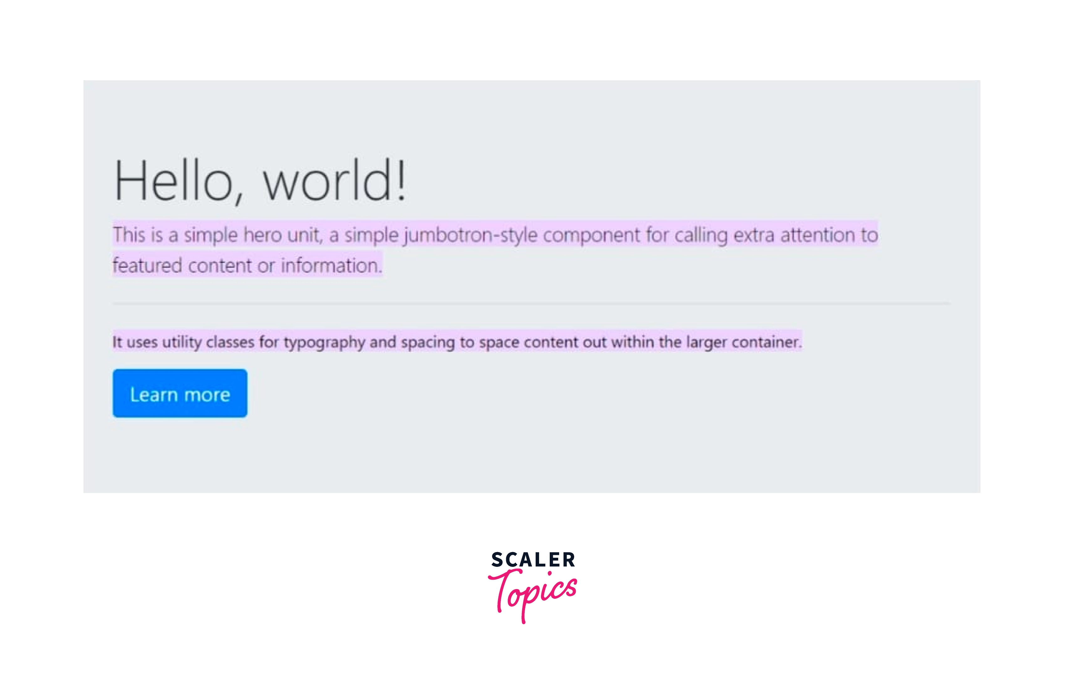
A Bootstrap jumbotron designates a large box to draw additional attention to some unique material or information. It appears as a grey box with rounded corners on the screen. Additionally, it can increase the text's font size.
Inside a jumbotron, you can use any valid HTML or Bootstrap components or classes.
A jumbotron is produced using the class .jumbotron in the div element.
Code:
Output
Conclusion
- When you wish to box up a DOM component, you use Bootstrap panels.
- The versatile and adjustable content container provided by Bootstrap panels comes in many forms.
- The .panel class is used to create panels, and the .panel-body class is used for content inside of panels
- Bootstrap panels have various beautiful style, sizes and layouts.
- A Bootstrap panel has sections just like Bootstrap Cards for eg. panel-body, panel-heading, panel-footer etc. .
- For colo,ring the panel's various contextual classes are used.
- Jumbotron is a large grey coloured box with rounded corners on the screen.
- Using Bootstrap panels have a lot of advantages like the overall structure of the page and User friendly look.
- There is no harm in using them so it is quite good to use it.
