Bootstrap Progress Bar
A progress bar, vital for displaying process completion on a computer, is easily integrated into web pages using Bootstrap's predefined classes. Bootstrap offers diverse progress bar types, with the default bar created using the .progress class within a <div> element.
How it Works?
A default progress bar is created using two HTML elements, some custom CSS to set the width of the progress bar, and a few attributes. Let us see them in detail and understand how they work.
- The.progressutility is used as a wrapper to indicate the maximum value of the progress bar.
- The inner .progress-bar utility is used to indicate the progress that we have made so far.
- This inner .progress-bar utility requires some custom CSS, inline styling, or utility class to set the width of the progress bar.
- Moreover, the .progress-bar utility also requires some role and aria attributes to make it accessible.
- The aria attributes that need to be added are aria-valuenow that denotes the current progress of the task, aria-valuemin that denotes the minimum value of the progress bar, and aria-valuemax that denotes the maximum value of the progress bar.
Therefore, by putting together all the above utilities and attributes, a progress bar is created.
Let us now create some basic progress bars with the help of the utility classes discussed above.
Output:
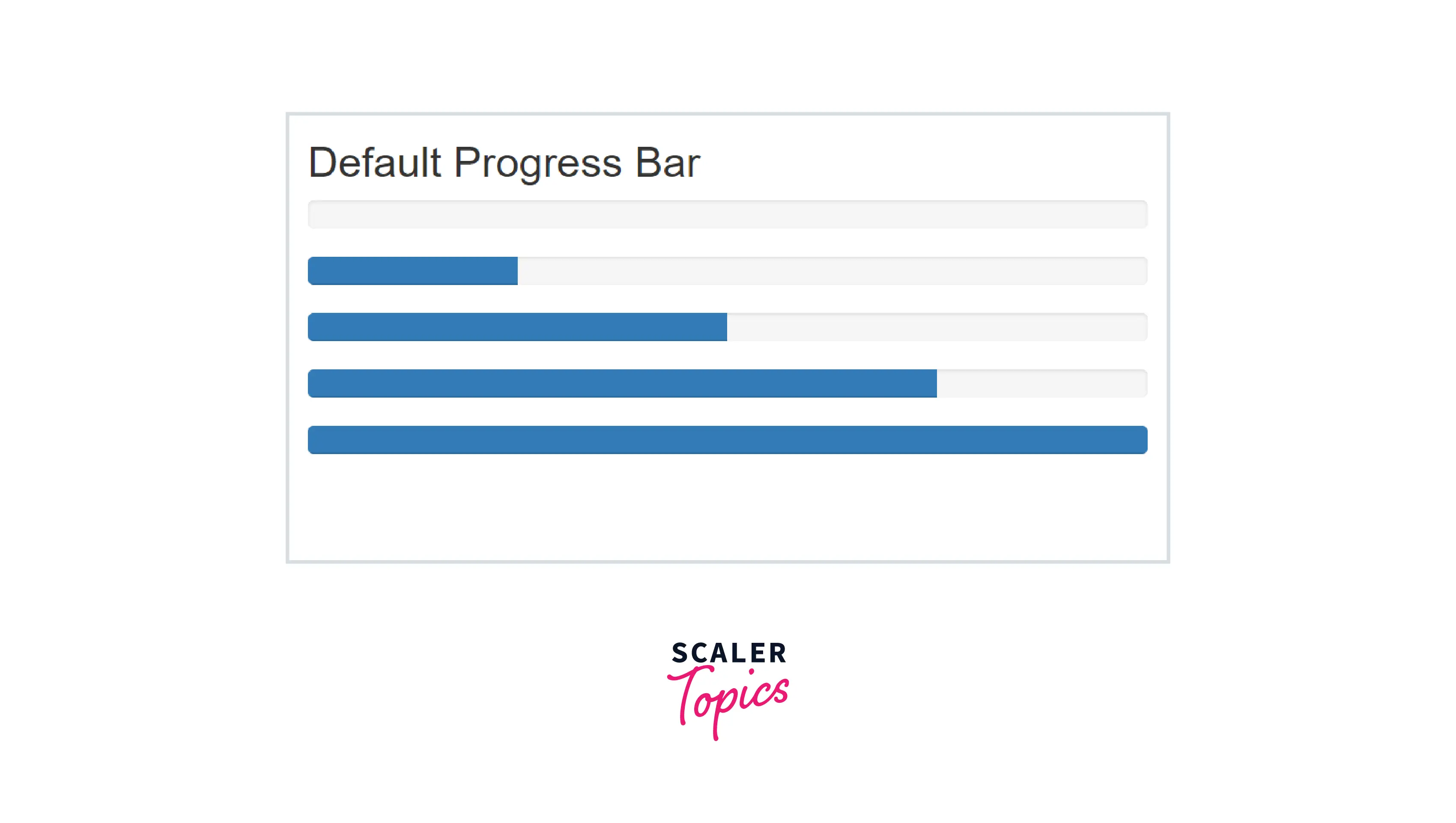
Therefore, as you can see in the above output, we have created different progress bars with different completion values.
In the above code, we have used two divs containing the classes .progress, .progress-bar and the role and aria attributes.
The role attribute is set to progressbar, the attributes aria-valuenow denoting the current progress of the task and the attributes aria-valuemin and aria-valuemax denoting the minimum and maximum value of the progress bar respectively.
Labels
You can add labels inside the progress bars by placing the label/text inside the .progress-bar utility class which appears as it is inside the progress bars.
Let us see an example of how to create progress bars with different labels inside them.
Output:
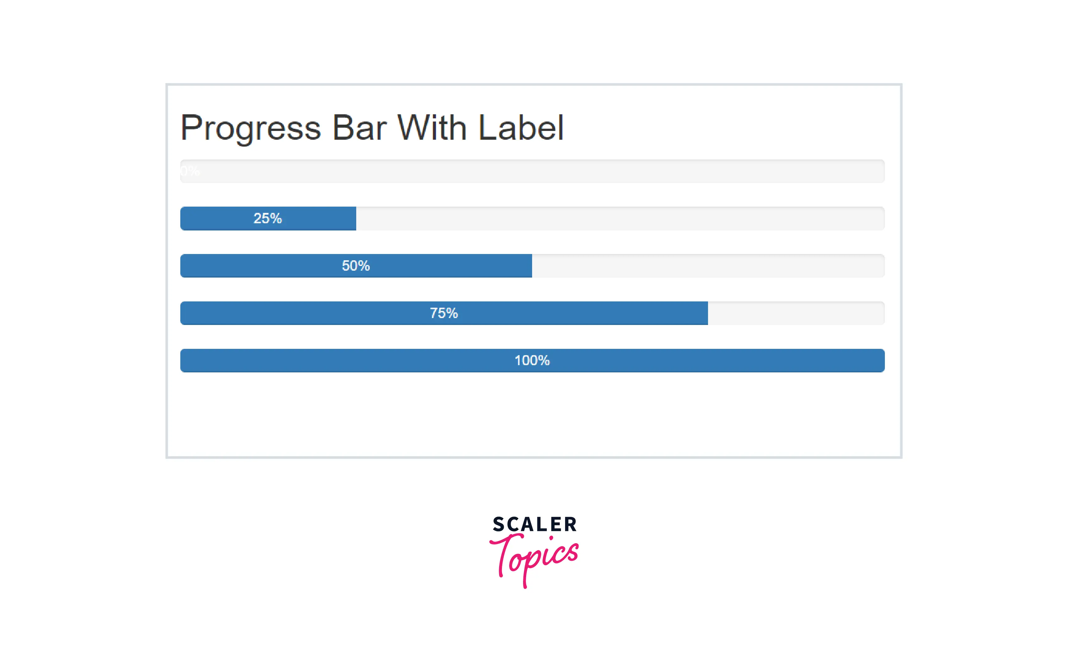
Therefore, as you can see in the above output, we have added the completion values of the respective progress bars as the labels inside them.
Height
You can also change the height of a progress bar for which you need to add a height attribute to the outer .progress utility. By adding the height attribute to the .progress utility class, the inner .progress-bar utility automatically resizes itself accordingly.
Let us now see an example of creating the progress bars of different heights using bootstrap.
Output:
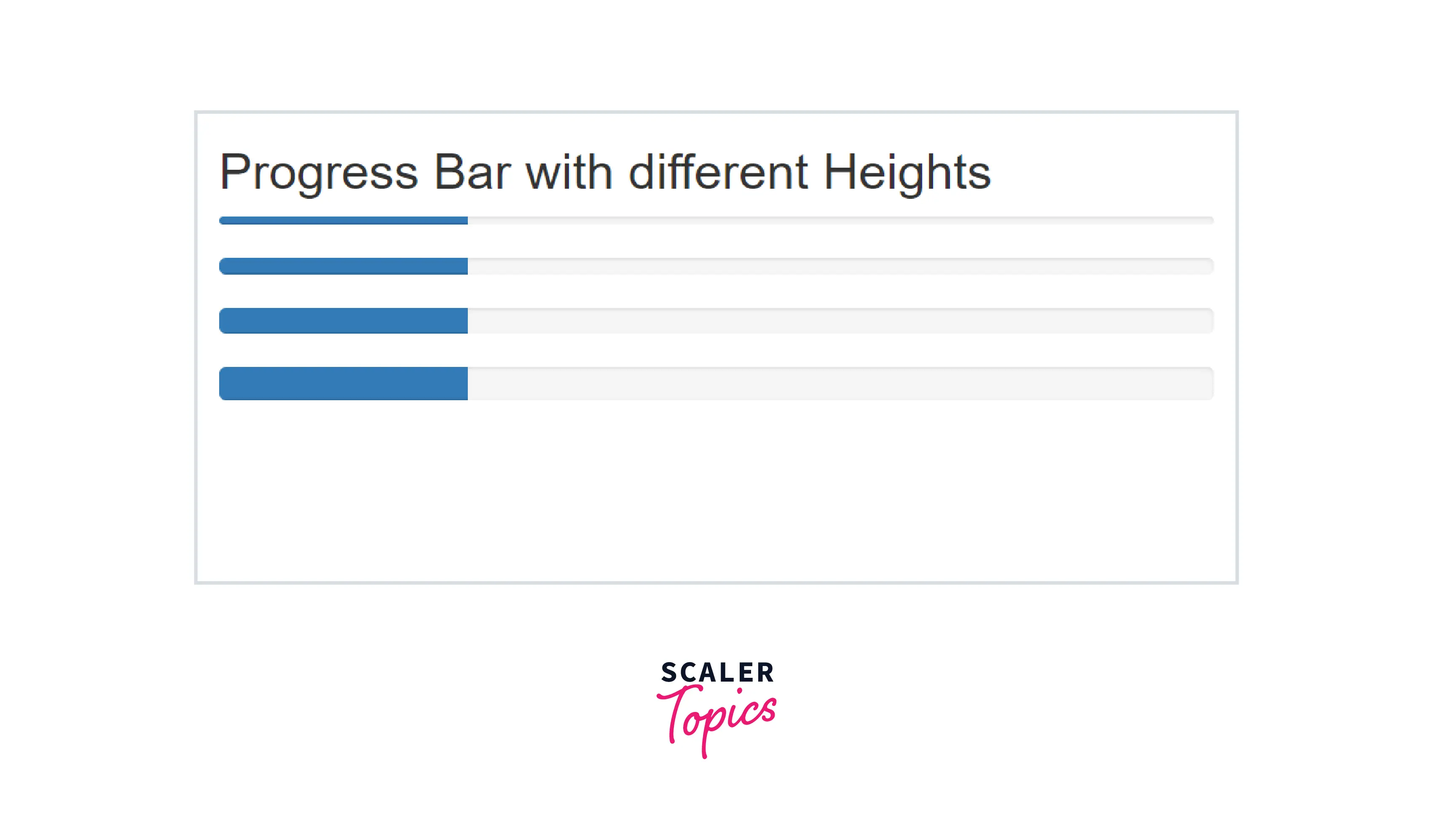
As you can see in the above output, the height of the progress bars has been changed by adding different values of heights to them.
Backgrounds
You can also change the color of the individual progress bars with the help of the contextual color classes provided by Bootstrap. The contextual classes that can be used with the progress bars are - progress-bar-secondary, progress-bar-success, progress-bar-warning, and progress-bar-info.
You can add these colors to the progress bars by adding the contextual color utilities to the .progress-bar class.
Let us see the different color backgrounds of the progress bars with the help of a code example.
Output:
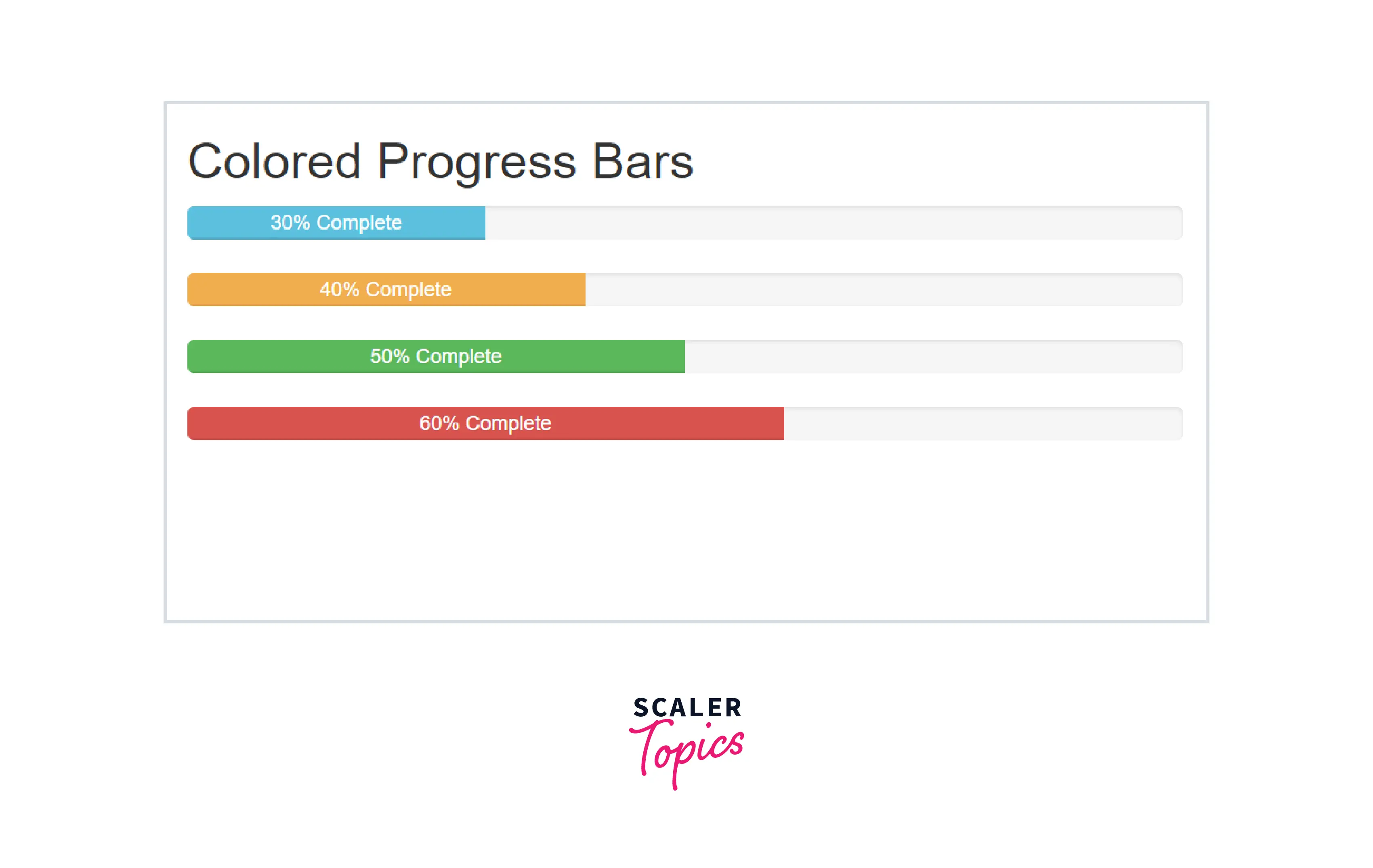
Therefore, as you can see in the above output, the progress bars have been colored with different color backgrounds by using the contextual classes provided by Bootstrap.
Multiple Bars
You can also include multiple bars in a single progress component by placing the multiple bars into the same <div class='progress'. An example of using multiple bars in a single progress component can be displaying the amount of free space and used space in mobile phones.
Let us see an example of multiple progress bars with the help of a code example.
Output:
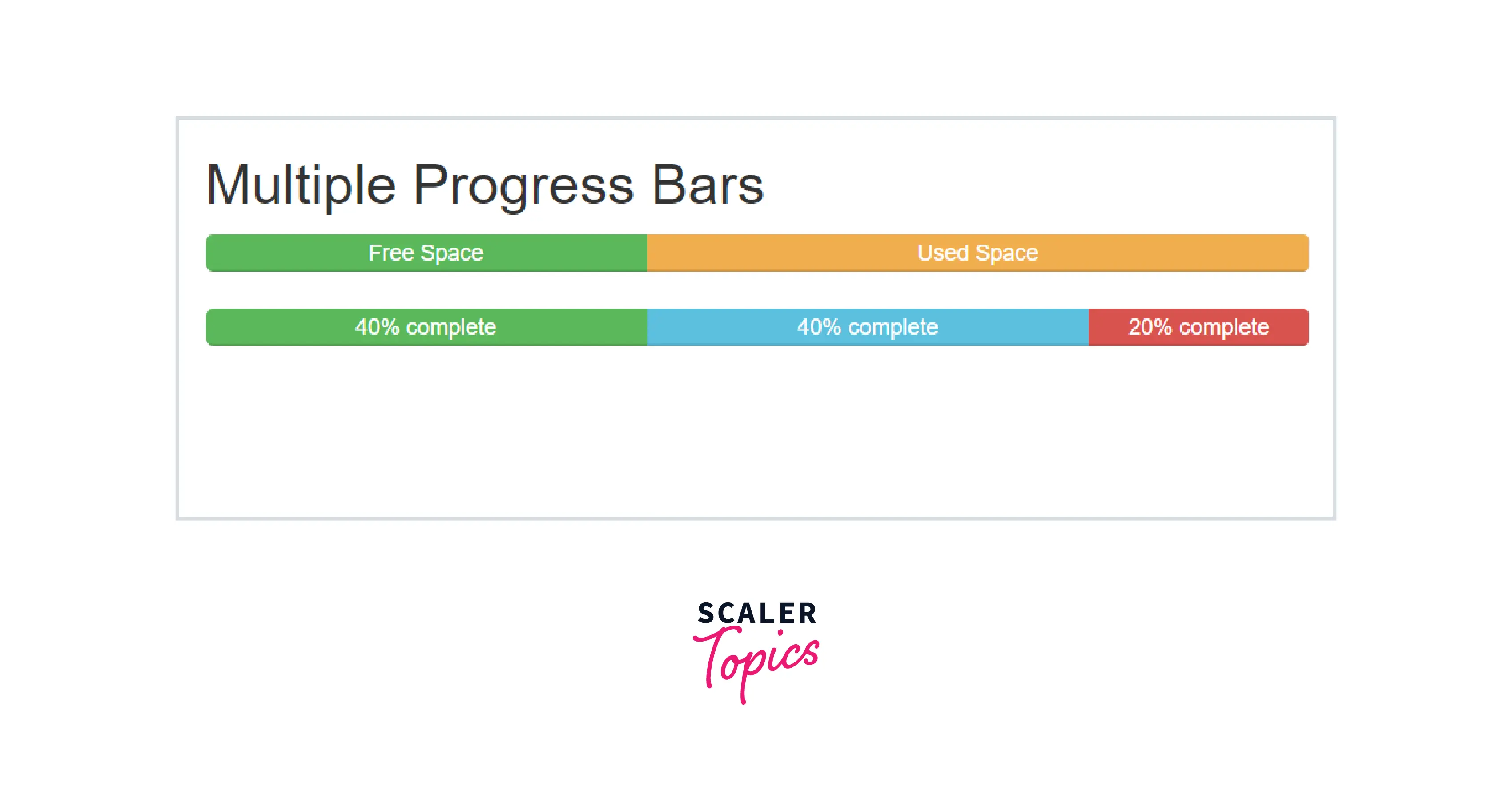
As you can see in the above output, the stacked progress bars have been created.
Striped
You can create striped progress bars in bootstrap as well for which you need to add the .progress-bar-striped utility class with the .progress-bar utility. It applies a stripe via CSS gradients over the progress bar's background colors. Therefore, it appears to be striped.
Let us see an example of striped progress bars in bootstrap.
Output:
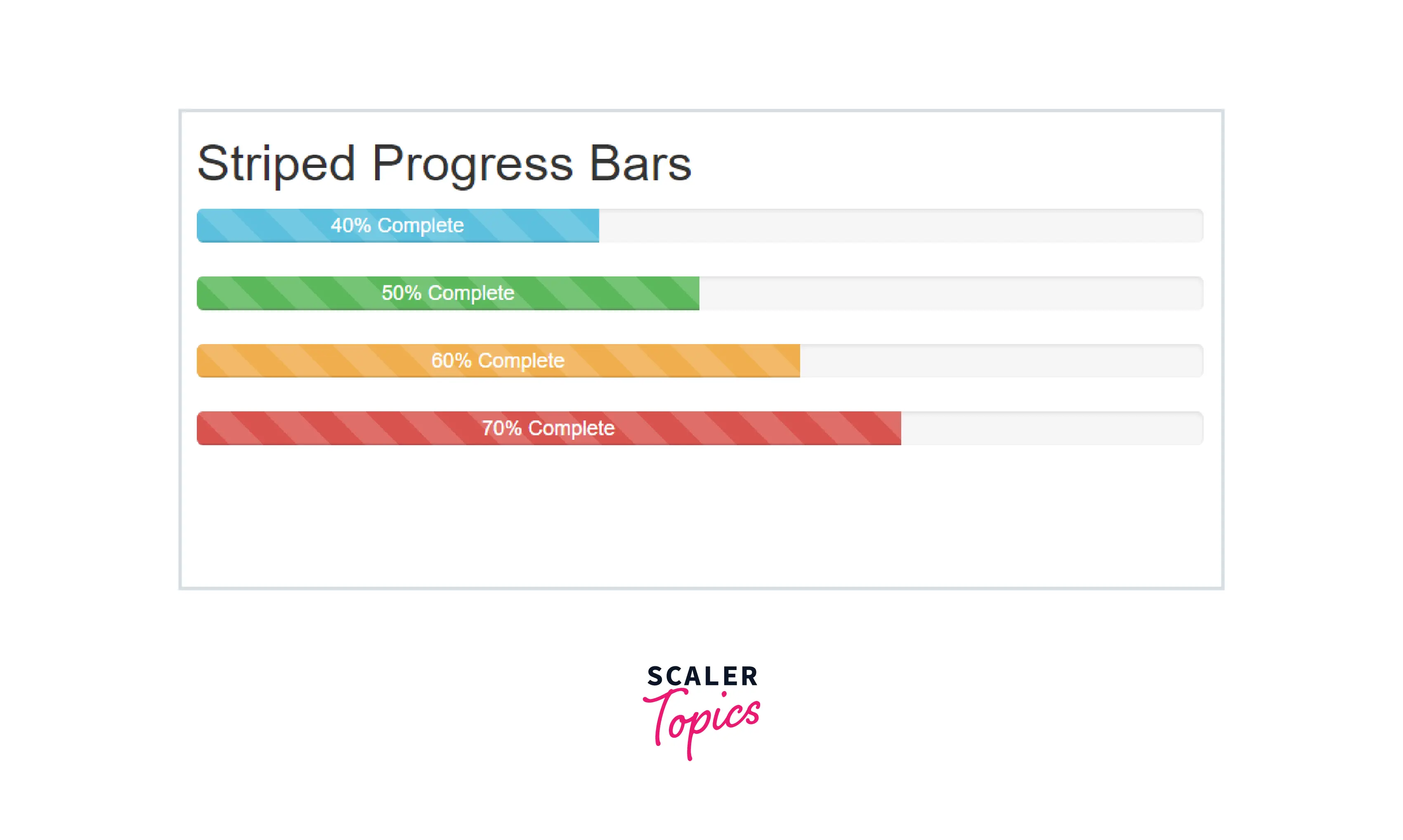
Therefore, as you can see in the above output, the background of the progress bar creates a gradient with a striped background where the aria-valuenow attributes denoting the current progress of the tasks.
Animated stripes
The strips added to the progress bars with the help of the .progress-bar-striped utility can also be animated. Bootstrap provides a utility class .progress-bar-animated to create an animated effect on the strips of the progress bars. or you can simply add a .active class with the .progress-bar utility.
These strips will animate from right to left via CSS3 animations.
Let us see the animated stripped progress bars with the help of a code example.
Output:
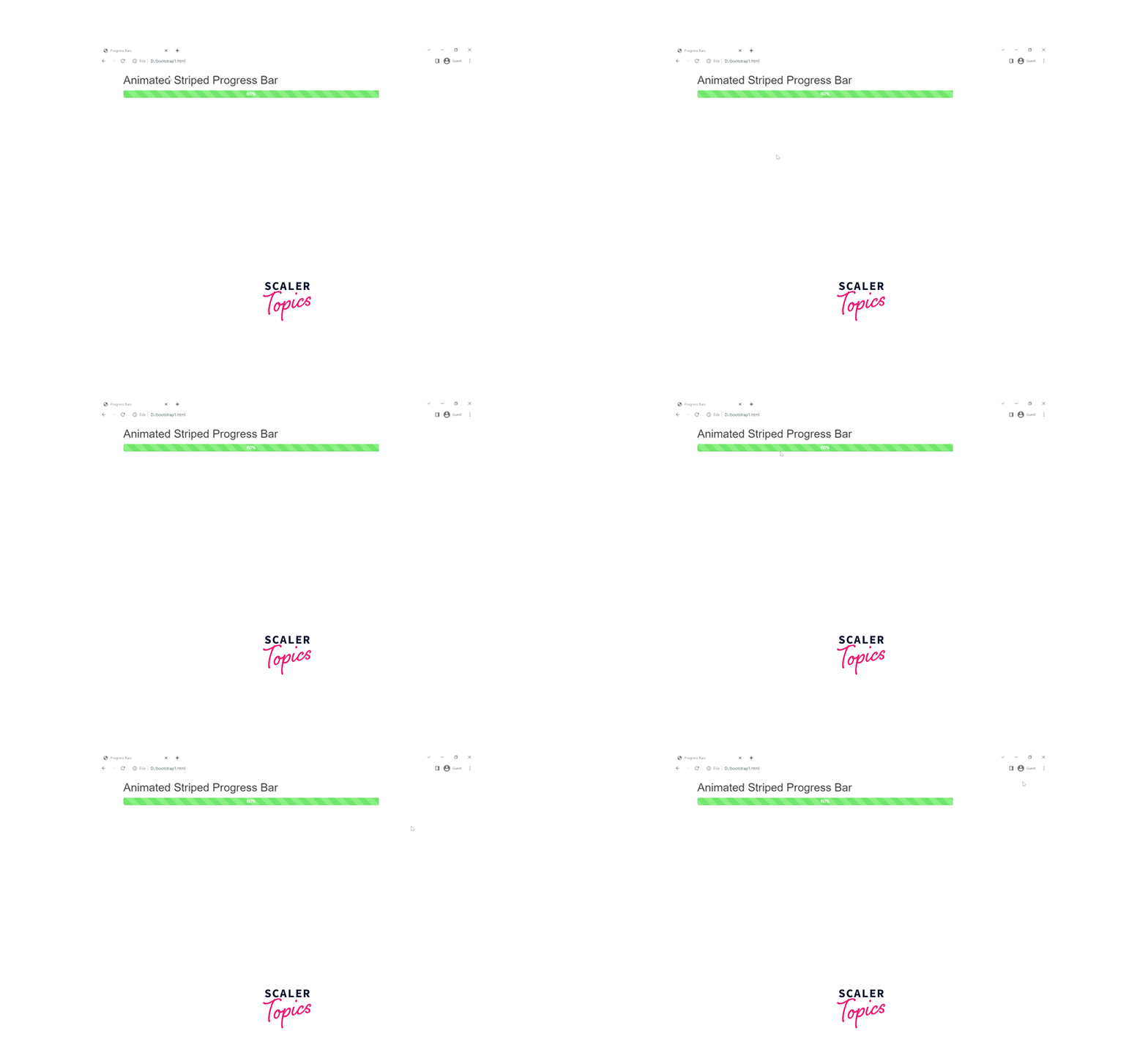
As you can see in the above output, the progress bar is animated using the .active class and the aria-valuenow = 60% attribute denoting the current progress of the task.
Conclusion
- Progress Bars are used to display the progress of a process in terms of percentages, steps, and other options.
- Bootstrap provides certain utility classes such as .progress, and .progress-bar for creating a bootstrap progress bar.
- The width of the progress bars needs to be added using some custom CSS or inline styling.
- You can create the progress bars of various colors using the different contextual classes provided by Bootstrap.
- You can also create multiple stacked progress bars by adding different .progress-bar utilities within the same .progress class.
- You can create a striped progress bar with the help of the .progress-bar-striped utility in bootstrap.
- Moreover, you can animate the progress bar with the help of the .active class in bootstrap.
