Bootstrap Select
Bootstrap-select enhances web design by customizing HTML <select> elements with unique CSS, creating attractive dropdowns. It offers features like search boxes, keyboard navigation, and select/deselect controls, elevating user experience in forms and menus. While it requires jQuery and Bootstrap’s dropdown.js, Bootstrap-select can be styled using .custom-select for a refined look. Note that for Bootstrap v4+, Popper.js is also necessary for full functionality.
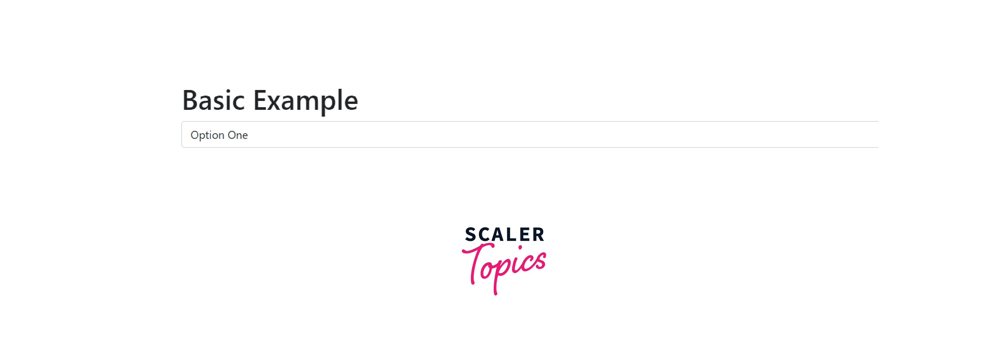
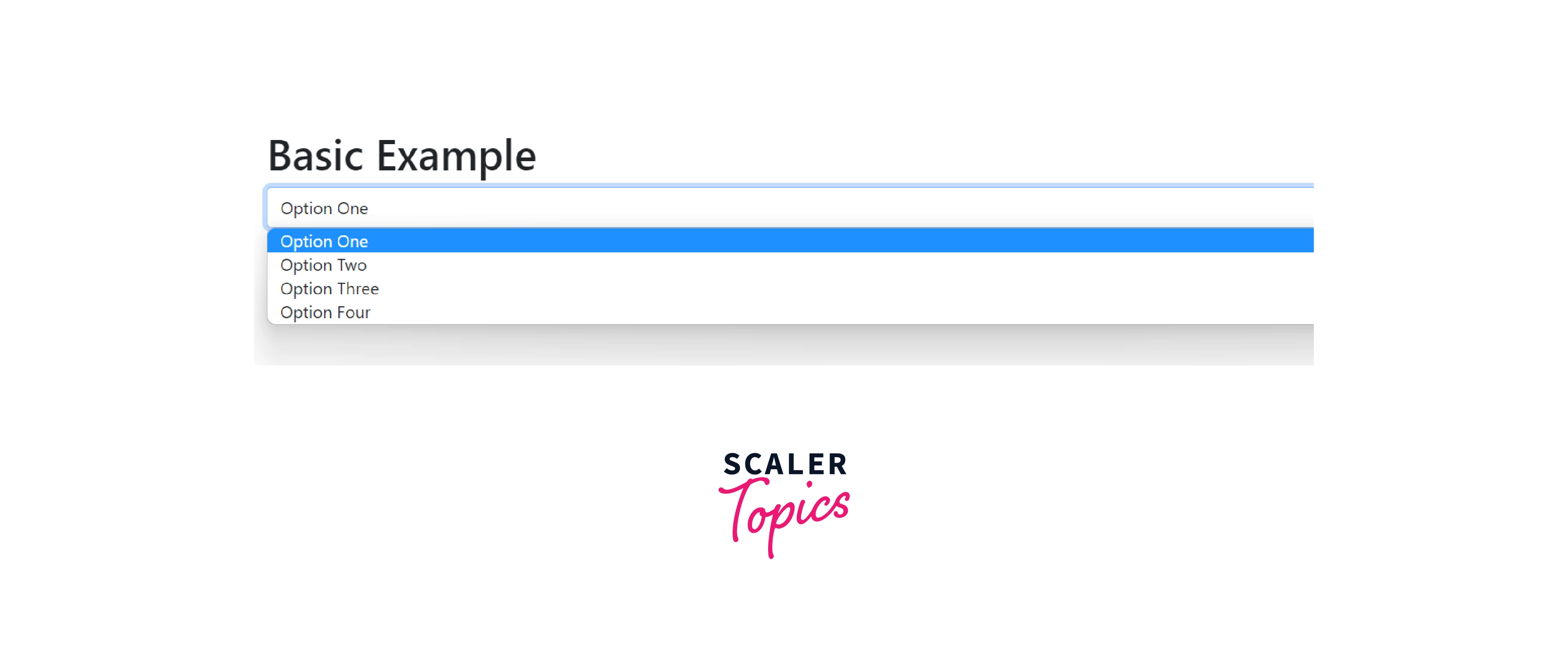
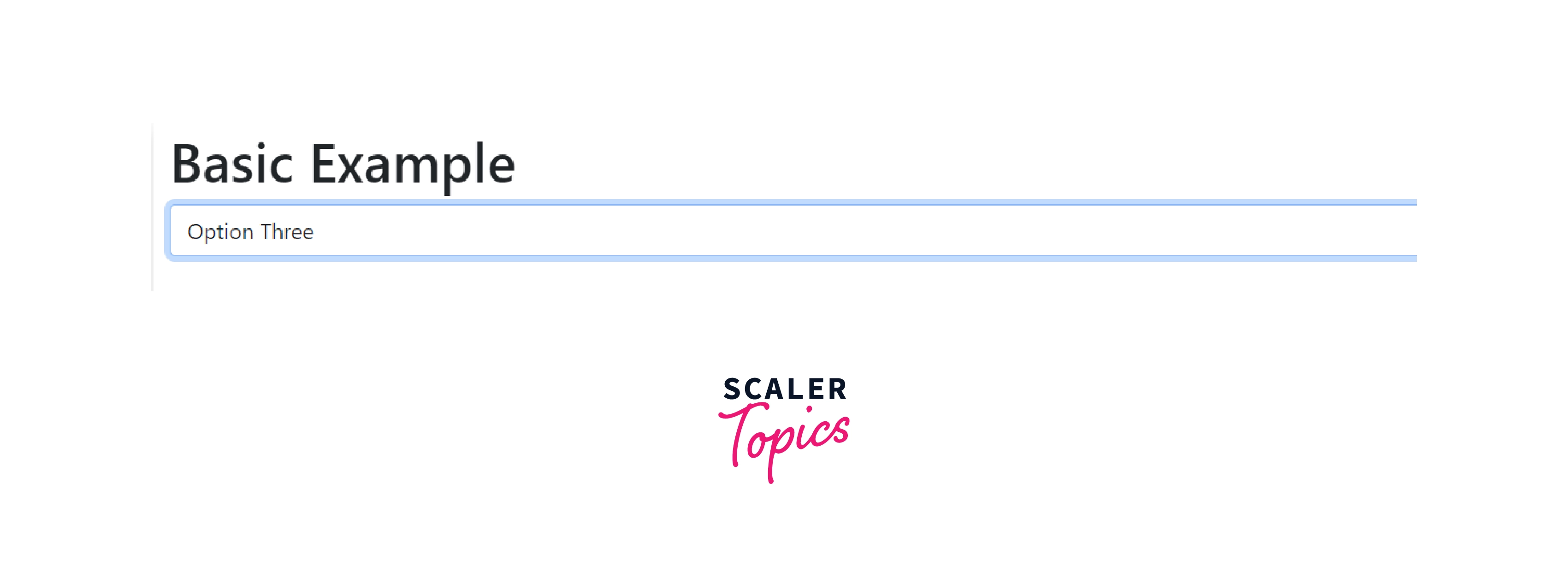
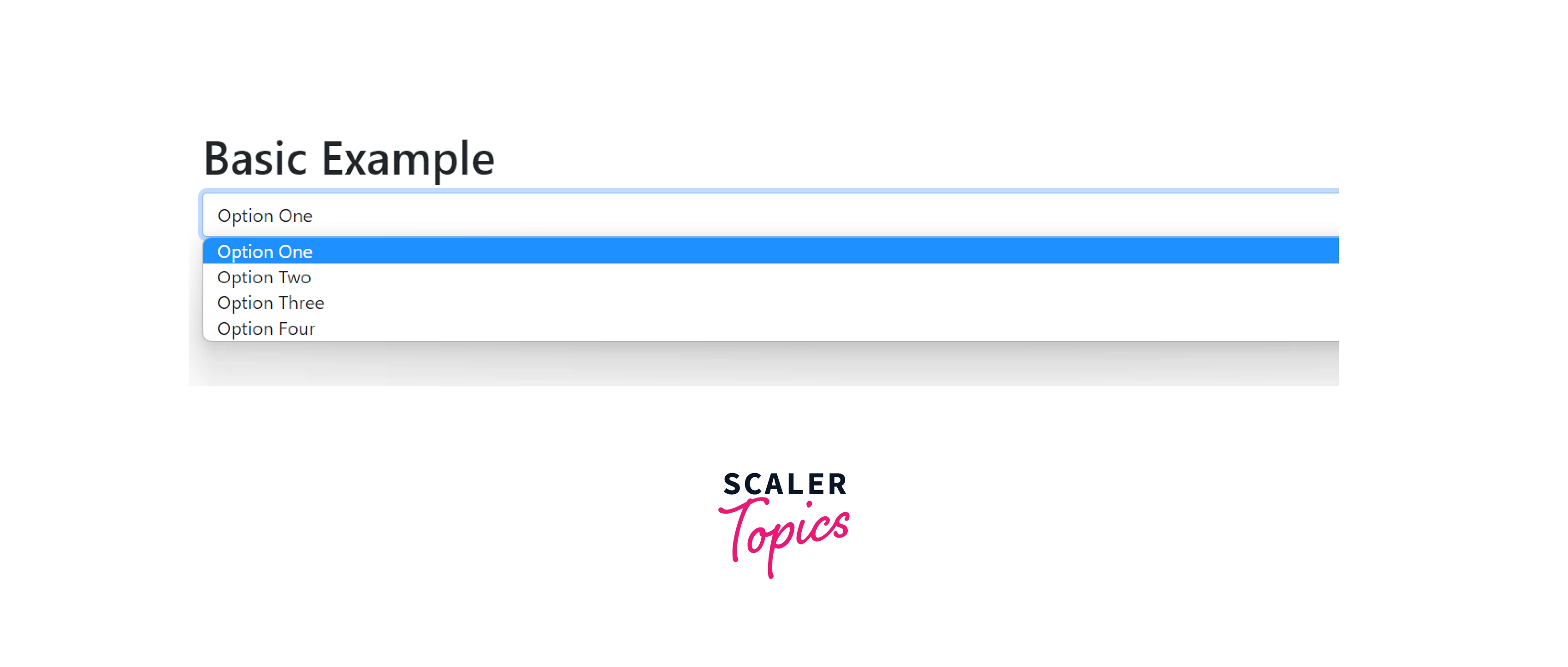
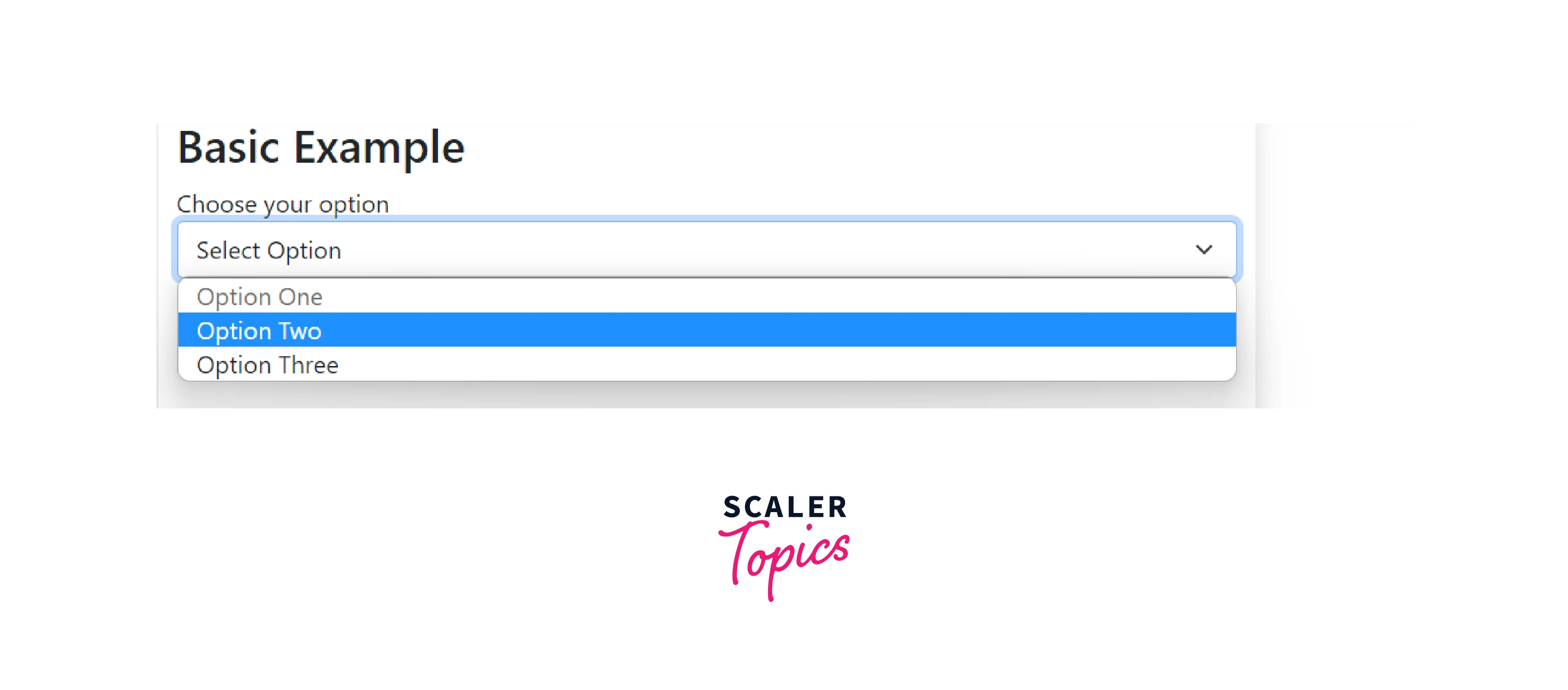
Basic Example
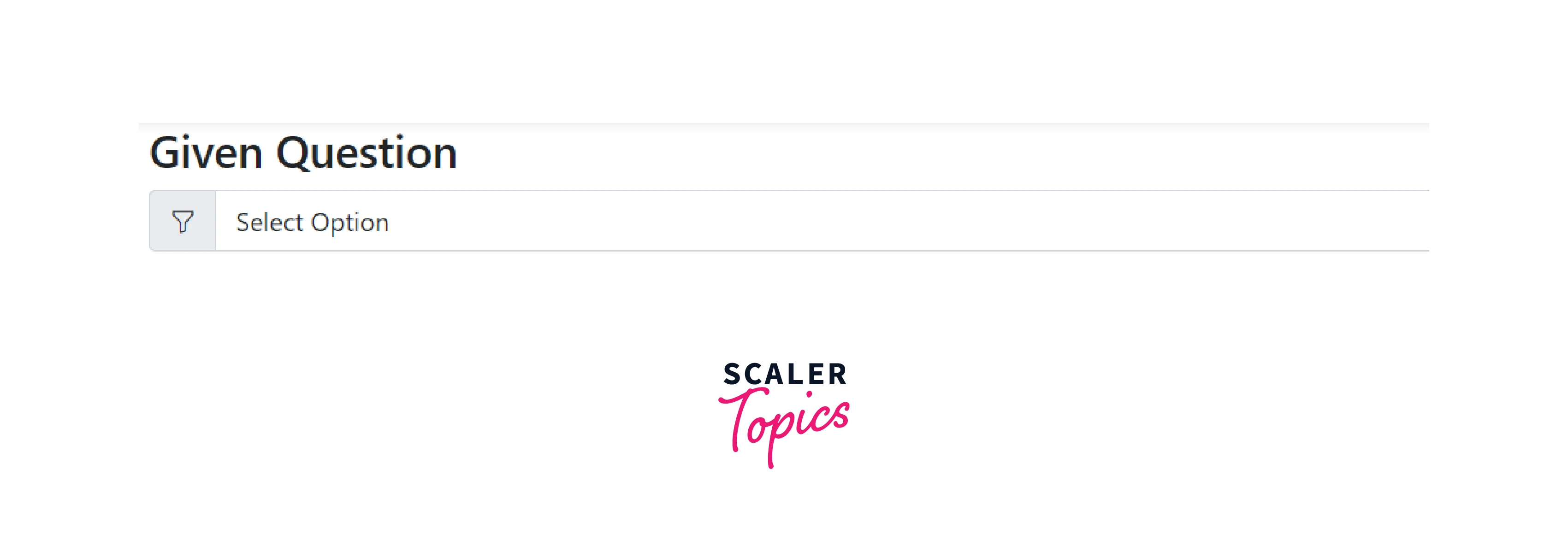
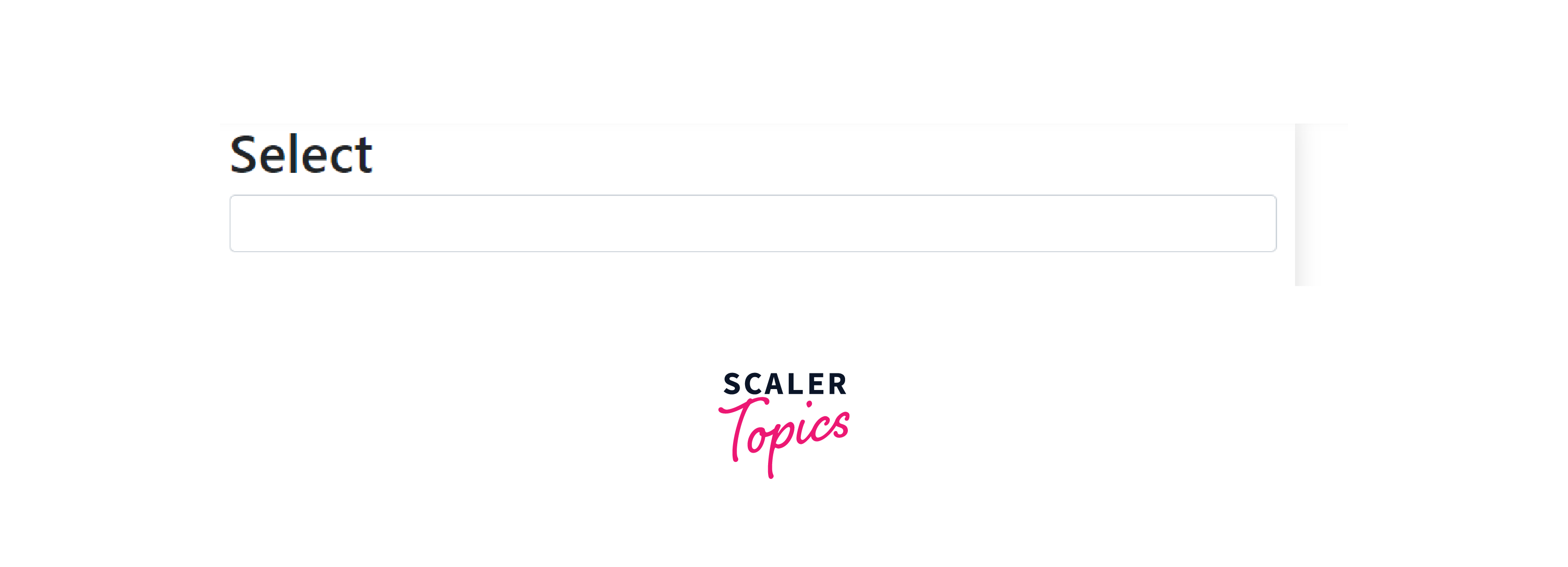
Basic example of a select component that allows you to choose from a number of options.
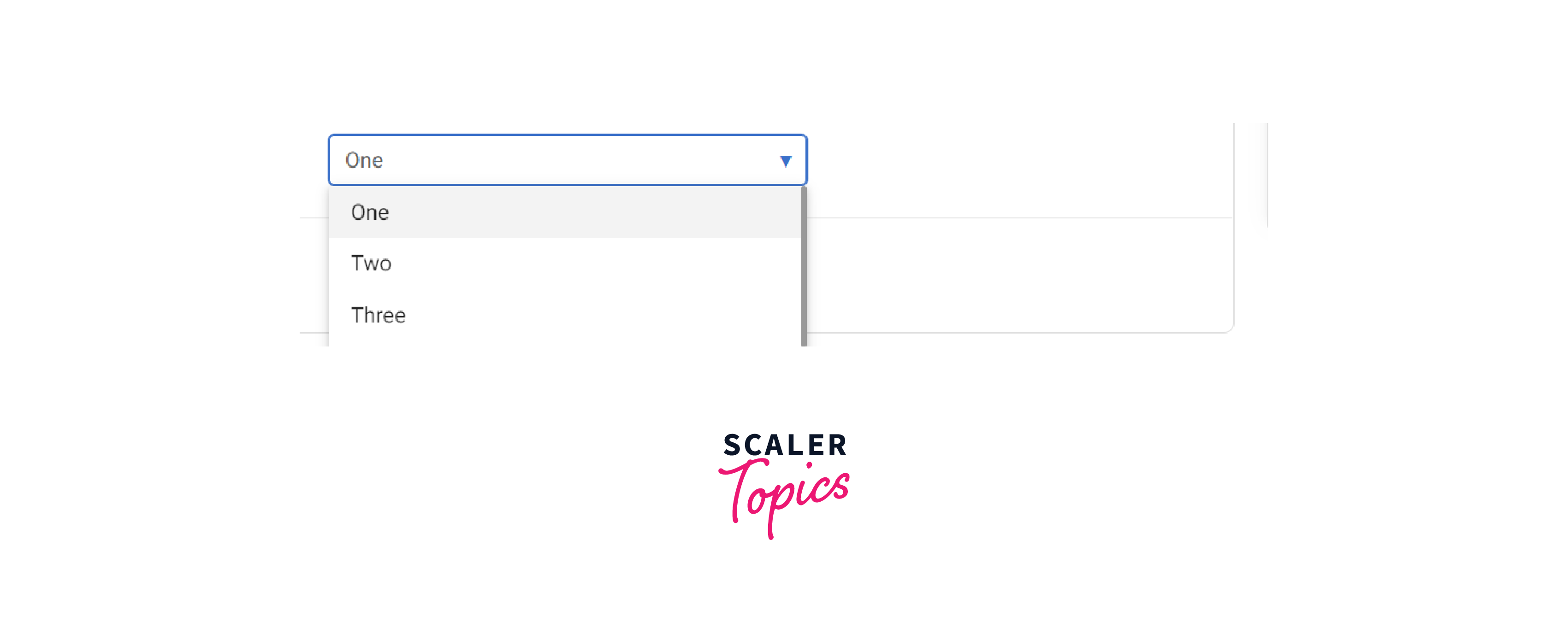
Dropdown with initially selected value as Option One.
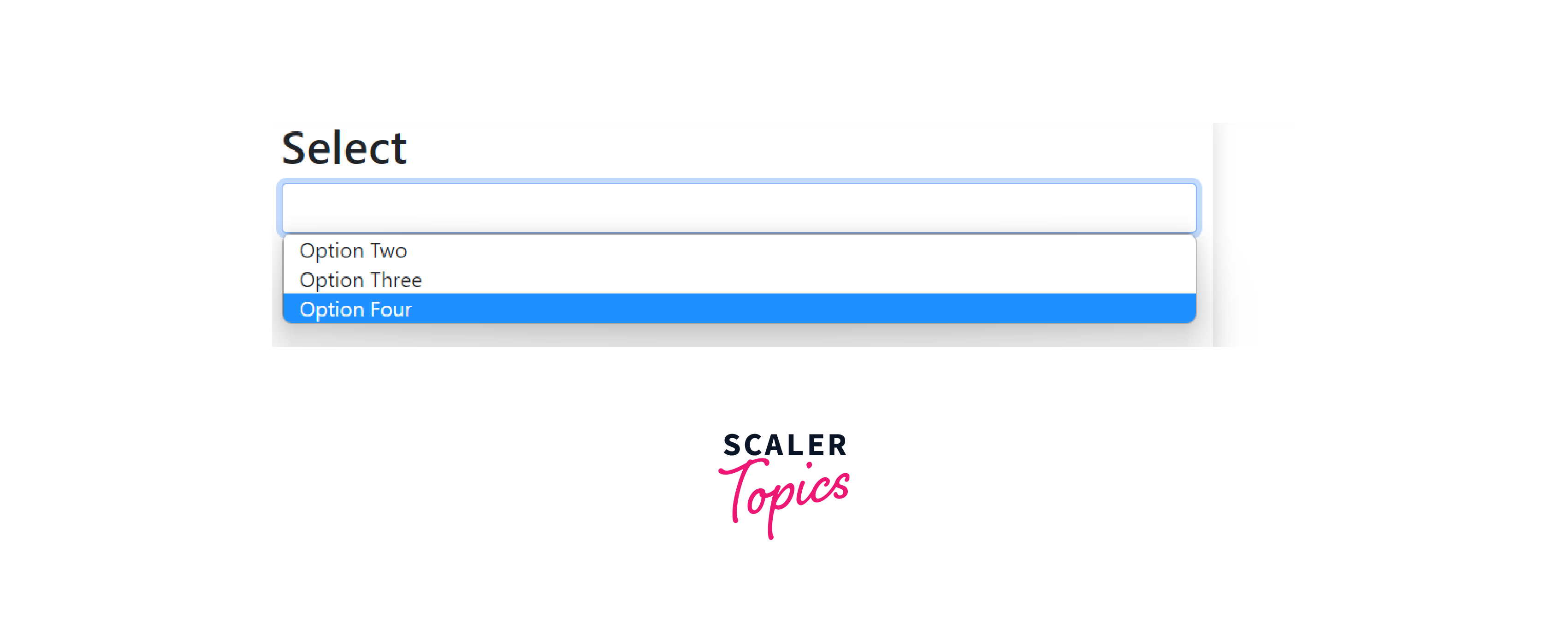
Dropdown with all options shown.
Option Three selected.
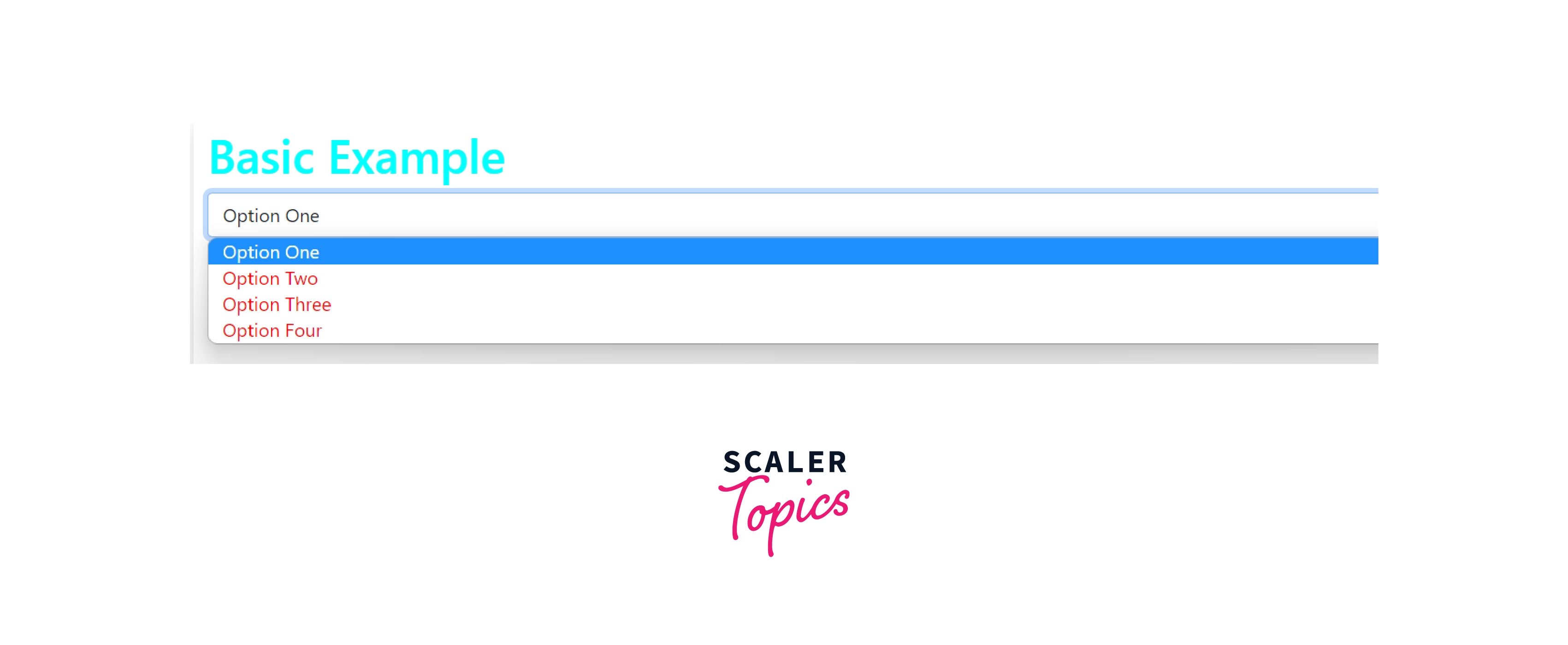
Adding Custom Style in Bootstrap Select
You can add custom styling using CSS in these Bootstrap-select dropdowns like changing font-color, size, font-size, etc.
Dropdown with heading color as cyan and options color as red.
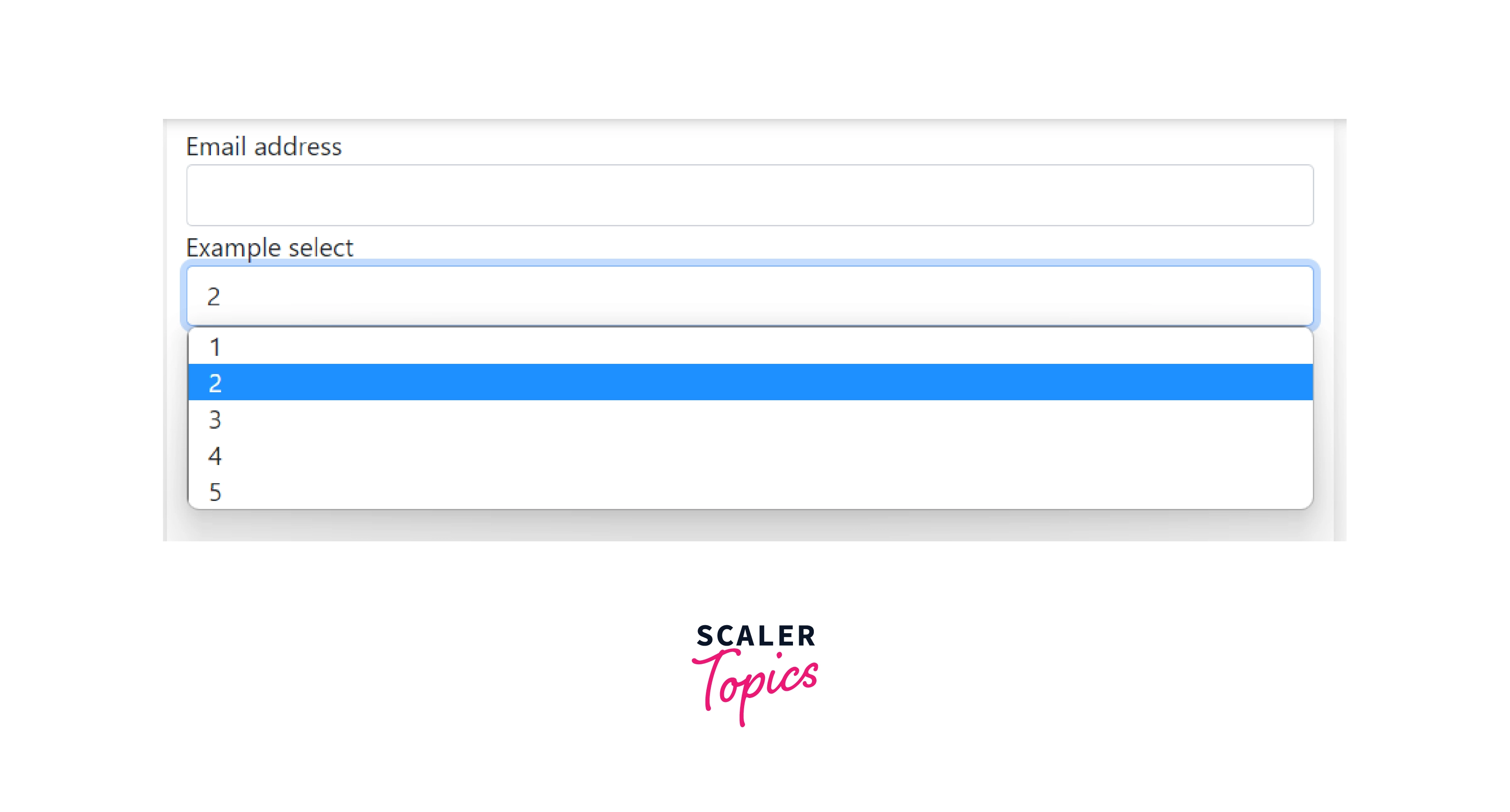
Select in a Bootstrap Form Example
You can include bootstrap-select in forms as well to make dropdowns with single select as well as multi-select.
Form with an option to add an email address and a dropdown formed using bootstrap-select.
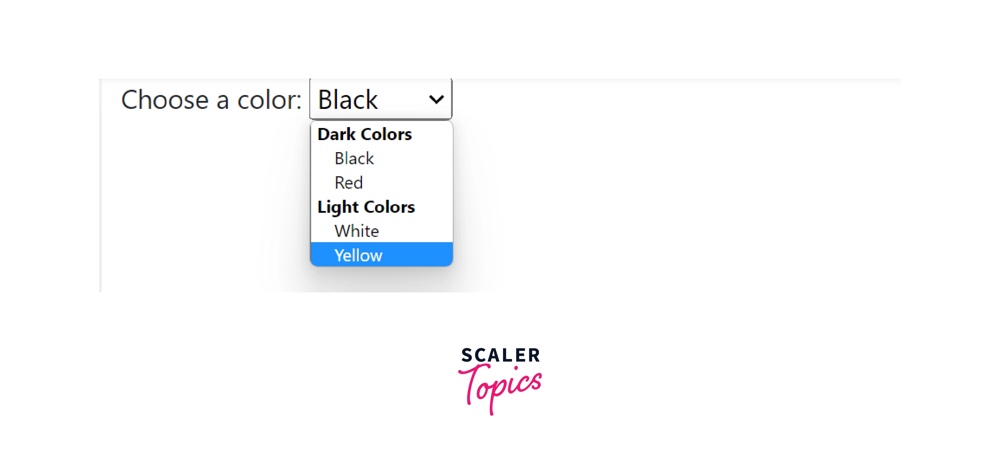
A Select With Option Groups Example
A select with option groups enable you to create options with respect to their respective group.
Dropdown with two groups, Dark Colors, and Light Colors and each having 2 options.
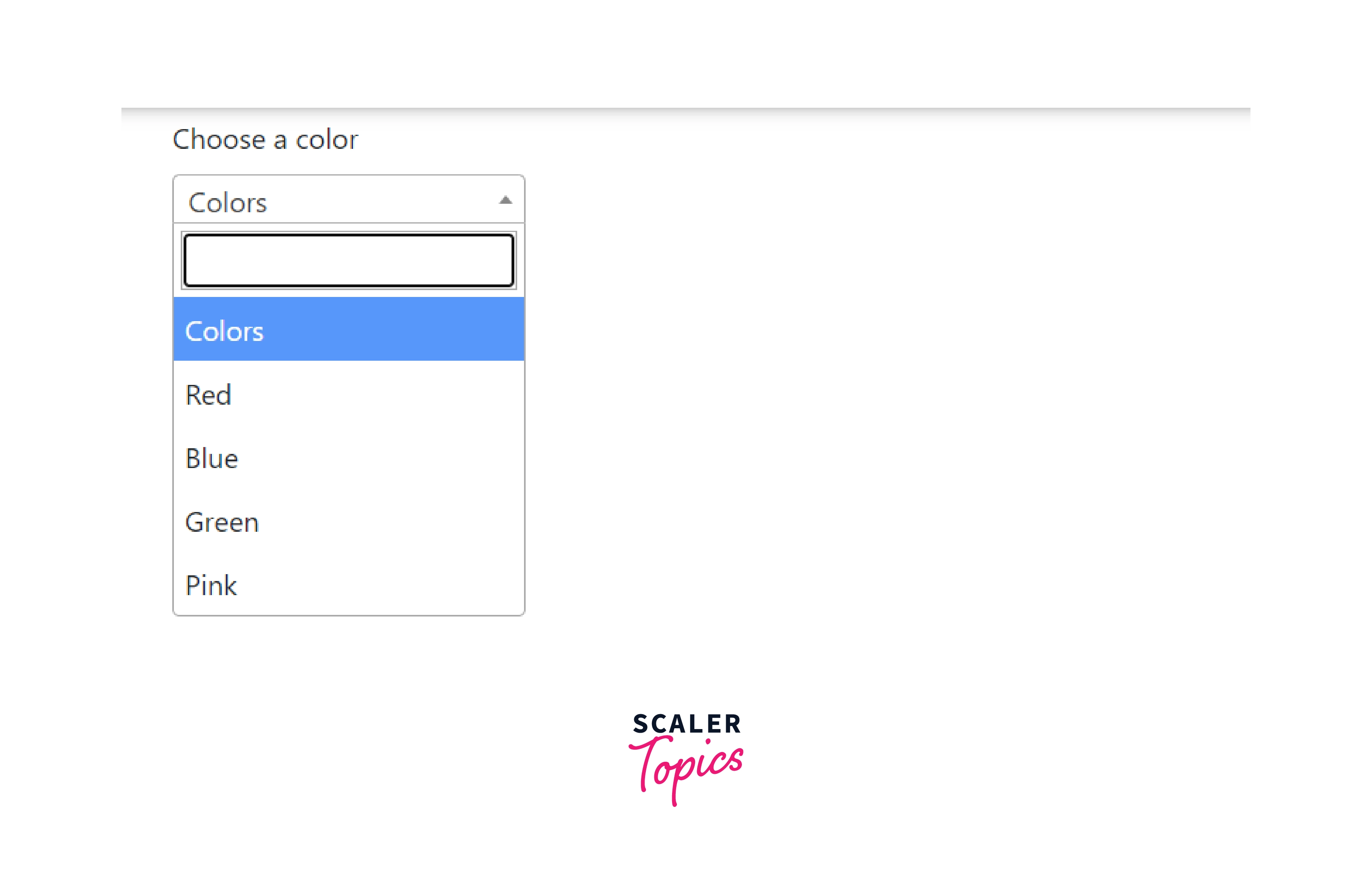
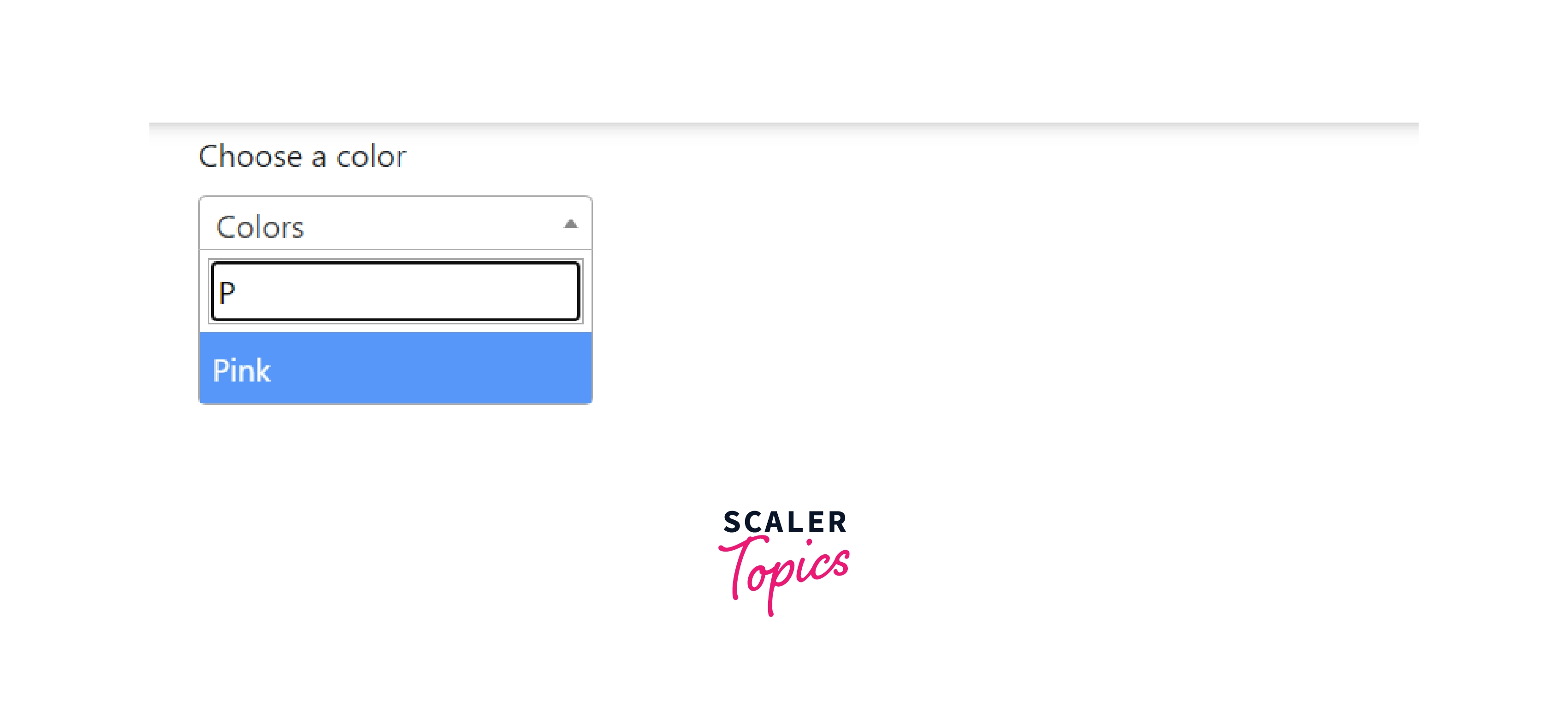
Adding Search Facility in Select
Bootstrap-select gives an option to add a search bar in the dropdown so that users can either search for their option or choose from the given options directly.
Dropdown with a search bar to choose a color.
If you search for any option with its starting alphabet you automatically get that option selected.
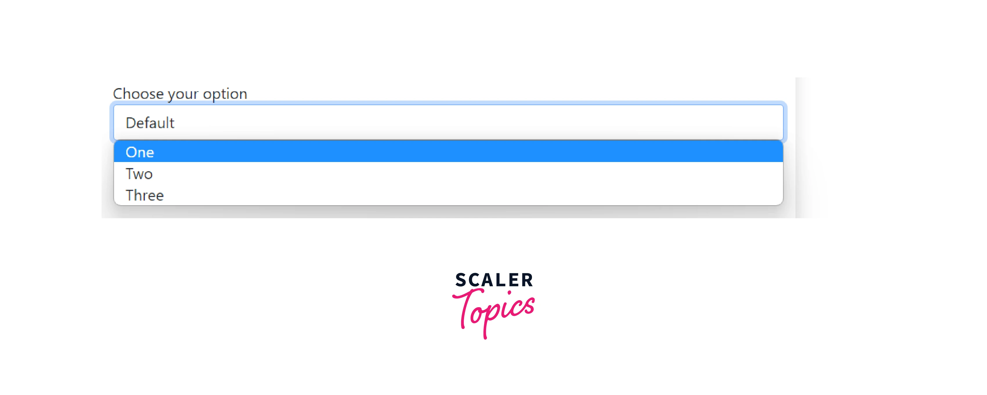
Select with Label
Label gives a heading to the selection box created by bootstrap-select. Like in the above codes different dropdowns have different headings. These labels help to increasing the crarity and specificity of the dropdowns. It is possible to add a select label by creating an element with the .form-label and .select-label classes.
It is a basic Example of a dropdown without a label.
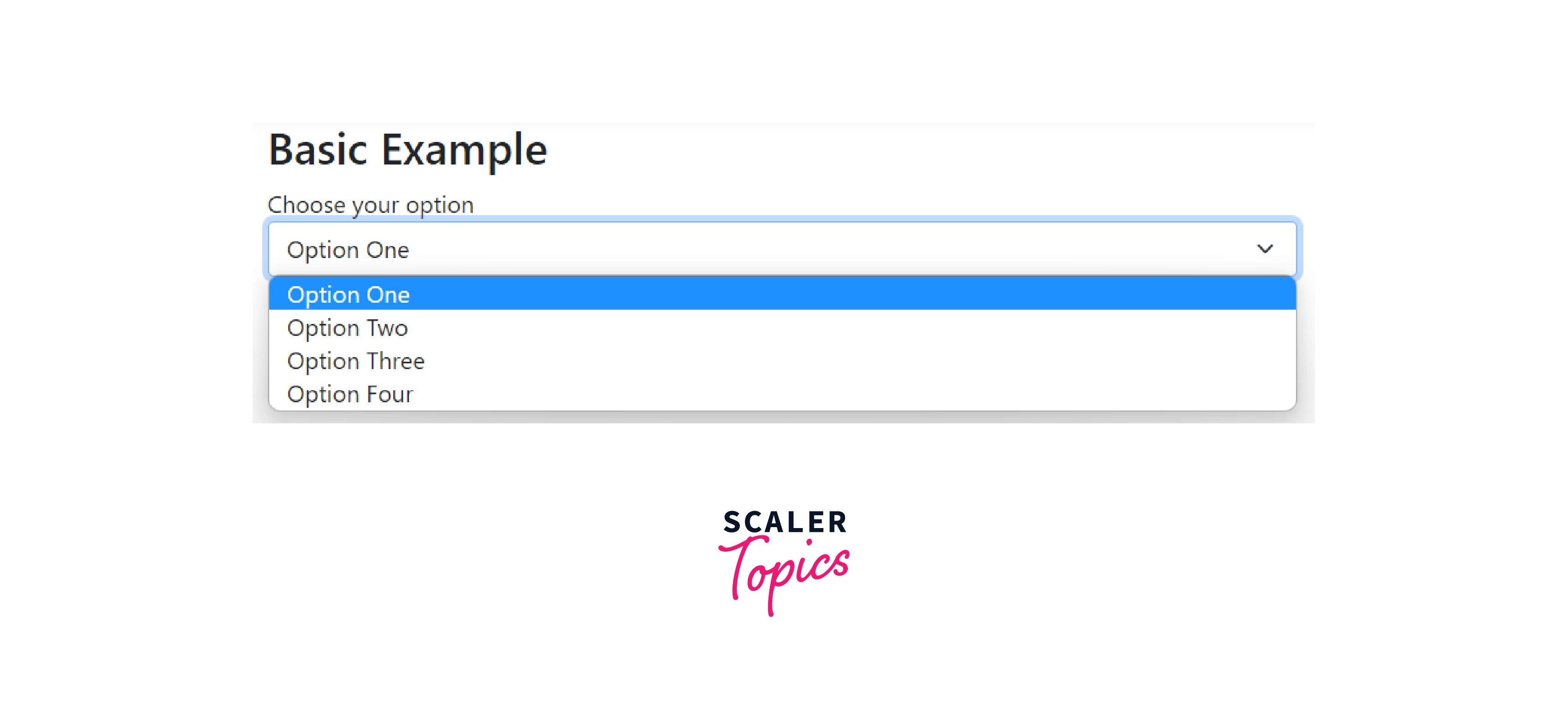
Here, the heading Choose your option above the dropdown is called label.
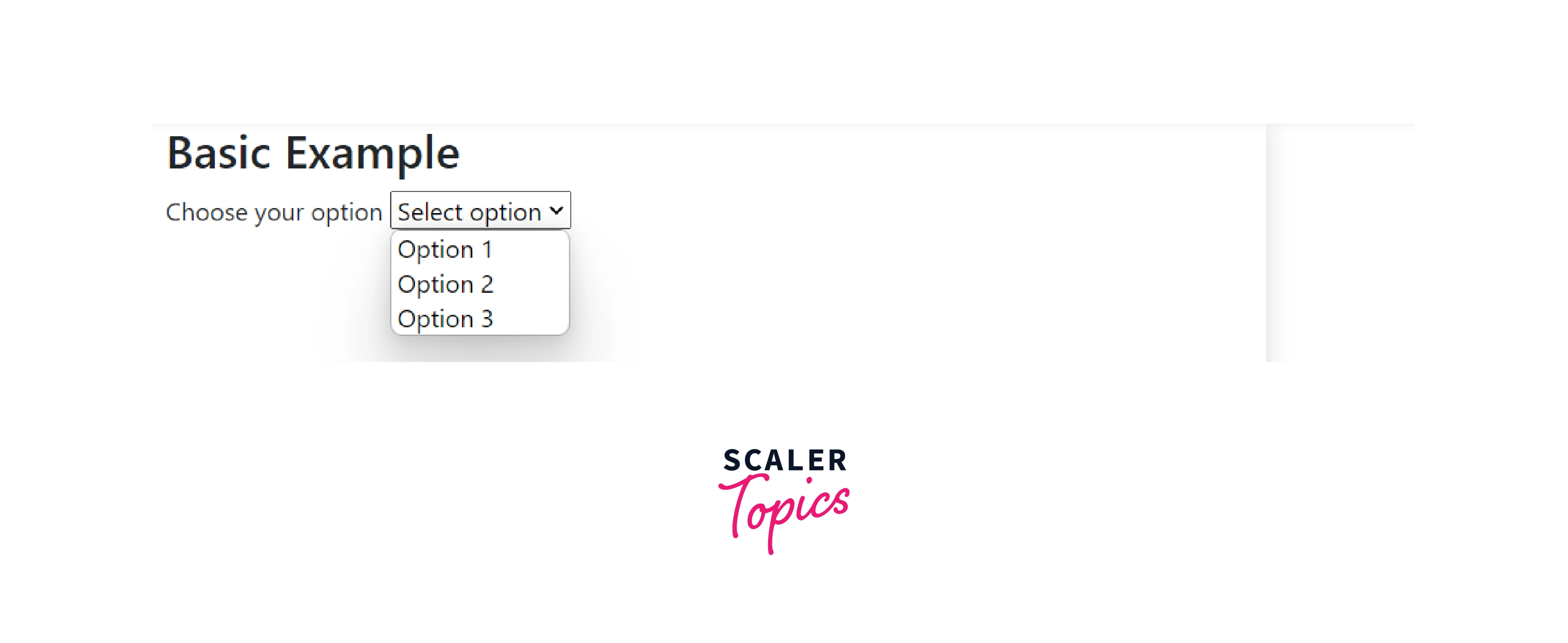
Select with Placeholder
When you use bootstrap-select with a placeholder the placeholder will be displayed when input is focused and no option is selected. The placeholder is not a part of the list of options in the bootstrap dropdown.
Disabled Select
Adding the disabled boolean attribute on a bootstrap-select component gives it a grayed out appearance and removes pointer events. Basically, the disable attribute helps to make the dropdown functionless.
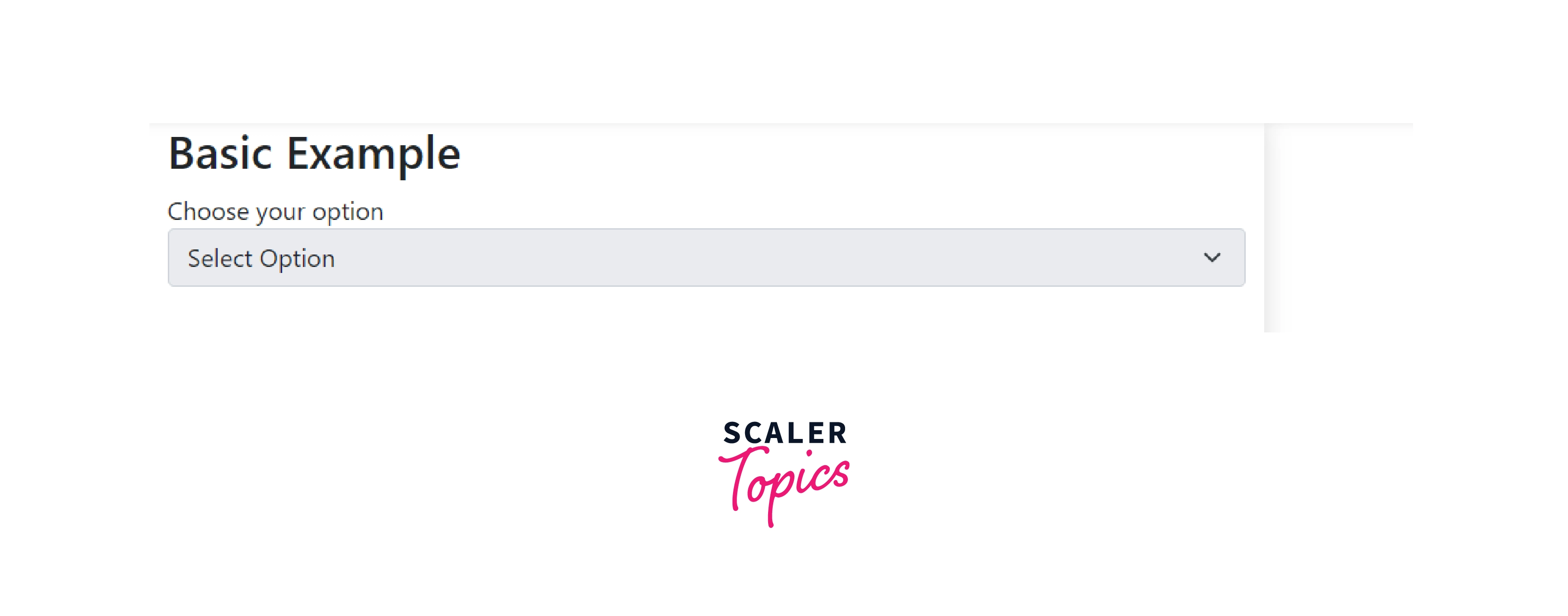
Here the dropdown will not open when clicked.
Disabled Options
As shown above you can disable a complete dropdown. The same can be done to any specific option. You can disable any option or option of the dropdown.
Here Option One is disabled. It cannot be selected.
Clear Button
The clear button enables the users to clear away the current value, selected in the dropdown when another value is selected.
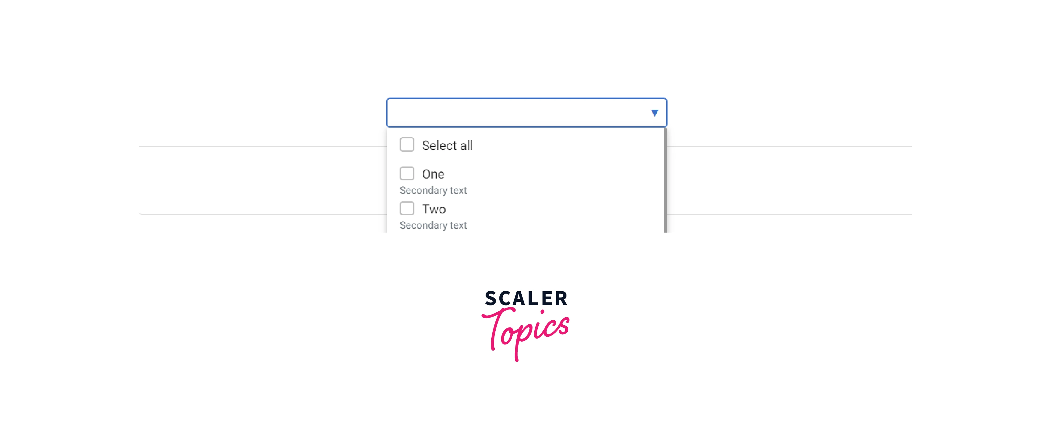
Secondary Text
Secondary Texts are like siblings to the options of the bootstrap-select dropdown. They are like a little information about the primary option. It's something like creating badges for the options.
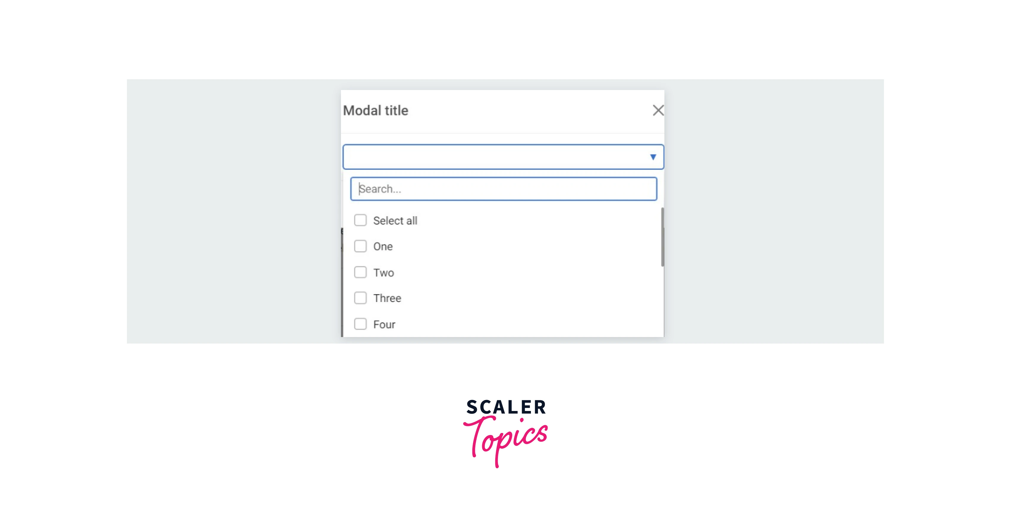
Select with Search Inside a Modal
Due to a focus trap in modals, it is not possible to focus the outer elements (like select dropdown). You can use select the data-mdb-container option to resolve this problem. It is important to use a unique selector to assign select to a specific modal.
Select with Icons
In bootstrap-select you can add different icons to different options. Adding icons to options enhances the user experience of the webpage as well as adding icons also helps the user to connect faster with the webpage.
Set value
The setValue method allows to programmatically set the component selections. You can set the value as
- Single Selection
- Multi Selection
- Select with toggle element
- Auto select
Single Selection In single selection you can only choose only one option from the given options in the dropdown created by bootstrap-select.
Multi Selection As the name suggests here you can choose multiple options at the same time.
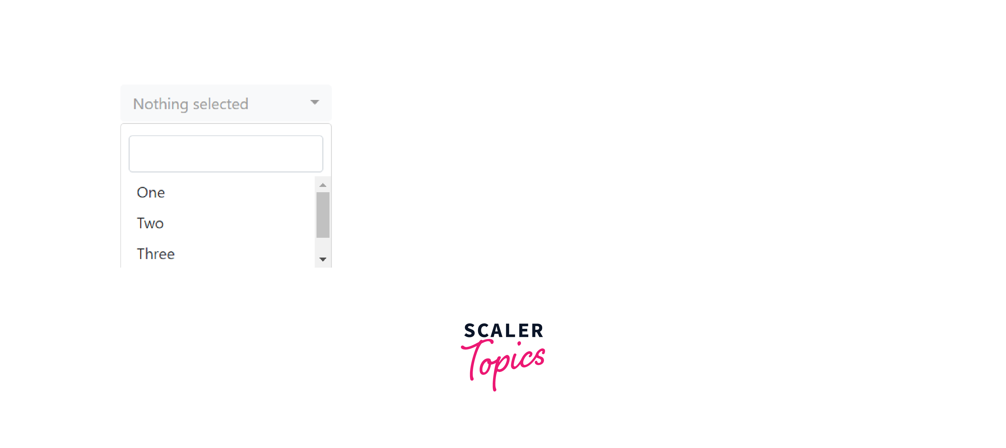
No option is selected.
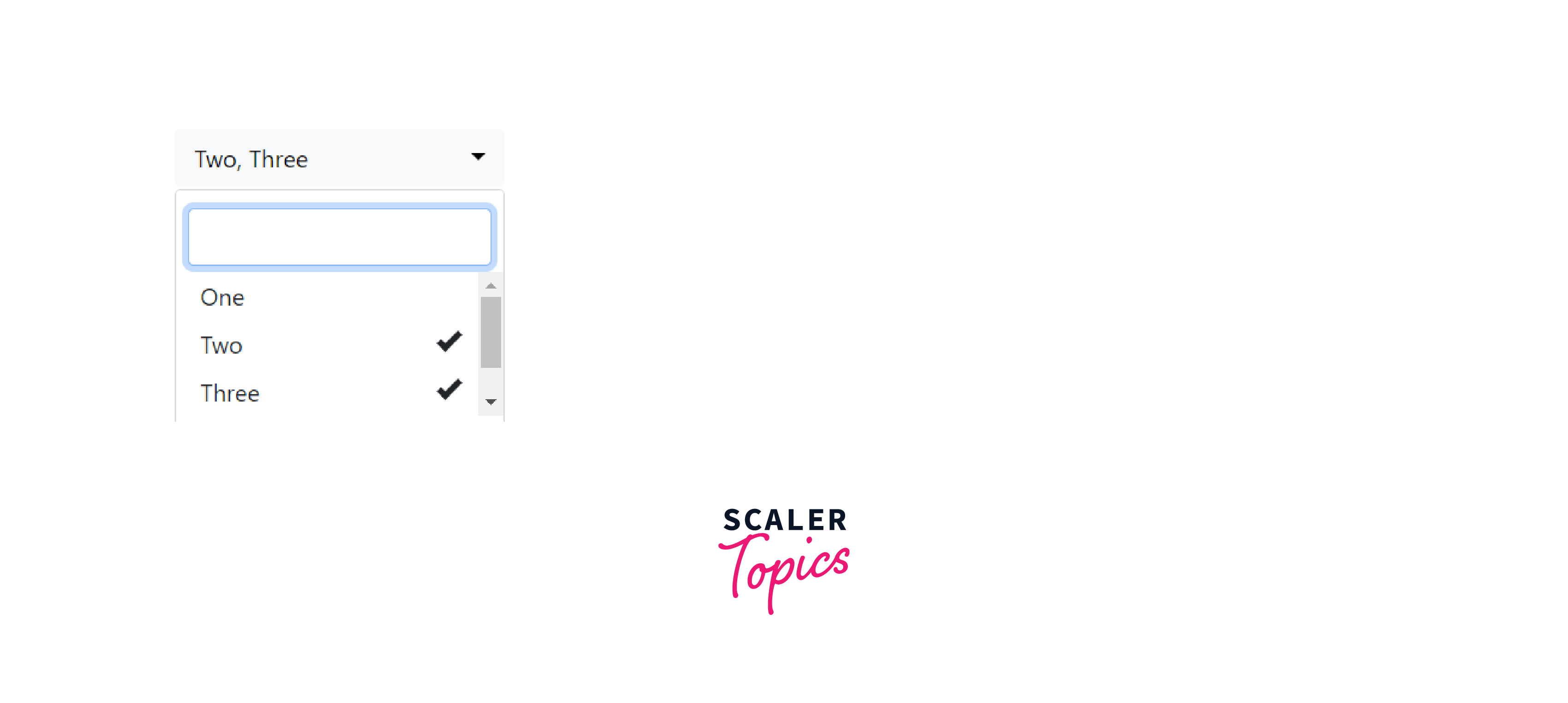
Option Two and Three are selected.
Select with toggle element
You can also create select with toggle element.

Auto select Set autoSelect option to true to enable selecting on Tab press.
Hidden Selected Option
It implies that initially, the dropdown is empty.
Before clicking on the select-box.
After clicking on the select-box.
Deleting Options
You can delete options from the dropdown using bootstrap and javascript.
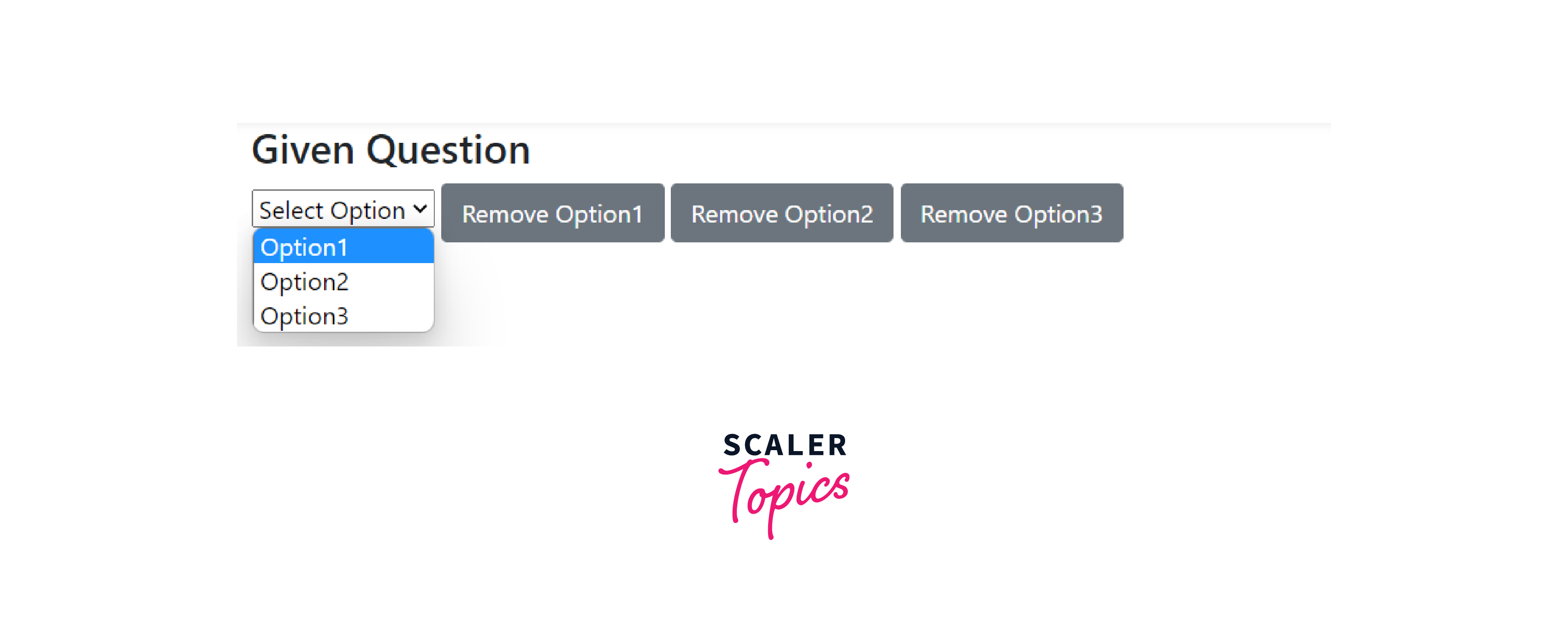
Initial state of the dropdown.
[IMAGE {25} {state of select with deleting options after clicking on Remove option1.} START SAMPLE]
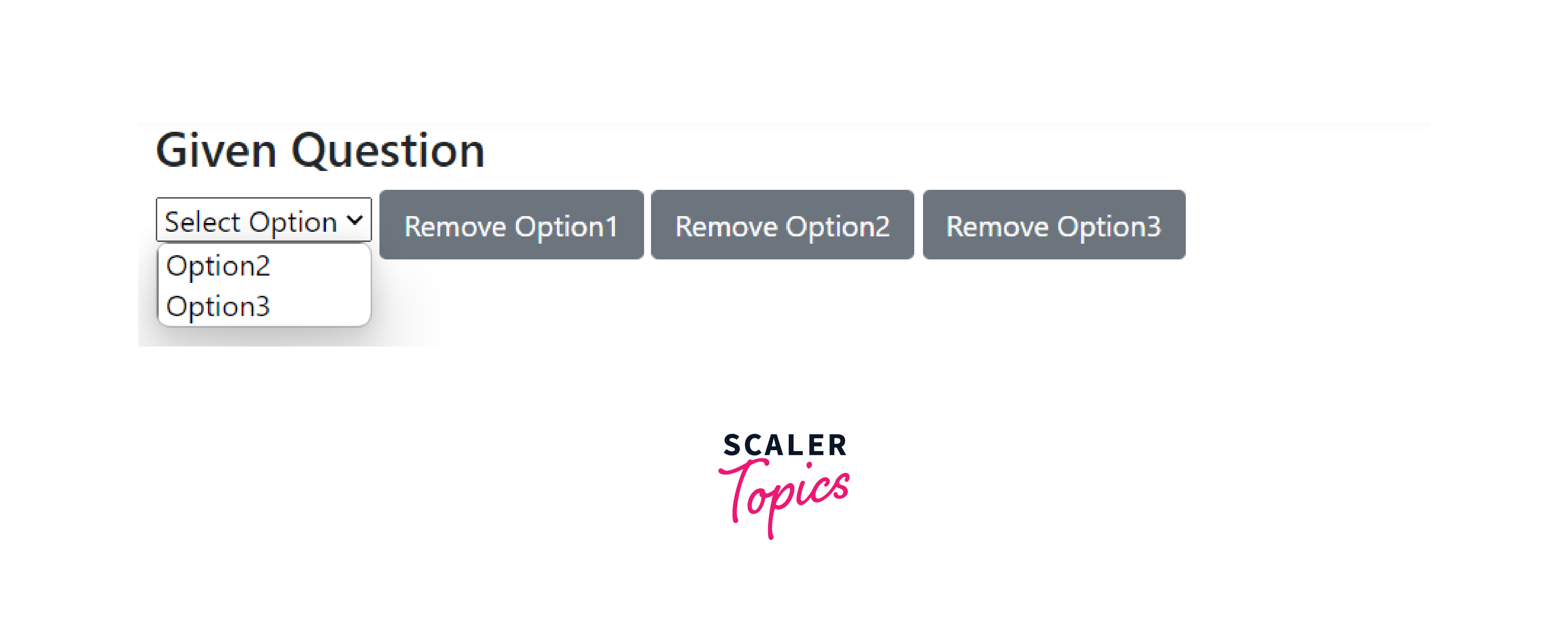
After clicking on the Remove option1.
Conclusion
- Using bootstrap-select you can create a lot of different types of select with different specifications and importance.
- You can create single select as well as multi-select select.
- Search bar as well as toggle button can also be embedded in these dropdowns using bootstrap-select.
- You can use label and placeholder to make the select more expanatory.
- Options in these select created using bootstrap-select can be disabled as well as deleted.