Bootstrap Tables
Introduction
Bootstrap tables enhance web content organization by structuring large data into readable rows and columns. Offering clean layouts and responsive design, they are crucial for data presentation. While HTML tables offer basic grid layouts, Bootstrap adds styling and structure, making data interpretation more intuitive and visually appealing.
Table Elements Supported by Bootstrap
Bootstrap supports many different elements that can be used to intensify the tables.
These are the elements supported by bootstrap tables :
- <table> :
<table> is used to wrap data and layout data in a tabular format. - <thead> :
<thead> is a container element for table header rows <tr> to label table columns. It is the header of a table. - <tbody> :
It is a container element for table rows <tr> in the body of the table. - <tr> :
It is a container element for a set of table cells <td> or <th> that appears on a single row. - <td> :
<td> is a default table cell. - <th> :
<th> is a special table cell for column labels or row labels. It Must be used within a <thead>. - <caption> :
It is a description or summary of the content of the table. The default caption of a table shows at the end of the table but you can also put the <caption> on the top of the table with .caption-top.
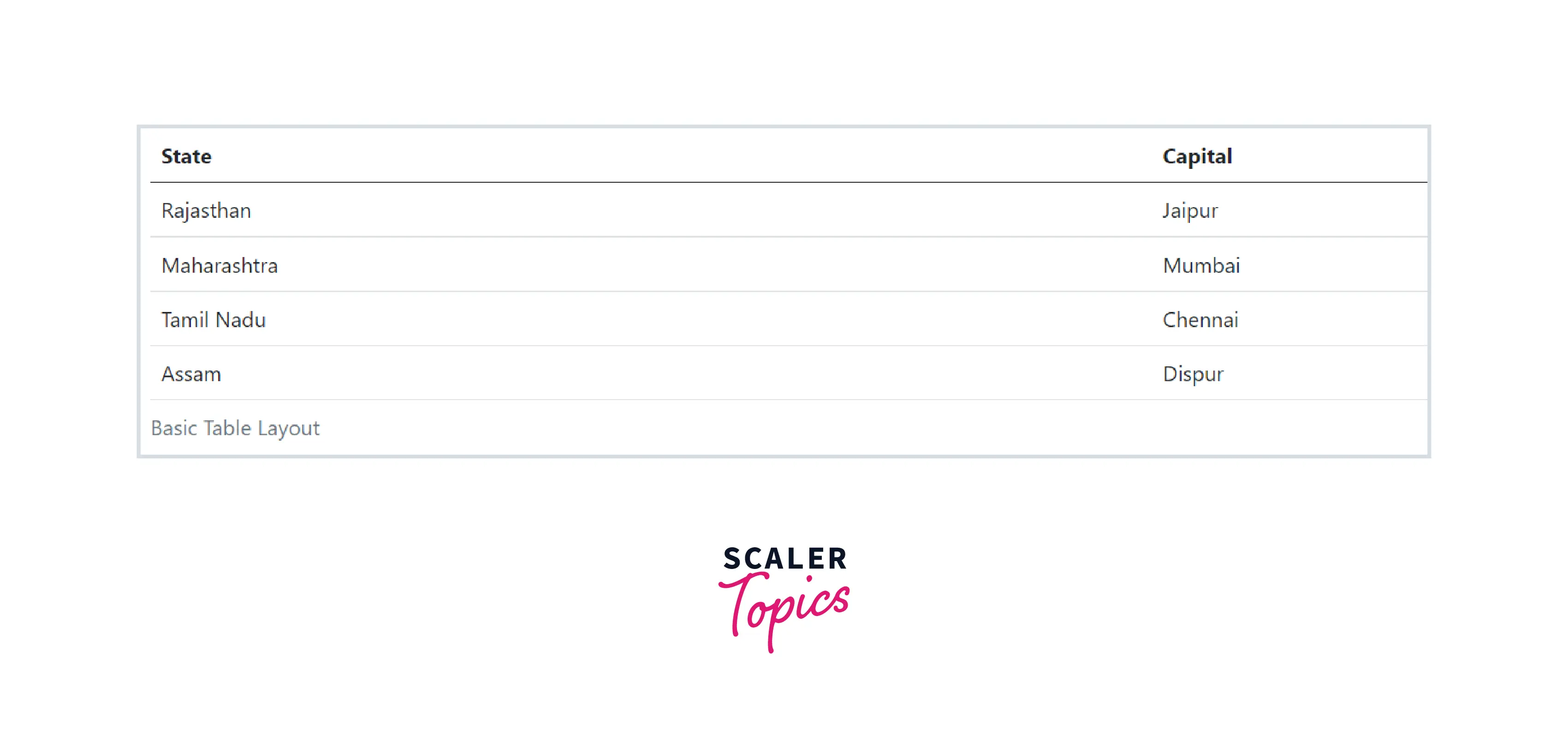
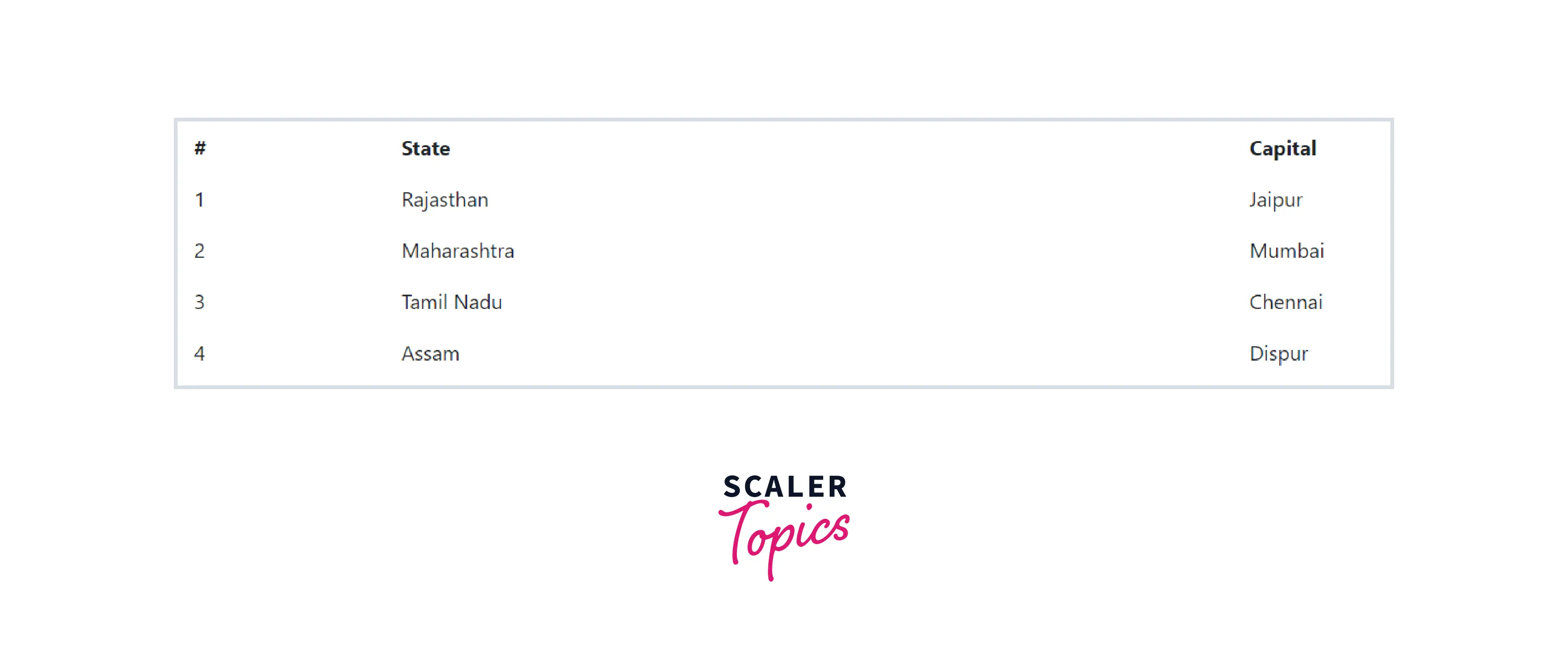
Bootstrap Basic Table
Bootstrap tables are opt-in. To build it, you just need to add.table class to any <table> and then style it.
The basic bootstrap table is just a simple CSS customized table with some light padding and horizontal dividers.
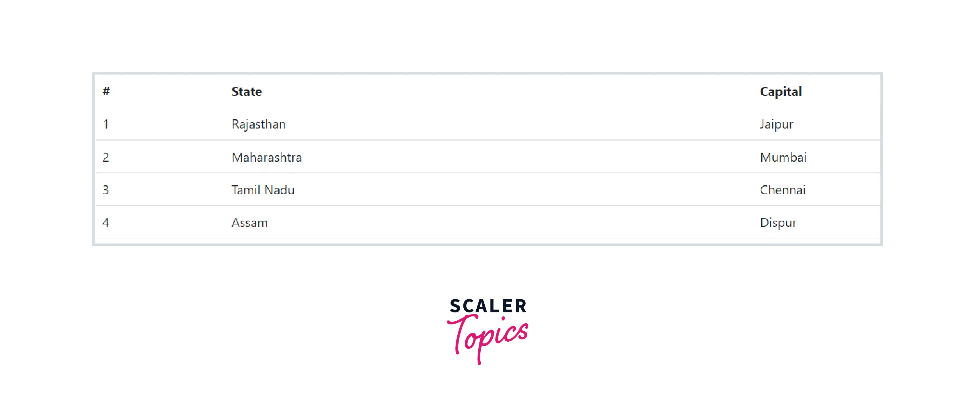
Striped Rows
You can also add zebra-striping to the table rows within the <tbody> by simply adding the class .table-striped to the .table base class. The adjacents rows will follow a pattern of light and comparatively darker backgrounds.
Bordered Table
You can add borders on all sides of the table and cells by adding the modifier class .table-bordered to the .table base class.
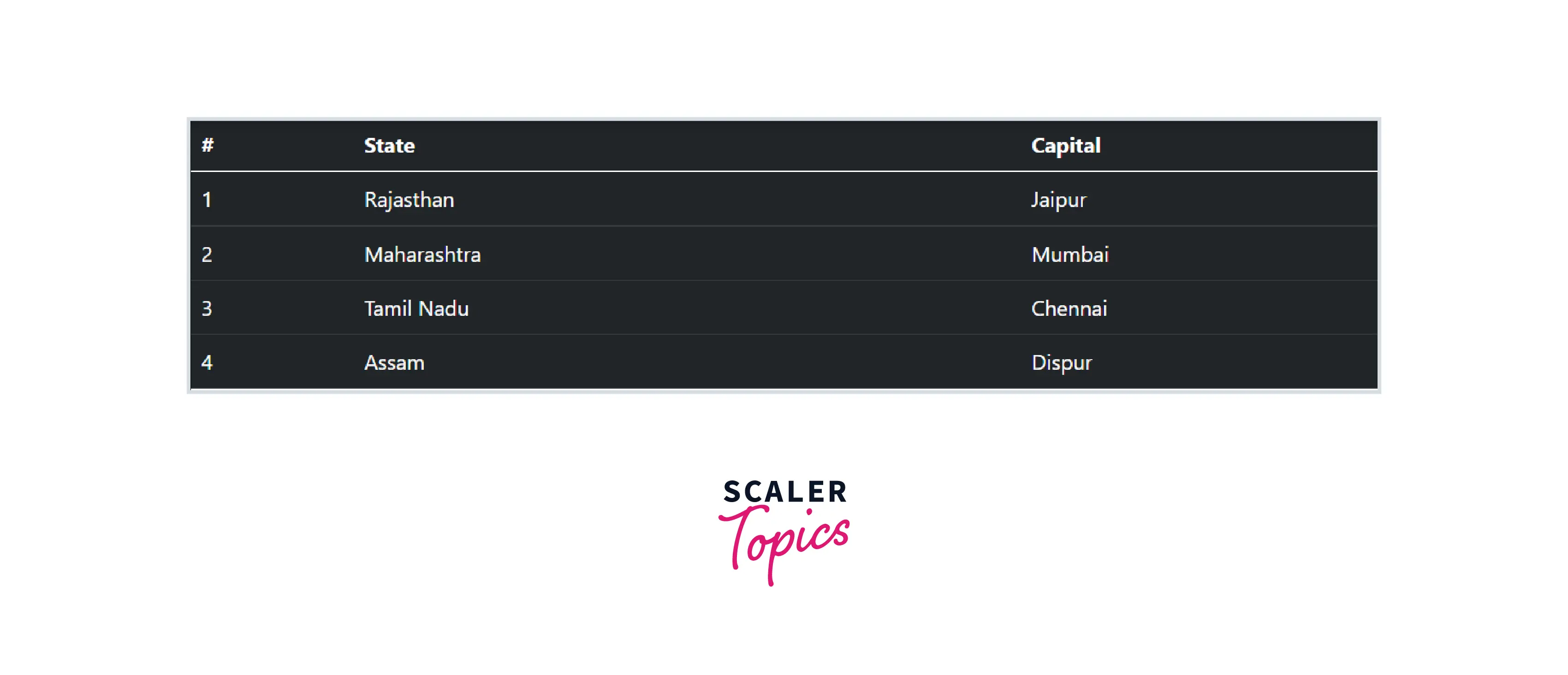
Borderless Table
You can also create borderless tables using the class .table-borderless on the .table element.
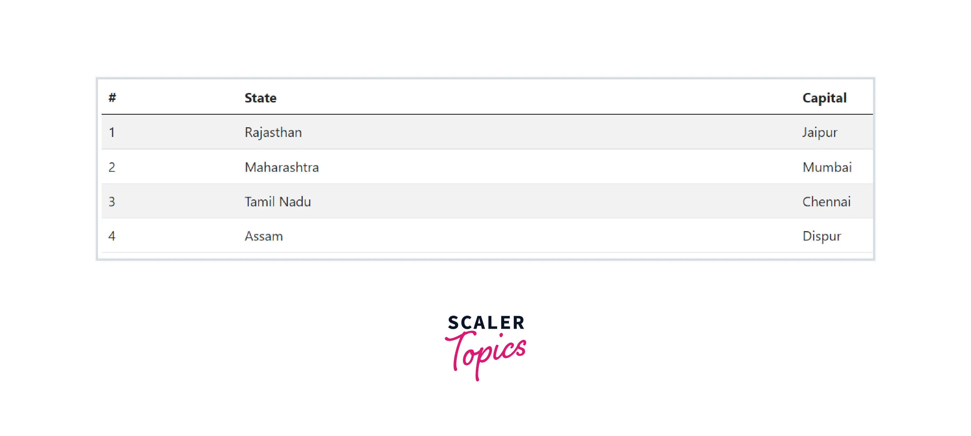
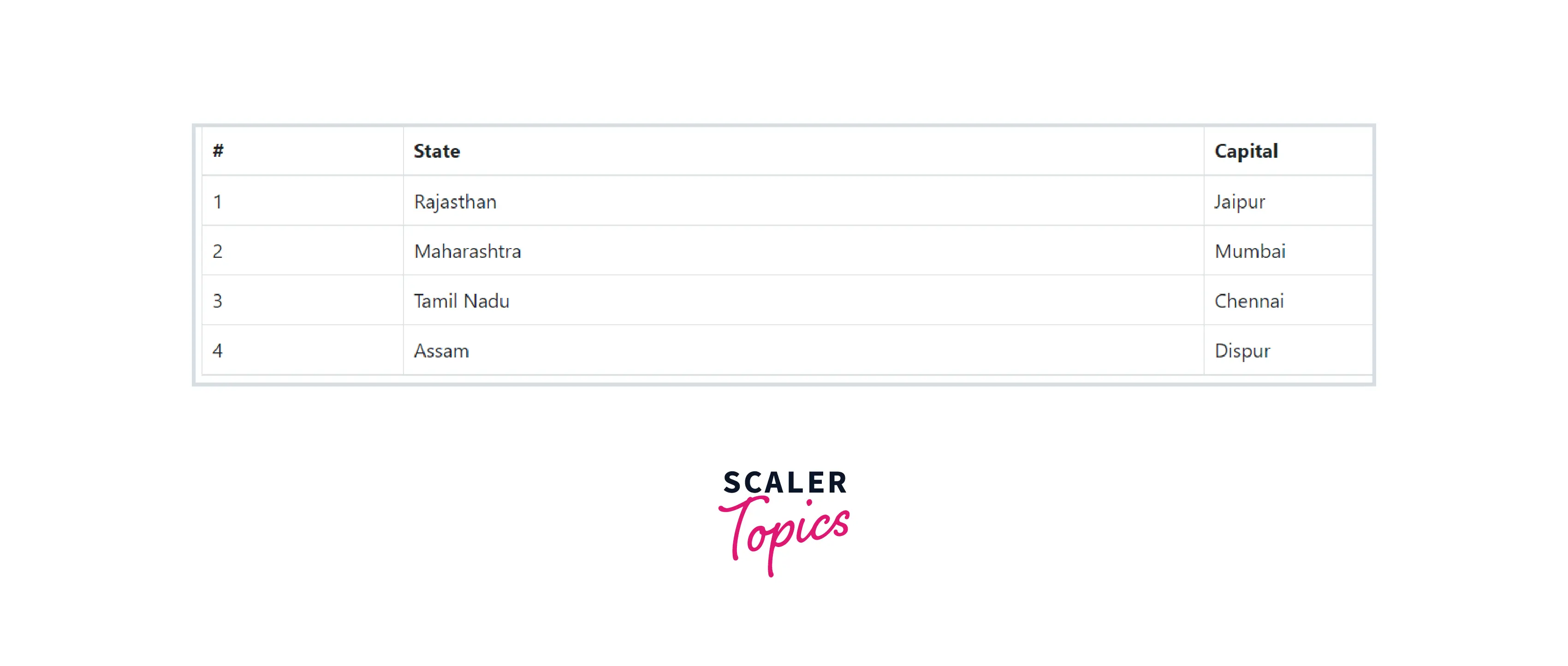
Hover Rows
Sometimes you need to highlight some rows of a table. So in Bootstrap, a hover state can also be enabled on table rows within a <tbody> element by adding the modifier class .table-hover to the .table base class.
The initial state of the table.
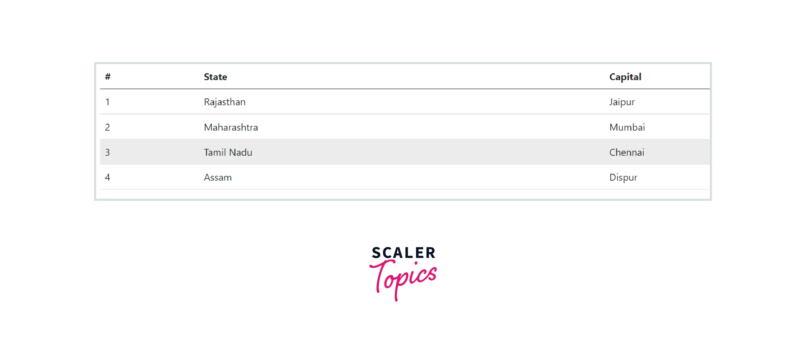
When the cursor hovers over the third row of the table, the color of the table is changed. This shows the hover state is enabled.
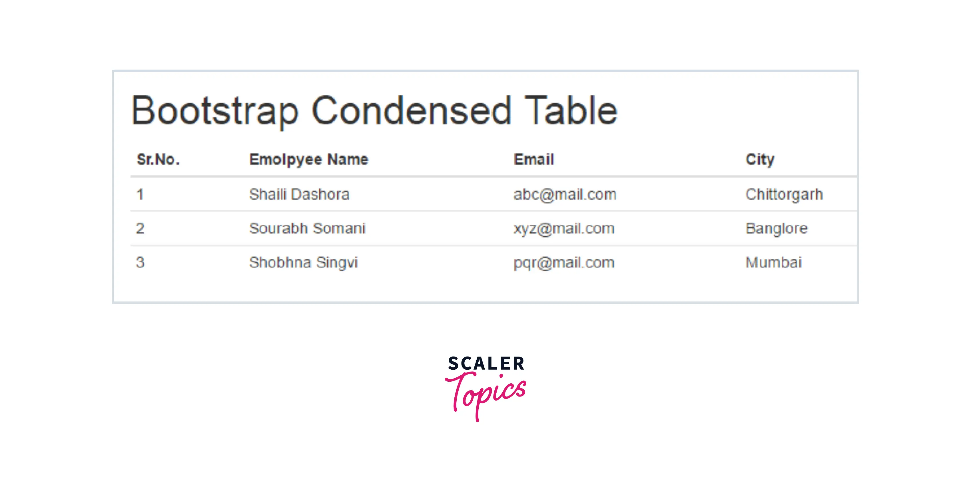
Condensed Table
You can make your rows more compact with the .table-sm class. It is used when you want any denser information. The .table-sm class cuts the row padding in half to condense the table.
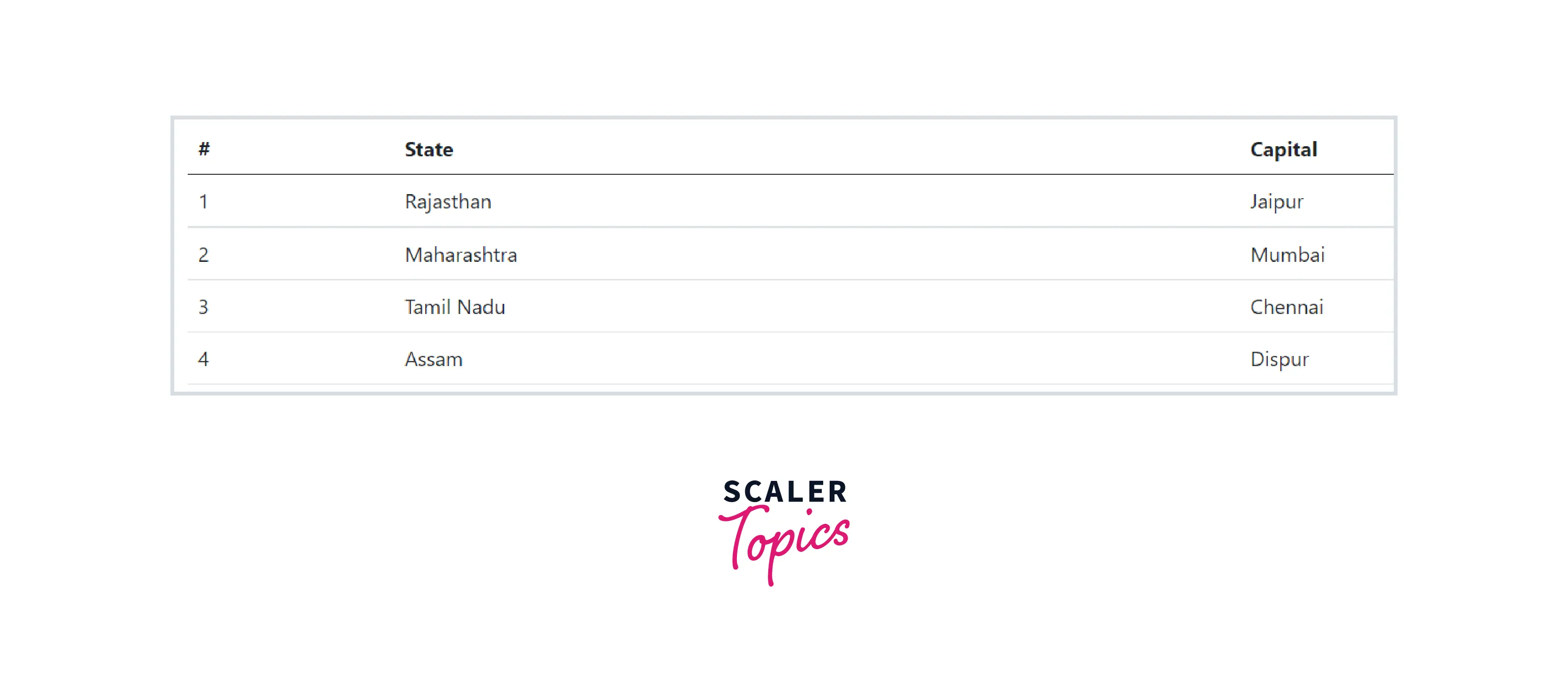
Table when the .table-sm class is not used.
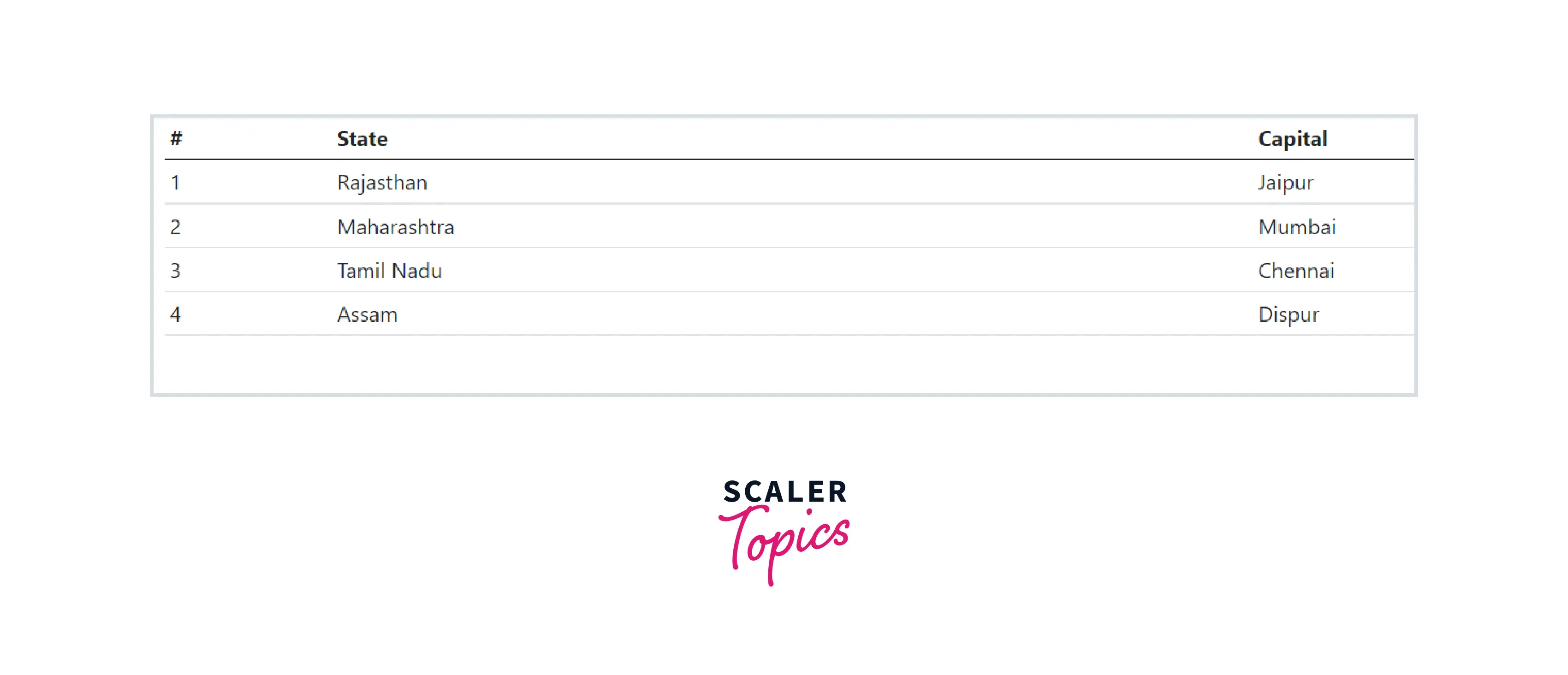
Table when the .table-sm class is used. After using this class the table gets condensed vertically.
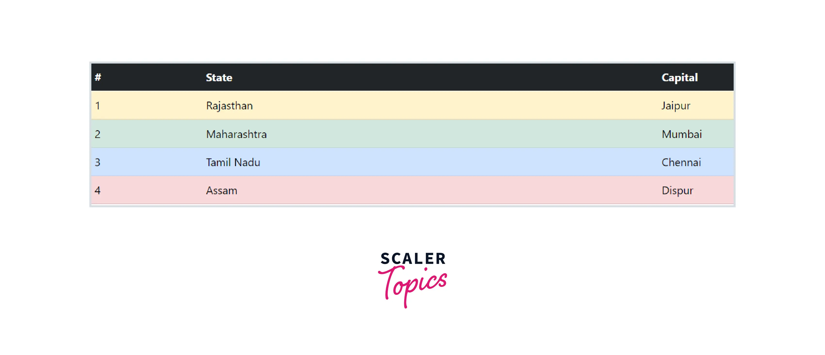
Contextual Classes
Using contextual classes helps to colorize individual rows or columns or cells. You can use several different classes at the same time to build a wide variety of tables.
To make a colorized table, apply the following classes to <tr> elements (rows) or <td> elements.
Responsive Tables
Making a table responsive is very important. To make any table responsive, wrap the <table> tag in a <div> with the class .table-responsive. Or you can specify the maximum breakpoint at which this table property will appear by adding the class .table-responsive {-sm | -md | -lg | -xl}.
The table on the tablet screen (768).

The table on the laptop screen (992).
Conclusion
- The bootstrap table is a plugin for integration with the most popular CSS frameworks.
- Using Bootstrap .table-responsive class with the table you can make the table fully responsive in a very short time.
- You can add borders on all sides of the table and cells with the .table-bordered class.
- You can assign different colors to different rows using contextual classes.
- Hover state can be easily enabled on table rows through the .table-hover class within a <tbody>.
- There are some more features like adding images and icons in your table, embedding buttons and a search box, and other features that can extend your bootstrap table.