Bootstrap Text Shadows, Truncation, Overflow
Bootstrap's text utilities, like shadow-sm, shadow-lg, text-truncation, and overflow, enhance webpages by controlling text alignment, shadows, and overflow. Learn to create visually appealing texts with Bootstrap 5, making pages vibrant rather than dull and monotonous.
Bootstrap Text Shadows
CSS and Bootstrap are used together to display the shadow of the text. This shadow is used in headings for the web pages. It can also be used to highlight text or separate text which has a similar color for the background.
The text-shadow CSS property is used to display the shadow of the text. Multiple shadows can be added to one text element. Each shadow contains x-offset, y-offset, blur radius, and color. The blur radius is optional. x and y offsets define the position of the shadow by taking the text at the origin.
Syntax:
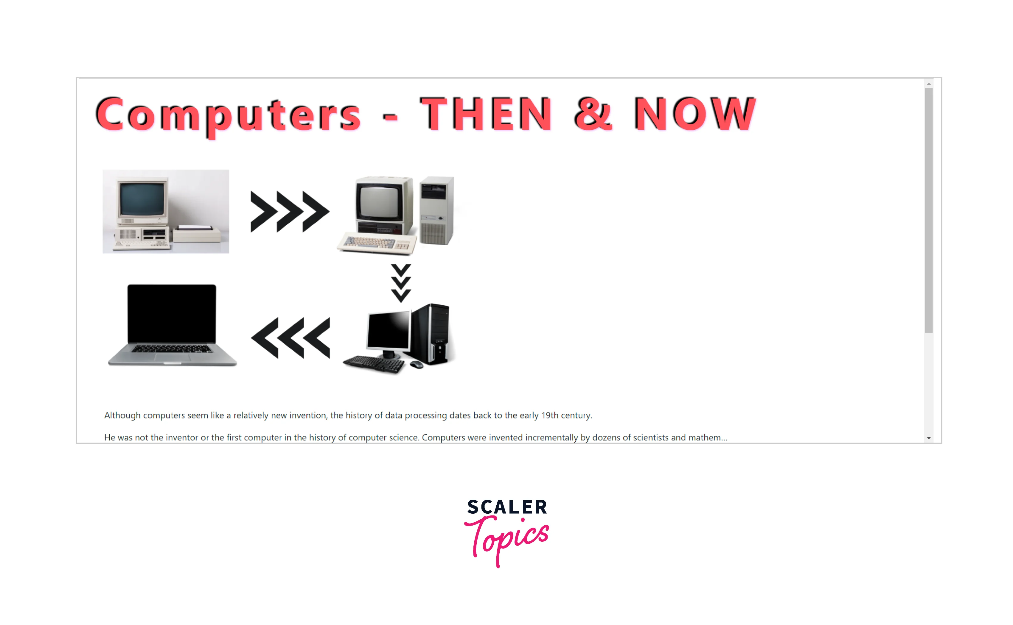
Have a look at the example below, the heading Computers - THEN & NOW is designed and has 3 shadows at different positions.
Example:
Output:
Explanation:
Let us see how we can add or remove shadows to elements on the webpage using the bootstrap box-shadow utility. By default shadows are disabled in Bootstrap. We can use jQuery $enable-shadows or box-shadow utilities to bring shadows back to life in Bootstrap.
No Shadow
To remove the shadow from an element we can use the bootstrap class shadow-non.
Example:
Output:
Small Shadow
To have a minor or small shadow on components, the shadow-sm class is used.
Example:
Output:
Regular Shadow
For the medium or regular shadow size, the default shadow class is used.
Example:
Output:
Larger Shadow
The shadow-lg class provides a large shadow to the component.
Example:
Output:
What is Bootstrap Text Truncation?
Text truncation is making text shorter by replacing the remaining text with an ellipsis i.e. (three dots ...). Bootstrap text truncation is used for long statements and big paragraphs using ellipses. When showing pre-text for headings truncation is used.
Bootstrap class text-truncate facilitates truncation of the text on a webpage. This class is only effective if the display property of the container is set to inline-block or block.
Basic Example of Bootstrap Text Truncation
Let us take an example of a webpage where we require the text-truncation:
Example:
Output:
Explanation:
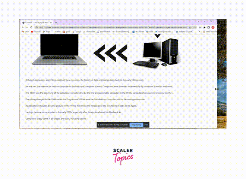
In the example above, we can see that the extra text is replaced by an ellipse (...). As we reduce the screen size, more and more paragraphs are reduced and replaced by ellipses.
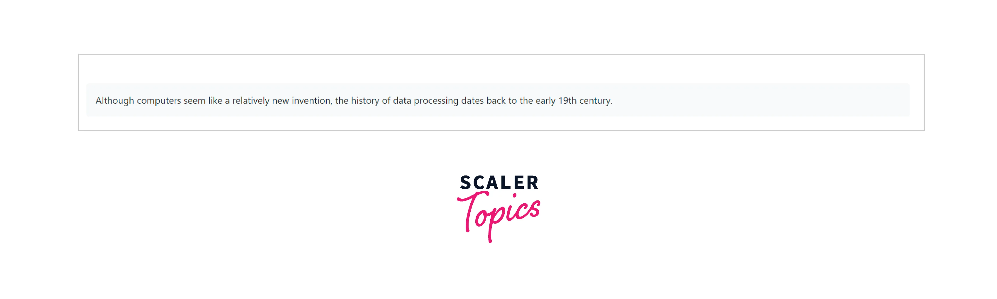
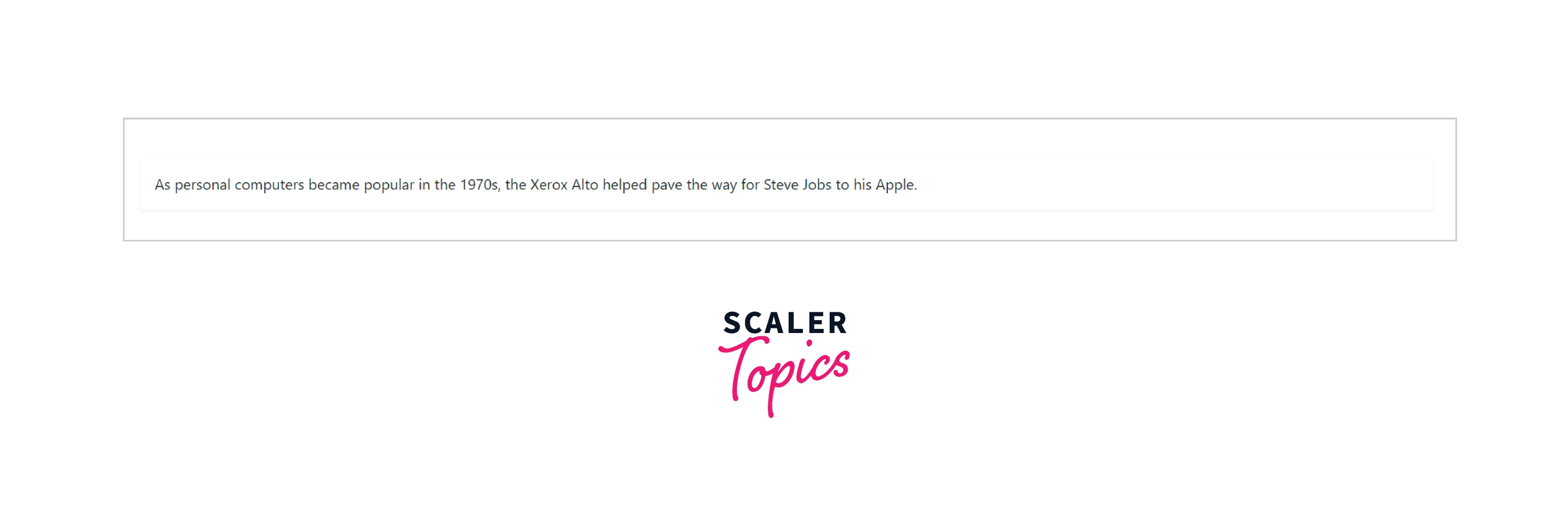
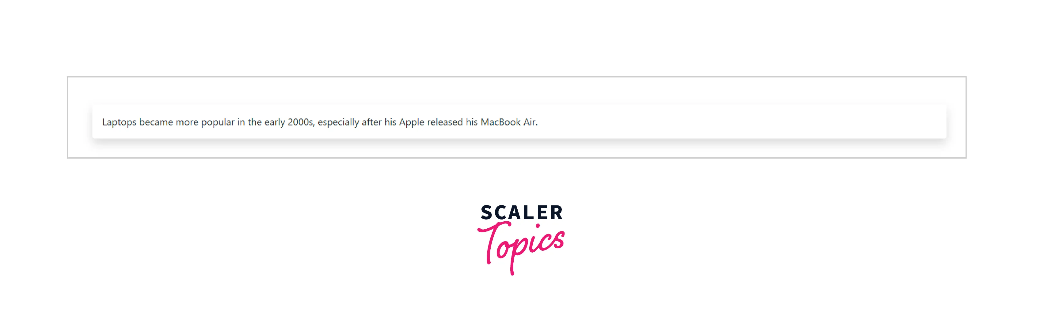
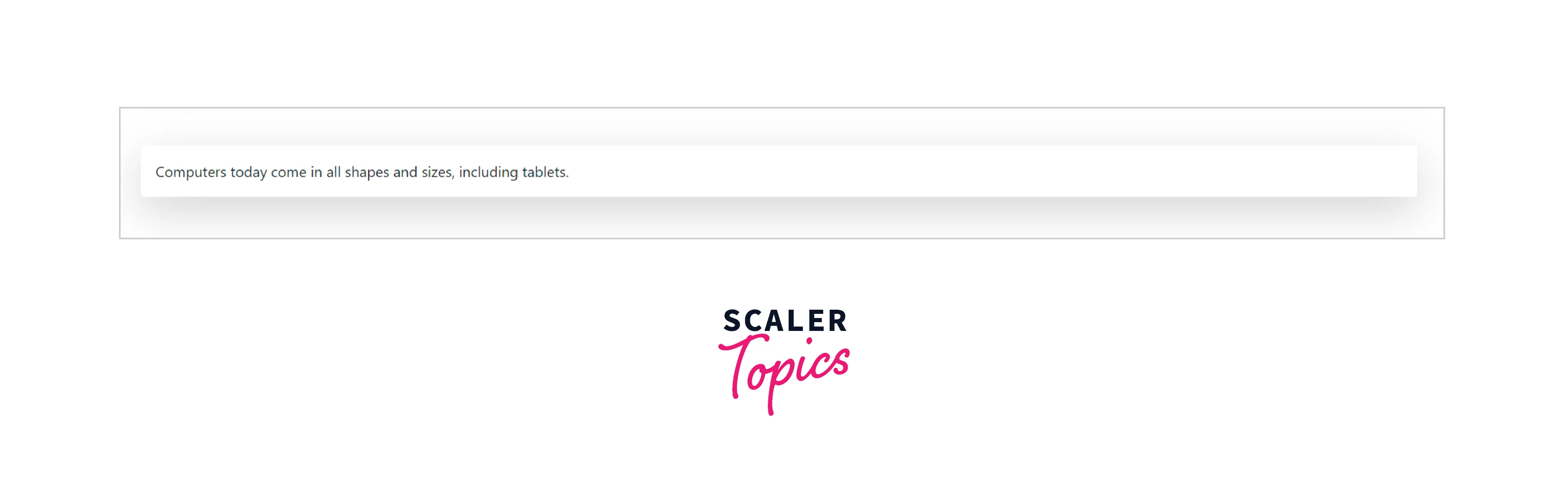
We are creating a webpage that tells users about the history of computers. It contains a few paragraphs each with class text-truncate. As the size of the page reduces and the content is bigger, the text is truncated by bootstrap.
Bootstrap Text Overflow
The entire webpage is divided into small containers, these containers can be a row, a rectangle, a square, etc. In other words, an element on the webpage is assigned its area i.e. section on the webpage and it should be displayed within the area only. Look at the example below, you will find many different size boxes, each containing specific content in it.

Sometimes the content size is bigger than the size of the container and thus, overflow must be handled. Bootstrap provides shorthand utilities that allow quick configuration for the overflowing of content in an element.
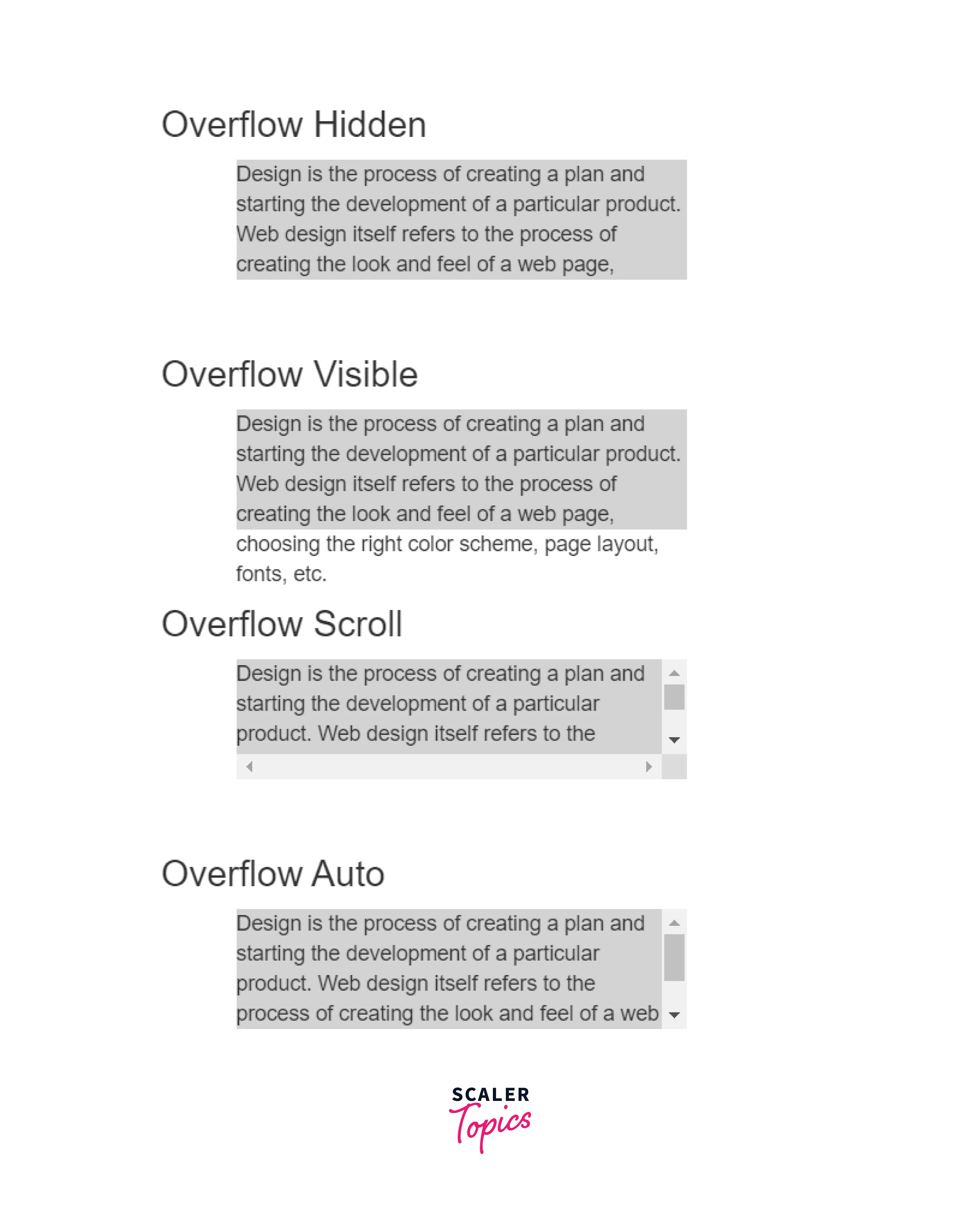
Bootstrap has 4 different overflow classes namely, overflow-hidden, overflow-visible, overflow-scroll, and overflow-auto.
- overflow-hidden:
It hides the content that overflows from an element. - overflow-visible:
It shows the content over other elements. If there is a margin or padding, its content is visible. - overflow-scroll:
It will attach a scrollbar to scroll the content that is overflowing. - overflow-auto:
It automatically adjusts the content of the container. It adds a scrollbar if the content is more.
Look at the example below to understand these overflows in detail.
Example:
Output:
Explanation:
As seen in the example above, the overflow-hidden hides the remaining content, the overflow-visible shows the content outside its container too, and the overflow-scroll adds a vertical scrollbar so that the user can scroll down to the rest of the content, and overflow-auto automatically adjusts the content in the container by adding a scrollbar.
Conclusion
- Texts, Shadows, Truncation, and Overflow text properties are used for paragraphs and headings.
- Text Shadows are used for headings to style and design them. We can also use it to highlight texts. We use the text-shadow property of CSS for text-shadow.
- To add shadow to a container like a box, we use the shadow-sm, shadow-lg, and shadow classes of Bootstrap.
- To remove the shadow from a container, we can simply add a shadow-none bootstrap class to it.
- Text truncation truncates or shortens the text. Bootstrap class text-truncate is used. It replaces the extra text with an ellipse(...).
- Text-truncation reduces text concerning the size of the screen, i.e. it is responsive.
- Bootstrap Text overflow is used to handle text when the container's size is smaller than the size of the text.
- overflow-hidden, overflow-visible, overflow-scroll, and overflow-auto are various overflow classes of Bootstrap.