Bootstrap Vertical Alignment
Overview
Bootstrap Vertical Alignment changes the alignment of the elements vertically. Bootstrap has special built-in classes to vertically align components. Two such available classes and methods in Bootstrap are align-items-center and d-flex.
Pre-requisite
- Bootstrap Grid
- Bootstrap
- HTML tables
- CSS Alignment
Introduction
It is often required to change the alignment of the text or components whether it is the close button, the footer, or headings and subheadings.
Bootstrap Vertical alignments are used to vertically align components with the help of vertical-alignment utilities. These utilities only affect inline, inline-block, inline-table, and table cell elements. Inline elements are single line components such as span, and inline-block elements are single line block with width and height values.
The very commonly used bootstrap vertical-align is using div. Vertical alignment can also be set using CSS but using Bootstrap is simpler and easier.
To change the vertical alignment of the components Bootstrap provides special built-in classes namely, align-items-center and d-flex.
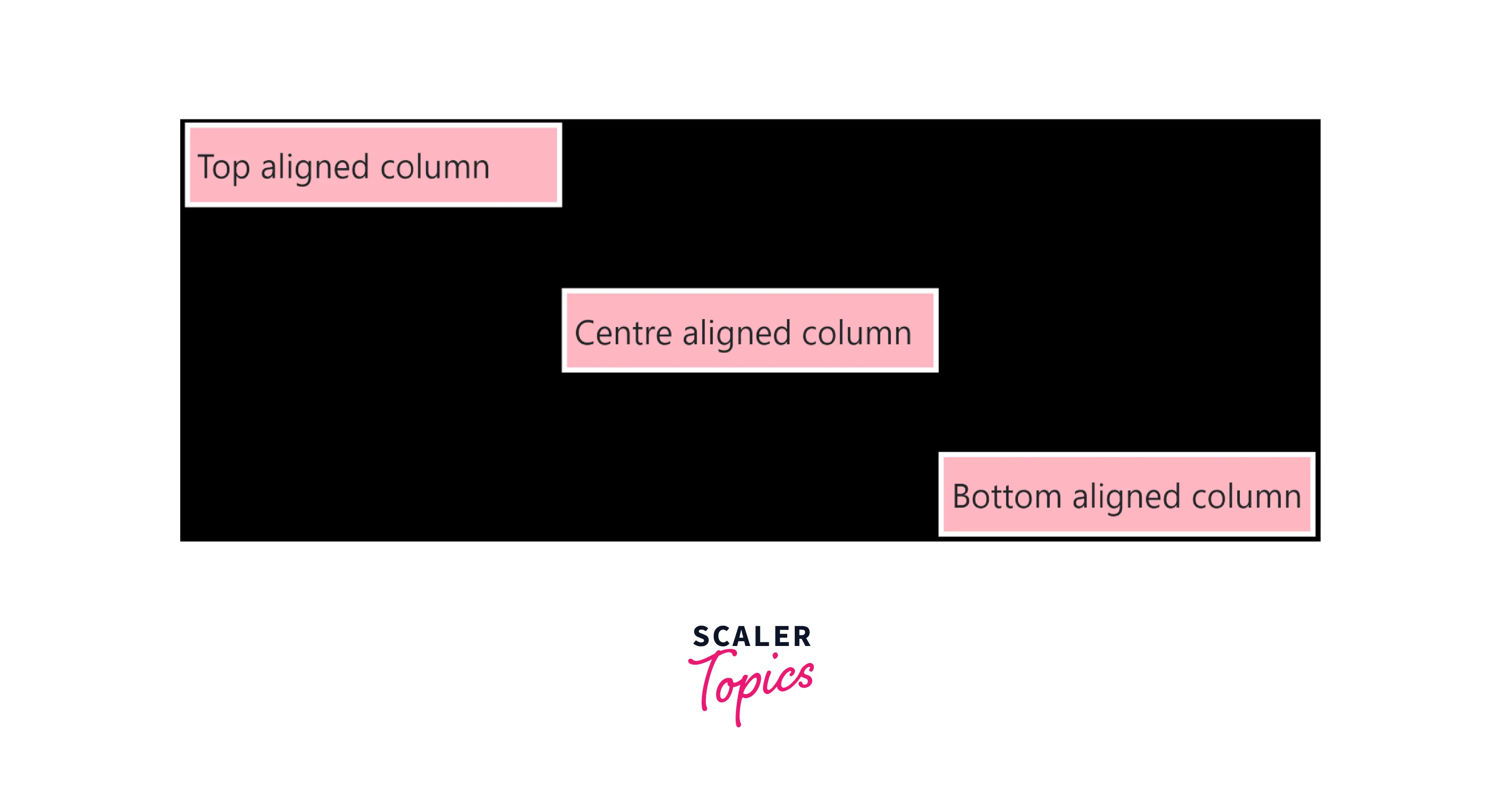
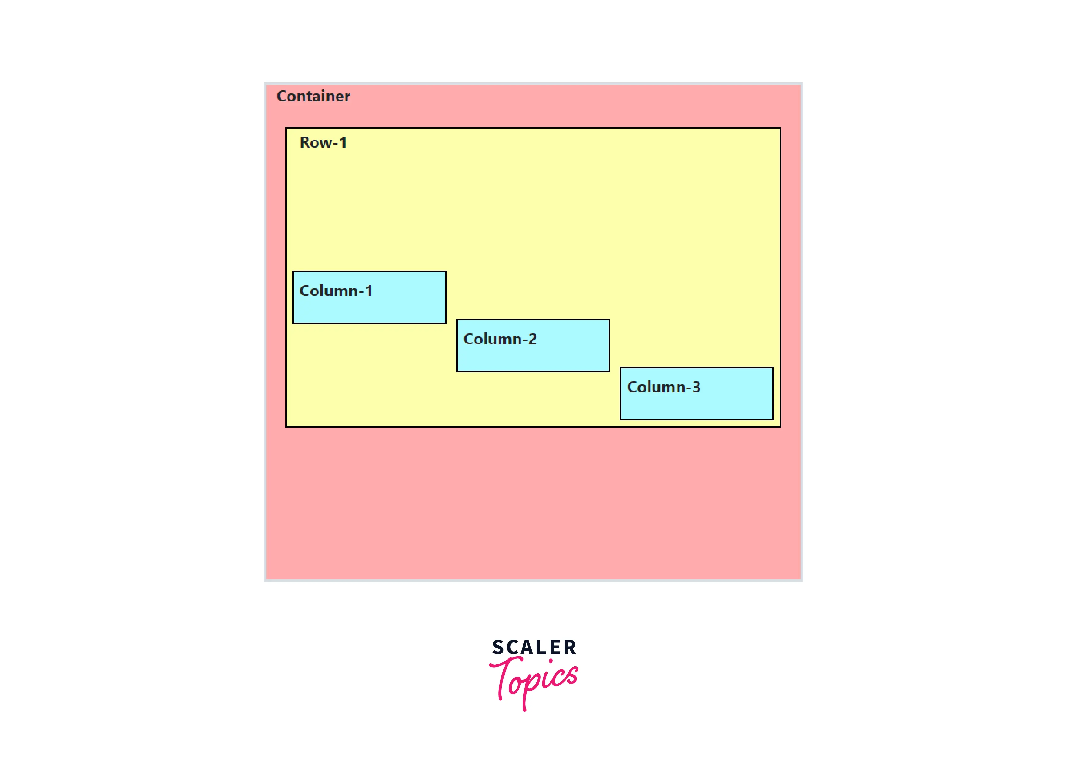
The image below shows what the alignment of the 3 columns of the same row looks like.
How to Vertical Align in Bootstrap?
Many classes of bootstrap can be used to achieve the functionality of bootstrap vertical align. These classes and methods are discussed below.
Using Class align-items-center of Flexbox Alignment Utility
From Bootstrap 5 onwards, to align a div element in the center, top, bottom, stretch, or baseline, etc., class align-items-center is used for the parent element of the div to be centered. Classes align-items are part of the flexbox alignment utilities to vertically or horizontally align columns and provide a responsive structure to the website.
Note: Responsive web design is about creating web designs that can adjust their components for different screen sizes. For example, the screen size and resolution of the laptop and mobiles are different and thus web design should be clear and concise on both.
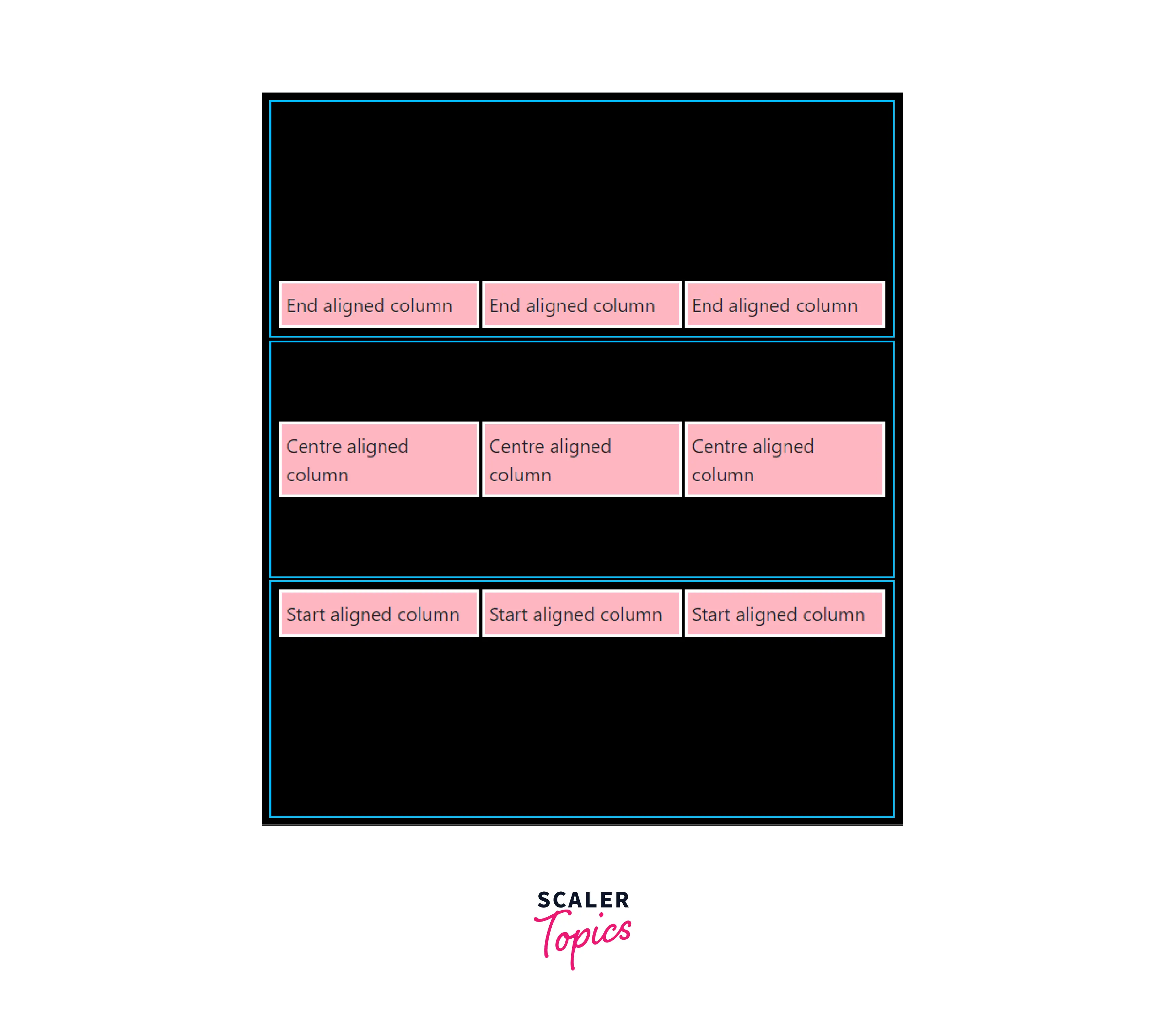
Let us see an example of a table that has 3 rows and each of them has different vertical alignments.
HTML
We have used the container class of Bootstrap. The container class is used for giving a table-like structure using row and col classes. Inside the container class, there are three rows and each row has three columns. These rows are the parent element to the columns in the above example and thus to align columns vertically using align-items[start | end | center], the class should be added to the row i.e. to the parent.
CSS
CSS is used to give margins, padding, and different colors to identify containers, rows, and columns. Black is the container, the one with a blue border is the row and the boxes with borders are the columns.
Responsive variations of align-items Various responsive variations are also available for align-items. A few of them are listed below:
- .align-items-start
- .align-items-end
- .align-items-center
- .align-items-baseline
- .align-items-stretch
- .align-items-sm-end
- .align-items-md-start
- .align-items-lg-baseline
- .align-items-xl-center
- .align-items-xxl-stretch
Using Class d-flex with Class align-items-center
In the above section, we saw how we can align elements of the containers. In this section, we will see that bootstrap vertical-align can also be applied to the div elements using the d-flex class and align-items-center and other classes. The d-flex class provides the same effect as we apply the CSS property display: flex;.
Look at the screenshot of the webpage below, the webpage has three boxes each containing the same three images but they are aligned vertically at the start, center, and end. Let us see how we can vertically align various items using d-flex class as shown below.
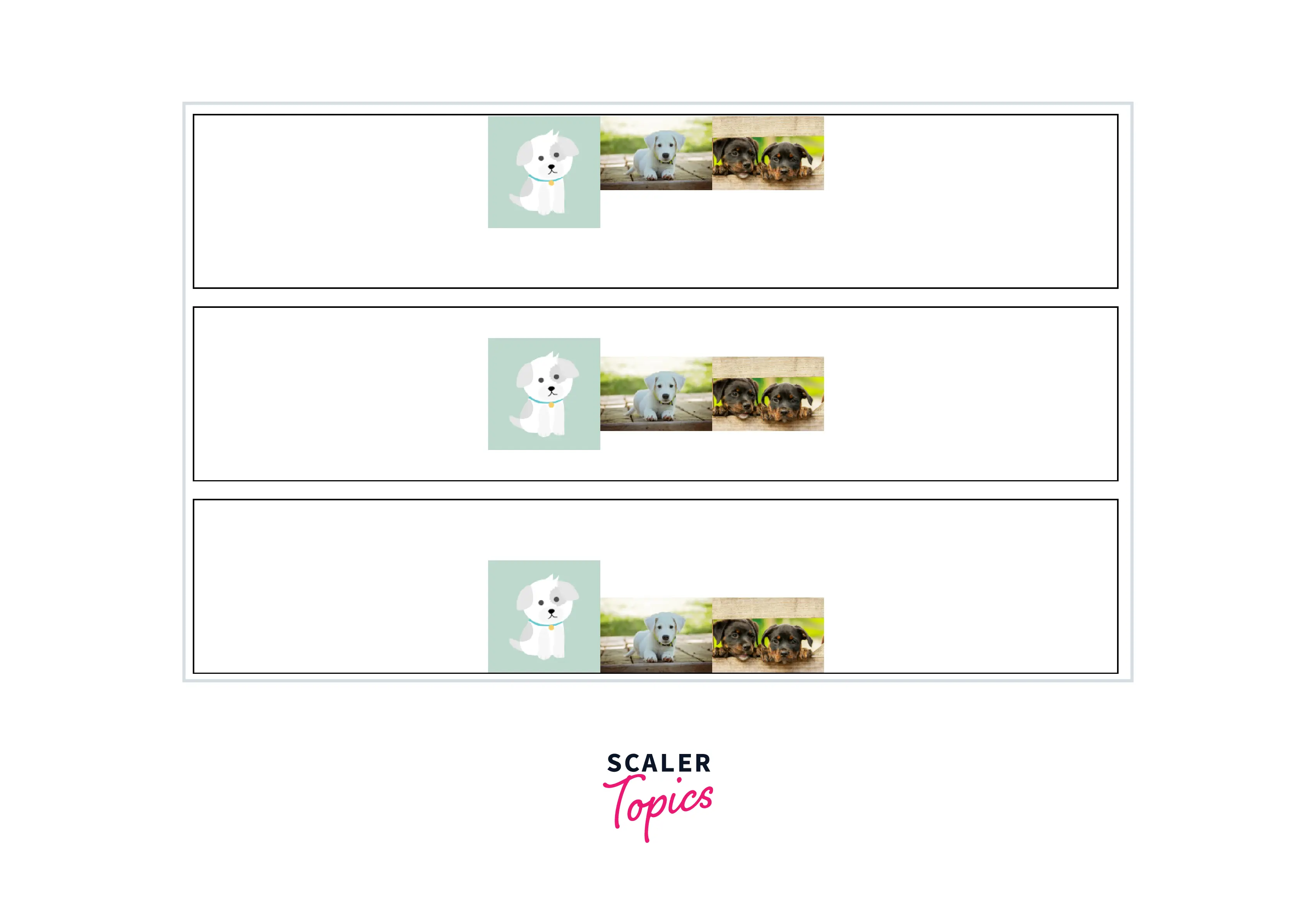
To achieve this functionality we have created three divs each containing given images. Next, we applied the d-flex and align-items class to each div.
Also, note that the justify-content-center in the above example changes the horizontal alignment of the images. The box class defines between style tags defines borders so that it is easy to depict the effect of the vertical alignment.
Change the Vertical Alignment of Table Cell Elements
It is easy to change the bootstrap vertical align of inline, inline-block, inline-table, and table-cell elements using Bootstrap. The vertical-alignment utilities are used to change the alignment of the elements.
Various classes available are .align-top, .align-middle, .align-bottom, .align-baseline, .align-text-bottom, and .align-text-top.
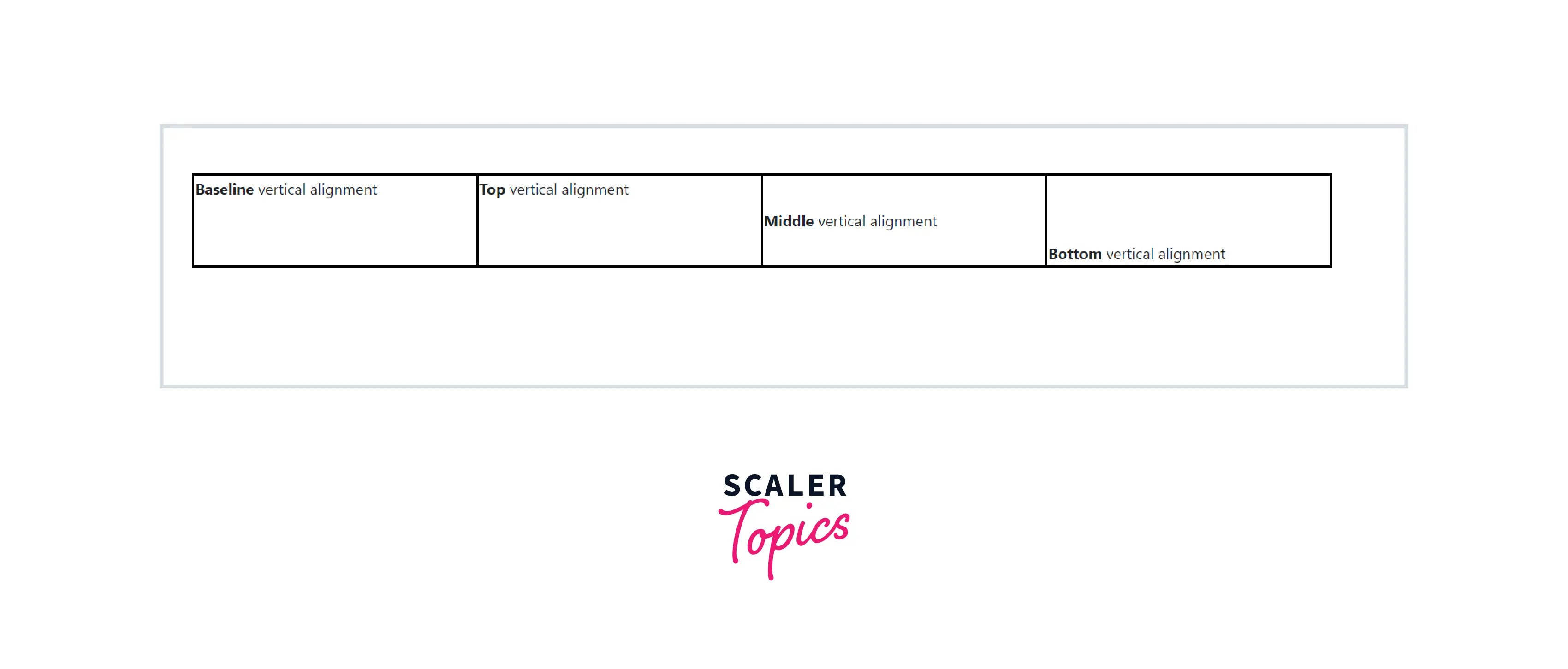
Let us create a table in HTML using <TABLE>, <TR>, and <TD> tags.
HTML
CSS
We have created an HTML table with a single row and four columns. Each column has its different alignment. This shows how we can vertically align table components using Bootstrap.
Grid System: Vertical Alignment
The grid system in Bootstrap facilitates building layouts of all shapes and sizes with twelve column system, etc., and dozens of predefined classes.
Flexbox utilities are used to vertically and horizontally align columns of the grid. It is applied to the rows i.e. parent element of the columns in HTML as well as to columns i.e. elements themselves.
To create a grid we have to create a div with the class container. This container can have multiple rows and each row can have several columns(usually at max 12 columns only). We will see the vertical alignment of the columns using a flexbox.
HTML
CSS
In the example above, instead of applying bootstrap vertical align to the row that affects all the columns, vertical alignment is applied to individual columns only.
Conclusion
- Bootstrap vertical-align provides many classes and utilities to change vertical alignments of HTML elements.
- Vertical alignments can be applied to an element using inline, inline-block, inline-table, and table-cell utilities.
- Classes align-items flexbox alignment utilities are the simplest way to vertically align items of the Grid.
- Alignment can be changed for the entire row or only a particular column using align-items-[start | center | end].
- Another way is to use the d-flex class along with align-items-[start | center | end] Classes. It can be applied to divs to change their vertical alignment.
- Bootstrap also provides functionality to change the alignment of the elements of the HTML tables using align-[align type] classes. These classes include baseline, top, middle, bottom, etc.
- Grid system also provides inbuilt bootstrap classes to vertically align components. Flexbox utilities are used to vertically and horizontally align grid elements.
