Flexible and Fluid Grids
Overview
As everyone is aware, the most popular CSS framework for building responsive and mobile-first websites is Bootstrap. Bootstrap provides a number of classes, so you don't have to start from scratch when building and developing the user interface (UI components) to meet your demands.
The grid system in Bootstrap makes use of a number of containers, rows, and columns to arrange and align content.
Introduction to Grid System in Bootstrap
In this article, we will talk about Bootstrap Grid System, which permits a page to have up to 12 columns. You can use each one separately or combine them to create wider columns. You can use any combination of values that add up to 12.
The Bootstrap grid system offers a quick and effective approach to building adaptable layouts of any size or form. It was constructed using Flexbox with a mobile-first mindset. Additionally, it uses a twelve-column structure (12 columns are available per row) and six preset responsive levels in addition to being fully responsive.
The predefined grid classes in Bootstrap may be used to easily create layouts for a variety of devices, including mobile phones, tablets, laptops, desktops, and more. For extra-small devices like mobile phones in portrait mode, you can generate grid columns using the .col-* classes, and for mobile phones in landscape mode, you can use the .col-sm-* classes.
The grid system in Bootstrap makes use of a number of containers, rows, and columns to arrange and align information.
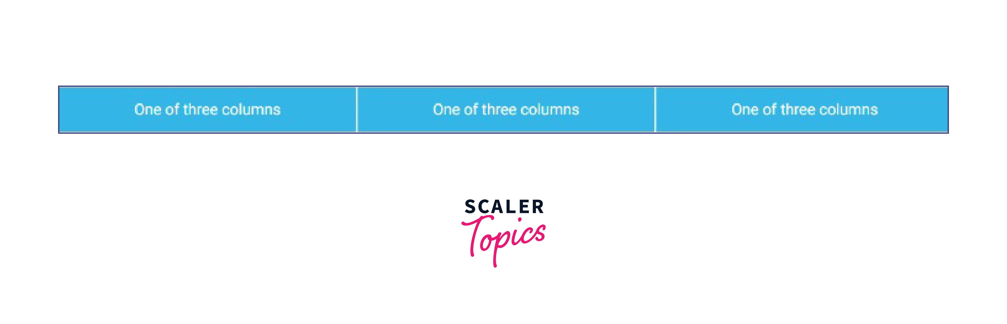
Let's see a basic example of how the grid system works:
Code:
Output-
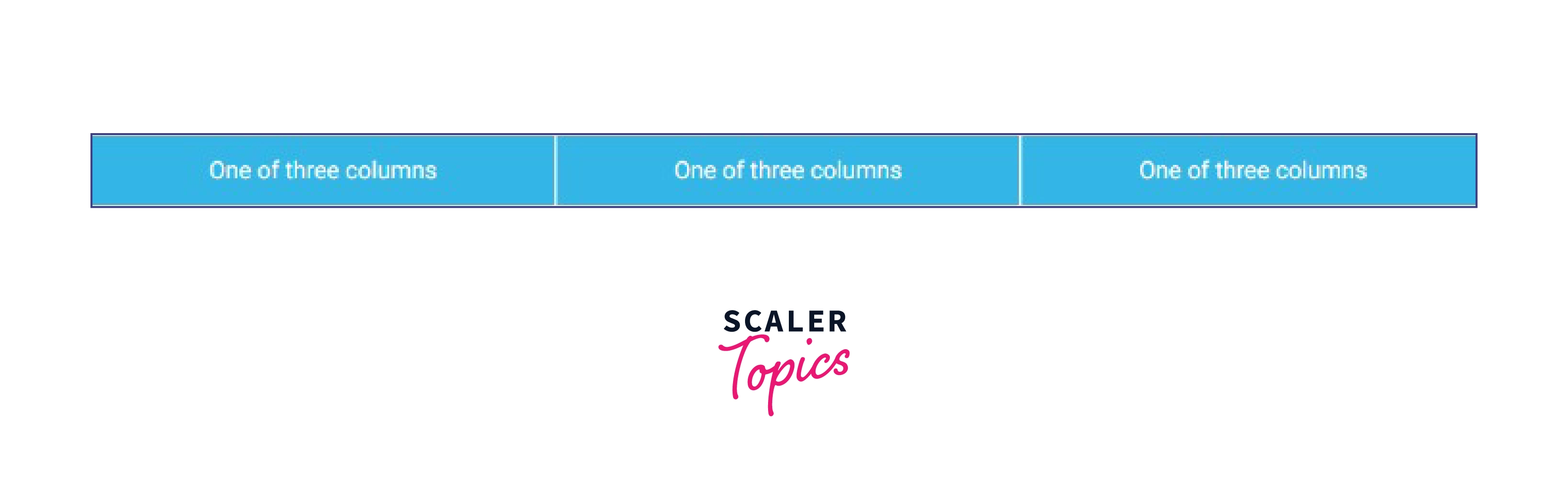
Using our predefined grid classes, the grid example shown above generates three columns of the same width for all devices and viewports. With the parent .container, the columns are centered on the page.
Grid Classes
You can easily create layouts for a variety of devices, including mobile phones, tablets, laptops, desktops, and more, by using the preset grid classes in Bootstrap. For extra-small devices like mobile phones in portrait mode, you can use the .col-* classes to build grid columns, and you can use the .col-sm-* classes for mobile phones in landscape mode.
Similar to this, you can construct grid columns for medium screen devices like tablets using the .col-md-* classes, small laptops using the .col-lg-* classes, laptops and desktops using the .col-xl-* classes, and huge desktop screens using the .col-xxl-* classes.
The grid system used by Bootstrap is broken down into its main components in the table below:
| Bootstrap Grid System | X-Small (xs) <576px | Small (sm)≥576px | Medium (md)≥768px | Large (lg)≥992px | X-Large (xl)≥1200px | XX-Large (xxl)≥1400px |
|---|---|---|---|---|---|---|
| Container max-width | None (auto) | 540px | 720px | 960px | 1140px | 1320px |
| Class prefix | .col- | .col-sm- | .col-md- | .col-lg- | .col-xl- | .col-xxl- |
| Number of columns | 12 | 12 | 12 | 12 | 12 | 12 |
| Gutter width | 1.5rem (.75rem on left and right) | 1.5rem (.75rem on left and right) | 1.5rem (.75rem on left and right) | 1.5rem (.75rem on left and right) | 1.5rem (.75rem on left and right) | 1.5rem (.75rem on left and right) |
| Custom gutters | Yes | Yes | Yes | Yes | Yes | Yes |
| Nestable | Yes | Yes | Yes | Yes | Yes | Yes |
| Column ordering | Yes Yes | Yes | Yes | Yes | Yes | Yes |
The above table illustrates an essential point: if a .col-md-*, .col-lg-*, .col-xl-*, or .col-xxl-* class is missing, applying any .col-sm-* class to an element would not only affect small devices but also medium, big, and extra large devices (viewport width 768px).
Similarly, if a .col-lg-*, .col-xl-*, or .col-xxl-* class is missing, the .col-md-* class will not only affect medium devices but also large and extra large devices.
Components of Grid System
Bootstrap grid components are a set of responsive, flexible, and customizable CSS classes that are used to create a grid-based layout for a website or application. These components are designed to work together in a fluid and flexible manner, allowing designers and developers to easily create a responsive and mobile-friendly layout that adapts to the screen size of the user's device.
Some examples of Bootstrap grid components include columns, rows, containers, and responsive breakpoints. These components can be used in combination to create a wide range of layout options, from simple two-column layouts to complex multi-column grids.
Containers
Bootstrap needs a contained element to enclose the contents of the website in a grid. The word "container" is used to describe both row components that contain and separate apart column In Bootstrap, the .container class is used to create a container element that has a fixed width, based on the size of the screen or viewport. The container is the top-level element in the grid system, and it is used to create a row, which is a horizontal group of columns.
Rows
For the purpose of proper alignment and padding, rows must be positioned inside the container or container fluid. Columns are arranged horizontally in groups using rows. The rows are created using the .row class, and each column within a row is created using a combination of the .col-* classes, where the * is replaced with a number that specifies the width of the column.
Columns
You can create grid columns by indicating how many of the twelve available columns you want to span. The columns are created using a combination of the .col-* classes, where the * is replaced with a number that specifies the width of the column. For instance, three col-lg-4 would be used for three equal columns.
Here is an example of some basic HTML code that uses a Bootstrap container, rows and columns, and a grid system to create a page layout:
Code:
Output:
Types of grids in Bootstrap
Fixed Grids
In the context of the Bootstrap framework, a fixed grid is a type of grid system that uses fixed-width columns. This means that the width of each column is defined in pixels, and it does not change based on the size of the screen or viewport.
The fixed-width columns in Bootstrap are created using the .col-* classes, where the * is replaced with a number that specifies the width of the column in pixels. For example, the .col-200 class will create a column that is 200 pixels wide.
Here is an example of some basic HTML code that uses the fixed-width grid system in Bootstrap to create a page layout:
Code:
Output:
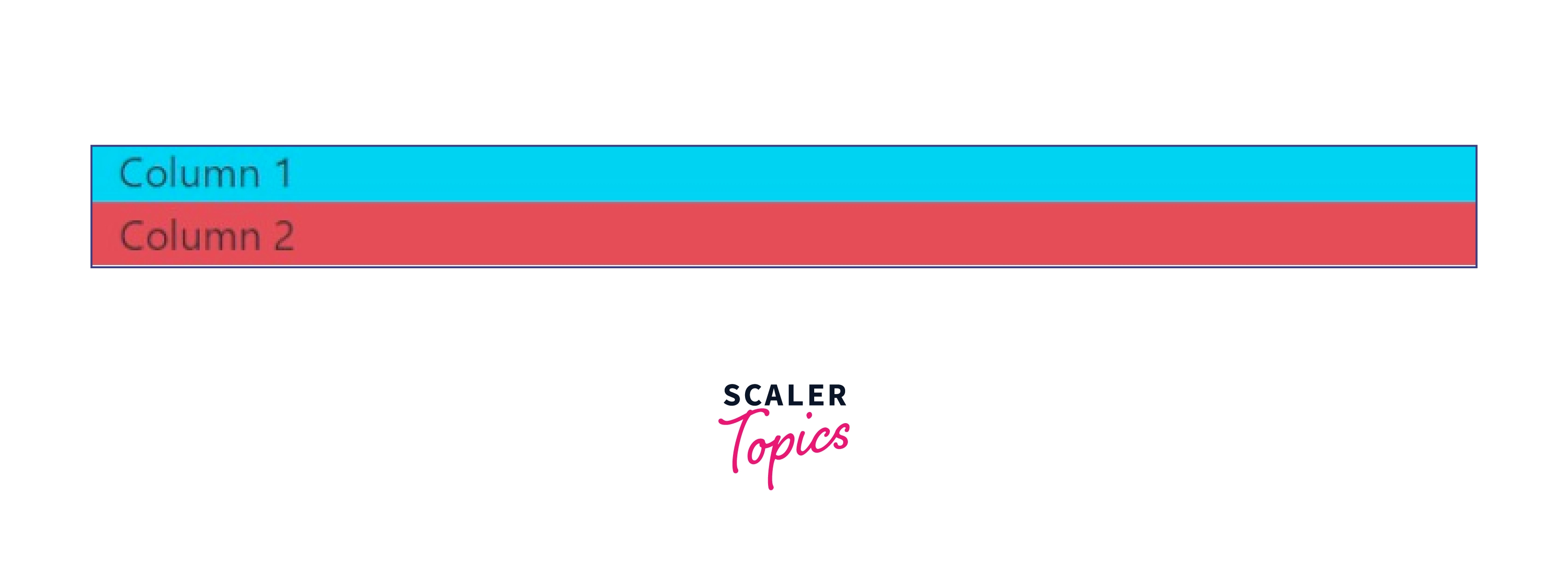
In this example, the .container class is used to create a container element that will hold the row and columns. The .row class creates a new row, and the .col-200 class creates two columns within that row that are each 200 pixels wide. The content of each column will be displayed side by side on the screen.
The fixed-width grid system in Bootstrap is not as flexible or responsive as the default grid system, which uses relative units (percentages) to define the width of the columns. However, it may be useful in some situations where you need to create a page layout with columns that have specific widths in pixels.
Fluid Grids
In the context of the Bootstrap framework, a fluid grid is a type of grid system that uses relative units (percentages) to define the width of the columns. This means that the width of each column is defined as a percentage of the width of the screen or viewport, so the grid will automatically adjust to the size of the screen to create a responsive layout.
The fluid grid in Bootstrap is created using the .col-* classes, where the * is replaced with a number that specifies the width of the column as a percentage. For example, the .col-50 class will create a column that is 50% of the width of the screen.
Here is an example of some basic HTML code that uses the fluid grid system in Bootstrap to create a page layout:
Code:
Output:
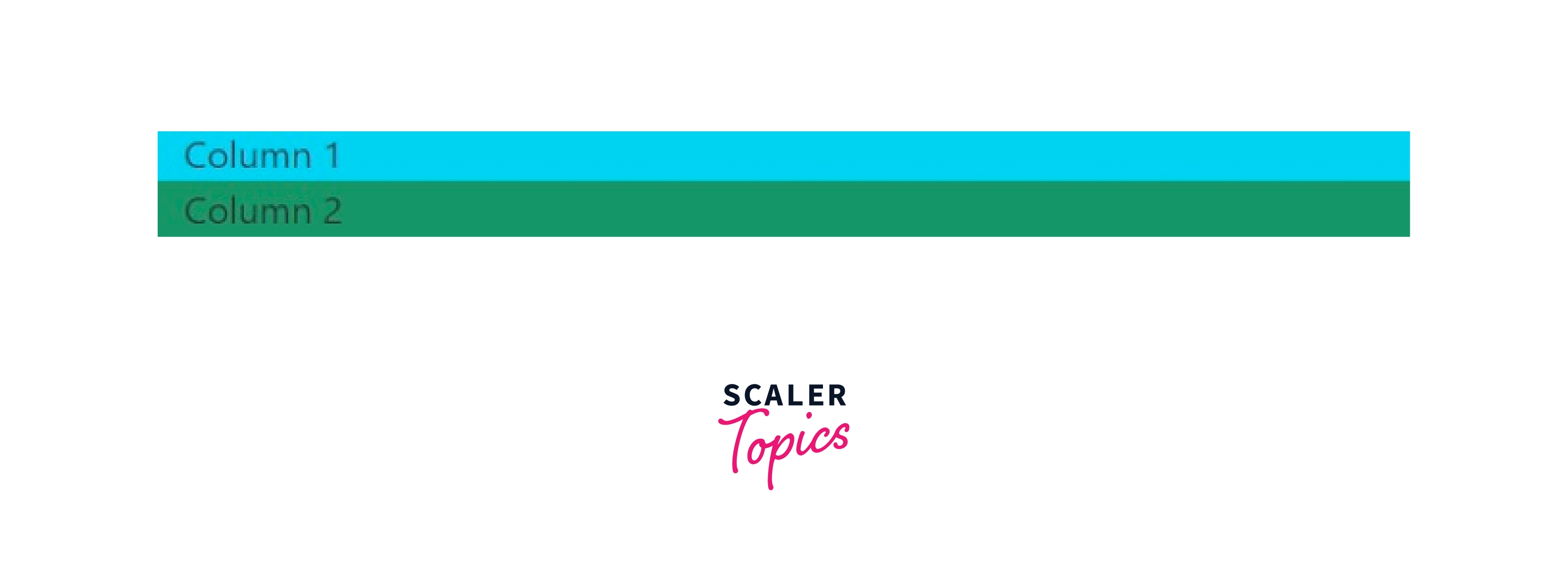
In this example, the .container class is used to create a container element that will hold the row and columns. The .row class creates a new row, and the .col-50 class creates two columns within that row that are each 50% of the width of the screen. The content of each column will be displayed side by side on the screen.
The fluid grid system in Bootstrap is a flexible and responsive way to create a page layout. It allows you to create complex layouts using a combination of rows and columns, and it automatically adjusts to the size of the screen to ensure that the layout looks good on any device.
Choosing between Fixed and Fluid Grid
There are a few key differences between fixed and fluid grid layouts in web design. Fixed grid layouts have a set width, meaning that the layout of the page will not change depending on the screen size or resolution of the device being used. This can make the webpage easier to design for, but it can also make the page less flexible and can cause problems if the screen size is significantly different from the size the layout was designed for.
Fluid grid layouts, on the other hand, use relative units like percentages rather than absolute units like pixels to define the width of elements on the page. This means that the layout of the page will automatically adjust to fit the size of the screen, making the webpage more flexible and responsive.
Ultimately, the choice between a fixed and fluid grid layout will depend on the specific needs and goals of your project. If you need a layout that is easy to design for and doesn't need to be particularly flexible, a fixed grid layout may be the better choice. If you need a more flexible and responsive layout, a fluid grid layout may be the better option.
Conclusion
- Bootstrap Grid System allows up to 12 columns to be placed across a page.
- Bootstrap grid system is built using flexbox and is fully responsive.
- Containers, rows, and columns are the components used in grid system.
- Content must be inserted within columns in a grid layout, and only columns may be rows' immediate children.
- There are various grid classes such as XS, SM, MD, LG, and XL.
- Fixed and Fluid are the two types of grids mainly used in the Bootstrap grid system.
- Using Bootstrap grids improves the overall structure of the page and gives the webpage an innovative appearance.