Bootstrap Toggle Button
Overview
We are often required to choose between one of the two predefined options on a webpage. In such cases, bootstrap comes to our rescue and provides us with a bootstrap toggle button which is used to choose between the preferred choices. Bootstrap provides certain toggle classes such as bootstrapToggle() which helps in toggling a button and choosing one of the two options provided on a webpage.
What is Bootstrap Toggle Button?
The bootstrap toggle button is used for choosing or activating one of the two predefined options on a webpage. It is often used to perform an on/off action on a webpage by choosing a particular and discarding the other. It is widely used in forms because it is very easy to use and saves the time that one takes while filling in the option in an input field.
We can achieve the functionality of the toggle button by using <input type="checkbox"> An example where a toggle button can be used is while answering a question in a form such as "Do you know bootstrap?" The user will either choose a yes or no as the answer and therefore toggle the button accordingly.
Toggle Buttons Used Areas
- The toggle button is widely used in forms for asking a question. Example - Do you have a disability?
- They are used to fill in preferred choices.
- They are used to implement the on/off functionality.
Why Bootstrap Over HTML?
Bootstrap is preferred over HTML as in HTML, we need to write the id, classes, links, buttons, cascading styles, etc whereas, in bootstrap, we mostly use the predefined classes, links, and buttons with their cascading styles that reduce the complexity of the code and is easy to write.
Basic Example
An example of a switch in bootstrap is given below.
Output:
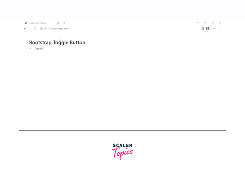
In the above code, we have added a checkbox input which is being made a toggle button using various bootstrap classes.
The class custom-control custom switch gives the checkbox predefined bootstrap styles and the default toggle button. The .custom-control-input makes the checkbox input a custom control input button. The custom-control-label gives an appropriate label to the checkbox input and the .customSwitches makes the toggle button iterative in nature.
Switch Button
Now, let us make the switch or the toggle button using the .switch and .lever classes in bootstrap.
Let us understand how to do it using a code example.
Output:
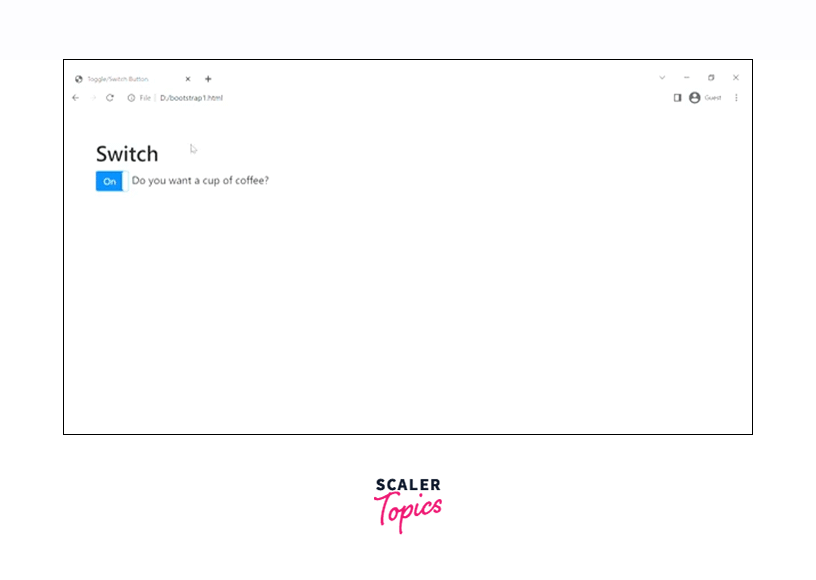
In the above example, we have used the .switch class for creating a switch toggle button and the .lever class for implementing the on/off functionality.
Toggle Button with Disabled Attribute
We can disable a button using the disabled attribute in bootstrap. By disabling a button, you cannot toggle them anymore. First of all, we will be seeing the usage of the disabled attribute in the default toggle button with the help of a code example.
Output:
As you can see in the output, the toggle button has been disabled.
Now let us disable the switch button using the disabled attribute.
Output:
As you see in the above output, the switch toggle button has been disabled just by using the disabled attribute with the checkbox button. Therefore, we are not able to toggle it anymore.
More Examples for Toggle Button in Bootstrap
Now, we will be discussing some more examples of the toggle button in bootstrap.
Stacked Checkboxes
Let us create a stack of checkboxes in which one of them will be enabled and the other one will be disabled in bootstrap.
Output:
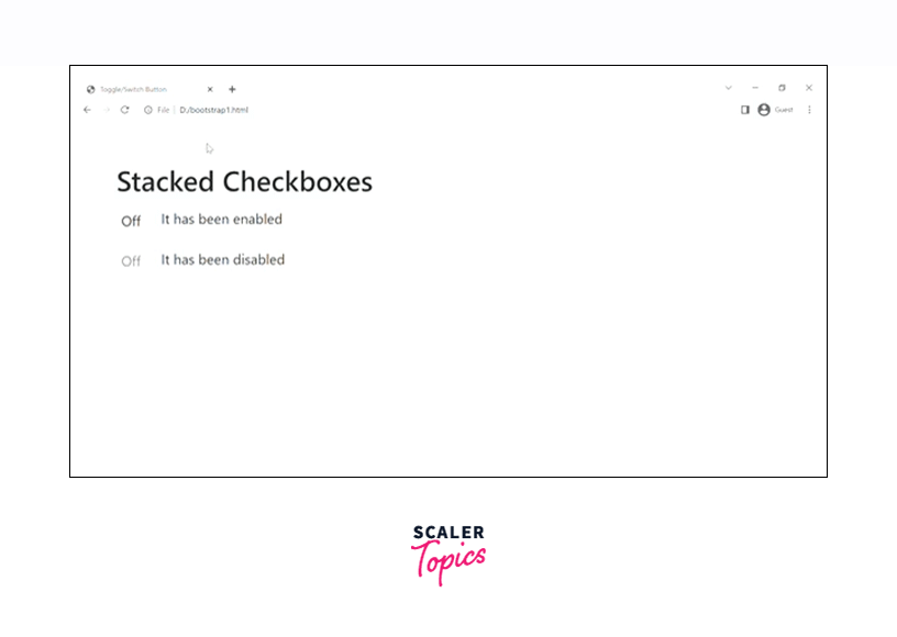
As you can see in the above output, we have created two toggle buttons in which one of them is enabled and the other one is disabled.
Inline Checkboxes
We can also add the checkboxes in one line, one after the other for which we use the class .checkbox-inline on each of the checkboxes we make.
Let us see how to make the inline checkboxes with the help of a code example.
Output:

Therefore, as you can see in the output, the toggle buttons are aligned in a single line one after the other.
Options
You can also pass different options in the toggle button for different purposes using the data attributes or Javascript. For using the data attributes, you need to append the option name with the data-* such as data-on='disabled'.
Let us see how to use it with the help of an example.
Output:

In the above code example, we have used two toggle buttons in which the first one uses the data attributes and the second one uses Javascript for using the options in the toggle button.
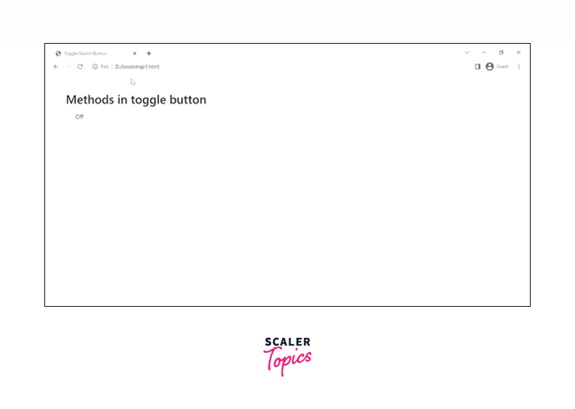
Methods
Bootstrap provides different states or function calls for controlling the toggles directly. All these states are passed to the bootstrapToggle() method to control the toggle button. Let us see such function calls in detail.
| States | example | description |
|---|---|---|
| initialize | $('#toggle-example').bootstrapToggle() | It initializes the toggle plugin with options |
| destroy | $('#toggle-example').bootstrapToggle('destroy') | It is used to destroy the toggle. |
| on | $('#toggle-example').bootstrapToggle('on') | It is used to set the state of the toggle as on. |
| off | $('#toggle-example').bootstrapToggle('off') | It is used to set the state of the toggle as off. |
| toggle | $('#toggle-example').bootstrapToggle('toggle') | It is used to toggle the state of the button in bootstrap. |
| enable | $('#toggle-example').bootstrapToggle('enable') | It is used to enable the toggle button. |
| disable | $('#toggle-example').bootstrapToggle('disable') | It is used to disable the toggle button. |
Let us see an example of how to use these methods in bootstrap.
Output:
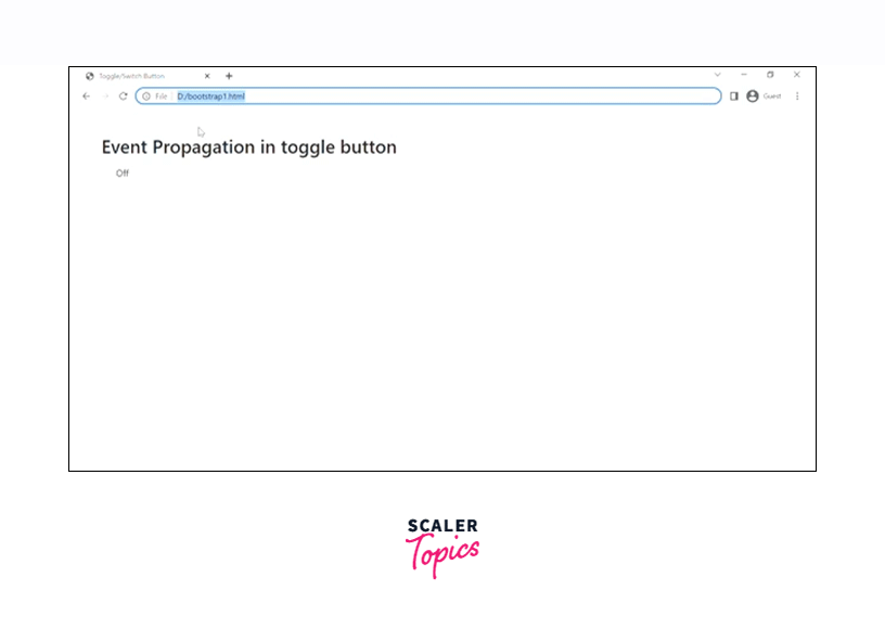
Event Propagation
The events that are triggered by the toggle button are all propagated to and from the input element in HTML. You can also look at custom events but listening to the input type='checkbox' directly is more recommended.
Let us understand it with the help of a code example.
Output:
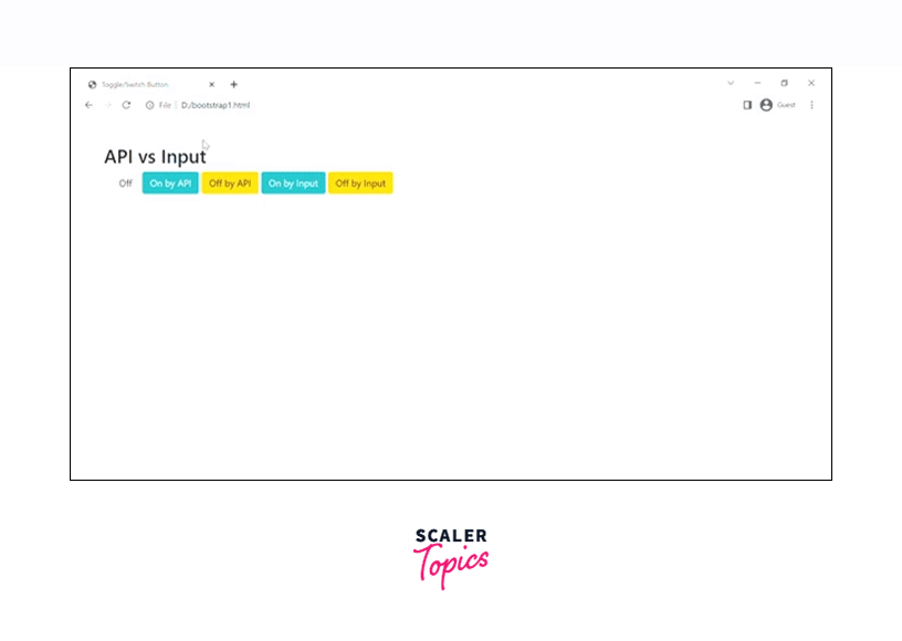
API vs Input
You can use either the API or the input to trigger the events of the toggle button. Toggling by the API would be done by triggering the bootstrap-toggle() function whereas triggering the toggling with the input will be done by the prop(checked, 'true').change() or prop(checked, 'false').change() functions.
Let us see it with the help of a code example.
Output:
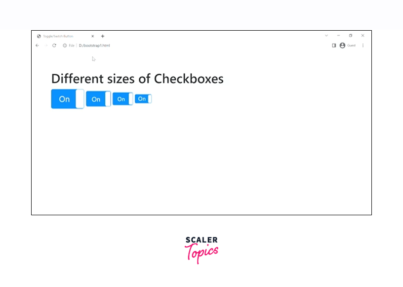
Sizes
Bootstrap toggle buttons are available in different predefined and custom sizes as per the requirement. We have certain predefined sizes by using the data-size option in which we can have the values as large, normal, small, and mini.
Let us see the toggle buttons of different sizes with the help of a code example.
Output:
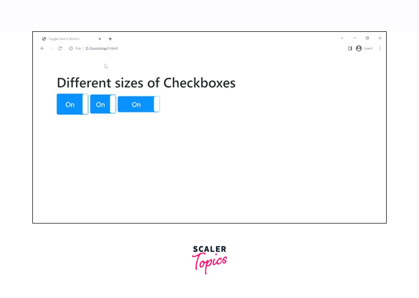
However, if you want to create toggle buttons of custom sizes, you are free to do that as well. Let us see an example of creating the custom size toggle buttons by using the data-width and data-height options in bootstrap.
Output:
Colors
We can also create toggle buttons of different colors for which we use the contextual colors used in bootstrap like primary, secondary, success, warning, and much more.
Now, let us create the toggle buttons of different colors in bootstrap.
Output:
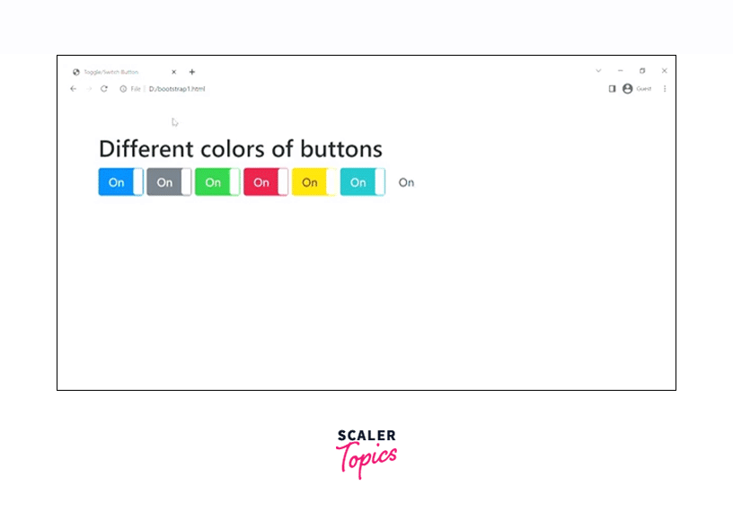
Therefore, we have created toggle buttons of different colors using different contextual colors. However, we can also create a mixture of colors using the options data-offstyle and data-onstyle.
Let us see it with the help of a code example.
Output:
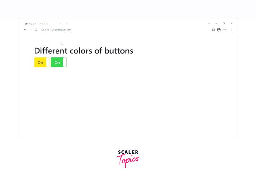
Therefore, as you can see in the above output, the data-onstyle option shows the color on the upper/on side of the toggle button whereas the data-offstyle shows the color on the lower/off side of the toggle button.
Custom Style
You can also give custom styles to the toggle buttons in bootstrap. Let us see an example of how to add such custom styles to the toggle buttons.
Output:
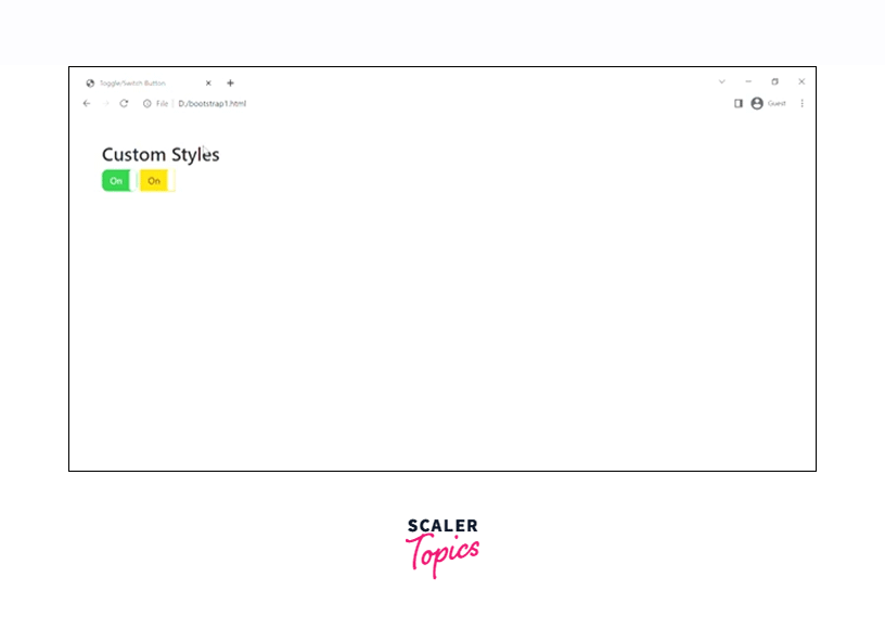
Therefore, we have internal CSS to the toggle button in the above example in which we have added the border-radius to the buttons.
Custom Text
The text that is written on the toggle buttons can be changed using the data-on and data-off attributes or options provided by bootstrap.
Let us see an example to change the custom text of a toggle button.
Output:
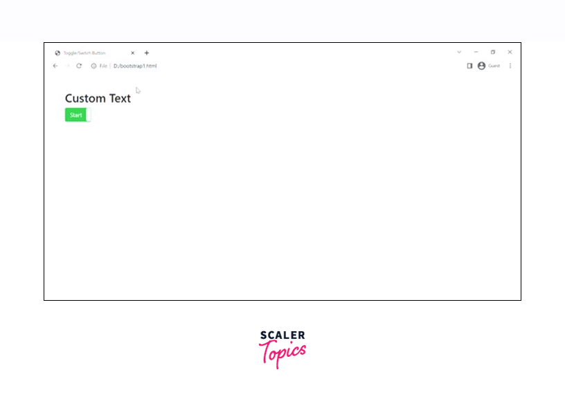
Therefore, we have changed the text inside the toggle buttons to "Start" and "Stop" in the above example.
Icons/Html Text
You can also easily add icons or images in the toggle buttons since the HTML is supported for on/off text.
Let us see how to include the icons and HTML text in the toggle button with the help of a code example.
Output:
As you can see in the above output, we have added the Home and the settings icon from the font-awesome. However, make sure that you have included the CDN link of the font-awesome website for the proper working of the icons in bootstrap.
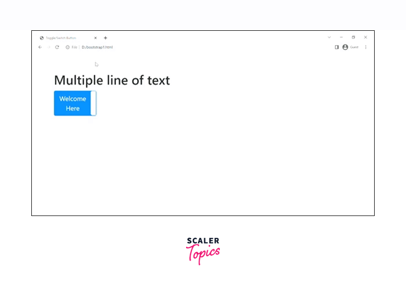
Multiple Lines of Text
You can also write multiple lines of text in a toggle button. The toggle button adjusts its height according to the size of the text in bootstrap.
Let us see multiple-line text in a toggle button with the help of a code example in bootstrap.
Output:
Conclusion
- Bootstrap toggle buttons allow you to choose between one of the two predefined options on a webpage.
- They are used to switch between the two options such as on/off, yes/no, enabled/disabled.
- You can disable these toggle buttons using the disabled attribute in bootstrap.
- You can change the text inside the toggle buttons using the data-on and data-off attributes.
- You can also add multiline text inside the toggled buttons using the data-on and data-off options.
- You can also trigger the toggle button using an API or an input in bootstrap.
- You can also add icons inside the toggle button using the font-awesome library.
- You can also change the size and color of the toggle buttons.
- Moreover, you can also add custom text and custom styles to the toggled buttons in bootstrap.