What are the Types of CSS Borders?

In this article, we are going to discuss the border types in CSS. Before getting started with the topic, let us get a short overview of what is a border-style css.
Border is a shorthand property of CSS, which is used to set a border on any content in CSS. Basically, the different properties provided by the border style in CSS allow us to set the width, color, and style of the border.
There are various types of CSS borders, and for different types of borders like the top border, right border, bottom border, and left border, we can set different types of properties. Let us see different types of border-style properties in detail.
CSS Border Style Property
The border-style CSS property may be defined by using one, two, three, or four values, that is we can basically give four different types of values in a border-style CSS property, let us see what these values specify.
- When there is only one value given to the border style css property, then all four sides are applied with the same style.
- When there are two values given to the border style CSS property, then the top and bottom are applied with the first value, and the left and right are applied with the second value.
- When three values are given to the border style property, then the top is applied with the first value, the left and right are applied with the second value, and the bottom is applied with the third value.
- When there are four values given to the border style css property, then the top, right, bottom, and left are applied with the values in clockwise order.
Let us now discuss the values which are chosen for the CSS border style CSS property in detail.
Dotted
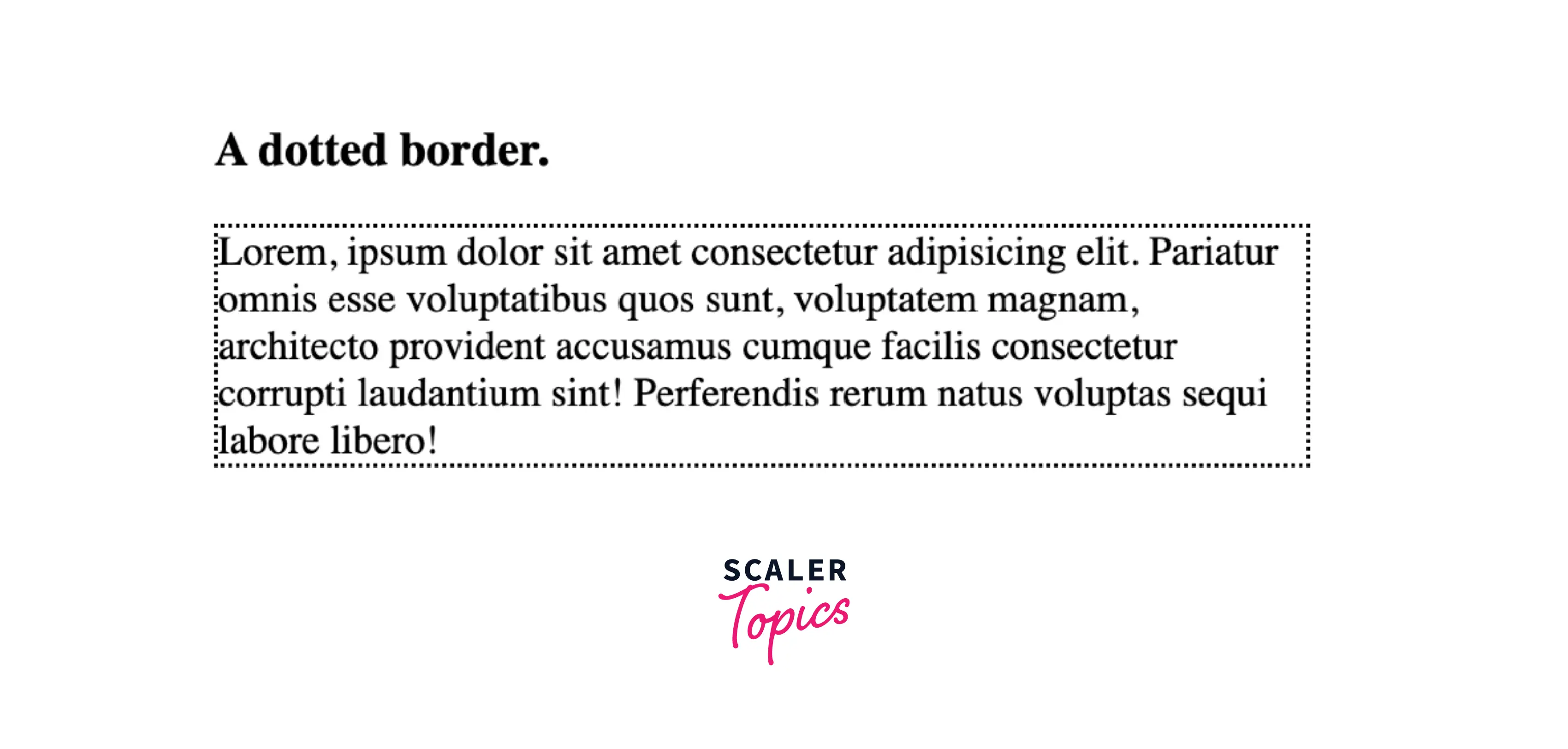
If we provide the border-style property with this value, the border will be displayed as a series of rounded dots. Basically, there will be a dotted border. The gaps between the dots are not defined by the specification and it is based on the implementation-specific. The radius of the dots is half the calculated value of the border width of the same side.
Syntax:
Example:
Let us look at an example of the dotted border style in CSS for a better understanding.
Code:
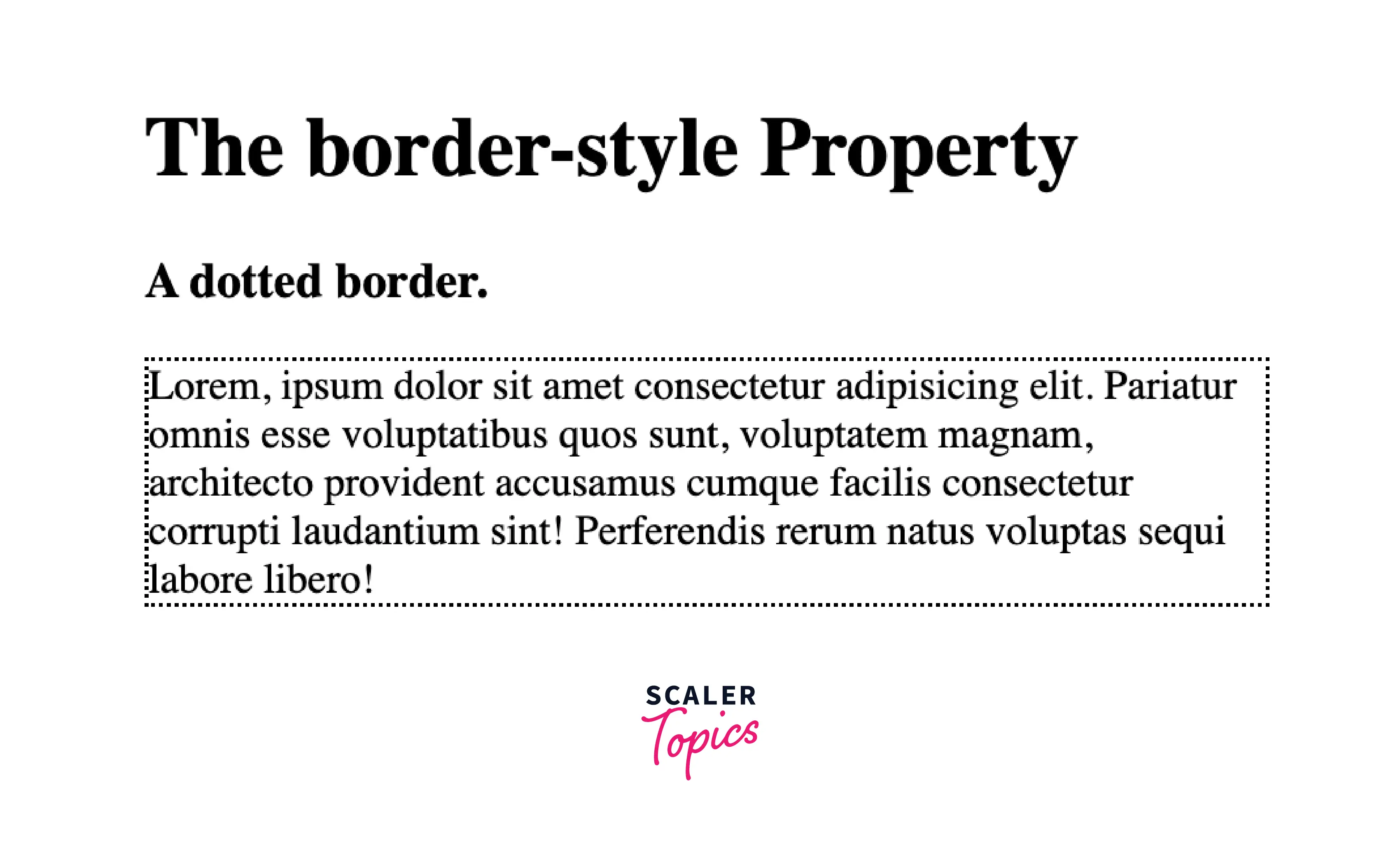
Output:
Explanation:
Let us understand the above code :
- In the above code, the body block consist of two headings and a paragraph with the class name "dotted".
- In the head block we have applied the Internal or Embedded CSS, in which we have done the styling of "dotted" class paragraph which includes the width and border-style.
- We have set the border-style value as dotted, and we can see how the border style is displayed as a series of rounded dots.
Dashed
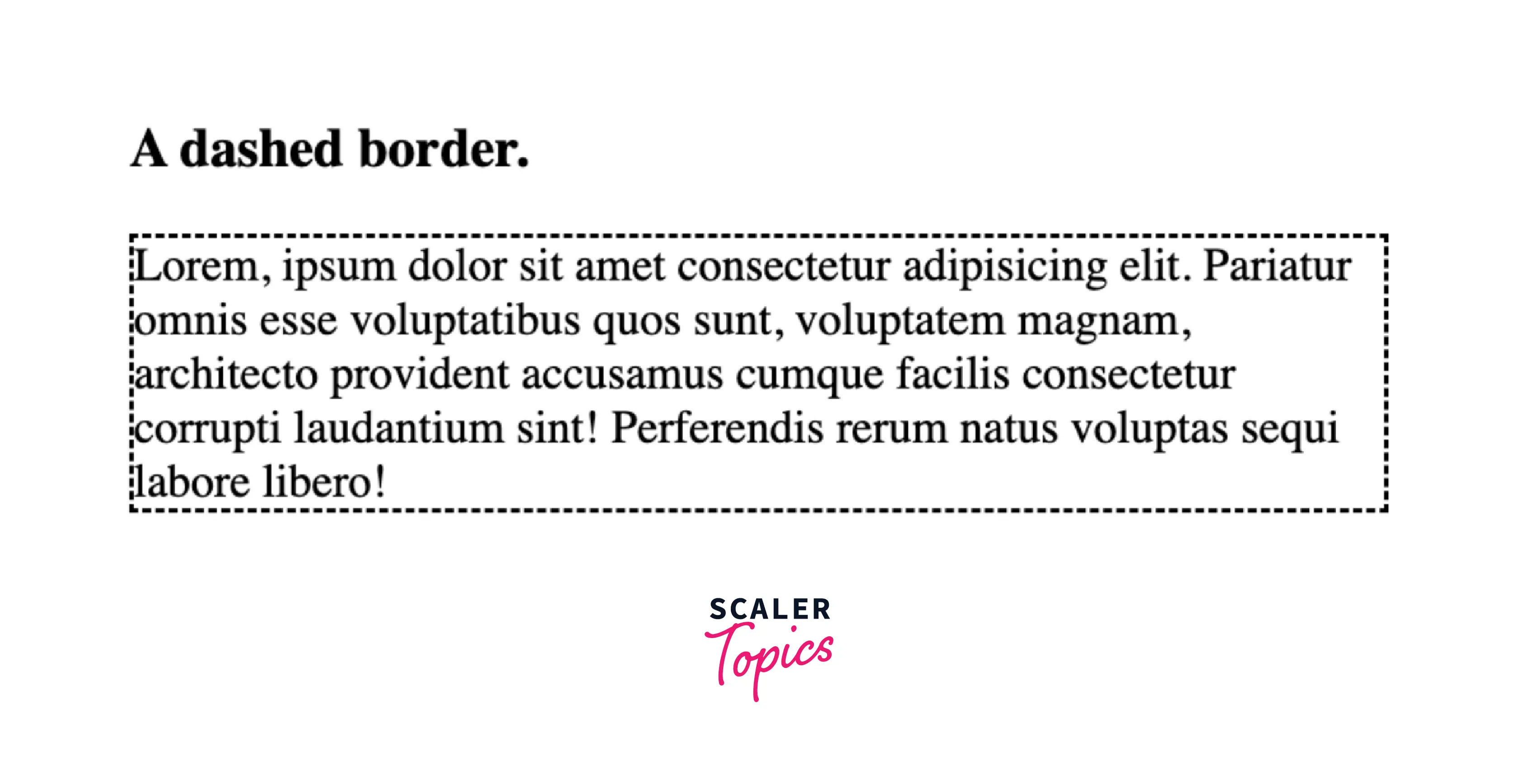
If we provide the border-style property with this value, the border will be displayed as a series of short square-ended dashes or line segments. Basically, there will be a dashed border. The length and accurate size of the segments are not defined by the specification and it is based on the implementation-specific.
Syntax:
Example:
Let us look at an example of the dashed border style in CSS for a better understanding.
Code:
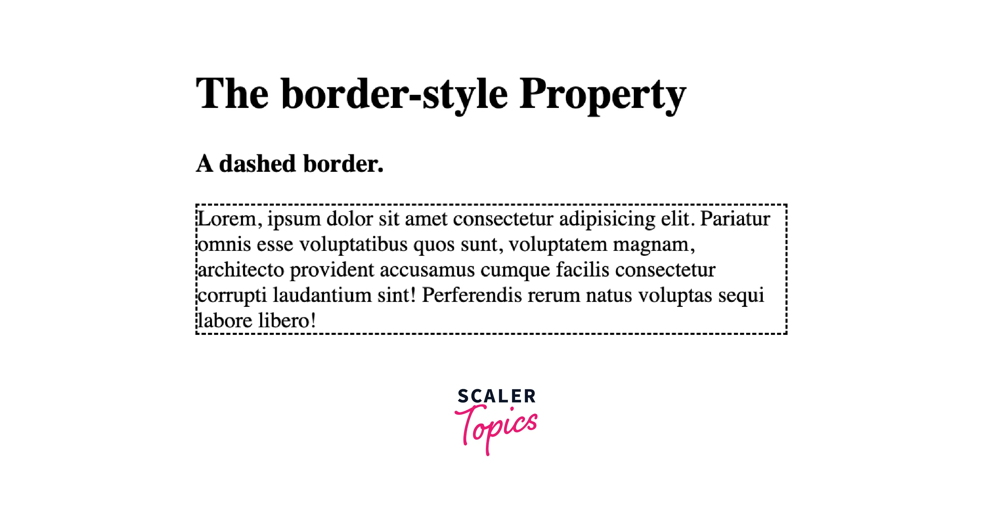
Output:
Explanation:
Let us understand the above code :
- In the above code, the body block consist of two headings and a paragraph with the class name "dashed".
- In the head block we have applied the Internal or Embedded CSS, in which we have done the styling of "dashed" class paragraph which includes the width and border-style.
- We have set the border-style value as dashed, and we can see how the border style is displayed as a series of short square-ended dashes or line segments.
Solid
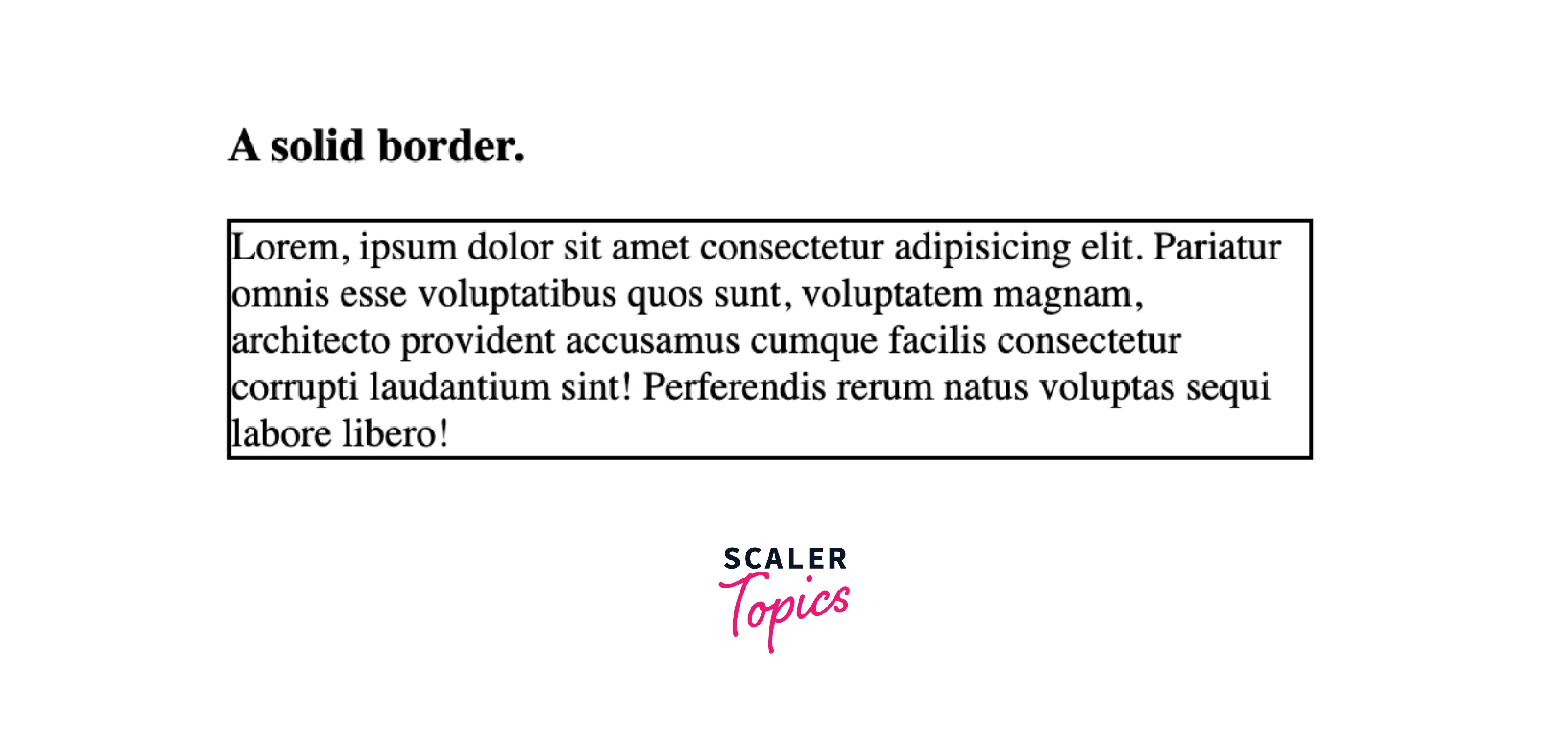
If we provide the border-style property with this value, the border will be displayed as a solid, single, and straight line. Basically, there will be a normal solid border.
Syntax:
Example:
Let us look at an example of the solid border style in CSS for a better understanding.
Code:
Output:

Explanation:
Let us understand the above code :
- In the above code, the body block consist of two headings and a paragraph with the class name "solid".
- In the head block we have applied the Internal or Embedded CSS, in which we have done the styling of "solid" class paragraph which includes the width and border-style.
- We have set the border-style value as solid, and we can see how the border style is displayed as a solid, single, and straight line.
Double
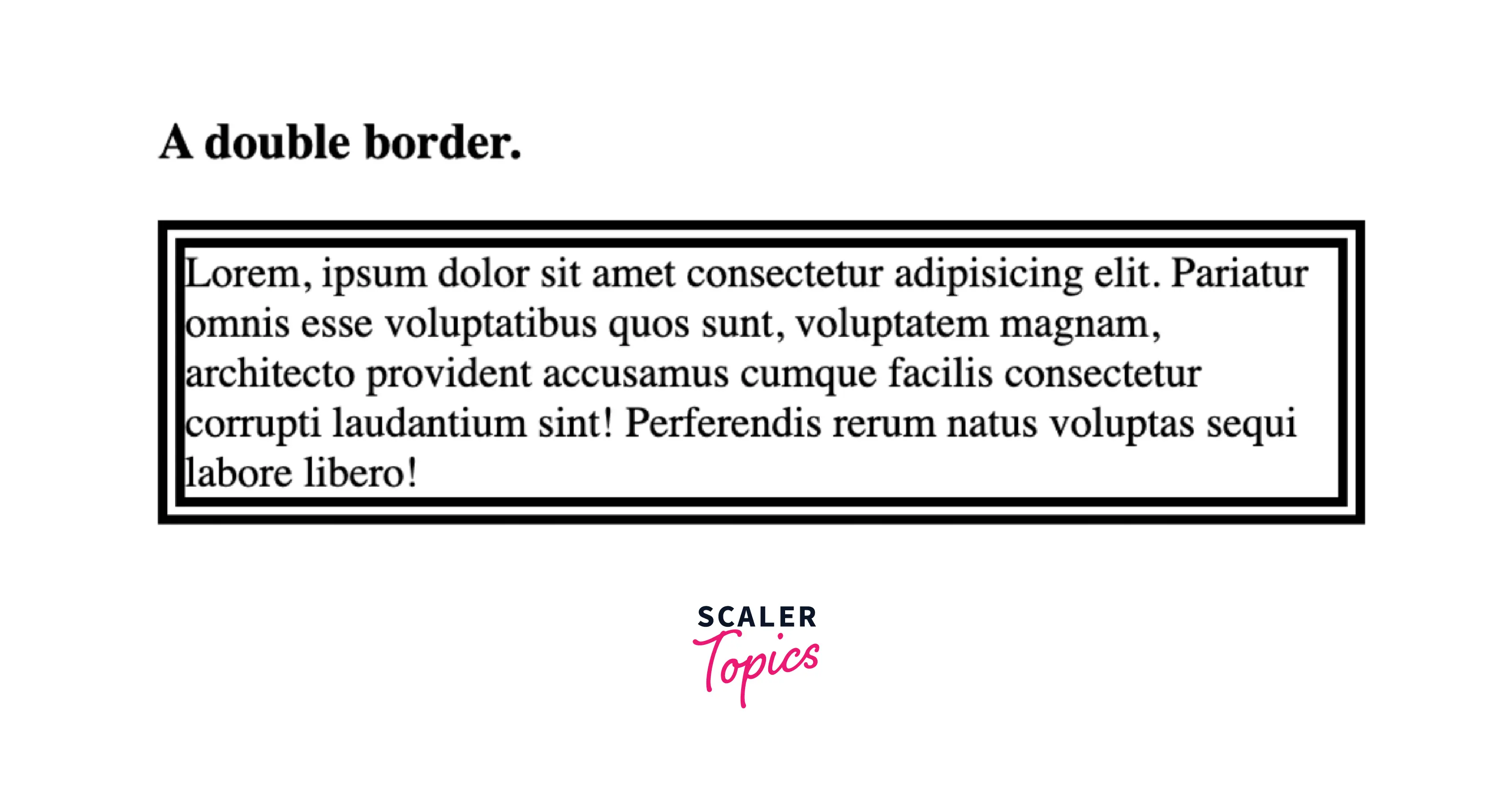
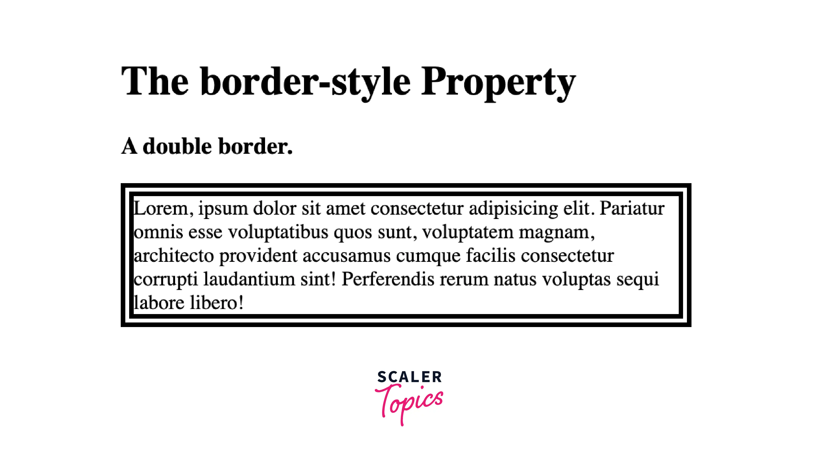
If we provide the border style property with this value, the border will be displayed by two straight lines that sum up to the pixel size defined by border width. Basically, there will be a two-lined border.
Syntax:
Example:
Let us look at an example of the double border style in CSS for a better understanding.
Code:
Output:
Explanation:
Let us understand the above code :
- In the above code, the body block consist of two headings and a paragraph with the class name "double".
- In the head block we have applied the Internal or Embedded CSS, in which we have done the styling of "double" class paragraph which includes the width and border-style and also the border-width depending on which the pixel size of the border will depend.
- We have set the border-style value as double, and we can see how the border style is displayed by two straight lines.
Groove
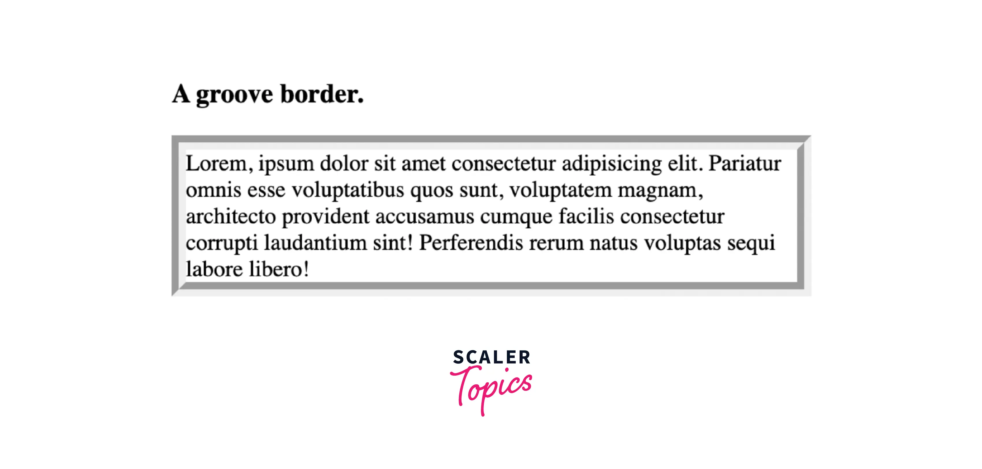
If we provide the border-style property with this value, the border will be displayed with a carved appearance. Basically, there will be a 3D carved appearance border. It is completely opposite of the rigid border.
Syntax:
Example:
Let us look at an example of the groove border style in CSS for a better understanding.
Code:
Output:

Explanation:
Let us understand the above code :
- In the above code, the body block consist of two headings and a paragraph with the class name "groove".
- In the head block we have applied the Internal or Embedded CSS, in which we have done the styling of "groove" class paragraph which includes the width and border-style and also the border-width depending on which the pixel size of the border will depend.
- We have set the border-style value as groove, and we can see how the border style is displayed with a carved appearance.
Ridge
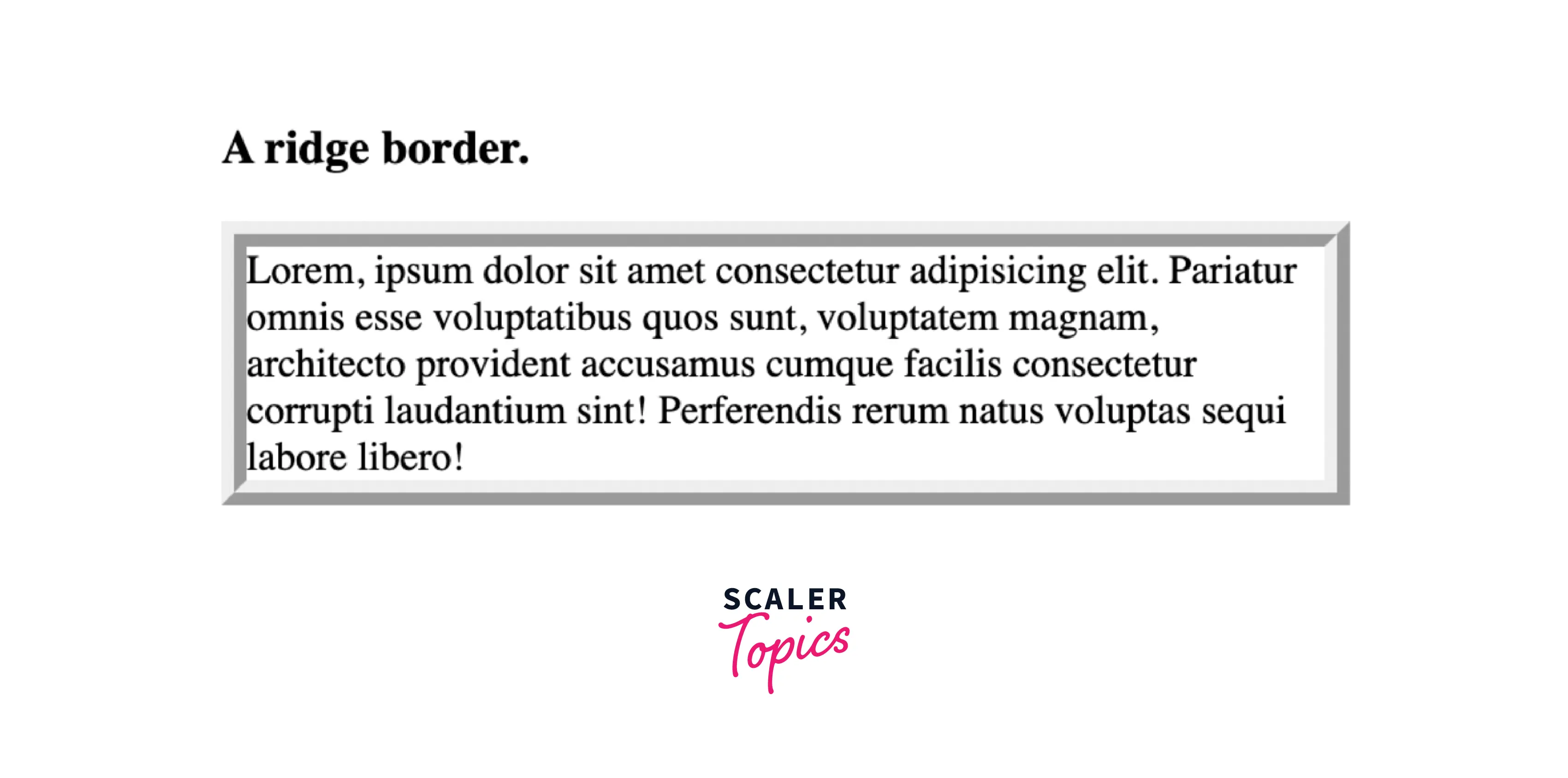
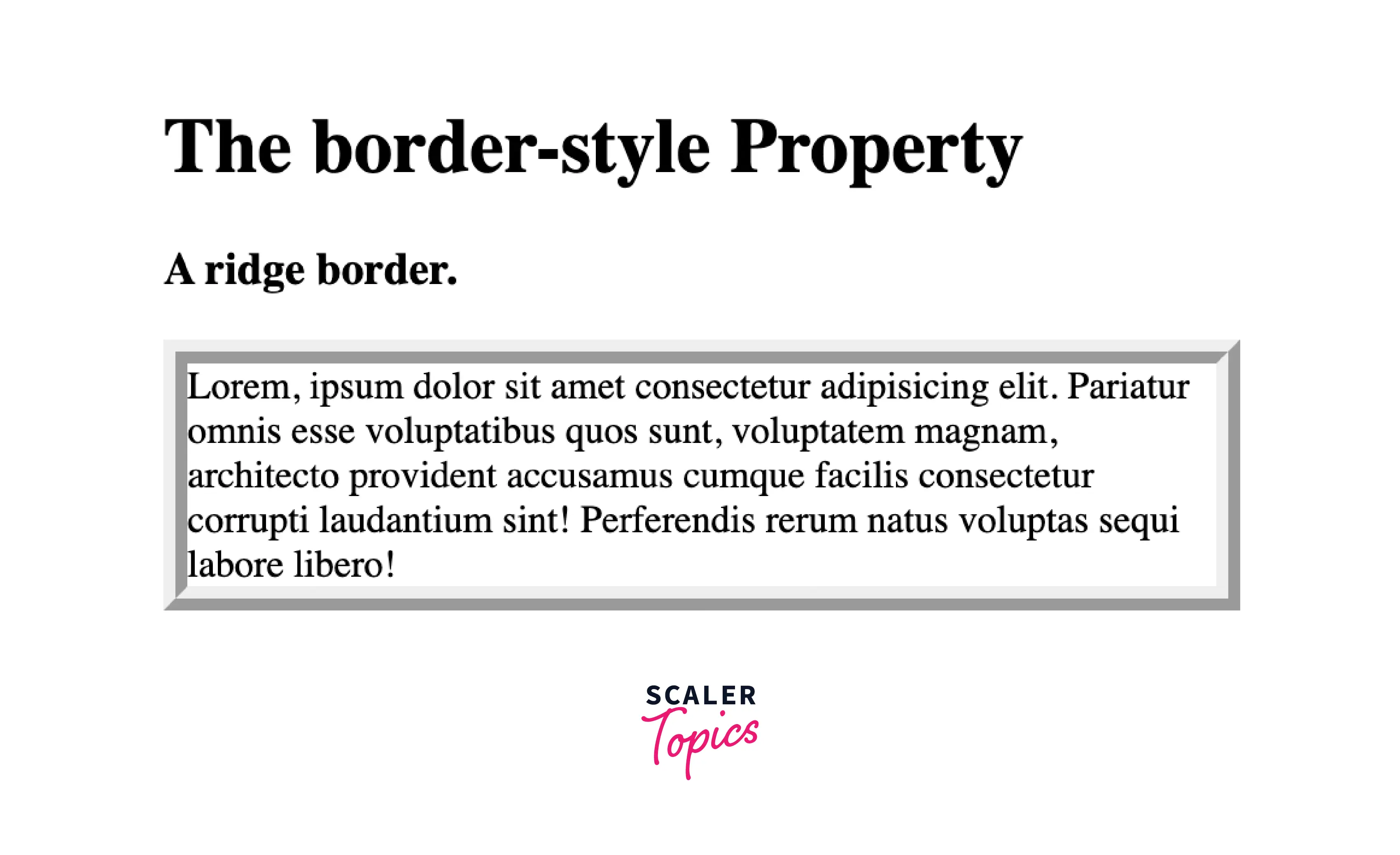
If we provide the border-style property with this value, the border will be displayed with an extruded appearance. Basically, there will be a 3D ridged border. It is completely opposite of the groove border.
Syntax:
Example:
Let us look at an example of the ridge border style in CSS for a better understanding.
Code:
Output:
Explanation:
Let us understand the above code :
- In the above code, the body block consist of two headings and a paragraph with the class name "ridge".
- In the head block we have applied the Internal or Embedded CSS, in which we have done the styling of "ridge" class paragraph which includes the width and border-style and also the border-width depending on which the pixel size of the border will depend.
- We have set the border-style value as ridge, and we can see how the border style is displayed with an extruded appearance.
Inset
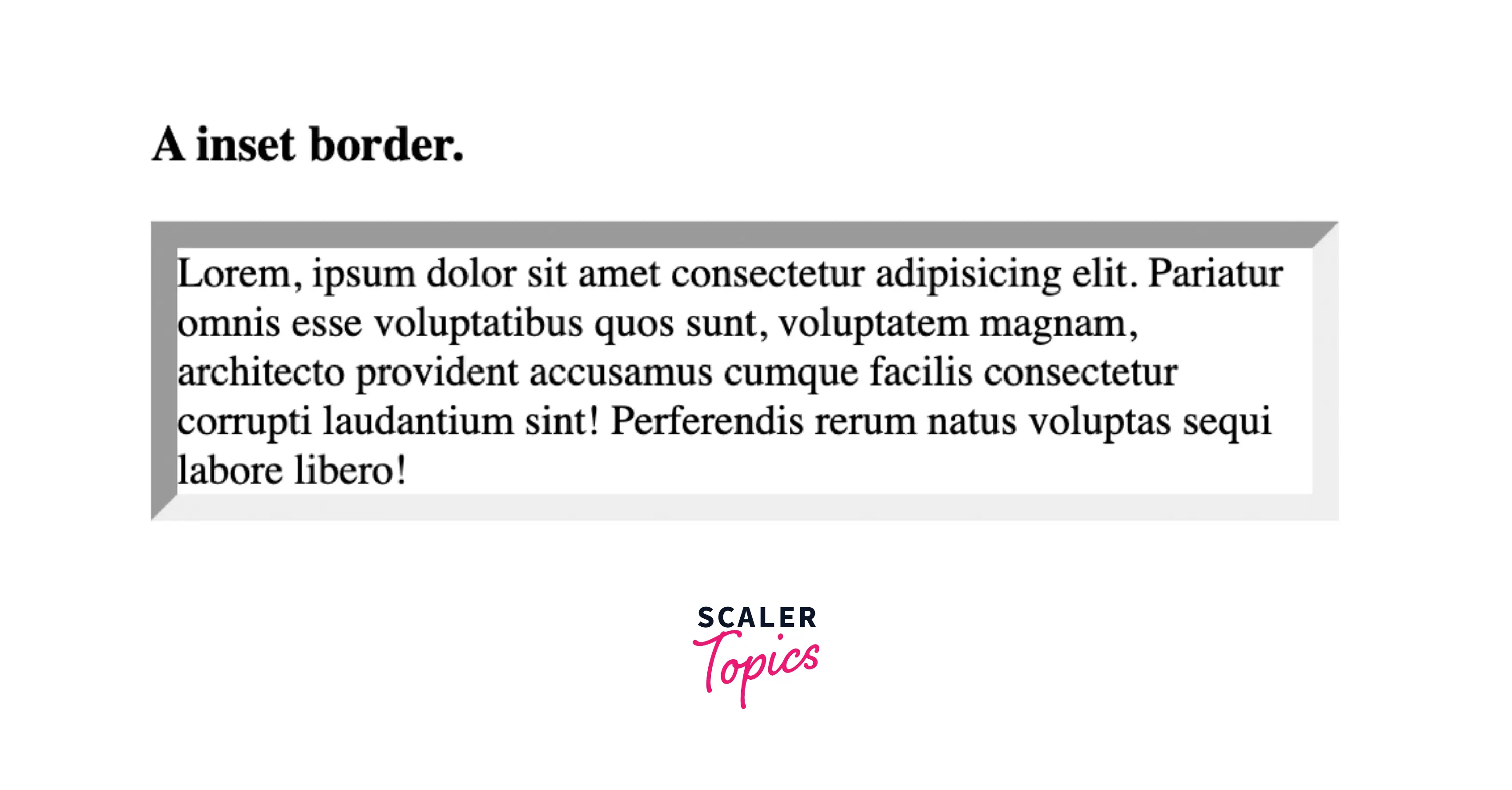
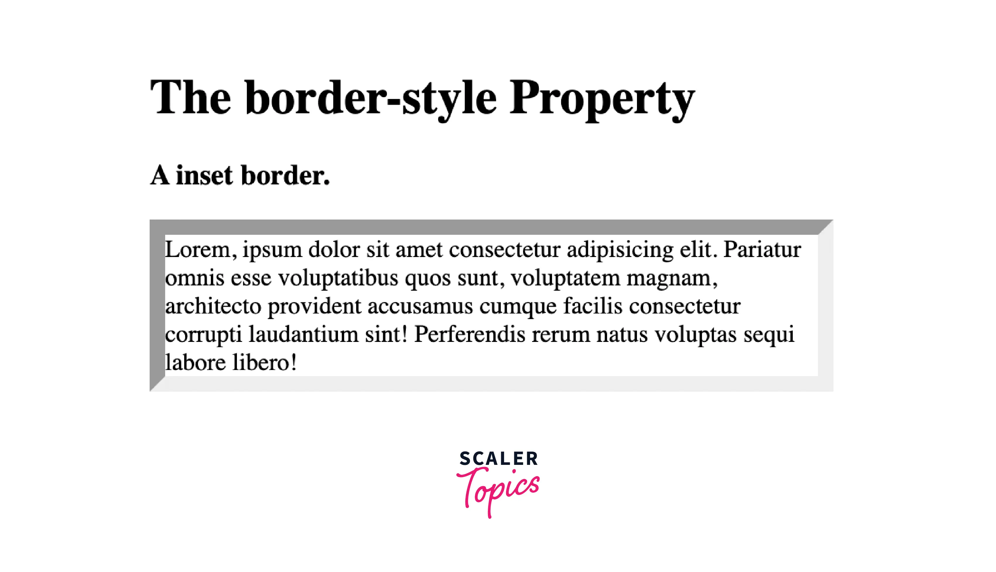
If we provide the border-style property with this value, the border will make the element displayed as embedded. Basically, there will be a 3D inset border. It is completely opposite of the outset border. When applied to a table cell with border-collapse set to collapsed, this value is similar to groove.
Syntax:
Example:
Let us look at an example of the inset border style in CSS for a better understanding.
Code:
Output:
Explanation:
Let us understand the above code :
- In the above code, the body block consist of two headings and a paragraph with the class name "inset".
- In the head block we have applied the Internal or Embedded CSS, in which we have done the styling of "inset" class paragraph which includes the width and border-style and also the border-width depending on which the pixel size of the border will depend.
- We have set the border-style value as inset, and we can see how the border style will make the element displayed as embedded.
Outset
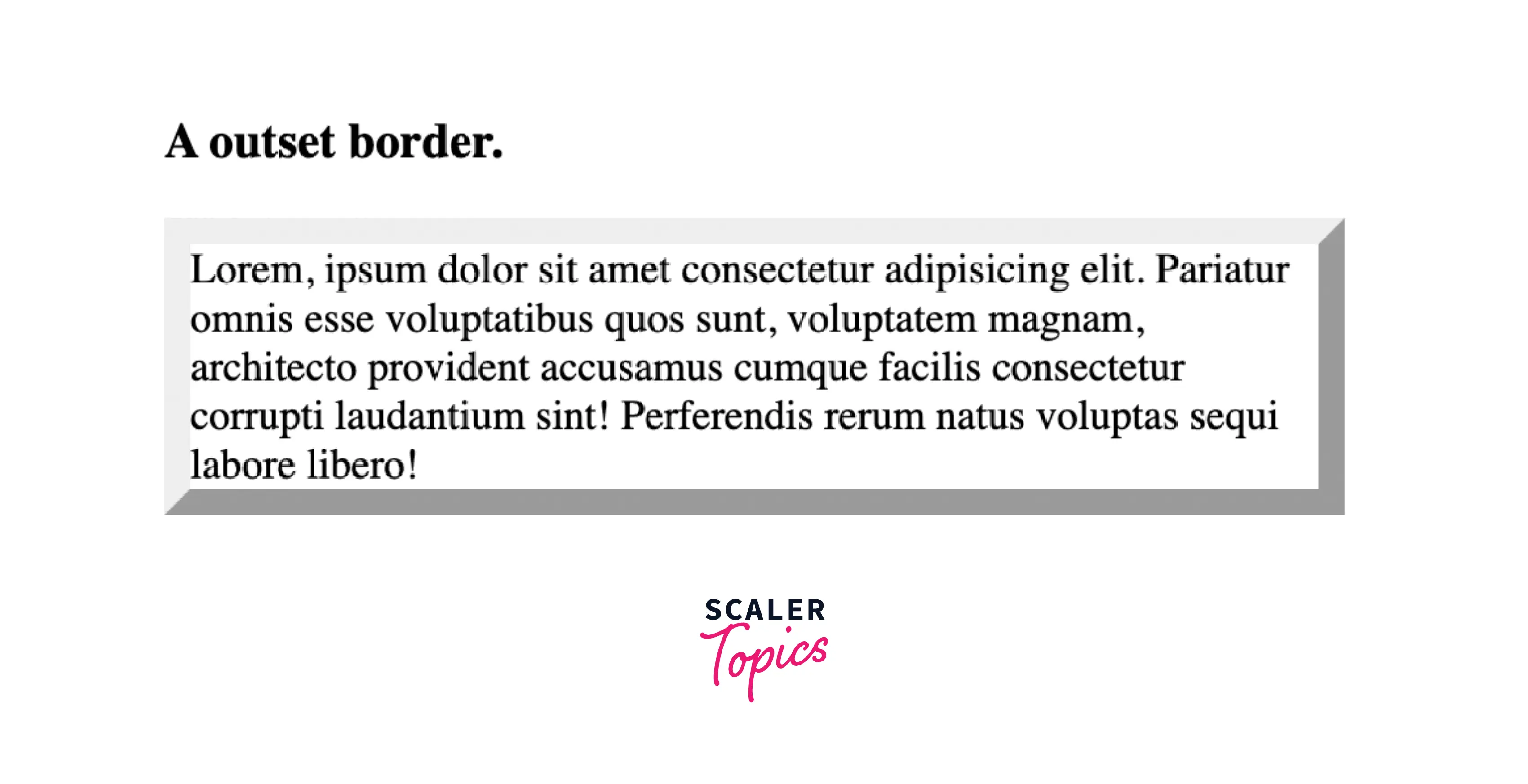
If we provide the border-style property with this value, the border will make the element displayed as embossed. Basically, there will be a 3D outset border. It is completely opposite of the inset border. When applied to a table cell with border-collapse set to collapsed, this value is similar to ridge.
Syntax :
Example:
Let us look at an example of the outset border style in CSS for a better understanding.
Code:
Output:

Explanation:
Let us understand the above code :
- In the above code, the body block consist of two headings and a paragraph with the class name "outset".
- In the head block we have applied the Internal or Embedded CSS, in which we have done the styling of "outset" class paragraph which includes the width and border-style and also the border-width depending on which the pixel size of the border will depend.
- We have set the border-style value as outset, and we can see how the border style will make the element displayed as embossed.
None
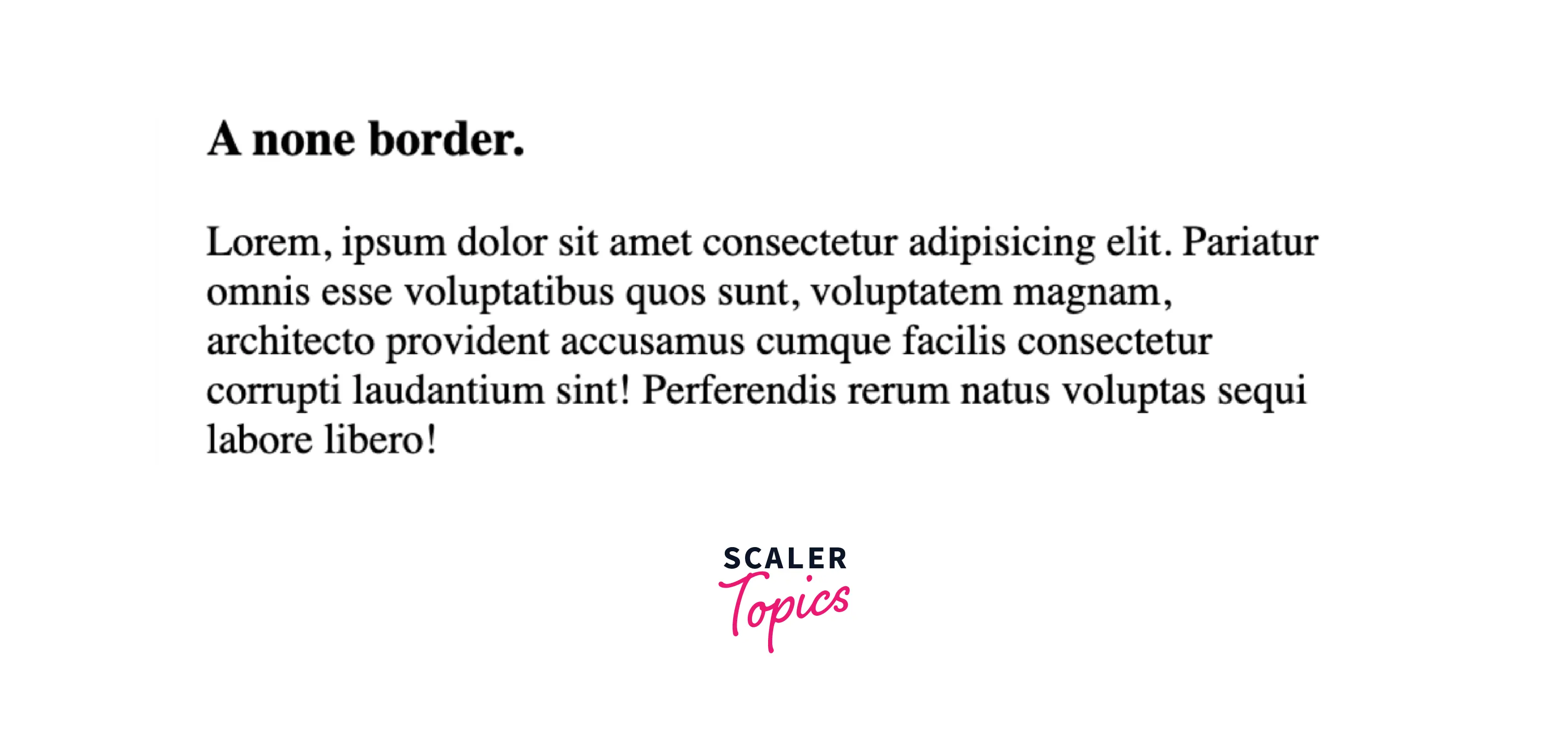
If we provide the border-style property with this value, it displays no border. There will be no border displayed unless there is any background-image. The computed value of border-width of the same side will be 0, even if the value specified for the border-width is something else. the none value has the lowest priority in the case of the table cell and border collapsing, that is if any other conflicting border is also given, then this none value border will be displayed. This value is similar to hidden.
Syntax:
Example:
Let us look at an example of the none border style in CSS for a better understanding.
Code:
Output:
Explanation:
Let us understand the above code :
- In the above code, the body block consist of two headings and a paragraph with the class name "none".
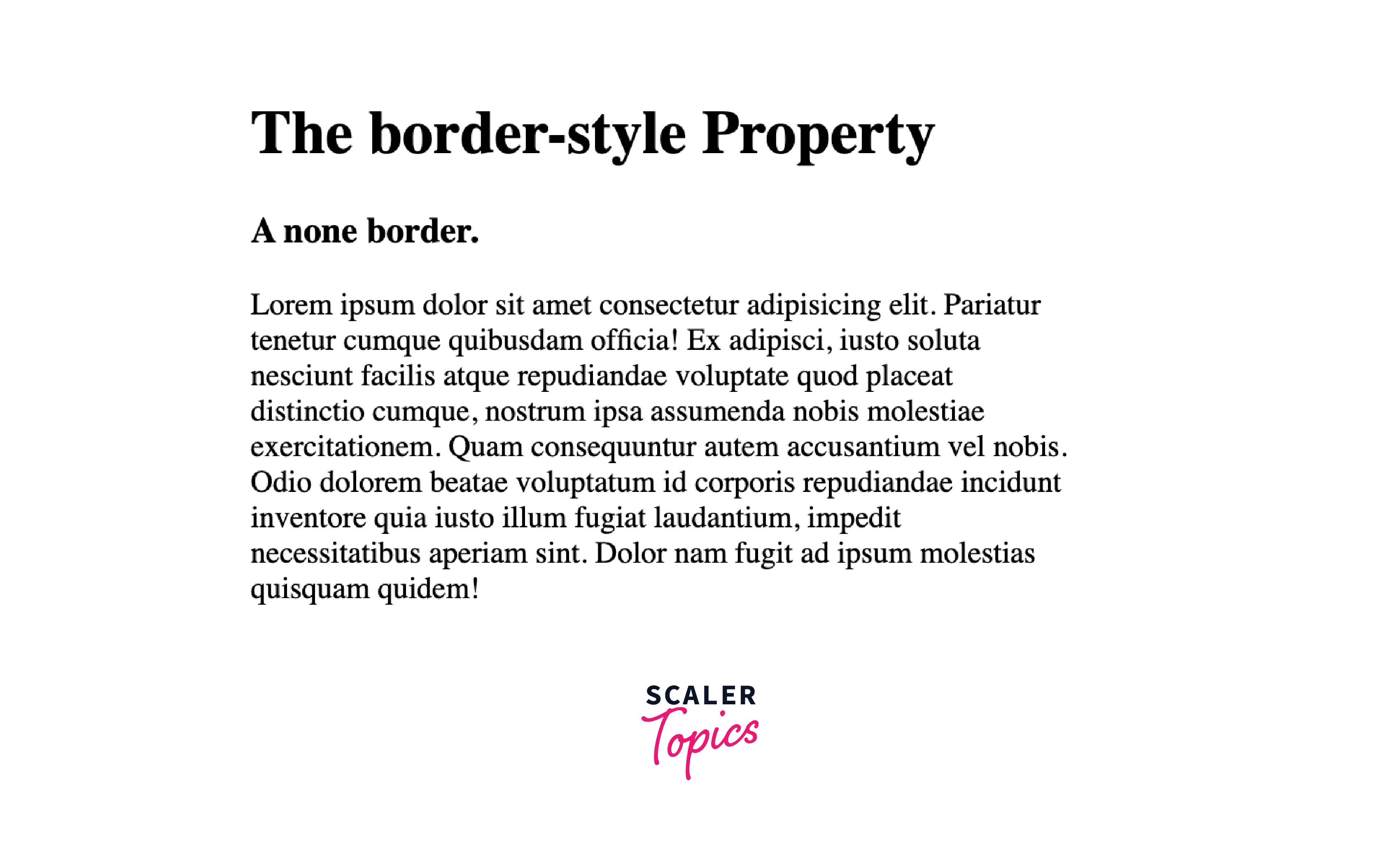
- In the head block we have applied the Internal or Embedded CSS, in which we have done the styling of "none" class paragraph which includes the width and border-style and we can observe we have also included the border-width. Still, it is not affecting the border's width and the border is not displayed.
- We have set the border-style value as none, and we can see how the border style will make the border displayed as none.
Hidden
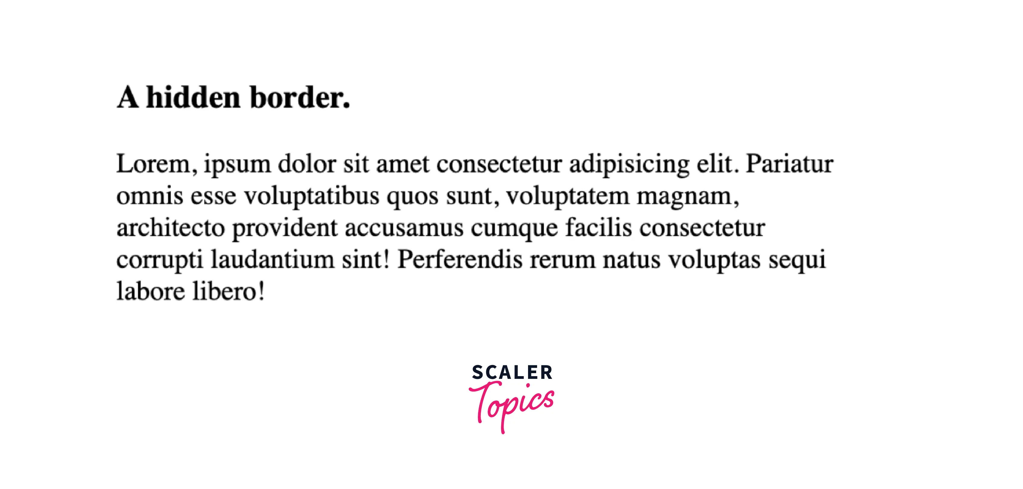
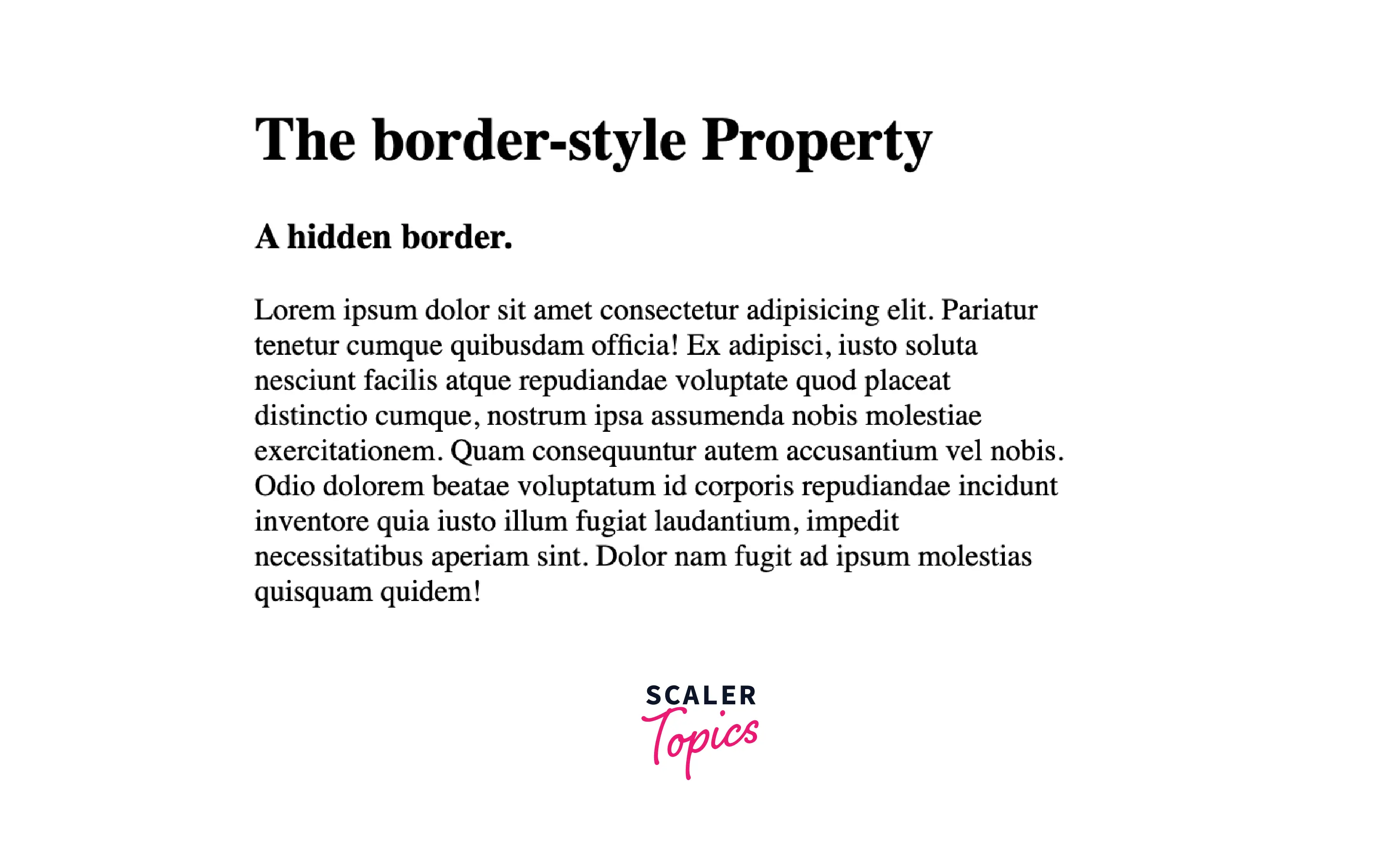
If we provide the border-style property with this value, it displays no border. There will be no border displayed unless there is any background-image. The computed value of border-width of the same side will be 0, even if the value specified for the border-width is something else. the none value has the highest priority in the case of the table cell and border collapsing, however, if any other conflicting border is also given, then this hidden value border will be displayed. This value is similar to none.
Syntax:
Example:
Let us look at an example of the hidden border style in CSS for better understanding.
Code:
Output:
Explanation:
Let us understand the above code :
- In the above code, the body block consist of two headings and a paragraph with the class name "hidden".
- In the head block we have applied the Internal or Embedded CSS, in which we have done the styling of "hidden" class paragraph which includes the width and border-style and we can observe we have also included the border-width with some value. Still, it is not affecting the border's width and the border is not displayed.
- We have set the border-style value as hidden, and we can see how the border style will make the border displayed as none.
CSS Border Color Property
To change the color of the surrounding border of any content we need this CSS border-color property. We can set the color of the border using the color name, hex value, or RGB value. If there is no color specified to any border, the border will inherit the color of its content itself.
We can change the color individually of the bottom, left, top, and right sides of the border of an element using some properties, let us discuss them.
- border-bottom-color: This property changes the color of the bottom border.
- border-top-color: This property changes the color of the top border.
- border-left-color: This property changes the color of the left border.
- border-right-color: This property changes the color of the right border.
Example:
Let us look at the example of the CSS border-color property, for a better understanding.
Code:
Output :

Explanation:
Let us understand the above code :
- In the above code, the body block consist of two headings and a paragraph with the class name "hidden".
- In the head block we have applied the Internal or Embedded CSS, in which we have done the styling of "hidden" class paragraph which includes the width, border-style, border-width, and also the border-color.
- We have set the border-color value as red, and we can see how the border color will make the border displayed in the color given as a value in the border-color property (red in this case).
CSS Border Width Property
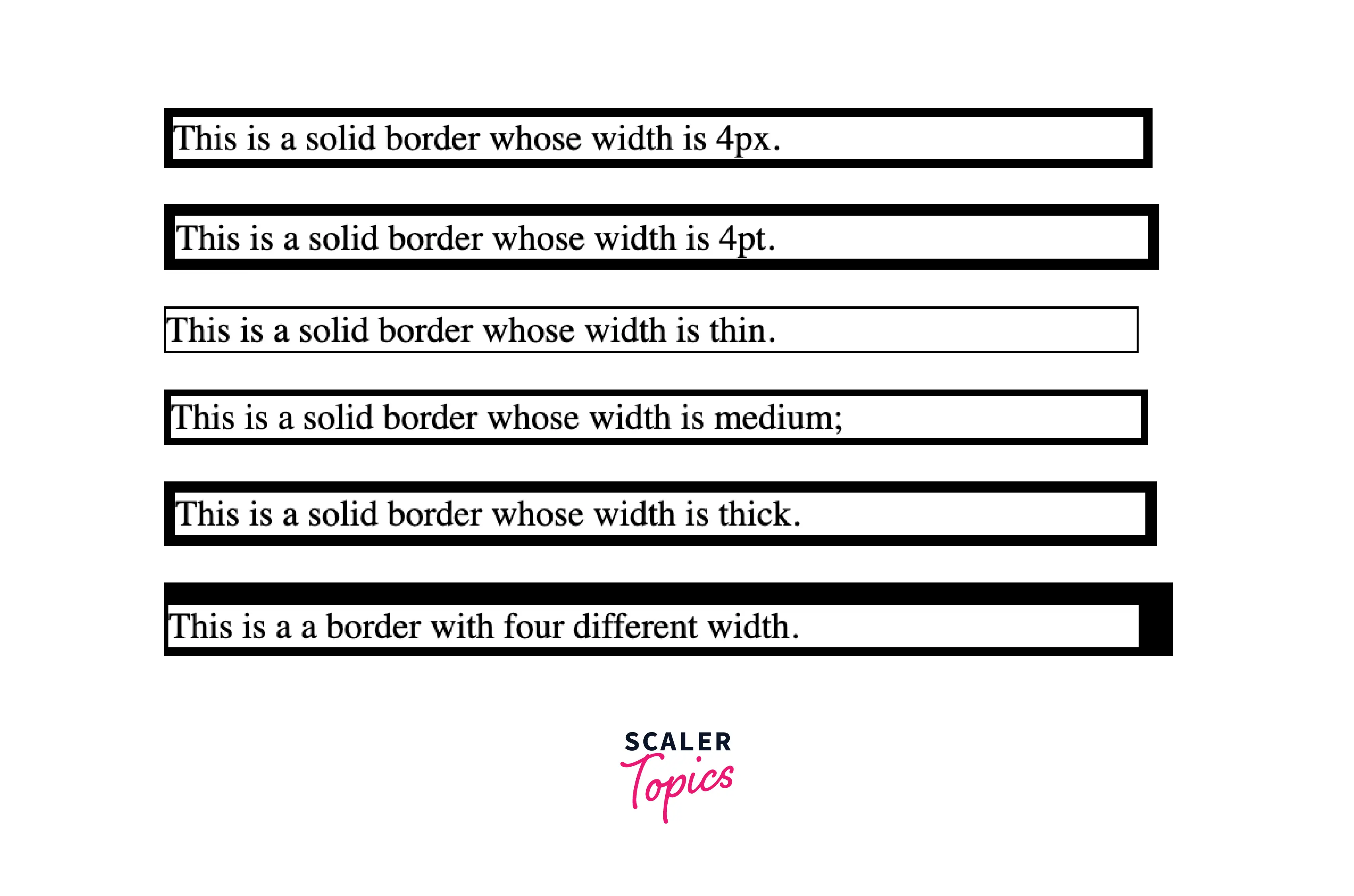
To change the width of the surrounding border of any content we need this CSS border width property. We can set the width of the border to thin, medium, or thick, or it could be either a length in px, pt, or cm.
We can change the width individually of the bottom, left, top, and right sides of the border of an element using some properties, let us discuss them.
- border-bottom-width: These property changes the width of the bottom border.
- border-top-width: These property changes the width of the top border.
- border-left-width: These property changes the width of the left border.
- border-right-width: These property changes the width of the right border.
Example:
Let us look at the example of the CSS border-width property, for a better understanding.
Code:
Output:
Explanation:
Let us understand the above code :
- In the above code, the body block consists of four paragraphs with their class names "width-px", "width-pt", "width-thin", "width-medium", "width-thick", "width-dir".
- In the head block we have applied the Internal or Embedded CSS, in which we have done the styling of all the classes of paragraph which includes the width, border-style, and also the border-width.
- We have set different border-width values for different classes of paragraph, and we can see how the border width will make the border displayed in the width given as a value in the border-width property.
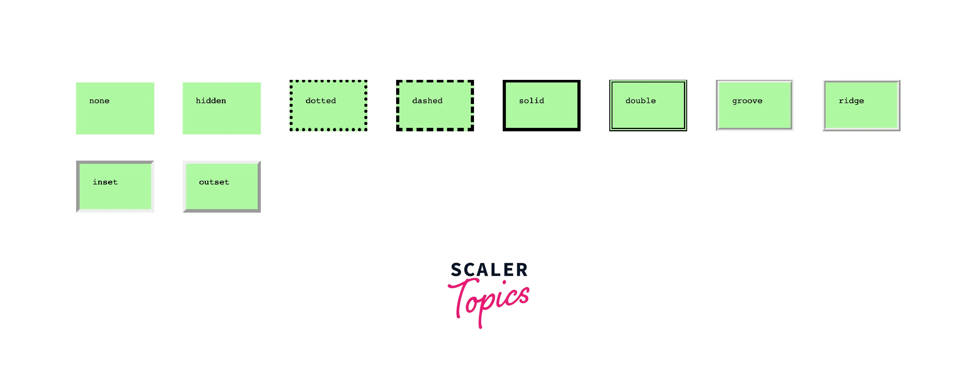
Example - Demonstration of the Different Border Styles
Let us look at an interesting example, which will include all the above value properties of the border style in CSS.
HTML Code:
CSS Code:
Output:
Conclusion
In this article, we learned about the border types in CSS. Let us recap the points we discussed throughout the article:
- Border is a shorthand property of CSS, which is used to set a border on any content in CSS. Basically, the different properties provided by the border in CSS allow us to set the width, color, and style of the border.
- The border-style property may be defined by using one, two, three, or four values.
- When there is only one value given to the border style property, then all four sides are applied with the same style.
- When there are two values given to the border style property, then the top and bottom are applied with the first value, and the left and right are applied with the second value.
- When three values are given to the border style property, then the top is applied with the first value, the left and right are applied with the second value, and the bottom is applied with the third value.
- When there are four values given to the border style property, then the top, right, bottom, and left are applied with the values in clockwise order.
- We have seen different border style properties like dotted, dashed, solid, double, groove, ridge, inset, outset, none, and hidden, we have also learned about them in detail with examples.
- To change the color of the surrounding border of any content we need this CSS border-color property.
- We can set the color of the border using the color name, hex value, or RGB value.
- To change the width of the surrounding border of any content we need this CSS border width property.
- We can set the width of the border to thin, medium, or thick, or it could be either a length in px, pt, or cm.
- We have also seen an example that includes all the border style property values in CSS.
