How to Build a Bottom Navigation Bar In Flutter?
Explore the versatility of Flutter's BottomNavigationBar, a pivotal widget for seamless app navigation. This guide delves into its functionality, highlighting its role in swiftly transitioning users between distinct content categories like games, apps, and movies. Learn how to integrate and customize this widget to enhance user experience, whether on compact mobile screens or expansive displays. As bottom navigation gains traction in app design, mastering its implementation in Flutter becomes essential for developers aiming to deliver intuitive and efficient user interfaces.
What is BottomNavigationBar in Flutter?
The BottomNavigationBar is a utility in Flutter, which eases the navigation of the user to multiple screens within an application. As we all know, navigation is an essential part of all mobile applications. We use the Bottom Navigation Bar to provide a nicely designed navigation system. This improves the users' experience of using the app significantly. Flutter also provides various other widgets such as the Drawer and TabBar etc. for navigation but the Bottom Navigation Bar is still the most commonly used utility used to switch between different screens or pages in the applications. The bottom navigation bar can alternatively be used to perform some different actions like showing menus or performing some actions etc. The BottomNaviogationBar comes with various customization options.
Properties of the BottomNavigationBar Widget
There are several properties of the Bottom Navigation Bar which allow us to customize how it appears to the users and how it behaves in our application. The properties of the bottom navigation bar allow the users to maintain a fixed or consistent visual style for their Flutter application and make it easier for the user to use that application. Now we will proceed to look at the six most important properties of the Bottom Navigation Bar which are items, currentIndex, onTap, iconize, fixedColor, and type etc.
items
The list of the items that appear in the BottomNavigationBar widget is defined by the item's property. Each item of the Bottom Navigation Bar has the properties such as title, icon, and activeColor. For specifying the text that appears below the icon, we use the title property of the bottom navigation bar. The icon property is used to specify the icon which is displayed for that particular item on the navigation bar while the activeColor property is used to specify the color of the icon and text when the item is in the selected state. The number of items in the BottomNavigationBar is limited to between two and five. The reason behind not allowing too many icons to be put into the BottomNavigationBar is to ensure that its appearance is not too cluttered. Each of the items is represented by a BottomNavigationBarItem object.
currentIndex
We need to specify to the user which item in the BottomNavigationBar widget is currently being used. The currentIndex property is used for the same purpose. It is used to specify the index of the currently selected navigation item in the bottom ntion bar flutter Widget. When a user taps on some different item in the bottom navigation bar then the currentIndex is updated to represent the new selection. For example, in all the modern-day applications that we use such as Instagram, Zomato, etc. we can easily know the currently selected index of the bottom navigation bar by just looking at it. It is a very crucial feature as it facilitates us in knowing what page or screen we are on currently so that we can decide our further course of action.
onTap
We need to define the action which will be performed when the user taps on an item in the BottomNavigationBar widget, the onTap property is used for that purpose. The onTap is nothing but a callback function that is called when a user taps on a navigation item in the bottom navigation bar widget. When the user clicks on the item then the pre-defined function is performed by the onTap function. We Flutter Developers can use the onTap property to perform a wide range of actions. Apart from navigating to a new screen, the onTap property is also used for various other tasks such as: displaying a dialog box, refreshing the current screen, etc. The onTap function is nothing but a callback function which is defined as a function or a method of the current widget.
iconSize
We need to define the size of the icons that appear as the items on the BottomNavigationBar. There is also a need to customize the size of any particular item to make it more appealing to the user. The iconSize property is used to accomplish both objectives. The developers have the option to either set the iconSize to some specific value in pixels or a dynamic value based on the current screen size or device orientation i.e. landscape mode or portrait mode. We need to keep the iconSize sufficiently large as makes it easy for the user to interact with the BottomNavigationBar. When we have to add a large number of icons then we use a smaller iconSize. The default value of the iconSize property provided by Flutter is 24.0. However, we can also adjust it to suit the needs of our application.
fixedColor
The developers need to fix the color of a particular item in the bottom navigation bar flutter widget such that it remains consistent and does not change during the application. Also, the user must be aware of which item has been currently selected by him. The fixedColor attribute of the bottom navigation bar is used to fulfill this objective. The developer can either set a fixed value or some dynamic value which is shown according to the need when the user reaches a particular screen in the application. The main purpose why the fixedColor property is used is to maintain a consistent visual style throughout our application. When we set the fixedColor property then the color of the selected item is the same as that of the fixedColor and the color of the unselected items is a muted version of the fixed color.
type
We need to specify the layout of our BottomNavigationBar. There are two types of BottomNavigationBar i.e. fixed, shifting, and labeled. In the fixed type, it highlights the selected item and displays all the items in the BottomNavigationBar every time whereas in the shifting type, only the selected item is displayed and all the other items are hidden. The hidden items are shown once the user taps on the "more" icon. In the labeled type, the icons are labeled according to their utility and function in the application. The usage of the type property is basically to let the developer choose the type of BottomNavigationBar based upon his needs and in such a manner that it best suits their app's design and functionality.
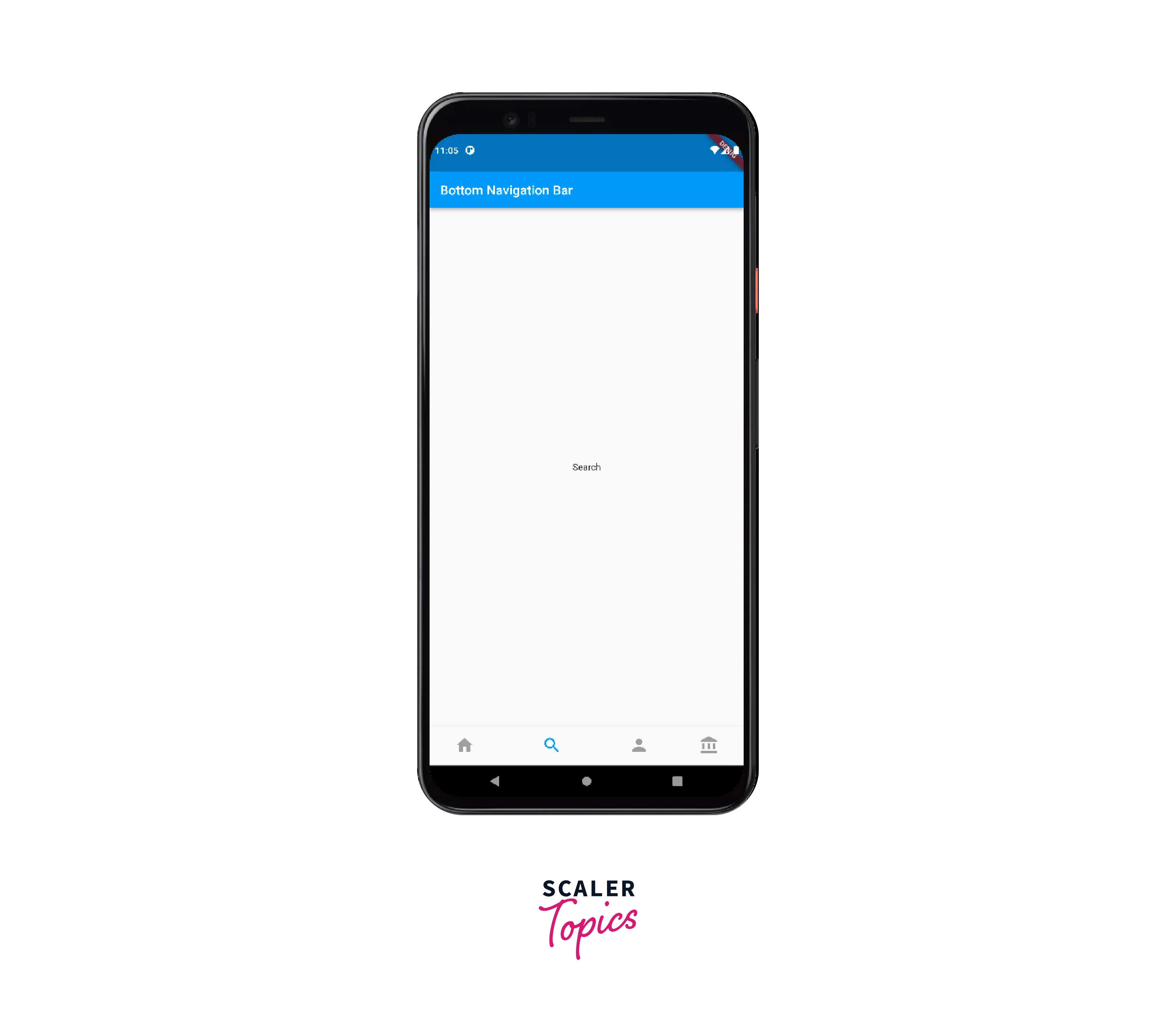
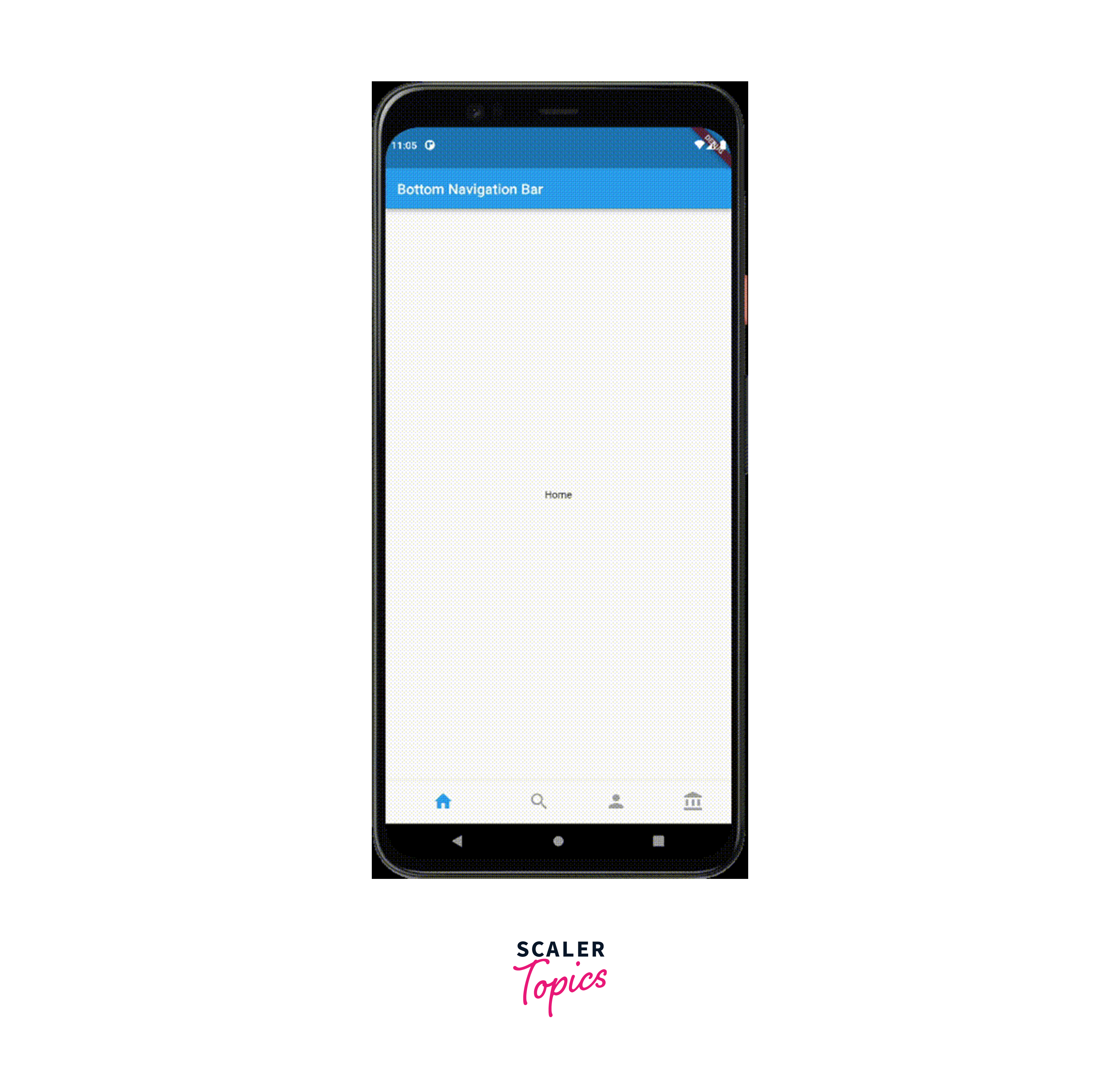
Example App Showing BottomNavigationBar
We have created a few files named properties.dart, tabbarwithbottomnavigationbar.dart, HideOnScroll.dart and scrolltohidewidget.dart etc. in the lib folder our repository to demonstrate the examples of the use cases of the bottom navigation bar.
a. Customizing the BottomNavigationBar
We can customize the BottomNavigationBar by changing the following properties as desired. Look at the code below and see how it's done.
- Background color
- Elevation
- Icon size
- Mouse cursor
- Selected item
- Unselected items
- Removing labels
- Highlighting the selected item
b. Preserving the state of Pages
We can preserve the state of pages while using the Bottom Navigation Bar flutter widget by following the steps shown below :
- First of all, we create an Indexed Stack widget with a list of children widgets. The children widgets are the pages that we want to include.
- Then we need to wrap the Indexed Stack widget with a PageStorage widget. It is a widget that allows us to save the state of the children's widgets and also to restore them whenever needed.
- In the onTap property of the BottomNavigationBar, we need to update the currentIndex to the new index.
- The setState function is now called to rebuild the widget tree.
- We need to set the index property of the Indexed Stack Widget to the currentIndex so that the current page gets displayed to the end user.
- We need to set the key property of each page widget to a UniqueKey() to ensure that it can identify the widgets and restore their state when they are displayed again.
If we change the search page into a Stateful Widget then we can demonstrate this even better :
Github Repository link for the implementation : https://github.com/shashwatssp/scaler_bottom_navigation_bar/blob/master/lib/helper.dart
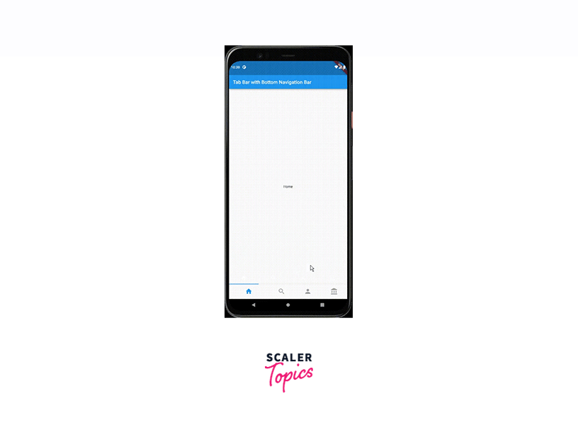
c. Including TabBar with Bottom Navigation Bar
We can follow the following set of steps to include TabBar with the Bottom Navigation Bar
- We initialize a new TabController and assign it to _tabController.
- Each Page will represent a different tab.
- We link the TabBarView to the _tabController
- We set the body property of the scaffolf to a TabBarView.
- The task of the onTap callback function is to update the _currentIndex and _tabController.index variables when a new tab is selected.
- We set the bottomSheet property of the Scaffold to a TabBar widget that displays icons for each tab.
- the _currentIndex variable is updated by the onTap callback function when a new tab is selected.
Here is the code for the same :
d. Hiding Bottom Navigation Bar on Scroll
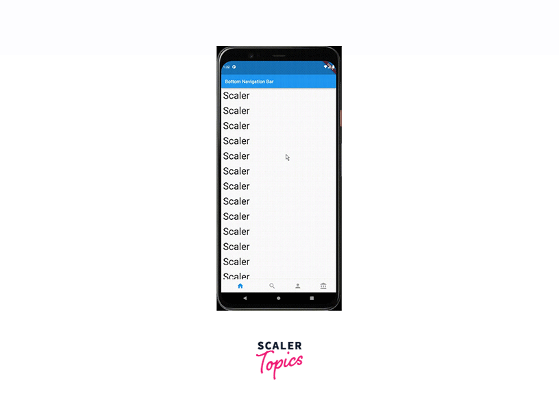
We will see how to implement the feature of Hiding the Navigation Bar on scrolling. here, we have the Properties widget as our main widget. It has a ListView.builder() as the body with a total of 25 items. We wrap the bottomNavigationBar in a ScrollToHideWidget widget.
We will discuss the ScrollToHideWidget widget in depth after showing the code for the HideOnScroll widget.
The ScrollToHide Widget :
- The ScrollToHideWidget is the most important widget as far as the implementation of hiding the Bottom Navigation Bar on Scroll is concerned. It is nothing, but a custom widget that takes in a child widget along with a ScrollController.
- The ScrollController is used to control how the ListView.builder() behaves upon scrolling.
- We also have an optional Duration parameter to control the animation duration when we are showing or hiding the bottom navigation bar.
- We have a variable named isVisible inside the _ScrollToHideWidgetState*, it is essentially a boolean that determines whether the navigation bar should be hidden or shown to the user.
- We have an initState() function which sets up a listener for the ScrollController. The function of the listener is to keep on listening for the changes and every time the user scrolls, it calls the listen() function.
- When the user scrolls in the forward direction (towards the end of the list), show() function is called, isVisible is set to true and the navigation bar is displayed.
- When the user scrolls in the reverse direction (towards the beginning of the list), the hide() function is called, the isVisible is set to false and the navigation bar is hidden.
- We also have an AnimatedContainer that is used inside the build() function of _ScrollToHideWidgetState. The role of the AnimatedContainer is for animating the height of the bottomNavigationBar based on the isVisible variable.
- If isVisible is true then the height of the navigation bar is set to kBottomNavigationBarHeight where kBottomNavigationBarHeight is a constant value and is provided by Flutter.
- If isVisible is false, the height of the navigation bar is set to 0 which effectively hides it.
Conclusion
- The BottomNavigationBar widget is a very important component in Flutter which allows the developers to provide the navigating functionality to their users.
- It provides various properties which let the developer provide an attractive and easy-to-use interface to the end user.
- Some of the properties provided by the BottomNavigationBar are currentIndex, onTap, iconSize, fixedColor, type, etc.
- Preserving the state of pages is a very crucial thing as far as mobile applications are concerned. It is achieved by using the IndexedStackWidget which helps in preserving the state of pages even when the user navigates away from them.
- We can use the TabBar with the BottomNavigationBar to provide a way better user experience and attractive appeal.
- In order to give a more immersive experience to the user, we hide the BottomNavigationBar on scrolling. It provides a cleaner look to the user Interface.
- This is achieved by using the AnimatedContainerWidget and adjusting the position of the Navigation Bar based on the scroll direction.
Overall we can say that the BottomNavigationBar is an amazing tool in Flutter for the developers helping them in order to provide a great, attractive, easy-to-use and immersive experience to the end user. These qualities of the BottomNavigationBar have made it an indispensable part of mobile application development using Futter.