How To Create A Modal Bottomsheet In Flutter?
Overview
 Bottom Sheets in Flutter are widgets that are like paper sheets that open up in front of the view and allow users to perform some actions. Bottom Sheets are widgets that open up in a different widget tree that is already there. What do we mean by that, we'll just discuss that in a moment.
Introduction
In this article, we are going to go into detail about bottom sheets and figure out those pesky little details that sometimes we overlook when building applications in search of speed.
Things like controlling details like the shadow color of a bottom sheet or understanding how to control the space used by the bottom sheets or avoiding safe areas when dragging the sheet.
In this article we will understand about different types of bottom sheets there are in Flutter and figure out how to create them.
Types of Bottom Sheets in Flutter
When defining BottomSheets in Flutter, we have 3 options to create BottomSheets from.
- Standard Bottom Sheet
- Modal Bottom Sheet
- Expanding Bottom Sheet
These BottomSheets provide various scenarios where we can use these widgets with different configurations that provide different outcomes.
Standard Bottom Sheets
Standard BottomSheets, also known as persistent bottom sheets, are widgets that provide a way to communicate with the app without restricting the user from interacting with the main content of the app. This type of bottom sheet usually resides at the bottom of the screen and opens different pages in the app. These bottom sheets in Flutter do not scroll down usually on user interaction and do not hide. They can expand as well to provide the user with more content on the screen for user actions.
This is how you create a persistent bottom sheet in Flutter. It is pretty simple.
Bonus Content:
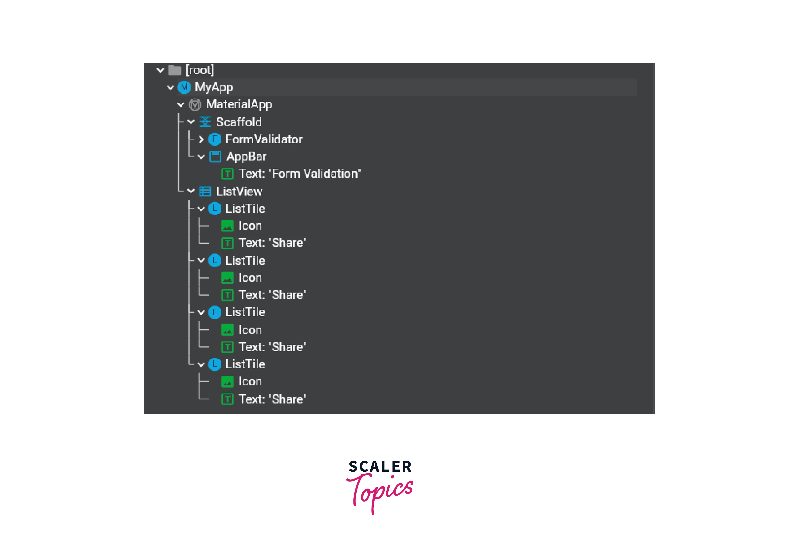
When Flutter opens a persistent bottom sheet, it creates it under the Scaffold. What it means is, it creates a new child of Scaffold and adds it to the tree. So when you open a persistent bottom sheet, it adds a back arrow to the app bar if there is any, giving us access to dismissing the sheet on back navigation.
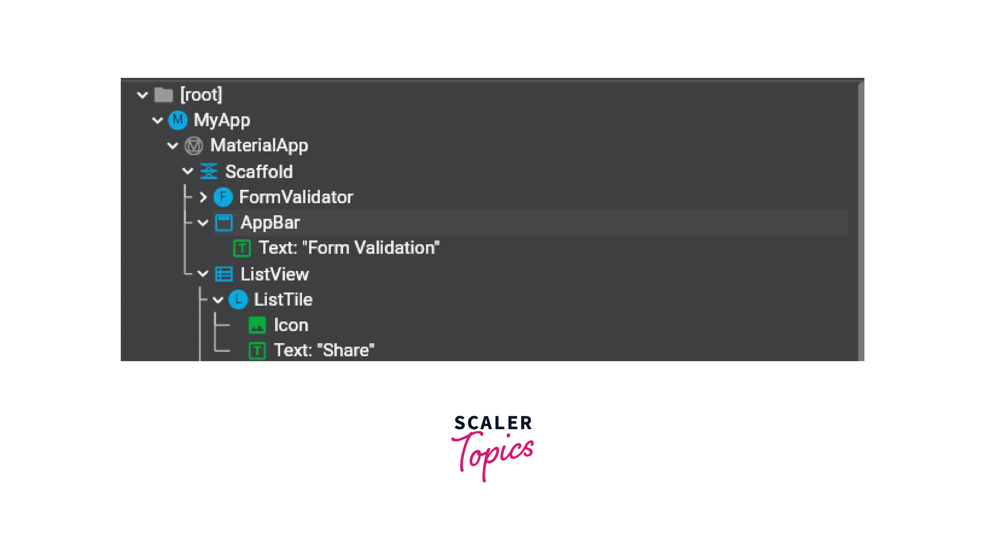
So when you open a persistent bottom sheet, it creates a child under Scaffold (Listview, here) as you can see in the image above.
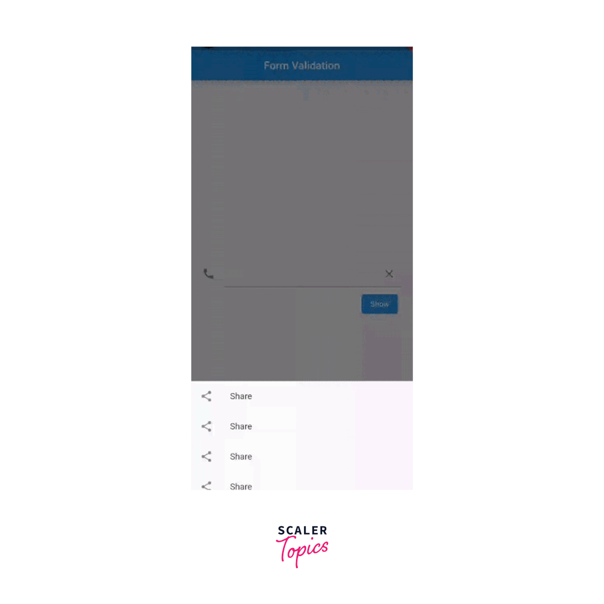
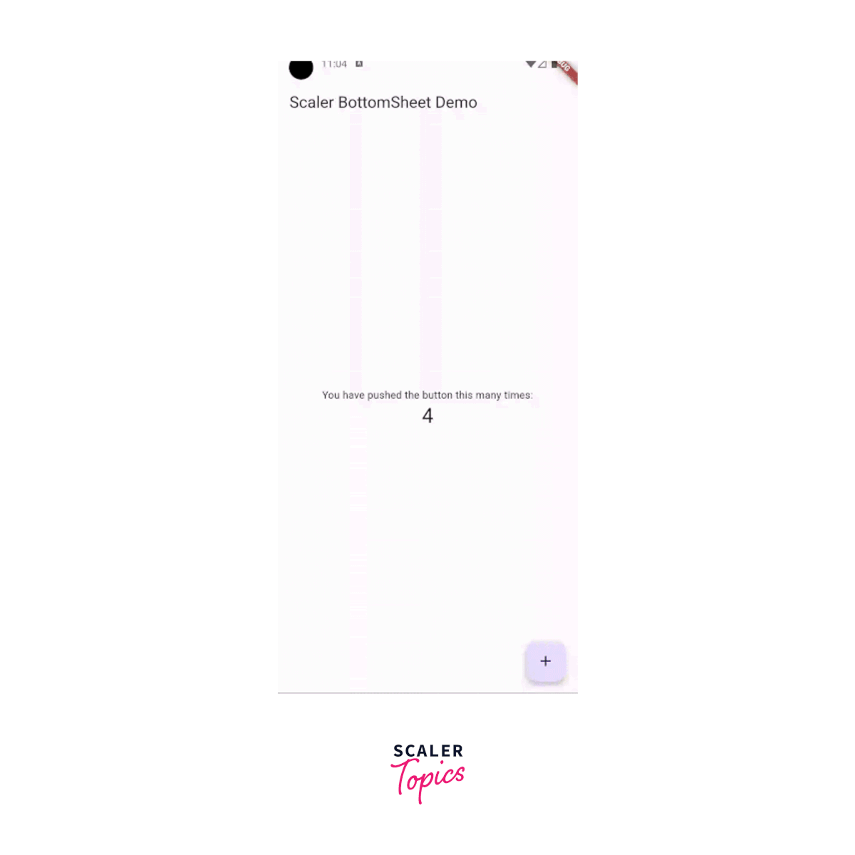
This is how it looks right now.
Modal Bottom Sheets
Modal Bottom Sheets are sheet-like widgets that, then come up on the screen, don't allow users from interacting with the main part of the app. They usually open on some user action and the user must dismiss them by either scrolling them down or clicking on part of the user interface hiding behind the bottom sheet, by default. They can expand, providing users with more content on screen for more user actions. When the modal bottom sheet comes up, there is usually a `translutranslucent-black that appears making the appearance of the user interface not clickable.
This is how you create a modal bottomsheet in Flutter. It's pretty similar to how we create a persistent `bottom sheet.
Bonus Content: When Flutter opens a modal bottom sheet, it creates it under the MaterialApp and not Scaffold. What it means is, it creates a new child of MaterialApp and adds it to the tree. So when you open a modal bottom sheet, there is no back arrow added to the app bar since it is not in the current widget tree. Flutter creates a separate tree altogether.
So when you do something like this,
to get the current route name, it returns null since it does not know the current navigation.
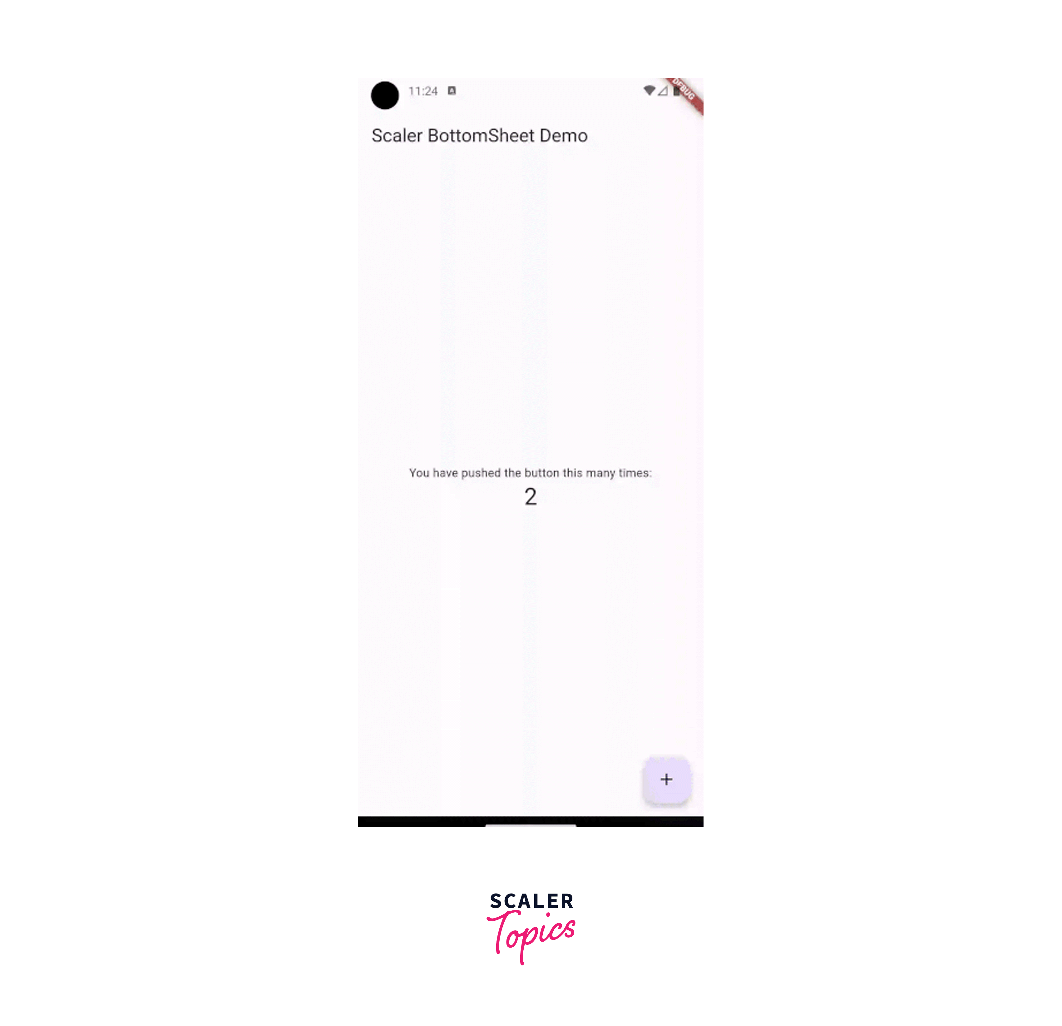
This is how it looks right now:
Expanding Bottom Sheets
Expanding Bottom Sheets in Flutter are widgets that are a hybrid of both Modal Bottom Sheets and Persistent Bottom Sheets. This kind of bottom sheet can scroll in the vertical direction and this functionality can be achieved using DraggableScrollableSheet.
This custom widget created by the Flutter team allows us to create a scrollable sheet in no time and we can scroll through the sheet. This widget gives us the capability to show a small fraction on the screen and displays more content once the user starts scrolling.
To create an expanding bottomsheet, we can either open a modal bottomsheet or an expanding bottomsheet.
This is how it looks right now:

What is a Modal Bottom Sheet?
This is what Flutter Documentation says what a modal bottom sheet is:
A modal bottom sheet is an alternative to a menu or a dialog and prevents the user from interacting with the rest of the app.
A modal bottom sheet in Flutter provides multiple properties to update its functionality, including but not limited to, making the sheet scrollable or disabling the dragging of the sheet.
What is a Modal Bottom Sheet Used For?
A modal bottom sheet comes in handy when you want to perform some action that is not intrusive enough like a dialog but still provides a way to communicate with the application.
Examples could be:
- When you want to confirm an action that the user might have selected by mistake. For example, deleting a file.
- When you would want to present a list of options to select from. For example when the user wants to select a picture, the same can be done either by clicking a picture or selecting one from the gallery.

The showModalBottomSheet Function
The showModalBottomSheet function is a static function that can be called anywhere from the dart code where BuildContext is accessible. It has a return type of Future<T?> which means that when the bottom sheet in Flutter closes it can return a Future which can be anything nullable when the call to Navigator.pop is made.
If let us suppose we want to return a String when the sheet closes, we would write the return type as Future<String>. And since this String return value can be nullable, it is represented as Future<String?>.
So this means you can await the showModalBottomSheet function and get results back.
showModalBottomSheet Properties
When you click on the showModalBottomSheet function, you get to its documentation and you can see all the arguments this function takes.
Below is the function signature.
Let us start exploring them one by one.
- context: Build Context is a required field and it is used when this method is called. It is used to get the Navigator State and the Theme. If you check the documentation, you will realize that ModalBottomSheet is just a specialized version of a Route that is pushed onto the Navigator.
- builder: It is also a required field and it is used to return a Widget that will be displayed inside the bottomsheet in Flutter. The bottomsheet will wrap inside the Material widget.
- backgroundColor: As the name suggests, it adds a background color to the bottom sheet. It is a nullable argument meaning you can choose to not pass a value and Flutter will choose it according to your theme.
- elevation: This is the shadow that appears behind the bottomsheet. You can customize it as a double value and it must not be negative. This is also a nullable field and if you don't provide a value, it will default to 0.
- shape: ShapeBorder class is used to define the borders and shapes to the bottomsheet in Flutter. This class handles how to add multiple borders together. Subclasses define various shapes, like circles (CircleBorder), rounded rectangles (RoundedRectangleBorder), continuous rectangles (ContinuousRectangleBorder), or beveled rectangles (BeveledRectangleBorder).
- clipBehavior: Sometimes when you define custom shapes to your bottomsheet, like rounded corners, the content sometimes goes out of the sheet. This is where ClipBehavior comes into play. ClipBehavior defines if you want to cut the content out of the view when the custom shape is involved or if you want to show the content.
- constraints: As the name suggests, this property constrains the height and width of the bottomsheet. It defines the minimum and the maximum sizes. Normally when you open a bottom sheet, it covers the entire width. So when you are working with larger-width screens, you would want to restrict the width to some part of the screen. This is where this property comes into play.
- barrierColor: This is the color that comes on the screen when the bottom sheet is in view. So when the bottom sheet opens up, normally there is a black scrim. That color is controlled by barrierColor. It defaults to Colors.black54.
- isScrollControlled: Set this property to true when the modal bottomsheet has a scrollable child like a Listview or a GridView. It defaults to false.
- useRootNavigator: Sometimes you are inside a nested Navigator. This happens in situations like a TabBar. You have pages A and B. So pages A and B use a nested Navigator. But the route where the TabBar is hosted uses the root Navigator. When you open a bottom sheet from page A or page B, and you use useRootNaviagtor as false, the bottomsheet opens inside the respective page. But when you set useRootNaviagtor as true, it opens above both the pages and covers the screen.
- isDismissible: This value defaults to true if not provided. If set to false, when you click on the scrim (or the shadow), the bottomsheet doesn't scroll down or dismiss itself. This can come in handy when you want to close the bottomsheet only on a specific condition.
- enableDrag: This value also defaults to true. If set to false, the bottomsheet is not draggable up and down and dismissed.
- useSafeArea: If useSafeArea is false, the bottom sheet is aligned to the bottom of the page and isn't exposed to the top padding of the MediaQuery.
- routeSettings: This is an optional setting and can be helpful when you are observing the routes it was opened from. Since modalBottomSheet opens as a child of MaterialApp and not Scaffold, we can't get the route name when inside the bottomsheet. If you pass the route settings, you can fetch it. This field is also used to observe PopupRoutes within a NavigatorObserver.
- transitionAnimationController: If you want to control the enter and exit animations of the modal bottomsheet, you can pass in a transitionAnimationController and dispose of it when the controller is not needed.
- anchorPoint: A DisplayFeature can split the screen into sub-screens. The closest one to anchorPoint is used to render the content.
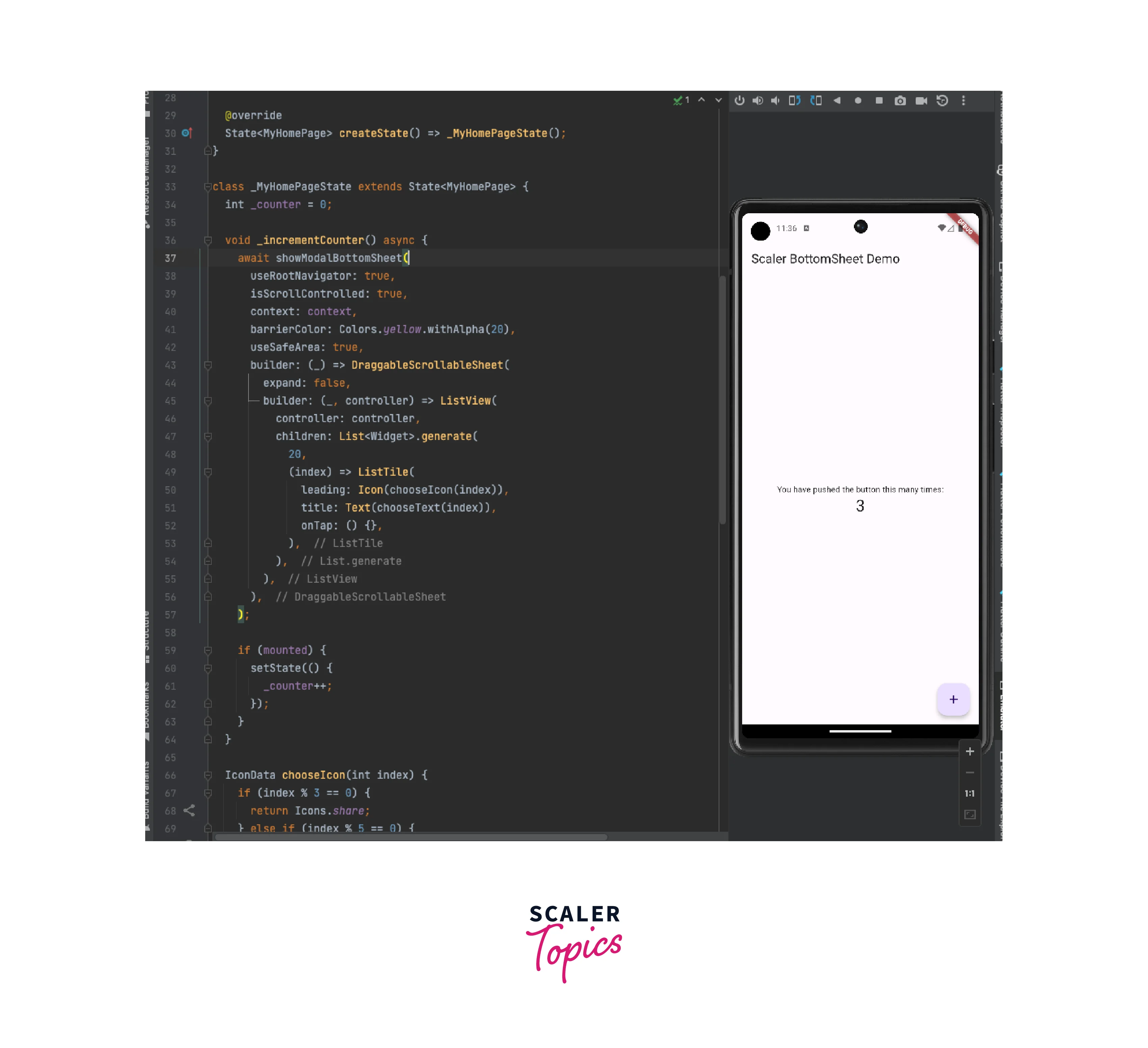
How to Create a Modal Bottom Sheet in Flutter?
Since we have already discussed what are the properties of the showModalBottomSheet function, it becomes pretty easy to create a modal bottomsheet.
What are we doing here?
- On clicking on Floating Action Button, we open a modal bottom sheet, using showModalBottomSheet.
- We have set isScrollControlled to true because the child of the modal bottom sheet is a DraggableScrollableSheet which is a scrollable child.
- We have set clipBehavior to Clip.antiAlias because we want to make sure that when we tap on the first List Tile, the ripple effect doesn't go out of the bottom sheet in Flutter.
- Passing in the required field, the build context, since it fetches the navigator state and the theme data.
- We have passed in the barrier color as Colors.yellow.withAlpha(20) and you will see in the GIF below that when the bottomsheet goes up, the shadow color behind the bottomsheet animates to yellow and back to white when the sheet is dismissed.
- We have also passed in useSafeArea as true to make sure that the bottomsheet doesn't overlap the status bar as you can see in the GIF below.
- And in the last, we have passed in the DraggableScrollableSheet as the WidgetBuilder which the BottomSheet pushes as a child of the Material widget.
- You can see we are waiting for the bottomsheet to close using the await keyword and once it is done, we check if the widget is mounted. And then we set the state with an increased counter variable. We check for mounted because we want to make sure there are no asynchronous gaps in the code.
This is how the app and the bottomsheet look right now:
If we were to remove the clipBehavior property from the function, this is how the bottomsheet will behave:
You can see in the GIF above that when clip behavior is removed, the ripple effect moves out of the content other than f bosheet'ssheet rounded corners.
Conclusion
-
In Flutter, bottom sheets are of 3 types, namely, Modal Bottom SheetPersistentnt Bottom Sheet and Expanding Bottom Sheet all providing developers with different functionalities.
-
A modal bottom sheet can be created using a static function provided by the Flutter SDK, showModalBottomSheet which takes in a context and opens a sheet from the bottom of the screen and is draggable by default.
-
A modal bottom sheet can be made scrollable with the help of the DraggableScrollableSheet widget which takes in a widget and by default offers a min-height and a max height. All scrollable widgets like SingleChildScrollView or ListView can go under that.
-
All the properties of a modal bottom sheet, for example, barrier color (scrim color), the shape of the bottom sheet, and padding insets can be used to customize the bottom sheet depending on the requirements.