CSS box-shadow Property
 FREE
FREE

Overview
The box-shadow property in CSS plays a vital role in making a visually pleasing website by adding shadow effects around the element. It is a considerably more practical and accessible option than adding images and background effects created by graphical editors like photoshop or Figma.
We'll learn about the box-shadow property by creating some beautiful shadow effects. We'll make some real-life examples of shadow effects, such as shadows around button elements or card components.
Why Should You Use The box-shadow CSS Property?
Creating a good-looking website is every developer's job, but paying attention to the small details sets you apart from the average developer. Those small details make your website more attractive and outstanding.
Let's take a simple example of the buttons with or without the box-shadow effect.
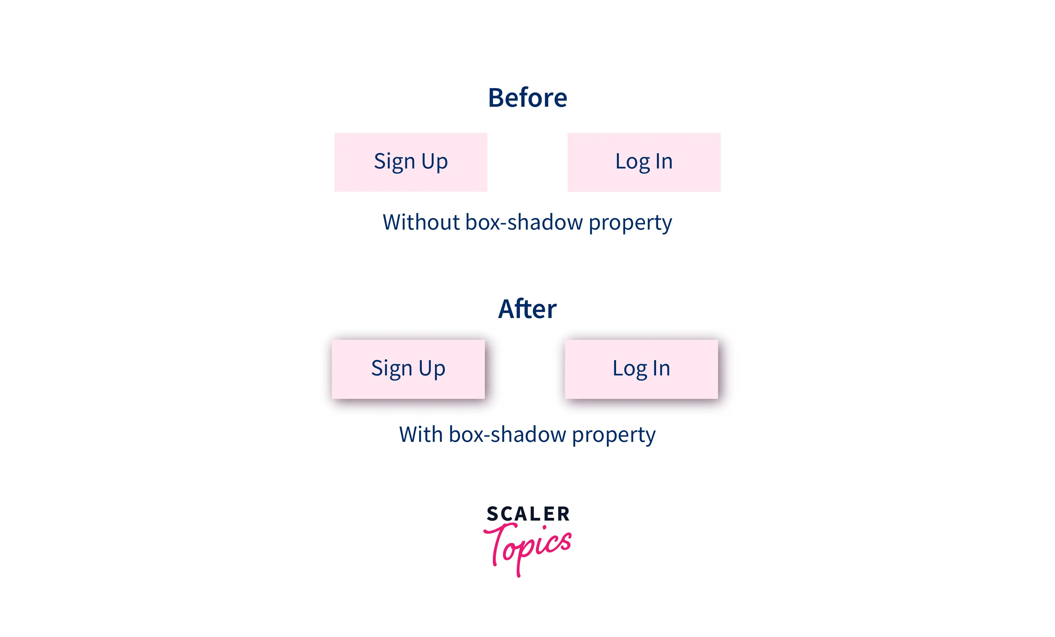 The latter buttons have more depth and look more attractive than before, and you can see that small details play a vital role in building excellent websites. You can quickly achieve this type of shadow effect through the box shadow CSS property.
Syntax
The box-shadow property adds shadow effects around the elements on a webpage.
The basic syntax of box shadow CSS property is:-
There are 5 important parts in the above code snippet. Let's understand what they mean:
| Syntax | Description | |
|---|---|---|
| inset | The keyword inset puts the shadow effect inside the element rather than outside of an element. | |
| Horizontal offset | We have a 1px Horizontal offset value in the above code snippet. This is the required value of the box-shadow property. A positive value creates a shadow on the right side, or a negative value pushes the shadow onto the left side. | |
| vertical offset | We have a 2px vertical offset value in the above code snippet. This is also the required value of the box-shadow property. A positive value creates a shadow on the bottom side, or a negative value pushes the shadow to the top side. | |
| blur radius | If the specified value is 0 (default value if not specified), then the box blur radius will be sharp. This value indicates how blurry the shadow effect will be. The higher the value, the more blurred it will be. We have a 3px blur radius in the above code snippet. | |
| spread radius | Spread radius means the Positive values will cause the shadow to expand and grow more extensively, and negative values will cause the shadow to shrink. We have a 4px spread radius in the above code snippet. If not specified, it will be 0. | |
| color | Box-shadow property takes any color value such as hex, RGB, HSLA, and even color name. We have specified color value in RGB form in the above code example. |
Now let's say we have two div elements with the same specified height or width, and we want to add a shadow around it or inside it. We have to select the element via CSS selectors and apply the box-shadow property to it.
The code snippet below shows simple div elements with given class names.
We select the div elements via their tag name and apply the 200px width and height on both.
The above code adds a shadow around and inside the element with the 1px horizontal offset, 2px vertical offset, 3px blur radius, 4px spread radius, and the end color value specified in the RGBA.
See below for the output of the above code:-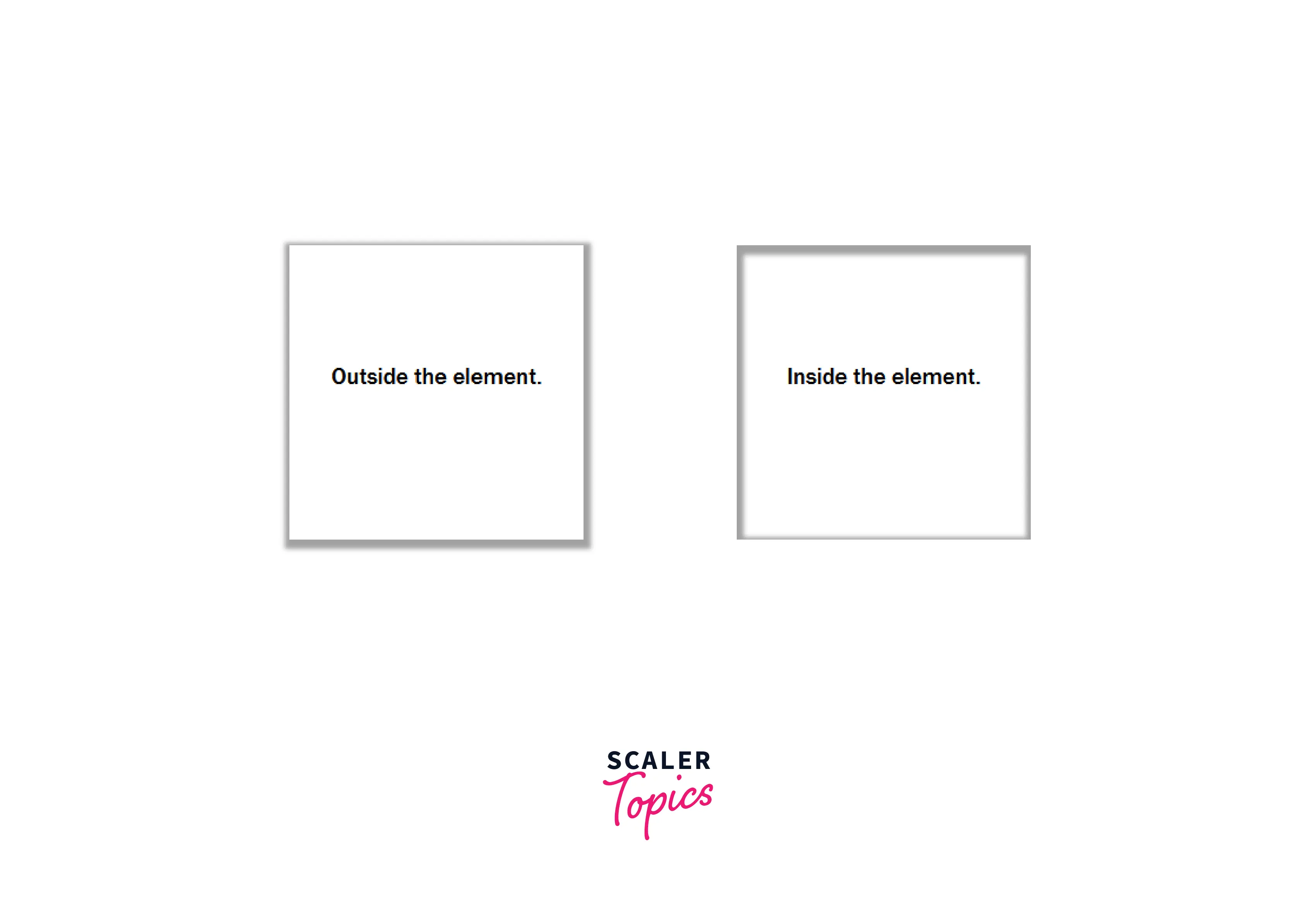
You can see the difference between with or without an inset keyword.
box-shadow in CSS
The box-model property takes several values and also supports variations of those values. You can draw shadows inside or outside the element and control the blur and spread radius of the shadow effect. So let's talk about each value in detail with examples:-
- Inset
As the name suggests, the inset keyword is used with the box-shadow property to create a shadow effect inside an element. It needs to be used when we want to add shadow inside an element. Otherwise, it is an optional value of the box-model property.
When we use the inset keyword, the shadow is drawn exactly inside the border but above the background and below the element's content.

In the above image, We have a log-in button with the text content Log In and gold background color. Then we added the shadow effect via the box-shadow property with the inset keyword to add the effect inside the element.
Because of our code below, the shadow effect is applied inside the entire element, and half of the background color is also covered, but the text content is still visible. This is proof that the inside shadow effect always occurs above the background color but below the element's content.
Example Code:-
We have not applied the spread value in the above code, which means it's, by default, 0.
- offset-x and offset-y
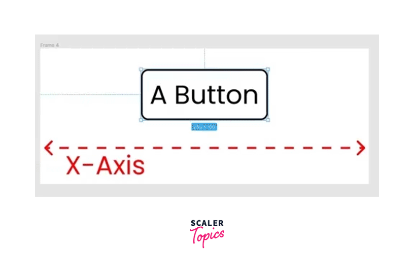
These are the two length values of the box-shadow property to set the offset on the x-axis and y-axis. Both values accept positive and negative values.
offset-x, also known as horizontal offset, specifies the shadow to the left or right of the element. A positive value creates a shadow to the right, while a negative value creates a shadow to the left.
A positive or negative value moves the shadow left and right on the x-axis. Take a look at the illustration below.
offset-y, also known as vertical offset, specifies the shadow to the top or bottom of the element. A positive value creates a shadow at the bottom, while a negative value creates a shadow at the top.
A positive or negative value moves the shadow bottom and top on the y-axis. Take a look at the illustration below.

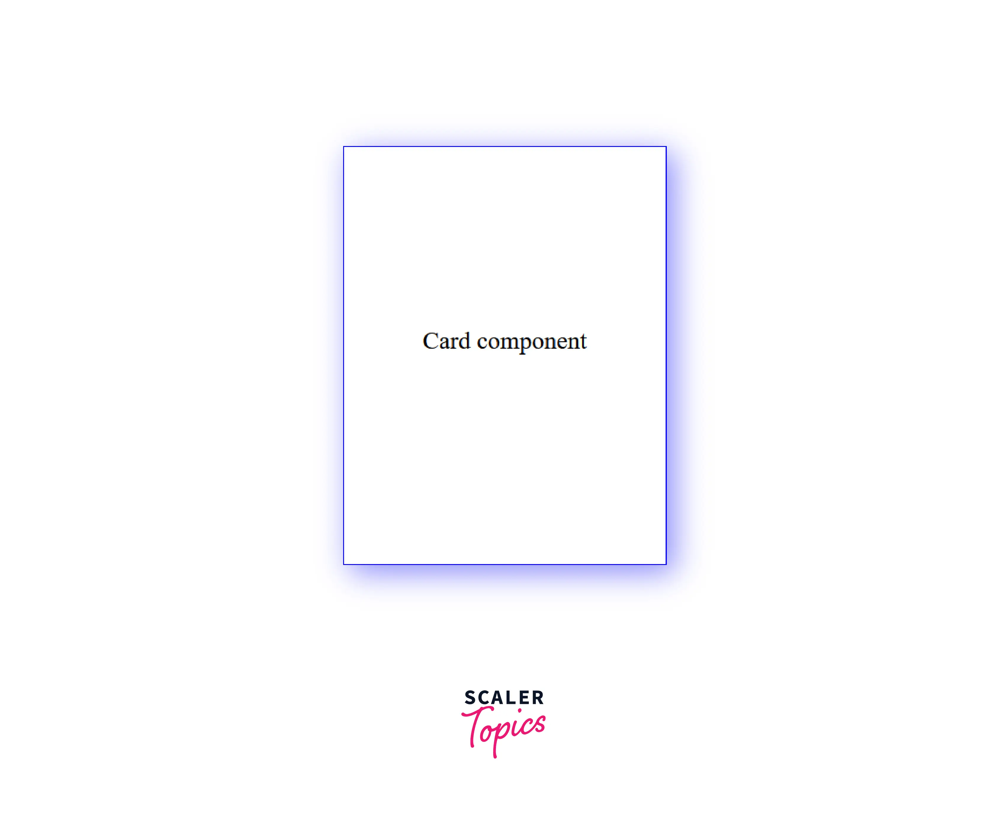
Now you know that offset-x controls the position of the shadow to the right and left, while offset-y controls the position of the bottom and top shadows. Let's take a combined example of both values to create a beautiful shadow around our card element.
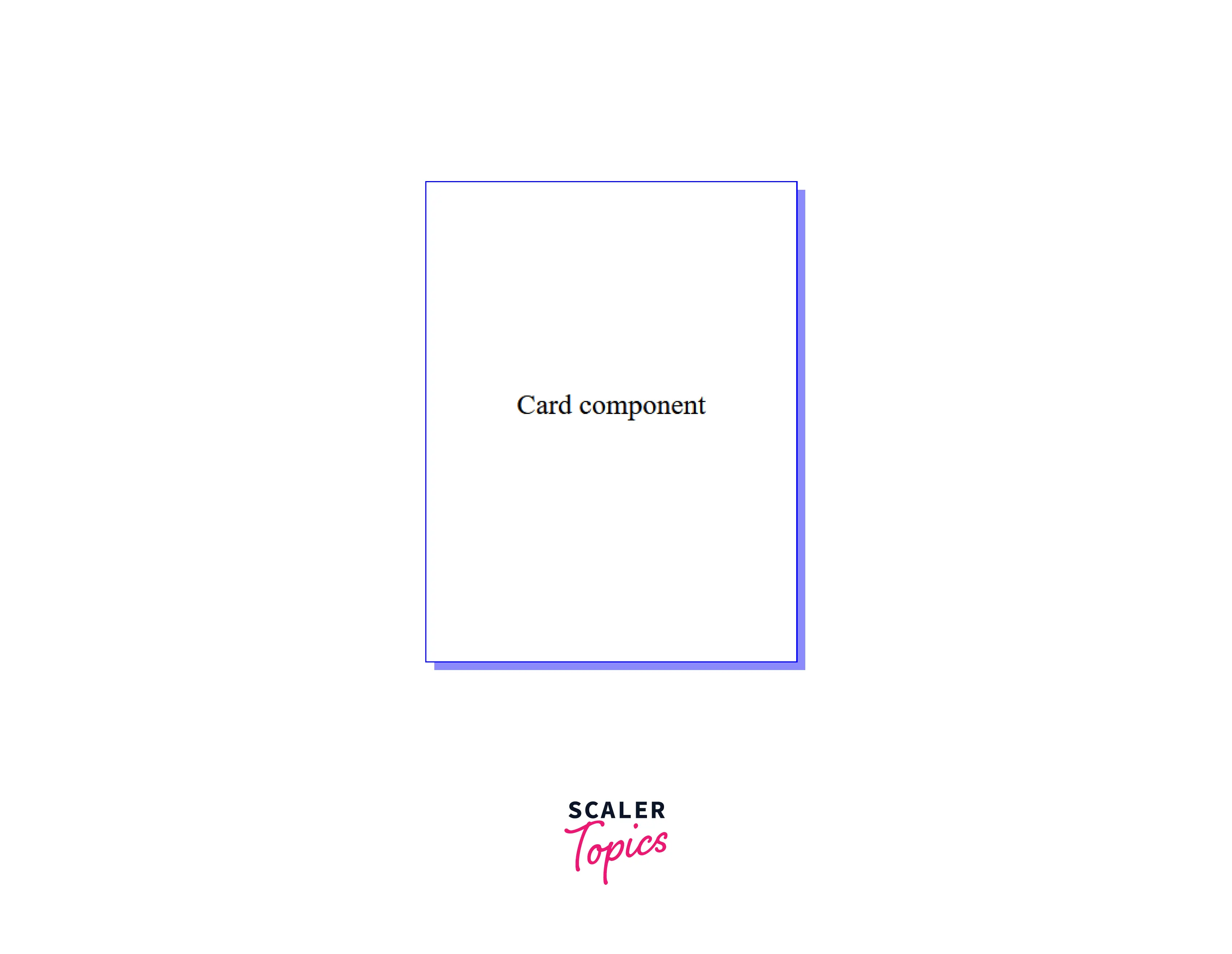
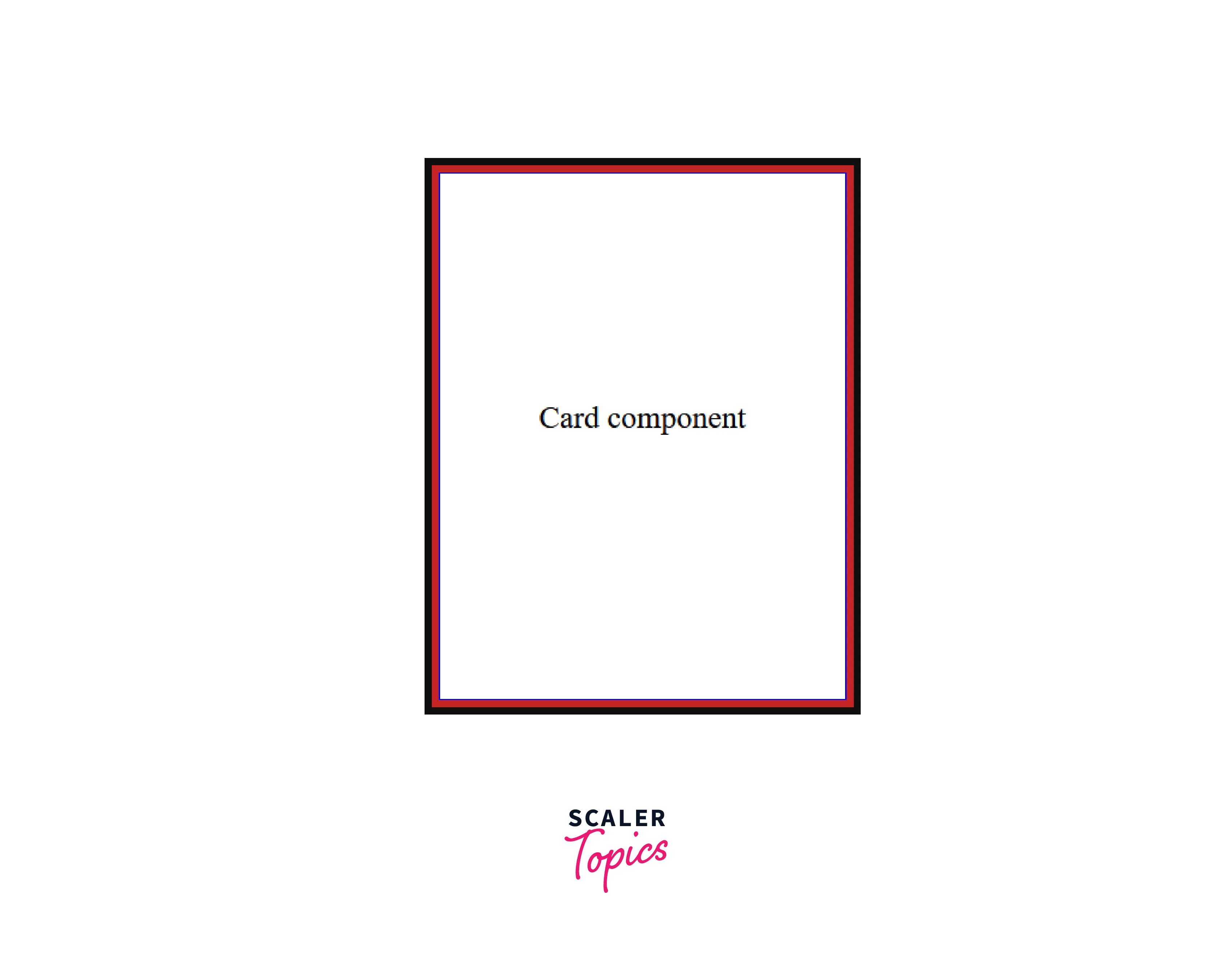
We have a div element with the text content "card component". Now we want to add shadows to the right and bottom sides of the element.
We've added a 1px solid border around the div element and width and height properties to make it a card component. And also added the 6px offset-x value and the 6px offset-y value with color in hex format.
The output of the above code looks like this:-
You can see that colored shadow on the right and bottom of our card component. We are still missing two values of the box-shadow property, Blur-Radius, and Spread Radius.
If the blur-radius and spread-radius values are not specified in the box-shadow values, both will be 0 by default.
- Blur-radius
Blur-radius plays a vital role in giving the shadow effect a more realistic and depth look. If the blur-radius value is not specified, it will be 0 (Which means it will create sharp edges). This value decides how blurry the shadow will be. The higher the value, the more shadow blurred it will be. It doesn't support the negative values.
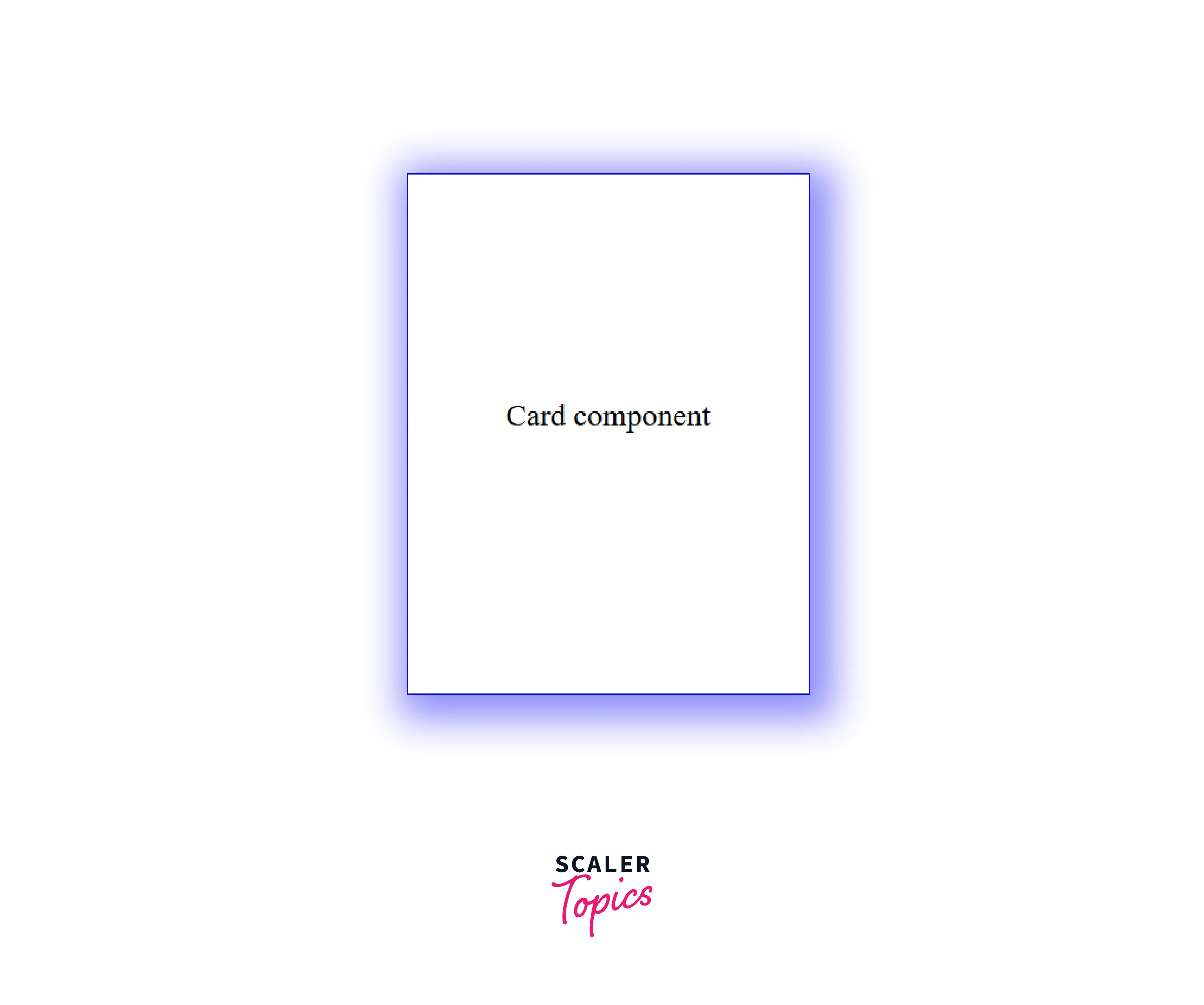
Let's retake our previous card component example and add a little bit of blurry effect to it.
Note the third length value, and it's the blur-radius value we defined as 25px. After adding the blur effect to the card component, it looks like this:-
You can see the blur effect on our shadow, and it now looks a little more elegant.
- Spread-radius
Spread-radius is used to grow or shrink the shadow effect. This takes both positive and negative values. A positive value causes the shadow to expand more or grow extensively, while a negative value is an opposite, which shrinks the shadow effect. When the value is not specified, it will be 0, which means the shadow will be the same size as the element.
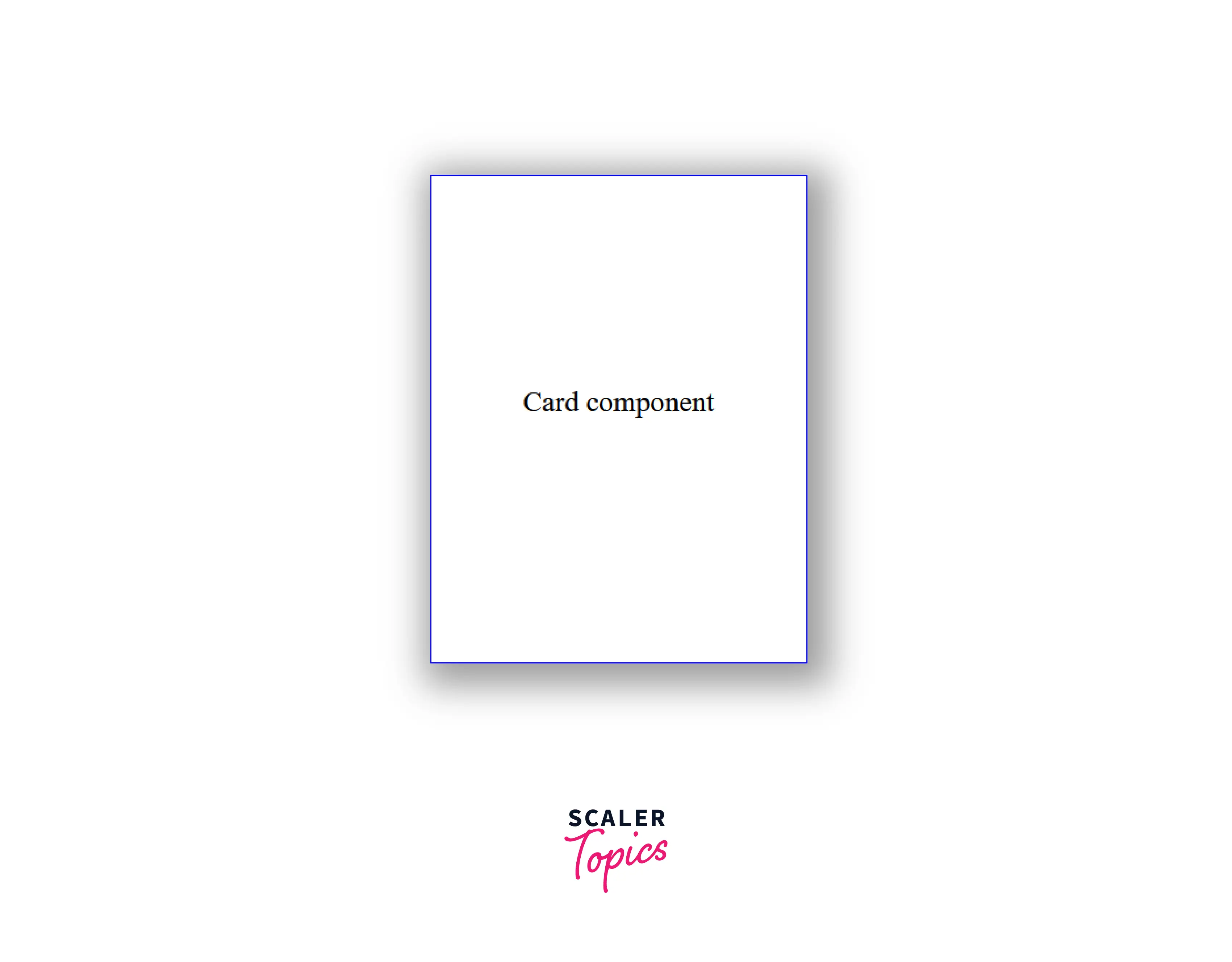
Now it's time to add our fourth value, the spread radius, to our card component example.
We have added the 10px spread radius, which will cause the shadow to grow a little bit. Take a look at the below output visuals.
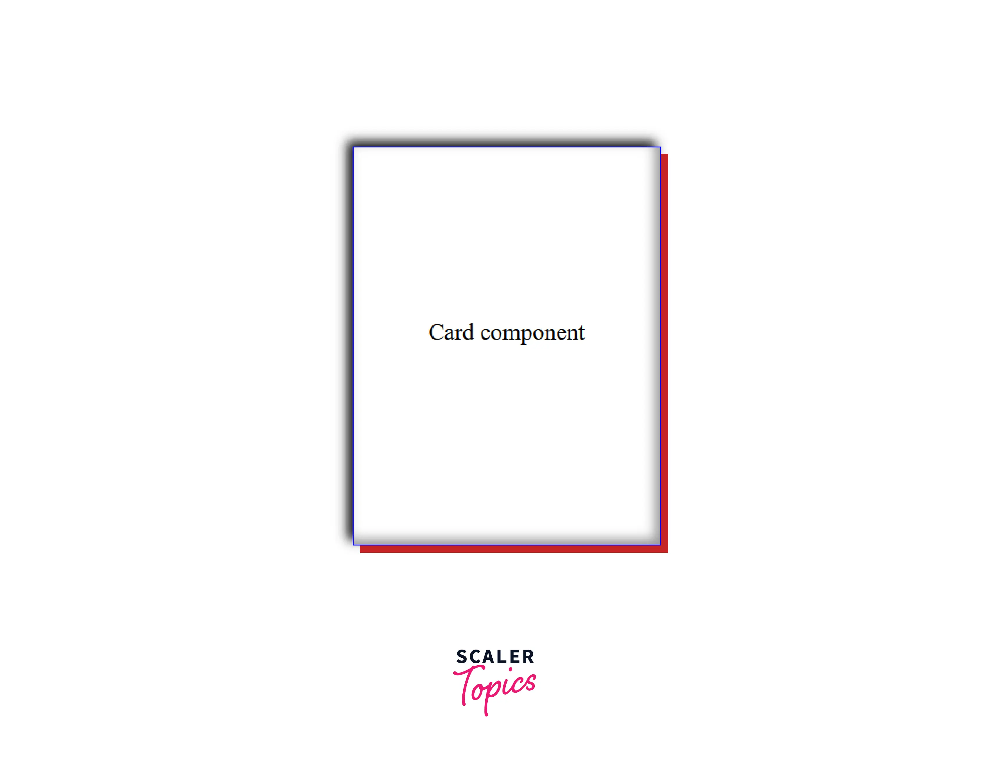
Finally, it's time to change the color of the shadow and find which color is most suitable for our card component.
- color
We don't need to be limited when it comes to the color of the shadow, as the box-shadow property takes multiple color formats as its value. It supports RGB, RGBA, HSL, HSLA, hex value, and color names.
Let's add a darker color to make our shadow more realistic, and the output of the above code can be seen below:-
Interpolation
Interpolation is the estimation of a new value between two known values. This simple concept is extensively helpful, and it's commonly seen in animation and transition on the web.
There are many scenarios when we animate our shadows, such as when multiple shadows values are updated with new values during box transition or the hover. The new values are known as interpolated. Interpolation determines the intermediate values such as Offset-x, offset-y, blur radius, spread radius, and color during the shadow transition.
When you have the comma-separated list of multiple shadows, the Interpolation only occurs between the same type of shadows, but if the one shadow is inset or another is not, then the entire list of shadows is left uninterpolated. And the shadow will change to the new value without the animation or transition effect.
The browser goes through these steps to interpolate multiple shadows under the hood, so you don't have to worry about it unless you want to implement it yourself.
Examples
We have learned a lot about the box shadow css property. Now it's time to go through some examples to understand its better implementation.
Setting three shadows
One of the most amazing things about the box-shadow property is we can set more than one shadow with just a single property. Each box-shadow is separated by a comma (,) to add more than one shadow. You can add as many as you want.
In the below code, we are setting three different shadows, the first is a simple shadow that covers the right and bottom side of the element, the second is a shadow with a negative value to cover the top and left side, and the third shadow is inside the element with inset keyword.
Again we're taking the same card component from our previous example for simplicity.
The output of the above code looks like this:-
Setting zero for offset and blur
When we set offset-x, offset-y, and blur values as zero, the shadow will be the solid color outline, and we can use the spread values to expand the shadow or shrinks the shadow equally on all four sides.
When we use multiple shadows, the shadows are drawn from back to front, which means the first shadow always sits on top of other subsequent shadows.
Now, we added two shadows with zero offset-x, offset-y, and blur values. And again, we're taking the same card component.
The output of two shadows with zero offset and blur values looks like this:-
Just for understanding, if we increase the spread radius of the first shadow equal to or more than the second shadow, it will cover the second shadow because we know that the first shadow always sits on the top of subsequent shadows.
Browser Support
It's important to note that the box-shadow is not fully supported on all browsers available in the market, especially when it comes to earlier versions, so it's recommended to use browser prefix when you target the older version of the browser.
And the fact is, if the browser does not support the shadow, then it will be omitted without affecting the layout of the web page.
Conclusion
- Box shadow CSS is used to create a stunning shadow effect around the element on the web page.
- box-shadow property takes five values: offset-x, offset-y, blur-radius, spread-radius, and color, and the crucial part is the order of each value.
- Inset keyword is used to create a shadow inside the element.
- We can easily create more than one shadow with the help of the box-shadow property.
- Most helpful fact is that when it doesn't support by the browser, it will be omitted without breaking the page layout.
Related Properties
- text-shadow
- color data type
- drop-shadow()