Boxplots in R
Overview
In R, Box plots, Violin plots, and Bag plots are commonly used for visualizing the distribution of continuous variables. A box plot in R provides a summary of the data distribution, displaying the minimum, maximum, quartiles, and outliers. Violin plots combine box plots with kernel density plots to show the density of the data at different values. Bag plots, a variation of box plots, illustrate the empirical cumulative distribution function. To create these plots in R, we can use functions from gglpot2 package, and bagplot() from the aplpack package. These plots help analyze data distribution, compare groups, and identify outliers or deviations from expected patterns.
Boxplots in R Programming Language
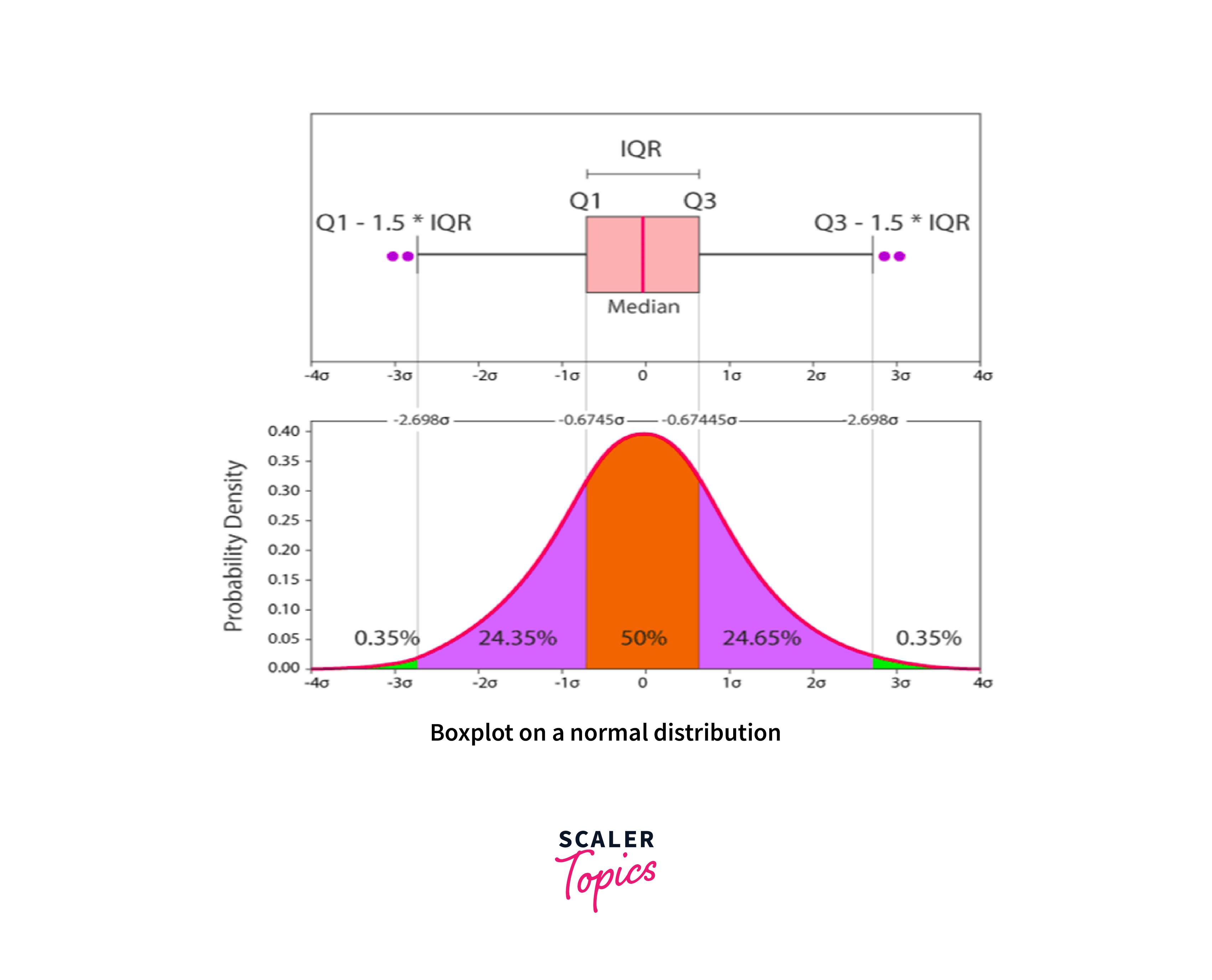
A boxplot in R, also known as a box-and-whisker plot, is a graphical representation of the distribution of a numerical variable. It displays key summary statistics that help in understanding the distribution's central tendency, spread, and presence of outliers. The plot consists of a rectangle (the box) and two lines (the whiskers) extending from the box.
The key components of a boxplot are as follows:
- Median (Q2): The line inside the box represents the median, which is the middle value of the dataset when it is sorted in ascending order.
- Box: The box spans the interquartile range (IQR), which is the range between the first quartile (Q1) and the third quartile (Q3). Q1 represents the 25th percentile, while Q3 represents the 75th percentile of the data. The box therefore contains the central 50% of the data.
- Whiskers: The whiskers extend from the box and represent the range of the data. By default, the whiskers extend to the most extreme data points that are within 1.5 times the IQR from the edge of the box. Any data points beyond the whiskers are considered outliers.
- Outliers: Individual data points that fall beyond the whiskers are plotted as points or asterisks to indicate their presence. Outliers are greater than Q3+(1.5 . IQR) or less than Q1-(1.5 . IQR).
- Interquartile Range (IQR)
Interquartile Range (IQR) is the range of values that includes the middle 50% of a dataset. It is calculated by subtracting the lower quartile (Q1) from the upper quartile (Q3), providing a measure of the spread that is resistant to outliers. IQR = Q3-Q1
Boxplots in R are useful for comparing the distribution of multiple groups or variables, identifying skewness or symmetry, detecting outliers, and understanding the range and spread of the data. They provide a concise summary of the dataset's characteristics in a single visual representation.

The box plot distribution will reveal the degree to which the data are clustered, how skewed they are, and also how symmetrical they are.
- Positively Skewed: The box plot is positively skewed if the distance from the median to the maximum is greater than the distance from the median to the minimum.
- Negatively Skewed: Box plots are said to be negatively skewed if the distance from the median to the minimum is higher than the distance from the median to the maximum.
- Symmetric: When the median of a box plot is equally spaced from both the maximum and minimum values, the box plot is said to be symmetric.
Syntax
To create a box plot in r using the ggplot2 package in R, we need to follow the syntax below:
Parameters
In the above section we have seen the synyax to plot the box-plot in R with ggplot2. In this Section, I will explain the various parameter present in syntax :
- library(ggplot2): loads the ggplot2 package.
- data: It refers to the dataset that contains the variables to be plotted.
- x_variable: It represent the specific variables from the dataset to be plotted on the x-axis.
- y_variable: It represent the specific variables from the dataset to be plotted on the y-axis.
- geom_boxplot(): It is the function that adds the box plot layer to the plot.
- labs(): It is used to set the plot's title, x-axis label, and y-axis label.
We can further customize the appearance of the box plot by adding additional functions and arguments. Here are a few commonly used options:
- fill: Changes the fill color of the boxes.
- color: Changes the color of the outlines of the boxes.
- notch: If set to TRUE, adds a notch to the box plot.
- varwidth: If set to TRUE, adjusts the width of the boxes based on sample size.
- orientation: If set to "horizontal", creates a horizontal box plot.
Example
In this Section, we will create simple Box-plot graph in R using mtcars dataset.
Let's break down the code step by step:
-
install.packages("ggplot2"): This line installs the ggplot2 package in R. The install.packages() function is used to install packages from CRAN (Comprehensive R Archive Network) or other repositories.
-
library(ggplot2): Once the package is installed, you need to load it into your current R session using the library() function. This makes the functions and capabilities of the "ggplot2" package available for use.
-
data <- mtcars : This line assigns the built-in dataset mtcars to the variable data. The mtcars dataset contains information about various car models, including variables like miles per gallon (mpg), engine displacement (disp), and others.
-
head(data): This command displays the first few rows of the data dataset. The head() function is used to inspect the structure and contents of a dataframe.
-
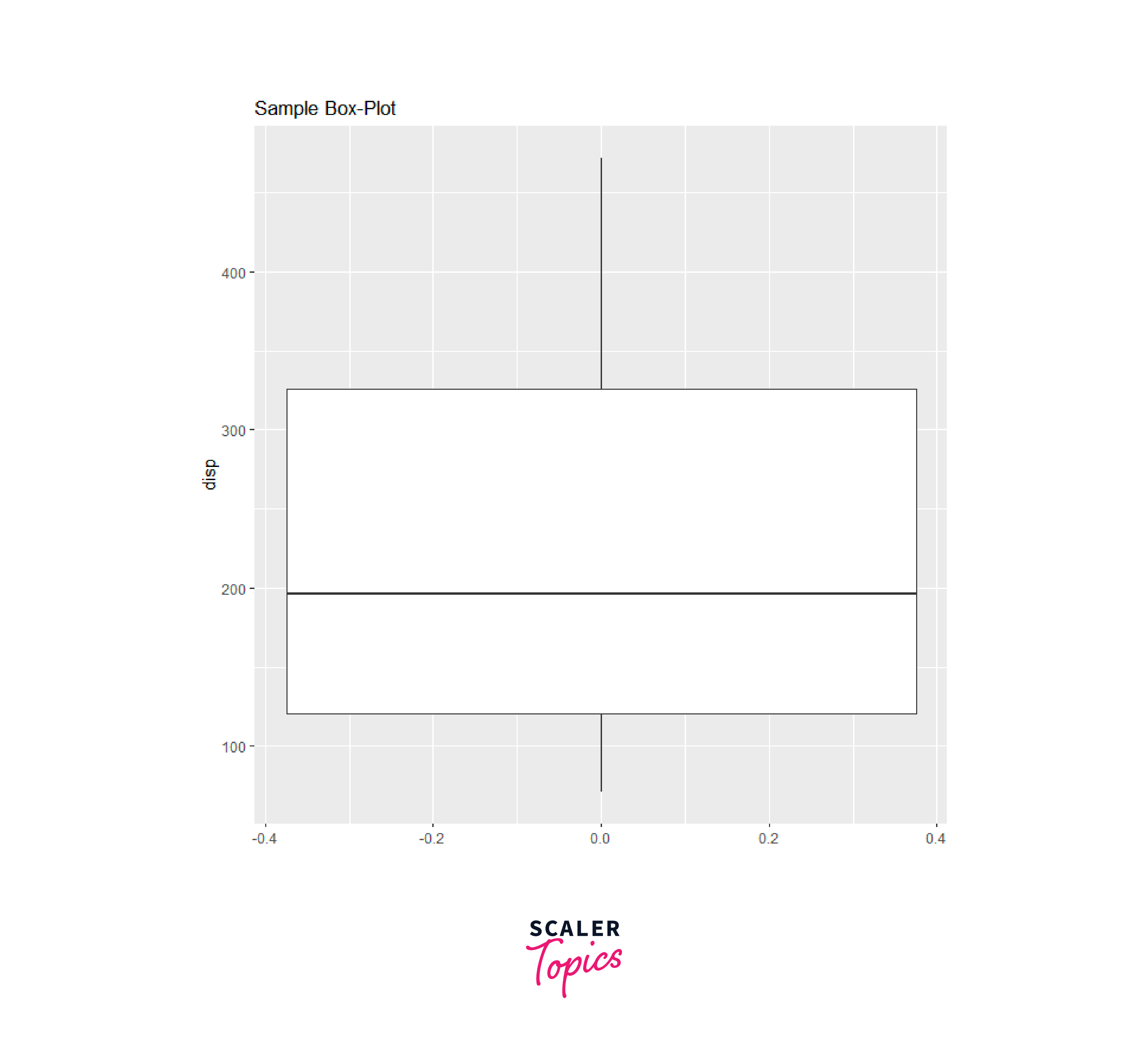
ggplot(mtcars, aes( y=mpg)): This line sets up the initial ggplot object. The first argument, mtcars, specifies the dataset to use. The aes() function is used to define aesthetic mappings, where y=disp maps the disp variable to the y-axis
-
geom_boxplot(): This command adds a box plot layer to the ggplot object. The geom_boxplot() function creates the box plot based on the aesthetics specified in the previous step.
Finally, you can run this code in R to generate a box plot with the given specifications using the ggplot2 package shown below. The box-plot of displacement (disp) has no outliers, the minimum value 25 (approximately) with maximum value 550 (approximately), median of 198 and Interquartile Range (IQR) between 125 - 350 (approximately).
Dataset to Create Boxplot
Through out this article we will use mtcars dataset. The mtcars dataset is a built-in dataset in the R programming language. It contains information about various car models and their performance characteristics. Here's an overview of the dataset:
The dataset contains 32 rows (observations) and 11 columns (variables). Each row represents a different car model, and each column represents a different attribute of the car Variables in the dataset are shown below:
- mpg: Miles per gallon (fuel efficiency)
- cyl: Number of cylinders
- disp: Engine displacement (in cubic inches)
- hp: Horsepower
- drat: Rear axle ratio
- wt: Weight (in thousands of pounds)
- qsec: 1/4 mile time (in seconds)
- vs: Engine (0 = V-shaped, 1 = straight)
- am: Transmission (0 = automatic, 1 = manual)
- gear: Number of forward gears
- carb: Number of carburetors
To access the "mtcars" dataset in R, we can simply type its name in the console, like this:
Output
Create Boxplot in R
To create a box plot in r using the ggplot2 package in R, you can use the geom_boxplot() function. Here's an example:
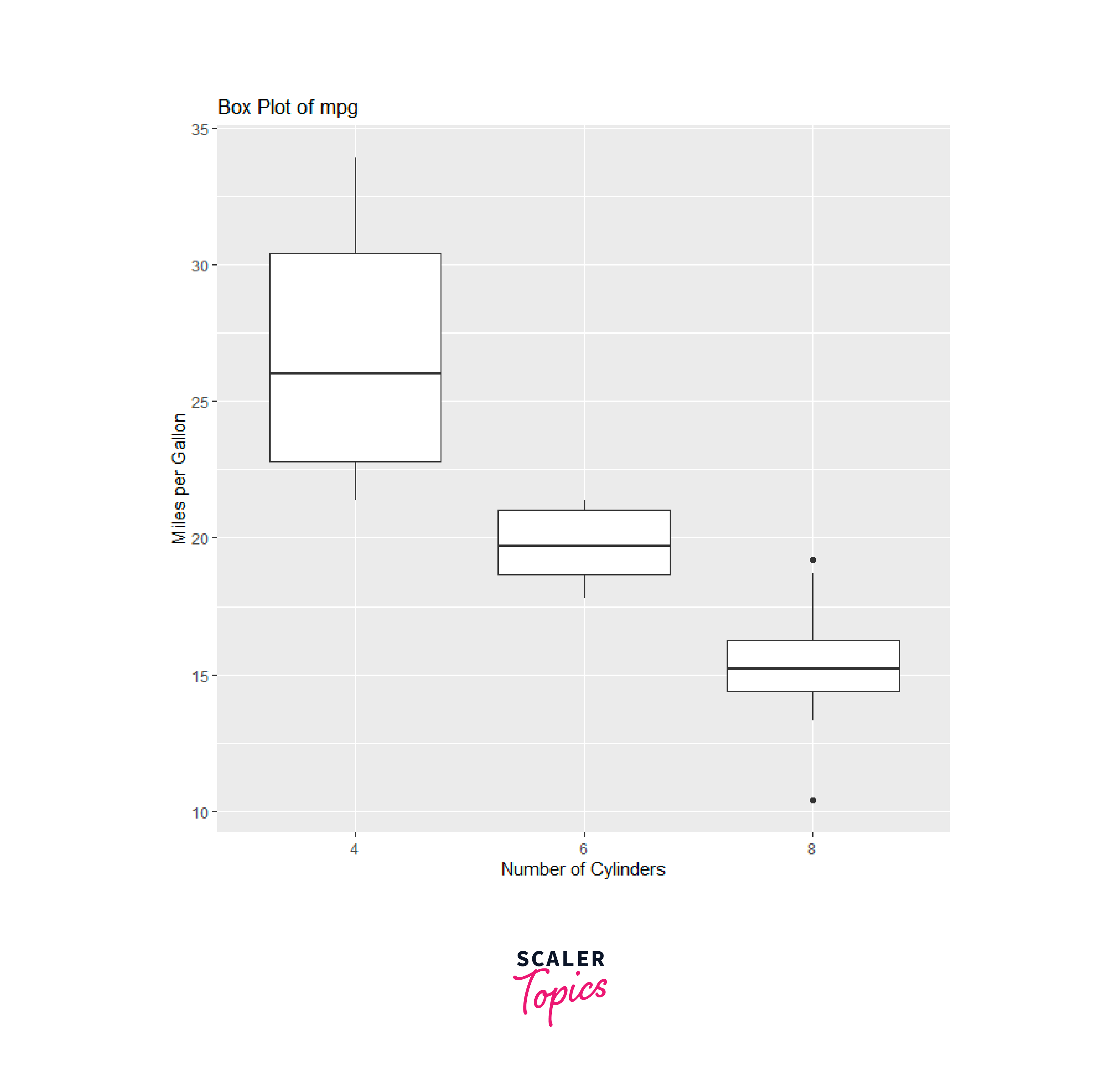
In this example, we used the ggplot2() function to create the base plot object. We specify the mtcars dataset and set the x-axis to the cyl variable (number of cylinders) and the y-axis to the mpg variable (miles per gallon).
The geom_boxplot() function is then added to create the box plot layer. We also added axis labels using the labs() function and a plot title using the ggtitle() function shown below. In the below plots we can ealisy identify the skewness, Mean, Median, Maximum and as well as the Minimum values moreover we can infer that some outliers are present in the dataset where vehicles have eight cylinders with respect to the Miles per Gallons.
We can customize the appearance of the box plot by adding additional layers or modifying aesthetics such as colors, fill, or line styles. Here's an example that adds color and changes the fill:
In this modified example, we added the am variable (transmission type) as the fill aesthetic. This results in different colors for the box plots based on the transmission type. We also added a legend for the fill scale using the scale_fill_discrete() function as shown below.
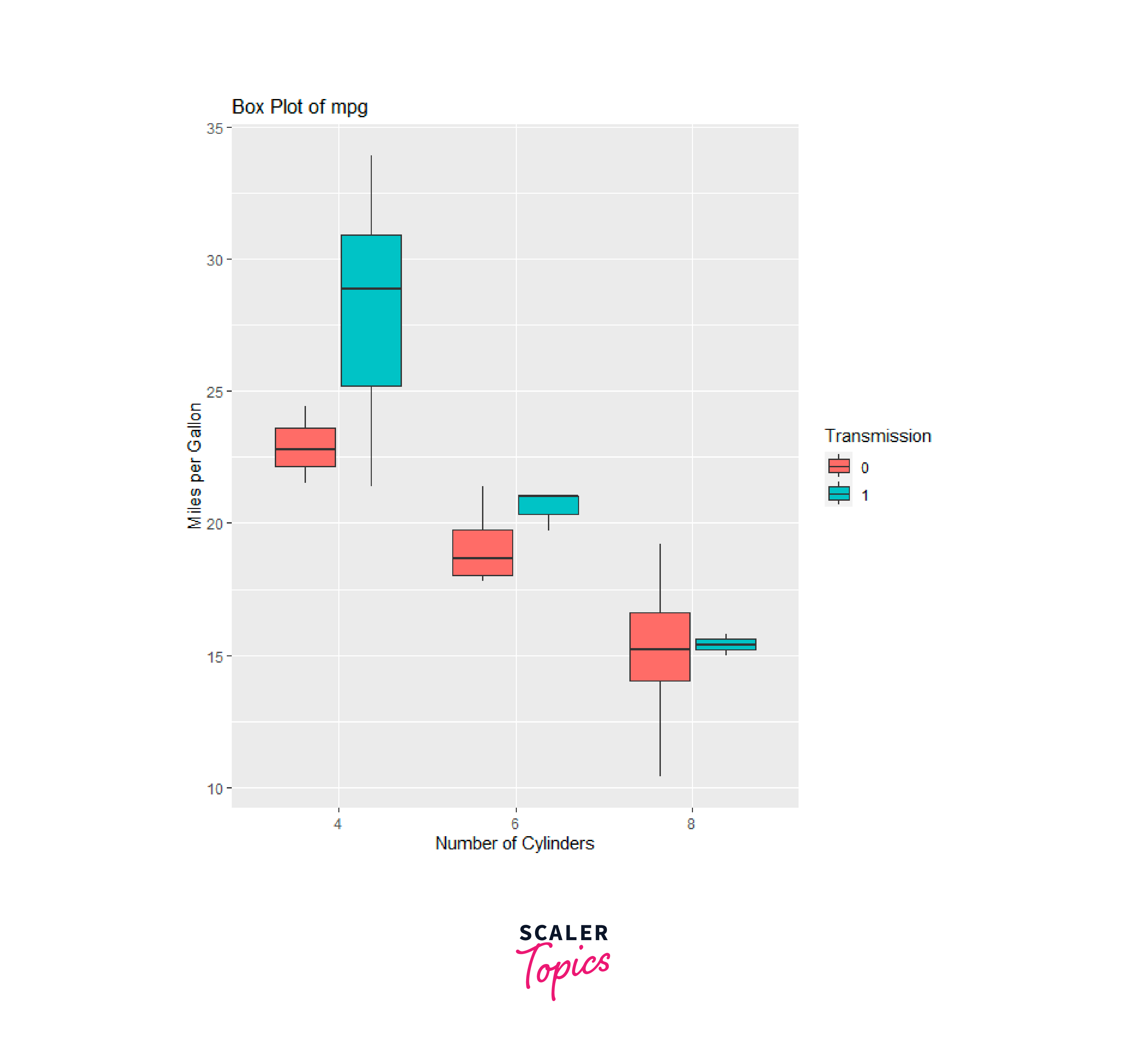
In the above plots we can ealisy identify the skewness, Mean, Median, Maximum and as well as the Minimum values moreover we can infer that some outliers are present in the dataset where vehicles have eight cylinders with respect to the Miles per Gallons which has been grouped by their transmission i.e., Automatic or Mannual.
Boxplot with Title,Label & New Color
To create a box plot in R using the base boxplot() function and add a title, labels, and change the color, you can use various arguments available in the function. Here's an example:
In this example, we used the boxplot() function to create a box plot of the mpg variable from the mtcars dataset. The main argument is used to specify the title of the plot, xlab for the x-axis label, ylab for the y-axis label, and col to set the color of the box plot as shown below.
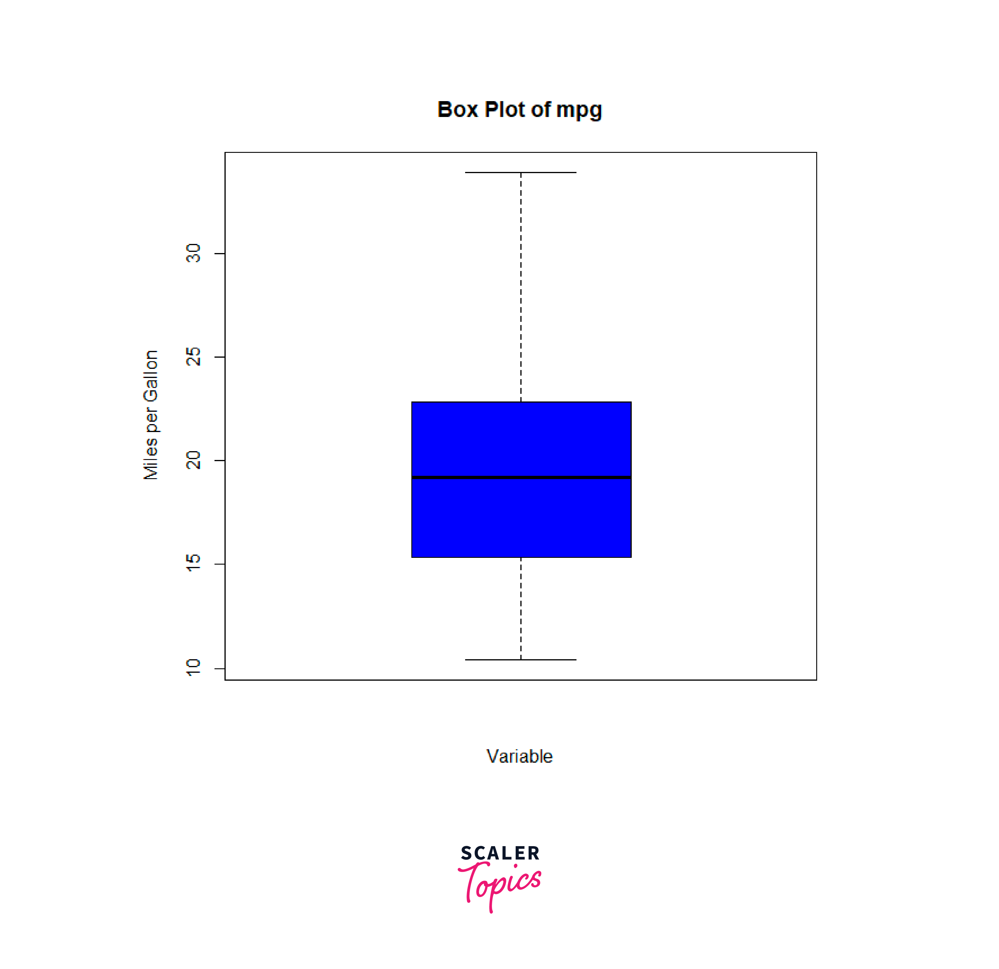
You can further customize the appearance of the plot by adjusting additional arguments, such as changing the font size, adding gridlines, or modifying the axis limits. The boxplot() function provides several options to control the appearance of the plot. You can refer to the documentation of the boxplot().
Boxplot Formula in R
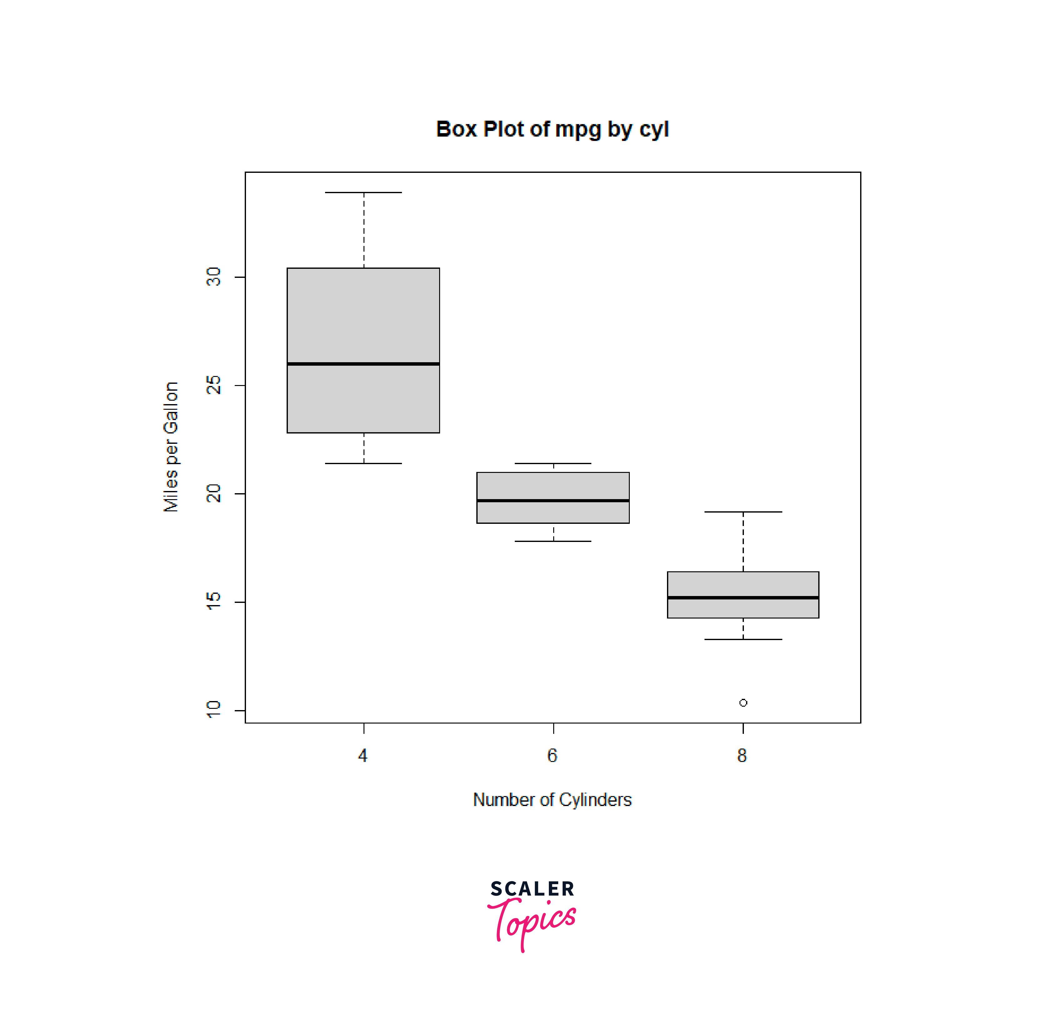
To create a box plot in R using a formula and the boxplot() function, we can provide a formula specifying the variables and grouping factors. Here's an example:
In this example, we used the formula syntax mpg ~ cyl within the boxplot() function to specify that we want to create a box plot of the "mpg" variable grouped by the "cyl" variable from the mtcars dataset. The data argument is used to specify the dataset. The main, xlab, and ylab arguments are used to provide a title and labels for the plot.
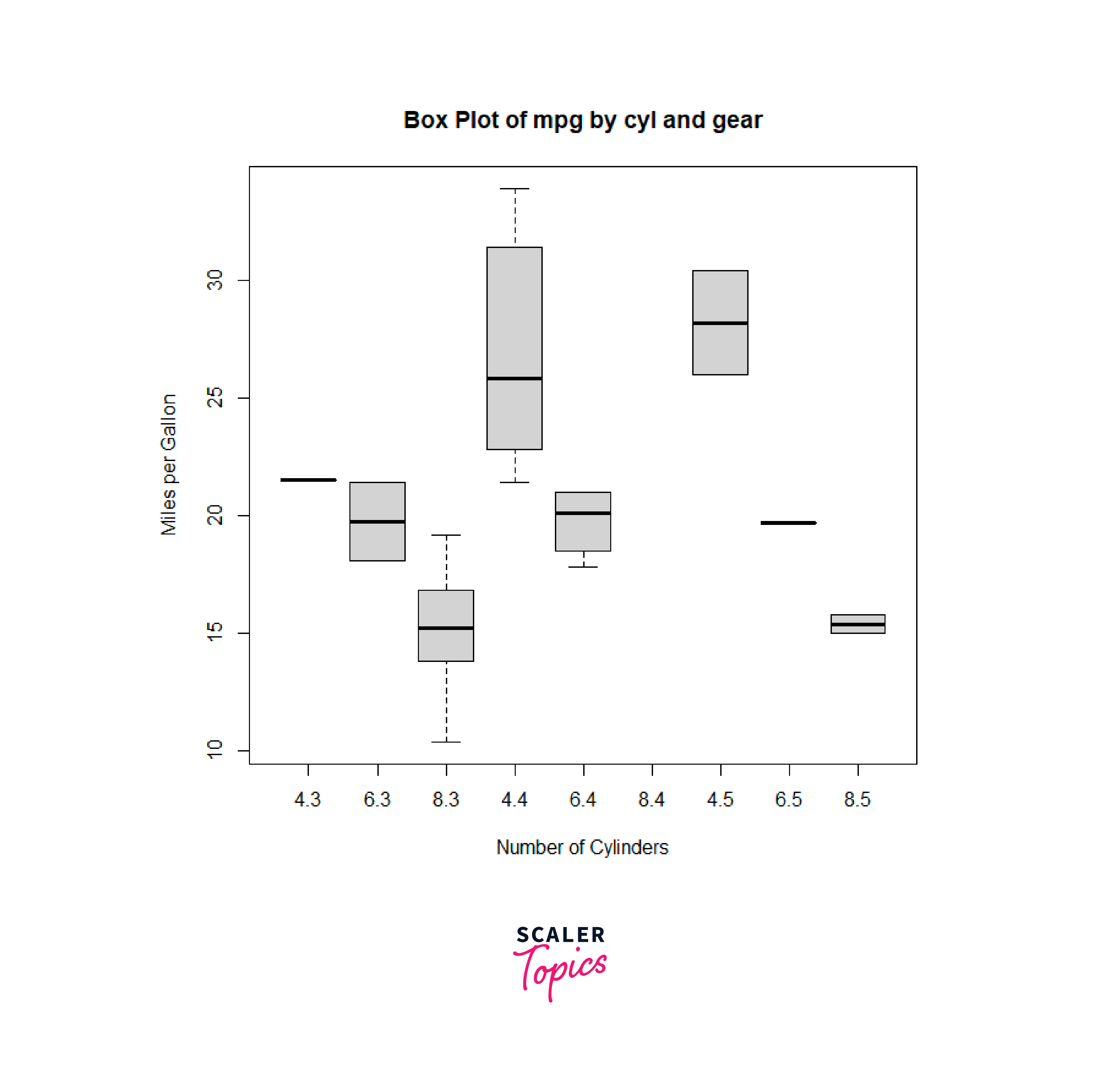
We can include additional grouping variables in the formula to create separate box plots for different groups. For example, to create box plots of mpg by both cyl and gear variables, you can modify the formula as follows:
In this modified example, we added the gear variable to the formula, resulting in separate box plots for different combinations of cyl and gear groups.
Boxplot With Notch
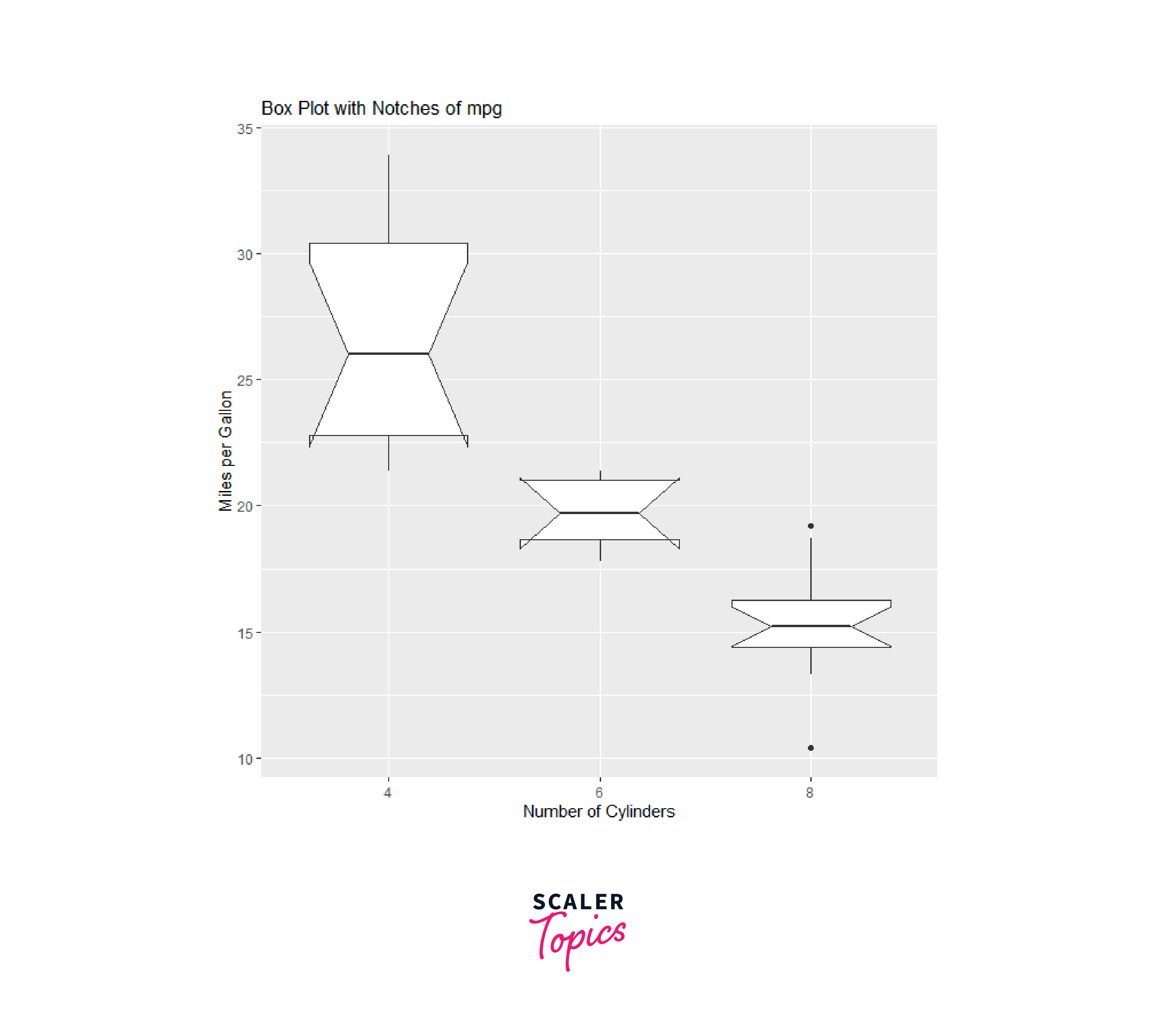
To create a box plot in r with notches in R using the ggplot2 package, we can utilize the geom_boxplot() function along with the notch argument. Notches provide a visual representation of the uncertainty around the median estimate. Here's an example:
In this example, we set the notch argument to TRUE within the geom_boxplot() function, which enables the notches in the box plot. The ggplot() function is used to set up the base plot, and we specify the mtcars dataset and the x-axis as the cyl variable (number of cylinders) and the y-axis as the mpg variable (miles per gallon).
By default, the notches in the box plot correspond to a 95% confidence interval around the median. If the notches of two box plots do not overlap, it suggests that the medians of the two groups are significantly different which is shown below.
In the above plots Boxplot with Notch we can ealisy identify the skewness, Mean, Median, Maximum and as well as the Minimum values moreover by the help of the notch we can statistically provide evidence to prove that difference in the dataset. In the above box-plot graph all the notch is perfectly overlapping each other so we can say that the variable no statistically differenece in the median.
Violin Plots
A violin plot is a data visualization technique that combines a box plot with a kernel density plot. It is used to display the distribution of a continuous variable across different categories or groups. The name violin plot comes from the shape of the plot, which resembles a violin or a mirrored density plot.
In a violin plot, each category or group is represented by a vertical violin. The width of the violin corresponds to the density of data points, with wider sections indicating a higher concentration of data. The plot also includes a white dot or a line within each violin, representing the median value of the data. The upper and lower edges of the violin indicate the quartiles or percentiles of the distribution.
A violin plot is a type of data visualization that combines a box plot and a kernel density plot. It is useful for visualizing the distribution of a continuous variable across different categories or groups.
In R, we can create a violin plot using the vioplot() function from the vioplot package or the geom_violin() function from the ggplot2 package.
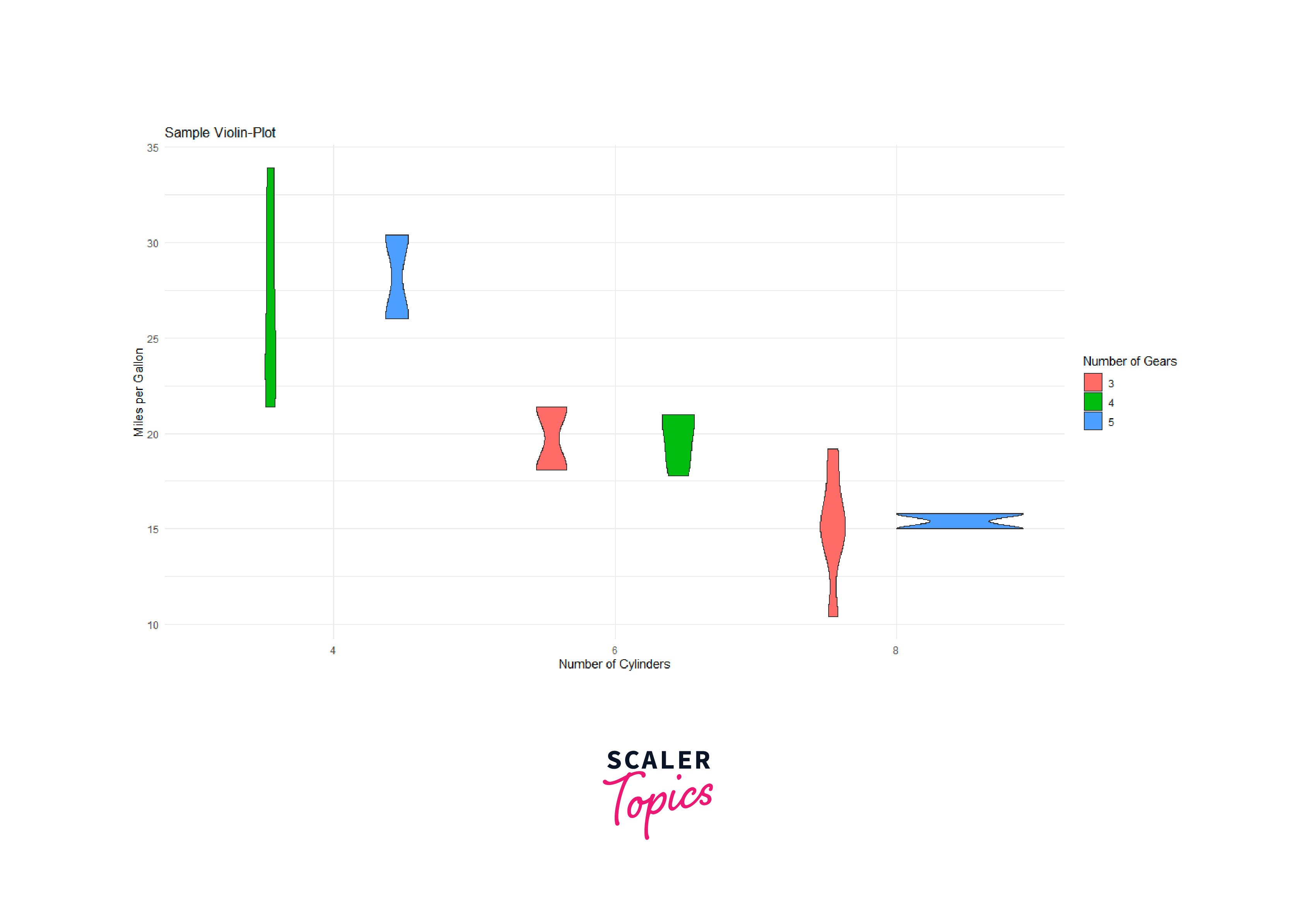
Here's an example of creating a violin plot using the ggplot2 package in R with the dataset mtcars explained in above section:
In this example, we are using the mtcars dataset, and we are plotting the mpg variable (miles per gallon) on the y-axis, categorized by the cyl variable (number of cylinders) on the x-axis. We added the gear variable as a grouping variable, which is represented by different colors within the violins.
From the above plotted graph we can estimate the relative frequency of the value, for example if you will analyse the first Violin-plot from left we can clear infer that the Probability Distribution Function (PDF) between mpg variable and cyl variable (number of cylinders) for all the vehicle with four gear is almost equal i.e, the relative frequency of the value is almost equall, similklarly we can infer the Probability Distribution Function (PDF) and estimate the relative frequency of the value for other variables also.
Bag plots
A bagplot is a type of data visualization technique used for robust multivariate analysis and outlier detection. It combines aspects of the box plot and bivariate scatterplot to provide a graphical representation of the central tendency, spread, and outliers in a multivariate dataset.
The bagplot consists of three main components:
-
The bag: The bag is an ellipse that represents the central region of the data. It is constructed using robust estimators of location and scatter, such as the median and the median absolute deviation (MAD).
-
The fence: The fence is an outer region surrounding the bag, indicating the extent of the data. It is defined by a robust measure of spread, such as the MAD or a user-specified scale factor.
-
The data points: The individual data points are plotted outside the bag, representing potential outliers. These points fall beyond the fence boundaries and are considered to be atypical observations.
The bagplot provides visual cues about the shape, dispersion, and outliers in a multivariate dataset. It can be particularly useful when dealing with datasets that have high-dimensional features or when traditional methods like mean and standard deviation are sensitive to outliers.
By examining the bag, fence, and data points, analysts can gain insights into the robust center, spread, and outlying observations in the data, facilitating the identification and characterization of atypical cases.
Bagplots can be created using various software packages or programming languages that provide relevant functions or libraries, such as R's aplpack package or other alternative packages mentioned in the previous response. In R, we can create bagplots using the bagplot() function from the aplpack package. Here's an example of how to create a bagplot using the built-in mtcars dataset:
In the above example, we used the bagplot() function to create a bagplot of the mpg and wt variables from the mtcars dataset. The main argument is used to specify the title of the plot.
In the image we can clearly infer that the orange area is the represents the central region of the data i.e. the bag whereas the the dark blue region is the indicating the extent of the data i.e, the fence and finally in the light blue region we have potential outliers which are outside the fence region. The resulting bagplot has display the central region of the data (identified by the bag), the outer fences, median lines, and potential outliers. It provides insights into the distribution and dispersion of the multivariate dataset.
Keep in mind that the aplpack package is not available on CRAN and may need to be installed from other sources, such as GitHub. Alternatively, you can explore other packages or methods for bagplots in R, such as the geom_bagplot() function from the ggdist package or the bagplot() function from the rrcovHD package, which may offer additional customization options and functionality.
Conclusion
- Box plots are effective for providing a visual summary of the distribution of a continuous variable. They show key statistics such as the median, quartiles, and outliers, allowing for quick comparisons between different variables,groups or categories.
- Box plots are helpful for identifying skewness, symmetry, and outliers in data, while violin plots provide a more detailed view of the data distribution. Bag plots are particularly useful for robust analysis and outlier detection in multivariate datasets.
- Bag plots are a robust method for multivariate analysis and outlier detection. They display the central region of the data using a robust estimator like the median, along with an outer fence that indicates the extent of the data. Individual data points outside the fence are considered potential outliers.
- Violin plots combine the features of a box plot and a kernel density plot, providing a more detailed representation of the data distribution. The width of the violin indicates the density, while the box within the violin represents the quartiles. Violin plots are useful for understanding the shape and spread of the data.
- These plots are implemented in R using various packages, such as boxplot() for box plots, geom_violin() for violin plots in the ggplot2 package, and bagplot() from the aplpack package for bag plots. Customization options, such as color, fill, and additional plot elements, can be applied to enhance the visual representation of these plots in R.
- The choice of plot depends on the nature of the data and the specific analysis objectives. Box plots are suitable for simple comparisons, violin plots offer more information about the distribution shape, and bag plots are useful for robust analysis and outlier identification.