How to Create Buttons in Flutter ?
Flutter's buttons, and integral graphical controls, empower users to trigger events and make choices. As part of the material design library, these widgets come in various shapes and styles, adaptable to UI components like dialogs and toolbars. Serving as essential components, they offer single-tap functionality for tasks such as form submission. Import the Material Components package ("package
Features of Buttons
Buttons in Flutter have` several features that developers can use to customize their appearance and behavior. Here are some of the most important features of buttons in Flutter:
- impressed: This is a callback function that gets executed when the button is pressed or clicked. Developers can specify what action should be taken when the button is pressed, such as navigating to a new screen or performing a specific function.
- child: The child widget that gets displayed inside the button widget. Developers can use any widget as a child of a button widget, such as Text, Icon, Image, or Container.
- color: The color of the button widget. Developers can specify the background color of the button using the color property.
- textColor: The color of the text displayed inside the button widget. Developers can specify the color of the text using the textColor property.
- padding: The padding around the button widget. Developers can specify the padding using the padding property.
- shape: The shape of the button widget. Developers can customize the shape of the button using the shape property. Flutter provides several built-in shapes, such as RoundedRectangleBorder, CircleBorder, and BeveledRectangleBorder.
- elevation: The elevation of the button widget. This property is only applicable to RaisedButton and FloatingActionButton widgets. It specifies the z-coordinate of the button widget's surface relative to its parent widget.
- splashColor: The splash color of the button widget. This is the color that appears when the button is pressed and held. Developers can specify the splash color using the splashColor property.
- highlight color: The highlight color of the button widget. This is the color that appears when the button is pressed. Developers can specify the highlight color using the highlightColor property.
- disabledColor: The color of the button widget when it is disabled. Developers can specify the color using the disabled color property.
In summary, buttons in Flutter have several features that developers can use to customize their appearance and behavior, including a compressed, child, color, text color, padding, shape, elevation, splash color, highlight color, and disabled color. By using these features, developers can create buttons that meet the specific requirements of their apps.
Types of Flutter Buttons
There are several types of buttons in Flutter for different purposes, look, feel, and functionality. Here is the list of different types of buttons in flutter.
- TextButton
- ElevatedButton
- OutlinedButton
- Drop Down Button
- Icon Button
- Inkwell Button
- PopUp Menu Button
- Outline Button
Let’s have a look at each one, one by one.
TextButton
-
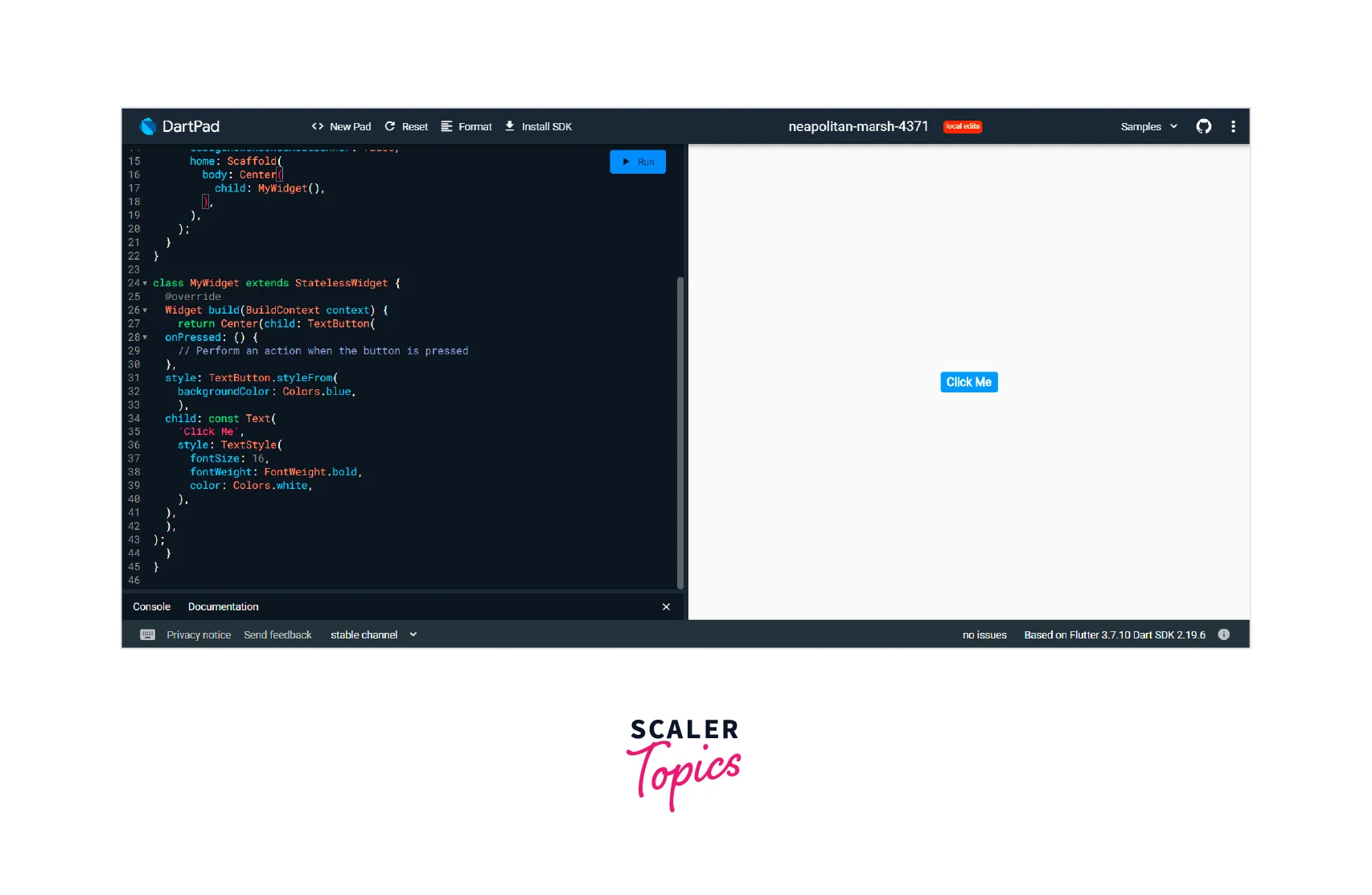
TextButton is a button in Flutter that allows users to tap or click on a button to act. TextButton is a Material Design widget that is used to create buttons that only display text.
-
Here are some of the important properties and methods of TextButton:
- onPressed: The onPressed property is a callback function that is executed when the button is pressed or clicked. Developers can specify what action should be taken when the button is pressed, such as navigating to a new screen or performing a specific function.
- child: The child property is a required property that specifies the widget to display inside the TextButton. Typically, this widget is a Text widget that displays the text of the button.
- style: The style property is used to set the style of the text that is displayed on the button. This property takes a TextButton.styleFrom object that defines the text style, such as the color, font size, and font weight.
- autofocus: The autofocus property is a boolean value that determines whether the button should be focused automatically when the screen is loaded.
- clipBehavior: The clipBehavior property determines how the button should be clipped if it overflows its bounds. This property takes a Clip enum value, such as Clip. none, Clip.hardEdge, or Clip.antiAlias.
-
Example
ElevatedButton
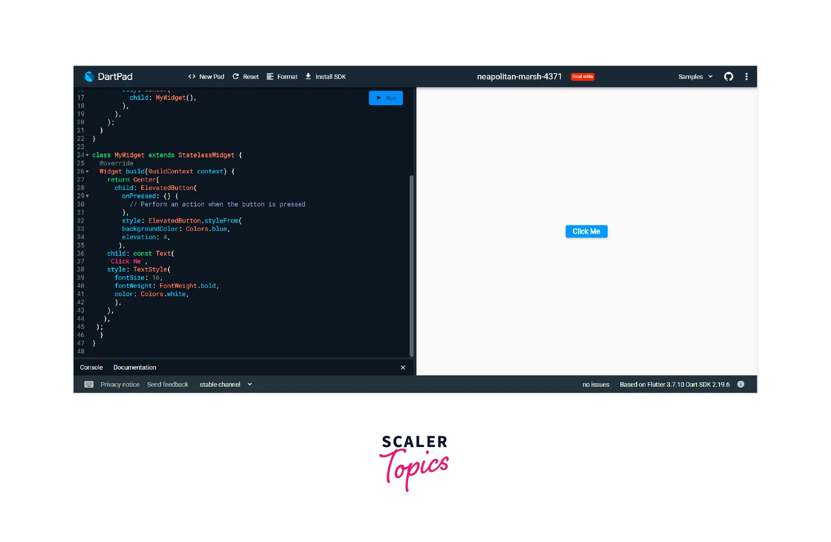
- ElevatedButton is a button in Flutter that allows users to tap or click on a button to act. ElevatedButton is a Material Design widget that is used to create buttons that have a raised appearance, with a shadow and a background color.
- Here are some of the important properties and methods of ElevatedButton:
- onPressed: The onPressed property is a callback function that is executed when the button is pressed or clicked. Developers can specify what action should be taken when the button is pressed, such as navigating to a new screen or performing a specific function.
- child: The child property is a required property that specifies the widget to display inside the ElevatedButton. Typically, this widget is a Text widget that displays the text of the button.
- style: The style property is used to set the style of the ElevatedButton, such as the background color, text color, and elevation. This property takes an ElevatedButton.styleFrom object that defines the button style.
- autofocus: The autofocus property is a boolean value that determines whether the button should be focused automatically when the screen is loaded.
- clipBehavior: The clipBehavior property determines how the button should be clipped if it overflows its bounds. This property takes a Clip enum value, such as Clip.none, Clip.hardEdge, or Clip.antiAlias.
- Here is an example of how to create an ElevatedButton widget in Flutter:
OutlinedButton
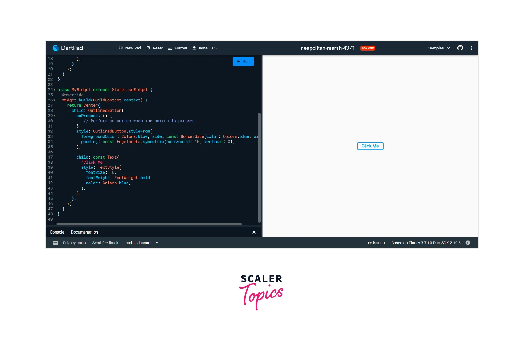
- OutlinedButton is a button in Flutter that allows users to tap or click on a button to act. OutlinedButton is a Material Design widget that is used to create buttons that have a border and no background color.
- Here are some of the important properties and methods of OutlinedButton:
- onPressed: The onPressed property is a callback function that is executed when the button is pressed or clicked. Developers can specify what action should be taken when the button is pressed, such as navigating to a new screen or performing a specific function.
- child: The child property is a required property that specifies the widget to display inside the OutlinedButton. Typically, this widget is a Text widget that displays the text of the button.
- style: The style property is used to set the style of the OutlinedButton, such as the border color, text color, and padding. This property takes an OutlinedButton.styleFrom object that defines the button style.
- autofocus: The autofocus property is a boolean value that determines whether the button should be focused automatically when the screen is loaded.
- clipBehavior: The clipBehavior property determines how the button should be clipped if it overflows its bounds. This property takes a Clip enum value, such as Clip.none, Clip.hardEdge, or Clip.antiAlias.
- Here is an example of how to create an OutlinedButton widget in Flutter:
Drop Down Button
- DropDownButton is a type of button in Flutter that is used to create a dropdown menu that allows users to select one option from a list of options. When a user taps on the dropdown button, a list of options is displayed, and the user can select one of them.
- Here are some of the important properties `and methods of DropDownButton:
- items: The items property is a required property that specifies the list of items that will be displayed in the dropdown menu. Each item in the list is represented by a DropdownMenuItem widget that contains the value and the text of the item.
- onChanged: The onChanged property is a callback function that is executed when the user selects an item from the dropdown menu. The selected item is passed as an argument to the function, and developers can specify what action should be taken based on the selected item.
- value: The value property is used to set the currently selected value of the dropdown menu. This property is typically set to a variable that is updated when the user selects a new item.
- icon: The icon property is used to set the icon that is displayed next to the dropdown menu.
- hint: The hint property is used to set the hint text that is displayed when no item is selected in the dropdown menu.
- Here is an example of how to create a DropDownButton in Flutter:

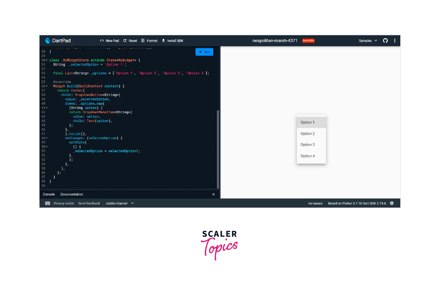
- In this example, we create a DropDownButton widget that displays a list of options in a dropdown menu. The currently selected value is set to "Option 1", and the list of options is defined in the _options variable. When the user selects a new option from the dropdown menu, the _selectedOption variable is updated, and the setState() function is called to update the state of the widget.
- Overall, DropDownButton is a powerful and customizable widget in Flutter that is ideal for creating dropdown menus that allow users to select one option from a list of options. With its customizable properties and methods, developers can create dropdown menus that fit the specific needs of their apps.
Icon Button
- IconButton is a button in Flutter that is used to create a button with an icon. The button can be customized with different icons, sizes, colors, and shapes. When a user taps on the button, an action is triggered, such as navigating to a different screen or performing an action.
- Here are some of the important properties and methods of IconButton:
- icon: The icon property is a required property that specifies the icon that is displayed on the button. The icon can be specified using the IconData class or by passing a custom widget.
- onPressed: The onPressed property is a callback function that is executed when the button is tapped. This function typically contains the code that performs the action associated with the button.
- iconSize: The iconSize property is used to set the size of the icon on the button. This property is optional, and if it is not specified, the default size is used.
- color: The color property is used to set the color of the icon on the button. This property is optional, and if it is not specified, the default color is used.
- tooltip: The tooltip property is used to set the text that is displayed when the user hovers over the button. This property is optional, and if it is not specified, no tooltip is displayed.
- Here is an example of how to create an IconButton widget in Flutter:

- In this example, we create an IconButton widget with an "add" icon. When the button is pressed, the pressed function is called, and the action associated with the button is performed.
- Overall, IconButton is a flexible and powerful widget in Flutter that is ideal for creating buttons with icons. With its customizable properties and methods, developers can create buttons that fit the specific needs of their apps, and provide a visually appealing and intuitive user interface.
Inkwell Button
- InkWell is a Flutter widget that is used to create a button that responds to touch events with a ripple effect. The ripple effect provides visual feedback to the user when they tap on the button, making the user interface more interactive and engaging.
- Here are some of the important properties and methods of InkWell:
- onTap: The onTap property is a required property that specifies the function that is called when the user taps on the button. This function typically contains the code that performs the action associated with the button.
- child: The child property is used to specify the widget that is displayed inside the InkWell widget. This is typically a text or icon widget that represents the button.
- splashColor: The splashColor property is used to set the color of the ripple effect that appears when the user taps on the button. This property is optional, and if it is not specified, the default color is used.
- borderRadius: The borderRadius property is used to set the radius of the corners of the button. This property is optional, and if it is not specified, the default radius is used.
- highlightColor: The highlightColor property is used to set the color of the button when it is being pressed. This property is optional, and if it is not specified, the default color is used.
- Here is an example of how to create an InkWell widget in Flutter:
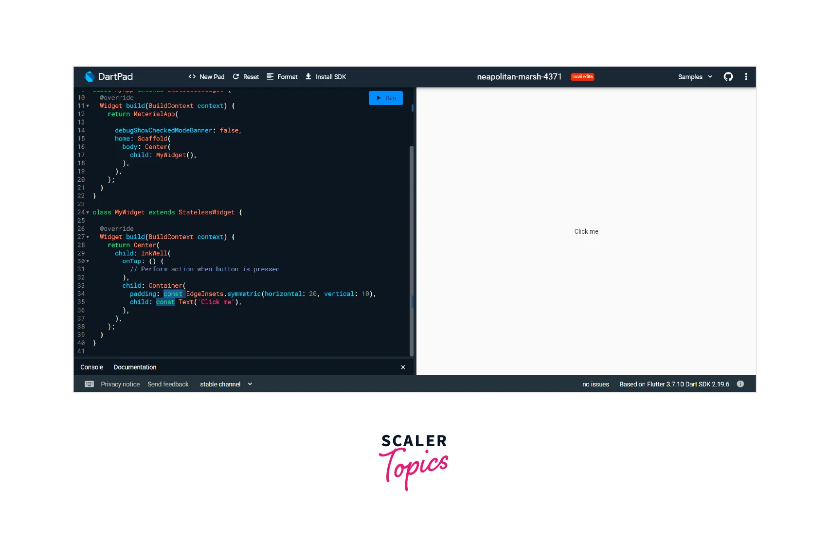
- In this example, we create an InkWell widget with a child widget that displays the text "Click me". When the user taps on the button, the onTap function is called, and the action associated with the button is performed.
- Overall, InkWell is a powerful and flexible widget in Flutter that is ideal for creating buttons that respond to touch events with a ripple effect. With its customizable properties and methods, developers can create buttons that fit the specific needs of their apps, and provide a visually appealing and engaging user interface.
Pop-Up Button
- PopupMenuButton is a button in Flutter that is used to create a button that displays a popup menu when tapped. The popup menu contains a list of options that the user can select from, providing a convenient and intuitive way to perform actions or navigate to different parts of the app.
- Here are some of the `important properties and methods of PopupMenuButton:
- itemBuilder: The itemBuilder property is a required property that specifies the function that creates the list of menu items that are displayed in the popup menu. This function typically returns a list of PopupMenuItem widgets.
- onSelected: The onSelected property is a callback function that is executed when the user selects an item from the popup menu. This function typically contains the code that performs the action associated with the selected menu item.
- icon: The icon property is used to specify the icon that is displayed on the button. This property is optional, and if it is not specified, no icon is displayed.
- offset: The offset property is used to specify the position of the popup menu relative to the button. This property is optional, and if it is not specified, the default position is used.
- tooltip: The tooltip property is used to set the text that is displayed when the user hovers over the button. This property is optional, and if it is not specified, no tooltip is displayed.
- Here is an example of how to create a PopupMenuButton widget in Flutter:
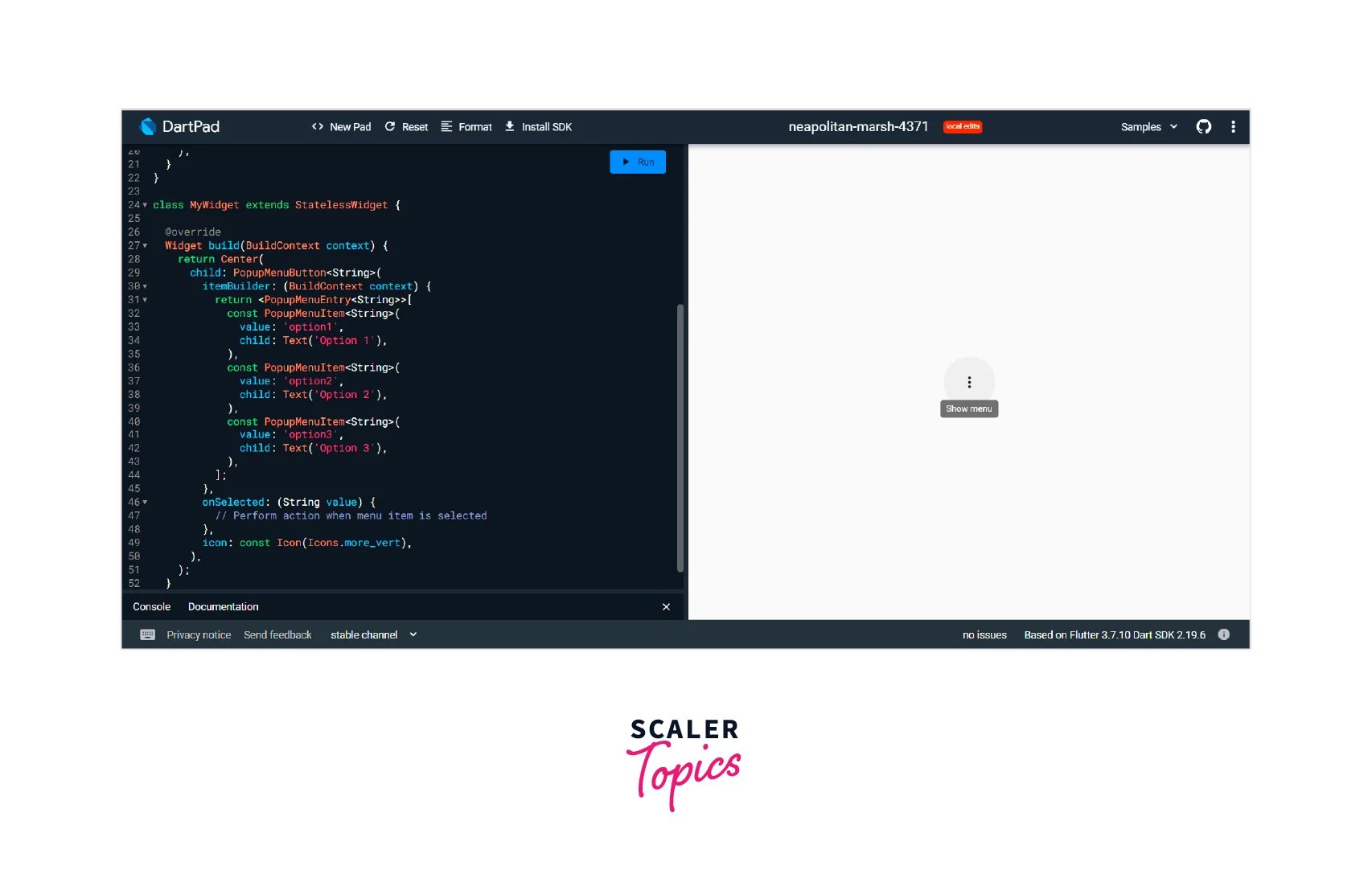

- In this example, we create a PopupMenuButton widget with three menu items. When the user taps on the button, a popup menu is displayed with the three menu items. When the user selects a menu item, the onSelected function is called, and the action associated with the selected menu item is performed.
- Overall, PopupMenuButton is a versatile and powerful widget in Flutter that is ideal for creating buttons that display a list of options when tapped. With its customizable properties and methods, developers can create buttons that fit the specific needs of their apps, and provide a visually appealing and intuitive user interface.
Outline Button
- In Flutter, the OutlinedButton is a button in Flutter used to create a button that has a border outline but no background color This type of button is often used as a secondary action button or to provide an alternative visual style to the standard ElevatedButton.
- Here are some important properties and methods of the OutlinedButton widget:
- onPressed: The onPressed property is a required property that specifies the function to be called when the button is pressed. This property takes a callback function that is executed when the button is tapped.
- child: The child property is used to specify the child widget that is displayed inside the button. This can be a text widget, an icon widget, or any other widget that can be placed inside a container.
- style: The style property is used to set the style of the button. This property takes an instance of the ButtonStyle class, which allows you to customize the appearance of the button, including the border, background, padding, and more.
- autofocus: The` autofocus property is a Boolean value that determines whether the button should be focused automatically when the widget is first displayed.
- clipBehavior: The clipBehavior property is used to determine how the button's contents should be clipped if they overflow the button's bounds.
- Here's an example of how to create an OutlinedButton widget in Flutter:

- In this example, we create an OutlinedButton widget with blue text and a blue border outline`. We also set the border-radius property of the ButtonStyle to give the button a rounded border.
- Overall, the OutlinedButton widget is a useful and flexible option in Flutter for creating buttons with a border outline. With its customizable properties and methods, developers can create buttons that match the visual style of their app and provide an intuitive and user-friendly interface.
Conclusion
Here are some key takeaways from an article on Button in Flutter:
- Flutter offers several built-in widgets for creating buttons, including ElevatedButton, TextButton, OutlinedButton, IconButton, and more.
- Each type of button has its own set of properties and methods that can be customized to fit the needs of the app.
- Button in Flutter can be styled using the ButtonStyle class, which allows developers to customize the appearance of the button, including the border, background, padding, and more.
- Flutter also provides additional button widgets, such as DropDownButton and PopupMenuButton, which allow developers to create more complex button interactions.
- When designing buttons in Flutter, it's important to consider the user experience and make sure that buttons are easy to locate, visually distinct, and provide clear feedback to the user when pressed.
