CSS calc() Function
 FREE
FREE

Overview
In CSS, the calc() function is versatile and powerful and is used to perform mathematical operations on different units of measurement within property values. It is useful to create a responsive and flexible webpage with the help of dynamic properties. It allows us to perform addition, subtraction, multiplication, and division operations among various units. CSS calc() function can be used with length, frequency, angle, time, percentage, number, and integer values.
Syntax of calc()
The syntax of the CSS calc() function is as follows:
The calc() function takes an expression as an argument and returns the resultant value that can be assigned to the given property. This expression can contain a combination of multiple units like vh with percentage(%).
Let us look at an example of calc() function:
Here, we are subtracting pixels from the viewport height(vh) to create a flexible height with a fixed offset.
The expression is evaluated using standard operator precedence rules. It can have Addition(+), Subtraction(-), Multiplication(*), and Division(/). In multiplication, at least one of the arguments must be a number, and in division right-hand side must be a number. Parenthesis can also be used to establish computation order.
Important Notes
- The + and - operators must be surrounded by a whitespace for CSS to recognize as an expression. For example, if we write an expression without whitespace, as calc(20%-4px) it interprets it as two different arguments and . Now calc() only accepts one argument and thus, it is an invalid expression. Whereas, calc(50%-8px) will be correctly interpreted as "a percentage followed by a subtraction operator and a length". Similarly, we can also write an expression as calc(7px + -10%) can be inferred as "a length followed by an addition operator and a negative percentage".
- We also use whitespaces with / and * for consistency, though is not required.
- Mathematical expressions that involve percentages for dimensions (widths and heights) in tables, including table columns, table column groups, table rows, table row groups, and table cells, can be handled as if the "auto" value had been explicitly specified, whether the table layout is "auto" or "fixed."
- We can also use calc() functions to nest expressions in case the inner ones can be treated as simple parentheses.
- In the case of lengths, and have different meanings. Thus, we cannot write instead we have to write . Thus, margin-top: calc(0px+20px); is valid whereas margin-top: calc(0+20px); is invalid.
- You cannot directly replace a percentage value with a numeric value using the calc() function. For example, calc(100/4)% is not valid, but calc(100%/4) is valid.
Formal Syntax
- The formal syntax for the calc() function is as follows:
- The calc-sum can contain a sum with a sub-expression connected using + or -.
- The sub-expression calc-product can be evaluated as a product of different calc-values having * or /.
- Thus, calc-value is the smallest value possible and therefore, it can contain percentage, dimension, etc.
- Lastly, calc-constant is a mathematical constant such as pi, infinity, etc.
- The expression in CSS calc() function is evaluated in bottom up approach. We will first fetch the value of a constant.
- Next, the value is evaluated. If there are any * or / signs between values or constants then it will be calculated. Lastly, the sum operators + or - are resolved and the resultant value is assigned to the property.
Working of calc() Function in CSS
The CSS calc() function uses either the explicit values provided by the user or the values derived from their parents while calculating. Let us understand the working of the CSS calc() function using an example.
Examples
Example 1: Fluid Typography
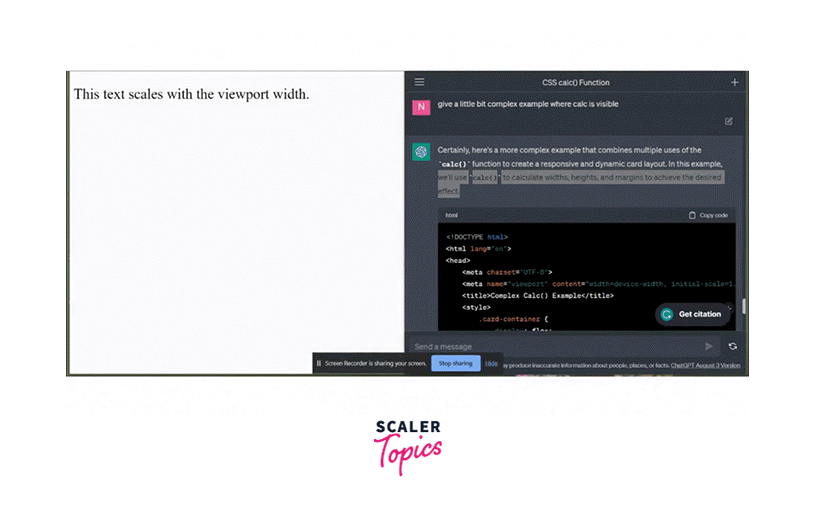
Fluid Typography refers to text that scales proportionally with the viewport width. Let us look at an example that allows fluid typography using the calc() function.
Code:
Output:
Explanation:
The font size of the text inside the <p> element will scale up as the width of the viewport increases or vice versa. This creates a responsive page that improves user experience by scaling text size based on the screen resolution.
The calc() function performs a calculation to determine font size. We have the fixed baseline of font size for all screens. Next, we have i.e of the viewport width which is added to the fixed font size. This is responsible for the responsiveness. This implies that as we increase the viewport width, the font size will also increase proportionally.
Example 2: Dynamic Cards
Let us look at a bit complex example of a dynamic responsive page containing a card layout. We'll use calc() to calculate widths, heights, and margins to achieve the desired effect.
Code:
Output:

Explanation:
We create a card layout with a flex container and individual cards. On hover, the cards scale up slightly for a visual effect.
flex: calc~(33.33\% - 20px); uses calc() to calculate the flex value. This sets each card's width to approximately one-third of the container's width, minus the 20-pixel gap between cards.
max-width:~ calc(33.33\% - 20px); sets the maximum width of the cards to the same calculation, ensuring that they don't exceed this width.
Media queries are used to adjust the card layout for different screen sizes. The cards stack in two columns on screens narrower than and occupy the full width on screens narrower than .
Accessibility Concerns
When using the CSS calc() function to define text size, make sure that one of the values in the calc() expression is a relative length unit. If none of them are relative to the screen size then text size will not scale even if the page is zoomed in or zoomed out. For example,
This ensures that when the page is zoomed, the text will also scale up.
Browser Compatibility
It is supported by most of the browsers like:
| Chrome | Edge | Firefox | Opera | Safari | Chrome Android | Firefox for Android | Opera Android | Safari on iOS | Samsung Internet | WebView Android | |
|---|---|---|---|---|---|---|---|---|---|---|---|
| calc() | more Toggle history | Toggle history | footnotemore Toggle history | Toggle history | more Toggle history | Toggle history | footnotemore Toggle history | Toggle history | more Toggle history | Toggle history |
Conclusion
- CSS calc() function is used to calculate mathematical expression within CSS while determining the value of a property using different measurement units like pixels, percentages, viewports(vh and vw), etc.
- It accepts addition, multiplication, division, and subtraction operations.
- It is used to define width, length, padding, aspect ratios, media queries, etc.
- It improves the user experience and readability of the website. It is also useful in creating dynamic and responsive websites.
- The + and - operators must be surrounded by whitespace.
- The calc() functions allows nesting inside the calc() function.
- Inside the calc() function and convey different meanings.
- The expression inside the calc() function is evaluated using the bottom-up approach.
- It is supported by most of the browsers Chrome, Firefox, Opera, etc.