Call Center Dashboard in Excel
:::
Overview
The Call Center Dashboard in Excel is a project that aims to provide a comprehensive overview of a call centre's performance. The dashboard is designed to display key metrics such as call volume, call duration, wait times, and customer satisfaction ratings in a visually appealing and easy-to-understand format. This tool can be used by call centre managers and supervisors to monitor performance, identify trends, and make informed decisions about staffing, training, and other operational improvements. With its intuitive interface and real-time data updates, the Call Center Dashboard in Excel can help improve customer service and increase efficiency within the call centre.
What are we Building?
Call centres are critical in ensuring excellent customer service and maintaining business relationships with clients. To make effective decisions, managers need to have accurate and up-to-date information about the call centre's operations. Excel is a powerful tool that can help create a Call Center Dashboard, which provides a comprehensive overview of the call centre's performance.
A Call Center Dashboard in Excel is a visual representation of key performance indicators (KPIs) that are important to the call centre's operation. It includes data such as the number of calls answered, the average time it takes to resolve customer issues, and the number of abandoned calls. The dashboard provides a snapshot of the call centre's overall performance and helps identify areas that need improvement.
Creating a Call Center Dashboard in Excel involves organizing and analyzing data from various sources, including call centre software, spreadsheets, and databases. Excel's built-in functions and tools, such as PivotTables and charts, make it easy to present this data clearly and concisely.
A Call Center Dashboard in Excel provides a useful tool for managers to monitor the call centre's performance and make data-driven decisions that can improve customer satisfaction, increase efficiency, and enhance the overall success of the business.
a. Pre-requisites
To create a Call Center Dashboard in Excel, there are several prerequisites or topics that you should be familiar with.
These topics include:
- Call Center Metrics: You should have a good understanding of the various call centre metrics used to measure performance, such as average handle time, first call resolution, call abandonment rate, and customer satisfaction.
- Data Collection and Analysis: Collecting and analyzing data is a critical aspect of creating a Call Center Dashboard. You should be familiar with different methods of data collection and analysis, including how to extract data from call centre software and databases.
- Excel Functions and Formulas: To create a Call Center Dashboard, you need to be proficient in using Excel functions and formulas. This includes basic functions such as SUM, AVERAGE, and COUNT, as well as more advanced functions such as VLOOKUP, IF, and SUMIF.
- PivotTables and PivotCharts: PivotTables and PivotCharts are powerful tools that can be used to summarize and analyze large amounts of data. You should be familiar with how to create and modify PivotTables and PivotCharts.
- Excel Charts and Graphs: Visualizing data is essential in creating an effective Call Center Dashboard. You should have a good understanding of how to create various types of Excel charts and graphs, including line charts, bar charts, and pie charts.
- Conditional Formatting: Conditional formatting is a feature in Excel that allows you to highlight specific data based on certain conditions. You should be familiar with how to apply conditional formatting to make your Call Center Dashboard more visually appealing and easier to read.
By having a good understanding of these prerequisites, you can create an effective Call Center Dashboard in Excel that provides a clear and concise overview of the call centre's performance.
b. How are we going to Build This?
To build a Call Center Dashboard in Excel, we will follow a step-by-step approach that includes the following steps:
- Define KPIs: The first step is to identify the key performance indicators (KPIs) that will be displayed on the dashboard. This includes metrics such as the number of calls answered, average handle time, first call resolution rate, and customer satisfaction scores.
- Collect Data: Next, we need to collect data from various sources, including call centre software, spreadsheets, and databases. This involves extracting and organizing data in a format that can be easily analyzed in Excel.
- Clean and Prepare Data: Once we have collected the data, we need to clean and prepare it for analysis. This involves removing duplicates, correcting errors, and consistently formatting the data.
- Analyze Data: Using Excel's built-in functions and tools such as PivotTables, we will analyze the data to calculate the KPIs and create charts and graphs that visualize the data.
- Design the Dashboard: Based on the KPIs and data analysis, we will design the dashboard layout, including charts, tables, and graphs, that provide a comprehensive overview of the call centre's performance.
- Add Interactivity: To make the dashboard more interactive and user-friendly, we can add features such as drop-down menus, slicers, and filters that allow users to customize the data displayed.
- Test and Refine: Finally, we will test the dashboard and make any necessary refinements based on user feedback and data accuracy.
By following this step-by-step approach, we can build an effective Call Center Dashboard in Excel that provides valuable insights into the call centre's performance and helps drive informed decision-making.
c. Final Output
Requirements
Since a Call Center Dashboard in Excel involves organizing and analyzing data from various sources, we need to have the necessary libraries, modules, and other requirements to collect, clean, and analyze the data effectively.
Here are some of the requirements needed for the project:
- Microsoft Excel: This is the primary requirement for building a Call Center Dashboard in Excel. We need to have a licensed version of Excel installed on our computer to access all the necessary features and functions.
- Data Sources: We need to have access to data from various sources, including call centre software, spreadsheets, and databases. We need to ensure that we can extract data from these sources in a format that can be easily analyzed in Excel.
- Data Cleaning and Preparation Tools: We need to use various data cleaning and preparation tools to ensure that the data is accurate, consistent, and formatted correctly. These tools include functions such as Remove Duplicates, Text to Columns, and Data Validation.
- PivotTables: PivotTables are one of the most powerful tools in Excel for analyzing and summarizing large datasets. We need to be familiar with PivotTables and know how to create them to calculate KPIs and visualize the data effectively.
- Charts and Graphs: Charts and graphs are essential for presenting data visually and making it easy to understand. We need to be able to create different types of charts and graphs in Excel, such as bar charts, line charts, and scatter plots.
- Macros: Macros are useful for automating repetitive tasks and performing complex data analysis. We need to have a basic understanding of VBA (Visual Basic for Applications) to write and run macros in Excel.
- Add-Ins: Excel Add-Ins can provide additional features and functionalities that are not available in the standard version of Excel. Some popular add-ins for building dashboards in Excel include Power Query, Power Pivot, and Power BI.
By ensuring that we have all the requirements, we can effectively build a Call Center Dashboard in Excel that provides valuable insights into the call centre's performance and helps drive informed decision-making.
Building the Call Center Dashboard in Excel
a. Data Collection and Preparation
Data Collection and Preparation are critical steps in building a Call Center Dashboard in Excel. The data sources used for the dashboard may include call centre software, spreadsheets, and databases. Let's take a closer look at the data collection and preparation process:
- Data Sources: To build a Call Center Dashboard, we need to have access to data from various sources. This includes call centre software, which tracks data such as call volume, average handle time, and customer satisfaction scores. Additionally, we may also use spreadsheets and databases to collect data on agent performance, customer complaints, and other metrics.
- Data Extraction: Once we have identified the data sources, we need to extract the data and organize it in a format that can be easily analyzed in Excel. This involves exporting data from call centre software, importing spreadsheets, and querying databases to extract the necessary data.
- Data Cleaning and Transformation: After the data has been extracted, we need to clean and transform it to ensure that it is accurate, consistent, and formatted correctly. This involves removing duplicates, correcting errors, and converting text fields to numerical values. We may also need to combine data from multiple sources and create new columns or fields to calculate KPIs.
- Key Metrics and KPIs: The Call Center Dashboard in Excel should display key metrics and KPIs that provide a comprehensive overview of the call centre's performance. Examples of key metrics include call volume, average handle time, and customer satisfaction scores. Some KPIs that can be calculated using the data include first call resolution rate, agent occupancy rate, and service level agreement (SLA) compliance.
By collecting and preparing data effectively, we can build a Call Center Dashboard in Excel that provides valuable insights into the call centre's performance and helps drive informed decision-making. The dashboard should be updated regularly to ensure that the data is accurate and reflects the call centre's current performance.
b. Dashboard Design and Layout
Dashboard design and layout are critical to the effectiveness of a Call Center Dashboard in Excel. A well-designed dashboard should be visually appealing, easy to read, and provide a comprehensive overview of the call centre's performance. Here are some design principles and best practices to consider when creating an effective dashboard:
- Keep it Simple: A dashboard should be simple and easy to understand. Avoid clutter and excessive information, and focus on displaying only the most important KPIs.
- Use Visuals: Charts, tables, and graphs are excellent tools for displaying data visually. They help users to quickly understand trends and patterns in the data.
- Prioritize Data: Use colour coding, bolding, and other formatting techniques to prioritize the most important data on the dashboard. This makes it easier for users to quickly understand the most critical KPIs.
- Ensure Consistency: Consistency in design elements, such as colour, font, and layout, makes the dashboard more visually appealing and easier to navigate.
- Add Interactivity: Adding interactive features, such as drop-down menus, slicers, and filters, makes the dashboard more user-friendly and customizable.
The layout and structure of the dashboard are also critical to its effectiveness.
Here are some best practices to consider:
- Header: The dashboard should have a header that includes the name of the dashboard, the date range for the data, and any other relevant information.
- KPIs: Display the most important KPIs prominently at the top of the dashboard. This makes it easy for users to quickly understand the call centre's performance.
- Charts and Graphs: Use charts and graphs to visualize data trends and patterns. They make it easy for users to quickly understand the data and identify areas that need improvement.
- Tables: Use tables to display detailed data, such as call volume by an agent or customer satisfaction scores by the department.
- Footer: Include a footer that provides additional information, such as data sources and the dashboard's creator.
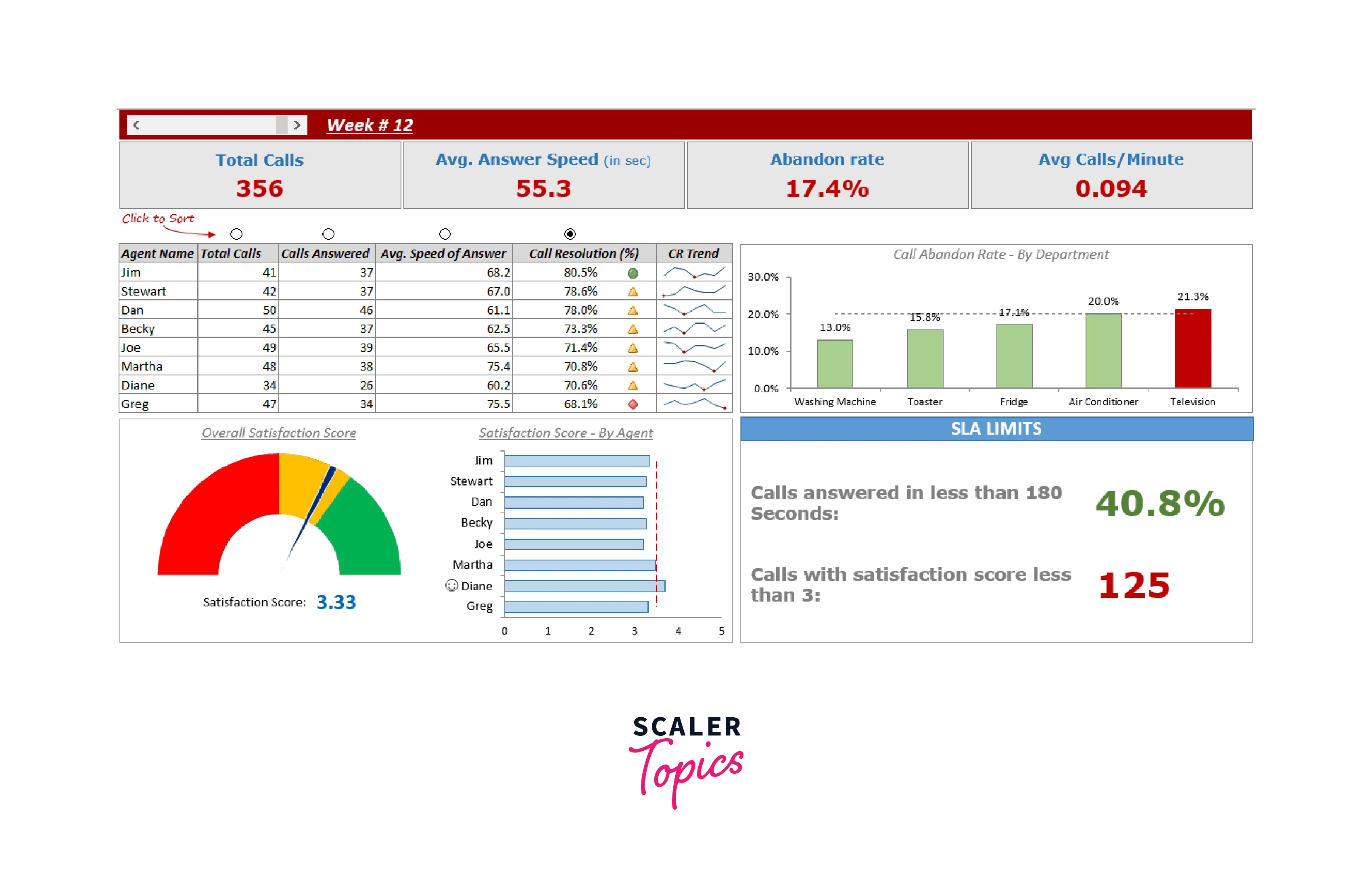
Here are some examples of different components that can be included in a Call Center Dashboard in Excel:
- Line chart displaying the number of calls answered over time
- Pie chart displaying the distribution of call types (sales, support, etc.)
- Bar chart displaying the average handle time by the agent
- Table displaying the number of calls by department
- Scorecard displaying the overall customer satisfaction rate.
By following these design principles and best practices, we can create an effective Call Center Dashboard in Excel that provides a comprehensive overview of the call centre's performance and helps drive informed decision-making.
c. Dashboard Functionality and Interactivity
The functionality and interactivity of a Call Center Dashboard in Excel are critical to its effectiveness in providing valuable insights into the call centre's performance. Here are some of the features and functions of a dashboard that enhance its usability and interactivity:
- Filters: Filters allow users to select specific data sets based on criteria such as date range, call type, and customer segment. This feature makes it easier to isolate and analyze specific data sets without affecting the overall dashboard.
- Slicers: Slicers are interactive controls that allow users to filter data in a Pivot Table or PivotChart. Slicers enable users to slice and dice data in real time, making it easy to drill down and analyze data at a more granular level.
- Drill-Downs: Drill-downs allow users to explore data in greater detail by clicking on a chart or graph to reveal additional layers of data. This feature makes it easy to identify trends and patterns in the data and make data-driven decisions.
- Charts and Graphs: Charts and graphs are essential to visualizing data and making it easier to understand. These features help users identify trends, patterns, and outliers in the data, enabling them to make data-driven decisions.
- Interactive Tables: Interactive tables allow users to sort, filter, and manipulate data directly in the dashboard. This feature enhances the usability and interactivity of the dashboard by enabling users to explore and analyze data more effectively.
- Conditional Formatting: Conditional formatting enables users to highlight specific data points based on pre-defined rules or conditions. This feature helps users identify trends and outliers in the data more easily.
- Interactive Maps: Interactive maps enable users to visualize data geographically. This feature helps users understand where customers are located and identify patterns and trends in call volumes by location.
By incorporating these features and functions into a Call Center Dashboard in Excel, we can create a more interactive and user-friendly dashboard that provides valuable insights into the call centre's performance. Users can interact with the dashboard to gain insights and make data-driven decisions, such as identifying call volume trends, analyzing customer satisfaction scores, and improving first-call resolution rates.
d. Dashboard Deployment and Maintenance
Dashboard Deployment:
- Once we have built a Call Center Dashboard in Excel, we need to consider the different options for deploying it. One option is to share the dashboard via email, which allows us to send a copy of the dashboard to specific users. However, this option can be challenging to manage and keep up to date.
- Another option is to host the dashboard on a server, which allows users to access it remotely. This option is useful for large organizations with many users who need to access the dashboard regularly. We can host the dashboard on a cloud-based platform such as Microsoft SharePoint or Google Drive or a private server.
Dashboard Maintenance:
- Maintaining and updating the Call Center Dashboard is critical to ensure that the data remains accurate and the dashboard remains useful for users. Some best practices for maintaining and updating the dashboard include:
- Regular Data Refreshes: We need to ensure that the data on the dashboard is refreshed regularly to reflect the latest information. We can set up automatic data refreshes using Excel's built-in data connection features or third-party tools.
- Software Updates: We need to keep our Excel software up to date to ensure that we have access to the latest features and functions. We can also update any third-party add-ins or tools we are using to build and maintain the dashboard.
- User Feedback: We should regularly seek feedback from users to identify any issues or areas for improvement. User feedback can help us refine the dashboard and ensure that it remains effective and useful.
- Security: We need to ensure that the dashboard is secure and that only authorized users can access it. We should also regularly back up the dashboard and data to prevent data loss.
Best Practices:
- To ensure that the Call Center Dashboard remains effective and useful for users, we can follow these best practices:
- Keep it Simple: We should design the dashboard with simplicity in mind and avoid cluttering it with unnecessary information or features.
- Use Clear and Consistent Formatting: We should use clear and consistent formatting, such as colours and fonts, to make the dashboard easy to read and understand.
- Provide Context: We should provide context for the data displayed on the dashboard, such as explanations of KPIs and benchmarks.
- Regularly Review and Update: We should regularly review and update the dashboard to ensure that it remains relevant and accurate.
By following these best practices, we can ensure that the Call Center Dashboard in Excel remains effective and useful for users over time.
More on Call Center Dashboards
Examples of Call Center Dashboards
Live Call Centre Dashboards:
Call Centre KPIs:
Benefits Of Call Center Dashboards and Reports
Call Center Dashboards and Reports provide a wide range of benefits to call centres of all sizes.
Here are some of the key benefits:
- Improved Performance Monitoring: Call Center Dashboards and Reports allow call centre managers to track key performance indicators (KPIs) such as average handle time, first call resolution, and customer satisfaction. This enables managers to identify areas of improvement and take corrective action to improve call centre performance.
- Real-time Data Analysis: With Call Center Dashboards and Reports, call centre managers can access real-time data analysis, providing insights into customer behaviour, agent performance, and call centre efficiency. This allows managers to make data-driven decisions that help improve customer satisfaction and reduce costs.
- Better Resource Planning: Call Center Dashboards and Reports enable call centre managers to forecast call volume and schedule resources accordingly. This helps to ensure that the call centre is staffed appropriately, reducing wait times and improving customer satisfaction.
- Enhanced Communication: Call Center Dashboards and Reports provide a common source of information for all call centre employees, improving communication and collaboration across teams. This enables call centre staff to work more efficiently and effectively, resulting in improved customer service.
- Customization: Call Center Dashboards and Reports can be customized to meet the specific needs of each call centre, enabling managers to track the KPIs that matter most to them. This ensures that managers have access to the information they need to make informed decisions that drive call centre performance.
- Increased Efficiency: With Call Center Dashboards and Reports, call centre managers can identify areas of inefficiency and take corrective action, improving overall call centre efficiency. This results in reduced costs, increased productivity, and improved customer satisfaction.
Tips for Call Center Reporting
Call centre reporting is a crucial aspect of managing a call centre. It enables supervisors and managers to analyze call data, track performance, and identify areas for improvement. One of the most effective ways to do this is by using a call centre dashboard in Excel. In this article, we will provide some tips for call centre reporting in the call centre dashboard in Excel.
- Define your KPIs:
Key performance indicators (KPIs) are metrics that measure how well your call centre is performing. Before creating your dashboard, it's essential to define your KPIs. Some of the most common KPIs in call centres include call volume, average handle time, first call resolution, and customer satisfaction. Once you have defined your KPIs, you can create charts and graphs to visualize your data. - Use Pivot Tables:
Pivot tables are a powerful tool in Excel that allow you to summarize and analyze large amounts of data quickly. Use pivot tables to break down your KPIs by date, agent, queue, or any other relevant data point. This will help you identify trends and patterns in your call data. - Create Charts and Graphs
Charts and graphs are a great way to visualize your call centre data. Use them to show trends in call volume, average handle time, or any other KPI. You can create charts and graphs directly from your pivot tables or use Excel's chart wizard to create custom charts. - Use Conditional Formatting
Conditional formatting is a feature in Excel that allows you to format cells based on their values. Use conditional formatting to highlight cells that are above or below your target KPIs. This will help you quickly identify areas that require attention. - Automate your Dashboard
Manually updating your call centre dashboard can be time-consuming. Use Excel's built-in automation tools like macros or VBA to update your dashboard automatically. This will save you time and ensure that your dashboard is always up-to-date. - Incorporate Real-time Data
Real-time data is crucial in call centre reporting as it allows supervisors and managers to identify issues and address them immediately. Use Excel's data connection features to incorporate real-time data from your call centre software or other sources into your dashboard. This will enable you to monitor performance in real time and take action as needed. - Include Qualitative Feedback
While quantitative data is essential in call centre reporting, qualitative feedback from customers and agents can provide valuable insights. Incorporate feedback from customer surveys, agent feedback, and social media monitoring into your dashboard. This will give you a more comprehensive understanding of your call center's performance and help you identify areas for improvement. - Customize your Dashboard
Every call centre is unique, and your dashboard should reflect that. Customize your dashboard to include the KPIs and metrics that are most important to your call centre. Use Excel's formatting tools to create a professional and visually appealing dashboard that is easy to understand and use. This will ensure that your dashboard is an effective tool for managing and improving your call centre's performance.
Call Center Reports Key Elements
Call Center Reports are an essential component of any Call Center Dashboard in Excel. They provide critical insights into the performance of the call centre and help managers make informed decisions.
Here are some key elements that should be included in Call Center Reports:
- KPIs: Call Center Key Performance Indicators (KPIs) are critical metrics that help managers evaluate the performance of the call centre. Some essential KPIs for Call Center Reports include Average Handle Time (AHT), First Call Resolution (FCR), Service Level, and Abandonment Rate.
- Trend Analysis: Trend Analysis allows managers to identify patterns and trends in call centre data over time. This information is essential for forecasting and capacity planning. Excel provides several tools for trend analysis, including charts, graphs, and regression analysis.
- Performance Comparison: Performance comparison helps managers understand how their call centre is performing compared to industry standards and benchmarks. Comparing performance against established benchmarks can help managers identify areas for improvement and set realistic goals.
- Root Cause Analysis: Root Cause Analysis helps managers identify the underlying causes of call centre problems. Excel provides tools for analyzing call centre data to identify trends and patterns that can help managers pinpoint the root cause of issues.
- Agent Performance: Call Center Reports should provide insights into agent performance, including metrics such as Average Handling Time, Call Quality, and First Call Resolution. This information can help managers identify training opportunities and optimize agent performance.
- Customer Feedback: Customer feedback is critical for understanding how customers perceive the call centre's performance. Excel can be used to analyze customer feedback data and provide insights into customer satisfaction levels, preferences, and pain points.
Call Center Reports are essential for any Call Center Dashboard in Excel. They provide critical insights into the performance of the call centre and help managers make informed decisions. By including the key elements mentioned above, Call Center Reports can help managers optimize call centre performance and improve customer satisfaction.
Top 5 Call Center Metrics
The success of a call centre depends on several key metrics that help measure its performance and effectiveness. Here are the top five call centre metrics that should be included in a Call Center Dashboard in Excel:
- Average Handling Time (AHT): This metric measures the average time it takes for a call centre agent to handle a customer call from start to finish. AHT includes time spent on hold, talk time, and after-call work. AHT helps measure the efficiency of call centre agents and identify opportunities for improvement.
- First Call Resolution (FCR): FCR measures the percentage of customer issues that are resolved on the first call. This metric is a critical indicator of customer satisfaction and can help identify areas for improvement in call centre processes and training.
- Service Level: Service level measures the percentage of calls answered within a specific time frame, such as 20 seconds. Service level is an important metric for measuring call centre performance and ensuring that customers are not waiting too long to speak with an agent.
- Customer Satisfaction (CSAT): CSAT measures the satisfaction level of customers after interacting with a call centre agent. CSAT is usually measured through post-call surveys or feedback forms. This metric helps measure the effectiveness of call centre agents and identify opportunities for improvement.
- Abandonment Rate: Abandonment rate measures the percentage of calls that are abandoned by customers before they are answered by an agent. High abandonment rates can indicate issues with call centre staffing or processes.
Conclusion
- The call centre metrics included in the dashboard should be chosen carefully based on the goals of the call centre and the needs of its customers.
- The dashboard should be designed to be easy to read and understand, with clear visualizations and explanations of the metrics.
- Excel offers powerful tools and functions for building and maintaining a Call Center Dashboard, including data connections and pivot tables.
- Regular data refreshes and updates are critical for ensuring the accuracy and effectiveness of the dashboard.
- User feedback and engagement are key to ensuring that the dashboard remains relevant and useful over time.
- Best practices such as keeping the dashboard simple, using clear and consistent formatting, providing context for the data, and regularly reviewing and updating the dashboard should be followed to ensure its effectiveness.