How to Create a Card with CSS?
 FREE
FREE

Overview
Creating a card with CSS is a fundamental skill for web developers and designers looking to enhance the visual appeal and organization of content on a webpage. Cards are versatile UI elements used for displaying information in a structured and visually appealing manner.
Pre-requisites
Before diving into creating a card with CSS, it's important to have a basic understanding of the following pre-requisites:
- HTML: You should be familiar with HTML, as cards are typically structured using HTML elements. Understanding how to create HTML documents, divs, headings, paragraphs, images, and links is essential.
- CSS Fundamentals: A solid grasp of CSS fundamentals is crucial. This includes knowing how to select HTML elements, apply styles using properties like color, font-size, margin, padding, and background, and understanding CSS classes and IDs.
- Box Model: Understanding the CSS box model is essential for controlling the sizing and spacing of elements within your card. You'll need to comprehend concepts like margin, padding, border, and content dimensions.
- Basic Layout: Familiarity with basic layout techniques such as using the display property (e.g., block, inline-block, flex, grid) to control the arrangement of elements is important for positioning content within your card.
- Understanding Selectors: Being able to select and style HTML elements using various CSS selectors (e.g., element selectors, class selectors, ID selectors) is essential for creating cards with specific styles.
Creating a Card with CSS
Creating a card with CSS involves defining a structured layout that typically consists of an image or header, a title, a description, and optional action buttons or links. Here's a step-by-step guide with examples on how to create a basic card:
Basic Structure of a Card
The basic structure of a card typically consists of several key elements, each serving a specific purpose to present information in a visually appealing and organized manner. Here's an explanation of the typical card layout:
Card Container (Outer Wrapper): The card container is the outermost element that holds all the card's content. It acts as a frame for the card and is usually styled with background colors, borders, and padding to define the card's appearance.
Image or Header: Many cards feature an image or header at the top. This element provides a visual context or a focal point for the card's content. It's often used to display a featured image, a product photo, or an illustration related to the card's topic.
Title: The title of the card is a concise and descriptive headline that summarizes the card's content. It helps users quickly understand the card's topic or purpose. Titles are typically styled with larger font sizes and may be bold or differently colored to make them stand out.
Text or Description: Beneath the title, there is usually a section for the card's main text or description. This is where you provide more detailed information, context, or additional details about the card's content. The text is often styled with a smaller font size and may include paragraphs or bullet points.
Action Buttons or Links: Cards often include action buttons or links that allow users to take specific actions related to the card's content. These actions might include "Learn More," "Read More," "Buy Now," or any other relevant call-to-action. These buttons are typically styled to stand out and may change appearance when hovered over to indicate interactivity.
Here's a visual representation of the typical card layout:
| Structure of a Card |
|---|
| Card Container |
| Image or Header |
| Title |
| Text or Description |
| Action Buttons or Links |
Step-by-Step Creation
Step 1: Define the Card Container
First, create a container for your card using HTML. This container will hold all the card elements. A common choice for this container is a <div> element with a class or ID for styling purposes.
HTML
Step 2: Style the Card Container
Use CSS to define the styles for your card container. This includes setting the background color, border, padding, and margin to create the card's overall appearance.
CSS
Step 3: Style the Card Header or Image
If your card includes a header image, you can style it within the card container. Use the <img> element and apply CSS styles to it.
HTML
CSS
Step 4: Style Card Content
Inside the card container, you'll have elements for the title, description, and any other content. Style these elements to fit your card design.
HTML
CSS
Step 5: Adding Action Buttons or Links
You can include action buttons or links within the card to allow users to interact with the card content.
HTML
CSS

With these steps, you've created a basic card with CSS. You can further customize the styles and layout to match your project's design requirements. Cards are versatile elements and can be adapted to various purposes by adjusting their content and styles accordingly.
How to Layout CSS Cards?
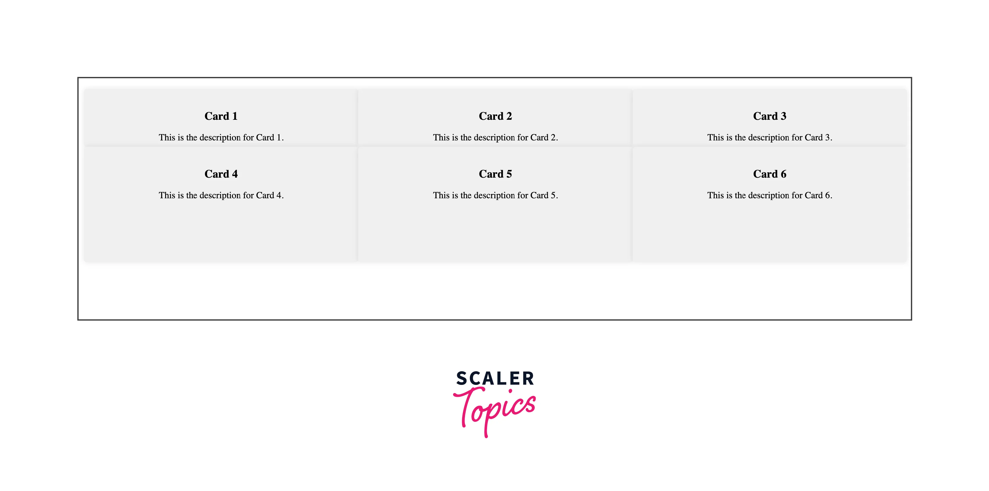
Laying out CSS cards involves arranging multiple cards on a web page in an organized and visually appealing manner. Cards are often used to present individual pieces of content, such as articles, products, or user profiles, in a consistent and structured format. Here's how you can lay out CSS cards effectively:
HTML Structure:
Start by creating the HTML structure for a single card. You'll define this structure within a container element (e.g., a <div>) that holds all the cards. Each card should be encapsulated within a separate container. Here's a simplified example of the HTML structure for a single card:
CSS Styling: Define the CSS styles for your cards. You'll typically set styles for the following aspects:
- Card Container: Style the outer container for the cards. This includes setting the background color, border, padding, margin, and any other visual properties that give your cards a consistent look.
- Card Content: Style the individual elements within each card, such as the title, description, image, and buttons. Adjust fonts, colors, sizes, and margins to achieve the desired appearance.
Layout: Decide on the layout for your cards. You can arrange them in rows, columns, or a grid layout. CSS properties like flexbox, or grid can be used to control the card positioning. Let's discuss about them in details:
Grid Layout
Grid layout is a powerful CSS feature that allows you to create complex, two-dimensional layouts with ease. It's especially useful for designing responsive web pages and organizing content in a grid-like fashion. Here's an overview of how to use CSS Grid Layout:
Defining the Grid Container:
To get started with Grid Layout, you need to define a grid container element. This container will hold the grid items (the elements you want to arrange in a grid). You can create a grid container by selecting an HTML element (e.g., a <div>) and applying the display: grid; property to it.
Example:
HTML
CSS
Defining the Grid Columns and Rows:
After creating the grid container, you can define the columns and rows of the grid. Use properties like grid-template-columns and grid-template-rows to specify the size and structure of the columns and rows.
Example:
Output:
Placing Grid Items:
Grid items are the elements you want to place within the grid container. To position items within the grid, use the grid-column and grid-row properties. You can specify the starting and ending positions of each item in the grid.
Example:
Output:

Automatic Grid Flow:
By default, grid items will automatically flow into the grid cells in row-major order (left to right, top to bottom). You can also control the grid flow with properties like grid-column-start, grid-column-end, grid-row-start, and grid-row-end.
Example:
Responsive Grids:
CSS Grid Layout is excellent for creating responsive layouts. Use media queries to change the grid structure, column sizes, or other grid properties based on screen size or device orientation.
Example:
Grid Gap:
You can control the spacing between grid items using the grid-gap property. This property defines the gap between columns and rows.
Example:
Nested Grids:
Grid layouts can be nested within other grid items, allowing for more complex layouts.
Example:
HTML
CSS
By following these steps and utilizing CSS Grid Layout properties effectively, you can create flexible and responsive grid-based layouts for your web projects, making it easier to organize content and adapt to different screen sizes.
Flexbox Layout
Flexbox, short for Flexible Box Layout is a CSS layout model that makes it easier to design complex layouts and align elements within a container, even when the size of those elements is unknown or dynamic. It's particularly useful for creating responsive designs and distributing space efficiently. Here's an overview of how to use Flexbox:
Defining the Flex Container:
Start by defining a flex container element. This container will hold the flex items (the elements you want to arrange using Flexbox). You can create a flex container by selecting an HTML element (e.g., a <div>) and applying the display: flex; property to it.
Example:
HTML
CSS
Flex Direction:
Flexbox works along a main axis and a cross axis. By default, the main axis is horizontal (left to right), but you can change it using the flex-direction property. Common values for flex-direction include row, row-reverse, column, and column-reverse.
Example:
CSS
Flex Items:
Any child elements within the flex container automatically become flex items. Flex items will align along the main axis by default, and their size will adapt to fit the content. You can control the sizing, order, and alignment of flex items using various Flexbox properties. Flex Wrap:
By default, flex items will try to fit within a single line. To allow items to wrap onto new lines when they exceed the container's width or height, use the flex-wrap property.
Example:
Justify Content:
The justify-content property controls the alignment of flex items along the main axis. Common values include flex-start, center, flex-end, space-between, and space-around.
Example:
Align Items and Align Content:
The align-items property controls the alignment of flex items along the cross axis. The align-content property controls the alignment of multiple lines of flex items along the cross axis when flex-wrap is set to wrap. Common values for align-items and align-content include flex-start, center, flex-end, and stretch.
Example:
Flex Growth and Shrink:
Flex items can grow or shrink proportionally using the flex-grow and flex-shrink properties. By default, items have a flex-grow value of 0 and a flex-shrink value of 1.
Example:
Ordering Flex Items:
You can change the order of flex items using the order property. Lower values come first.
Example:
Flexbox provides a powerful and intuitive way to create flexible and responsive layouts in CSS. By adjusting the various Flexbox properties, you can control the alignment, ordering, and sizing of elements within a flex container, making it a valuable tool for modern web design.
Browser Compatibility
Cards created using HTML and CSS are generally supported across all modern web browsers. However, it's important to keep in mind that some older or less commonly used browsers may have limited support for certain CSS properties or may display your cards slightly differently. Below is a list of popular web browsers and their general support for HTML and CSS, including cards:
| Google Chrome | Microsoft Edge | Mozilla Firefox | Opera | Safari | |
|---|---|---|---|---|---|
| Versions | 57 | 16 | 52 | 44 | 10.1 |
Conclusion
- Creating a card with CSS involves defining a container, styling the header or image, formatting card content (title, description, etc.), and adding action buttons or links.
- The basic structure of a card consists of a container, an optional header or image, a title, a description, and optional action buttons.
- CSS is used to style the card's appearance, including background, borders, fonts, and spacing.
- Cards are versatile UI elements suitable for various content types and can be customized to match your design preferences.
- Responsive design considerations ensure the card layout adapts to different screen sizes and devices.
- Regular testing across multiple browsers helps ensure compatibility and consistent card rendering.