Chart Styling in Excel
Overview
Chart styling in Excel involves a variety of tools and techniques that can be used to create efficient and informative charts. From selecting the right chart type to simplifying your data and using clear and concise labels, there are many ways to improve the readability and effectiveness of your charts. In addition, you can use trendlines and data markers to provide additional context and choose appropriate chart layouts and styles to create a visually appealing chart. By utilizing these chart styling techniques, you can create charts in Excel that effectively convey your data and insights in a clear and concise manner.
Introduction
Excel offers a wide range of features to help you style your charts to perfection. You can add trendlines to show patterns and trends in your data, change the chart style and layout to suit your needs, and customize the colors, fonts, and borders to match the look and feel of your presentation or report. Additionally, Excel offers several pre-designed chart templates that you can use to create professional-looking charts quickly. By using Excel's styling tools effectively, you can create charts that are both visually appealing and informative, making it easier for you to convey your message to your audience.
What is Chart Styling in Excel?
Chart styling is a critical aspect of data visualization. Charts and graphs are essential tools that help to represent complex data in a visually appealing and easy-to-understand format. By styling your charts, you can make your data more compelling and persuasive, which is crucial when presenting your findings to others.
Excel offers a wide range of tools and features to help you style your charts to perfection. You can adjust the colors, fonts, and borders of your charts, and you can also add visual elements like data labels, legends, and titles. These tools allow you to customize the appearance of your charts to match the look and feel of your presentation or report.
How to Create a Chart in Excel?
- First, select the data you want to chart in your worksheet.
- Next, go to the "Insert" tab on the ribbon and click on the chart type you want to create. You can choose from several different chart types, including column, line, pie, and bar charts.
- Excel will create a basic chart based on your data. You can then customize the chart by adding or removing elements such as titles, axis labels, and legends.
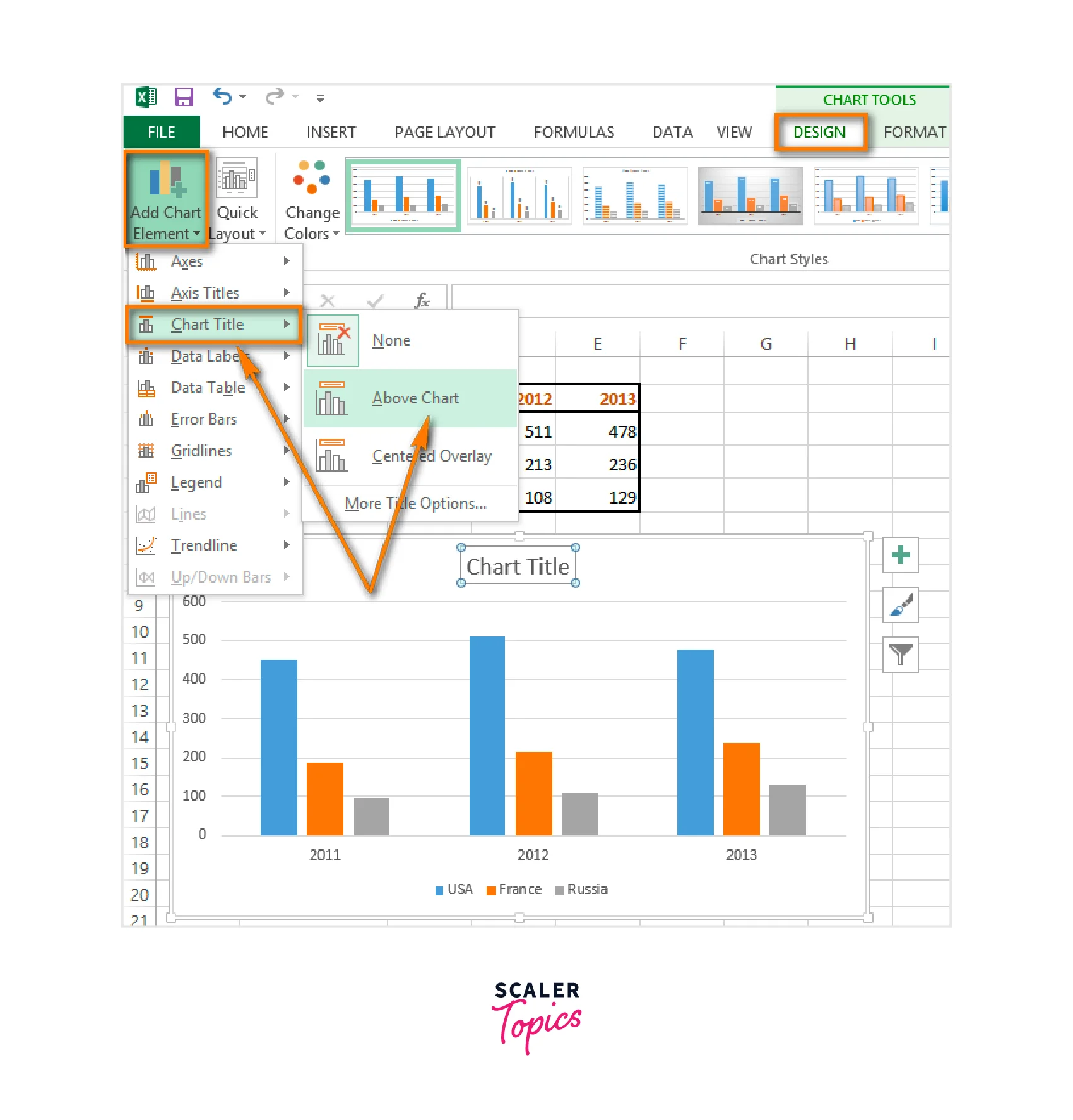
Add a Trendline
- First, create your chart using the steps above.
- Next, select the data series to which you want to add a trendline by clicking on it once. You can tell which data series is selected by the small circles, or data markers, that appear on the chart.
- Right-click on the selected data series and choose "Add Trendline" from the menu that appears.
- In the "Format Trendline" pane that appears on the right-hand side of the screen, select the type of trendline you want to add. You can choose from several different options, including linear, exponential, logarithmic, and polynomial.
Different Chart Tools in Excel
How to Use Chart Tools in Excel?
- Go to the "Insert" tab on the ribbon and click on the chart type you want to create.
- Once you've created your chart, you can use the chart tools on the "Chart Design" and "Format" tabs of the ribbon to customize your chart as needed.
- To add or modify chart elements, such as titles, axis labels, or data labels, click on the chart element you want to modify, and use the options on the ribbon to customize it.
- To change the style or layout of your chart, use the options on the "Chart Design" tab to select a pre-designed style or layout or customize your own.
- To add a trendline, right-click on the data series in the chart and select "Add Trendline."
- To change the colors, fonts, and borders of your chart, use the options on the "Format" tab of the ribbon.
Chart Layout
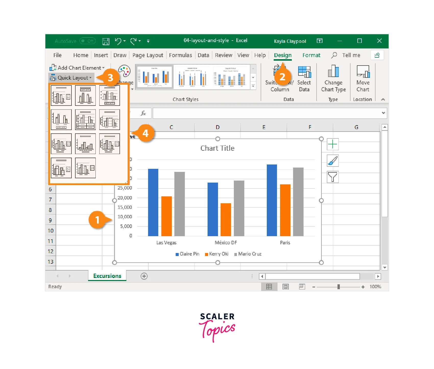
- Once you've created your chart, click on it to select it. This will bring up the "Chart Tools" contextual tab on the ribbon.
- Click on the "Chart Design" tab on the ribbon. You should see several options for chart styles and layouts.
- Click on one of the "Quick Layout" options to apply a pre-designed layout to your chart. You can hover over each option to see a preview of what it will look like.
- If you want to save your customized chart layout for future use, click on the "Save As Template" button on the "Chart Design" tab.
- The Chart Layout settings in Excel allow you to quickly apply pre-designed chart layouts or customize individual chart elements to create professional-looking charts that effectively communicate your data insights.
Change Colors
- Once you've created your chart, click on it to select it. This will bring up the "Chart Tools" contextual tab on the ribbon.
- Click on the "Format" tab on the ribbon. You should see several options for customizing your chart's appearance.
- To change the color of a specific chart element, such as a data series, click on it to select it. Then, click on the "Shape Fill" or "Shape Outline" button on the ribbon, and choose a new color from the drop-down menu.
- To change the color of the entire chart, click on the "Chart Area" or "Plot Area" to select it. Then, click on the "Shape Fill" or "Shape Outline" button on the ribbon, and choose a new color from the drop-down menu.
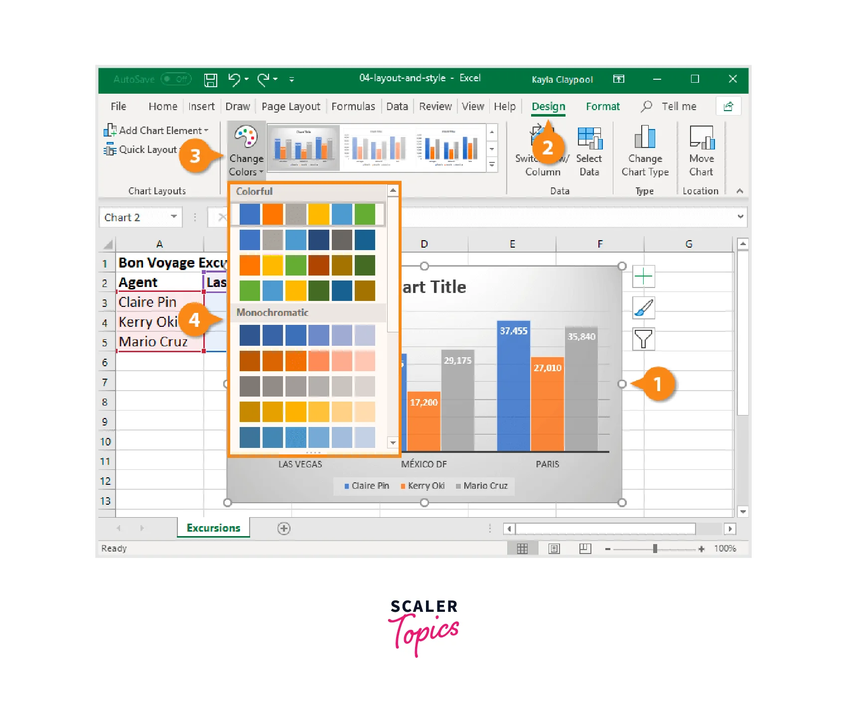
Chart Styles
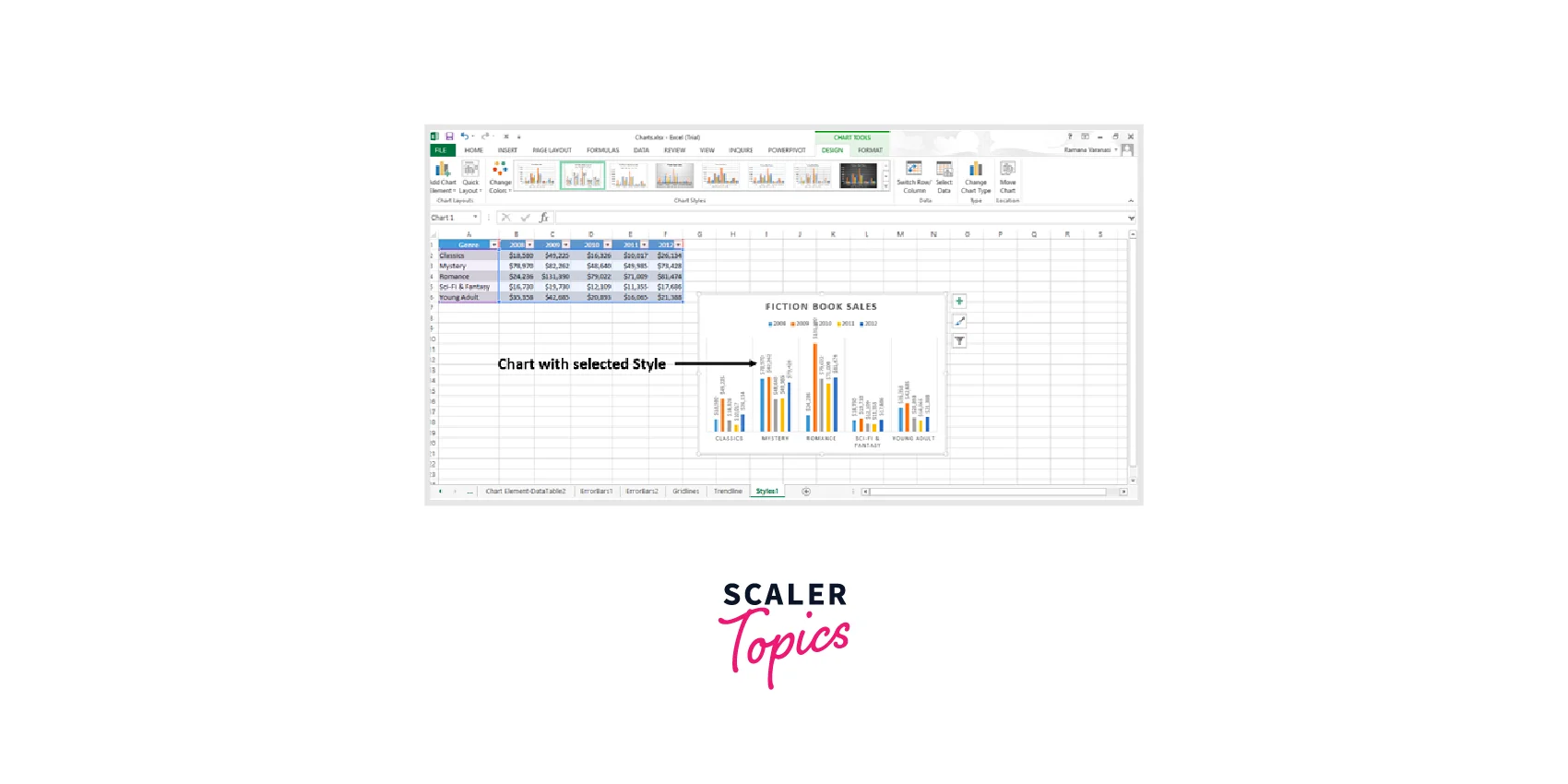
- Once you've created your chart, click on it to select it. This will bring up the "Chart Tools" contextual tab on the ribbon.
- Click on the "Chart Design" tab on the ribbon. You should see several options for chart styles and layouts.
- To customize the style of your chart, click on the "Chart Styles" button on the "Chart Design" tab. This will give you several options for pre-designed chart styles that you can apply to your chart.
- If you want to customize your own chart style, click on the "Style" button and choose "Customize" from the drop-down menu.
Switch Row / Column
- Once you've created your chart, click on it to select it. This will bring up the "Chart Tools" contextual tab on the ribbon.
- Click on the "Design" tab on the ribbon.
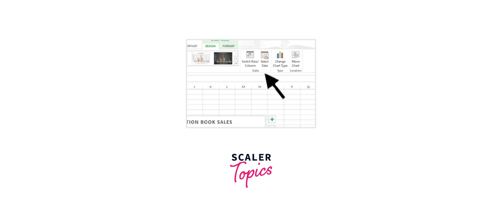
- In the "Data" group, click on the "Switch Row/Column" button. This will swap the row and column data in your chart.
- Once you've switched the row/column data, you may need to adjust your chart to display the data correctly. For example, you may need to re-label your axis or adjust your chart layout
Select Data
- Once you've created your chart, click on it to select it. This will bring up the "Chart Tools" contextual tab on the ribbon.
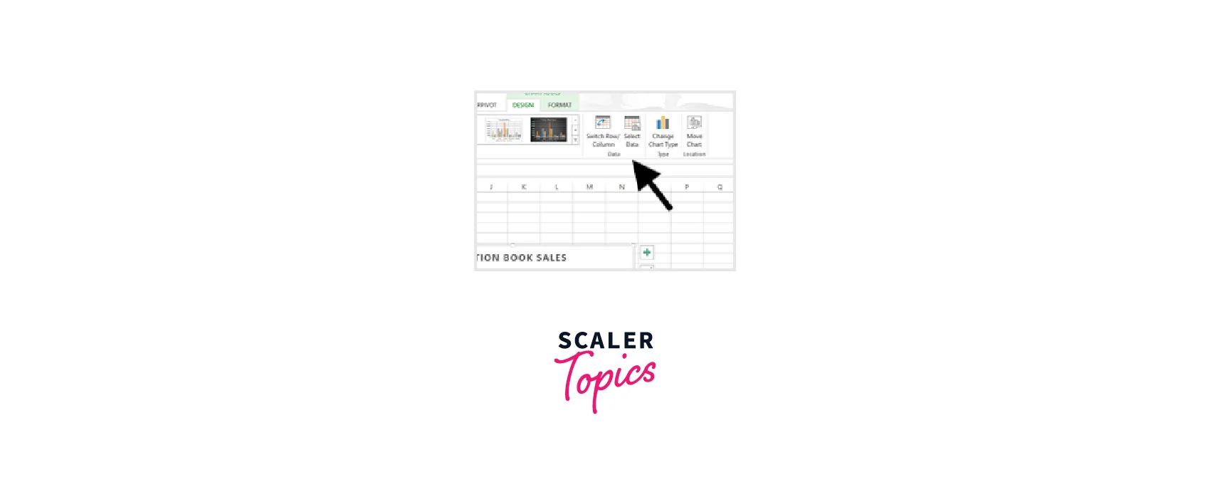
- Click on the "Select Data" button in the "Data" group on the "Design" tab of the ribbon.
- In the "Select Data Source" dialog box that appears, you can add, edit, or remove data series from your chart.
- To add a new data series to your chart, click on the "Add" button under the "Legend Entries (Series)" section. Then, in the "Edit Series" dialog box that appears, enter the name and data range for the new series.
- To edit an existing data series, select the series you want to modify from the list under the "Legend Entries (Series)" section, and then click on the "Edit" button. You can then modify the name and data range for the series.
- To remove a data series from your chart, select the series you want to remove from the list under the "Legend Entries (Series)" section, and then click on the "Remove" button.

Change Chart Type
- Once you've created your chart, click on it to select it. This will bring up the "Chart Tools" contextual tab on the ribbon.
- Click on the "Design" tab on the ribbon.
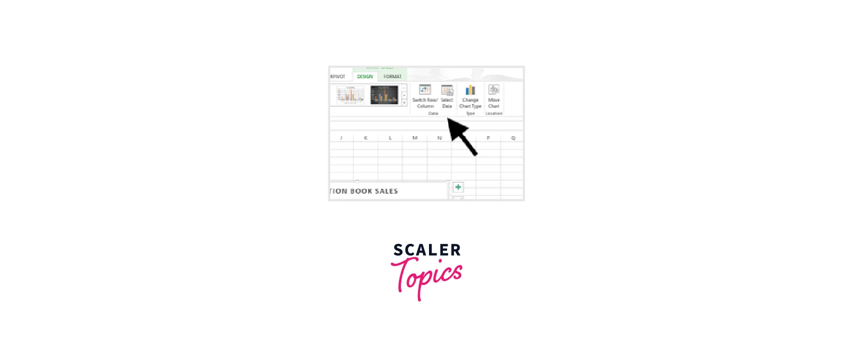
- In the "Type" group, click on the "Change Chart Type" button. This will bring up a menu of chart types you can choose from.
- In the "Change Chart Type" dialog box, select the new chart type you want to use.
Move Chart
- If you want to move the chart to a new worksheet, right-click on the chart and select "Move Chart" from the context menu.
- In the "Move Chart" dialog box that appears, select the option to move the chart to a new sheet.
- Choose the name of the new sheet and click on the "OK" button.
- The chart will now be moved to the new sheet.
How to Save a Chart in Excel?
- Once you've created your chart, click on it to select it. This will bring up the "Chart Tools" contextual tab on the ribbon.
- Click on the "File" tab in the ribbon to go to the "Backstage" view.
- Select the "Save As" option from the menu on the left-hand side.
- In the "Save As" dialog box that appears, choose the location where you want to save the chart.
- Type a name for the chart in the "File name" field.
- In the "Save as type" dropdown menu, select the file format you want to use to save the chart. For example, you could save it as a PDF or an image file.
- Click on the "Save" button to save the chart.
Tips to Create Efficient and Informative Charts in Excel
- Choose the right chart type for your data : Selecting the right chart type is critical to creating an efficient and informative chart. Consider the data you want to represent and choose a chart type that best showcases that data.
- Simplify your data : Avoid overloading your chart with too much data. Simplify your data by removing unnecessary data points and highlighting only the most important information.
- Use clear and concise labels : Make sure your chart is easy to understand by using clear and concise labels. Labels should be informative, yet brief enough to not overwhelm the chart.
- Format your chart for clarity : Formatting your chart can help to increase its clarity and readability. Use appropriate font sizes and colors, and consider using bold or italics to draw attention to important information.
- Utilize trendlines and data markers : Adding trendlines and data markers can help to provide additional context to your chart and make it more informative.
- Choose appropriate chart layouts and styles : Choosing the appropriate chart layout and style can make a big difference in the readability and efficiency of your chart. Consider using contrasting colors and a simple layout to keep the focus on the data.
Conclusion
- Chart styling in Excel is a crucial aspect of creating efficient and informative charts that effectively communicate your data and insights.
- Techniques such as selecting the right chart type, simplifying your data, using clear and concise labels, and adding trendlines and data markers can greatly enhance the effectiveness of your charts.
- Choosing appropriate chart layouts and styles can help to create visually appealing charts that are easy to understand and communicate information effectively.
- Using chart styling tools such as Chart Layouts, Chart Styles, and Colors can further enhance the visual appeal and effectiveness of your charts.
- By utilizing these chart styling techniques, you can create charts in Excel that are optimized for readability and effectiveness, allowing you to effectively convey your data and insights to others.
