Gantt Chart, Pareto Chart, and Matrix Chart in Excel
Overview
A bar chart feature in Microsoft Excel can be formatted to create gantt chart in excel. Constructing a Gantt chart in PowerPoint might be quicker and easier if you frequently communicate with clients and executives and need to produce and update one.
Each of these two possibilities is described in its section on this page. First, we'll start with a bar chart and walk you through creating a Gantt chart in Excel. Then, by pasting or importing data from an.xls file, we'll instantly demonstrate how to create an organizational gantt chart in excel.
Pareto chart
A Pareto chart is a form of a chart that combines a line chart with a bar chart, with the line chart serving as the cumulative total representation. To see the biggest overall improvement, they are typically utilized to identify the defects to prioritize. The Pareto principle, which takes its name from renowned Italian economist Vilfredo Pareto, is referenced in the chart's name. The Pareto principle, named after the Italian economist Vilfredo Pareto, is the foundation for Pareto analysis. And according to this theory, 20% of the causes account for 80% of the effects of most events. Because of this, the 80/20 rule is another name for the Pareto principle.
Here are some real-world applications of the Pareto principle:
- Around 80% of global income is controlled by the richest 20% of the population.
- According to statistics in medicine, 20% of patients utilize 80% of the resources for health care.
- In software, 80% of failures and crashes result from 20% of flaws.
- You can create a Pareto chart in your Excel spreadsheet to determine the most important aspects that should receive your attention.
The discussion in this section is limited to two varieties of Pareto charts:
- Static Pareto Chart.
- Dynamic Pareto Chart.
- Static Pareto Chart: A static Pareto Chart is a simple chart that displays all the data without allowing the viewer to view only the data related to specific values.
- Dynamic Pareto Chart: Dynamic Pareto chart allows users to change the values and view the outcomes for those changes.
How to Create A gantt chart in excel?
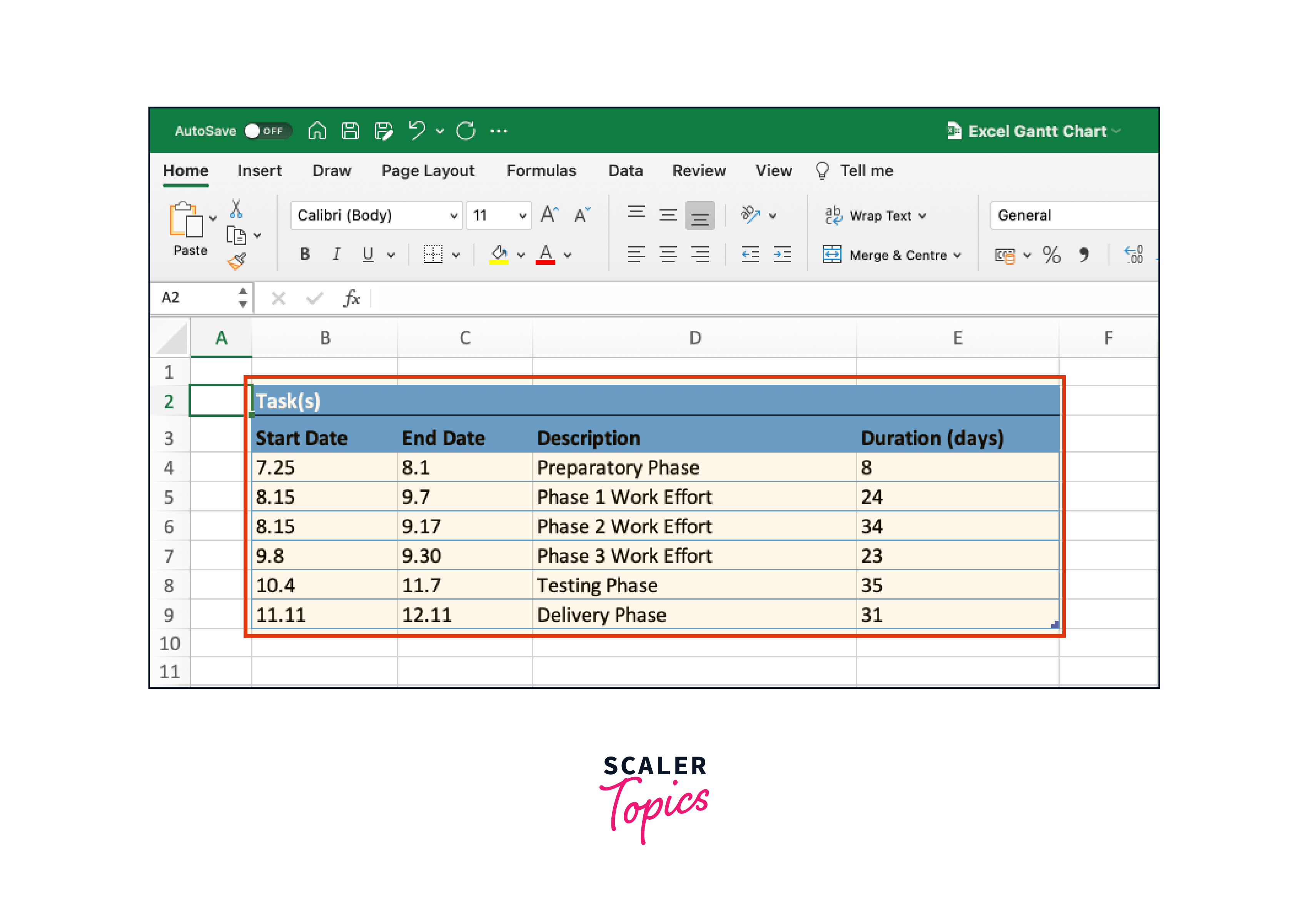
- Create an Excel table with your project schedule in it. Divide the overall undertaking into manageable tasks or segments. These are called project tasks and serve as the framework for your Gantt chart. Enter your data in Excel 2013, 2016, and 2019 by specifying the Start Date, Finish Date, and Duration (the number of days needed to accomplish each task). As indicated in the figure below, order the tasks by placing the earliest start date first and the latest date last. Remember to give a brief description of each work.
- Convert your Excel Gantt to a stacked bar chart to create it. Click on any empty cell on the worksheet that contains the Excel table. Choose the INSERT tab from the Excel ribbon. Drop down the Bar Chart selection option in the Charts area of the ribbon. Then, choose Stacked Bar (do not choose 100% Stacked Bar), adding a sizable white blank chart space to your Excel worksheet.

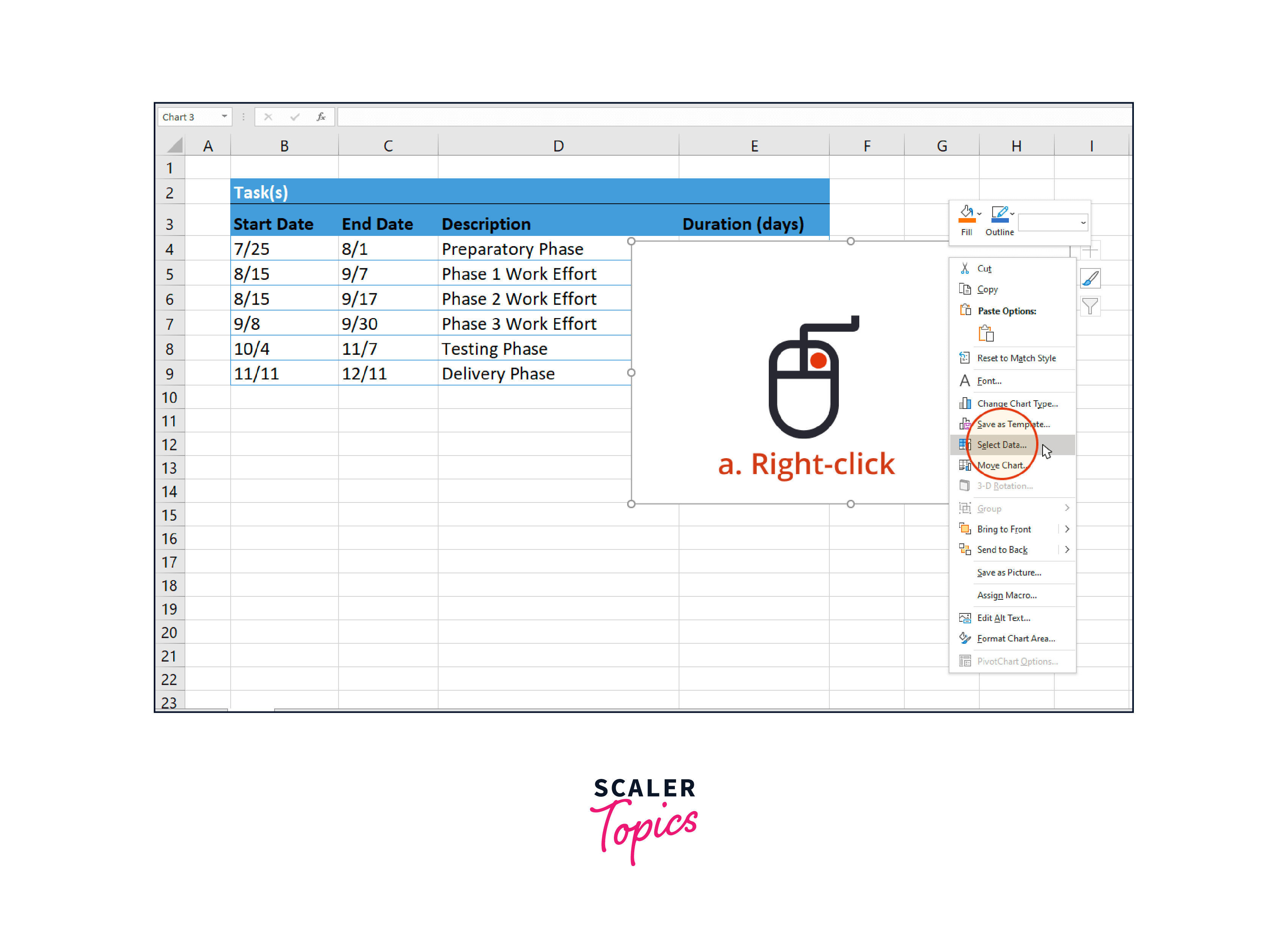
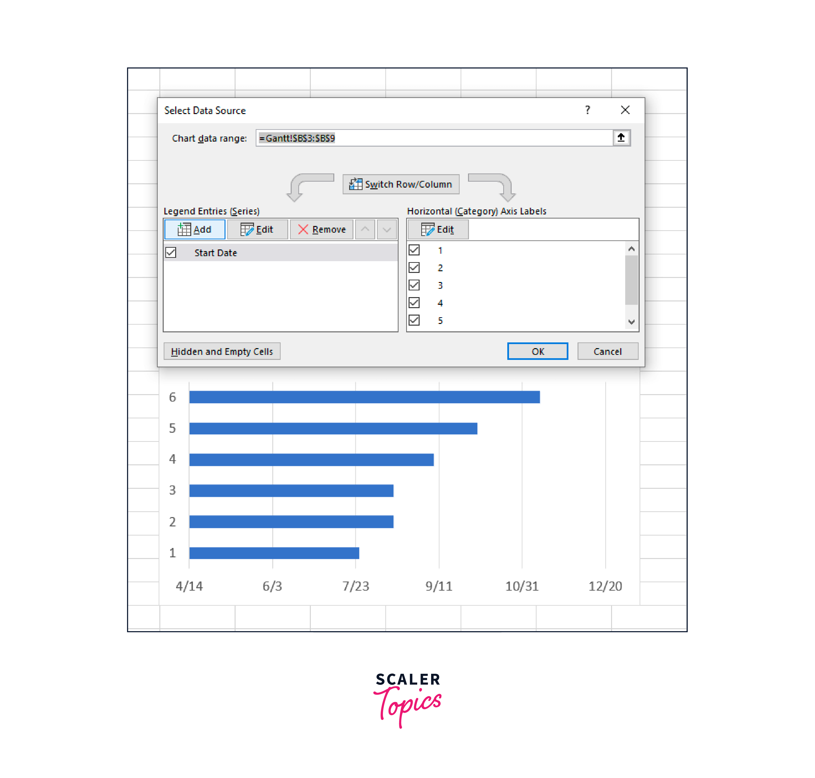
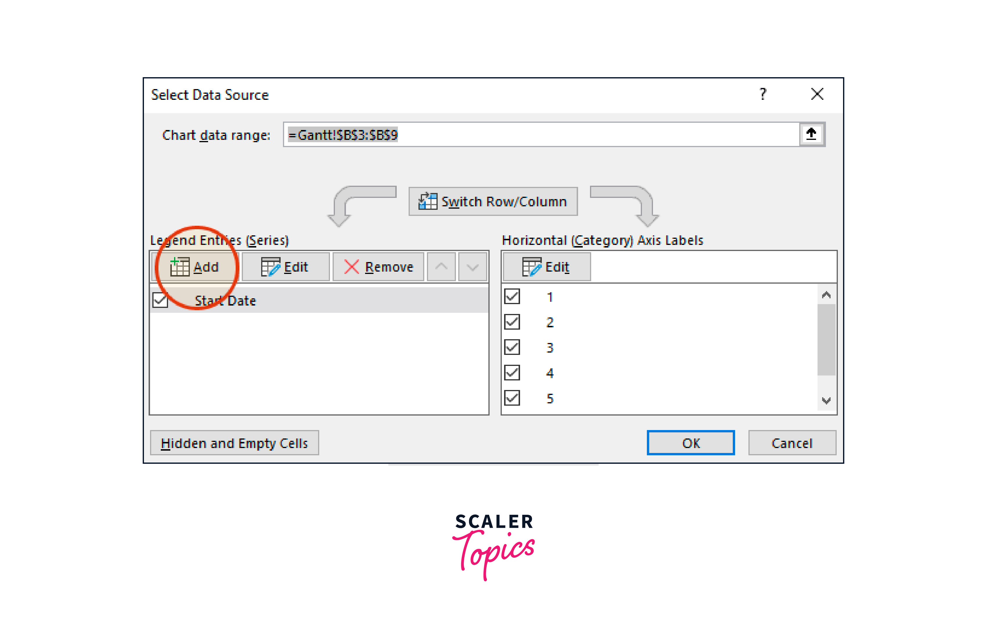
- Update the Gantt chart with the start dates of your tasks. To display the Select Data Source window in Excel, right-click the blank area of the chart and choose Select Data.
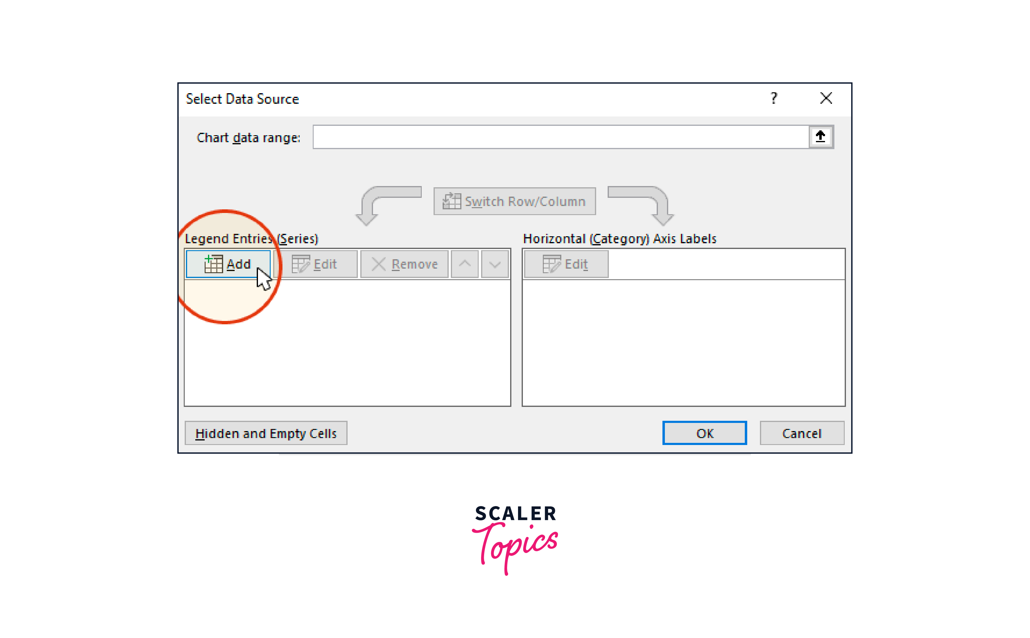
You can find a table called Legend Entries (Series) on the left of Excel's Data Source window. The Add button will open the Edit Series box in Excel, where you can start entering the task data into your Gantt chart.
We will now add the information from your task
I. To begin, we must give the data (Series) we are entering a name. Your table's Start Date column header should be selected after you click and position your cursor in the blank space beneath the Series name field.
ii. Scroll down to Series value while still in the Edit Series window. You should specify the Task start dates here. Doing it is simple. A symbol with an arrow goes up to the right of the Series values box.
![]()
When you click the icon, Excel will launch a more compact Edit Series window. Drag your mouse down to the last start date after clicking the first start date in your task table. This highlights all of the task start dates in your Gantt chart. Check to see whether you accidentally highlighted the header or any more cells.
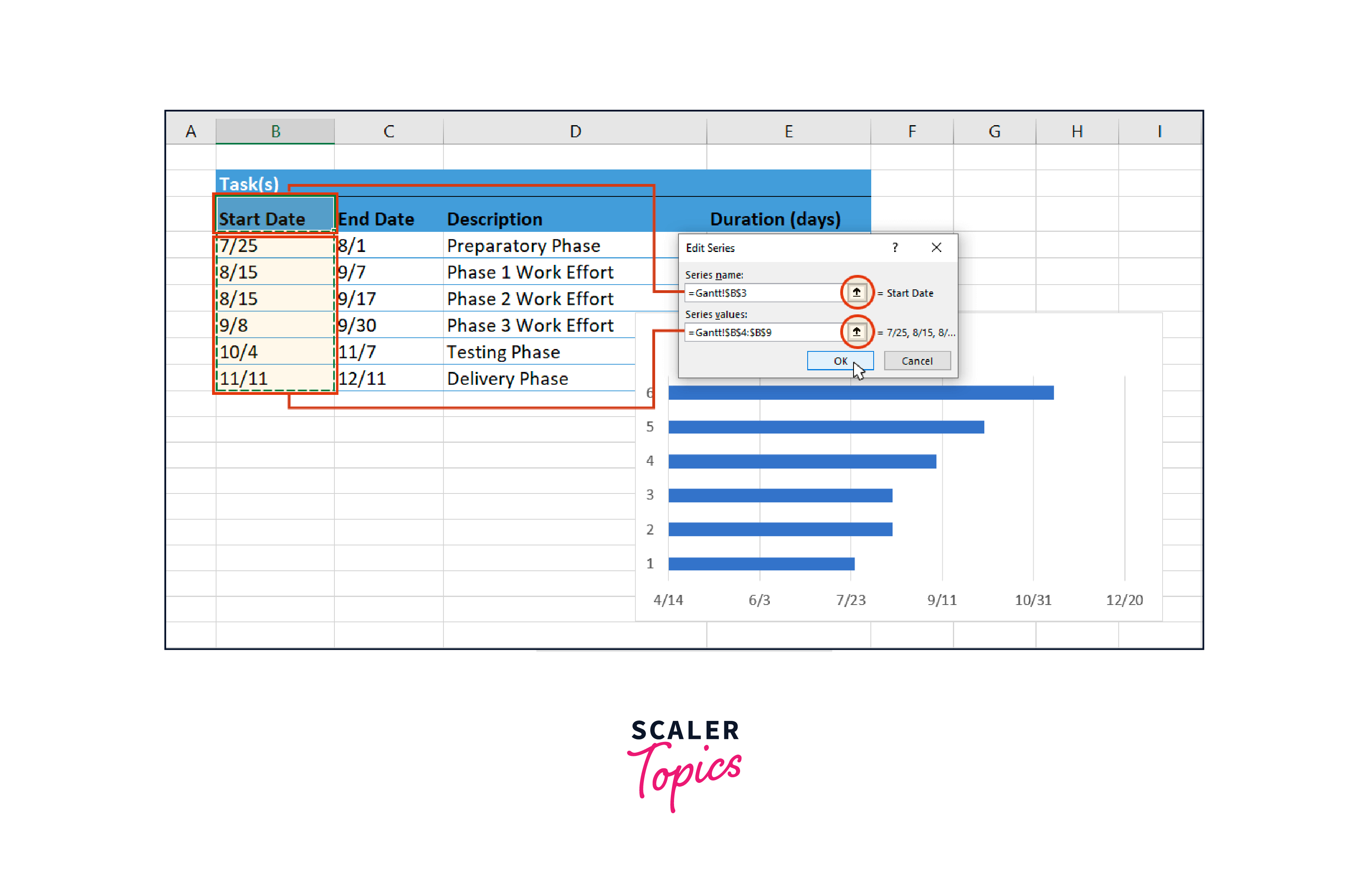
When finished, click the arrow icon next to Edit Data to go back to the Edit Series window that was previously displayed. To continue, click OK. Your Gantt chart should now appear as follows:
Your task durations should be added to the gantt chart in excel. Re-click the Add button while still in the Select Data Source window to open the Edit Series window in Excel. The duration information will be added to your Gantt chart here.
Click again on the column header named Duration in your task table after clicking in the empty field under the title Series Name in the Edit Series window.
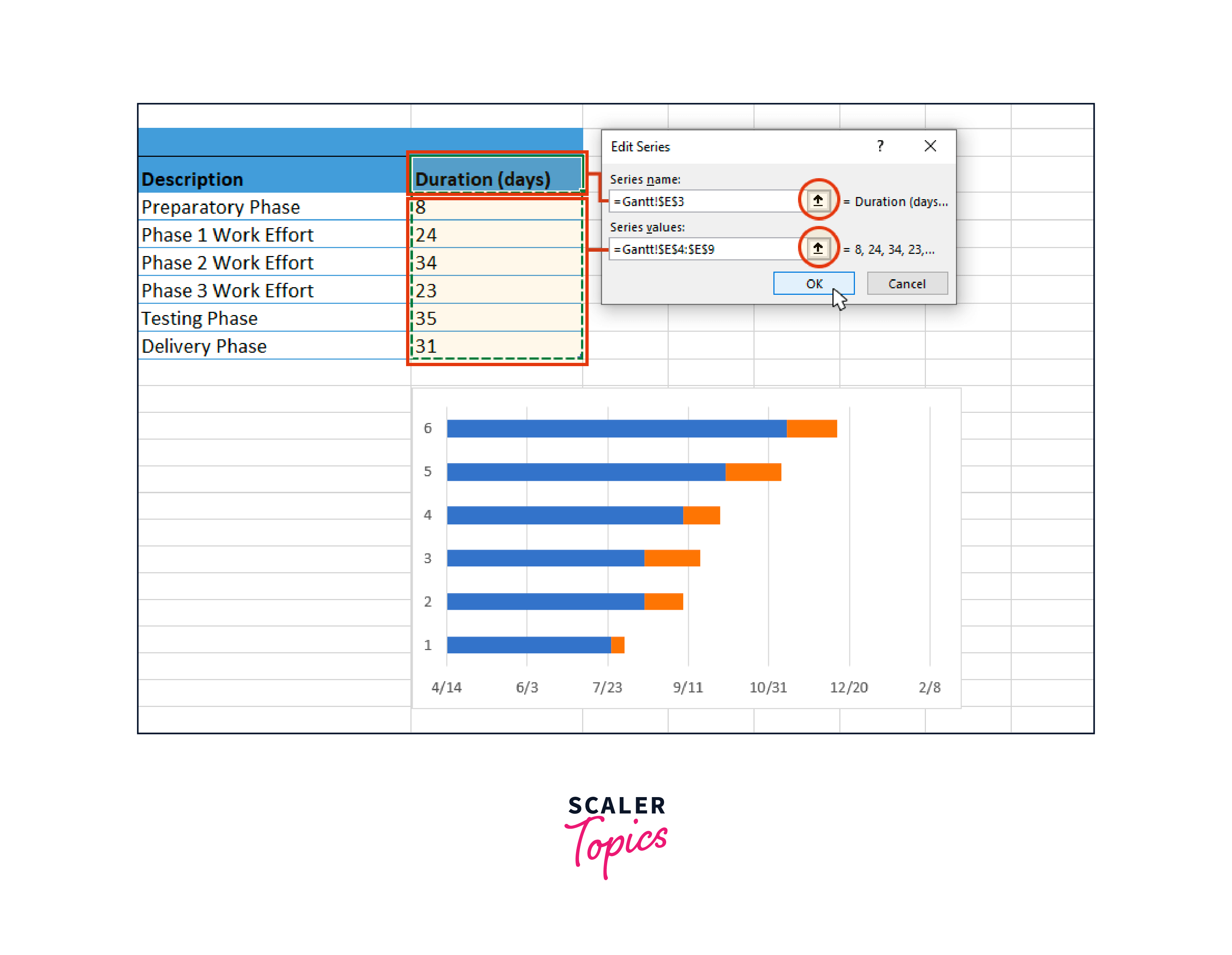
Staying in the Edit Series window, scroll down to the Series value and click the Edit Series Button spreadsheet icon once more to edit the data field in Excel. Click on the first Duration in your project table to choose it, then drag the mouse down to the final Duration to highlight all the durations.
To close the window, click the tiny spreadsheet icon with the black arrow again. This will take you back to the previous window. After clicking OK, you should be back in the Select Data Source window. To update your Gantt chart, click OK once more; it should now look this:
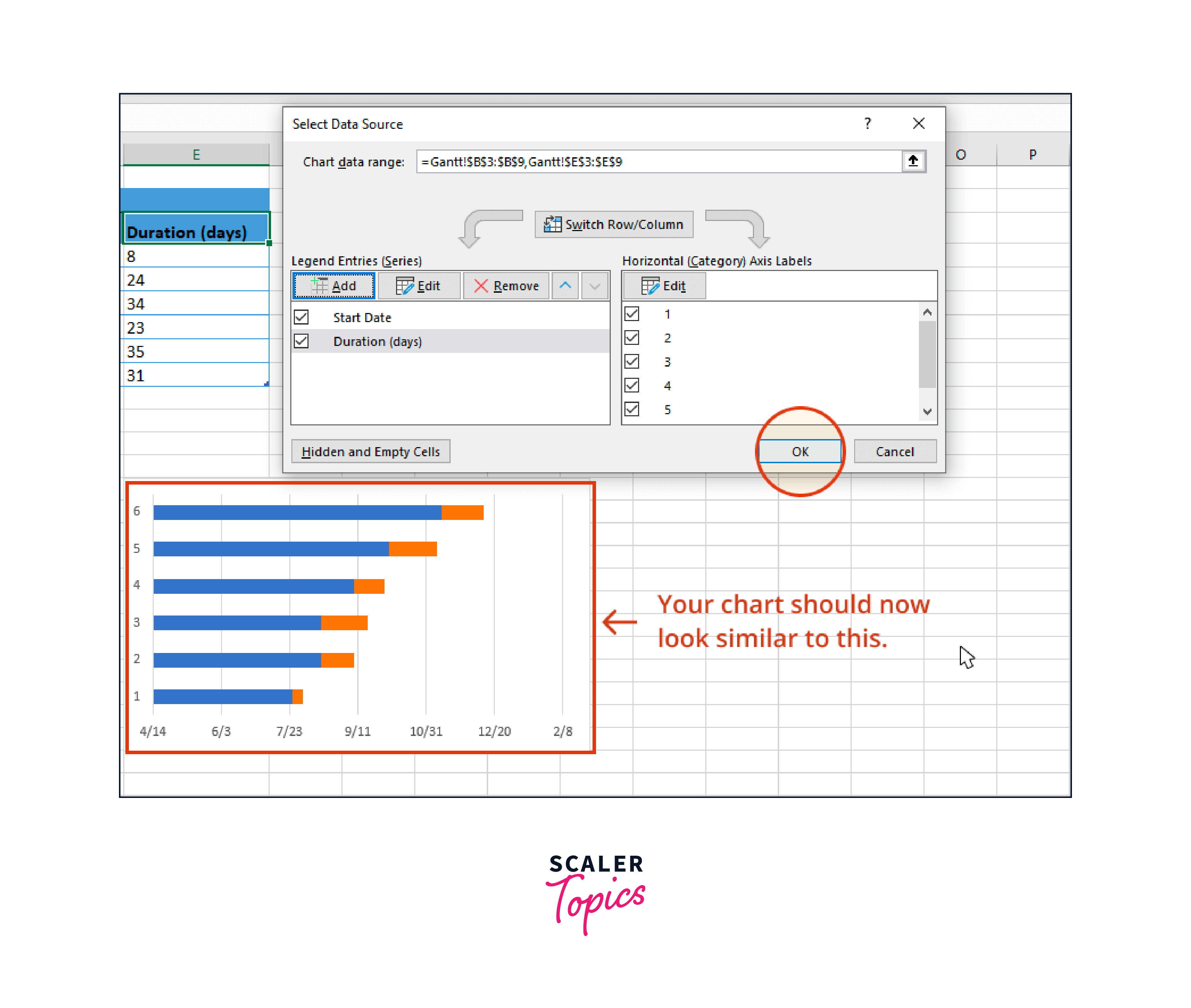
- To the Gantt chart, add the task descriptions.
- To open the Select Data Source window, right-click one of the Gantt chart's blue bars and then click Select Data again
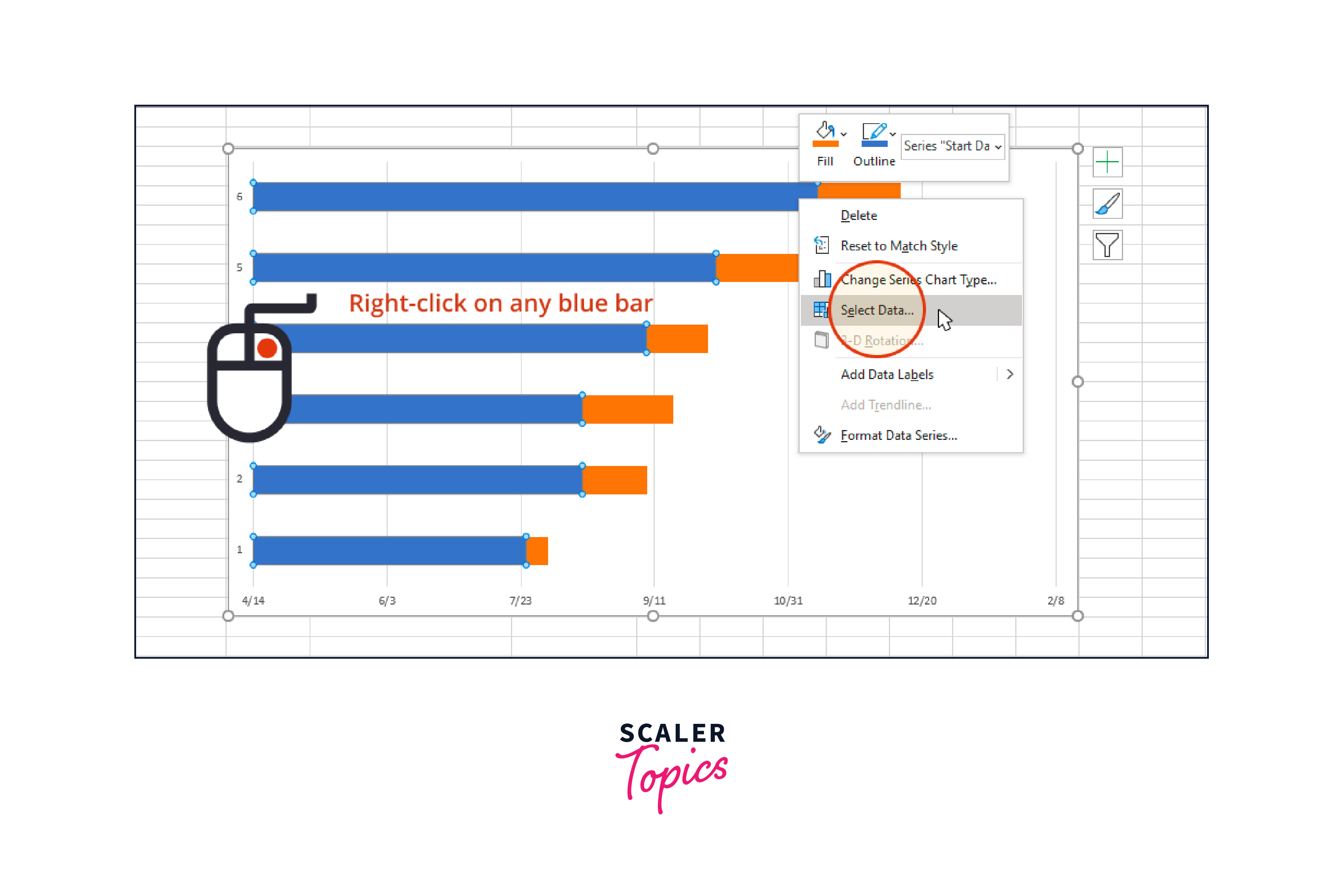
A table titled Horizontal (Category) Axis Labels can be found on the right side of Excel's Data Source window. In addition, the Edit button can be used to open a smaller Axis Label window.
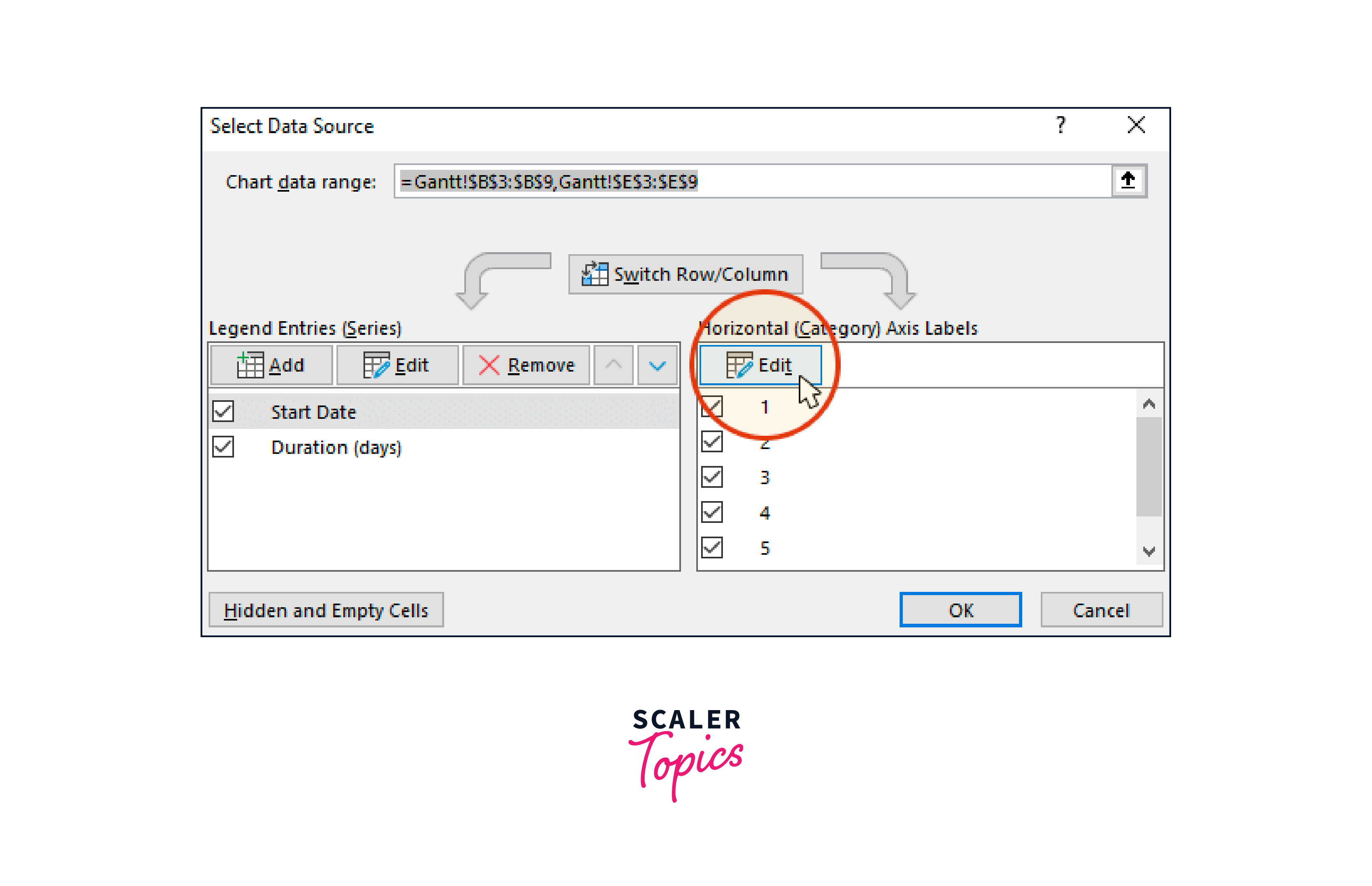
Click once more on the tiny spreadsheet icon. Then select all of your tasks by clicking on the first name of each one (in our example, the first task description is "Preparatory Phase"). Be careful not to use the column name itself. When finished, click the tiny black arrow icon to close this window again.
![]()
To close the Select Data Source window, click OK twice. Now, your Gantt chart should seem something like this, with the appropriate task descriptions next to their respective bars.
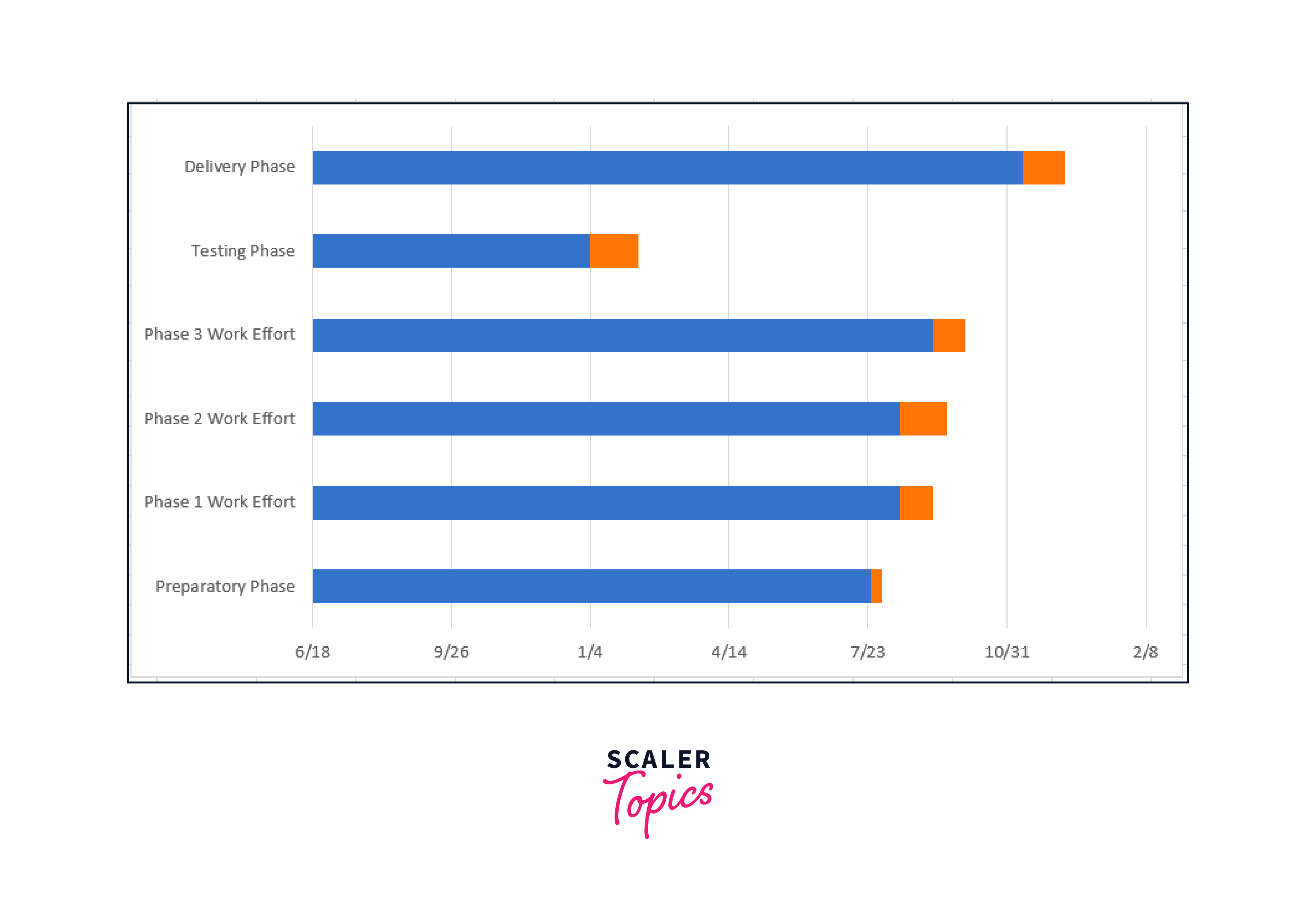
Your chart should be structured to resemble a Gantt chart.
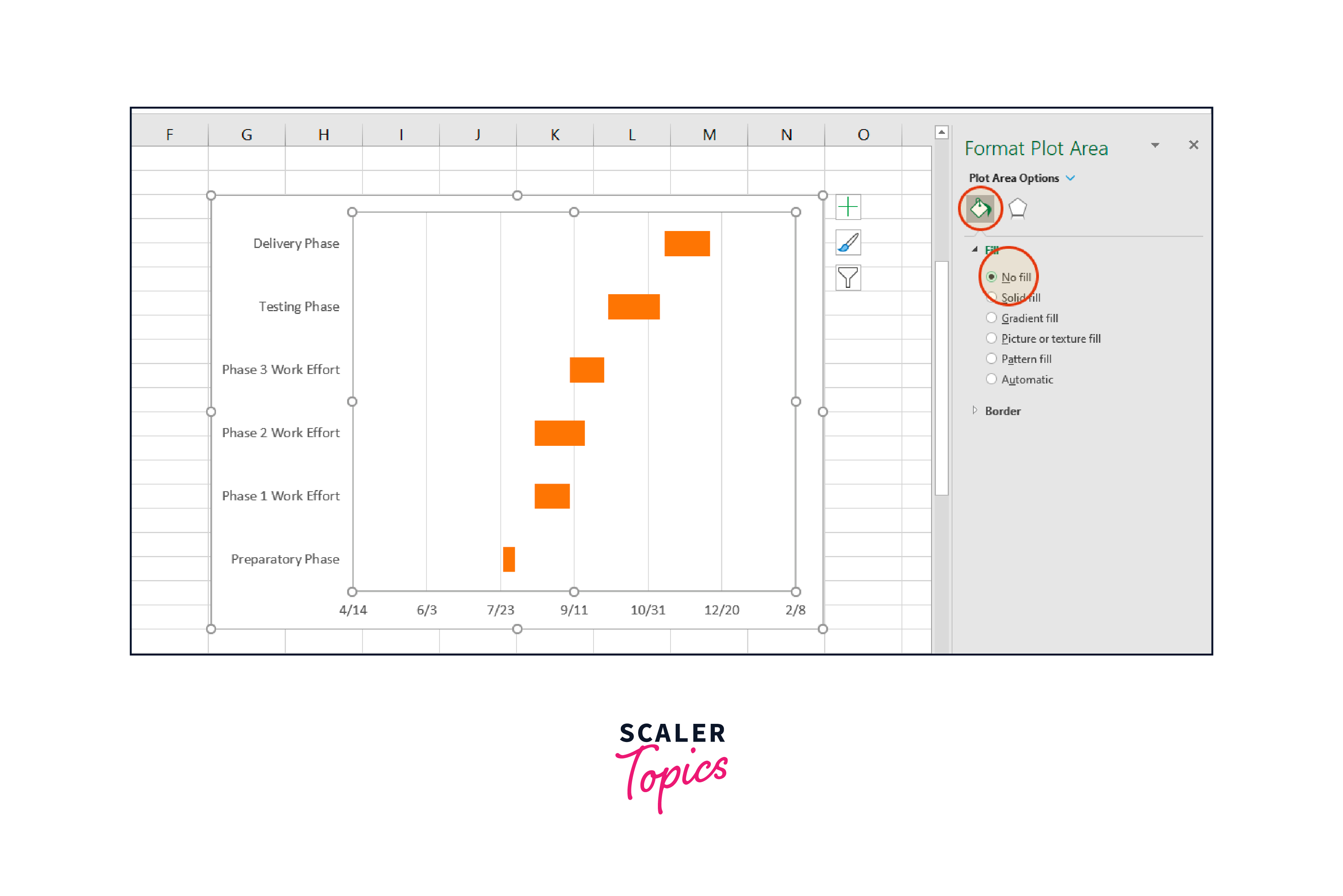
You have effectively created a Stacked bar chart up to this point. Now it needs to be formatted to resemble a Gantt chart. For the orange portions of each taskbar to be visible, we must make the blue portions of each taskbar transparent. Your Gantt chart's tasks will be there.
The Format Data Series window in Excel will open when you right-click on any Gantt chart bar and choose All Task Bars. To accomplish this, click on the blue portion of any bar in your Gantt chart.
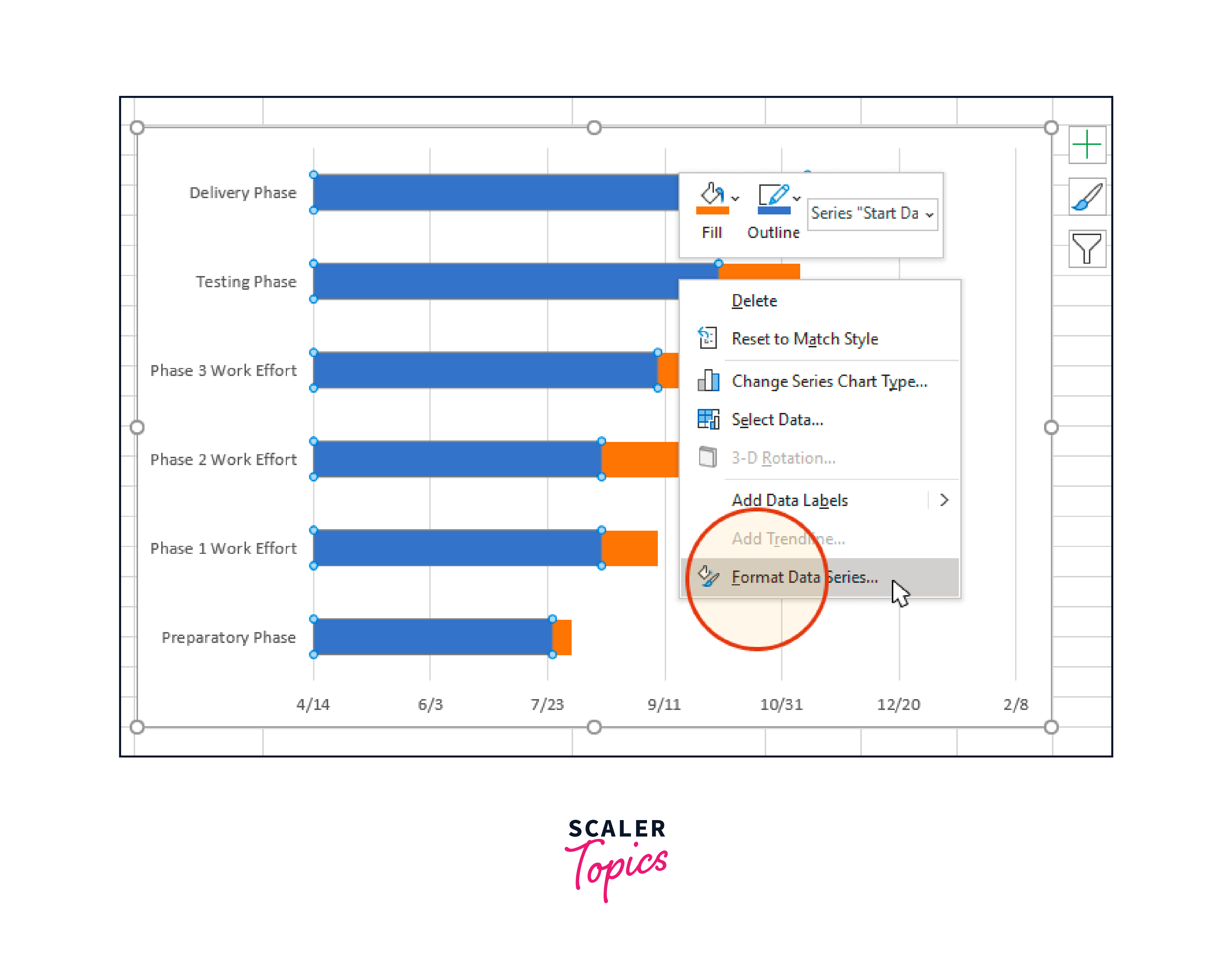
To access the Fill & Line choices, select the Fill & Line icon (which resembles a paint can) in the Format Data Series task window. Select the No Fill radial button next to Fill and the No Line checkbox next to Border. The Format Data Series task window should be open because you'll need it in the following action.
Now, your Gantt chart ought to seem like follows:
The tasks on your Gantt chart are likely arranged in reverse order, with the last task being shown at the top and the first task being listed at the bottom. However, Excel makes it simple to arrange them in the opposite direction.
-
To do this, click on the list of tasks on your Gantt chart's vertical axis. This opens the Format Axis task window and selects them all at once.
-
Click the Bar Chat icon in the Format Axis task window to reveal the Axis Options menu.
-
Select the checkbox labeled "Categories in reverse order" under the headers "Axis Options" and "Axis Position" in the Format Axis task pane.
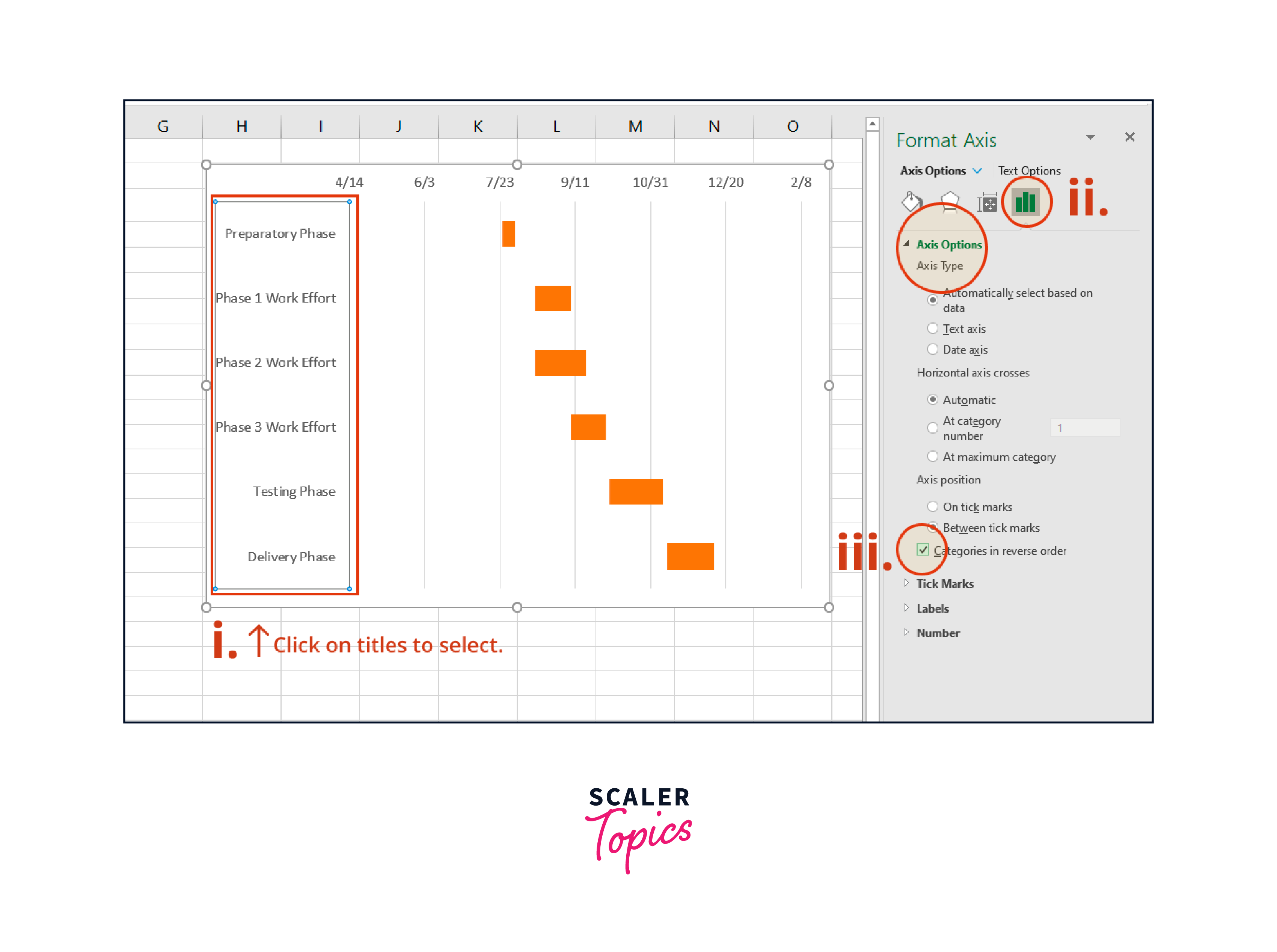
You'll see that Excel relocated the date markers from below to above the image and organized your jobs on your Gantt chart from first to last. As a result, it is now really beginning to look like a Gantt chart.
With these styling suggestions, complete your Gantt chart. You can additionally design your Gantt chart after it has been produced to improve its appearance and legibility. Here are some recommendations in this area.
Your Gantt chart's white area should be minimized.
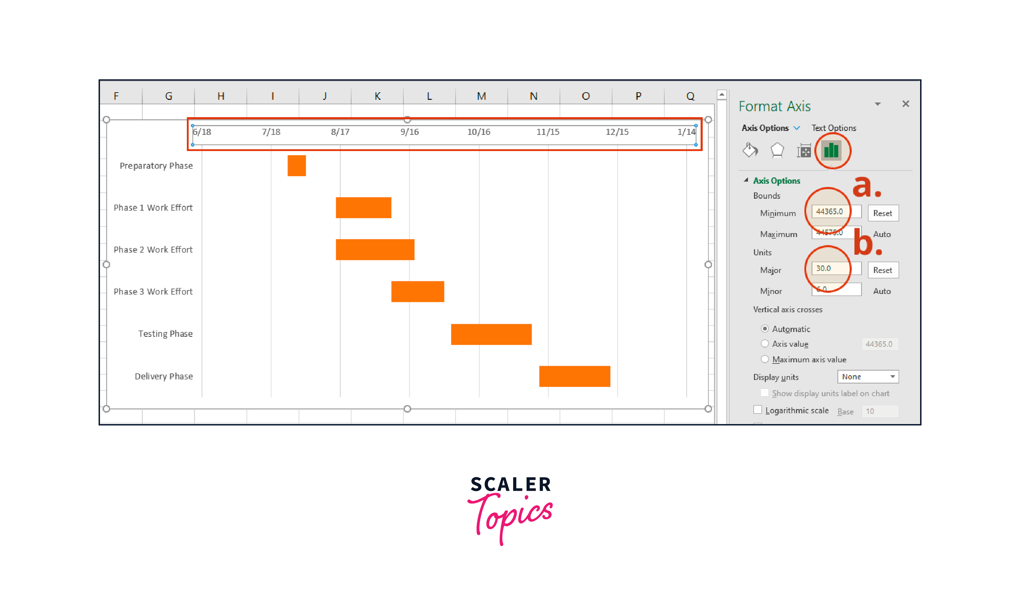
You can move your jobs closer to the vertical axis of your Gantt chart by deleting some of the empty white space where the blue bars stand. Then, click on any of them to choose the dates above the taskbars. After that, right-click to display the Format Axis window in Excel.
Take note of the Minimum Bounds' current value in the Axis Options window's Bounds header.
It indicates the Gantt chart's leftmost boundary. Your jobs will be closer to the vertical axis of your Gantt chart if you increase this value.
In our instance, we altered the initial value, 44300.0, to 44365.0. Of course, you can always press the reset button to return to the default settings.
This allows you to experiment with various parameters until you discover the one that gives your Gantt chart the greatest appearance.
Change the dates' density at the top of your Gantt chart.
You can change the distance between the dates at the top of the horizontal axis in the same Axis Options window's Units section under the header. For example, excel will make the space between each date larger if you increase the Major unit number, reducing the number of dates your Gantt chart displays. Conversely, reducing the distance between each date can increase space on your Gantt chart, allowing you to add more dates. In our situation, we increased the initial value from 20 to 30.
Your Gantt chart's taskbars should be thicker.
To access the Format Data Series control, right-click on the top taskbar and select Format Data Series. You may access the Gap Width option by clicking the Series Options header. It can be moved up or down to alter the size of the task bars on your Gantt chart. Play around until you discover a solution that best suits your needs.
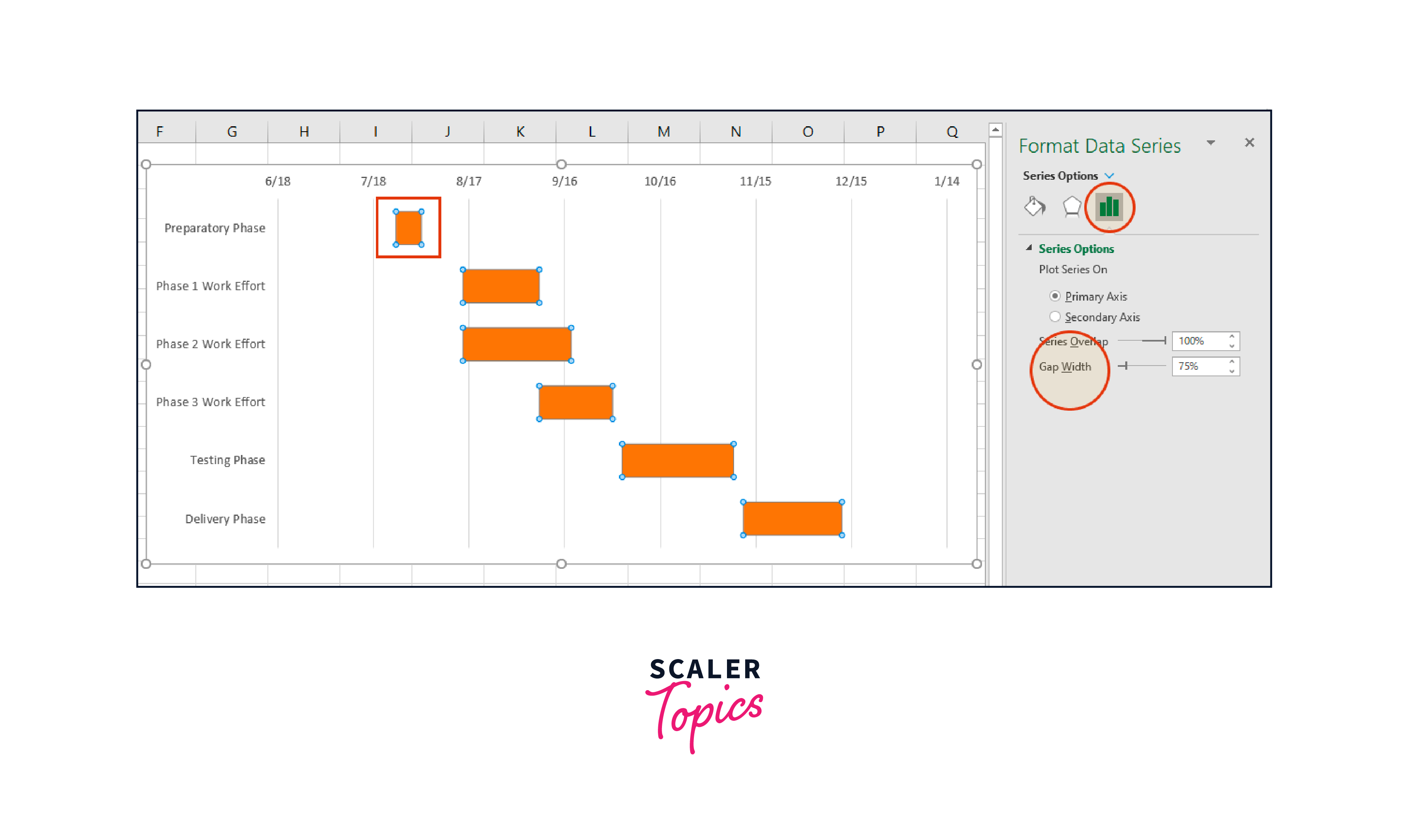
Customize the chart area and taskbars.
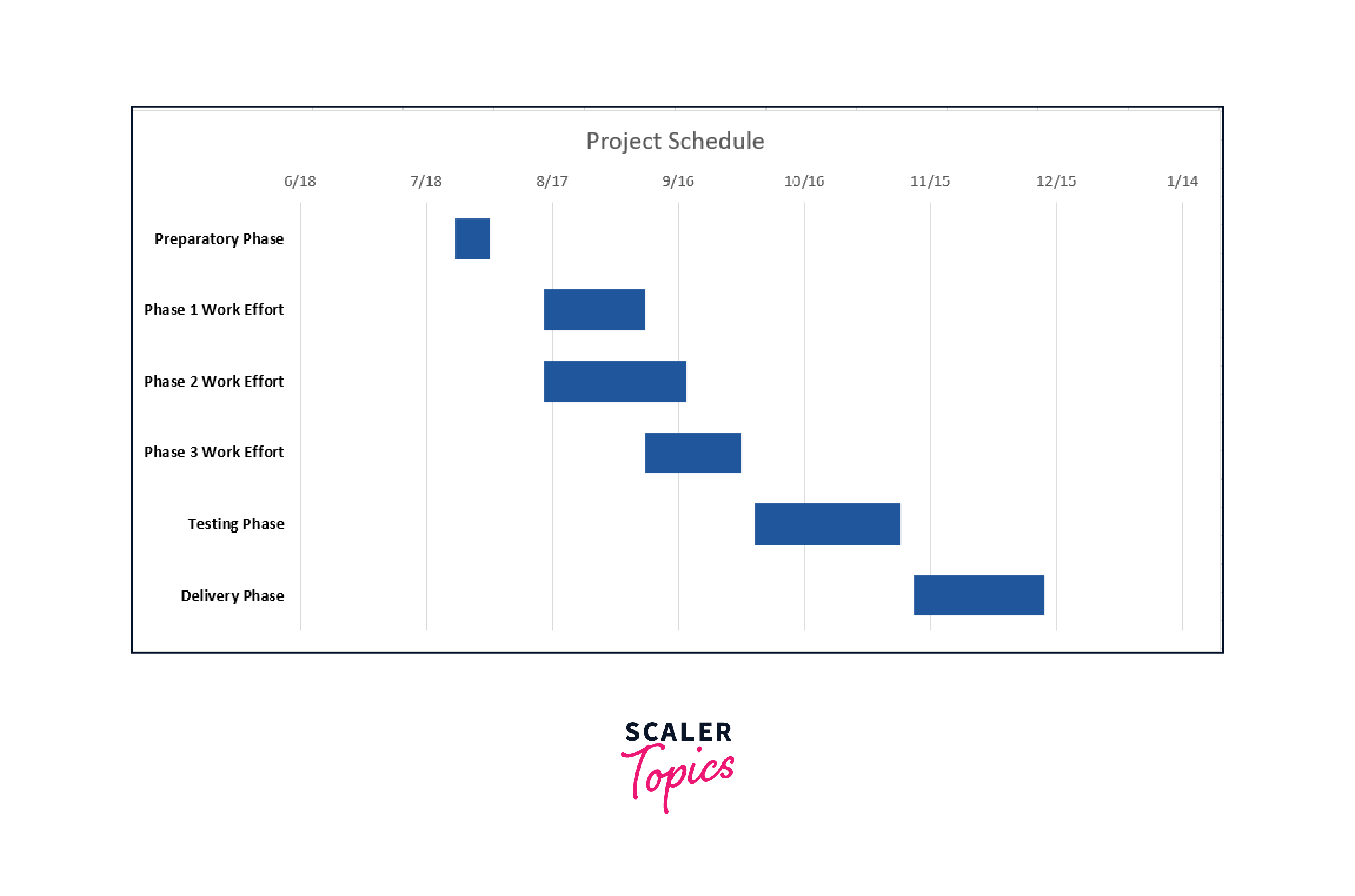
Use a different text font, modify the color of the task bars, or add a title as a last touch to your Gantt chart. In our situation, we decided to:
- change the chart's orange color to a dark blue hue by double-clicking any of the bars, then selecting the Fill color option menu from the Fill & Line section of the Format Data Series pane on the right;
For the text of the work descriptions, use bold font. Click on the titles to select them all, then press Ctrl + B to accomplish the same;
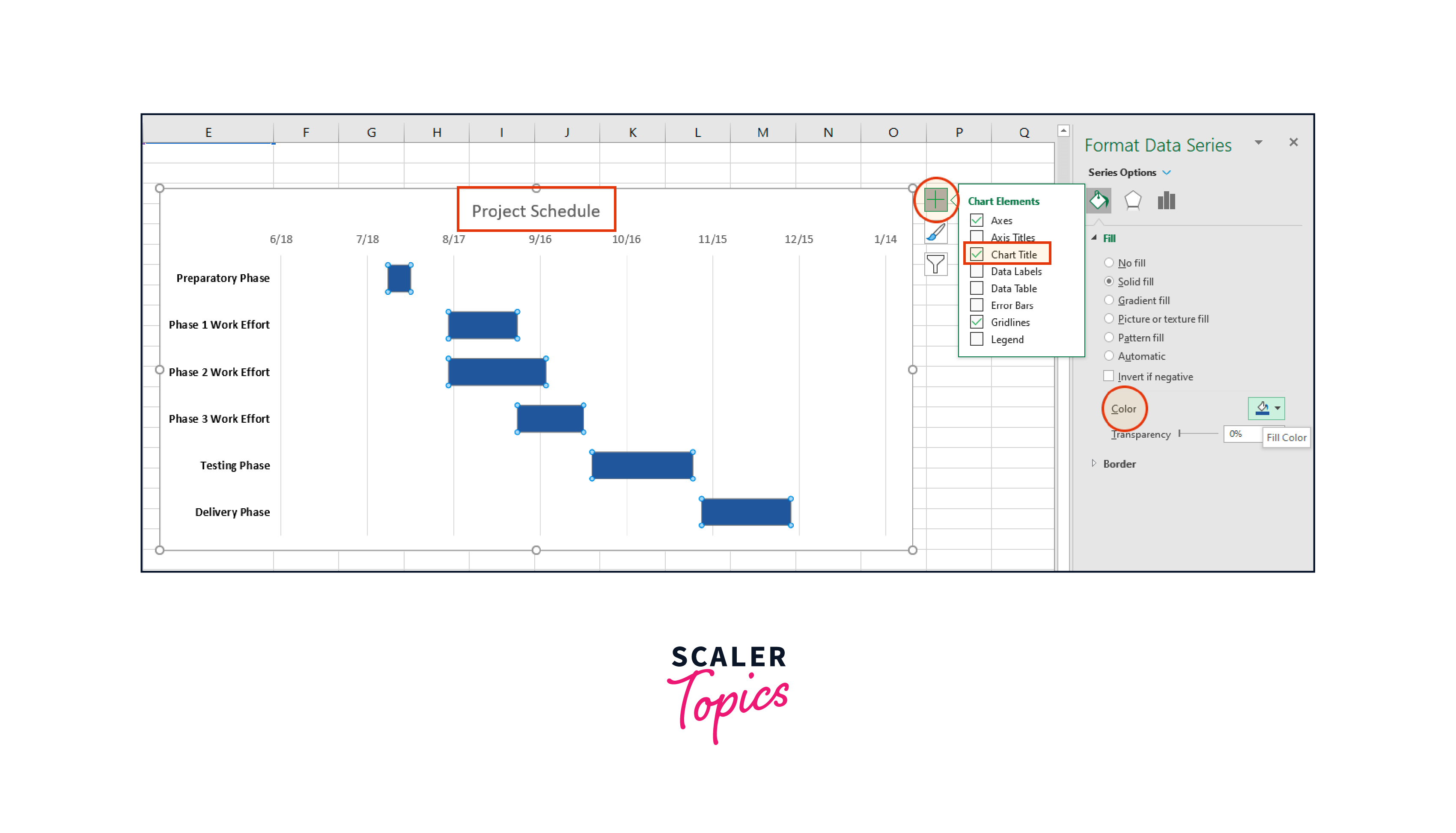
- Include a title in the graphic by selecting the chart area, pressing the "+" button in the top right corner, and then selecting the Chart Title checkbox. Doing this will add a text box to the top of your Gantt, where you must double-click to continue typing the name of your visual.
How to create a Pareto chart in Excel?
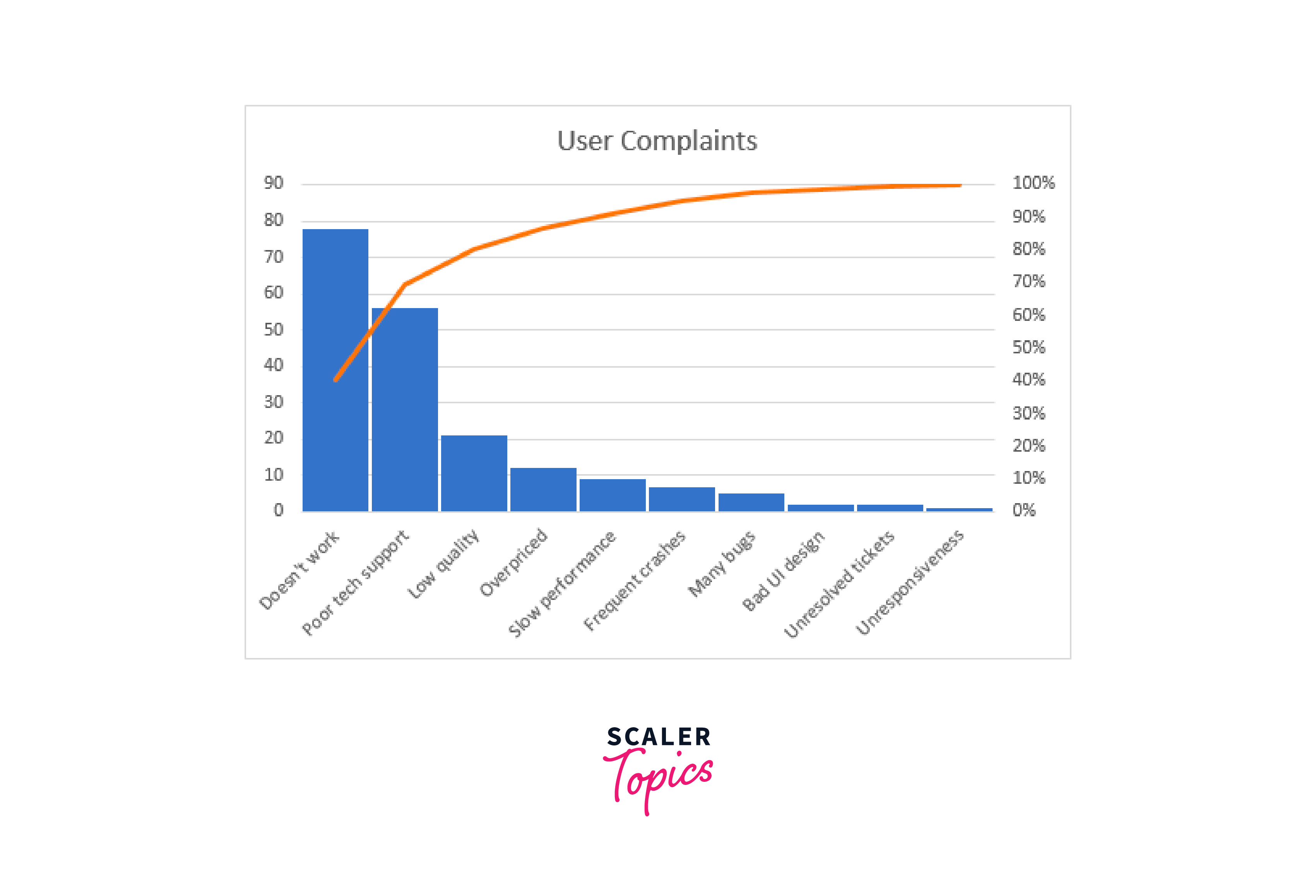
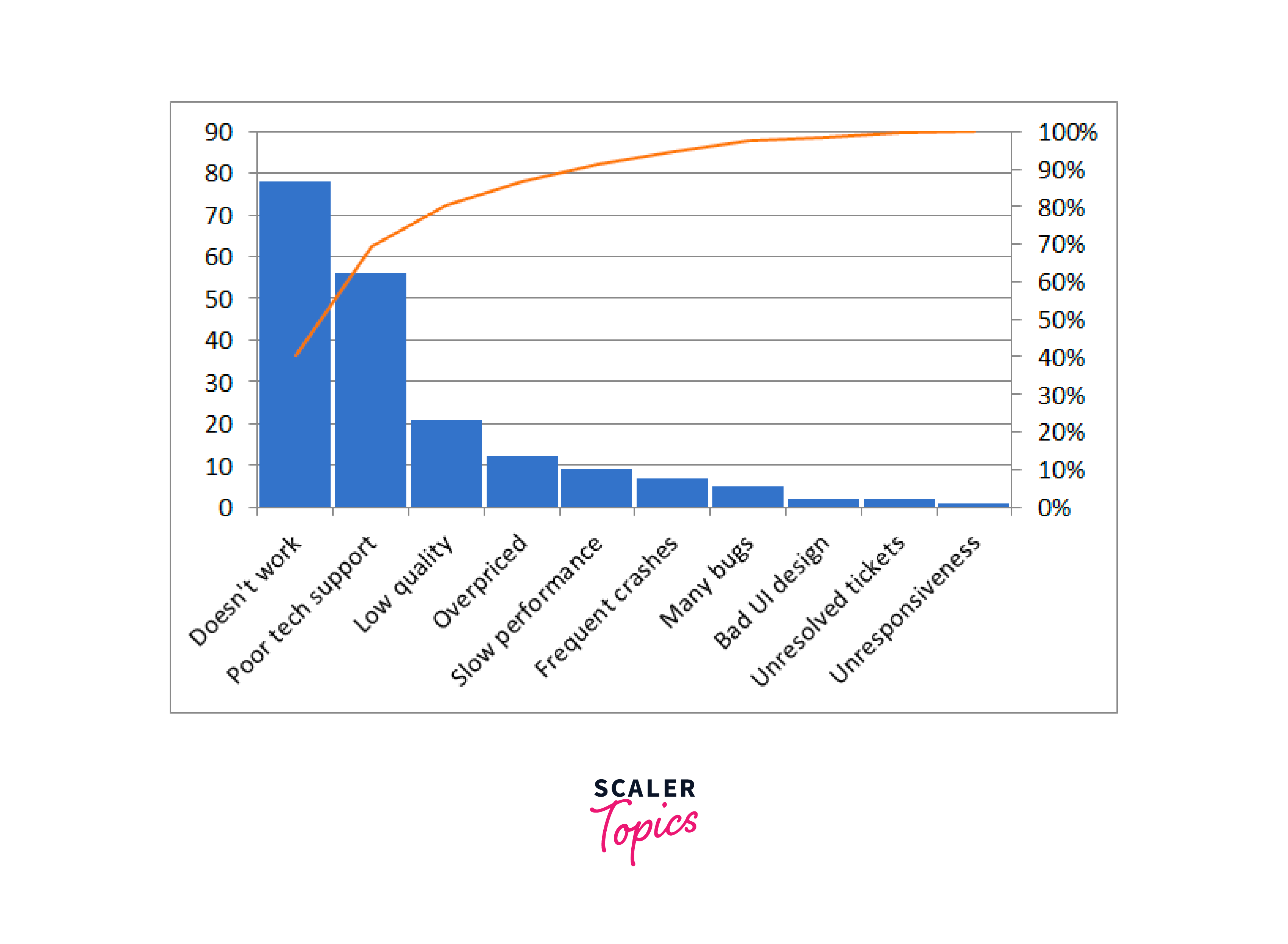
A graph built on the Pareto principle is called a "Pareto chart," sometimes called a "Pareto diagram." It is a histogram in Microsoft Excel with vertical bars and a horizontal line. The line indicates the cumulative total percentage, and the bars, presented in descending order, represent the relative frequency of values.
Here is an example of an Excel Pareto chart:
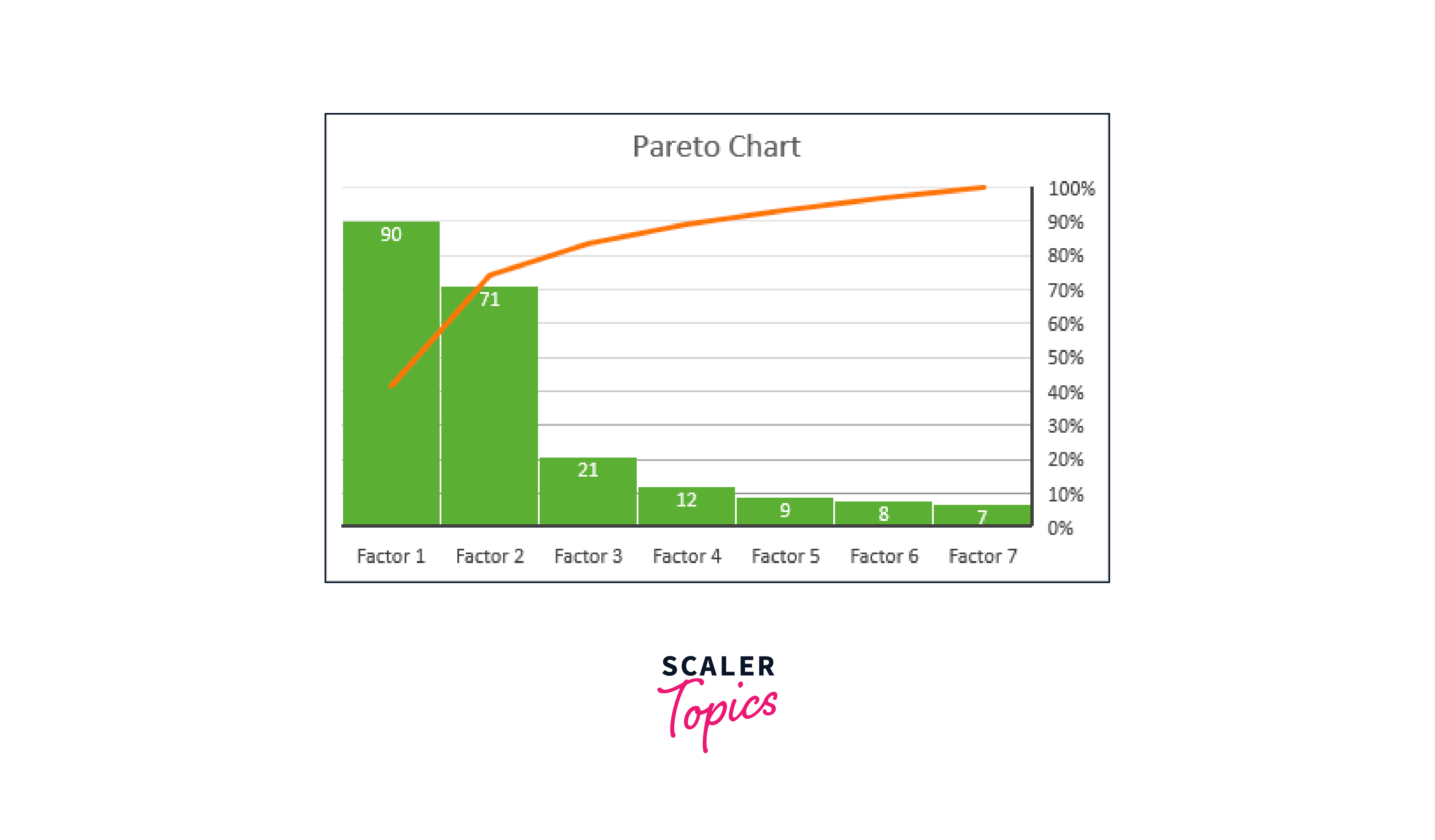
As you can see, the Pareto graph identifies the key components of a data set and displays their relative value to the whole. The step-by-step directions for making a Pareto diagram in several Excel versions are below.
How to create a Pareto chart in Excel 2016 - 365?
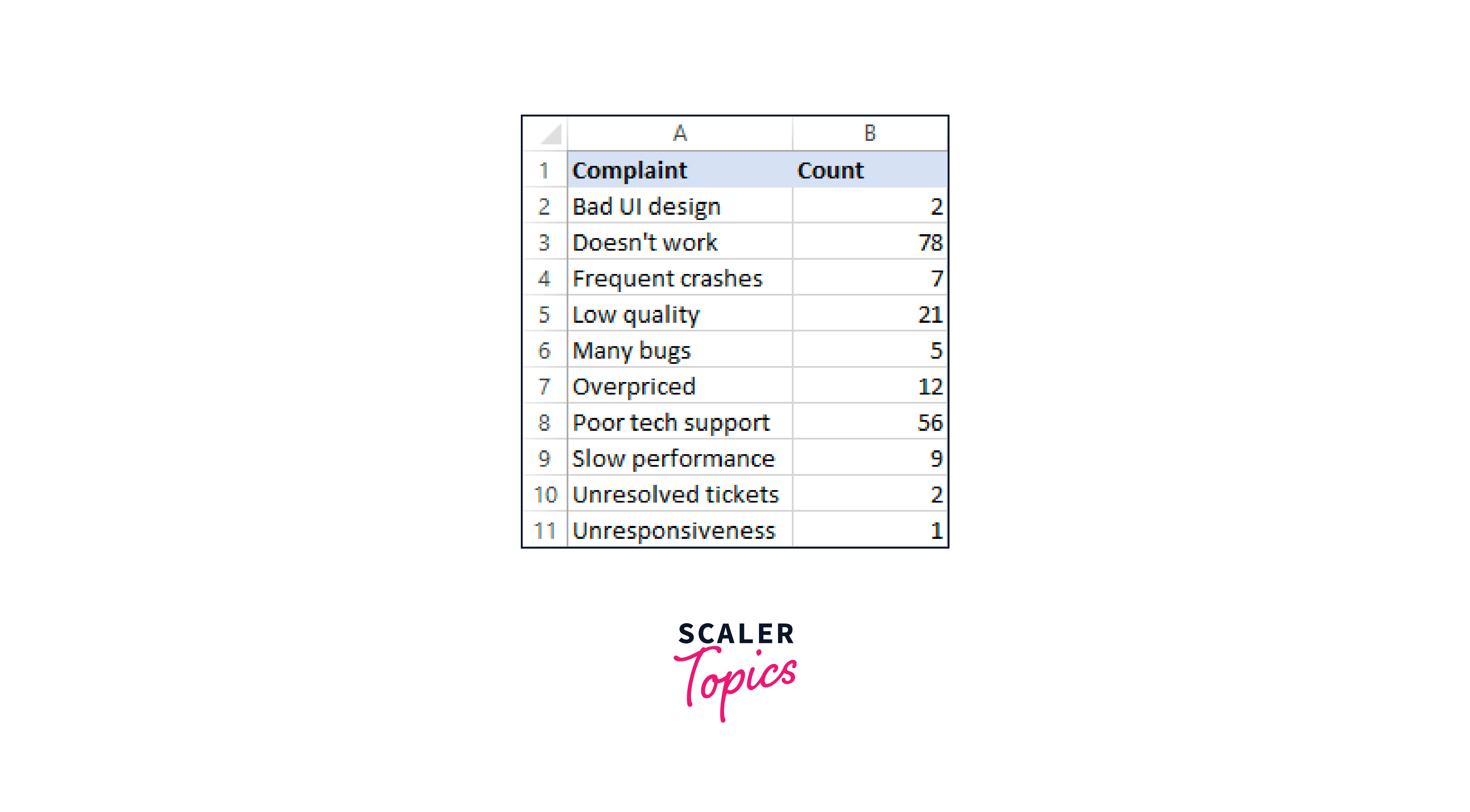
Modern Excel versions have a built-in Pareto chart type, which makes plotting a Pareto diagram simple. A list of objects (problems, factors, categories, etc.) in one column and their count (frequency) in another are all required.
Based on the following data set, we will perform a Pareto analysis of typical user complaints concerning the software.
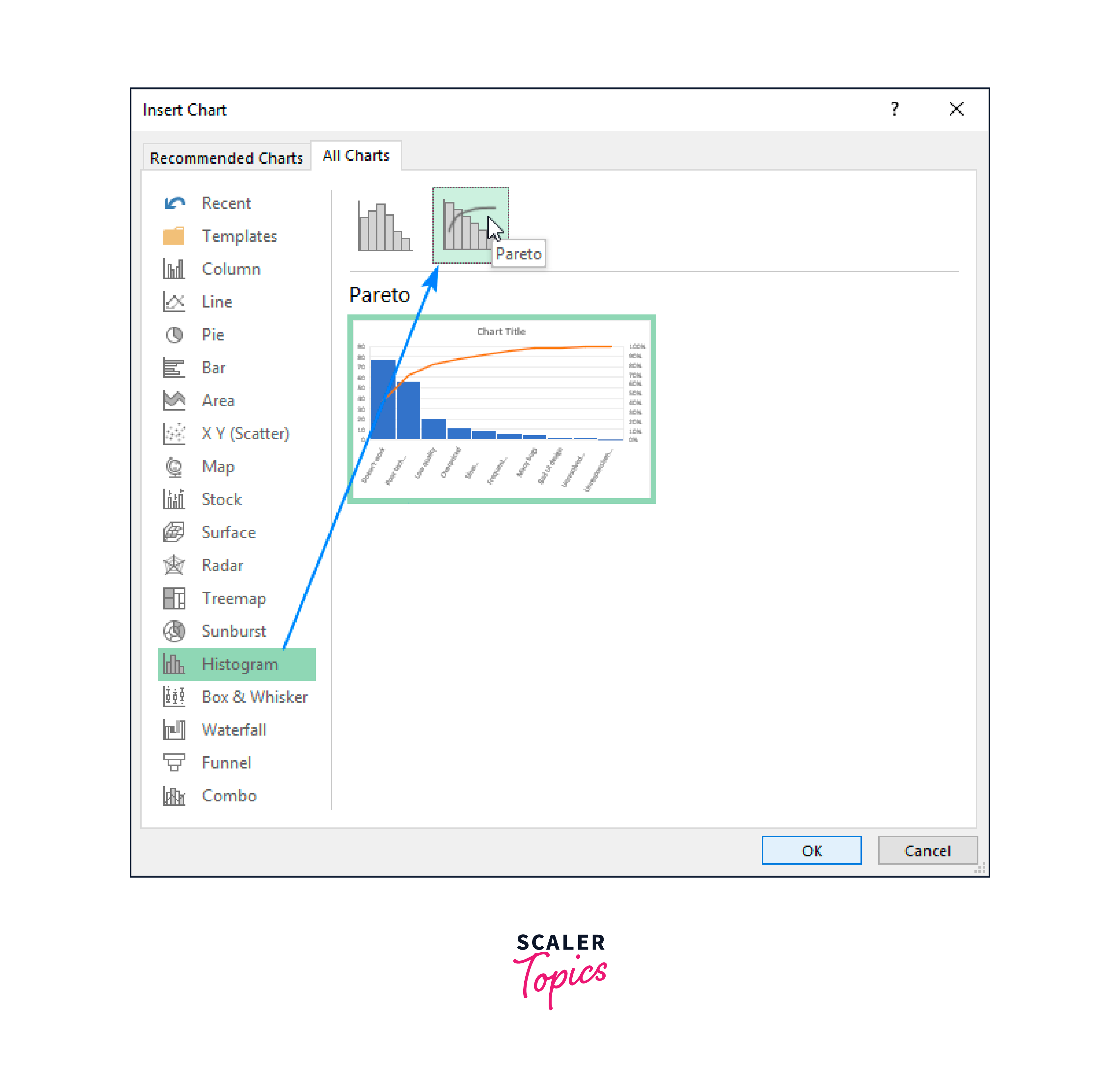
Please follow these easy procedures to create a Pareto graph in Excel:
- Choose a table. Most of the time, selecting just one cell is sufficient to have Excel automatically select the entire table.
- Click Recommended Charts under the Charts group on the Insert tab.
- Select Histogram from the left pane in the All Charts tab, then click the Pareto thumbnail.
- Select OK.
All there is to it is that! A worksheet is immediately updated with the Pareto chart. The only thing you might want to edit or add to the chart is the title:
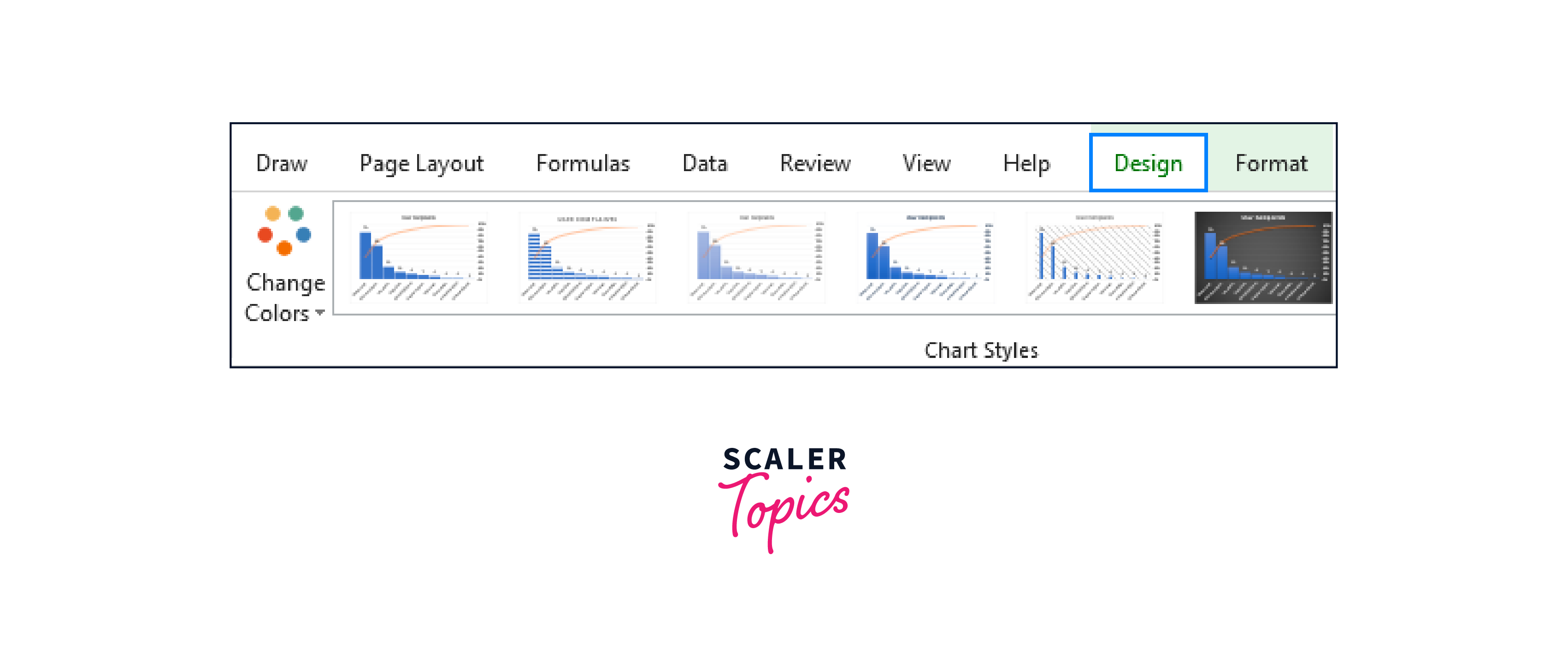
Creating a Pareto graph in Excel Excel's Pareto chart can be customized in every way. You can alter the design and colors, display or conceal the data labels, and more.
Create the Pareto chart as you see fit. Your Pareto chart will appear on the ribbon when you click anywhere. Change to the Design tab and play around with various chart formats and colors:
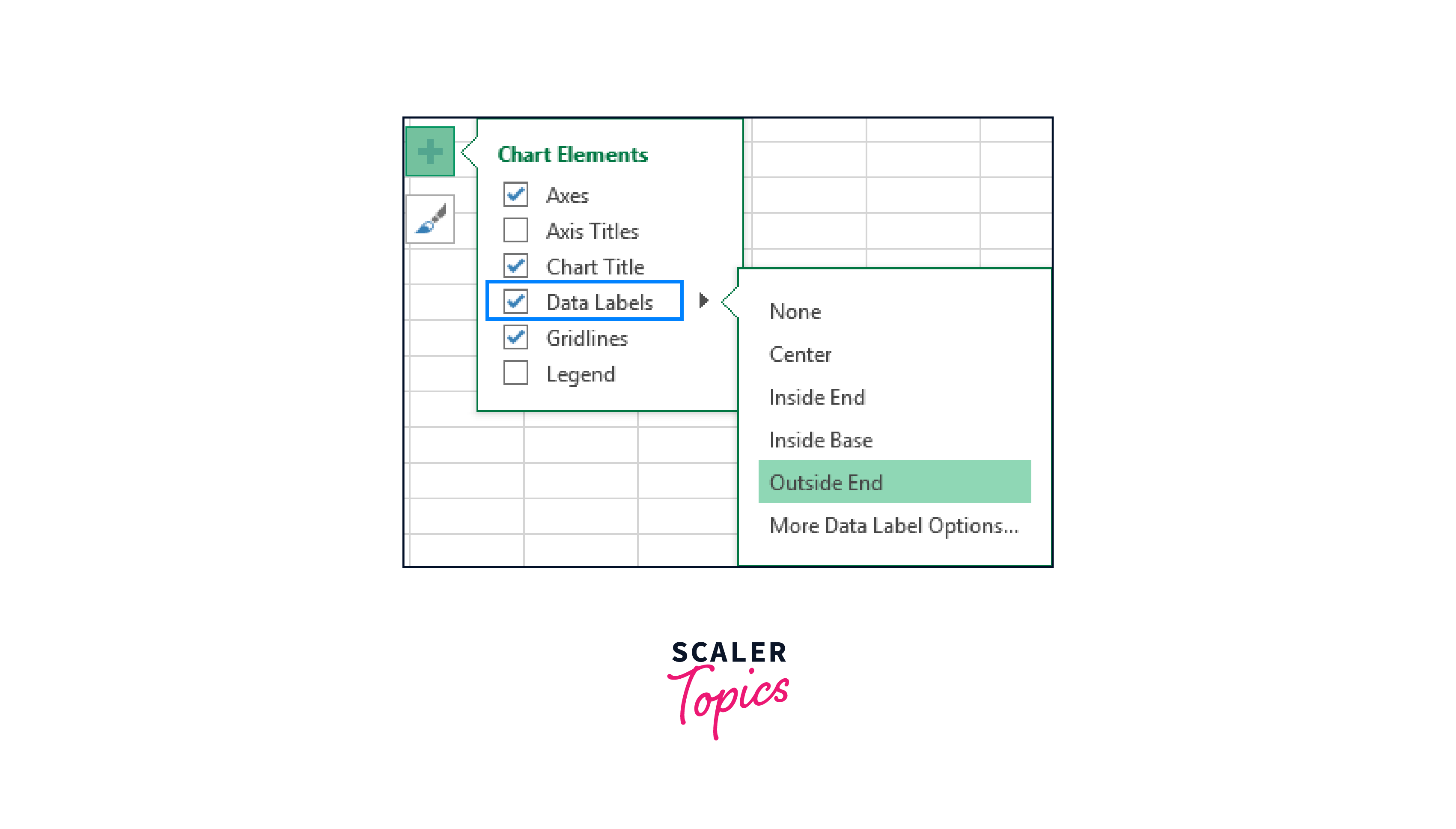
Display or hide data labels. Excel automatically generates a Pareto graph without any associated data labels. If you wish to see the bar values, click the Chart Elements button on the chart's right side, check the box for Data Labels, and then decide where to put the labels:
You can hide the main vertical axis that displays the same values because it is no longer necessary. To do this, click the Chart Elements button again, select Axes, click the small arrow next to Primary Vertical Axis, and click OK.
This is how the resulting Pareto chart will appear:

How to make a Pareto chart in Excel 2013?
Since the Pareto graph is not a predefined option in Excel 2013, we will use the Combo chart type instead because it is the closest to what we require. However, a few extra steps will be needed because you must execute all the current Excel operations automatically by hand.
Gather information for a Pareto analysis. Configure your data set as shown below:
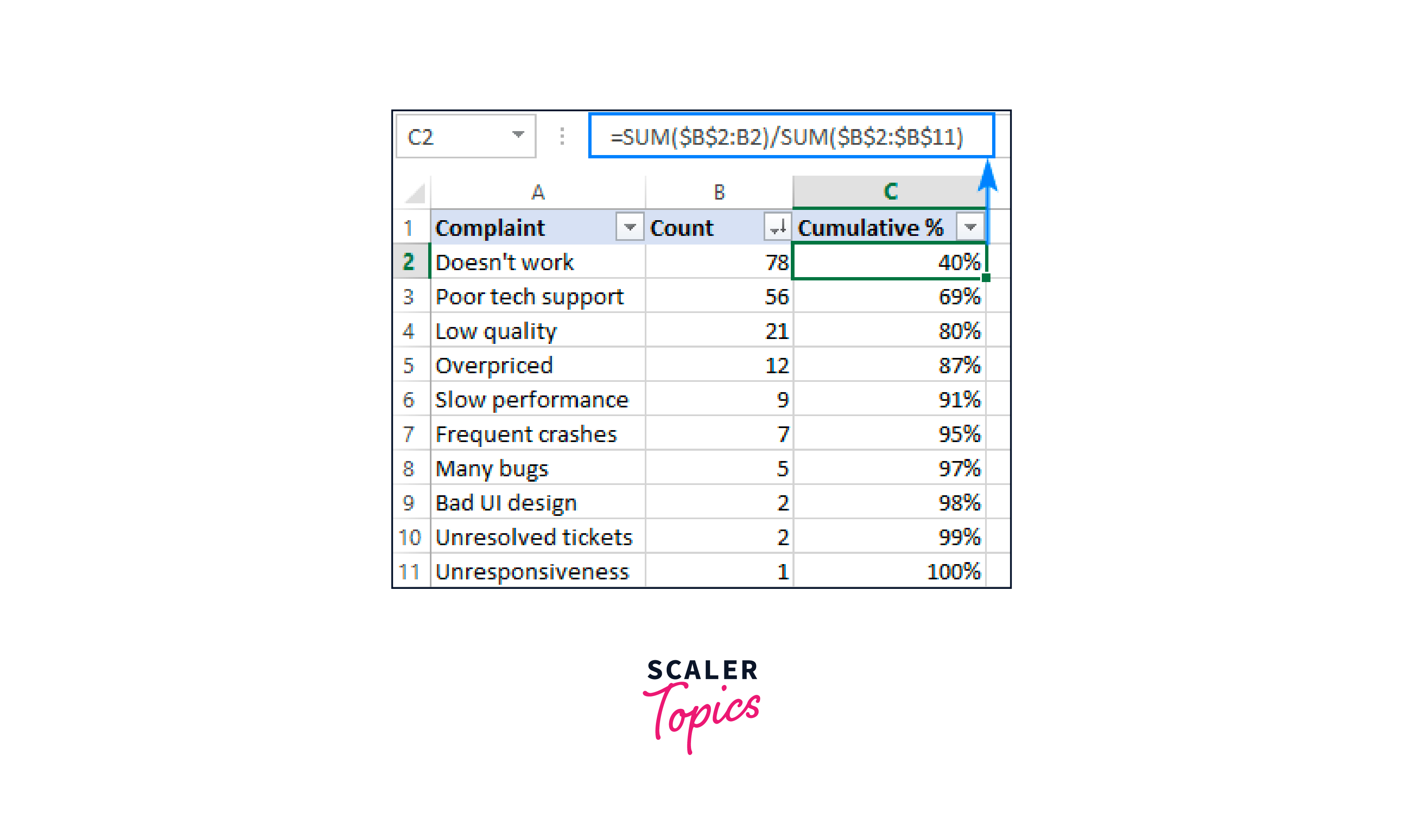
- Determine the cumulative overall percentage. Your data set should now have an additional column to enter the cumulative total percentage formula:
=SUM(2
B2 is the first cell with data in the Count column, and B11 is the last.
A cumulative sum formula that adds the values in the current cell and all cells above is entered into the dividend. To get percentages, divide the component by the total.
Copy the formula below the column after entering it in the first cell. Set the Percent format for the column to ensure that the results are shown as percentages. Reducing the decimal points to zero will display the percentages as integers.
- Decreasing the count in the order of a sort. Arrange the values in the Count column from higher to lower since the bars in a Pareto chart should be shown in descending order. To do this, choose any cell and click A-Z in the Sort and Filter group on the Data tab. Expand the selection if Excel asks you to if you want to keep the rows together during sorting.
As an alternative, include an auto filter to make future data re-sorting faster.
Your source data should now resemble the following:
Make a Pareto diagram.
- A Pareto graph is simple if the source data is organized properly. Only three steps:
- Choose a cell in your table or the entire table.
- Click Recommended Charts under the Charts group on the Insert tab.
- Make the following adjustments by switching to the All Charts tab, choosing Combo on the left, and selecting Combo:
- Choose Clustered Column (default kind) for the Count series.
- Choose the Line type and the Secondary Axis checkbox for the Cumulative% series.
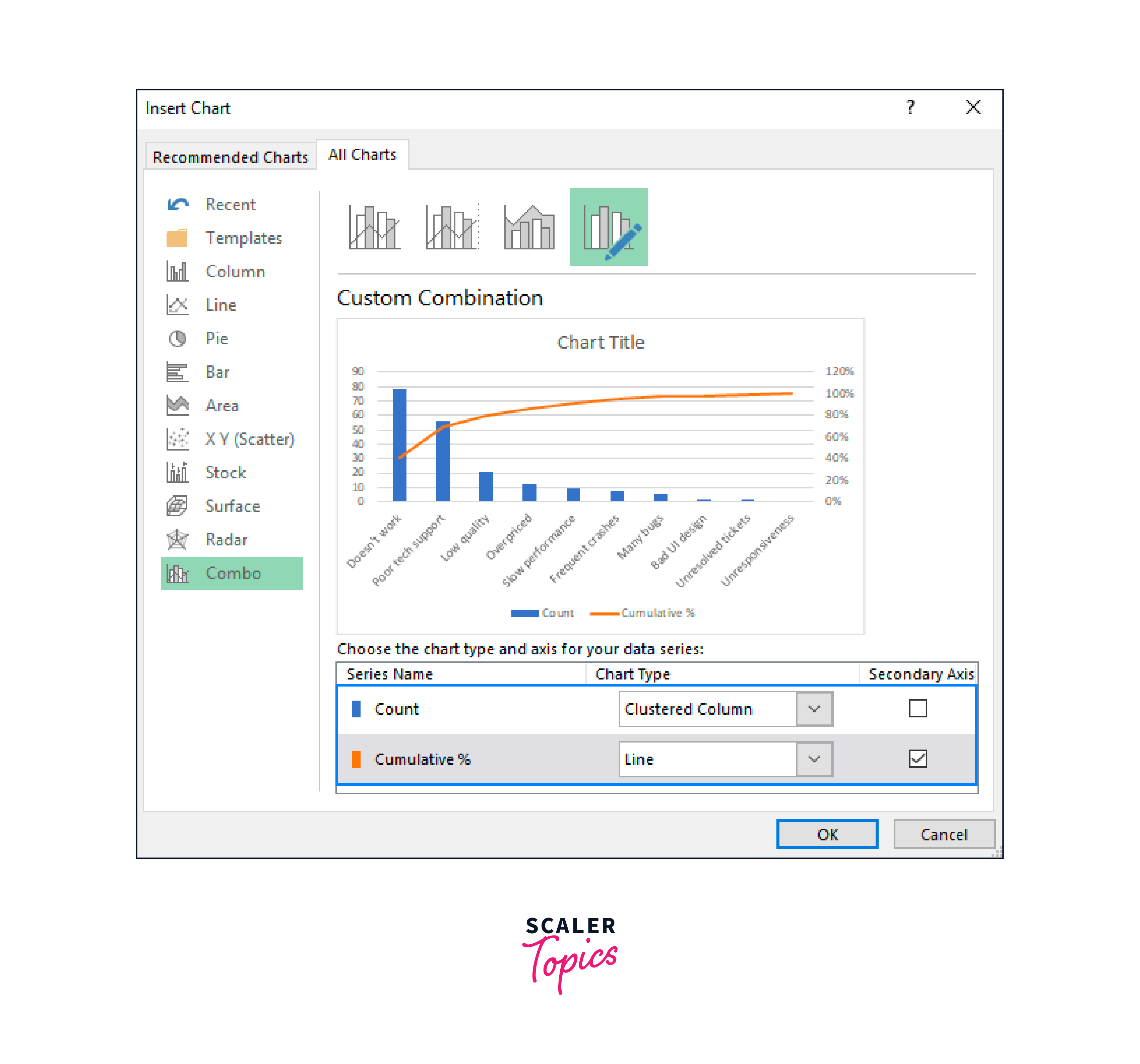
This is the type of chart Excel will insert into your worksheet:
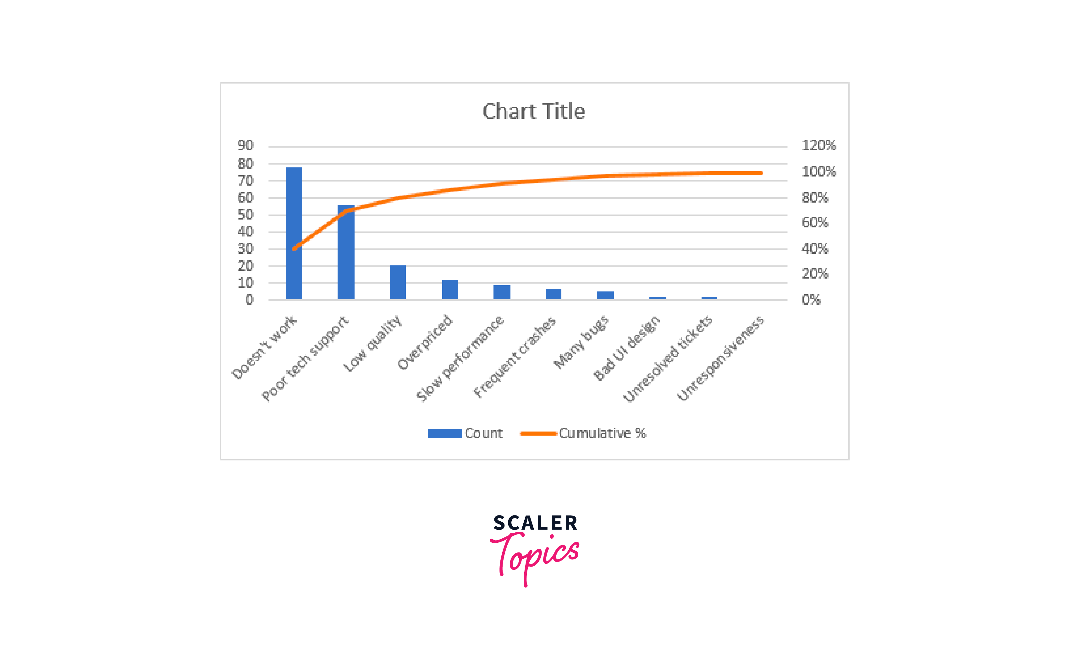
Improve the Pareto chart. Although your chart already closely resembles a Pareto diagram, you might want to make the following changes:
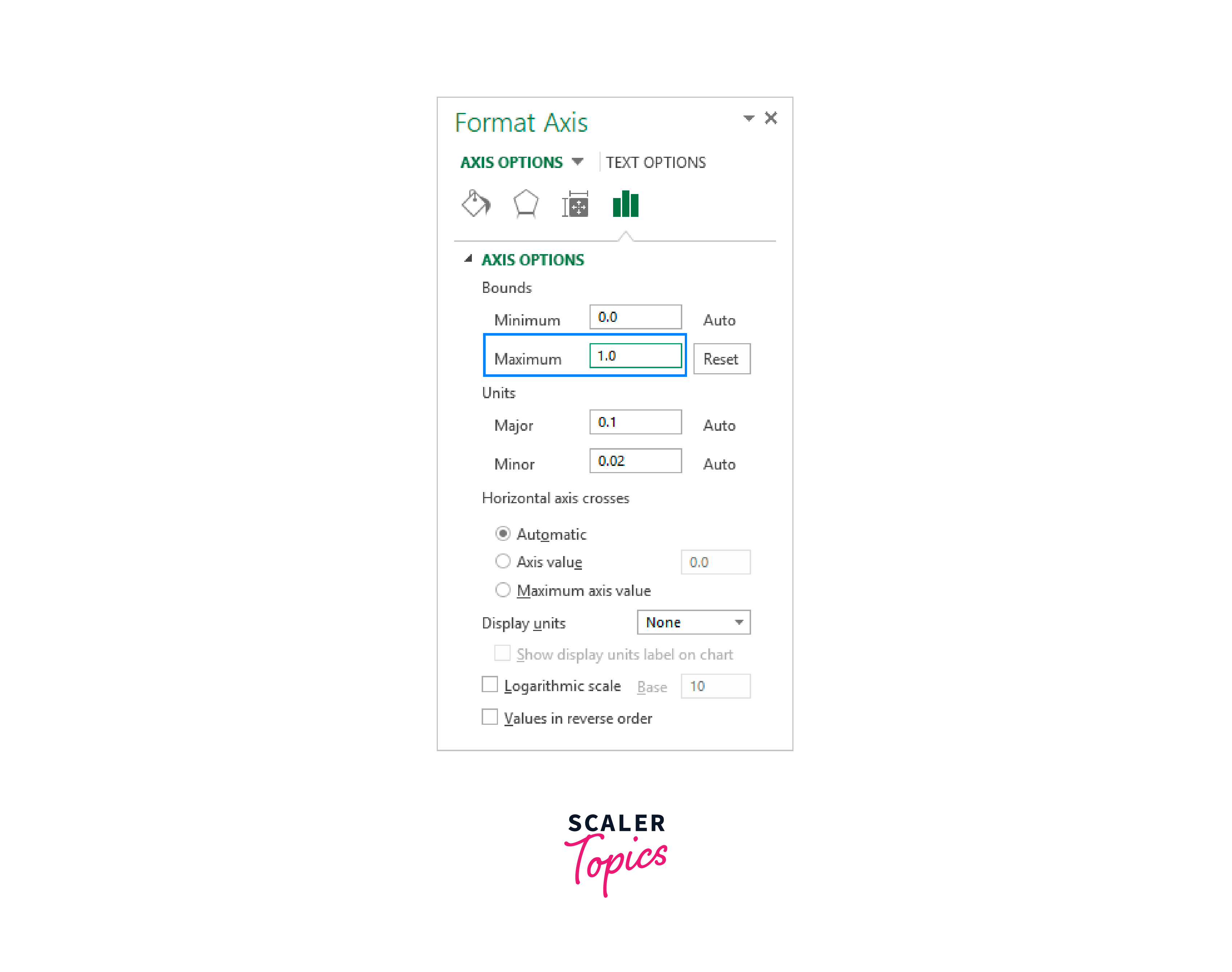
- Make 100% the maximum percentage value. Excel's default setting for the maximum value of the secondary vertical axis is 120%, whereas we prefer 100%. Right-click the % values on the Y-axis on the right side and select Format Axis to change this. Set 1.0 in the Maximum box under Bounds on the Format Axis window.
- Reduce the distance between bars. The bars are plotted closer to a typical Pareto graph than a combination chart. Right-click the bars and select Format Data Series to correct this. Next, set the desired Gap Width, say 5%, on the Format Data Series pane:
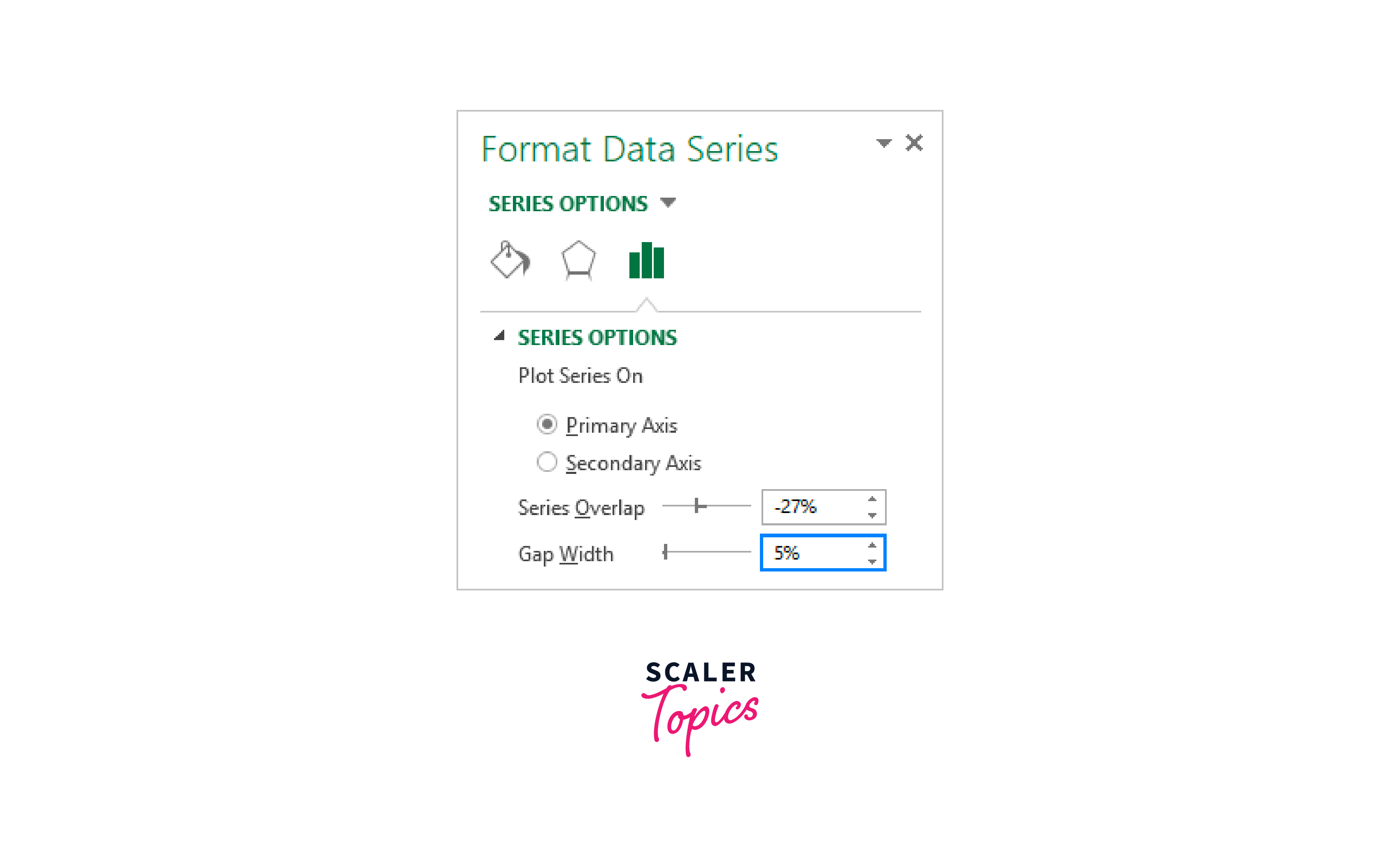
Change the chart's title last, and you can even choose to hide the legend.
What you now have appears to be an ideal Excel Pareto chart:

How to draw a Pareto chart in Excel 2010?
Neither the Pareto nor Combo chart types are available in Excel 2010, although this does not preclude the creation of a Pareto diagram in Excel versions before 2010. Naturally, this will be a little more work but also more enjoyable:) So let's get going.
Sort your data according to count in descending order, then compute the cumulative total percentage. Choose your table, then select the 2-D Clustered Column chart type under the Insert tab > Charts group:
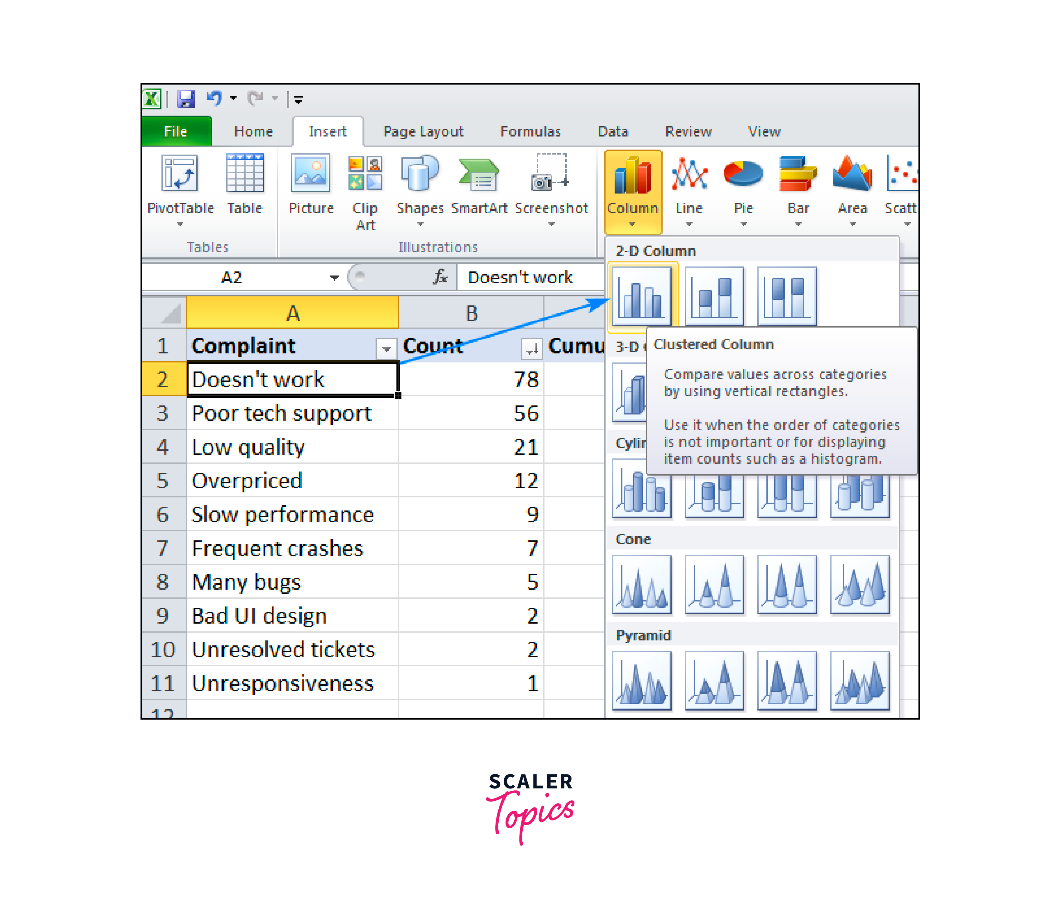
Doing this will add a column chart with two data series (the count and the cumulative percentage).
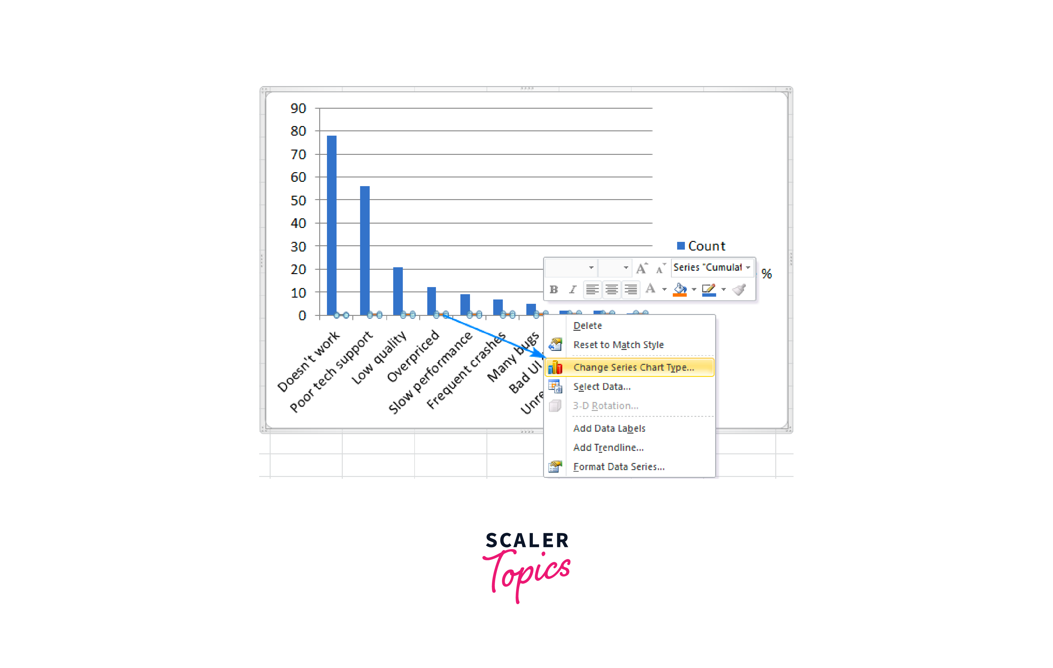
Change Chart Series Type is available by right-clicking the Cumulative% bars. (Given the small size of the bars, this could be the trickiest portion. To get the Series "Cumulative%" tip, move your cursor over the bars until you see it, and right-click.)
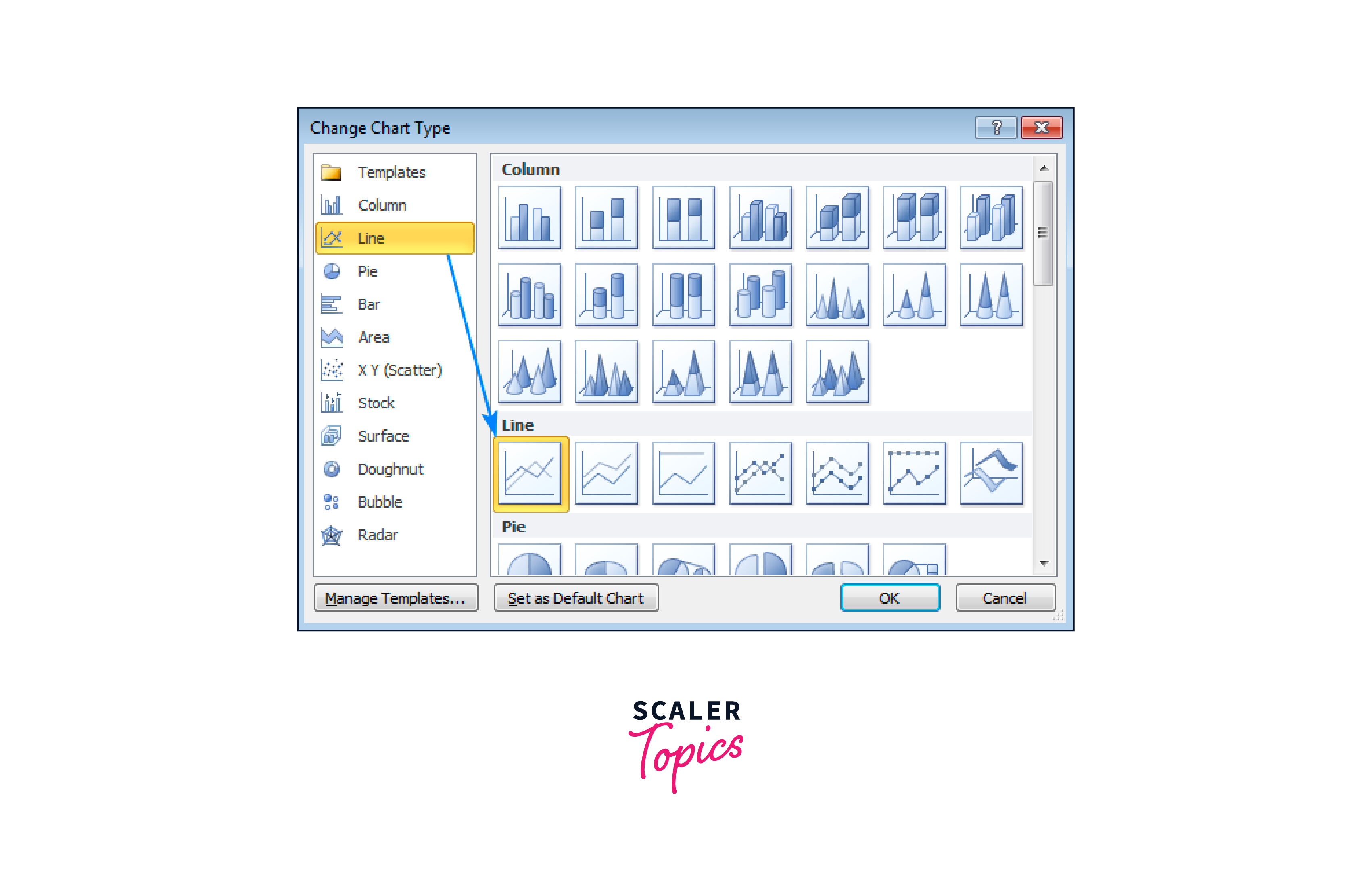
Select a Line in the Change Chart Type dialogue box.
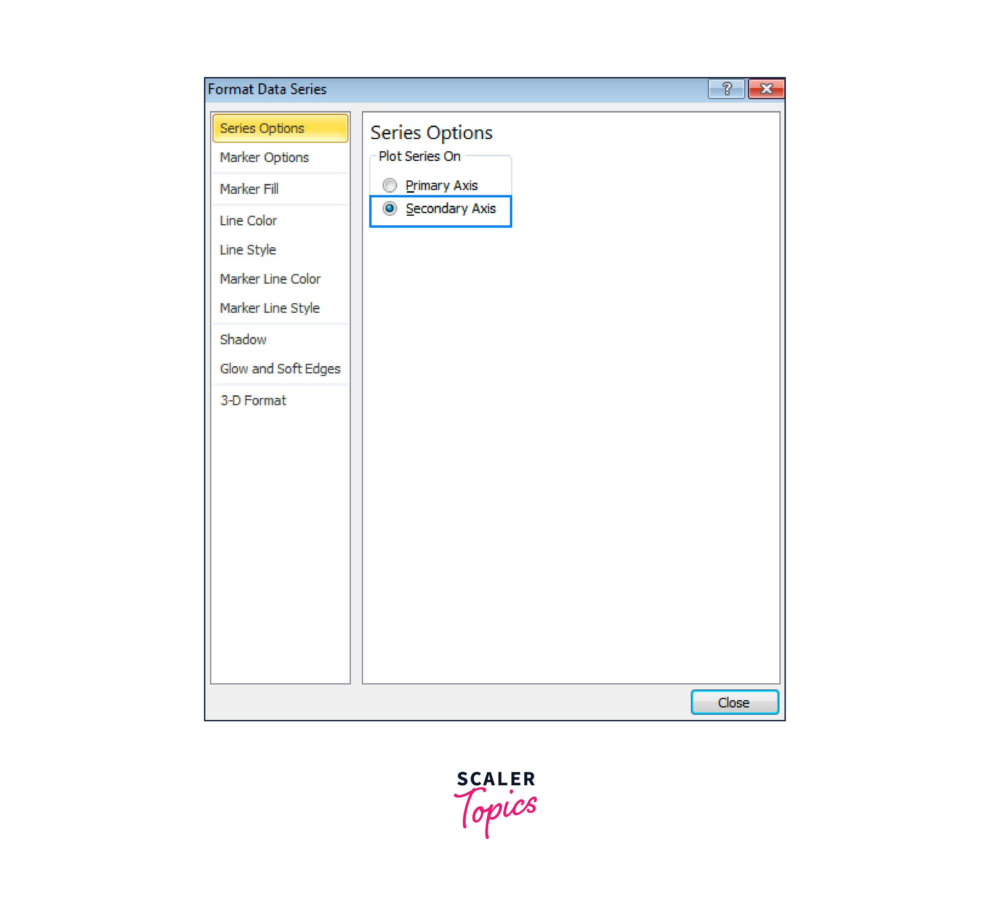
You currently have a bar chart with a flat line running the length of the horizontal axis. You must add another vertical axis to the right side of it to give it a curve. Select Format Data Series from the context menu by right-clicking the Cumulative% line.
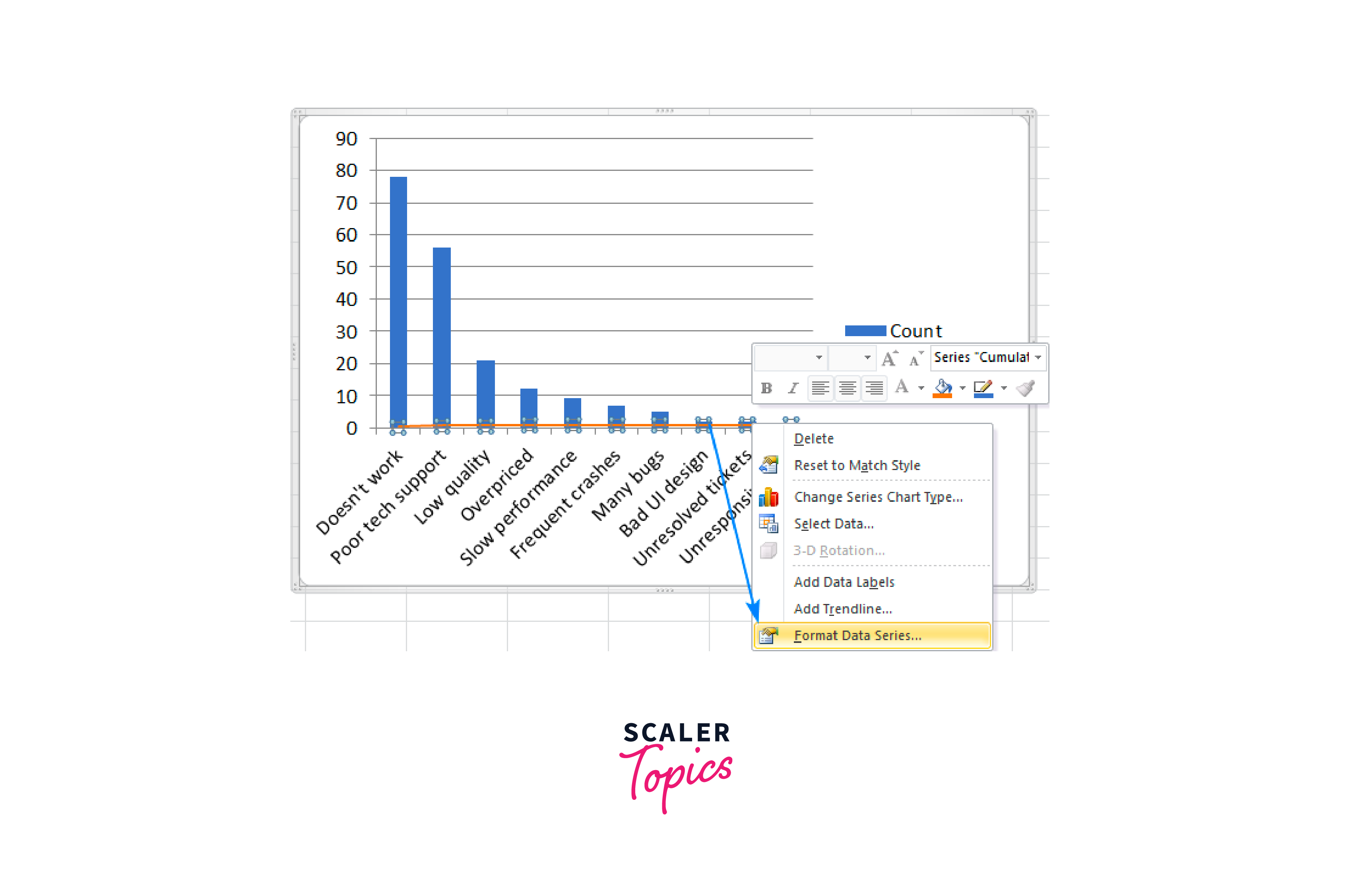
Select Secondary Axis under Series Options in the Format Data Series dialogue box, then click OK.
Finishing touches include making the bars bigger, the secondary vertical axis' maximum value 100%, and, if desired, hiding the legend. The procedure is the same as what was detailed above for Excel 2013. Your Excel 2010 Pareto Chart is now complete:
How to create a Matrix in Excel?
Data is displayed in rows and columns that can be compressed and expanded in a matrix. The matrix's ability to dig up and down when a hierarchy is present is useful. Because of this, a matrix is very useful for displaying data. A matrix can also be used to display data without repeating values. You can create your matrices using Excel's helpful templates per your professional requirements.
Take into account the actions listed below to create a matrix in Excel:
-
Open the window for "SmartArt." Click the "Insert" tab on the command ribbon to open the "SmartArt" window. Expand the "Illustrations" options after that. Then, select "SmartArt" from among these options to display a window with graphics selection samples.
-
Decide on a matrix Select "Matrix" from the navigation pane. Four different layout alternatives are displayed in this. See the various matrix options below: The basic matrix option demonstrates the relationships between the several quadrants and the overall picture. Matrix: This choice shows how the four quadrants relate to one another. Grid matrix: This matrix demonstrates how concepts can be arranged along two axes, emphasizing the parts rather than the total. Cycle matrix: This option demonstrates the relationship between a central idea and a cyclical trend.
You can scroll through the samples to see a preview of the features and looks of each choice. The matrix will be applied to your worksheet once you click "OK" to close the dialogue box.
-
Fill out the matrix using your data. Another dialogue box appears next to your new, empty matrix, asking you to "Type your text here." Here, you can fill in the relevant fields with your data. Test out several informational orders to ensure the matrix successfully communicates your data. Change your font by clicking the "Home" tab on the command ribbon and selecting "Font" from the list.
-
Create a matrix. When a matrix has been applied to your worksheet, the "SmartArt Design" and "Format" tabs on your command ribbon should appear. Your matrix's appearance is crucial because it is meant to be displayed; therefore, you should carefully consider your feature selection. For example, the "SmartArt" Design tab offers the following design choices:
Add bullets and shapes, show or hide the text box, and move and reorder the parts of your matrix using the Create Graphic option.
Layouts: Use this option to easily switch between the four matrix possibilities and present your data differently.
Use SmartArt Styles tools to change your matrix drawings' colors, outline, fill, and opacity. Presets can also be selected by selecting the "More" arrow in the bottom right corner.
Reset: You can use these options to erase all of your matrix modifications or break them into separate forms that you can alter separately.
- Add additional details. After designing the matrix's basic layout, you can add more details for more sophisticated data tables. The "Format" tab contains more thorough design choices:
- Change the size and shape of a certain matrix quadrant with this option.
- Change the accents and outline colors of shapes using these settings. Additionally, there are presets from which to select.
- WordArt Styles:
- Make changes to your font's color.
- Fill.
- Outline and effects with these options.
Additionally, there are presets from which to select.
Accessibility: Use this option to give images alt text so screen readers can read them. Arrange: Use these choices to align, organize, and rotate objects and move objects ahead or backward. You can also use the "Selection Pane" to get a comprehensive list of your objects. Size: Use this option to change the matrix's width and height to your preferred values.
- Save your worksheet Confirming that you have all the features you require before saving is crucial. Then, before saving your work by clicking "File" on the command tab, think about proofreading it. Next, choose "Save As." Next, choose a file location, enter your worksheet's information, and click "Save."
Guidelines for creating an Excel matrix
Matrix representations of data can be used in various ways. Thus, numerous methods exist to customize and enhance them for your purposes. First, examine the following advice for using Excel matrices:
Matrix copy and paste.
Consider your preferred presentation style as you choose how to use your matrix utilize your matrix, for instance, copy it from your Excel worksheet in a slideshow and paste it onto the relevant slide. Likewise, copy the matrix from the Excel spreadsheet and paste it into your document if you plan to print your presentation materials.
Create several matrices in a single worksheet.
You can construct more than one matrix on the same worksheet if you wish to present different data types. For example, comparing several data sets or demonstrating how data has changed over time could be helpful. To generate numerous matrices with various data sets, follow the directions above.
Insert your matrix
On your worksheet, a matrix can be placed wherever you need it. You could put two tables next to each other, for instance, if they both contain the same information and you wish to demonstrate it. You can move the matrix to the desired area by clicking and dragging it.
Conclusion
- Diversity of Excel Charts: The article showcases Excel's versatility in creating advanced charts, such as gantt chart in excel, Pareto, and Matrix charts, which are instrumental in managing projects, identifying significant factors, and performing matrix analyses.
- Applicability Across Versions: Excel's consistent functionality across different versions, demonstrated by creating Pareto charts in Excel 2010, 2013, and 2016-365, ensures a broad application base for these charting techniques.
- Project Management Tools: The Gantt chart creation illustrates Excel's potential as a project management tool, providing a visual timeline for project tasks and their progress.
- Data Analysis Capability: The Pareto chart and Matrix creation underscores Excel's capability in data analysis and decision-making, emphasizing its significant role in business intelligence.
- Easy Learning Curve: The step-by-step approach to creating these advanced charts in Excel underscores its user-friendly interface, making it a preferred tool for both novices and experienced users.