Charts in Python

Overview
The graphical display of data and information is known as data visualization. Data visualization tools, which include visual components such as charts, graphs, and maps, make it easy to view and comprehend trends, outliers, and patterns in data.
Libraries in the programming language Python for data visualization include Matplotlib as well as Seaborn. They have components for creating various graphs.
Scope
- In this article, we are going to discuss what data visualization in Python is and how programmers can plot graphs and create charts in Python.
- All the various types of charts used in the programming language Python will also be covered in this article along with examples and programs.
- We will also write a few programs along with the outputs to understand the concept of data visualization in Python.
Data Visualization in Python
The display of information, as well as data in graphical form, is known as Data Visualization. It assists individuals in understanding the meaning of data by summarising as well as displaying massive amounts of data in a very easy style, as well as in communicating information effectively and clearly.
Matplotlib is known to be a common plotting package provided by Python. It is a cross-platform as well as an open-source tool for creating two-dimensional charts from data types known as arrays. It is commonly used for data visualization and representation using various types of charts and graphs.
Matplotlib was created by John D. Hunter in 2003. Matplotlib 2.2.0 was released in the month of January, the year 2018.
We must first download the matplotlib library in our Python environment in order to begin working with it.
Different Types of Charts in Python
There are various types of charts that are used in Python. Let's discuss each of the charts in python along with examples.
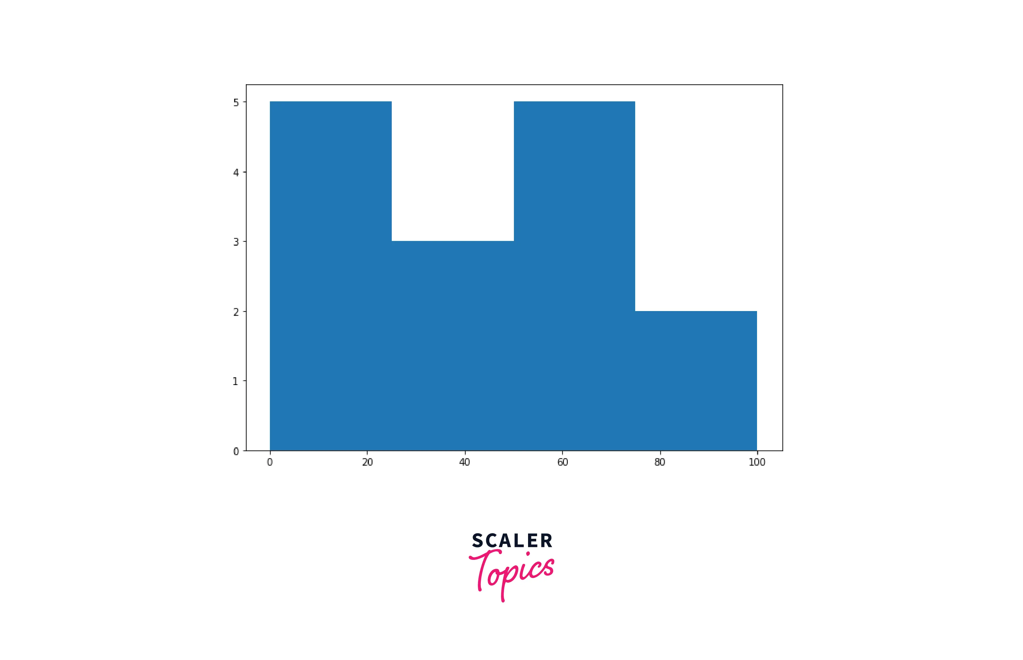
1) Histogram
In Python, a histogram is primarily used to depict data in the form of groupings. It is a precise way of graphically representing the mathematical distribution of data. It is a kind of bar graph in which the X-axis shows bin ranges whereas the Y-axis represents frequency.
Python Code:
Output:
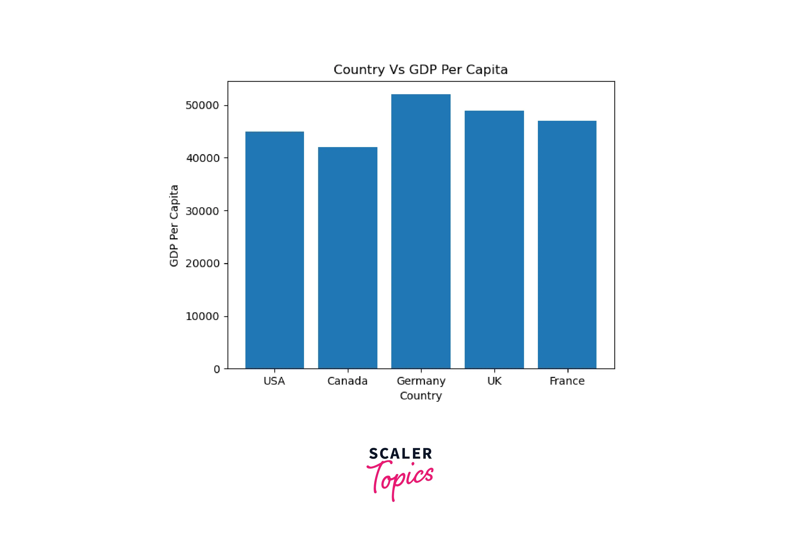
2) Column Chart
In Python, a column chart is defined as a type of data visualization in which every division is displayed by a rectangle, the length of which is equal to the numbers depicted. Vertical bar charts are another name for column charts.
Syntax for Column Chart:
Python Program for Column Chart:
Output of the Code:
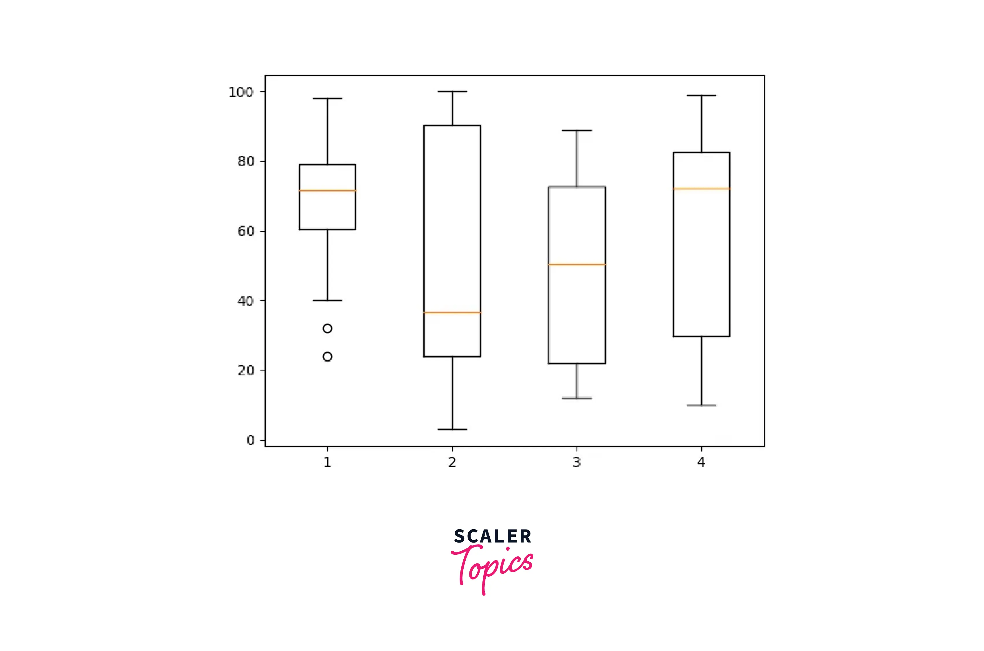
3) Box Plot chart**
A Box Plot is one of the types of chart in Python programming language. The other name for a box plot is a Whisker Plot, which is utilized to show an overview of a collection of data values with qualities such as lowest, initial quartile, middle, third quartile, and highest.
Let's know how a box plot is constructed. A box is drawn from the initial quartile towards the third quartile in the box plot, and a vertical line is drawn through the box at the midpoint. The x-axis depicts the information that needs to be plotted, whereas the y-axis in the box plot represents the frequency count.
Python Program for Box Plot Charts in Python
Output of the Code:
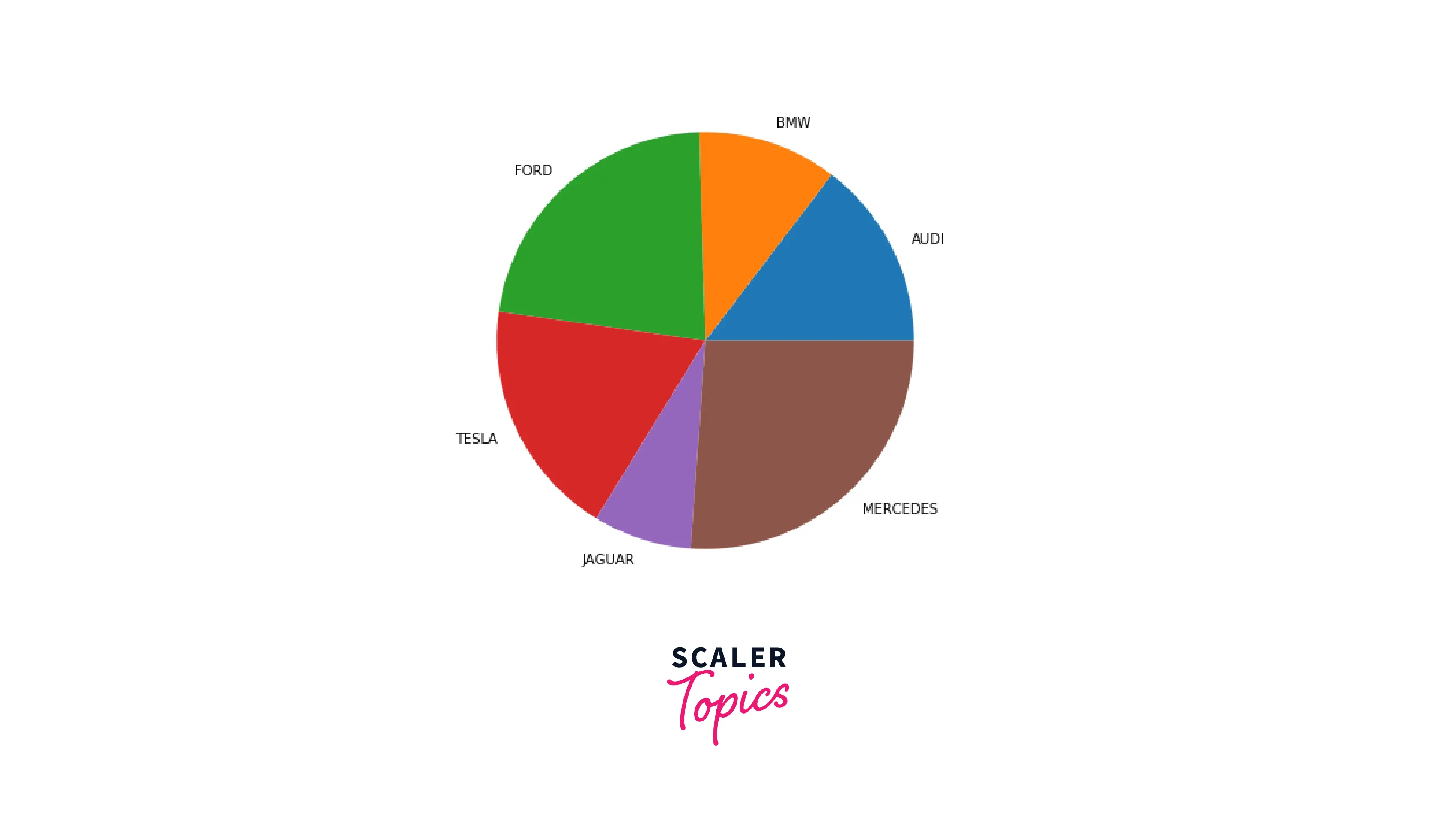
4) Pie Chart
A Pie Chart is one of the charts in Python which is defined as a spherical statistical graphic that is able to represent a single set of data at a time. The chart's area represents the entire percentage of the given data set. The percentage of the data is represented by the area of the pie slices.
Pie charts are widely used in corporate presentations to provide a brief review of topics such as sales, and operations. They are also used for data survey purposes.
Syntax for Pie Chart:
data: This field in the syntax is used to represent the array of values that need to be shown, and data/sum represents the area which is a fractional part of every slice (data). labels: It is a collection of string sequences that define the label of every wedge in the chart. colors: The color attribute is utilized to give the color of the wedge. autopct: The string autopct can be used to designate the wedges in the chart with its numeric values. shadow: The shadow field in the syntax is utilized to generate the shadow of the wedge.
Python Program for Pie Chart
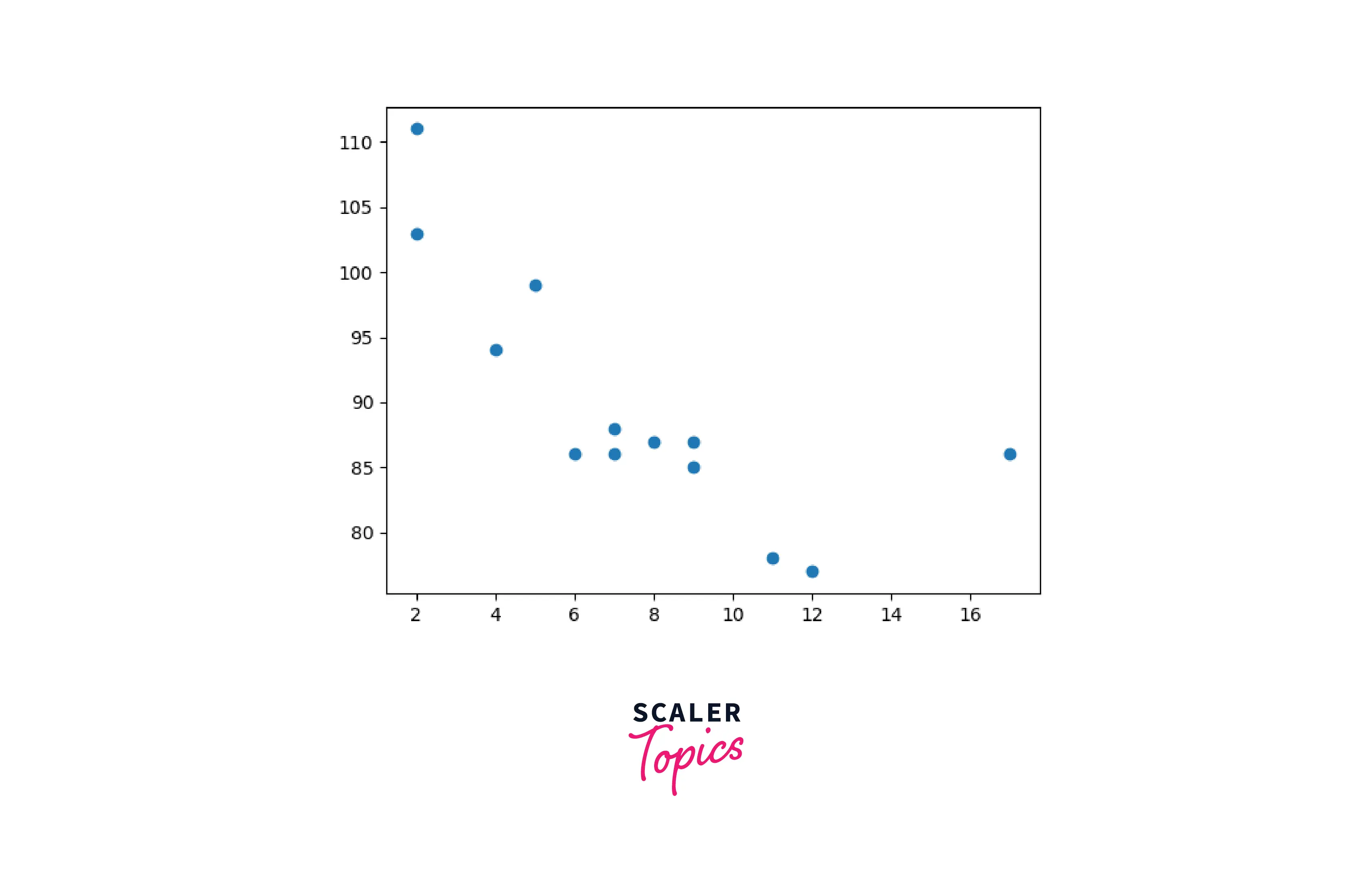
5) Scatter Plot Chart
A scatter plot is a diagram in which a dot represents each data point.
Python Program for Scatter Plot Chart
Output of the code:
FAQs
Q What is a Python chart?
A Python is a powerful programming language that has excellent data visualization libraries. A collection of Pandas, NumPy, as well as matplotlib may be used to create almost any form of visualization chart.
Q Does Python generate graphs?
A The Matplotlib library in Python programming language can be utilized to plot graphs. The Matplotlib library is mostly used to plot graphs. In order to display graphs utilizing matplotlib, you must first download it. Matplotlib is employed to create basic lines, bar graphs, histograms, and pie charts.
Related Articles
If you are new to Python and would like to know what Python is and why is it widely used, check out this article What is Python Programming Language?.
Check out this article Applications of Python to know about the various applications of Python in real life.
To know how to install Python in your Windows system, you can check out this article How to Install Python in Windows?
Conclusion
- Python is now one of the most widely used primary universal languages for visualization techniques and other purposes. It is frequently the best solution for machine learning Problems, Learning Techniques, Artificial Intelligence, as well as other fields. Because of its very understandable code, it is object-oriented and very simple to use.
- A chart that is utilized to compare distinct attributes or to display a comparison of objects across time is known as a column chart.
- A pie chart depicts a fixed number and also how categories represent a portion of something's overall composition.
- There are various charts that can be used in Python for visualizing and analyzing data.