Checkbox in Flutter With Examples
In Flutter, checkboxes are essential material design widgets embody Boolean values for selecting multiple options. They typically appear as square boxes, often accompanied by labels for clarity. Flutter offers various checkbox types, including the compact 'checkbox' and the feature-rich 'CheckboxListTile', each with customizable properties like activeColor for enhanced control over appearance and functionality. This article explores the use and customization of these checkboxes in Flutter, demonstrating their application in stateful widgets. Now let’s look at an example of how to create a checkbox in Flutter.
In the below example, we’ll demonstrate how to add a checkbox in Flutter and make it switchable when the user clicks the label on the box. Checkboxes are essential components of every form. Consider the following example:
You will only see a checkbox with an unchecked status here. If your project wants the Checkbox to be flexible and flip between true and false, you may configure it such that the value changes to the opposite value every time the checkbox is pushed.
Constructor of Checkbox Widget
This is a constructor of a checkbox widget in Flutter which creates a material design checkbox. The checkbox itself maintains no state. Instead, when the checkbox's status changes, the widget invokes the onChanged function. Most checkbox-using widgets will listen for the onChanged callback and rebuild the checkbox with a new value to refresh the checkbox's visual look.
The following parameters must be provided for a checkbox to function efficiently:
- The value affects whether or not the checkbox is checked. Only if tristate is true may the value be null.
- onChanged, which is called when the checkbox's value changes. To deactivate the checkbox, set it to null.
The tristate and autofocus values must not be null. If tristate is true, the checkbox can potentially display three values: true, false, and null. A dash is displayed when the value is null. Tristate is set to false by default, and the checkbox value must be true or false.
Properties of Checkbox
Checkbox has various characteristics, and we will go through a few of them here:
| Attributes | Description |
|---|---|
| value | This property accepts a boolean value as an object to determine whether or not the CheckBox is checked. |
| onChanged | It is called when the value is changed. The ValueChanged<T>typedef is the object assigned to this property. It is invoked when the value of the CheckBox widget has to be modified. |
| Tristate | Checkboxes are typically either ticked or unchecked. If this property, which accepts a boolean as an object, is set to true, it can also be changed to null. |
| activeColor | When this parameter is checked, the Color class is used to fill up the CheckBox. |
| checkColor | This property accepts the Color class as an object. It gives the check icon a color. |
| materialTapTargetSize | It is in charge of determining the size of the tapped area. The MaterialTapTargetSize enum is used as the object. |
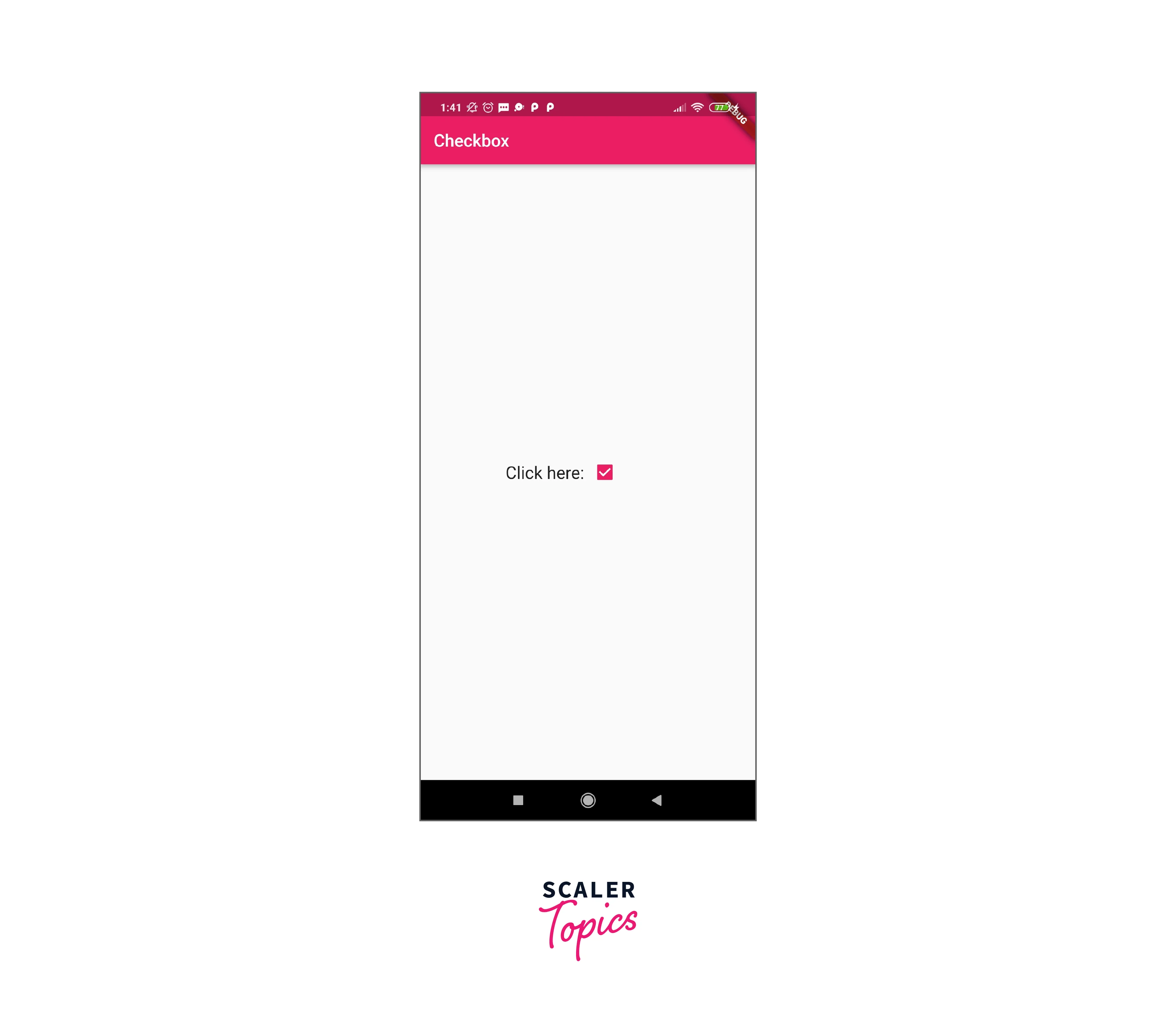
Let's write the entire code to show how a checkbox appears in Flutter. To begin, open the main. dart file in Android Studio and replace it with the following code:
Output: When we run the app in the emulator or on the device, we will see the following screen:

Properties of CheckboxListTitle
Here are a few properties of CheckboxListTitle:
| Property | Description |
|---|---|
| value | This property accepts a boolean value as an object to determine whether or not the CheckBox is checked. |
| onChanged | It is called when the value is changed. The ValueChanged<T>typedef is the object assigned to this property. It is invoked when the value of the CheckBox widget has to be modified. |
| title | It indicates the list's primary title. |
| subtitle | It indicated the list's subtitle. It is typically used to provide a description. |
| activeColor | When this parameter is checked, the Color class is used to fill up the CheckBox. |
| selected | It is false by default. Upon selection, it highlights the text. |
| secondary | It is the widget that appears in front of the checkbox. |
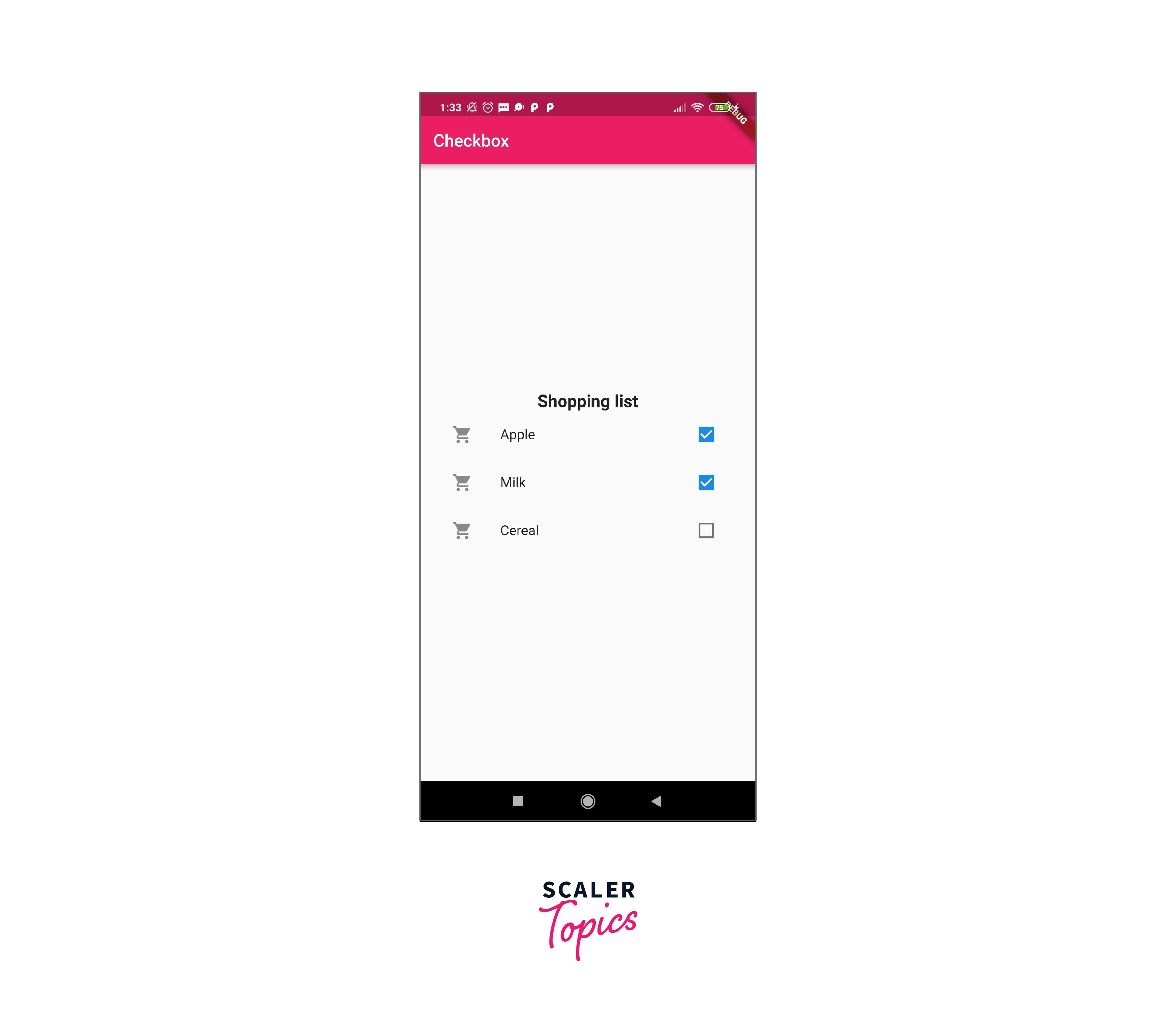
The following is a CheckboxListTitle demo:
To demonstrate how CheckboxListTitle is presented in Flutter, let's write the whole code. To begin, start an Android Studio project, open the main. dart file, and replace the following code:
Output: When we run the app in the emulator or on the device, we will see the following screen:

Conclusion
- A checkbox in Flutter is a graphical user interface element that stores a Boolean value.
- It allows users to pick numerous alternatives from a list of possibilities and can only provide a yes or no answer.
- On the screen, checkboxes are often represented as square boxes with white space or a tick mark.
- The checkbox is usually utilized in the Stateful Widget and has various parameters like activeColor, checkColor, mouseCursor, etc. to provide developers complete flexibility over the widget’s appearance and feel.
- When the checkbox’s status changes, the widget invokes the onChanged function.
- Parameters must be provided to function efficiently, such as true, false, and null.
- CheckboxListTitle has many properties like value, onChanged, title, subtitle, activeColor, selected, and secondary, etc.
- ValueChangedtypedef is invoked when the value is changed.
