Checked CSS Selector
 FREE
FREE
How to Use the CSS Checked Selector?
The :checked CSS pseudo-class selector is used to select or deselect an already selected element for styling them.
We can use it with the help of checkbox element(<input type="checkbox">),option element (<option> in a <select>) and radio element(<input type="radio">).
Syntax
The general syntax is as follows
Examples
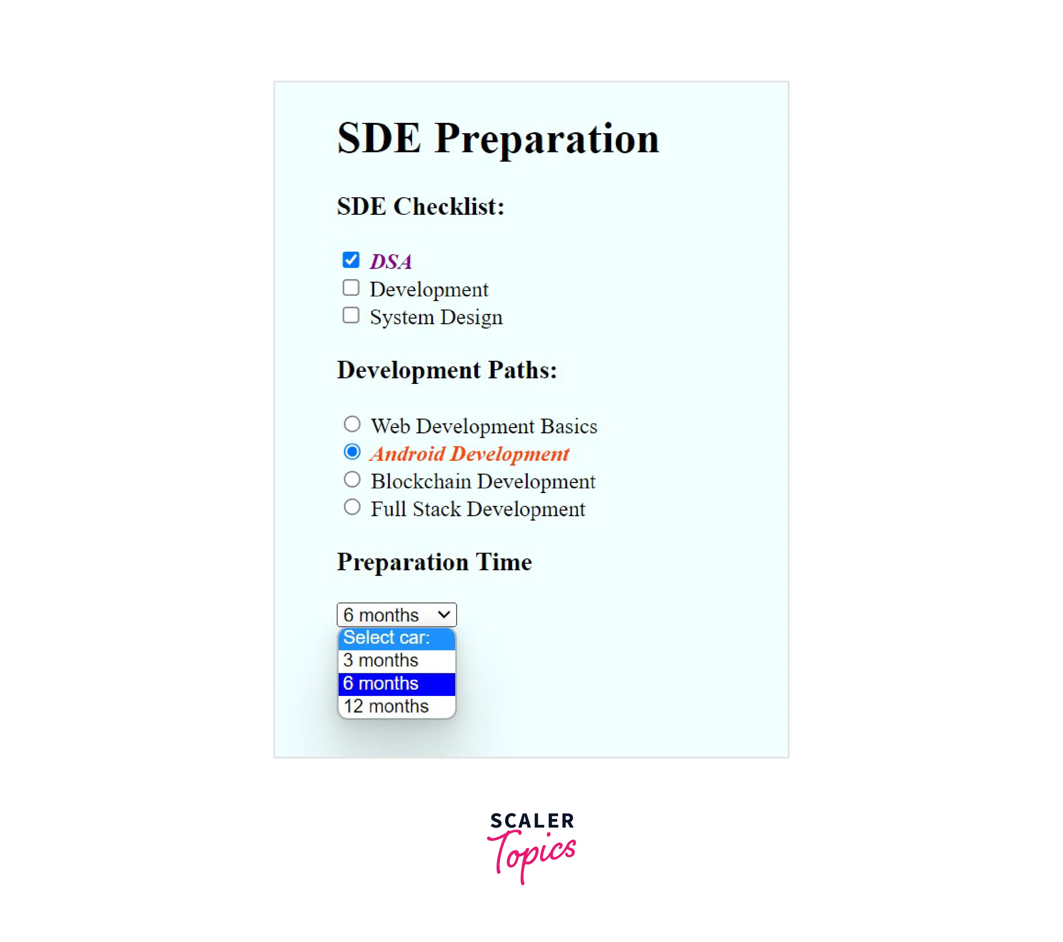
Example 1: Basic Example of CSS :checked
In this example we will be applying :checked CSS pseudo-class selector to style a checkbox element(<input type=“checkbox”>), option element (<option> in a <select>) and radio element(<input type="radio">).
Output
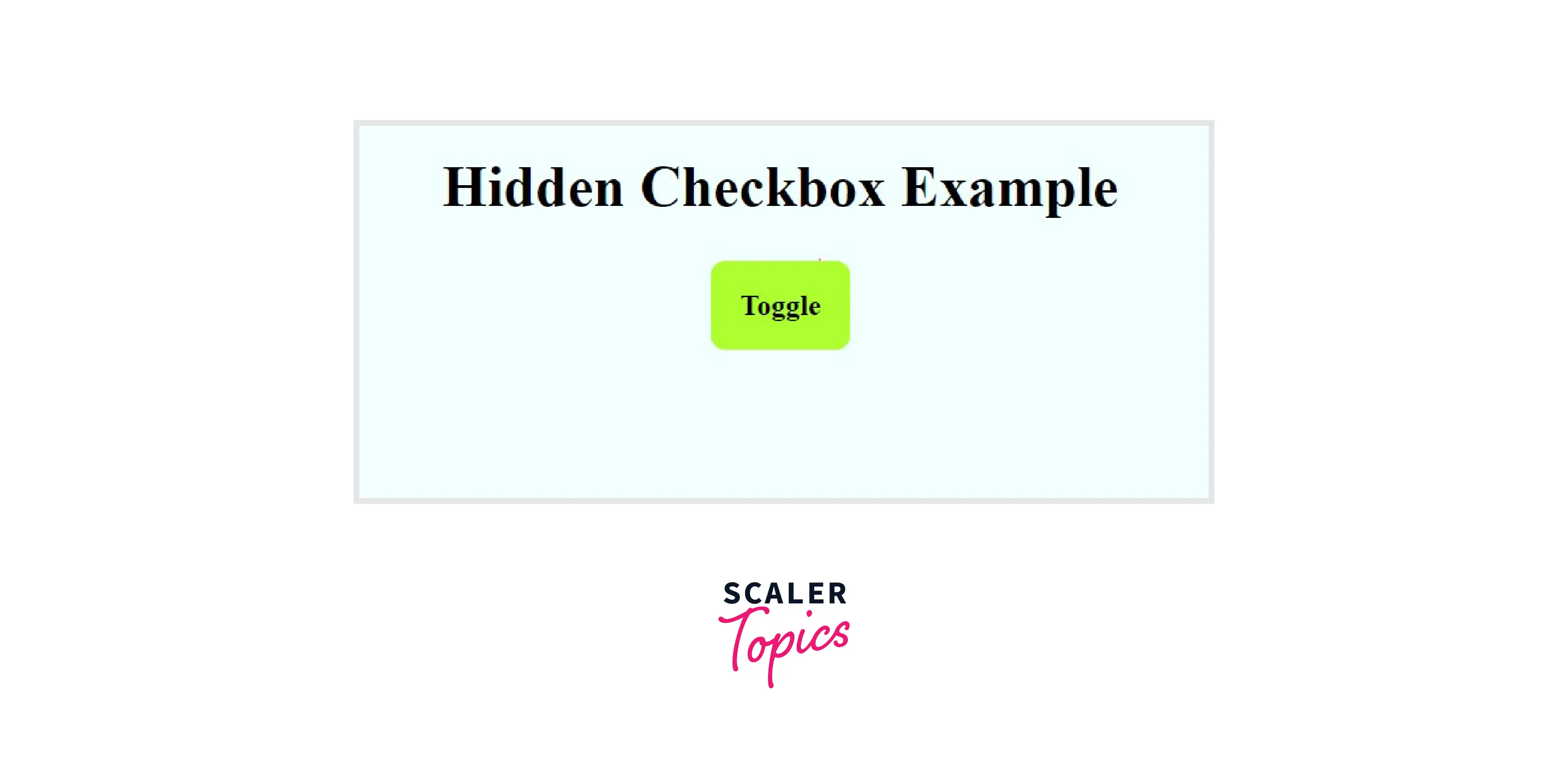
Example 2: Toggling Elements with a Hidden Checkbox
In this example, we will be using a hidden checkbox that can be used to toggle an element.
We can use the hidden property to hide the checkbox, and with the help of the <label>, we can control the toggle functionality.
Then we can use the adjacent sibling combinator to style the differently based on the
Output
When checkbox is checked and we click on the toggle button.
When checkbox is checked and we click on the Toggle button.
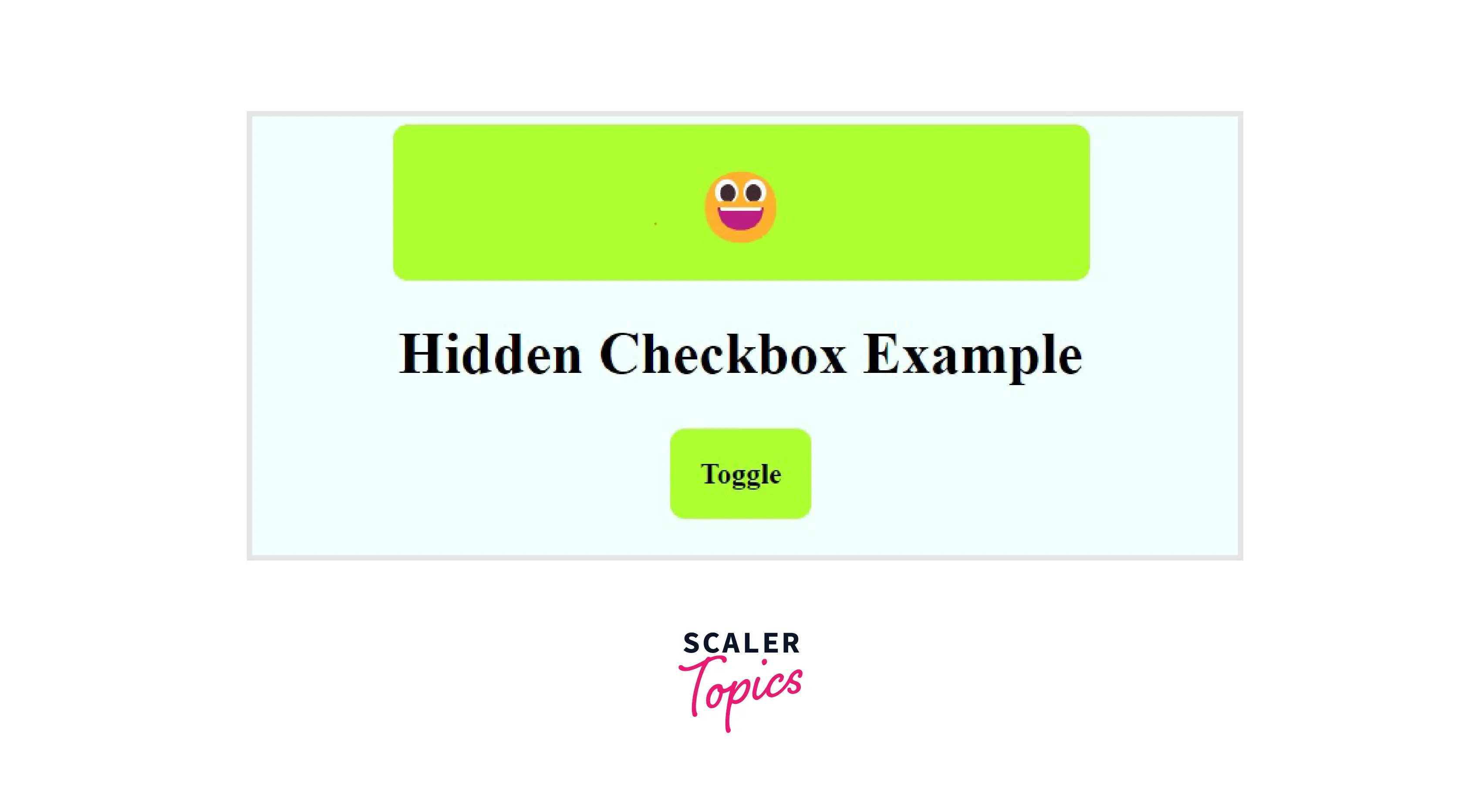
Note: By default the checkbox is unchecked in the above code snippet.
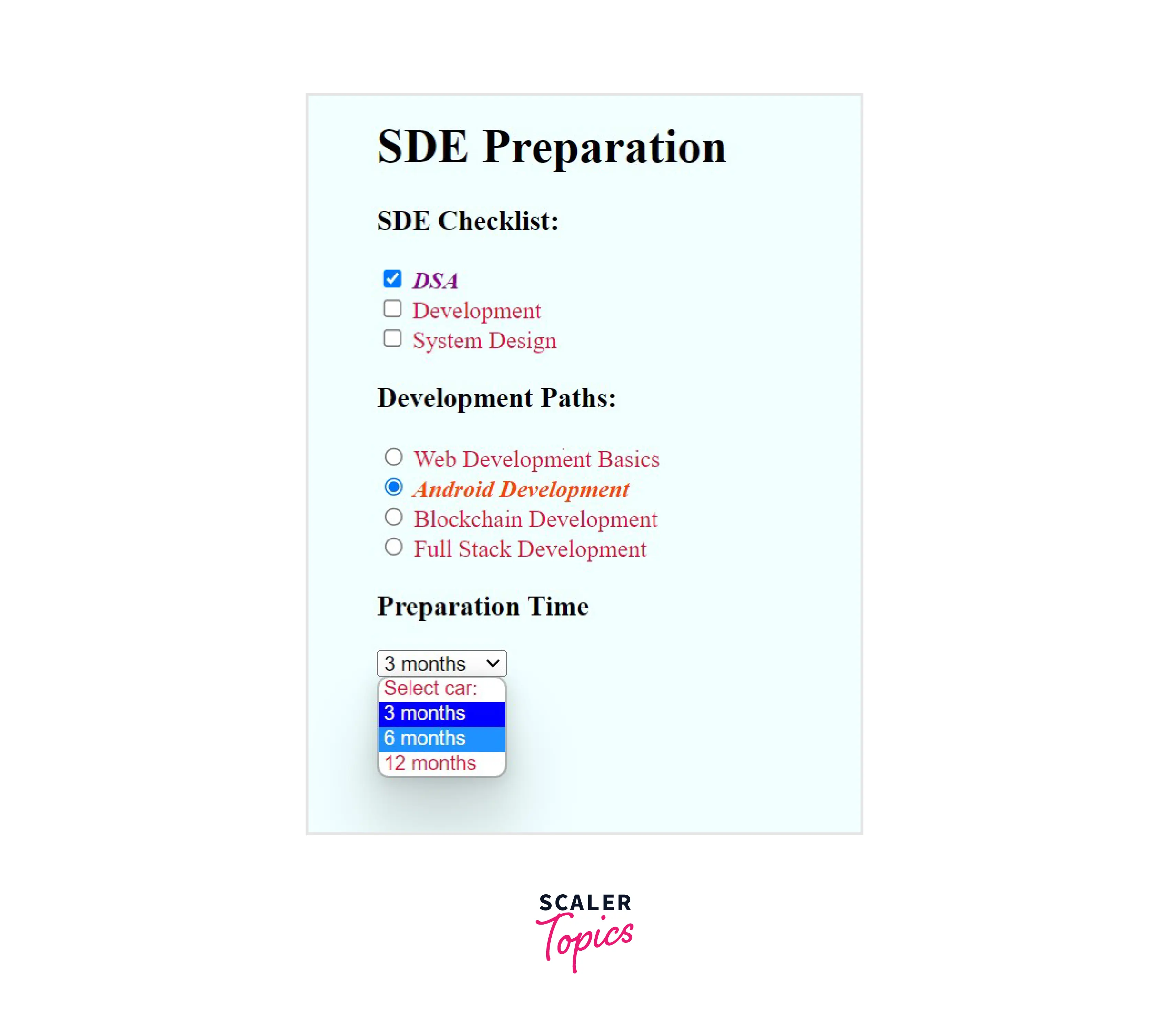
Explicit Styling Unchecked Elements
We can combine the :not pseudo-class with
For example, in the code snippet, we have used the explicit style to unchecked elements and gave them a red color.
Output
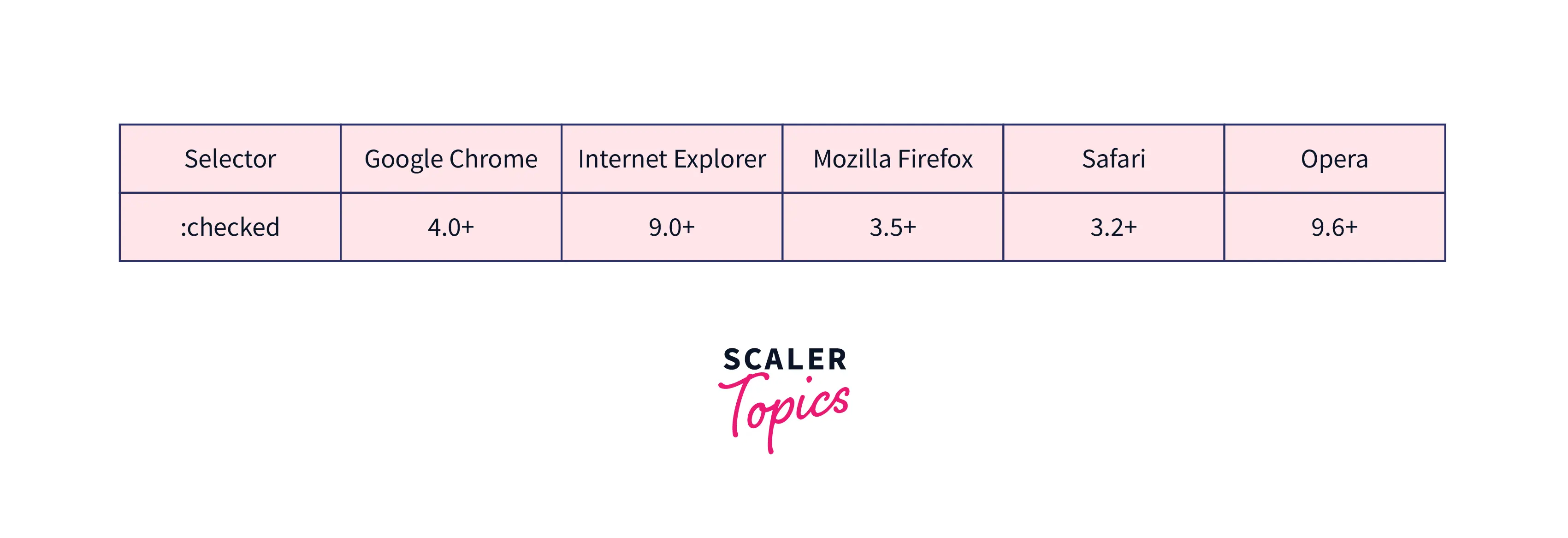
Browser Support
The following browsers fully supports the CSS
Conclusion
- :checked is a pseudo-class selector that’s used to style the checked state of radio, checkbox, or option elements.
- We can hide the checkbox and can still toggle its value on and off by clicking the
- the :not pseudo-class with :checked can be used to explicitly style unchecked elements.