How to Set Border Radius for Container in Flutter?
Explore Flutter's BorderRadius widget to effortlessly add stylish rounded corners to containers, enhancing UI aesthetics. By leveraging methods like BorderRadius.all and BorderRadius.circular, developers can craft visually appealing elements such as buttons and cards. Implementing border radius not only elevates design elegance but also ensures consistent visual appeal across various screen sizes, refining the overall user experience in Flutter applications.
BorderRadius
BorderRadius is a pre-existing widget in the Flutter framework. Its primary purpose is to create a curved effect around the corners of a widget's border. There are five different approaches to using this widget.
-
The first approach is to utilize BorderRadius.all, where the radius for all corners is the same.
-
The second approach involves employing BorderRadius.circular, where a single radius value of type double needs to be specified. This radius creates a circular effect for all corners.
-
The third approach is accomplished by utilizing BorderRadius.horizontal, which allows for different border radii to be assigned to the left and right sides of the widget.
-
The fourth approach involves using BorderRadius.only, which allows for different radii to be assigned to each of the four corners of the border.
-
The final approach is to use BorderRadius.vertical, which enables distinct radii to be assigned to the top and bottom portions of the border.
Container Border Radius can be set by following these steps.
Applying Border Radius to a Container
To apply border radius to a Container widget in Flutter, you can make use of the decoration property of the Container and set it to a BoxDecoration with the desired border-radius. Here's an example:
In the above code snippet, the Container widget has a width and height of 200 pixels and a BoxDecoration is applied to its decoration property. The borderRadius property of the BoxDecoration is set to BorderRadius.circular(20) to create rounded corners with a radius of 20. The color property is set to Colors.blue to give the Container a blue background color.
You can adjust the values of width, height, borderRadius, and color to fit your specific requirements of the container border radius.
Border Radius Variations and Examples
This section demonstrates different ways to apply container border radius to a Container widget in Flutter. Adjust the values of width, height, and radius according to your needs.
Applying Circular Border Radius to Create Rounded Corners
To apply a circular border radius and create rounded corners in Flutter, you can use the BorderRadius.circular constructor. Here's an example of applying a circular border-radius to a Container:
In the above code snippet, the Container widget has a width and height of 200 pixels. The borderRadius property of the BoxDecoration is set to BorderRadius.circular(20) to create rounded corners with a radius of 20. The color property is set to Colors.blue to give the Container a blue background color.
You can adjust the values of width, height, and borderRadius to fit your specific requirements. This will give your Container widget rounded corners based on the specified circular border radius. In this way, the specifics of the container border radius can be defined.
Using Elliptical Border Radius for Unique Shape Customization
In Flutter, you can use BorderRadius.elliptical to create elliptical border radii and achieve unique shape customization. The BorderRadius.elliptical constructor takes two parameters: xRadius and yRadius, representing the radii along the x-axis and y-axis, respectively.
Here's an example of applying an elliptical border-radius to a Container widget:
In the above code snippet, the Container widget has a width of 200 pixels and a height of 150 pixels. The borderRadius property of the BoxDecoration is set to BorderRadius.elliptical(100, 50), which creates an elliptical shape with a radius of 100 along the x-axis and a radius of 50 along the y-axis. The color property is set to Colors.blue to give the Container a blue background color.
You can adjust the values of width, height, xRadius, yRadius, and color to customize the elliptical shape according to your desired dimensions and appearance.
Combining Multiple Border Radii for Complex Shapes
In Flutter, you can combine multiple BorderRadius values to create complex shapes with varying border radii. The BorderRadius class provides several constructors and methods to achieve this. Here's an example of combining multiple border radii to create a custom shape:
In the above code snippet, the Container widget has a width and height of 200 pixels. The borderRadius property of the BoxDecoration is set to a combination of BorderRadius.only and add methods. The BorderRadius.only specifies different radii for specific corners (top left, bottom right, top right, and bottom left). The add method is used to combine additional border radii (top right and bottom left) to the existing BorderRadius.only values. The color property is set to Colors.blue to give the Container a blue background color.
By combining and adding multiple BorderRadius values, you can create complex shapes with custom border radii for each corner. Adjust the values and combinations according to your desired shape and appearance.
Properties of BorderRadius
In Flutter, the BorderRadius class is used to define the border radii for widgets such as Container or Material using the borderRadius property of the BoxDecoration. Here are the properties available in the BorderRadius class:
-
BorderRadius.circular(double radius):
Creates a circular border radius with the specified radius value.
-
BorderRadius.all(Radius radius):
Applies the same radius to all four corners of the widget.
-
BorderRadius.only({Radius topLeft, Radius topRight, Radius bottomLeft, Radius bottomRight}):
Allows specifying different radii for each corner of the widget.
-
BorderRadius.horizontal({Radius left, Radius right}):
Specifies different radii for the left and right sides of the widget.
-
BorderRadius.vertical({Radius top, Radius bottom}):
Specifies different radii for the top and bottom sides of the widget.
-
add(BorderRadius other):
Combines two BorderRadius instances, creating a new BorderRadius that encompasses both radii.
These properties of the BorderRadius class provide flexibility in defining various border radii configurations for different shapes and designs in Flutter.
Styling and Customizing Container Borders
In Flutter, you can style and customize the borders of a Container widget using the BoxDecoration class. Here are some ways to achieve that:
-
Applying border color and width: You can set the border property of the BoxDecoration to specify the color and width of the border.
-
Applying rounded corners: Use the borderRadius property of the BoxDecoration to create rounded corners.
-
Applying specific border sides: You can customize which sides of the container have borders by using the Border class.
These examples demonstrate how to style and customize the borders of a Container in Flutter. Adjust the values of width, height, border, borderRadius, and other properties to achieve your desired border design. The container border radius can be styled and optimized in this way.
Animating Border Radius
To animate the container border radius of a widget in Flutter, you can make use of the animation framework provided by Flutter, such as the AnimationController and Tween classes.
The example application below demonstrates the use of animations. You can go through it to understand the concept.
Example App
Output:
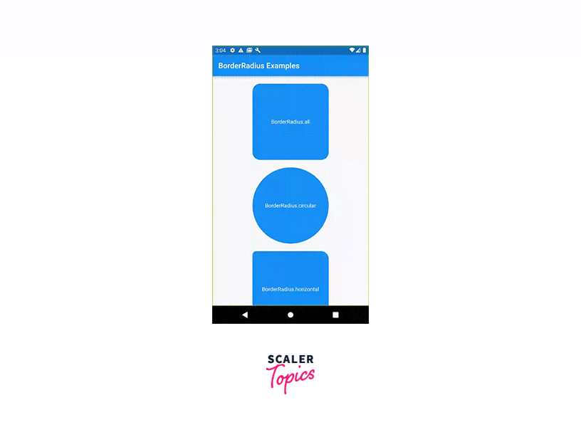
This example app displays a BorderRadiusScreen with multiple Container widgets, each showcasing a different way to use BorderRadius. The containers have different border-radius configurations, and the text inside each container describes the specific BorderRadius variation being demonstrated.
When you run the app, you'll see a screen with containers representing each BorderRadius variation. You can customize the values, sizes, and colors as needed to explore different visual effects and experiment with the BorderRadius functionality in Flutter.
Conclusion
-
Border radius is essential in Flutter for achieving visual aesthetics and creating appealing user interfaces.
-
Flutter provides the BorderRadius class with various approaches for setting border radii, including BorderRadius.all, BorderRadius.circular, BorderRadius.horizontal, BorderRadius.only, and BorderRadius.vertical. These approaches allow customization of corner radii based on specific design requirements.
-
The text also mentions how to style and customize container borders using BoxDecoration properties, including border color, width, specific border sides, and custom border shapes. Additionally, it explains how to animate the border radius of a widget using Flutter's animation framework.