CSS Align-Self Property
 FREE
FREE
Overview
The CSS align-self property specifies the alignment for the selected item inside a flexible container.
- In a grid, the CSS align-self property aligns the item inside the grid area.
- In a flexbox, it aligns the item on the cross-axis.
- The align self CSS property doesn't apply to block-level elements or table cells.
- If a flexbox item's cross-axis margin is auto, then align-self is ignored.
Note: It overrides a grid or flex item's align-items value.
Syntax
The align self CSS property accepts keywords and global values. By default, it has an auto value.
We will discuss the various align-self supported values in the following section of the article.
Align-self in CSS
The various property values of Align-self are discussed below,
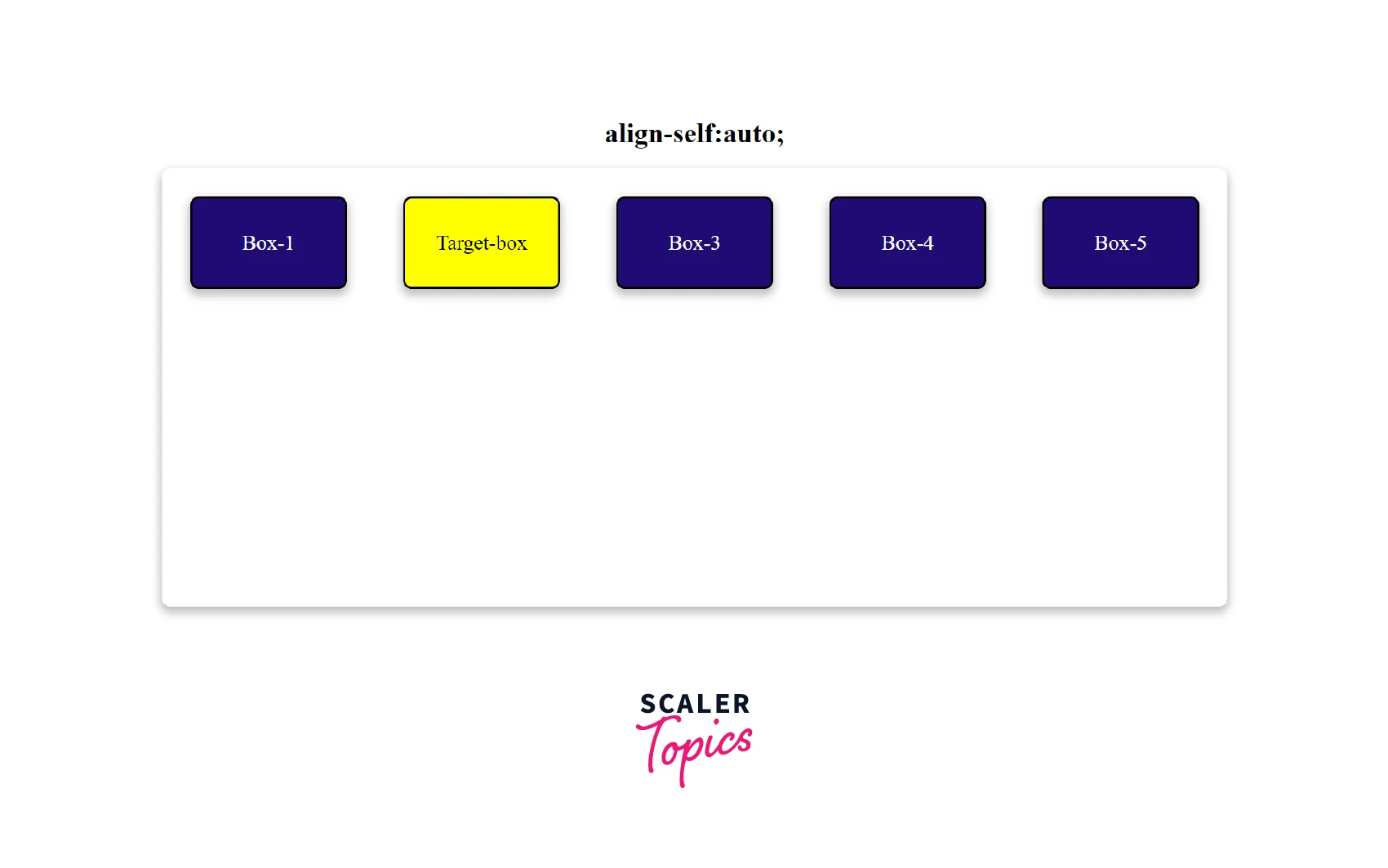
Property Value: Auto
The align self CSS property accepts auto as its default value. The element inherits its parent container's align-items property, or stretch if no parent container exists.
Let us consider the following example to understand the auto value. Example
In this example, we have five boxes, of which one box is our target box. We will apply the align self CSS property to the target box.
HTML
CSS
Output The target will use the value of align-items.
Property Value: Normal
Our layout mode determines the effect of the normal keyword:
- The normal keyword behaves like start on replaced absolutely-positioned boxes and as stretch on all other absolutely-positioned boxes in absolutely positioned layouts.
- It behaves as a stretch for a static position of an absolutely positioned layout.
- For flex items, the keyword behaves as stretch.
- In grid items, it behaves similarly to stretch, except for boxes with an aspect ratio or intrinsic size; the normal value acts like a start value.
- The property doesn't apply to block-level boxes and table cells.
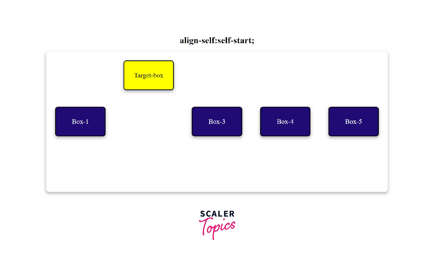
Property Value: Self-start
The self-start value packs the items immediately adjacent to the edge of the alignment container on the start side of the item, on the appropriate axis.
Example
HTML
CSS
Output
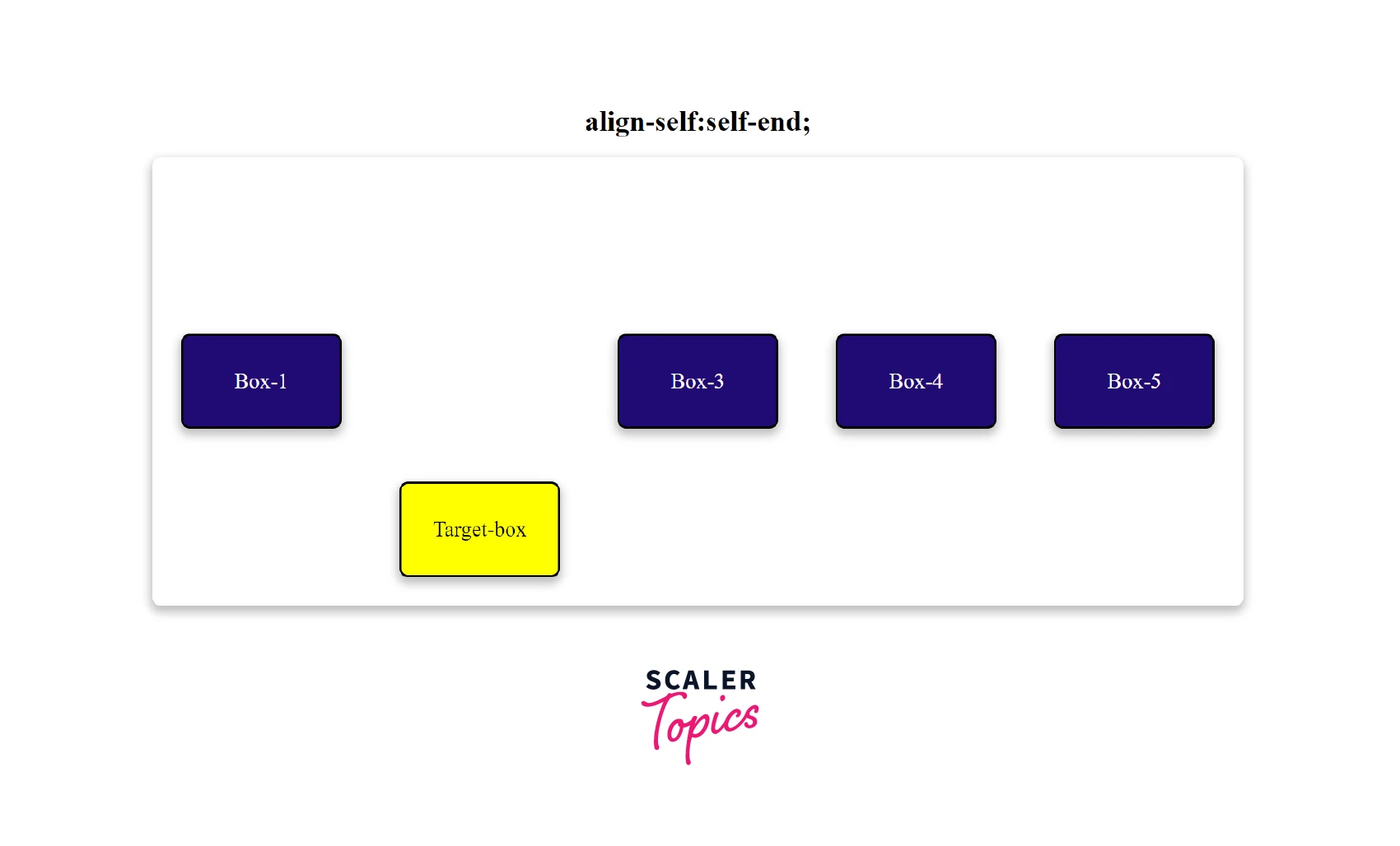
Property Value: self-end
The self-start value packs the items immediately adjacent to the edge of the alignment container on the end side of the item, on the appropriate axis.
Example
HTML
CSS
Output
Property Value: Flex-start
The flex-start value positions the selected item at the start of the flexible container. The cross-start margin edge of the flex item is immediately adjacent to the cross-start edge of the line.
Example The .main container has align-items: center and the target has align-self: flex-start. Therefore, only the target will be at the start of the cross-axis. The target box is aligned vertically at the top.
HTML
CSS
Output
Property Value: Flex-end
The flex-end value positions the selected item at the end of the flexible container. The cross-end margin edge of the flex item is immediately adjacent to the cross-end edge of the line.
Example The .main container has align-items: center and the target has align-self: flex-end. Therefore, only the target will be at the end of the cross-axis. The target box is aligned vertically at the bottom.
HTML
CSS
Output
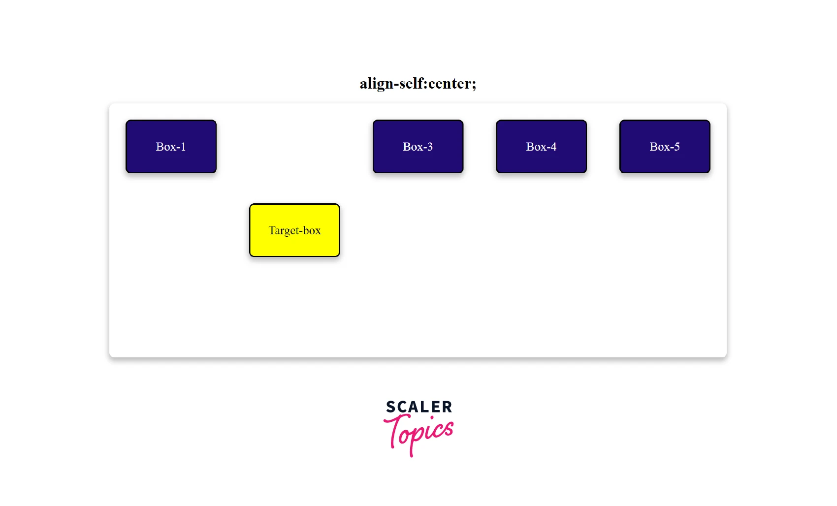
Property Value: center
The center value places the item at the center of the flexible container.
Example
The .main container has align-items: flex-start and the target has align-self: center. Therefore, only the target will be at the center of the cross-axis. The target box is aligned vertically centered.
HTML
CSS
Output
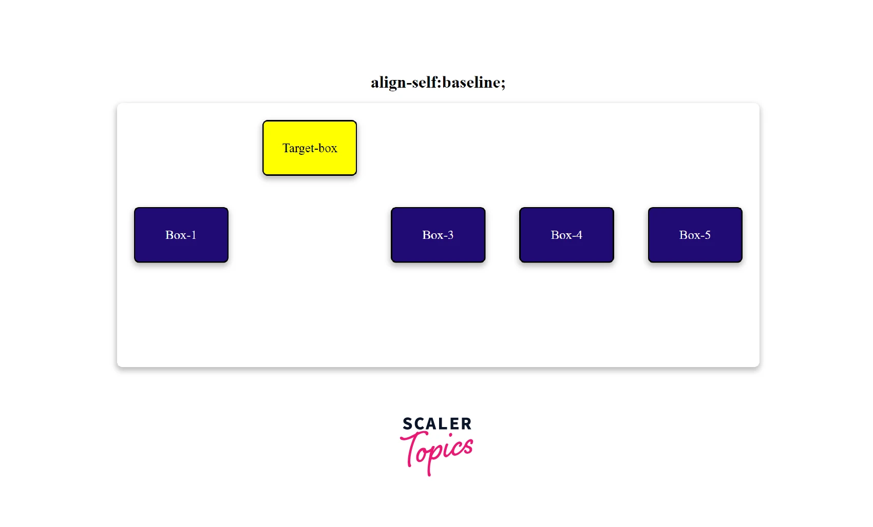
Property Value: Baseline, First Baseline, Last Baseline
The baseline value places the item at the baseline of the flexible container.
Example The .main container has align-items: center and the target has align-self: baseline. Therefore, only the target will be at the baseline of the cross-axis. The target box is aligned along the baseline of the text.
HTML
CSS
Output
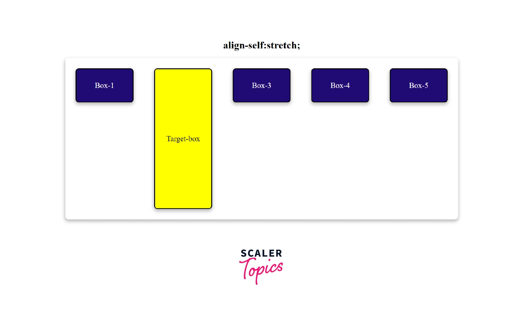
Property Value: stretch
The stretch value positions the elements to fit the container.
Example The .main container has align-items: center and the target has align-self: stretch. Therefore, only the target will stretch along the whole cross-axis.
HTML
CSS
Output
Property Value: safe
The safe keyword causes the item to align as if the alignment mode was start if the item overflows outside the alignment container.
Property Value: unsafe
Items are aligned only according to their alignment keyword values, regardless of their relative sizes.
Note: we use the safe and unsafe keyword values with other alignment keywords. For example, align-self: safe center;
Browser Support
The following browsers support the align-self property:
| Browser | Version |
|---|---|
| Google Chrome | 29 |
| Safari | 9 |
| Mozilla Firefox | 20 |
| Microsoft Edge | 12.0 |
| Chrome Android | 29 |
| Firefox for Android | 20 |
| Opera Android | 12.1 |
| Safari on iOS | 9 |
| Samsung Internet | 2.0 |
| WebView Android | 4.4 |
Conclusion
- The CSS align-self property specifies the alignment for the selected item inside a flexible container.
- It overrides a grid or flex item's align-items value.
- The align self CSS property doesn't apply to block-level elements or table cells.
- The align self CSS property accepts keywords and global values like auto, flex-start, baseline, stretch, etc.
- By default, it has an auto value.
- We can use the safe and safe keywords for overflow alignment.
Related Properties
- flex-box
- grid
- align-items