CSS Crop Image

How to Crop Image in CSS?
CSS has advanced fast over the last few years, with many functionality now available in pure CSS. MDN Web Docs is one of the best among the plethora of resources available for one to improve their knowledge about the functionalities of CSS.
Many of the existing and planned capabilities may be learned using the interactive examples on the MDN website.
Additionally, a table of browser compatibility is displayed so you can see which features are covered by which browsers.
Now coming over to the question of How to crop images in CSS?, Cropping photographs is one of the elements that is required for almost all websites. For picture cropping, many websites use PHP, Node, and other computer languages. But let's not get mired down in programming languages and instead concentrate on two CSS approaches that rely on them less. Instead of really cropping a picture, we may occasionally only need to conceal a particular area.
Prerequisites
You will need the following to follow when reading this article:
- Understanding CSS values and properties.
- Using style property-assisted CSS declarations.
- A contemporary web browser with object-fit and object-position capabilities.
Different Ways to Crop Images in CSS
The <img> Tag with Object-fit And Object-position
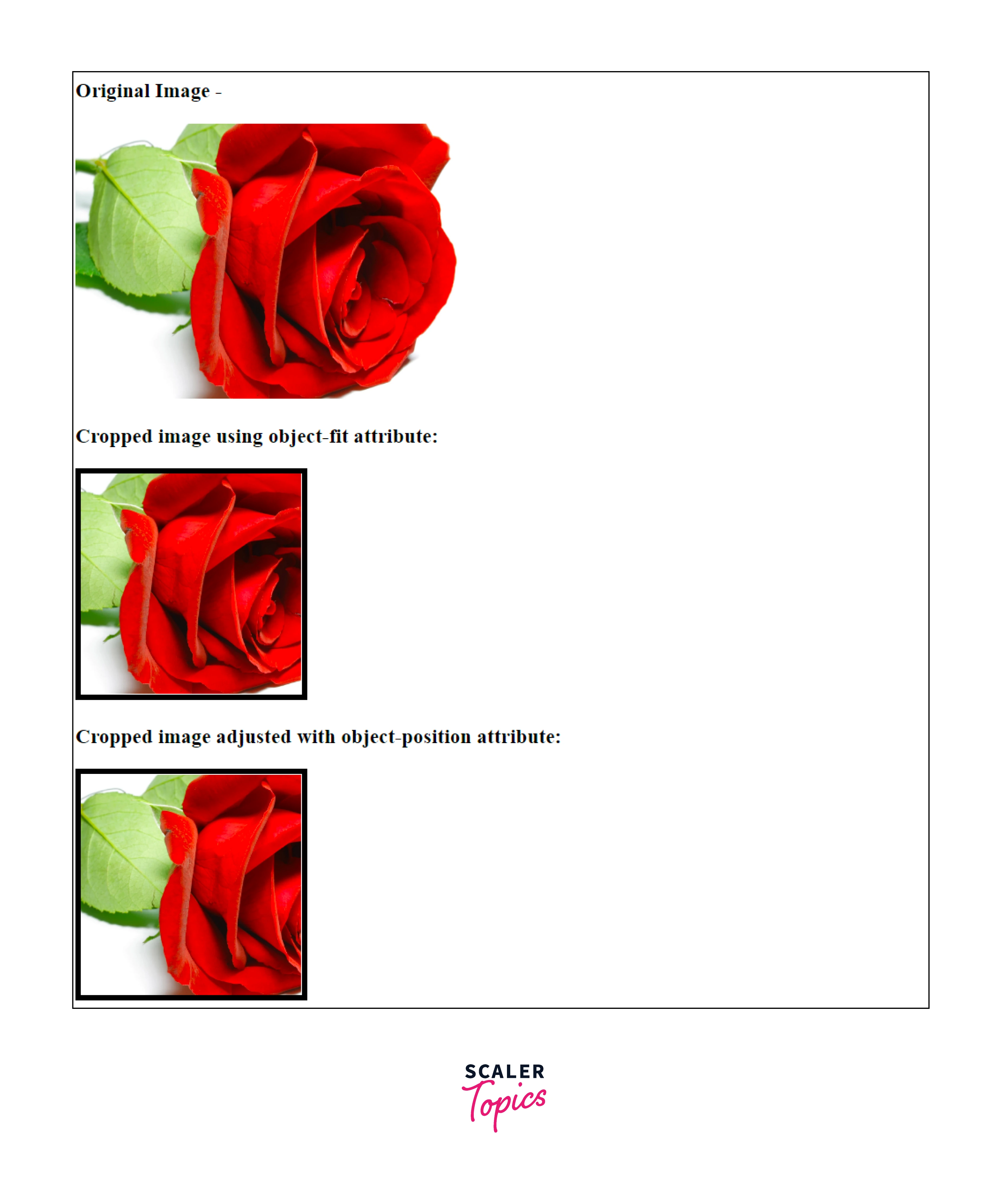
Cropping photos is a simple process when using the object-fit CSS feature. There are five possible options for it, but the cover is the best choice. The image's aspect ratio is maintained while still fitting inside the size of its content box by using the object-fit: cover; option.
Adjusting the region of the picture to crop may be done by combining the object-fit and object-position properties. The picture must be positioned using the x% and y% values of the object-position property; the default position is 50% 50%. Additionally, x px and y px are available as pixel locations, but they are typically not helpful.
Think about the object-fit and object-position tools that were used to trim and reposition this 350 x 250 pixel image of a dog. Try modifying its settings and notice the results.
HTML Code-
Output Image-
The Background-Image Property with Background-Size and Background-Position
The requirements for background image, background-size, and background position should be mentioned first. Spending too much time there will prevent you from getting useful solutions. Use the samples below and learn about their CSS instead.
Where would you like to substitute the background picture for a regular <img> Using backdrop pictures, however, does not provide you a drag-and-drop functionality. I advise utilizing backdrop photos to set the tone if we're discussing perception in this context. As simple visuals are more effective in the case of highlighting a particular object. Leaving perceptual thinking aside we apply the fundamental illustrations:
HTML Code-
Output -
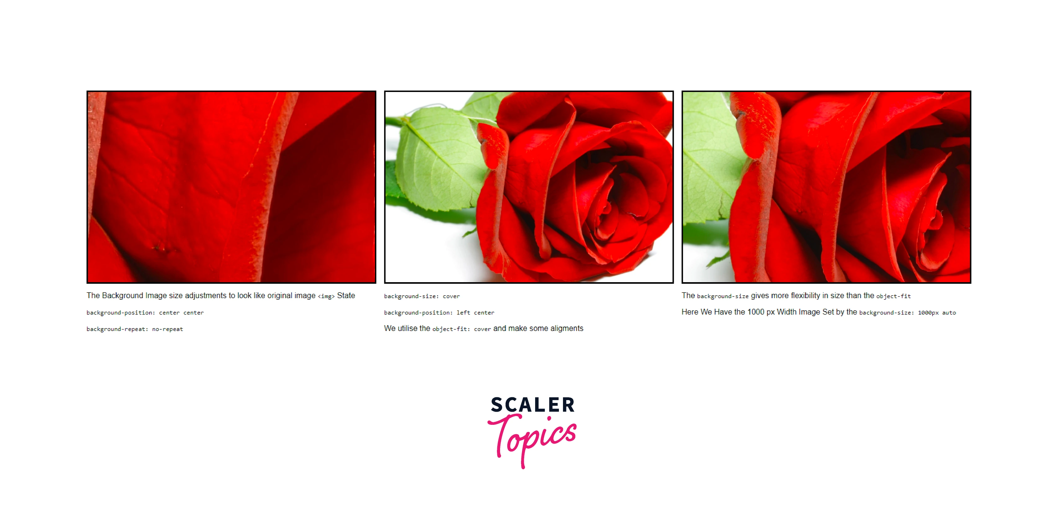
An initial branching name for the backdrop picture would be preferable than cropping. Other instances show the behavior we anticipate from cropping. You have greater freedom to choose a size to extend your image by using the background-size property.
There are three potential choices for background origin and background-clip: border-box, padding-box, and content-box. In the first scenario, you specify where the background picture will be placed. For border-box, the background's upper-left corner would be at the border's upper-left corner. Both content-box and padding-box follow the same reasoning. The application of the backdrop makes the sole difference.
Image or Background Image with Persistent Ratio
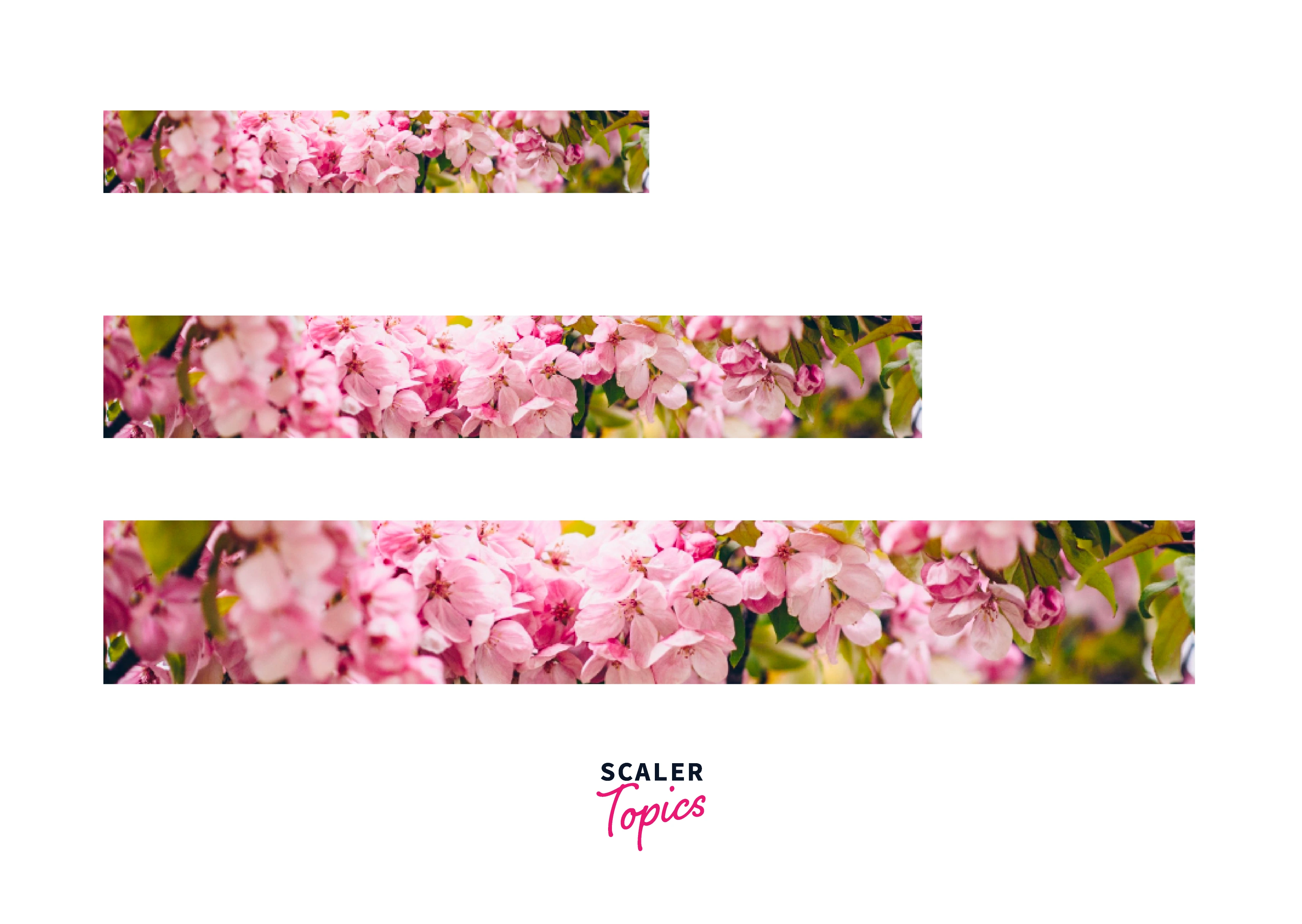
You cannot specifically define height to maintain proportions when using an image that fills a container to 100% of its width. You may use the aspect-ratio CSS attribute to your advantage in this situation. It supports newer browsers in a respectable manner, but not well enough to allow carelessness.
HTML Code -
Output -
Round Cropping Using Border-Radius
Two tools that CSS experts use to create their images are a properly configured border-radius and a hidden overflow. To conduct some rounded cropping, we'll employ their methods. This method works with both background pictures and regular photos, and we've already covered both, so we won't dwell on them for too long.
The border of the lovely flower image above is not rectangular. Try hovering it to check whether the browser uses the real rectangular boundary rather from the one it has assumed to be there. I advise utilizing a reliable reference to better grasp the border-radius property's syntax because it is complex.
HTML Code -
Output-

Complex Paths of Cropping with Clip-Path
Among the ones mentioned, this one is the most intricate and effective. In order to cover all of its potentials, it could require a separate article or even a specialized book. We'll go through its syntax, fundamental use, and various examples.
In some ways, this CSS tool is the only one mentioned in this post that is specifically designed for cropping photographs, if you give it some thought. Did we even think to consider the cropping that occurs as a byproduct of other CSS properties? mainly due to the fact that these features are far more usable. Furthermore, cropping may occasionally be a necessary secondary effect rather than the primary one. Let's first examine the clip-path property's syntax:
Basic-Shape and Geometry-Box
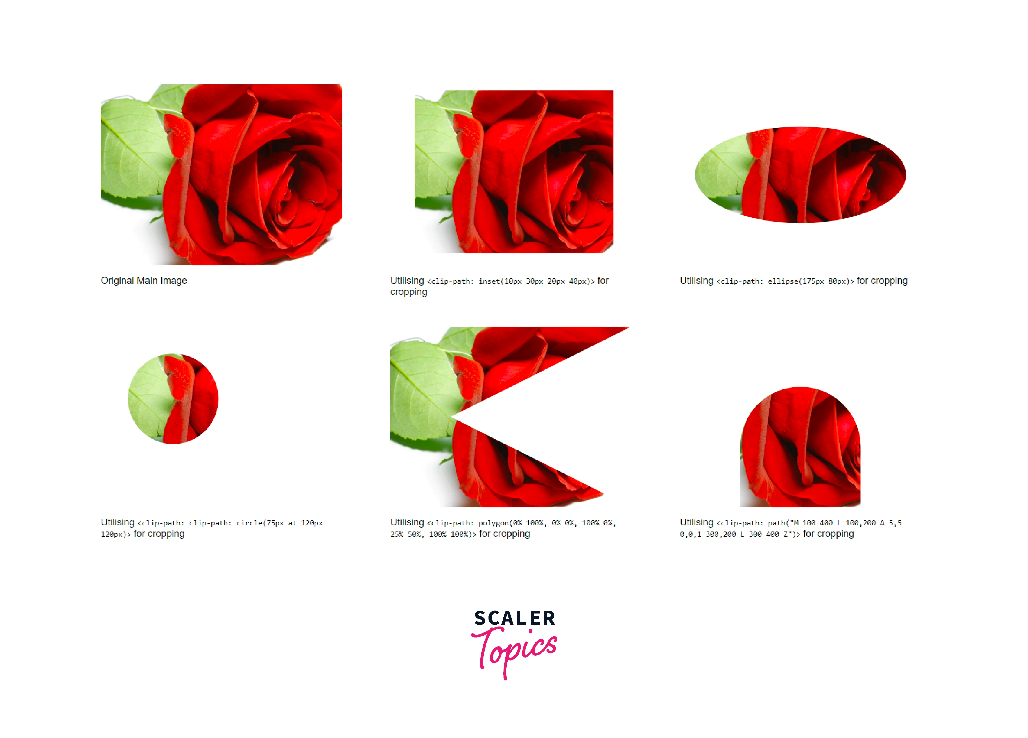
We may work utilizing the preset collection of shapes thanks to this section of the syntax. It is pretty strong despite its flaws. You may use the functions inset(), circle(), ellipse(), polygon(), and path to create basic shapes. The last one gives users the option to crop images using SVG syntax.
The value for the geometry box might be left out. We may use it instead of the basic-shaped one. When you utilize geometry-box, you may restrict cropping by using a certain region, such as padding-box or a stroke-box using SVG influences. I won't give usage examples for the geometry-box.
HTML Code-
Output-
Using Width, Height and Overflow to Crop Images in CSS
Although this approach appears to be a workaround, it has applications of its own. The width, height, and overflow attributes of CSS are used in this method.
- It can get a class container by adding a div.
- Set the overflow to hidden and the width and height to 150px.
- The picture may be placed according to your demands by using margin. In this instance, change it to -100px 0 0 -150px.
HTML Code-
Output-
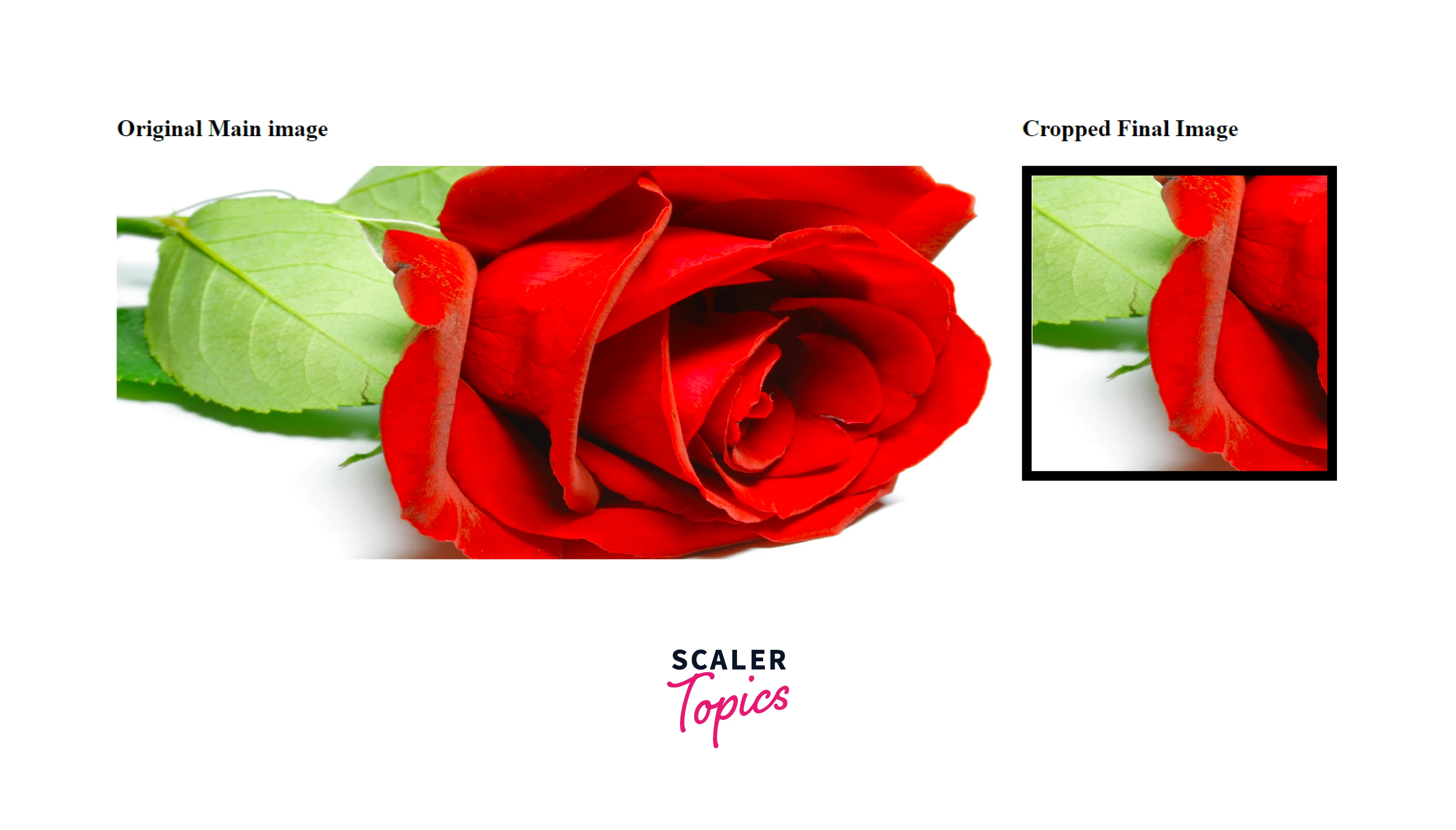
Aspect Ratio Cropping with Calc() and Padding-Top
Although it takes a little additional work, you can trim an image to the aspect ratio you choose.
The so-called perfect square hack will be needed first. Using this hack, you can turn any image into a square by putting it inside an image container that meets the criteria listed below:
- It has a height of 0.
- The padding-top value is equal to the container's width.
- The relative value for the position property is selected.
- Set the absolute value for the image position property with a top value of 0.
- Use the calc() method to set the padding-top value of the image container to your preferred aspect ratio.
HTML Code-
Output-
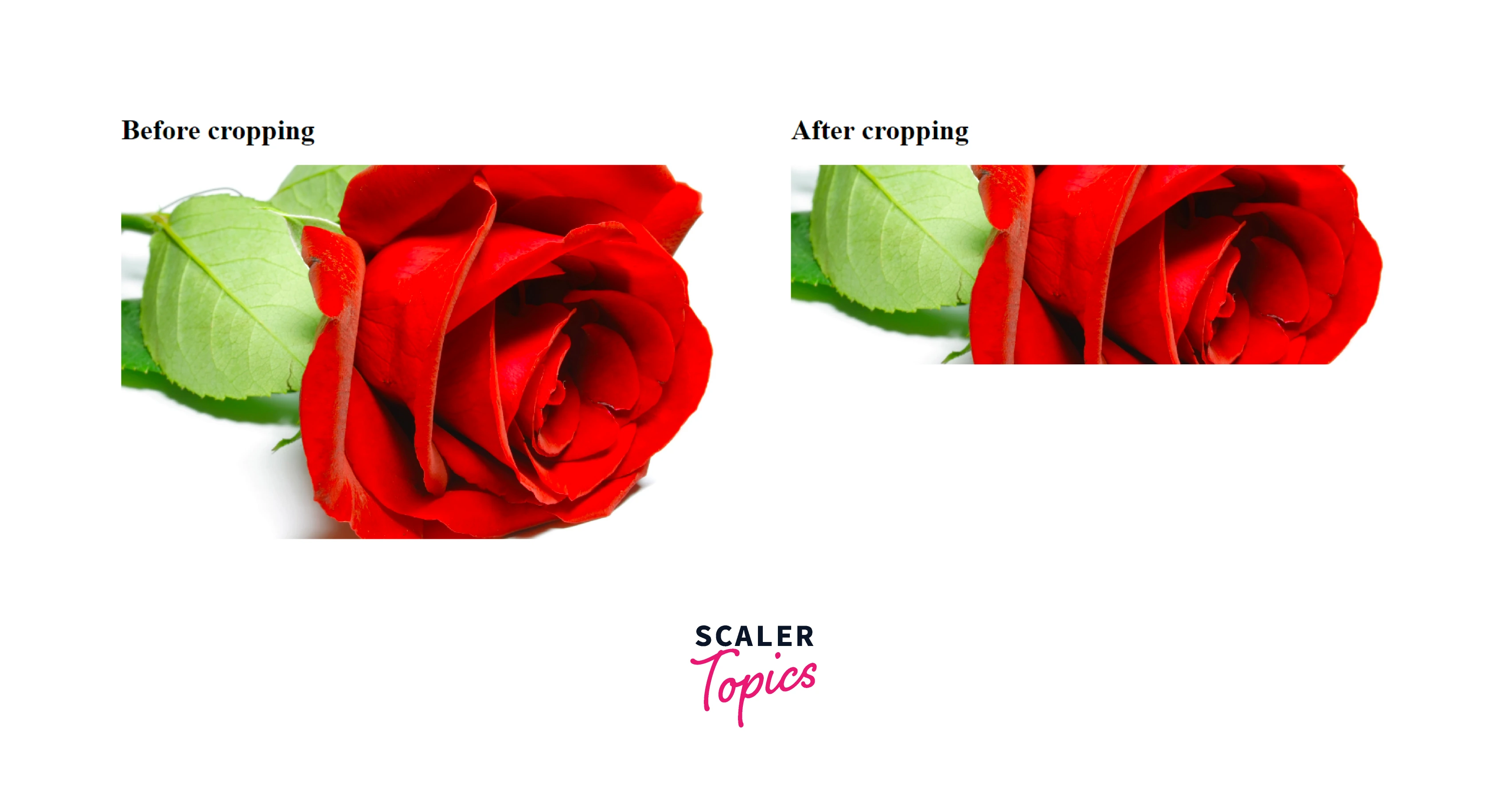
Using CSS Transforms
Cropping with CSS transforms expands on the aspect ratio cropping method that was previously covered. The main distinction is that we'll resize, move, and rotate the picture using the CSS transform feature.
HTML Code-
Output-

Pan to Crop with Margin-Top and Margin-Bottom
The top and bottom borders are used in conjunction with the picture itself in this method. These can also be utilized in conjunction with the parent container's overflow property's hidden value.
Output-
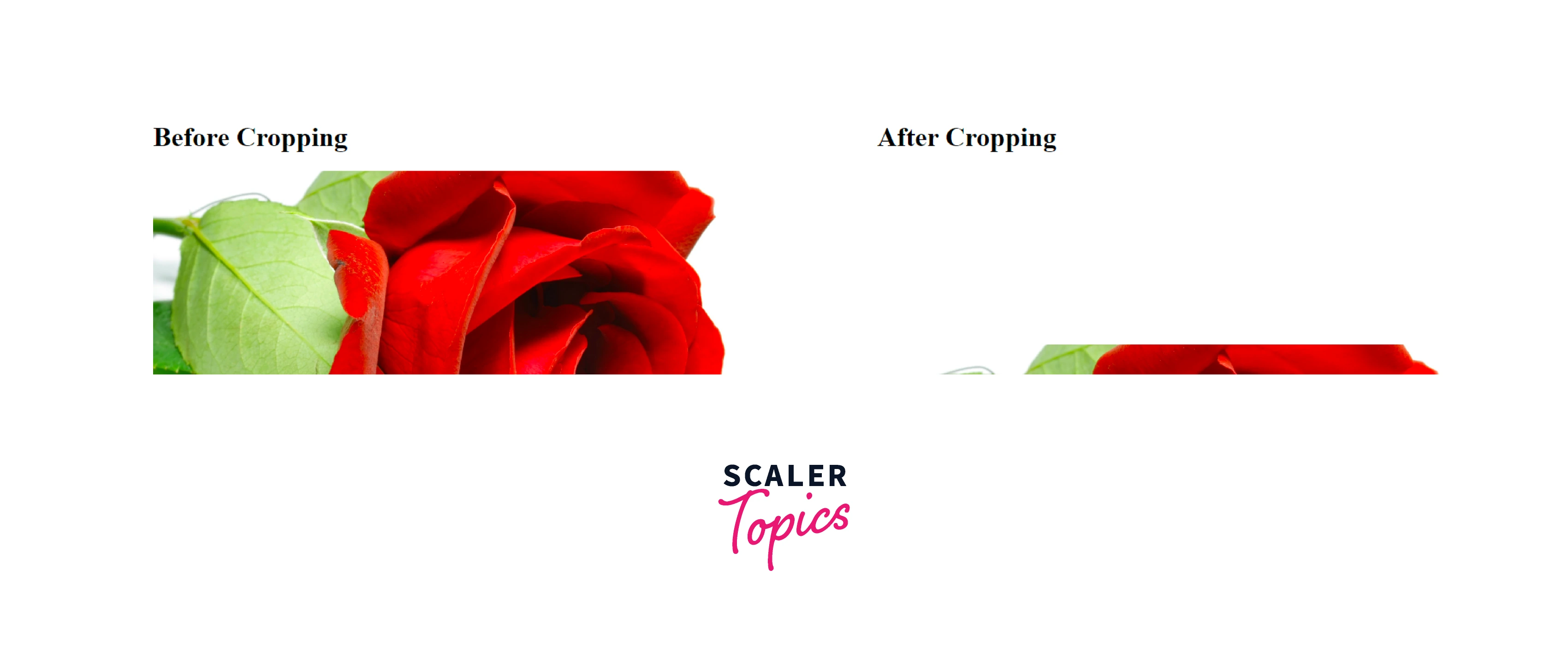
Pan to Crop with Margin-Left, Margin-Right, and Width
Similar to the method that was previously covered, except in this case the image is cropped using the right and left margins. You may choose the width of the cropped image by doing this.
Output-

Conclusion
- In this article we discussed, How to crop an image in CSS? and the different ways of cropping an image using CSS.
- We learnt about using the <img> tag with object-fit and object-position tools used to trim and reposition the image. We also discussed using the background-image property with background-size and background-position method.
- We use background images with persistent ratio or aspect-ratio attributes to our advantage.
- We learned about shaping the cropped image using border-radius.
- We discussed about cropping with clip-path using the syntax :
- We also learned basic shape and geometry box creation using the SVG syntax.
- We used aspect ratio with the calc() method and applied padding-top to convert any image into a square by putting it inside a container meeting certain criteria and using CSS transforms.
- We utilize the margin-top and margin-bottom overflow properties to crop the image and lastly, we do the same for margin-left and margin-right.
